Words have the power to inflict or bind wounds. May we choose ours carefully.
| Posted, by Carol L. Douglas. Watercolor on Yupo paper. I never did figure out a color for those water-lilies. |
I was checking into an event when the canvas-stamping person said, “Oh, you paint on a red ground? I’ll have to check your work out. A lot of people do that near where I live, and I hate it.”
I have no idea what—or even if—she was thinking when she said that. But it has subtly affected me ever since. I’m finding myself less likely to leave the ground showing, more likely to lard the paint on. Neither is good technique.
I’m a confident painter. Imagine if I was less experienced, or less secure. It might have completely shaken a painter at the start of a competitive event. It’s a perfect example of how not to offer criticism.
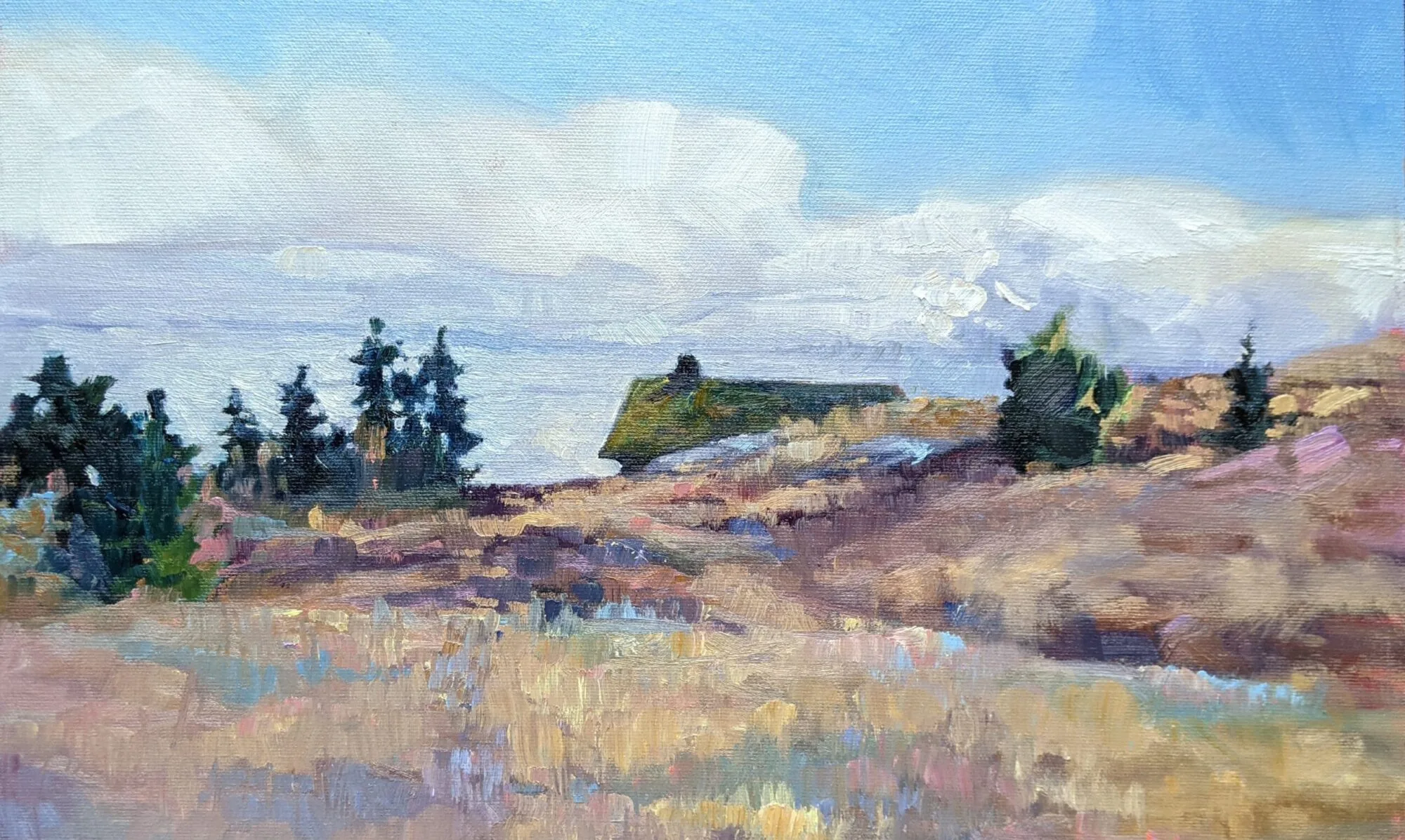
| Private Island, oil on canvas. This was interrupted by headache last week. |
Compare that to my dear friend Mary Byrom, who doesn’t like that red ground either. Mary is a crackerjack painter herself. I know she has good technical reasons for her opinion. She is also a loyal, kind, supportive friend. I know her intentions are good. I can listen to her opinion and weigh it fairly, without being defensive. She’s earned the right to critique my painting.
I’ve spent the month looking at and absorbing Joseph Fiore’s paintings, and I plan to start tinkering with some of his technical approaches, particularly his surfaces and scribing. He clearly—and successfully—paints on white canvases. He leaves areas white, scrubs the paint back, and lets the ground show through.
 |
| After checking every day this week, I decided I had to paint the reflections from my sketch, because there’s a constant breeze on Damariscotta Lake right now. |
Toning, for those of you who aren’t painters, means painting the white gesso a color before you start the painting proper. I was taught to always tone my canvases, and it’s something I also teach my students. Of course, the way I learned was to lightly tone with an earth tone in sepia, yellow ochre or grey. The brilliant red was a later addition.
Toning is as old as painting itself, but its rationale is explained through the 19th century concept of simultaneous contrast. This is a fancy way of saying that a color looks lighter against black, darker against white. To see it accurately, you need to see it against something that’s a neutral value.
Toning:
- Establishes the mid-tone values from the start;
- Unifies the color of the composition;
- Sets an emotional tone for the painting;
- Stops any specks that peek through from competing with your highlights;
- Gives you a more accurate sense of the value and size of your darks when you first set them down.
In the field, it also stops you from being blinded by brilliant white.
| Working Dock is the painting I showed you yesterday, properly photographed this time. (I finished it at dusk.) |
From observation, I’d say the majority of my plein air peers start on toned boards. It is something I’ll continue to recommend to my students. But should I keep doing it? That I can’t answer until I experiment on a white canvas. And that will wait until this workshop is over, because I only brought toned canvases with me.
While I’d like to say I’m thinking through this as a response to the Fiore paintings, there’s a small niggling part of me that’s still reacting to that woman’s comment. It’s a reminder that words have the power to inflict or bind wounds. Good advice is invaluable, in painting and in life. But may we all be as kind as Mary Byrom when we offer our opinions.
