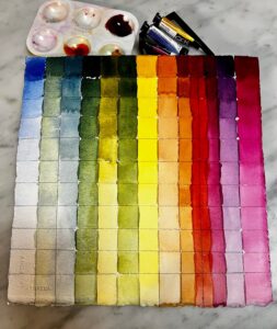
Last week I mailed a small sample of paints to a student in South Carolina. She was frustrated with her paints and I was equally frustrated watching her try and fail to hit color notes. What I sent her was a simple, primary-color limited palette: QoR brand Ultramarine Blue, Nickel Azo Yellow, and Quinacridone Magenta. This is what she did with them:

There are disadvantages to limited palette-for example D. couldn’t hit a brilliant green because the red tones in her blue and yellow partially cancel out green. (I’ve explained that in greater depth here.) But the range she did hit is amazing.
Quality, please
You’re far better off with a high-pigment-load, professional-quality limited palette than a dozen badly-chosen paints. Yes, I know the lure of the bargain bin at the art store, but those pigments are in there because they’re unnecessary or, worse, useless.
Sometimes you’ll read rapturous nonsense about pigments. For example, cobalt violet is sometimes described as “deep, richly glowing, and unmatchable by mixing.” I like the color but not enough to bypass my desire to avoid metal pigments wherever possible. Cobalt violet has a lovely weightiness in oils, but it’s hardly unmatchable. In fact, D. did it in the second column from the right, with just magenta and blue.

Tastes differ
I like my paint to be able to hit intensely saturated colors, because you can always kill chroma, but you can never intensify it. A more traditional palette, like my Winsor & Newton field kit, never seems brilliant enough. It has convenience mixes like Sap Green and Payne’s Grey, along with umbers and alizarin crimson. Those colors cannot compete with knockout 20th century pigments. When I weigh the convenience of sliding a palette in my pocket vs. having the colors I want, I invariably come down on the side of more color.

I’ve observed that the more experienced I get, the less stuff I buy. I know what I need, and I’m not tempted to deviate. Having said that, I recently updated my supply lists to replace Prussian blue with phthalo blue. Their color profiles are very similar, but phthalo is just a little clearer than Prussian. The downside is that phthalo is a more heavily-staining pigment. But after dithering for years, I’ve finally decided that clarity outweighs staining. Of course, both are excellent pigments, and can easily substitute for each other (except in acrylic, where Prussian blue is not available).
I make my supply lists for watercolors, oils, pastels, acrylic and gouache freely available to my readers (although this is copyrighted material; you don’t have permission to appropriate them and pass them off as your own). These are paired primary palettes with limited earths added, just because they’re cheap and useful. I have an entire cabinet of samples, gifts and bad purchases myself; I never touch any of them. These pigments are sufficient.
Reserve your spot now for a workshop in 2025:
- Advanced Plein Air Painting, Rockport, ME, July 7-11, 2025.
- Sea and Sky at Acadia National Park, August 3-8, 2025.
- Find Your Authentic Voice in Plein Air, Berkshires, MA, August 11-15, 2025.
- Immersive In-Person Fall Workshop, Rockport, ME, October 6-10, 2025.

