There’s more to composition than just avoiding these no-nos, but respecting the bounding box is a good place to start. Treat the edges as if they’re an important part of your composition.

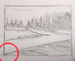
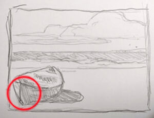
Don’t cut off the corners
This can sometimes be difficult when running an S-curve to the corner of the page, but will make a painting feel boxed in. If you absolutely can’t avoid it, bring the contrast in that corner way down.

Don’t let a line exit through a corner
That’s a variation on the same problem—the energy in the line slams against the corner and is trapped. The viewer’s eye follows with the same effect. Again, if you absolutely can’t avoid it, bring the contrast way down.

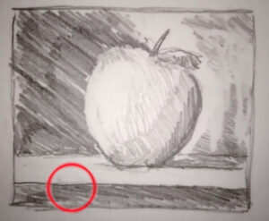
Don’t run an unbroken parallel line with the sides of your painting
Nobody told Renaissance painters this, but even Caravaggio gave it up as he matured. An edge at the bottom, an unbroken horizon line, etc., just creates a box-within-a-box. Unless you have a op-art reason for doing it, it results in dead space within your canvas. And it’s a wasted opportunity to use angles beautifully, as Francis Cadell did with his still lives.

Don’t put a focal point on the edge of your painting
Focal points are an invitation for the viewer’s eye to linger, to be drawn in. A focal point at an edge is an invitation for them to just leave.

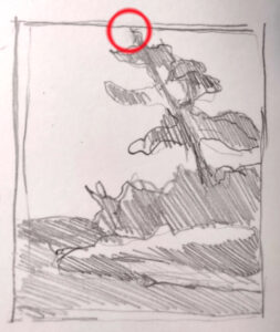
Avoid shapes just skimming the edge of your canvas
Either bring it in comfortably inside the picture frame, or let the object extend past it. And don’t scrunch trees trying to avoid hitting the edge; that robs them of their majesty. It’s better to start over.

