fbpx

Monday Morning Art School: do you see what I see?

Marshes along the Ottawa River, Plaisance, 8X10, oil on archival canvasboard, $522 includes shipping and handling in continental US.

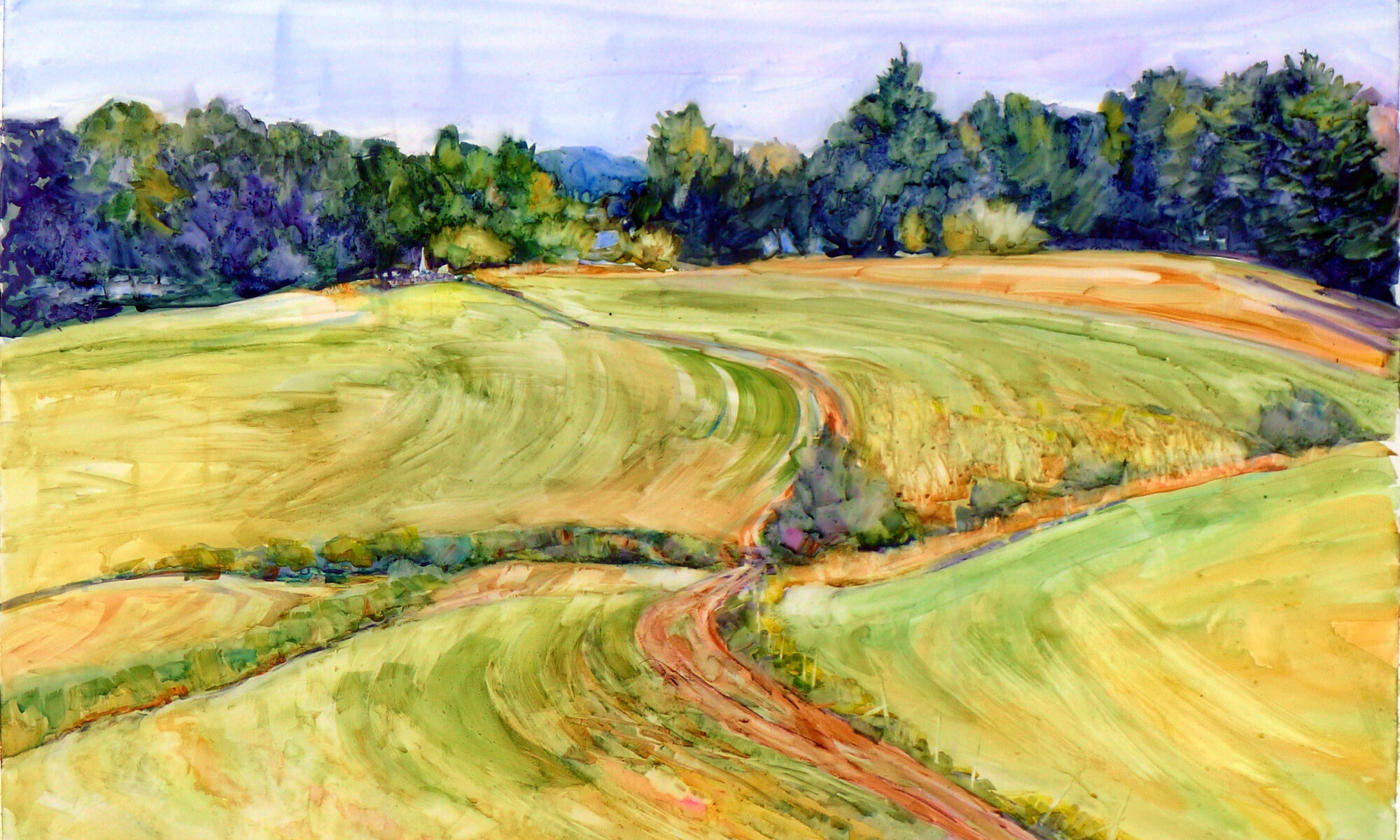
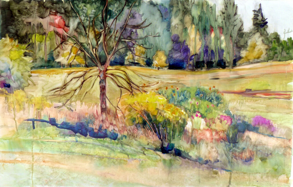
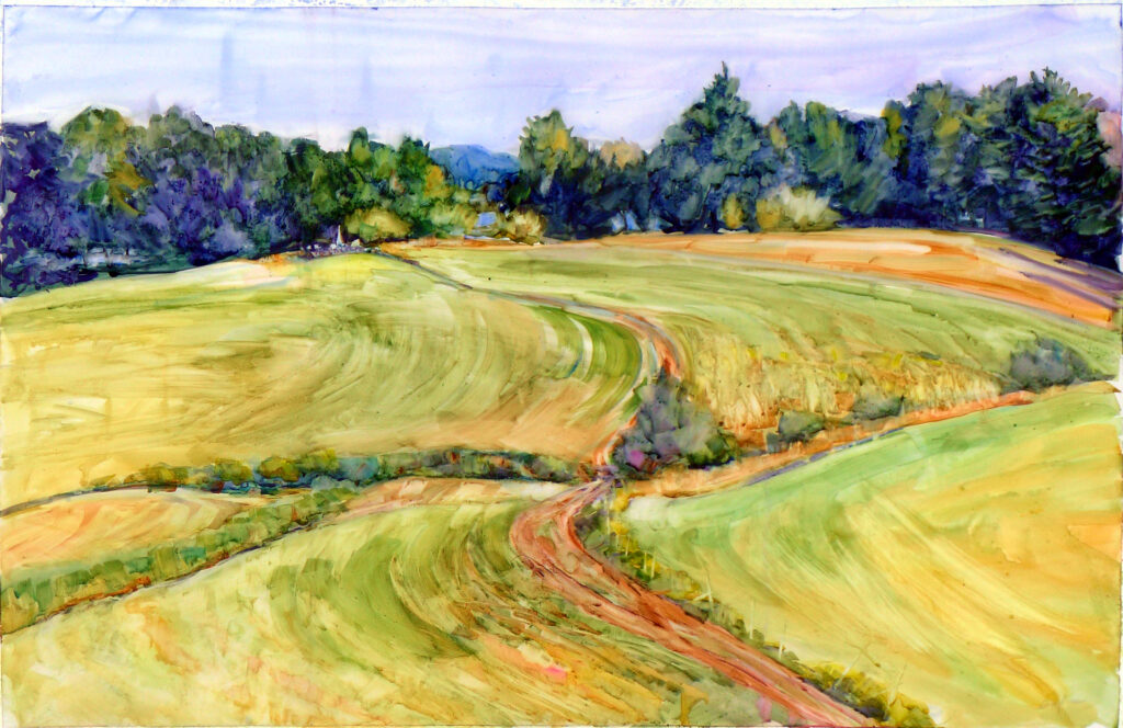
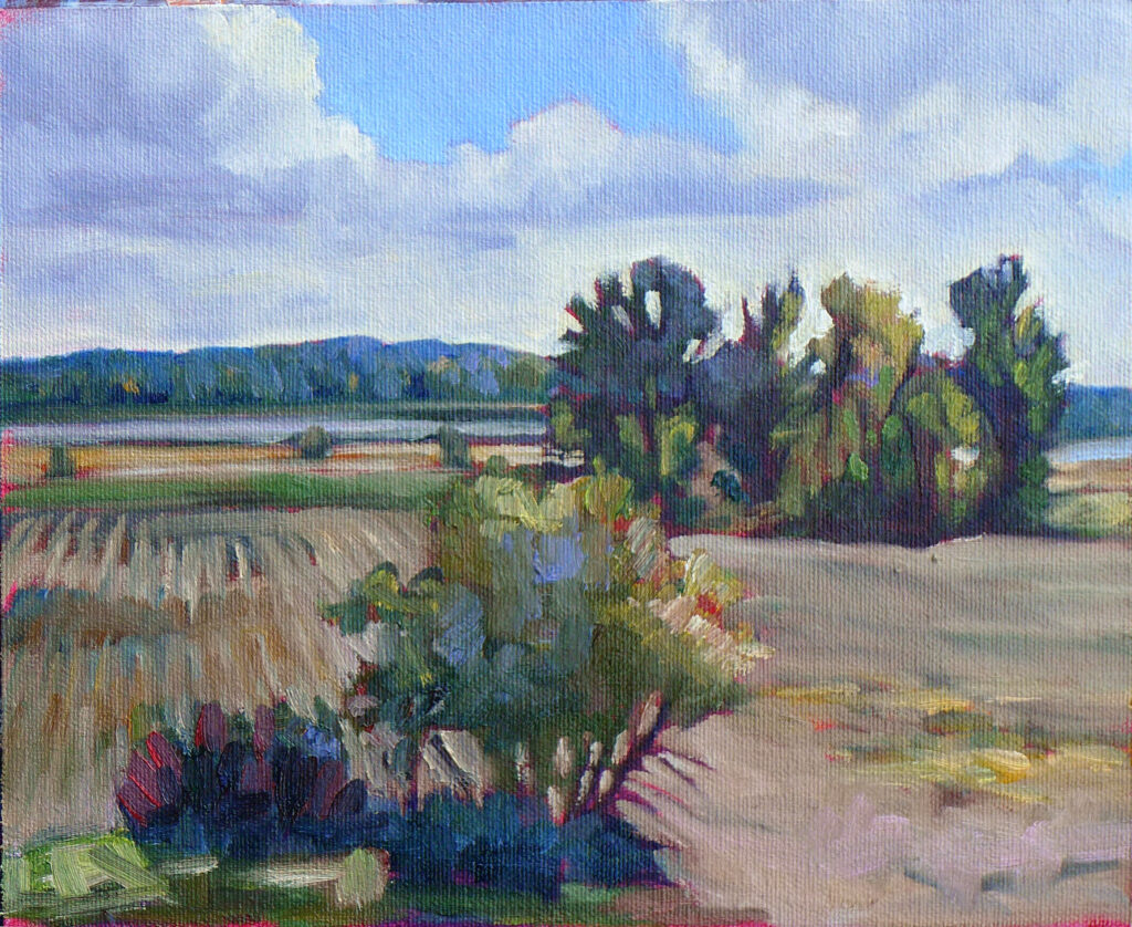
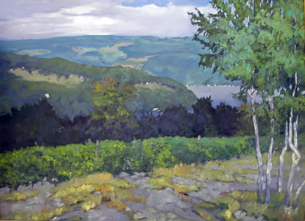
There is a young maple tree that I watch from my living room. This morning, it’s green overlaid with bronze. The maple behind it has a golden hue where it’s hit by the sun, but the part in shadow is a very dull blue. Closer to my house, the neighbor’s tree is developing dull violet overtones.

We old-timers say that maple trees start turning color before the kids go back to school. That’s not strictly true, because maple trees change their color throughout the season, starting with the brilliant red buds that we recognize as one of the first signs of springs. New leaves are chartreuse and mature into the full-throated, deep, dull “wall of green” that’s the undoing of many painters. There summer sits for a few hot weeks before it begins to slide inexorably into the cooler air and warmer tones of fall. By autumn’s end, all the deciduous leaves will be gone except those of the young beeches and oaks, which will dry yellow and bronze on their stems and create a quiet susurration in the winter woods.

The Pine Tree State, 6X8, oil on archival canvasboard, $435.

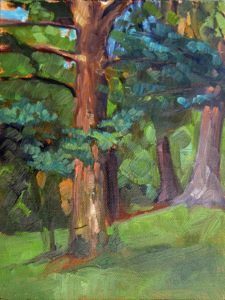
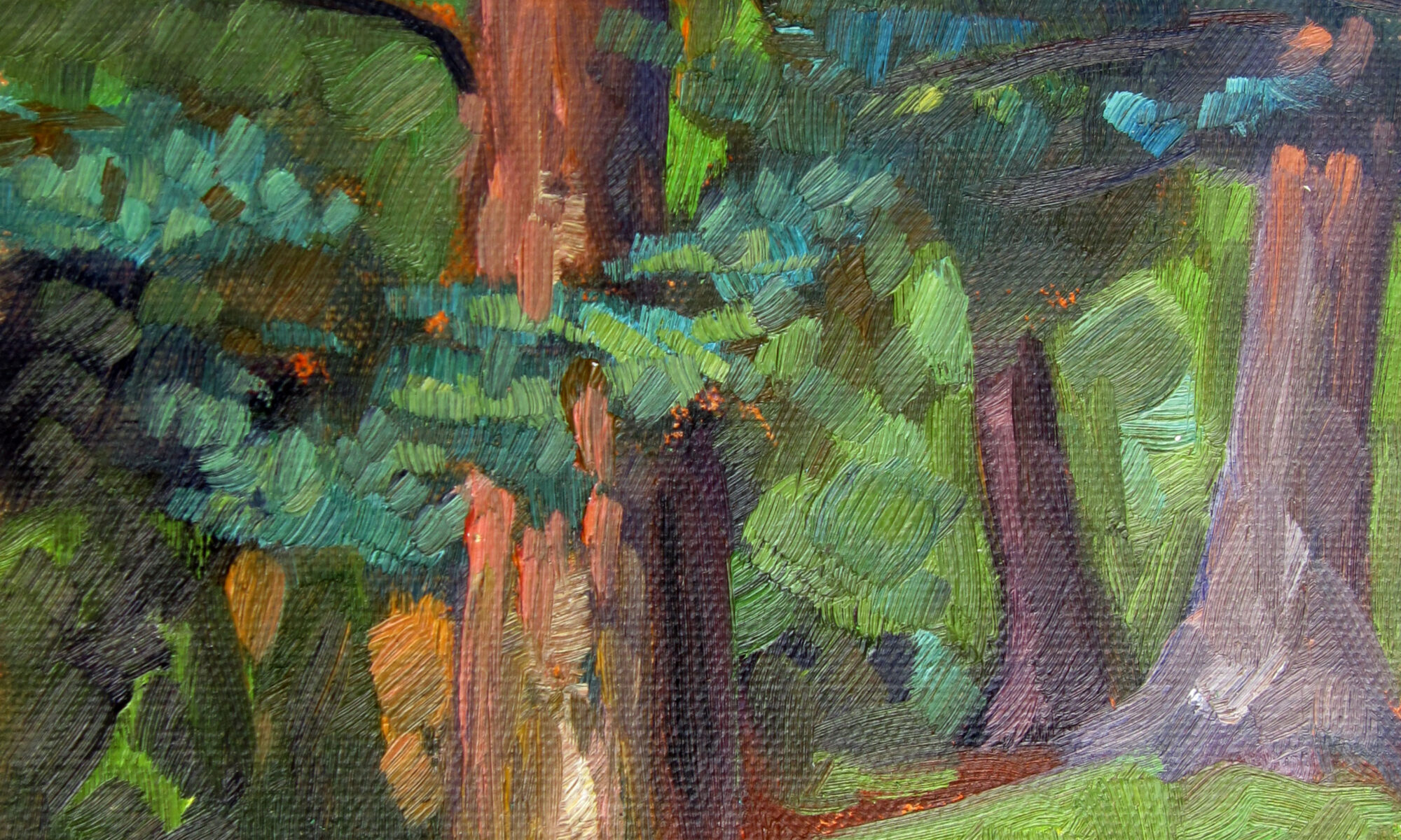
But ask us what color a tree’s leaves are, and we’ll invariably say, “green.” We won’t specify the glossy dark green of summer oak leaves, or the delicate light green of the katsura tree. (I have one in my back yard, and as the leaves dry and fall, they smell like apple pie.)

The green that many painters use for foliage bears about the same relationship to the natural world’s green as Gatorade does to juice.

The Vineyard, oil on linen, 30X40, $5072 framed, includes shipping and handling in continental US.

Do you see what I see?

Sometimes I paint with sunglasses on, because I like painting contre jour and the light hurts my eyes. As much as people tell you not to do that, I never notice much problem matching values; my glasses are limiting the light reflecting from my paint and canvas as much as they are the light bouncing off the ocean. (Where they make a difference is in specular highlights, but forewarned is forearmed.)

Visual perception varies from person to person, but within our own brain, we make consistent adjustments. If you always see things as pinker than I do, you’ll see your paints that way, too, and unconsciously make the correction. Not that we really know what anyone else sees; how could we measure that?

Are you looking or thinking?

We humans are too smart for painting. We paint with our reason rather than our eyes. For example, we ‘know’ that the irises of the eye are round. We paint that without noticing that for most of us, our top lids cut off a wedge of this pie shape. We know that barns are red, so we don’t notice that the bright red barn on a far hill is in fact objectively brown; our minds interpolate the color for us.

“Eastern Manitoba Forest,” Sandilands National Forest, Manitoba

What do you really look like to others?

“Who is this old woman looking at me in the mirror?” my mother once asked me. Most of us carry around a mental snapshot of ourselves that’s a combination of all our prior selves, real or imagined. That can make a candid photo or unexpected compliment tough to take.

That’s, I think, the same phenomenon as described above. Our inner selves know us rather than see us objectively.

What’s the solution?

Time and practice are the great healers for this problem. Meanwhile:

• Consciously look at things as if you were seeing them for the first time. 
• Take the time to measure; that forces you to be objective.
• Draw or paint the same subject from different angles.
• Look for subtle color shifts and patterns.
• Observe light and shadow without thinking about what object you’re drawing.

Mark next Friday on your calendar

Grand opening
Carol L. Douglas Gallery at Richards Hill
Friday, September 13, 5-7 PM
394 Commercial Street, Rockport, ME 04856

For more details, see here.

My 2024 workshops:

Monday Morning Art School: human vision and color theory

Rachel’s Garden, ~24×35, watercolor on Yupo, museum-grade plexiglass, $3985 includes shipping and handling in continental US.

Is human vision subjective? Absolutely; so are cameras (although they cheat less than our eyes). We don’t perceive things as they really are, and the gap between what we do perceive and what is ‘real’ is probably unmeasurable. It’s no surprise that witnesses often report wildly different events.

Bunker Hill overlook, watercolor on Yupo, approx. 24X36, $3985 framed includes shipping and handling in continental US.

How our eyes work

No other organ is quite like our eyes; they’re really an extension of our brains. The retina and optic nerve develop from the same tissue as the brain and that direct connection is maintained through life. The eyes are not merely sensors; they’re processing information before sending it up to the brain. They use the same neurotransmitters and signalling mechanisms as the brain. No wonder they’re so good at fooling us!

The primary visual cortex processes and interprets the signals received from the retina. That gives us the interpretive part of vision, where we sort color, motion, and depth. It’s there that we integrate and interpret visual data into coherent images and meaningful information.

Clary Hill Blueberry Barrens, watercolor on Yupo, ~24X36, $3985 framed includes shipping and handling in continental US.

How our eyes trick us

All humans have tunnel vision, some of us more than others. We focus on what’s in the center of our vision. What’s peripheral falls off, to various degrees depending on the person. One of the great lies of painting and photography is that they smooth out this tunnel vision.

There’s also wide variation in the distribution and density of rods and cones, which affect how we perceive color. Then there’s the condition of our lenses and corneas. (That’s why I keep hoping I’ll qualify for cataract surgery, but it never happens.)

Once the eyes send their signals to our brain, the relationship to ‘reality’ becomes even more tenuous. It appears that different individuals process various aspects of vision differently in their visual cortex. Our interpretation of what we see is also influenced by our experiences, our mood, and the degree to which we’re attending. And of course, lighting affects how we see (and how we fill in what’s missing).

Context affects how we see color

Certain visual patterns can trick our brains into seeing things that are not there or misinterpreting what we think we see. This is the basis of optical illusion, and it’s helpful for the painter to understand. Colors look different depending on what’s around them. Prolonged exposure to a particular color can create afterimages that affect how we see subsequent colors.

Most importantly, our expectations alter our color perception. For example, knowing that a distant roof is red can mislead painters into painting it brilliant scarlet, even when the atmospheric color shift has made it a far softer tone.

Path to the Lake, ~24X36, watercolor on Yupo, framed in museum-grade plexiglass, $2985 includes shipping and handling in continental US.

How do we sort all this out?

If we could separate what we see from what we ‘know,’ we’d be left with simple patches of light and color, because that’s all vision is. It’s very hard to do that, but the more we strive for that, the better our representation is.

After all, in our field of vision, things are not inherently large or small, close or near; our brain sorts the data and makes these comparisons.

Why am I thinking about this stuff?

I’m swotting to teach a new class, Applied Color Theory, on Tuesday evenings, starting on August 20. And it all starts with the brain, so that’s what I’m thinking about first.

There are just a few seats left, so if you’re interested you should enroll as soon as possible.

My 2024 workshops: