fbpx

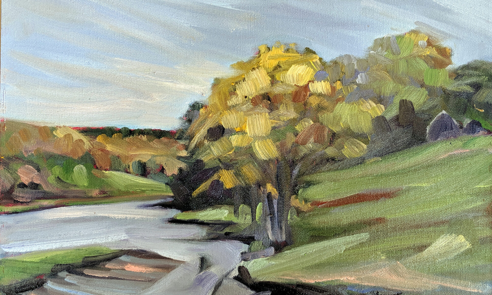
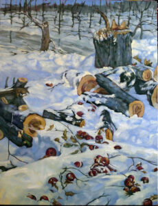
All Flesh is as Grass

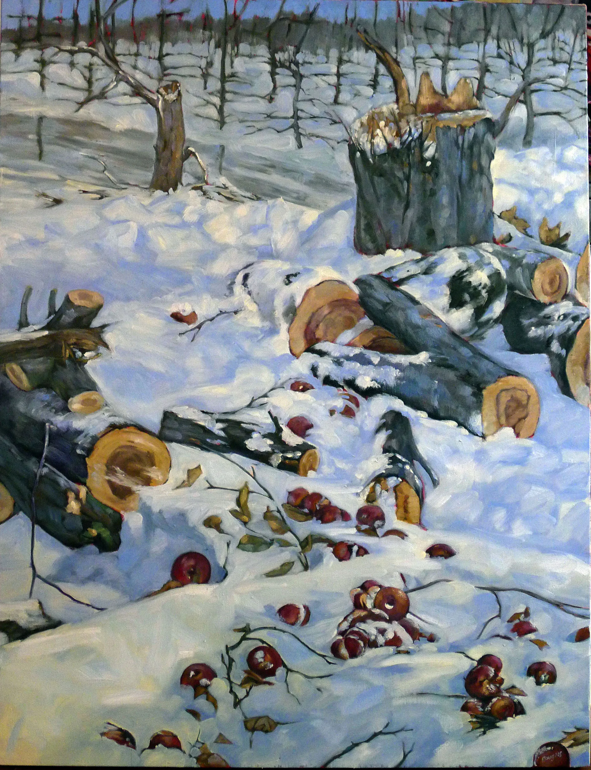
All Flesh is as Grass, oil on linen, 30X40, $5072 framed, includes shipping and handling in continental US.

Of all the paintings I have hanging in my home, the one that gets the most comments is All Flesh is as Grass, above. It was part of a solo show called God + Man: Paintings by Carol L. Douglas at the Davison Gallery at Roberts Wesleyan College, and reprised at Aviva Gallery in Rochester, NY.

Harry Rogachefsky was an elderly man who lived across the street from us. He had a lovely apple tree curling over his driveway. He told us we were welcome to all the apples we wanted. They were not sprayed and thus organic, and they made great pies.
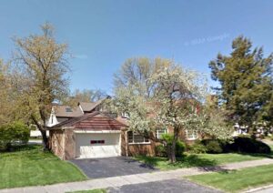
Mr. Rogachefsky’s house in happier times (2007) with his apple tree in flower.

The house was built in 1948, and the tree was planted around the same time. I thought of painting it many times, as I’m fascinated by the twisting branches of old apple trees. Alas, I never did it.

Mr. Rogachefsky eventually died at the venerable age of 95. His house sat vacant until Christmas, 2014, when a flurry of contractors descended. It had been purchased by house flippers. They yanked the mature foundation plantings and cut down that beautiful old tree.

I found its remains while walking with my dear friend Mary. Its trunk was shattered and its branches sawn into logs. Its fruit was crushed and frozen.
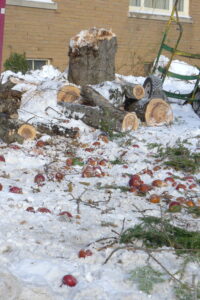
What Mary and I saw as we rounded the corner.

There must be a standard landscaping plan for house flippers. When they were done with Mr. Rogachefsky’s house, five little popsicle shrubs marched along the sidewalk. Luckily, I didn’t live there much longer. Although I’m now hundreds of miles away, when pie season starts, I think fondly of Mr. Rogachefsky and his apple tree.

All flesh is like grass and all its glory like the flower of grass.
The grass withers, and the flower falls, but the word of the Lord remains forever.
(1 Peter 1:24-25)

We know that intellectually, but it’s still a shock when the chainsaw comes out.
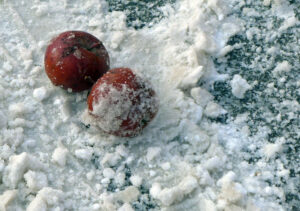
No more pies, ever, from this tree.

A little while before the new owners moved in, I saw a boy knocking down icicles from the porch.

My next-door neighbor Aviva (may her memory be a blessing) had been seriously injured by a falling icicle a few years earlier. Icicles can weigh up to a thousand pounds and have a perilous pointy end. They’re especially lethal when they drop from any great height.

“Hey, kid, stop that!” I yelled from my stoop. “It’s dangerous!”

“Don’t worry!” he called back, and pulled off his hood to show me he was wearing a helmet underneath. It was Mary’s son Xoan, who was always prepared for any eventuality.
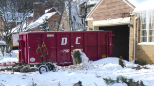
One knows it’s inevitable, but it’s still painful to see.

In the painting, I changed the setting to be an orchard of young trees; a chainsaw is in their unthinkably-distant future. The light is filtered and indirect; that’s the usual state of affairs along Lake Ontario in winter. There are warm lights and cool shadows, but they’re not as brilliant as in Maine. All Flesh is as Grass is a big painting, 36X48, but its delicate color structure means it’s not overwhelming. It’s in my own diminutive living room (about 14X12 feet) and looks lovely.

I recently pointed out to Naomi Aho that most painters’ paintings drop in price/square inch as they get larger. That makes a large painting like this a great deal, since it has the presence to compel as much or more than several smaller ones. Until the first of the year, you can use the discount code THANKYOUPAINTING10 to get 10% off it or any other painting on my website. And shipping and handling are always included within the continental US.

Reserve your spot now for a workshop in 2025:

Monday Morning Art School: why grisaille?

Sometimes you just need to push paint around in a dream state. A grisaille is the perfect place to do that.

A grisaille is a monochromatic painting. In oil painting, it forms the first step of underpainting. In watercolor, it’s a separate reference to check values.

There are a few painters I know who skip the grisaille step entirely. (I’m not one of them.) The only ones who are successful at it are so experienced that they can integrate hue, value and chroma simultaneously. Even then, they’re still working dark to light and being careful not to misstep and put gobs of white or light paint where it doesn’t belong.

Eric Jacobsen is one of these outliers, and he graciously offered to demo his underpainting technique for my newest online class, The Essential Grisaille. (Appearances by his dog Sugar and his chickens were completely unscripted – but cute.)

As we filmed, I kept thinking, “Kids, don’t try this at home!” Eric isn’t skipping the grisaille step so much as integrating it with his initial color notes. That’s very difficult for all but the most experienced painters.

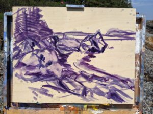
Early in the grisaille process for the Scottish portrait I wrote about on Friday.

Why grisaille?

The human mind sees value before hue or chroma. The arrangement of rods and cones makes us more sensitive to value shifts when scanning a vista. We also have a wide dynamic range. Both were awfully convenient for our hunter-gatherer ancestors, and they influence how we see paintings.

In the brain, processing starts with low-level information like brightness and contrast. That’s processed more quickly and efficiently than higher-level color information, which requires additional signals from the eyes.

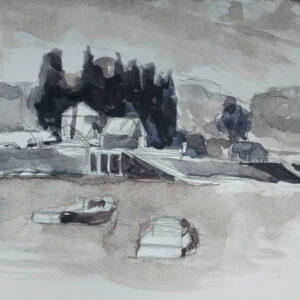
Sometimes my sketch for an oil painting will take the form of a watercolor grisaille.

In a nutshell, that means the viewer will see your value structure before he or she sees anything else. A painting that fails on its value structure will just fail, period. Arthur Wesley Dow, who wrote the definitive 20th century composition book, is the guy who gave us the notion of notan. He taught students to restrict the infinite range of tonal values to specific values. He wanted students to realize that all compositions are, underneath, a structure of light and dark shapes. That’s a critical insight that influences all modern painting.

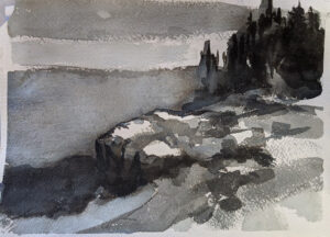
A watercolor grisaille done as preparation for a watercolor painting.

What is grisaille?

Grisaille just means a monochromatic painting. I teach both oil and watercolor students to do this preparatory step. In watercolor, it’s a monochrome study on a separate page that guides the color choices for the finished painting. For oil painting it’s the underpainting step before we start adding color.

In oils, it’s done in a dark tone that relates to the overall color scheme of the planned painting-if the shadows are cool, the grisaille should be cool, and if the shadows are warm, the grisaille should be warm. That’s because the grisaille will be part of the finished painting, sometimes visible with no covering whatsoever.

The paint is thinned with odorless mineral spirits (OMS) and no white or light colors should be introduced. A brush and a rag are both used to get the full range of values.

Even for a QuickDraw, I do a grisaille. This is partly covered with color notes. The finished painting is here.

Simple, right?

Another watercolor grisaille. All examples are by me.

I’ve just spent about six weeks writing and filming The Essential Grisaille*, and thinking through all the ways it can go wrong. Julie Hunt, who is a very good student and painter, told me, “There were beginning things I fudged with little instruction that I remember.” She has now carefully worked through every step of The Essential Grisaille to really master the subject. I’m excited to see how her painting changes.

Julie has put her finger on the difficulty of all classes, online or in person. There’s so much to take in that nobody gets it all the first time they hear it. And we can fill in the gaps with inspired guesses or just wrong-headed mistakes. It all comes down to being ready to hear, grasshopper.

Which is why Seven Protocols for Successful Oil Painters is designed to be open-ended. You can go back and revisit themโ€ฆ as long as I pay my internet bill.๐Ÿ˜Š

*I’m talking about both watercolor and oils in this post, but The Essential Grisaille is intended for oil painters.

Reserve your spot now for a workshop in 2025:

Monday Morning Art School: avoid muddy colors

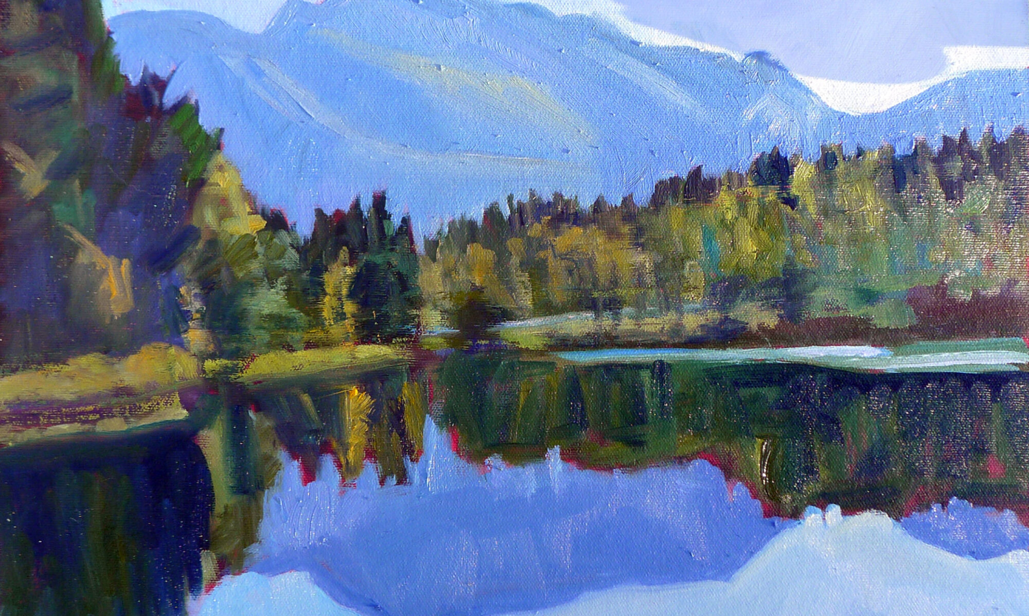
Early spring in Maine, oil on canvasboard, by Carol L. Douglas

Does your oil paint look bright on the palette, but turn muddy or grey on the canvas? Do you have trouble keeping colors clean? You’re using too much solvent and/or medium. It’s an easy problem to fix, once you’ve learned the correct technique.

Why fat-over-lean?

Fat-over-lean prevents sinking color and cracking paint emulsion. The first is that dullish grey film that develops over paint that’s overthinned with solvent. Cracking paint doesn’t usually appear until after the artist is dead but is a major issue in some masterpieces.

Some manufacturers of alkyd mediums argue that the fat-over-lean rule no longer applies. Take this with a grain of salt. It takes time for problems to appear in paintings, time that’s measured in decades, not years.

Perfect layering demonstrated by Laura Felina at my recent workshop in Sedona.

Simple concept, tricky application

By ‘fat’ we mean the medium-either commercially-mixed mediums or drying oils like linseed, poppy or walnut. The paint itself contains medium as a binder, usually in the form of linseed oil. By ‘lean’ we mean a solvent, usually odorless mineral spirits (OMS).

OMS evaporates, so its dry-time is dependent on temperature and humidity. Drying oils don’t evaporate, they oxidize. That means they stay there, bonding with oxygen, creating a new chemical structure on the surface of the paint. This combination can be extremely durable.

In plein air, this process is usually cut back to two or three steps: an underpainting cut with OMS, a layer that’s pure paint, and then possibly a detail layer cut with medium on the top. However, in more complex paintings with more layers, the shift from lean to fat can be more gradual.

This is a properly-dry start to a painting.

The underpainting

The underpainting or grisaille should be thinned sparingly, and only with solvent (OMS). Keep it dry enough that it’s not shiny. How can you tell? Stick a finger in your paint. If you can slide the paint around, it’s too sloppy. If your finger looks like you were just fingerprinted, it’s too sloppy. You should be able to see just a bare hint of color on your fingertip.

If you put too much solvent in the bottom layer, you’ll get muddy, mushy color as you try to build. No, you don’t need to wait for it to dry. Take a paper towel and lay it carefully on the surface of your painting. Use your hand to apply pressure. You’re blotting-not wiping-the excess moisture away. It should be almost dry to the touch before you proceed.

It’s best to avoid blotting. Learn to use only fractional amounts of solvent, just enough to allow the paint to move without dragging. Use a rag to lift paint from light passages, instead of using excess solvent to thin these passages.

If it’s shiny, there’s too much solvent in the bottom layer. The subsequent layers will be soft and muddy.

The middle layer (which is also sometimes the last layer)

This next layer should be as close to pure paint as possible. If your paint is too stodgy to move freely, check to be sure that you aren’t using clotted, hardening paint. Or, your brushes may be too soft for alla prima painting, which works best with hog bristles. If you must thin your paint, a drop of oil is all that’s appropriate in this layer.

The top layers may need no medium at all. Many painters don’t use it. Blueberry barrents, by me, early spring.

Top layer or detailing

Here you can use medium or linseed oil. But if you use more than a dollop the size of a mechanical pencil’s eraser in an 8X10 painting, you’re overdoing it. Using too much medium will result in soft, lost lines and mediocre brushwork.

Medium is helpful for laying detail down over wet paint, but don’t develop an overreliance on it. Many artists use none at all.

There’s room in my upcoming critique class. It’s a great way to bring your painting to the next level. Open to intermediate painters in all media.

Reserve your spot now for a workshop in 2025: