
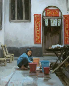
“Many plein air painters pick the worst light of the day to paint,” a reader emailed. “Photographers would never go out at 10 AM or 2 PM. So why are paint-outs called for those hours? The light sucks. And so do so many of the paintings.”
The short answer, my correspondent, is that life happens. I don’t paint at 7 AM-when the light is glorious-because dogs aren’t allowed off-leash in my local land trust after 9 AM. So, he gets his long run first and then I get to work.
Luckily, I live in Maine where the sun never climbs to the middle of the sky anyway. The closer to the equator, the more extreme the midday dead zone becomes. The closer to the summer solstice, the longer it lasts.
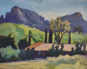
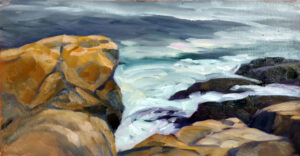
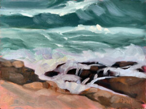
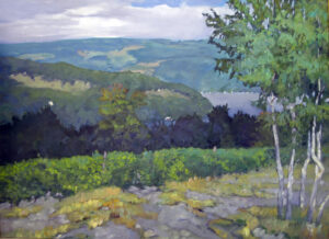
What do I mean by the midday dead zone? The light becomes cooler; shadows shorten and stop defining space. It’s possible to paint through this, but only when you’ve set up a composition in advance.
What color is light?
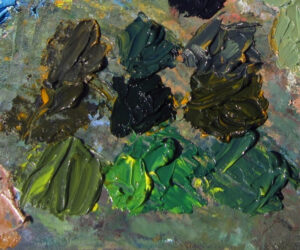
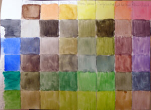
Most non-artists would tell you that light is white and shadows are grey. It takes practice to perceive the color of light. But light always has color. Outdoors, atmospheric noise bends and distorts the rays of the sun. Indoors, light bulbs are tuned to specific light spectra.
One of three situations prevails:
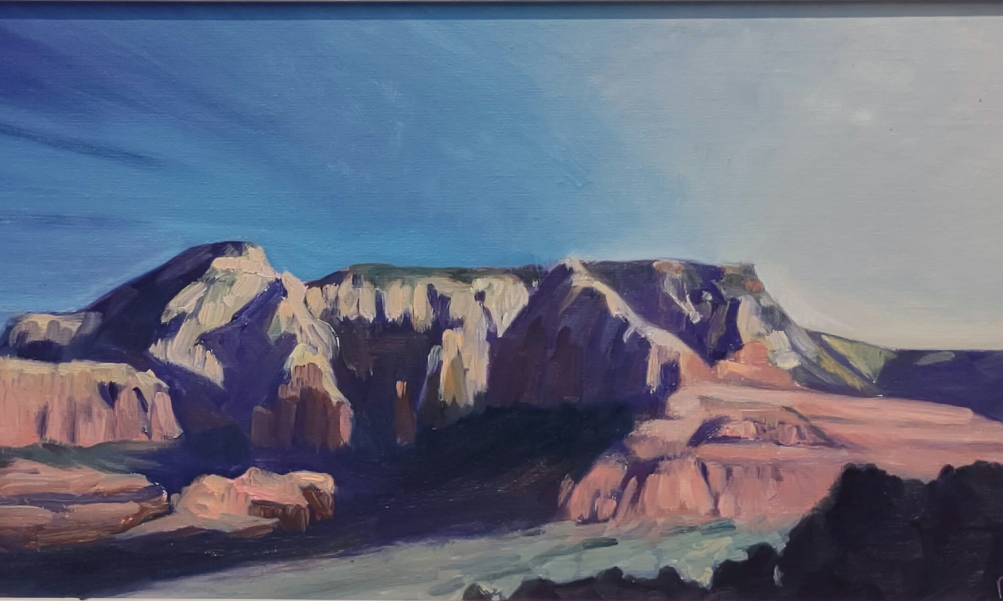
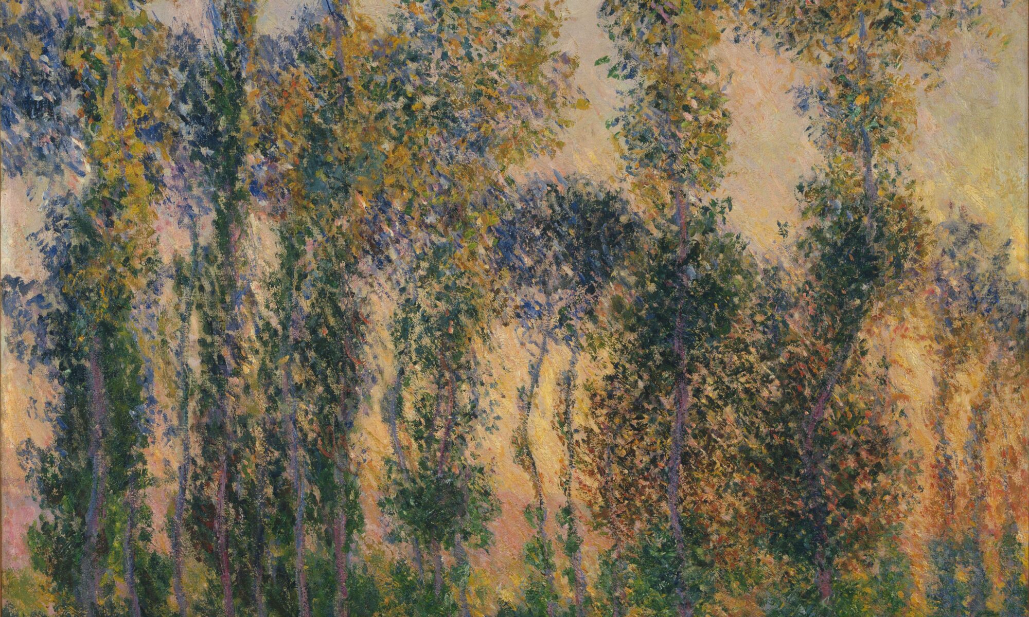
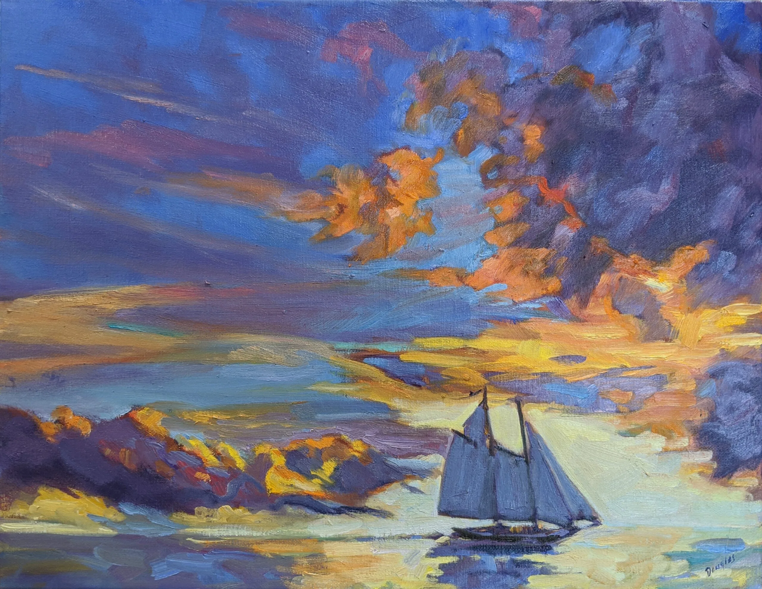
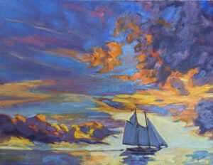
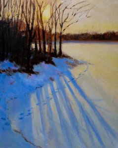
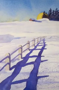
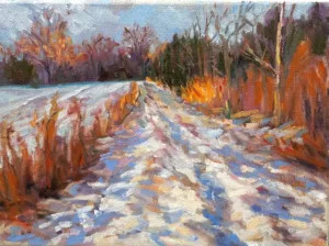
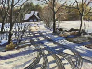
At midday, shadows are warm and the light is cooler.
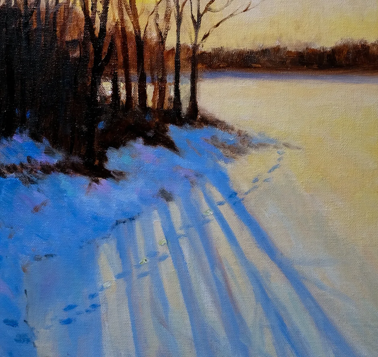
In early morning and late afternoon, shadows are cool and the light is warm. This is also the prevailing light closer to the poles.
Shadows and light are neutral. This happens on grey days, when light and shadows are indistinct. This light has color, but it’s very subtle. Usually, you can pick it up by isolating the grey of the sky and determining if it’s warm or cool.
There are exceptions to this rule. For example, the cool light under a porch roof will produce even cooler shadows; our mind reads cool-and-cooler as indirect light. Or, light filtered through an awning will have a color cast from the fabric.
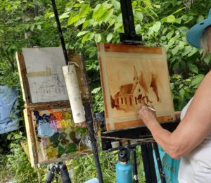
Don’t chase light and shadows
Instead of painting spasmodically fast, make a value sketch. This is the most important step in painting. Make a study, or multiple studies.
The value study is where one explores relationships and determines the ‘final cut.’ It’s far more helpful than slavishly transcribing a scene to canvas from a viewfinder. It’s in the value sketch that you make subtle adjustments to the elements for compositional purposes.
Most importantly, that value sketch in your notebook becomes your guide when the shadows and light flatten out. You’ve got their shapes recorded. You have a value structure recorded. You can use the changing scene in front of you to adjust details.
(But a warning: at some point the light will flip when the sun crosses the sky. At that point, it’s best to put away the painting and start another.)

Use your sketchbook to record any spectacular lighting effects that whiz by
Atmospheric effects like crepuscular rays, breaking clouds and rainbows are transient. Before you add them, be certain they support your composition. If so, and you’re able to do so, paint them right in. If you’re not at that point of development, sketch what’s happening so you can refer back to your notes.
They may be beautiful but clash with your existing composition. If that’s the case, just sit back and enjoy them, or record them in your sketchbook for another painting.
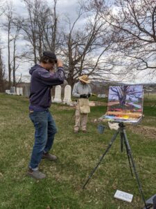
Notice that I didn’t mention a camera
You should be able to develop a plein air painting without any relying on photo reference at all. If you can’t, then why?
Reserve your spot now for a workshop in 2025:
- Advanced Plein Air Painting, Rockport, ME, July 7-11, 2025.
- Sea and Sky at Acadia National Park, August 3-8, 2025.
- Find Your Authentic Voice in Plein Air, Berkshires, MA, August 11-15, 2025.
- Immersive In-Person Fall Workshop, Rockport, ME, October 6-10, 2025.


