fbpx

Monday Morning Art School: five fast things you can do to improve your painting

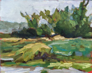
Spring Greens, 8X10, oil on canvasboard, $522 unframed includes shipping in continental US.

Ditch the convenience greens

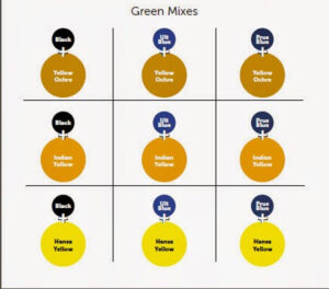
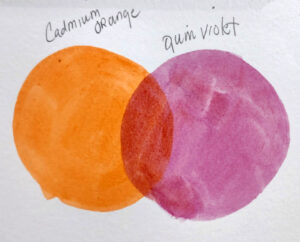
Sap green is a convenience mix, made of Indian (dairylide) yellow and phthalo or Prussian blue. Hookers Green is even more complex, using nickel azo yellow, indanthrone blue, and quinacridone magenta to get that deep, dull solid green tone.

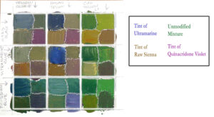
Premixed colors suck the life out of your paintings, because they make dull mixtures. Instead, learn to use paired primaries. In particular, learn to mix greens. That’s the only way to avoid boredom in the ‘wall of green’ that the northeast is about to enter.

I explain this more fully in my online video class, The Perfect Palette.

Spring Allee, 14X18, oil on canvas, $1594 framed includes shipping within continental US

Clean your brushes

Oil painting is more forgiving of dirty brushes than watercolor, but they both need clean brushes, both within the process and after.

In watercolor, that means rinsing them in cool water until it runs clean, and then wiping down the excess water and setting them lovingly aside to dry. Unless you’ve dropped them in cow muck, soap is never necessary. But you should have enough water at hand to regularly clean your brushes during the painting process. Change it as soon as it gets dirty.

In oil painting, it’s best to rag-clean your brushes during the painting process. If you must rinse in mineral spirits, carefully towel the brush dry before you start painting again, or you’ll end up with soupy paint.

When you’re done, you need to get the paint out of bristles and ferrule. If your brushes have splayed, the most common culprit is paint dried deep within the ferrules. It’s impossible to get that out, so it’s best to get them clean right after use.

I have a video on how to clean oil brushes here.

Apple Blossom Time, 9×12, oil on canvasboard, $696 unframed includes shipping in continental US

Set out fresh paint

I store my oil painting palette in the freezer between painting sessions. The paint is good for several weeks, but as soon as it develops a film or becomes stodgy, it’s history. Oil paint is carefully formulated at the proper consistency and pigment load. You cannot refresh half-dried paint by adding mineral spirits or medium to it.

“I hate waste,” you say, and so do I. But the most precious thing I have is time. I won’t waste it on a painting that’s destined to fail.

Organize your palette

Watercolorists keep your paints in the same pans because you’re wetting and reusing the same paints over and over. You’re smart to arrange them in rainbow order. You do not need 50 different paints. A paired primary palette, plus a few more for fun, will get you to any point in the color spectrum.

Oil painters can plop their paint down anywhere, but it’s a terrible idea. Lay them out in a rainbow order and then stick with that. (That’s a good reason to not scrape your palette perfectly clean between uses; the trace colors will be your guide.)

I encourage my oil-painting students to paint with tints, because it’s a fast way to lay down bright midtones. But even without this, an organized palette that you understand is a fast route to success.

Owl’s Head fish shacks, 11X14, framed, $1087 includes shipping in continental US

Do a value drawing

If you tend to make more duds than successes, you need to slow down and do value drawings first. Don’t proceed to painting until you have a sketch you really like. The value drawing lays out the overall composition and the focal points before you ever get to paint. That fifteen minutes at the beginning is not just a tremendous time-saver, it saves you from setting off on a fundamentally-flawed path.

If you are unfamiliar with the concept, or don’t know how to do it, I recommend my online class, The Value Drawing.

Reserve your spot now for a workshop in 2025:

Monday Morning Art School: Subject vs. focal point

The People’s Census at Bethlehem, 1566, Pieter Brueghel the Elder, courtesy Royal Museums of Fine Arts of Belgium

The number one question you must ask about your painting is: is it boring? If your painting is boring, nobody is going to engage with it.

One way to do keep things interesting is to manipulate where you put the subject of your painting. You don’t need to plop the subject in the center of your canvas and the subject does not necessarily have to be the focal point.

Consider Pieter Brueghel the Elder‘s masterpiece, The Census of Bethlehem, above. It’s unlikely that Brueghel consulted a text about composition, because those things didn’t exist back in the 16th century. He came up with this visual trick on his own and used it over and over.

The Procession to Calvary, 1564, Pieter Brueghel the Elder, courtesy Kunsthistorisches Museum. This is a veritable “Where’s Waldo” of a painting.

The subject is not in the middle of the canvas. Nor is it the focal point. In fact, the subject will only be clear to you if you know the Bible story about Mary and Joseph traveling to be counted in Bethlehem. Because of the overall energy of the canvas, you’re engaged enough to hunt for them, and to realize that Mary and Joseph are at the very bottom of the canvas, heading towards the census-taker at the bottom left.

That’s different from the focal points, which are within the swirl of activity that made up the daily life of a medieval village.

Landscape with the Fall of Icarus, c. 1558, either Pieter Brueghel the Elder or a close copy thereafter, courtesy Royal Museums of Fine Arts

Brueghel often made the subjects of his painting seem like almost an afterthought to the big scene. Another great example of this is Landscape with the Fall of Icarus, about which William Carlos Williams wrote:

According to Brueghel
when Icarus fell
it was spring

a farmer was ploughing
his field
the whole pageantry

of the year was
awake tingling
near

the edge of the sea
concerned
with itself

sweating in the sun
that melted
the wings’ wax

unsignificantly
off the coast
there was

a splash quite unnoticed
this was
Icarus drowning.

In that short poem, Williams says everything about Brueghel’s compositional technique.

The Peasant Wedding, 1566-69, Pieter Brueghel the Elder, courtesy Kunsthistorisches Museum. Brueghel also painted many genre paintings, meant to illustrate a known story or moral argument.

So, what’s the difference?

The focal point is a visual engagement, whereas the subject is what the painting is about. The subject of a painting can be a story or fable, as were Brueghel’s paintings. It can be an object or person. Or, in the case of abstraction, it can be nothing at all.

Focal points are something quite different. They are the points that your eye rests on at it moves through a painting.

What draws the human eye to a specific passage in a painting?

  • Contrast in value, hue and chroma, with value being the biggest driver of the three. If you have a dark shape next to a light shape, the eye tends to look at that place.
  • Detail. Assuming the whole painting is not overloaded with detail, if there’s a lot of detail in a passage, that is where the eye will go first.
  • Line. Lines within the composition act like arrows, drawing your eye to the focal points.

Is there just one focal point in the painting?

I sure hope not, because your job as the composer is to get the human eye to dance its way through the composition, to engage the viewer for as long as you can keep them interested. The longer they spend looking at your picture, the more involved they become with it.

Reserve your spot now for a workshop in 2025:

Monday Morning Art School: what’s the point of a three-hour painting?

Early Spring on Beech Hill, oil on canvasboard, Carol L. Douglas, 12X16, $1449 framed includes shipping in continental US.

Near the wonderful, loose Andrew Wyeth watercolors at the Farnsworth Art Museum is a small room dedicated to his painting practice. You are surrounded by his careful investigation of details, compositional sketches, and studies. “When I was painting Christina’s World I would sit there by the hours working on the grass, and I began to feel I was really out in the field. I got lost in the texture of the thing. I remember going down into the field and grabbing up a section of earth and setting it on the base of my easel. It wasn’t a painting I was working on. I was actually working on the ground itself,” he said.

Edward Hopper, who mined similar veins of alienation as Wyeth, was known for meticulously storyboarding his major paintings. He drew thousands of preparatory sketches. A comparison of one of his final sketches for Nighthawks with the final painting shows just how important his drawings were in cutting things down to the bone. He used drawing to shake off the burden of representational reality.

Failed attempt #1 at Chauncey Ryder trees. I’ll go back up the hill and try this again if it ever dries out. Dialing back the chroma will help.

Modern plein air painting

On the flip side, there’s contemporary plein air painting, dashed off in alla prima technique in a matter of a few hours. I love plein air painting myself, but a recent conversation with a student had me wondering about its lasting value. She is frustrated with her local painting group, which never works more than two or three hours. “What’s the point of rushing like that?” she asked me.

There are hundreds of plein air events in the United States every year, each of which has around thirty juried artists, each of whom in turn produces 5-10 works per event. That means the art market is flooded with tens of thousands of paintings from these events alone. Not all of them are good. I’ve produced more than my share of duds.

These events create a commodity that’s affordable to a middle-class audience. There’s nothing inherently wrong with that; it’s what drove the Dutch Golden Age of Painting, which gave us Vermeer, Frans Hals and Rembrandt.

Failed attempt #2 at Chauncey Ryder trees. Boring composition and I made a messed up stew of the buds on the branches.

But it’s equally true that mass movements give us our share of dreck. The paintings done at plein air events are often safe (read ‘boring’) and dashed off without a lot of thought. That’s because plein air events are a production grind.

Loose brushwork has become the norm of plein air painting. But there’s no law that says that plein air must be quick, or that loose brushwork is the apotheosis of outdoor painting. These are just tropes of our times. Leaning into them too heavily just makes you a copier of other people’s ideas.

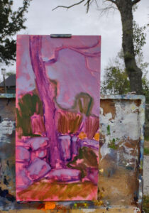
This start I like. Luckily, it’s steps from my house, so I can revisit it the next time there’s a break in the rain.

Go outside and take your time

This spring in the northeast is miserably cold and wet. I’ve painted outdoors just twice. Out of the three things I did, the one I like is the least-finished (above). In the other two, I was tinkering, trying to feather trees like Chauncey Ryder. Everything else in my paintings suffered. I don’t care; I’ll wipe out the boards and try again.

I have my eye on another stand of trees, small spruces. I want to see if I can mimic the soft brushwork of Anders Zorn in them, since to me he’s the only person who ever painted baby evergreens convincingly.

“You’re going to confuse yourself with all this mimicry!” Eric Jacobsen chided me. Well, no, because I don’t really want to paint like Ryder or Zorn. I want to figure out how they did this specific soft-focus thing on trees. I could never do this if I was still rushing around churning out three-hour paintings at events. The cost of failure is too great.

Reserve your spot now for a workshop in 2025:

Monday Morning Art School: activate your paints

Clary Hill Blueberry Barrens, watercolor full sheet, $3985 framed includes shipping in continental US.

I give new students a protocol sheet. On one side it lists the steps for a good oil painting, on the other side, the steps for a good watercolor. (Acrylic painters can follow the oil painters’ lead.) Then I tell them they no longer need me, and laugh.

Last year, I realized that there was a step missing on the watercolor side, a step that seemed so basic that I had failed to include it. It was to wet the paints on the palette before starting painting. I expected that everyone knew that. Silly me, because it’s critical for clean, bright color.

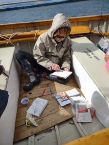
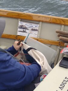
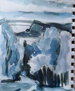
The deck of the schooner American Eagle, from which I teach watercolor twice a year. 8X5.5 sketch.

Watercolor can be purchased in pans or tubes. If the latter (which I far prefer), it’s generally squeezed into a palette and allowed to dry. (There are a few painters out there who squeeze out new watercolors every time they work; that’s an expensive and unnecessary practice.) In either case, the paint needs to be activated. That means wetting it down to approximate its consistency out of the tube.

The easiest way to do this is with a small spray bottle; you can also use a syringe or drop (clean) water from a brush. It should be done 10-15 minutes before you start painting, and might need to be redone as you work, depending on environmental conditions.

Before activating your paints, make sure they’re clean. Any color that’s migrated into another pan is best removed when the underlying color is dry. You can do this very easily with a damp brush. And if you didn’t clean your mixing wells earlier, this is a good time to do it.

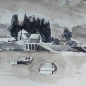
Penobscot Bay sunset, from the deck of the same schooner. 8X5.5 sketch.

How wet should your paints be? Wetter than you might imagine. You need to lay a solid film of water over the top of the paints and let it soak down into the pigments. That takes more than a few seconds. If you go several days between painting sessions, expect it to take at least fifteen minutes.

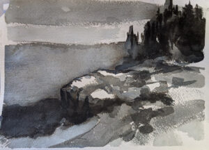
Most of my watercolors are dashed off between oil paintings, but they still need activated paint. 8X5.5 sketch.

The proof is in the pudding

My old pal, watercolorist Stu Chait paints deep, intense hues in his abstract paintings. He gets them by working with suspensions of paint in little square cups. Bruce McMillan, master of clean color, paints on a big butcher’s tray with paint cups around the center.

The best way to achieve a prissy, old-lady look in watercolor is to start with dry paints. Even a wet brush can’t pick up enough pigment to give saturated color. To compensate, the artist starts to glaze colors, over and over. Eventually he has something so delicate, so refined, so dull, that it looks like it was done by a minor British noble’s maiden aunt.

Watercolor is shockingly durable. I have a palette given to me by a retired artist. It contains the paints she used back in art school in the 1970s. They awaken with a sheer misting of water. This is one reason for the perpetual love affair of painters with watercolors-they’re patient. You can slip them in a backpack and ignore them for months between uses.

Rocks along the Pecos River. How I miss teaching in New Mexico!

One more thing

There are a few slots open in my critique class, starting tonight.

Reserve your spot now for a workshop in 2025:

Monday Morning Art School: avoid muddy colors

Early spring in Maine, oil on canvasboard, by Carol L. Douglas

Does your oil paint look bright on the palette, but turn muddy or grey on the canvas? Do you have trouble keeping colors clean? You’re using too much solvent and/or medium. It’s an easy problem to fix, once you’ve learned the correct technique.

Why fat-over-lean?

Fat-over-lean prevents sinking color and cracking paint emulsion. The first is that dullish grey film that develops over paint that’s overthinned with solvent. Cracking paint doesn’t usually appear until after the artist is dead but is a major issue in some masterpieces.

Some manufacturers of alkyd mediums argue that the fat-over-lean rule no longer applies. Take this with a grain of salt. It takes time for problems to appear in paintings, time that’s measured in decades, not years.

Perfect layering demonstrated by Laura Felina at my recent workshop in Sedona.

Simple concept, tricky application

By ‘fat’ we mean the medium-either commercially-mixed mediums or drying oils like linseed, poppy or walnut. The paint itself contains medium as a binder, usually in the form of linseed oil. By ‘lean’ we mean a solvent, usually odorless mineral spirits (OMS).

OMS evaporates, so its dry-time is dependent on temperature and humidity. Drying oils don’t evaporate, they oxidize. That means they stay there, bonding with oxygen, creating a new chemical structure on the surface of the paint. This combination can be extremely durable.

In plein air, this process is usually cut back to two or three steps: an underpainting cut with OMS, a layer that’s pure paint, and then possibly a detail layer cut with medium on the top. However, in more complex paintings with more layers, the shift from lean to fat can be more gradual.

This is a properly-dry start to a painting.

The underpainting

The underpainting or grisaille should be thinned sparingly, and only with solvent (OMS). Keep it dry enough that it’s not shiny. How can you tell? Stick a finger in your paint. If you can slide the paint around, it’s too sloppy. If your finger looks like you were just fingerprinted, it’s too sloppy. You should be able to see just a bare hint of color on your fingertip.

If you put too much solvent in the bottom layer, you’ll get muddy, mushy color as you try to build. No, you don’t need to wait for it to dry. Take a paper towel and lay it carefully on the surface of your painting. Use your hand to apply pressure. You’re blotting-not wiping-the excess moisture away. It should be almost dry to the touch before you proceed.

It’s best to avoid blotting. Learn to use only fractional amounts of solvent, just enough to allow the paint to move without dragging. Use a rag to lift paint from light passages, instead of using excess solvent to thin these passages.

If it’s shiny, there’s too much solvent in the bottom layer. The subsequent layers will be soft and muddy.

The middle layer (which is also sometimes the last layer)

This next layer should be as close to pure paint as possible. If your paint is too stodgy to move freely, check to be sure that you aren’t using clotted, hardening paint. Or, your brushes may be too soft for alla prima painting, which works best with hog bristles. If you must thin your paint, a drop of oil is all that’s appropriate in this layer.

The top layers may need no medium at all. Many painters don’t use it. Blueberry barrents, by me, early spring.

Top layer or detailing

Here you can use medium or linseed oil. But if you use more than a dollop the size of a mechanical pencil’s eraser in an 8X10 painting, you’re overdoing it. Using too much medium will result in soft, lost lines and mediocre brushwork.

Medium is helpful for laying detail down over wet paint, but don’t develop an overreliance on it. Many artists use none at all.

There’s room in my upcoming critique class. It’s a great way to bring your painting to the next level. Open to intermediate painters in all media.

Reserve your spot now for a workshop in 2025:

Monday Morning Art School: The golden light

Cypresses and shadows, 11X14, oil on archival canvasboard, $869 unframed includes shipping in continental US.

“Many plein air painters pick the worst light of the day to paint,” a reader emailed. “Photographers would never go out at 10 AM or 2 PM. So why are paint-outs called for those hours? The light sucks. And so do so many of the paintings.”

The short answer, my correspondent, is that life happens. I don’t paint at 7 AM-when the light is glorious-because dogs aren’t allowed off-leash in my local land trust after 9 AM. So, he gets his long run first and then I get to work.

Luckily, I live in Maine where the sun never climbs to the middle of the sky anyway. The closer to the equator, the more extreme the midday dead zone becomes. The closer to the summer solstice, the longer it lasts.

What do I mean by the midday dead zone? The light becomes cooler; shadows shorten and stop defining space. It’s possible to paint through this, but only when you’ve set up a composition in advance.

Blown off my feet, 16×20, $2029 framed includes shipping in continental US.

What color is light?

Most non-artists would tell you that light is white and shadows are grey. It takes practice to perceive the color of light. But light always has color. Outdoors, atmospheric noise bends and distorts the rays of the sun. Indoors, light bulbs are tuned to specific light spectra.

One of three situations prevails:

At midday, shadows are warm and the light is cooler.

In early morning and late afternoon, shadows are cool and the light is warm. This is also the prevailing light closer to the poles.

Shadows and light are neutral. This happens on grey days, when light and shadows are indistinct. This light has color, but it’s very subtle. Usually, you can pick it up by isolating the grey of the sky and determining if it’s warm or cool.

There are exceptions to this rule. For example, the cool light under a porch roof will produce even cooler shadows; our mind reads cool-and-cooler as indirect light. Or, light filtered through an awning will have a color cast from the fabric.

Beautiful Dream (Rockport Harbor), oil on canvasboard, 12X16 $1,449.00 framed includes shipping in continental US.

Don’t chase light and shadows

Instead of painting spasmodically fast, make a value sketch. This is the most important step in painting. Make a study, or multiple studies.

The value study is where one explores relationships and determines the ‘final cut.’ It’s far more helpful than slavishly transcribing a scene to canvas from a viewfinder. It’s in the value sketch that you make subtle adjustments to the elements for compositional purposes.

Most importantly, that value sketch in your notebook becomes your guide when the shadows and light flatten out. You’ve got their shapes recorded. You have a value structure recorded. You can use the changing scene in front of you to adjust details.

(But a warning: at some point the light will flip when the sun crosses the sky. At that point, it’s best to put away the painting and start another.)

Skylarking, oil on canvas, 24X36 $3,985.00 framed, includes shipping in continental US.

Use your sketchbook to record any spectacular lighting effects that whiz by

Atmospheric effects like crepuscular rays, breaking clouds and rainbows are transient. Before you add them, be certain they support your composition. If so, and you’re able to do so, paint them right in. If you’re not at that point of development, sketch what’s happening so you can refer back to your notes.

They may be beautiful but clash with your existing composition. If that’s the case, just sit back and enjoy them, or record them in your sketchbook for another painting.

Notice that I didn’t mention a camera

You should be able to develop a plein air painting without any relying on photo reference at all. If you can’t, then why?

Reserve your spot now for a workshop in 2025:

Monday Morning Art School: Brides and bridesmaids

Today’s blog was delayed due to a DDOS attack on my server. I’m assuming it was by a jealous blogger. 😊

Poplars at Giverny, Sunrise, 1888, Claude Monet, courtesy MoMA.

“You have three colors in this painting battling for supremacy,” I told Theresa Vincent during last week’s lesson on color. “One of them can dominate; the others need to be somewhat muted.”

“Ah,” she answered in her melodious Texas twang. “There can be only one bride; the others have to be content to be bridesmaids.”

Until that moment, I hadn’t been thinking of the red gazebo roof in her painting as Bridezilla, but it worked. In a triad color scheme (which is what Theresa was working in), all three colors can’t be of equal intensity. One must lead. Consider Monet’s Poplars at Giverny, Sunrise, above, which is a triad of green, orange and purple. The green is the star of the show, followed by the orange and purple.

Monet also demonstrated that even at the most carefully-controlled event, every wedding guest should be welcome to wear what they want (within the limits of propriety, of course). His painting is dotted with hints of accidental color. There are blues and yellows, pinks, and even red at the party. A color scheme is the guiding principle, but it isn’t dictatorial. Brilliant paintings have guests from every position on the color wheel.

I’ve written about the basic color harmonies here; understanding them will help you integrate color in your painting. It’s not necessary to memorize these harmonic schemes; the greater lesson is that color harmonies matter.

Arrangement in Gray: Portrait of the Painter, c. 1872, James McNeill Whistler, courtesy Detroit Institute of Arts. Whistler was enamored with monochromatic grey.

Color is fashion-based

The stylish Victorian matron avoided pastels; she decorated in maroon, red, burgundy, chestnut, and dark green, brown and blue. Her Art Deco granddaughter loved bright yellow, red, green, blue, and pink. Neither would have tolerated the monochromatic grey that dominated interior design a decade ago. Our color choices are fashion-based and what looks good to you and me will probably not appeal to our kids.

Each color harmony has multiple permutations, since you can start at any position on the color wheel. Then there is the question of which color leads, to which end you could either use higher chroma or allow it to take up more real estate on your painting. By the time you’re done considering the options, you realize that just about any color scheme you can develop fits somewhere in that chart of color harmonies.

Above Lake Garda at San Vigilio, 1913, John Singer Sargent, source unknown. Sargent loved his complements.

Does that mean you can just ignore color schemes? Of course not. It means you should be inventive but aware. Otherwise, you just might end up in the situation that Theresa found herself, where the bride and bridesmaids are squabbling over who’s in charge.

You should also be aware of how colors influence their neighbors. The definitive text on this is Interaction of Color, by Josef Albers. If you take away one thing from it, it will be the importance of setting values early in the process.

Regatta at Argenteuil, c. 1872, Claude Monet, courtesy Musée d’Orsay, is a split-complementary color scheme.

The same is true of focal points

I’ve written before about the importance of multiple focal points in drawing the eye through the painting. They should be intentional. But, again, only one gets to be the bride, drawing viewers into the painting. The rest, like good bridesmaids, should be quiet supporting actresses.

If focal points aren’t intelligently designed, and you’re not drawn through them with contrast, line and detail, then it’s back to the drawing board for you.

Reserve your spot now for a workshop in 2025:

Monday Morning Art School: get the most from a painting workshop

Rim Light, 16X20, 16X20, oil on archival canvasboard, $1623 includes shipping in continental United States.

The hardest thing for a teacher is the student who says, “yes, but…” to everything one tells them. I should know; I tend to be one of those myself. I know what it means to stubbornly protect what I already know, to rely on my own skills instead of opening my mind to new concepts. (Note to Cornelia Foss: I really was listening; I wish I’d listened better.)

I’m teaching in Sedona this week and Austin next week, so preparation is on my mind.

The Rocks Remain, 16X20, oil on archival canvasboard, $1623 includes shipping in continental United States.

Come prepared

Study the supply list, but don’t just run right out and buy everything on it. Every teacher has a reason for asking for specific materials. In my case, it’s that I teach a system of paired primaries. You can’t understand color theory without the right paints. Another teacher might have beautiful mark-making. If you don’t buy the brushes he suggests, how are you going to understand his technique?

A tube of cadmium green that I once bought for a workshop and never opened still rankles. I never want to do that to my students. When you study with me, I want you to read my supply lists. If something confuses you, or you think you already have a similar item, email and ask.

(If you find yourself buying something for one of my classes or workshops and not using it, would you let me know? It means I’m missing something.)

Bring the right clothes. It’s hovering in the 50s in Sedona this week, but Austin will be in the 70s. I send my students a packing list for clothes and personal belongings. But modify it for the weather you’re expecting. Don’t ignore the insect repellant and sunscreen.

The Surf is Cranking Up, 8×16, $903 includes shipping in continental United States.

Know what you’re getting into.

“How can you stand this? It’s all so green!” an urban painter once said to me after a week in the Adirondacks.

There are no Starbucks in Acadia National Park or on the clear, still waters of Penobscot Bay. If you’re dependent on your latte macchiato, you may be uncomfortable at first. But the beauty of America’s wild places more than makes up for it. (And somehow, there’s always coffee, even where there’s no cell phone reception.)

Take notes

There’s a sketchbook on my supply list; plan on writing as much as you draw. If you write down key points, you’ll remember them far better than if you just read my handouts.

Listen for new ideas and ask questions. If I can’t stop and answer them mid-stream, save them for after the demo. Participate in discussions and know that your voice is valued; I’ve learned more from my students than from anyone else.

Seafoam, 9X12, oil on archival canvasboard, $869 framed, shipping included in continental United States.

Be prepared to get down and dirty.

I’m not talking about the outdoors here, I’m talking about change and growth. I am highly competitive myself, so it’s difficult for me to feel like I’m struggling. However, it’s in challenge that we make progress. Use your teacher’s method while you’re at the workshop, even if you feel like you’ve stepped back ten years in your development. That’s a temporary problem.

You can disregard what you learn when you go home, or incorporate only small pieces into your technique, but you signed up for the workshop to grow and change. You can’t do that if you cling to your own technique.

Connect with your classmates

There’s power in those relationships. Exchange email addresses. Keep in contact. Follow them on Instagram or Twitter. You’ll learn as much from each other as you will from me.

Reserve your spot now for a workshop in 2025:

Monday Morning Art School: painting plein air fast

My top five tips to finish a plein air painting in three hours.

The Rocks Remain, 16X20, oil on archival canvasboard, $1623 unframed includes shipping.

Keep your equipment organized

Eric Jacobsen improved my life when he suggested I buy a good, dedicated backpack instead of using cheap gear bags. I bought this Kelty Redwing; you must find the pack that’s sized for you.

When not in use, that pack hangs on the back of my studio easel. With a few exceptions, my plein air kit stays in it. My tubed paints are in a tough pencil pouch (more durable than a ziplock bag), and my small tools are in a zippered makeup bag. The tripod for my easel stays put. The pochade box itself is usually in my freezer in a 35-liter waterproof stuff-sack. My brush cleaning tank is attached to the pack with a carabiner and there’s always a spare canvas ready for painting.

When I get back after a day of painting, I spend a few minutes pulling it back together. Everything goes in its designated place so I can find it when I need it.

I use the same brushes for studio and field work, so they live in a brush case next to my easel when I’m not carrying them outdoors. I clean them when I come in.

When I decide to go out, I can be out the door in a matter of minutes.

Jimmy the donkey admiring my palette.

Lay out your palette in advance

Cleaning all the paint off your palette between sessions wastes time and money. Only clean the mixing area of your palette, and leave your unused paint for the next session. Or, do as I do and never clean your palette at all. I just knock off any dried paint as it annoys me.

Every palette needs attention at some point (even mine). It’s easiest to reset the colors when you finish for the afternoon, but if that doesn’t work for you, do a reset before you walk out the door the next morning.

Your palette doesn’t need to be cleaned off before you fly. When I arrive in Sedona on Monday, I can just flip open my pochade box and I’m ready to go.

A painting student from my Adirondack workshop, with her drawing at hand. (The subject was perspective.)

A sketch in time saves nine

It’s faster and easier to work out your composition with a pencil than to do it with a brush. It’s a lot easier to erase pencil errors than to scrape out bad brushwork-or worse, start again in watercolor. The ten or twenty minutes you spend with a pencil on this first step will save you hours of bad painting later.

Your sketch should lay out your basic composition. The human eye sees value first, so if that doesn’t work in your composition, the painting will fail. “I substitute off-value color and chroma for accurate value. Then, except for a couple spots of high-chroma yellow, I wonder why my paintings are flat,” a student once told me. He took that observation and ran with it, painting only in greyscale for months.

You don’t have to go that crazy, but with every painting, work out the darks to lights in your sketchbook first. Alla prima painting requires great skill in color mixing, because the goal is to nail it on the first strike. You can be off on the hue, but when you don’t have the value right, you start to paint and overpaint passages. That’s flailing, and it kills a painting.

I do not know what Eric Jacobsen or Björn Runquist were up to, but my sketchbook is right underneath my easel, as I was faithfully copying my original idea.

Stick to your value sketch

The worst error of plein air painting is chasing the light. It’s seductive. The shadows lengthen and grow heavier, and you want to capture every second of that transition. You can’t.

If you start with a good value sketch and stick with it, you’ll have a strong painting. That sketch on paper (instead of just on your canvas) gives you reference for when the light inevitably changes.

Make sure you aren’t intimidated by your neighbors, who just dive in without sketching and appear to be going much faster than you. The goal isn’t to finish first, but to paint your best.

Cypresses and shadows, 11X14, oil on archival canvasboard, $869 unframed.

Don’t fuss with the ending

A good alla prima painting has two or possibly three layers of paint:

  • Grisaille or underpainting.
  • Midlayer, where the tonal relationships are worked out.
  • Finish layer of judiciously-selected detail.

Many exciting paintings are chewed down at the end, when painters perseverate over brushwork and/or details. If you find yourself noodling, stop.

This is not to say that you can’t ever paint in detail. But the ending should be about strengthening composition, not adding last-minute tchotchkes.

I’m off this weekend to teach back-to-back workshops in Sedona and Austin. There’s still a seat or two left in each (I think), and airfare has dropped considerably since last year.

My first online painting class is up and running, here. It’s called The Perfect Palette and is about the very first step in painting-the paints you should buy.

Reserve your spot now for a workshop in 2025:

Monday Morning Art School: how important is drawing, anyway?

Toy Monkey and Candy, 6×8, oil on archival canvasboard, $435 framed.

I sometimes have students tell me, “I hate to draw!” What they usually mean is that they’re afraid of drawing. Part of this is because of the lie our culture tells us about drawing, that it’s an innate skill rather than a learned discipline. These students worry that when God was handing out the talent, they were elsewhere. That’s a horrible misunderstanding of how drawing works.

As with language, we all have different fluidity with drawing, but very few of us can’t do it. I once did an experiment where I taught Dr. Amy Vail to draw over her protestations of incompetence. “I thought measuring was cheating,” she told me. If you are not mentally handicapped and you have an interest, you can learn to draw.

Dish of Butter, 6X8, oil on archival canvasboard, $435.
Modern art must take part of the blame here

Much 20th and 21st century art has the knack of looking like the artist can’t draw, when the exact opposite is true. Ann Trainor Domingue uses simplified forms of people and boats but don’t be fooled; I’ve sailed with her and she draws beautifully. That simplification is the endpoint of a lifetime of drawing, not its beginning.
Possum, 6X8, oil on archival canvasboard, $435.

Painting is drawing

What drawing-resistant students don’t realize is that painting is just drawing with brushes. It’s easier to understand some of drawing’s principles in graphite than in messy paint. Fixing mistakes is a lot faster with an eraser than a scraper.

Feeling the relationship between the brush and the pencil makes for better, lighter brushwork. They’re two variations of the same basic tool.

Think of drawing as the grammar of art, and color as art’s vocabulary. Just as with language, many of us understand grammar intuitively, but we need education to lift it to its highest level. We all start with some vocabulary, but that expands with reading and study.

That’s not to downplay the mysterious part of the brain that makes language and art possible. It’s just that we all have the basic tools imprinted in us.

In art school, students spend a year on the fundamentals of drawing and color theory before they ever start painting. In a way, this mirrors our natural experience of picking up a pencil or crayon long before we discover the brush.

Hiking, 6X8, oil on archival canvasboard, $435.

But I don’t have a lifetime to learn to draw!

I don’t expect you to spend a year drawing an extremely foreshortened skeleton. But understanding measurement, perspective, and shading will make your painting better. I’ve written innumerable posts on drawing-just go over to the box on the right and type in “how to draw” and start reading.

But reading isn’t enough. You must practice. The good thing is, drawing is easy and cheap. I like Strathmore’s Visual Journal and a #2 mechanical pencil. If you want more refinement, my readers and I recommended fancier products here.

Stick two pencils in the ring binder of your sketchbook and toss it in your backpack or purse. Pull it out whenever you have fifteen minutes to kill. The ‘news’ on your phone will remain unchanged whether you spend that time scrolling or drawing, and you’ll have something to show for your time if you draw instead.

Drawing from life is better than drawing from photos (because it’s more difficult) but any drawing is good practice. Just a few minutes a day is all you need.

Drawing is my personal refuge

I may not always make it to my easel, but I can always draw. Even a few moments with my sketchbook clears my mind, gives me ideas, and makes me feel creative again.

I’m watching a close friend struggling with early-onset dementia. She may not remember what she told me last week, but she can still draw beautifully. A habit of sketching and drawing has given her a vocabulary independent of words.

Reserve your spot now for a workshop in 2025: