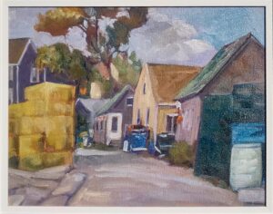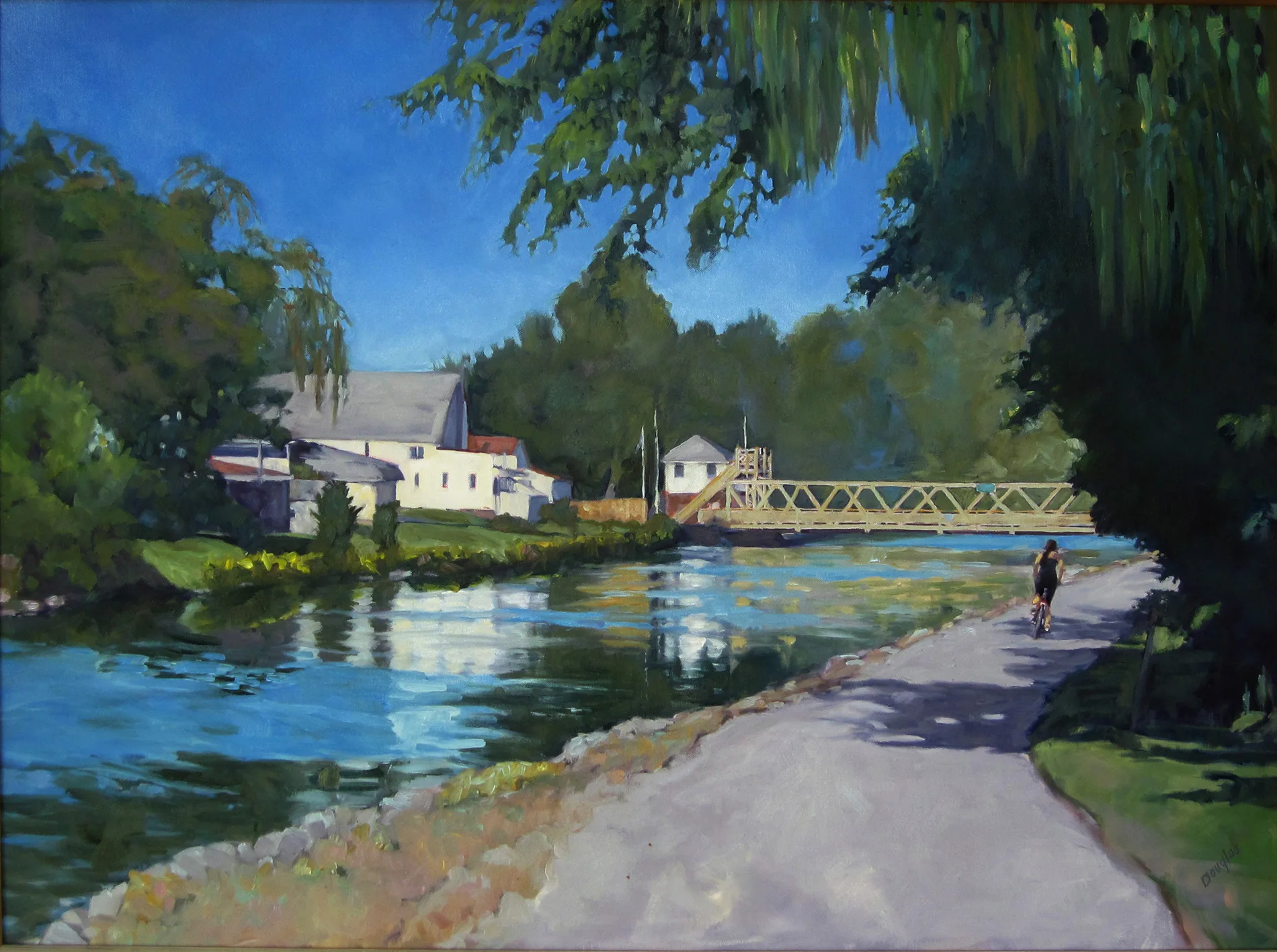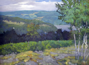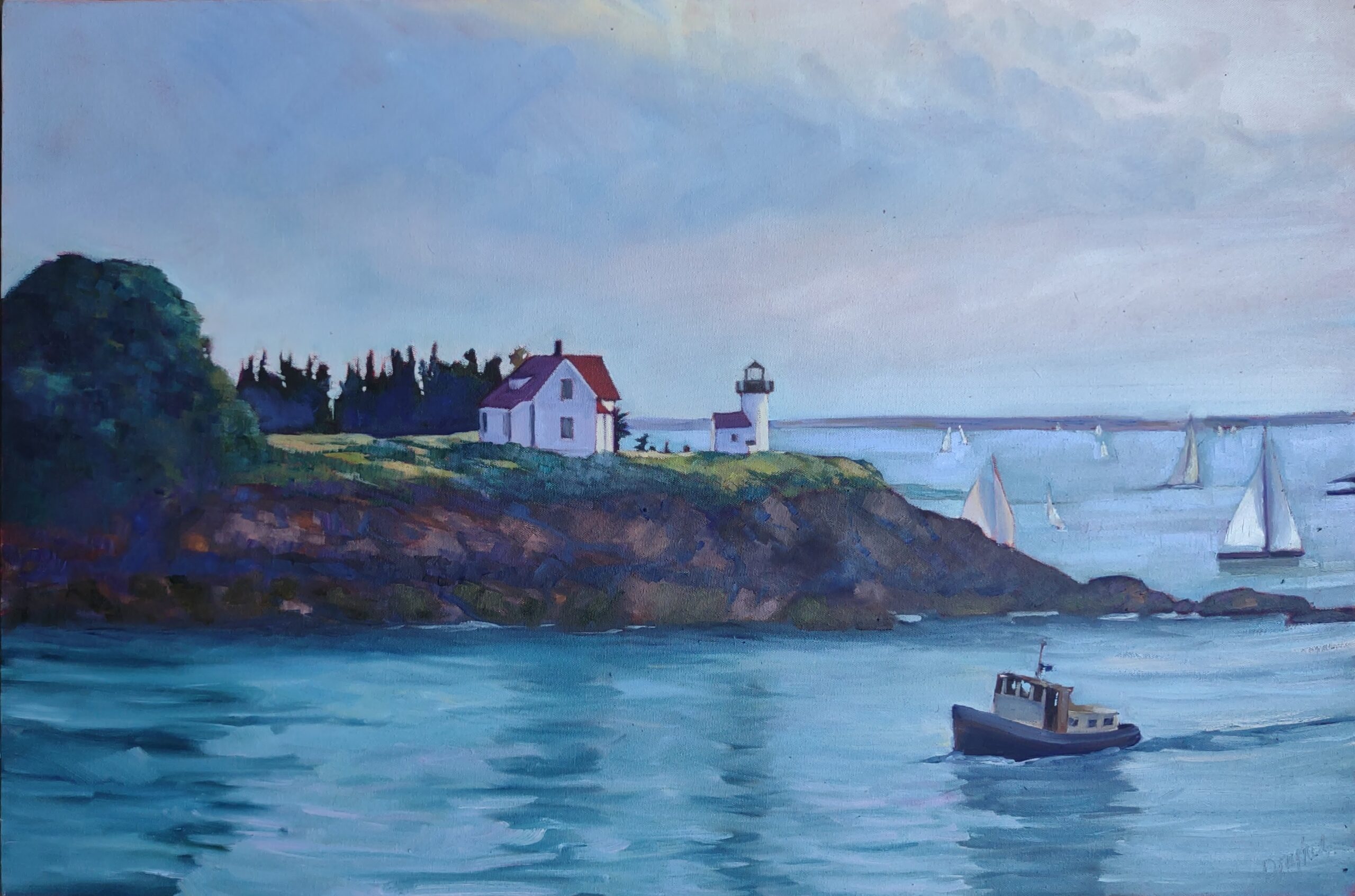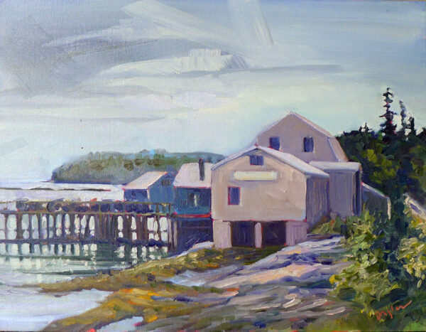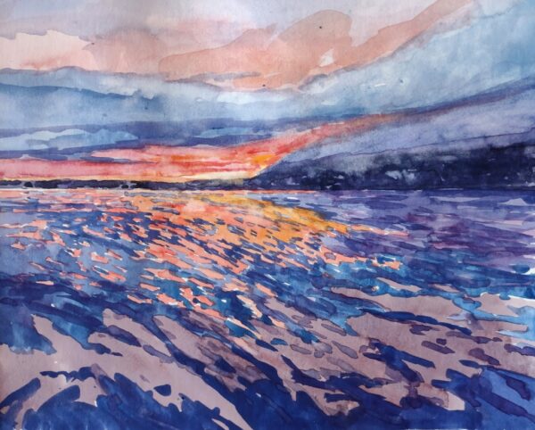
One thing I hear over and over is, “I plan to take one of your workshops someday.” K—, who started painting with me when she was sixteen and is now a fully licensed architect, used to say it every year. Finally, I pointed out to her that I’m not going to be around forever. She was shocked. I’m not planning on retiring any time soon, mind you, but I am practically middle-aged. Although my goal is to retire at age 107, I recognize that nature sets limits on us all.
K—took my Sedona workshop this year. Now, she’s engaged to be married. It’s a good thing she went while she was still footloose and fancy-free. Life inevitably gets in the way of our good intentions. So, if you’re thinking about taking one of my workshops, I must ask: if not now, when?

This might be the most-important present you’ve ever gotten, or given yourself. My teaching gets consistently high reviews. I’ve been doing it for decades, including ten years here in Maine. A workshop organizer once called me “the hardest-working painting teacher in America.” (If you can’t get by on your looks, you’d better work hard instead.)
This year I’m focusing on teaching in the northeast, although I will be back in Sedona again and possibly Austin, TX (see my addendum below) in the early spring. New England is paradise in the summer; it’s easy to get here, and once you’ve been charmed by it, you will never want to leave.

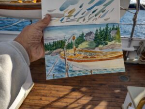
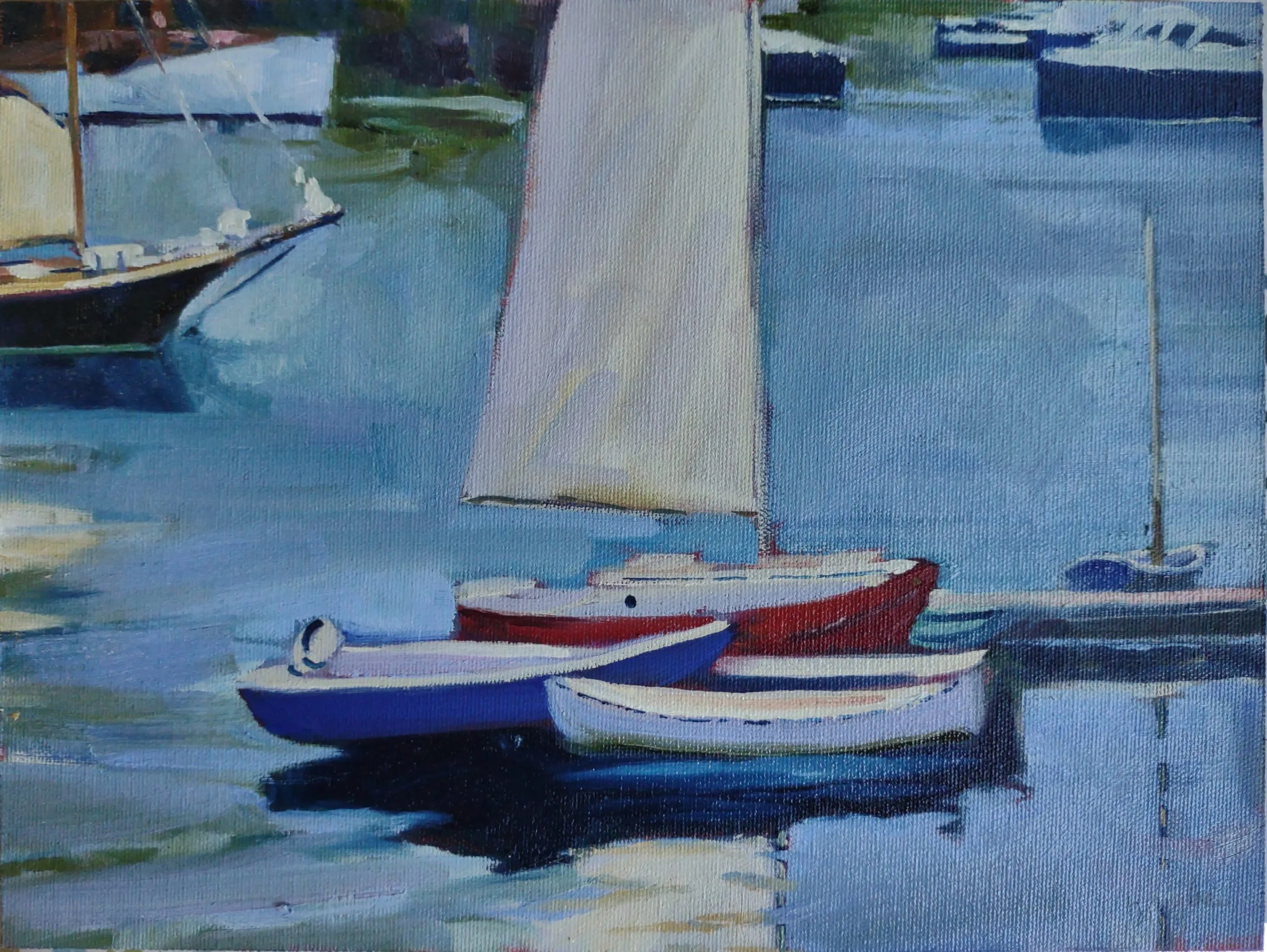
Age of Sail: Workshop on the water
This has two sessions: June 20-24, 2023 and September 16-20, 2023. 2022 was the first year I sailed with American Eagle’s new captain, Tyler King. Tyler’s as thoughtful a host as he is a skilled sailor. In October, I went to Gloucester and saw the boatyard his parents run. It’s no surprise that he has saltwater in his veins.
For this workshop, I provide the supplies, including a professional-quality kit of QOR watercolors. By the time we’re done, you’ll understand how to paint water, and how to paint with watercolors. Students of all levels are welcome.
(Georgette Diamandis wrote about our fall trip here.)

Towards amazing color: Sedona, AZ—March 20-24, 2023
March is just when it seems like winter will never end here in the northeast. Meanwhile, it’s balmy in Arizona’s high desert. Sedona has beautiful red-rock massifs, great hiking trails, wildlife, and clear, constantly-changing light. It also has fabulous shops, wineries, galleries, and restaurants. It’s a fun escape at the end of winter. This workshop is sponsored by the Sedona Arts Center, which is in itself a destination.

Sea & Sky at Schoodic—August 6-11, 2023
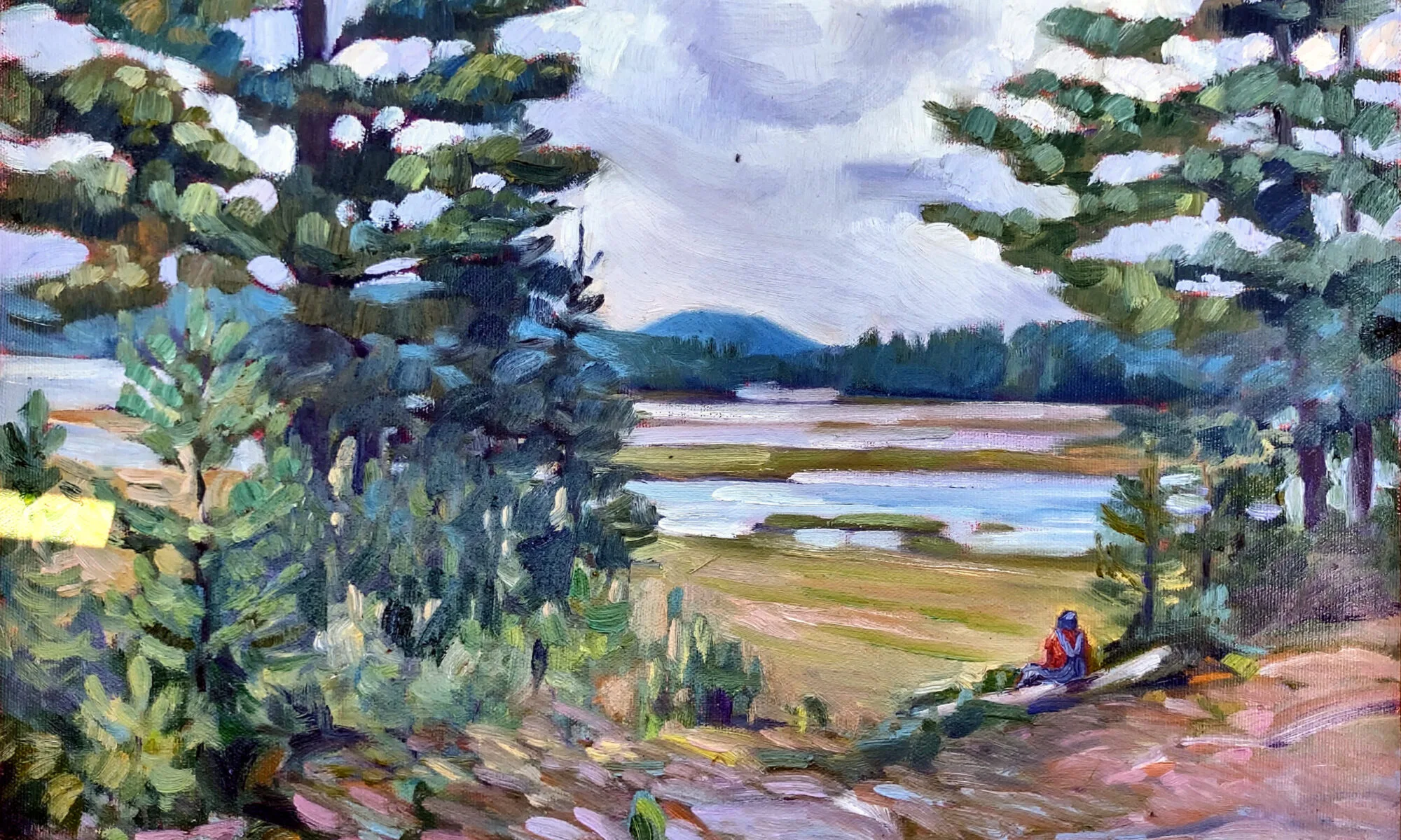
I love all of Acadia National Park, but my favorite part is the Schoodic Peninsula. It has the same dramatic rock formations, windblown pines, pounding surf and stunning mountain views as Mt. Desert Island, but only a fraction of the people. I can walk home to my room at Schoodic Institute in the twilight and never see another person—this year, Cassie Sano saw a bear instead. And there are dolphins and seabirds.
This is structured so that you can either camp in the area (choose instruction only) or register for all-inclusive accommodation, depending on your taste and budget.

Find your Authentic Voice in Plein Air: Berkshires—August 14-18, 2023
I fell in love with the Berkshires when my oldest daughter lived in Pittsfield, MA. They’re rolling old mountains, dotted with historic New England villages and farms. But there are also amenities and cultural institutions. We’re centered in Pittsfield, so there are ample hotels and restaurants. Yet we’re close to some of the most beautiful towns in old New England.
Pittsfield is just three hours from Boston and New York and it’s accessible by train from either city.
ADDENDUM: Here's the information on Austin:
Find your Authentic Voice in Plein Air: Austin--March 27-31, 2023
This is part three of a four-part series on Holiday Gifts for Artists. The prior two parts are Holiday gifts for the serious artist and Holiday gifts for the budding artist (including kids).
