fbpx

Putting yourself in the frame

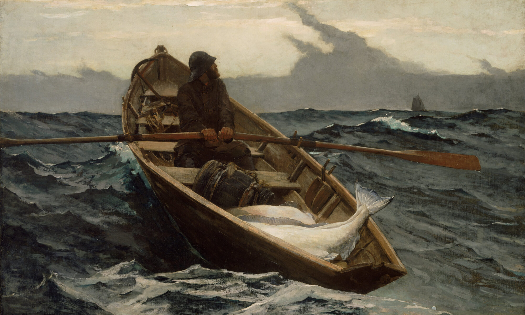
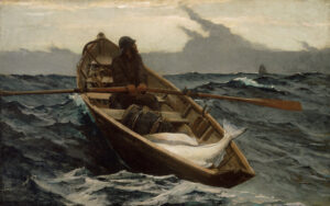
The Fog Warning, 1885, Winslow Homer, 30 × 48.5 in., courtesy Museum of Fine Arts, Boston.

In our narrative painting class on Monday, Bobbi Heath told us about a man who didn’t want anyone in the dinghy in his painting. “I want to be able to imagine myself in it,” he said.

In addition to portraiture, there are several ways in which one can approach the figure in painting, including:

  • A specific individual serving as an archetype, as in Mary Whyte‘s paintings.
  • Through a vague, implied, incomplete or anodyne figure, as in Andrew Wyeth‘s Trodden Weed or Winslow Homer‘s The Fog Warning, above.
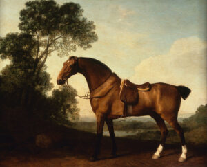
  • Through objects or settings that suggest an imminent arrival, as in that empty dinghy or George StubbsA Saddled Bay Hunter, below.
A Saddled Bay Hunter, 1786, George Stubbs, 21 3/4 × 27 3/4 in, courtesy Denver Art Museum

It’s one thing to paint a pretty picture. It’s another to blur the line between the audience and the scene, to paint something where the viewer can step into the frame and build a relationship with the work.

Leonardo da Vinci’s Mona Lisa is important to art history because of its use of landscape, its sfumato and its anatomical accuracy. That doesn’t explain its enduring popularity. Mona Lisa resonates because we engage with her.

The subject makes eye contact with us, with a rather penetrating gaze. She’s not demure, she’s not dreamy, and she’s not dressed to advertise her femininity, wealth or power. (As an aside, I’m sure this is why we get the periodic daft theory that it is a concealed self-portrait of the artist; after all, what mere woman could be that self-assured?)

Mona Lisa invites you to have a parasocial relationship with the subject. That’s a modern term for a one-sided relationship with a person we don’t know, usually an influencer, celebrity, or fictional character. We project attitudes, values, and beliefs onto them, just as we project them onto Mona Lisa.
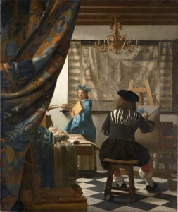
The Allegory of Painting, c. 1666-1668, 47.2 × 39.3 in, Johannes Vermeer, courtesy Kunsthistorisches Museum

The word ‘voyeur’ wasn’t created until a few centuries after Johannes Vermeer was painting. His intent wasn’t to titillate in that modern sense, but to create the kind of genre paintings that were so popular in his time. However, his perfect drafting and the subtle interactions of his figures make us feel like we’re looking through a peephole. That drags us almost violently into his paintings.

Edward Hopper picked up where Vermeer left off. Works like Hotel Room or Room in New York leave us feeling almost as if we’re peeping toms. It’s unlikely that in the early 1930s, that was Hopper’s intention. Incandescent lighting was just becoming widespread in New York . Hopper was fascinated by it, and by the jewel-like, illuminated scenes it created through city windows. But art has overtones that shift and change over time, regardless of the artist’s intentions.
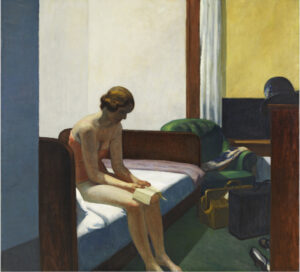
Hotel Room, 1931, Edward Hopper, 152.4 × 165.7 cm, Museo Nacional Thyssen-Bornemisza, Madrid, included under fair use exemption of the US Copyright Law and restricted from further use.

In Hopper’s paintings we come full circle to the same incomplete or anodyne figures of Winslow Homer or Andrew Wyeth. If the woman on the bed in Hotel Room was detailed and realistic, she’d be almost unbearably vulnerable. Stylizing her preserves her, and our, dignity.

Reserve your spot now for a workshop in 2025:

Monday Morning Art School: quiet passages

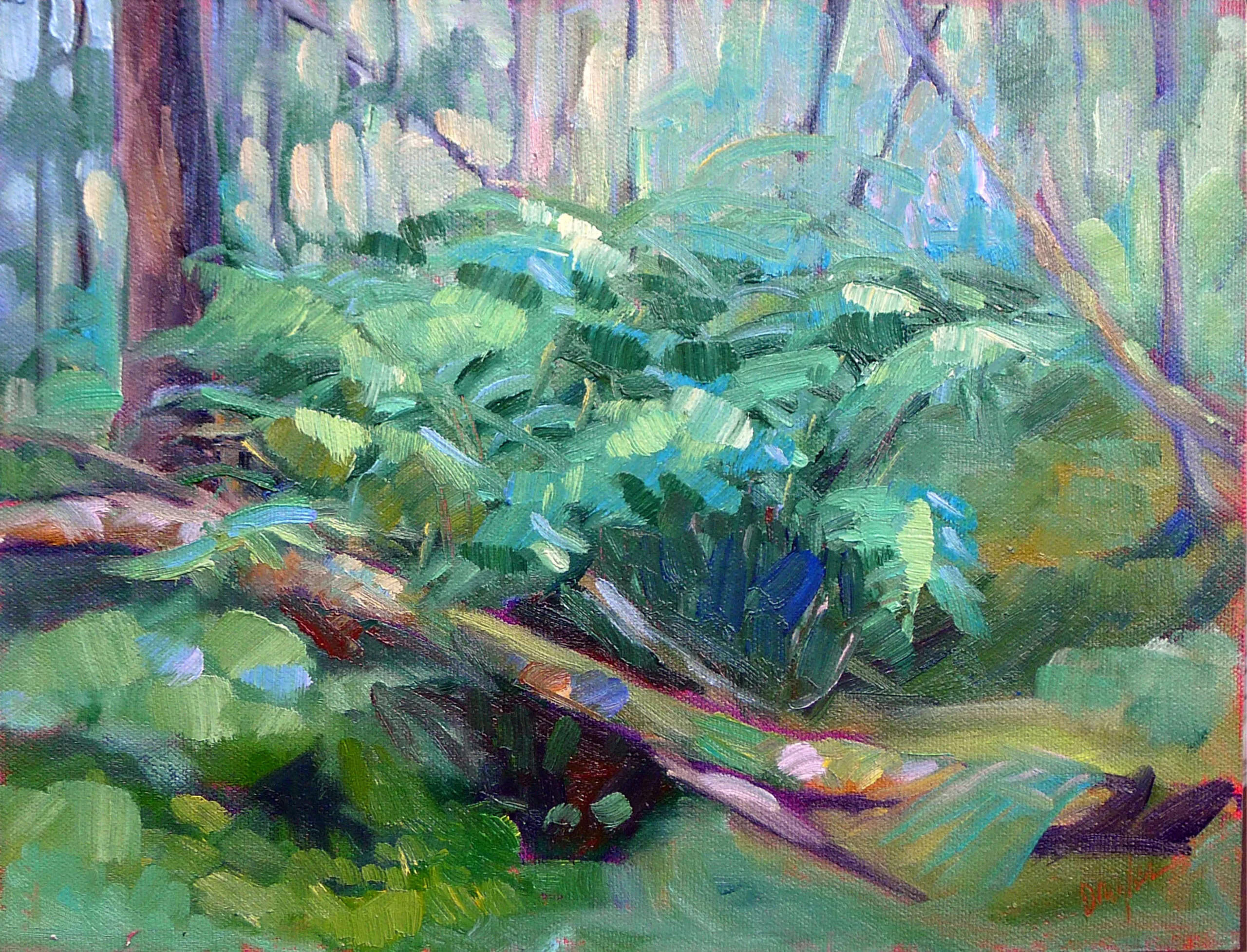
Bracken Fern, 9x12, oil on archival canvasboard, $869.

I’m in Paul Smiths, NY, teaching for Saranac Lake ArtWorks. Yesterday, student Mark Gale asked, “What should I do about this passage,” gesturing to a dark line of spruces. He was, at the time, bookended by Beth Carr and me. She’s been my student for several years, and is a crackerjack painter with impeccable judgment.

“Nothing,” we said in unison. “It's the quiet that allows the rest of the painting to sing,” Beth added.

I spend a lot of time talking to students about patterns of darks and lights, motive lines that drive energy through the painting, and focal points. These are such difficult concepts that I never seem to move on to quiet passages, but every painting has them and needs them. They exist in counterpoint to areas of motion, and they’re equally important.

Spring Greens, oil on archival canvasboard, 9X12, $869.

A quiet passage isn’t an empty passage. It may include figures, trees, brooks and other objects. However, it’s not detailed and doesn’t have high contrast. It’s more of an invitation to imagine than a statement in full.

It needn’t be dark, either. Consider Claude Monet’s haystack paintings. There are passages of luminous color that, nonetheless, recede. They’re not high-contrast or line-driven, but they shimmer with chroma and careful mark-making. “What keeps my heart awake is colorful silence,” he said.

The quiet passage allows the mind to rest. It acts as a foil for the main object.

Quiet passages can be destroyed by excess noodling. Here plein air painters have an advantage—they’re typically worn out long before they can cover every inch of canvas with information. But not always, and the impulse to fill these empty spaces later in the studio can sometimes be overwhelming. It’s one reason I’m not a fan of excessive touch-up of plein air paintings—it can ruin a previously-wonderful design.

Fog over Whiteface Mountain, 11X14, oil on canvasboard, $1087.

Yesterday I had my students paint in the boreal bog at Paul Smiths VIC. It’s a landscape of stunted larches and spruces, pitcher plants and sundews, with a lazy river chugging through it. It’s heavy on color and light on structure, making it a challenging subject to paint. My monitor had painted trees and figures along the boardwalk, and asked me what she should do with the rest of the space. There was no way she could fill it in with every tiny tree.

“Essentially, nothing,” I said. It was already shimmering green. Had we had more time, I’d have suggested a bit more in the way of soft brushwork, but the facts were already there, and the quiet of her greens set off the figure on the boardwalk.

Lobster pound, 12X16, oil on canvas, $1594.

Silent passages are where the mind fills in what isn’t there. The human mind seems to rebel against having everything spelled out for it; it loves mystery. Even so-called photorealism uses silent passages; we aren’t even aware of the artist’s judicious editing.

I often use Johannes Vermeer’s The Girl with the Red Hat as an example of the lost-and-found edge, but it’s also a fabulous example of the power of silence. Much is not stated: the drapery in shadow, the carving on the chair, even the modeling in most of the face. These stand as powerful foils for what is stated: her sensuous lips, the feathering of her hat, and her lace collar.

My 2022 workshop schedule can be found here. That includes the beautiful red rocks of Sedona, urban painting in Austin, TX, June and September workshops aboard schooner American Eagle, mountain vistas in the Berkshires, and our ever-popular Sea & Sky at Schoodic in Acadia National Park.

Boys will be boys

Boys must be boys

The ick factor in art history is compounded by our own era’s obsession with sex and power.

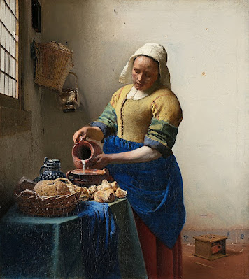
The Milkmaid, c. 1600, Johannes Vermeer, courtesy Rijksmuseum

During Monday’s class, I zipped quickly through Vermeer’s oeuvre on line, when a sentence about Vermeer’s The Milkmaid stopped me cold. This is one of the most well-known paintings in western art, so familiar that it’s become background noise.

“For at least two centuries before the painting was created, milkmaids and kitchen maids had a reputation as being predisposed to love or sex, and this was frequently reflected in Dutch paintings of kitchen and market scenes from Antwerp, Utrecht and Delft. Some of the paintings were slyly suggestive, like The Milkmaid, others more coarsely so.”

This interpretation apparently came from a 2009 show at the Metropolitan, curated by the late Walter Liedtke, because most of the text was lifted verbatim from his catalog.

“The physical appeal of the ‘milkmaid’ is sensed naturally,” wrote Liedtke, “like the taste of milk or the touch of bread. Rough sleeves reveal bare arms, where the skin (unlike that of the wrists and hands) is rarely exposed to sunlight. The ruddy wrists and face, the woman's generous proportions, and her warmth, softness and approachability are qualities not found in Vermeer's more refined young ladies. They too are alluring, but the kitchen maid is frankly so.”

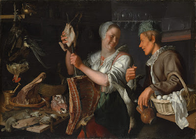
Kitchen Scene, 1620s, Peter Wtewael, courtesy Metropolitan Museum of Art

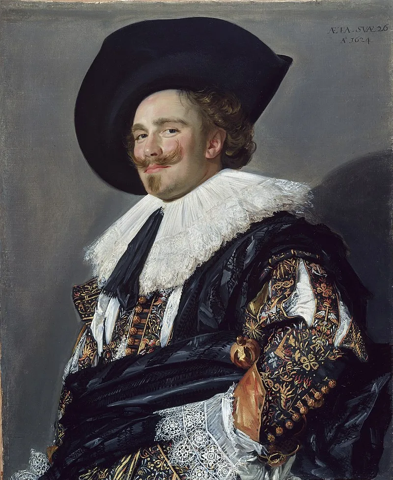
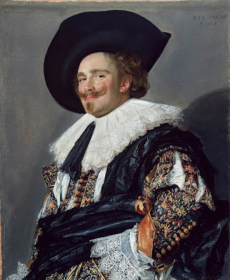
There are certainly coarse Dutch kitchen scenes—the Peter Wtewael kitchen scene, above, is a compendium of every sex reference that can be crammed on a canvas. Dutch painting of this time was full of jokes and bawdy comic references. Frans Hals’ laughing faces contrast vividly with the rest of Europe’s dour demeanor in Baroque portraiture. Art history tells us that the Dutch drank copiously.

Yes, the 17th century Dutch Republic was Calvinist. Prostitution and adultery were against the law. That didn’t stop the Dutch from recognizing the realities of life, and laughing at them.

The Laughing Cavalier, 1624, Frans Hals, courtesy the Wallace Collection

But Peter Wtewael’s kitchen scene is the attraction of equals. That’s very different from the class abuse of men like Samuel Pepys groping their maids.

These paintings are no longer in middle-class Dutch homes. They have been moved to palaces and museums, where their caretakers and interpreters are the wealthy, educated and powerful. It’s no surprise that their own privilege subtly colors the work they analyze.

To Liedtke, the wide-mouth jug in The Milkmaid was a symbol of feminine anatomy. “By inserting a foot warmer and, next to it, a Delft tile depicting Cupid, Vermeer intimates that love and desire, as well as work, are burdens the maid must bear… Foot warmers do not heat rooms. They heat feet and, under a long skirt (as in Van Loo's Wooing), more private parts.”

Ick.

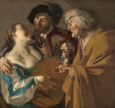
The Procuress, c. 1622, Dirck van Baburen, courtesy Museum of Fine Arts.

This is not to say that there wasn’t an erotic underpinning to Dutch art, or that servants weren’t the objects of male lust. “I am perfectly willing to believe that you are knowledgeable in the delectable art of preparing stews / But I feel even more appetite for you / Than for the stew that you are preparing,” read the French caption for an engraving of Gerrit Dou’s A Girl Chopping Onions.

It’s just that the ick factor is compounded by our own era’s obsession with sex and power.

Vermeer was just too intelligent to have played this game of simple parts. His mature paintings show keen psychological insight. His milkmaid is a dignified, moral presence. It’s obscene to suggest otherwise.