
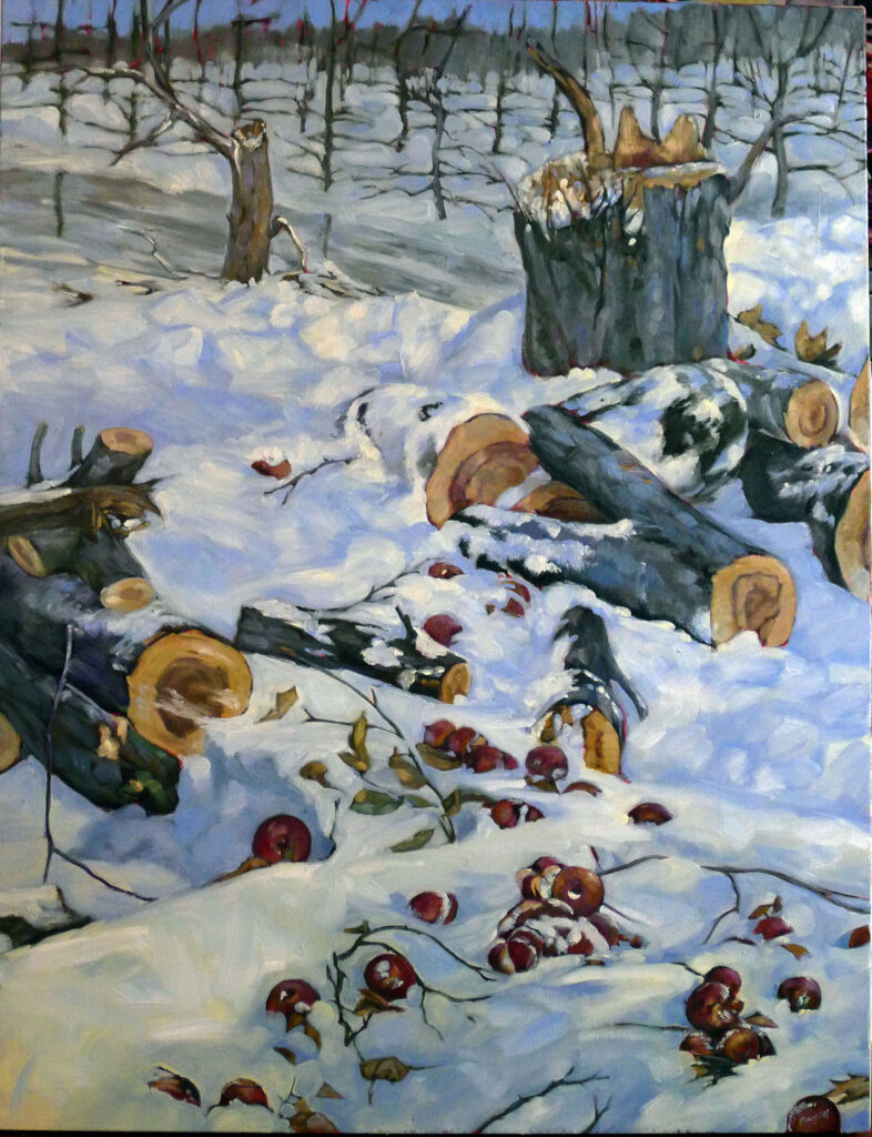
A focal point in art is the area of a composition that draws the viewer’s eye and holds his or her attention. It’s the visual center of interest.
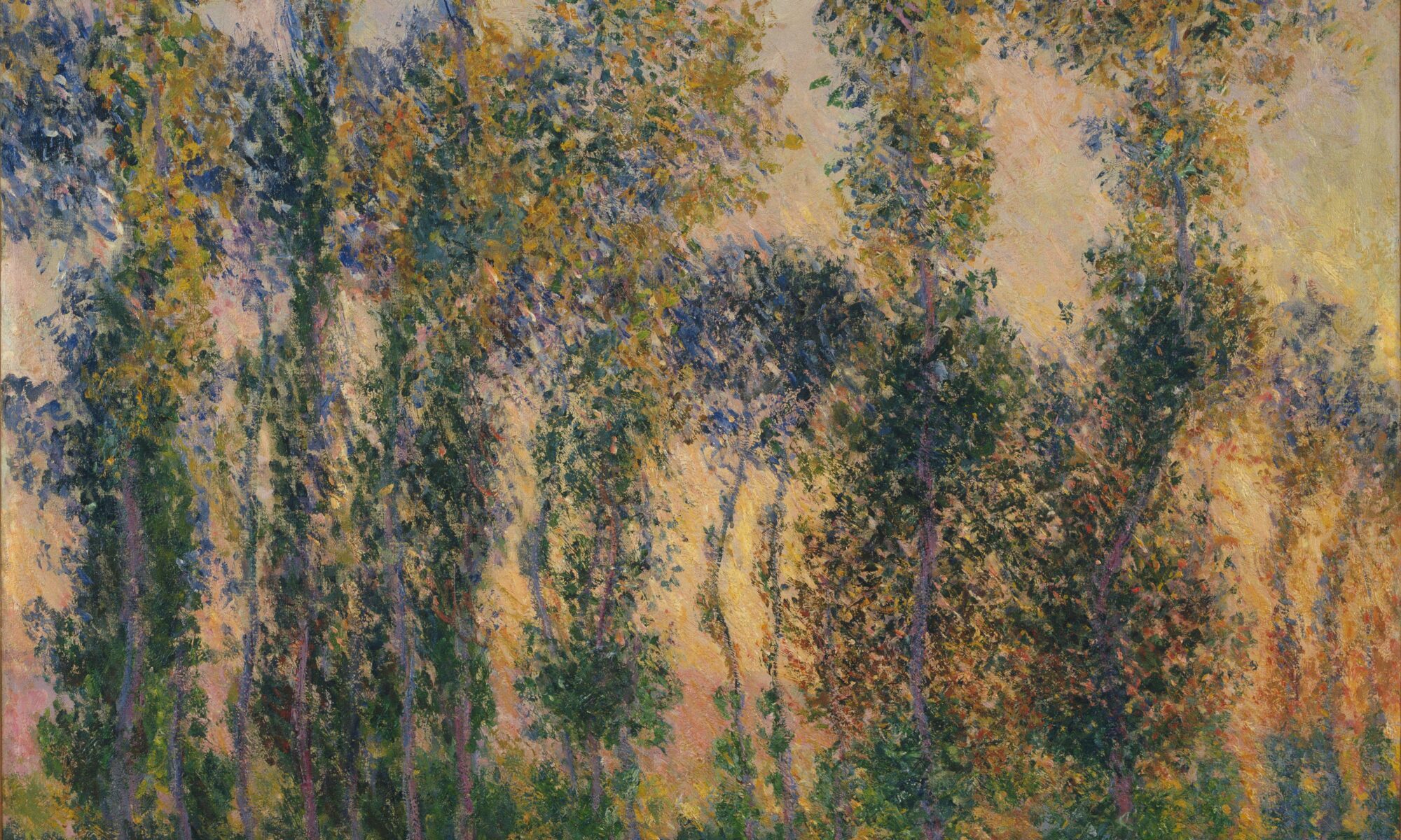
Artists create focal points primarily with contrast in value, hue and chroma, but other elements of design also support focal points. These include lines that guide the viewer’s eye, textural changes, and placement. Detail and complexity will naturally draw the viewer, as will isolation (which is usually also an exercise in contrast). And everything else being equal, a large object will dominate.
Why do focal points matter?
A good visual composer, just like a good musician, guides his or her viewer through the composition. Focal points engage the viewer, and lead them through the space in a calculated way.
Should a work of art have just one focal point?
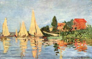
Generally, most paintings have more than one focal point, although occasionally an artist will let just one section of the canvas dominate. Good examples are Rembrandt van Rijn’s self-portraits, where humanity, as expressed through his face, is everything.
A single focal point creates a clear, strong emphasis, but the downside is that there’s no path forward into the painting. Multiple focal points create movement and tension, leading the viewer’s eye through the composition. The longer a person looks at an artwork, the more they engage with it.
How to prioritize focal points
You, the artist, are the boss here. You should ponder the hierarchy of focal points before you ever pick up a brush. (That’s one reason for a good value sketch.) What is the strongest focal point? What is its spatial relationship to the others? One focal point should lead the band, the others should follow merrily along.
Make sure none of your focal points are at the edge of your canvas or leading off the page. Think of your focal points as elements that are connected compositionally, connected by color harmonies, lines, and value.
Are focal point and subject the same?
While focal point and subject often overlap, they are not always the same thing.
The subject is what the artwork is about—the main idea or theme. The focal point is where the viewer’s eye is drawn first.
In many situations, they might be identical; for example, a black dog running in the snow would be both the focal point and the subject. But in Johannes Vermeer’s Girl with a Red Hat, the subject is the girl and her stupendous hat, but the focal points are the side of her face, her lace fichu, and the flash of red at the far right of her hat. The focal points are masterfully drawn down the canvas by a single line of light. Rembrandt’s The Night Watch is a portrait of the militia of Frans Banning Cocq and Willem van Ruytenburch but none of the supporting militiamen are focal points at all.
How do you apply this?
In your next painting or drawing, make a conscious effort to set out and emphasize focal points, using value, hue, chroma and line. Can you articulate where they are and how you want the viewer to read them?
This spring’s painting classes
Zoom Class: Advance your painting skills (whoops, the link was wrong in last week’s posts)
Mondays, 6 PM – 9 PM EST
April 28 to June 9
Advance your skills in oils, watercolor, gouache, acrylics and pastels with guided exercises in design, composition and execution.
This Zoom class not only has tailored instruction, it provides a supportive community where students share work and get positive feedback in an encouraging and collaborative space.
Tuesdays, 6 PM – 9 PM EST
April 29-June 10
This is a combination painting/critique class where students will take deep dives into finding their unique voices as artists, in an encouraging and collaborative space. The goal is to develop a nucleus of work as a springboard for further development.
Reserve your spot now for a workshop in 2025:
- Advanced Plein Air Painting, Rockport, ME, July 7-11, 2025.
- Sea and Sky at Acadia National Park, August 3-8, 2025.
- Find Your Authentic Voice in Plein Air, Berkshires, MA, August 11-15, 2025.
- Immersive In-Person Fall Workshop, Rockport, ME, October 6-10, 2025.