fbpx

Monday Morning Art School: the golden rectangle and other design ideas

Dawn along Upper Red Rock Loop Road, Sedona, 20X24 oil on canvas, $2318 unframed includes shipping and handling in continental US.

ā€œWhy do odd numbers of objects in a composition look more ā€˜interestingā€™ than even numbers,ā€ my correspondent asked.

ā€œThe explanation Iā€™ve heard is that the brain wants to create symmetry, and when unable to do so because there are an odd number of objects, the gaze just continues to move around the composition.  I briefly worked on a sheep farm, and ewes who had three lambs always seemed confused, like they were counting ā€˜oneā€¦ twoā€¦ wait a minute! Let me count again!ā€™ā€

Carrie, even with twins I was confused most of the time. Sheep, like humans, have only two teats, but no opposable thumbs, and theyā€™re kind of dumb. But back to your question:

ā€œIs a desire for symmetry really hardwired into our brains? Or is this a cultural preference? Or a myth? If our brains want symmetry, then why not give it to them and make symmetrical art? Do people actually look at paintings of odd numbers of objects longer? Do they like them better?ā€

The short answer is that the brain seems hardwired to like complicated visual relationships.

Home Farm, 20X24, oil on canvas, $2898 framed includes shipping and handling in continental US.

The Golden Rectangle, the granddaddy of all design ideas

That need for visual mystery is the basis for the Golden Rectangle. It resolves to 1.618:1, which is a ratio none of us can parse. Yet it looks pleasing. Thatā€™s because it derives from the Golden Spiral and the Fibonacci Sequence, with their perfect squares.

By HB – Own work, CC BY-SA 4.0, https://commons.wikimedia.org/w/index.php?curid=114843794

The Golden Rectangle is the first ā€˜absoluteā€™ design model I ever learned. It has been used since at least the ancient Greeks. However, it doesnā€™t match up with the aspect ratio of modern canvases, frames and cameras, so we donā€™t hear about it as much anymore.

The rule of thirds

The rule of thirds never meant that you should have three objects. It divides an image into nine equal parts using two horizontal and two vertical lines. The most important elements of the image are placed along the lines or their intersections. That creates points of interest that are evenly spaced and aesthetically pleasing

It works, of course, but it is by no means the most interesting compositional grid. 1/3, although a repeating decimal, isnā€™t all that difficult for the brain to parse.

Camden Harbor from Curtis Island, oil on canvas, $2782 unframed includes shipping and handling in continental United States.

Is symmetry always bad?

Whenever someone tells me you should never put something smack dab in the middle of their canvas, I direct them to the Mask of Tutankhamun. Itā€™s powerful, stately and grand. Thatā€™s why Renaissance artists like Leonardo da Vinci used symmetry to such good effect. Itā€™s less popular today, perhaps because we donā€™t believe in absolutes truth much anymore.
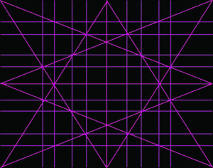
Dynamic Symmetry

Jay Hambidge hoped to capitalize on the brainā€™s love of inscrutable proportion when he devised his theory of dynamic symmetry back in the 1920s. Itā€™s since been discredited, but pops back up with dismaying regularity.

I learned it from the painter Steven Assael and fiddled with it for several years. In the end, what it taught me was not to put focal points at the edge of my canvas, which Iā€™m telling you here, for free.

Home Port, 18X24,, $2318 includes shipping and handling in continental US.

The circle

The circle is balanced in every direction. If symmetry were boring, a circle would be the last word in dullness. Instead, itā€™s fascinated us from da Vinciā€™s Vitruvian Man to now.

Besides being a model of human proportion, Vitruvian Man is a nod to an ancient math problem called squaring the circle. That was the challenge of constructing aĀ squareĀ with theĀ area of a given circleĀ using geometry.Ā 

Ultimately it proved impossible. Thatā€™s because of our old high school buddy, Ļ€. Ļ€ is whatā€™s called a transcendental number, which just means itā€™s non-algebraic and goes on and on without ever repeating. Circles interest us precisely because they canā€™t be pushed into a square hole (and vice-versa).

Reserve your spot now for a workshop in 2025:

Monday Morning Art School: a Hail Mary with Dynamic Symmetry

Apple Blossom Time, oil on archival canvasboard, $869 framed includes shipping and handling in continental US.

I first learned about Jay Hambidge‘s theory of Dynamic Symmetry in a workshop taught by Steven Assael many years ago. I was looking for the Holy Grail of composition and fiddled with Dynamic Symmetry for several years before putting it in my Folder of Fundamentally Flawed Design Ideas, along with the Golden Ratio, Silver Ratio, Fibonacci Sequence, Rule of Thirds, and a lot of other stuff I’ve mercifully forgotten.

You can go look it up and try to deal with the arcana of root rectangles if you want; the bottom line is that it sets up a static system of space division that sometimes looks like this:

The details depend on who you ask, and somehow the star-grid never seems to work out the same, depending on who’s interpreting it. I’m just showing you it as I wrote it down in that classroom at the Art Students League. I’m not suggesting you use it; if you look at Jay Hambidge’s paintings, you’ll observe that they tend to be static. I much prefer the simple instruction Don’t Be Boring.

Just start painting?

I’m working on a commission to paint from a photograph taken in deep woods, but I can’t seem to make any decent division of the wall of green. I could easily over-egg the diagonals, but the woods in my reference is flat, and I want to respect that. That worked very well for Gustav Klimt’s beech grove paintings, which I adore, but I have different goals in mind.

I’ve looked at painters of the woods whom I admire, I’ve drawn repeated iterations, and I’ve rendered it in watercolor. I still wasn’t liking the space division. On Thursday I started to commit a cardinal error of painting: “I can’t think of any other way to draw this, so I’ll just start painting and see if something occurs to me.”

I know that’s wrong; I’ve told my students not to do that at least a gazillion times. If it doesn’t work as a drawing, it’s never going to work as a painting. Value is the first thing the eye sees, and if it makes no sense in greyscale, it’s unlikely to be riveting in color.

Spring Greens, 8X10, oil on archival canvasboard, $652 framed includes shipping and handling in continental US.

Saved by the bell

I was about to start transferring my drawing to my canvas when I thought, “what the heck, I’ll just grid this with Hambridge’s Dynamic Symmetry grid instead of a simple square transfer grid. It’ll at least be more of a challenge when I’m transferring the drawing to the canvas.”

That was an eye-opener. I moved things and checked their positioning in terms of the dynamic symmetry grid, and suddenly found that with a few tweaks, it will read just fine.

Fog over Whiteface Mountain, 11X14, $1087 framed includes shipping and handling in continental US.

When you’re stuck you need to mix it up

I am unlikely to use the Dynamic Symmetry grid ever again, and certainly not at the design phase. However, I’m glad I had it tucked in the back of my mind when I needed to veer out of the groove that had become a rut.

There is no design idea that is universally applicable, and no idea, including Dynamic Symmetry, that is completely useless. It’s helpful to understand how other artists answer design questions against the time you, too, are stuck.

When a composition is off-balance, off-putting, or just excruciatingly dull, try to set it against some sort of framework and see what’s going right or wrong. That’s why I ask my students to do composition exercises, and why my first question in critique is always, “what kind of compositional framework is this? What are the focal points?”

Reserve your spot now for a workshop in 2025: