All real-world limited palettes have gaps in them. Paired primaries work best.
 |
|
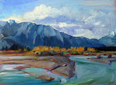
The Athabasca River, by Carol L. Douglas
|
Savvy folk in the far north often reserve their peregrinations until March. That way, winter’s back is broken by the time they arrive back home. I knew that meant my current painting class would be scattering to the four winds soon. I had a neat little map of lessons laid out for them before they left town. Then my new grandson arrived early, and they didn’t get them in order. I’ll try to correct that here.
 |
|
The three primary colors we learned in primary school are red, yellow and blue. Forget about any other color space you’ve learned about; they’re not relevant to painting.
|
Above are the three primary colors in subtractive color. This is the color space in which painters work, and it predates modern color theory. These three colors are the foundational building blocks on which all other colors are made.
 |
|
Mix the primary colors in the first illustration with their neighbors and you end up with the secondary colors. A secondary color is always across the color wheel from a primary color.
|
Back in elementary school, we learned that if you mix a primary color with one adjacent to it, you get the secondary colors:
- Green (blue and yellow)
- Orange (yellow and red)
- Purple (red and blue).
Importantly, a secondary color is always across the color wheel from a primary color. When you want to dull down (reduce the chroma) a color in a hurry, the fastest way to do it is to mix it with whatever’s sitting across the color wheel.
 |
|
All blues are not created equal: the wavelengths of common painting blues, from Multispectral Imaging of Paintings in the Infrared to Detect and Map Blue Pigments, by John K. Delaney, Elizabeth Walmsley, Barbara H. Berrie, and Colin F. Fletcher, Scientific Examination of Art: Modern Techniques in Conservation and Analysis, the National Academies Press, 2005
|
All limited palettes are based on a simple red-blue-yellow color scheme. Unfortunately, in the real world, there are no pure paint pigments. They’re either warm or too cool, or they have overtones that muddy them up in certain mixes. This means that all real-world limited palettes have gaps in them, places you just can’t get to with the available pigments.
In practical terms, this can be useful to the beginning artist, as limited-palette paintings always feel integrated. That’s because they hit a limited range of notes. For the beginner, that avoids discordance, but it also means that he or she will never learn how to mix through the whole color universe.
 |
|
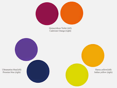
The colors on my palette are a variation of primary colors. It’s the same principle, but there’s a warm and cool version of each of them.
|
This is why I use paired primaries on my palette. I have a warm and a cool blue, warm and cool red, and warm and cool yellow. This allows me to go almost anywhere on the color wheel without sacrificing chroma.
Why, then, do I have four more tones: yellow ochre, raw sienna and burnt sienna, and black? You don’t need these colors, actually; you can mix to get to any of these points. I use these iron-oxide pigments because they’re cheap and they make great modulators in places where white is inappropriate.
 |
|
This allows you to go anywhere you want on the color wheel without sacrificing chroma (intensity).
|
All the colors on my color wheel are modern synthetic pigments (with the exception of the cadmium orange, which is a 19th century organic pigment). Conversely, the iron-oxide pigments are the most ancient pigments known to man. We know they’re not fugitive. Engraved ochre has been found that dates from around 75,000 years ago.
