Why do teachers harp on value? Because it drives everything else in the painting.
 |
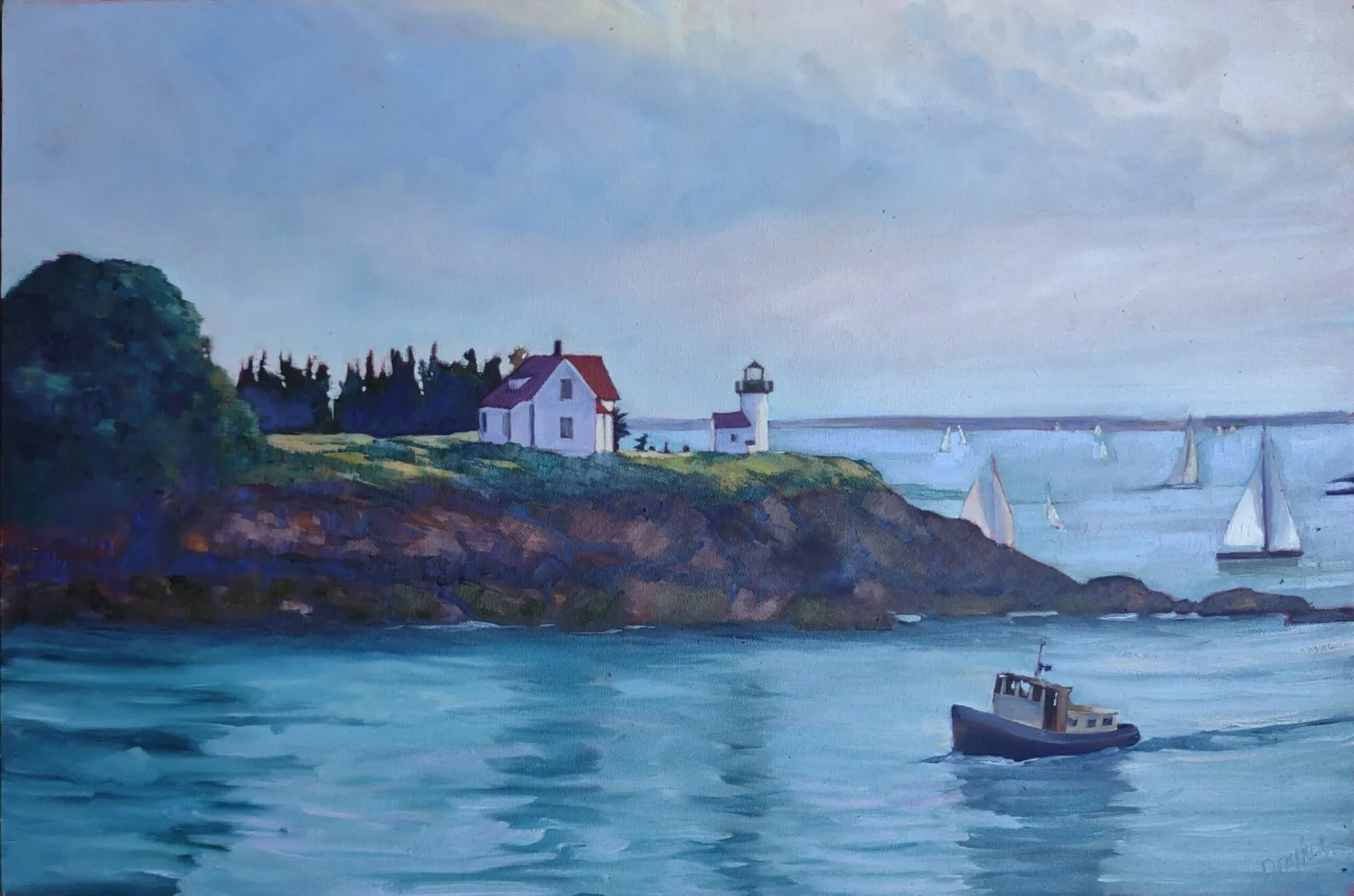
| Belfast harbor, 11X14, oil on canvas, Carol L. Douglas. Available framed $1087. |
You cannot overstate the importance of value in visual art. It drives our perception and guides us through the painting. There are various ways to focus on value: notans, value sketches, and grisailleunderpaintings being the most popular. However we get there, the first step of a good painting is to see each composition in terms of its value structure.
Claude Monet was the greatest optics experimenter of Impressionism (and probably of art history in general). He visited the question of value over and over—in his haystacks, his waterlilies, his series in the Gare Saint-Lazare. We have been happily exploiting his discoveries ever since. We’ve learned that we can substitute color temperature for value, but the value structure remains the most important part of the painting. Even when the dark shapes are not literally dark, they have a form.
 |
|
Haystacks, (Midday), 1890–91, Claude Monet, courtesy National Gallery of Australia |
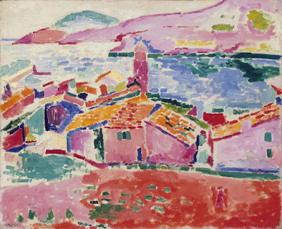
Just as the human mind can interpolate blue as dark, it has a great capacity to read red for blue as long as the values are true to the scene. The Fauvesexperimented with this, painting skies pink and faces green. We have no trouble identifying what they’re painting. However, it’s an either-or proposition. We can substitute hue for value, or we keep the values accurate and mess with the hues. Mixing them both up together makes an unintelligible mess.
Alla prima painting requires great skill in color mixing, because the goal is to nail it on the first strike. That goes not just the for darks, but every color in the picture. Even a painting with wonderful shadows and lights will have many middle tones, often closely related in value. These are actually the most difficult colors to mix accurately. If you have a painting that isn’t working, ask yourself if it has a full tonal range, or is it simply hitting the highs and lows. For example, when people get in trouble painting texture, it’s usually because they’re overstating the contrast.
 |
|
Les toits de Collioure, 1905, Henri Matisse, courtesy The Hermitage |
All color is relative, meaning it depends on its neighbors. That’s particularly true when it comes to value. Below see a plate from Joseph Albers’ groundbreaking Interaction of Color. The inner violets are the exact same value. But the framing color influences how we see those values, so one looks much lighter than the other.
To mix paint accurately you must become absolutely conversant with the colors on your own palette. The first step is to identify the natural value of your paint, straight out of the tube. No pigment can go darker than its natural hue without the addition of another color. That’s why it’s so difficult to make shadows on lemons.
For oil painters, figuring out the natural value of a pigment is easy. For watercolorists, it’s a bit of work to figure out what that really darkest point is, because it’s never the same as it appears on your palette. The colors wetted are a better guide, but you’ll need a test paper handy to experiment.
When you figure out the darkest natural position of each pigment, you need to see how it tints. For watercolorists, that means dilution. For oil and acrylic painters, that means mixing with white. Every paint has a natural tinting strength. That’s determined by the type of pigment, the amount of pigment and how fine it’s been ground.
There are three things to remember:
· Value judgments are subjective. There’s no reliable way to measure the value of a color. The camera is as subjective as the human eye.
· You can’t get a color to go darker than its ‘natural’ value without distorting the hue or chroma. Thus, there is no natural dark version of cadmium yellow, so the shadows in a yellow object require a workaround.
· All pigments can make about the same number of discrete steps. While the yellows have a shorter range, the steps are more noticeable. Blues can mix from almost-white to almost-black, but the middle points are very similar.

