
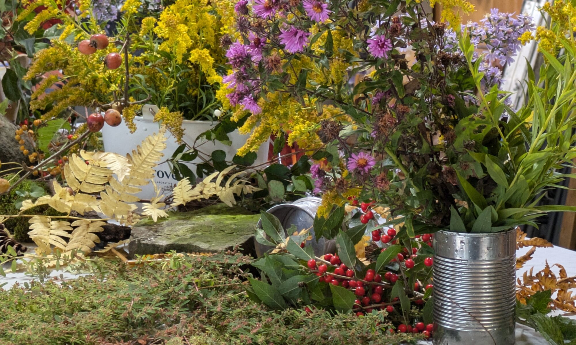
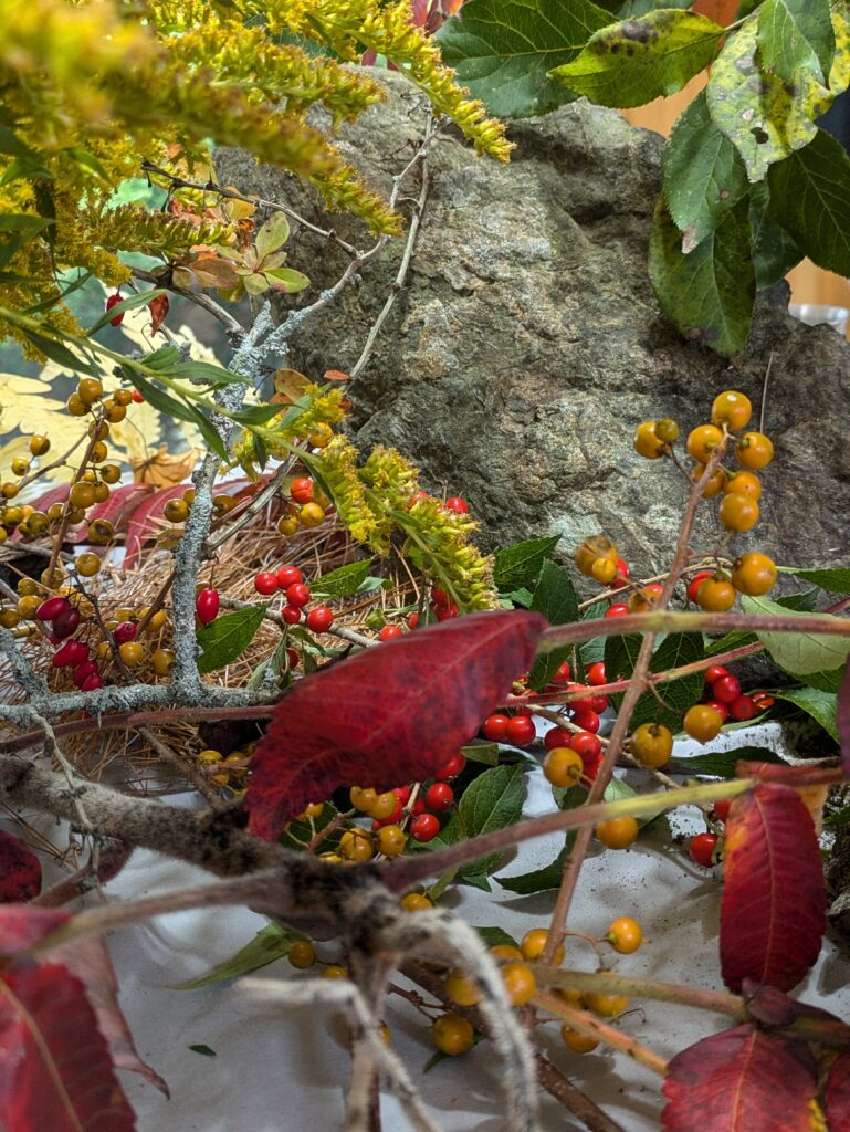
I start teaching my Rockport Immersive workshop tomorrow morning, and our forecast is for 100% chance of precipitation. I have a backup plan. Yesterday, in my amble through the woods, I cut various blossoms and berries.
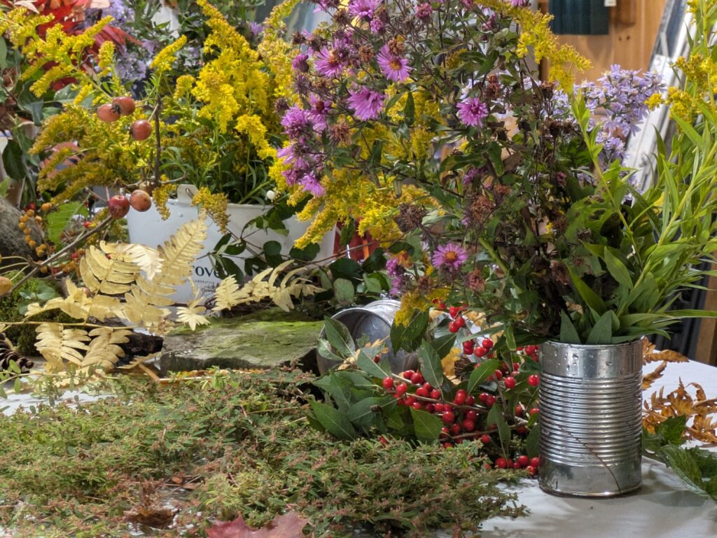
Setting up a still life is great fun, but when you’re doing it for a roomful of artists, different rules apply. You treat it more like a still-life-scape, from which each painter can pull bits and pieces.
Whether you’re doing it for one or ten people, setting up a still life is excellent training. There was a period in my life where I painted a still life every morning, before I got on to my ‘serious’ work. It’s how I learned to paint with assurance.
Choose Your Objects
My theme for this still life was autumn, “season of mists and mellow fruitfulness.” Formerly, I’ve done still lives based on internet memes, nonsense my kids wandered around singing, or things I like to do. Even a simple book of matches can be an arresting still life.
Get in the mood
In autumn, the mood is lush; easy, peasy. Other still lives may not be so simple. They may be austere, luxurious, absurd or romantic.
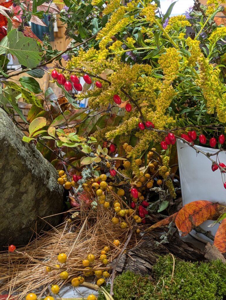
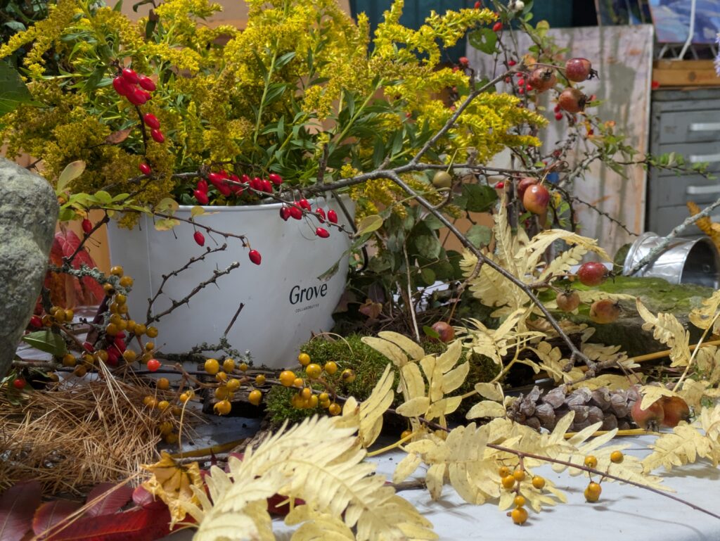
The color scheme is an extension of mood. In this case, it’s purple and gold, reds, russets and yellow. If I were doing something romantic, it would be lighter and more ethereal. If I’m being snarky, all bets are off.
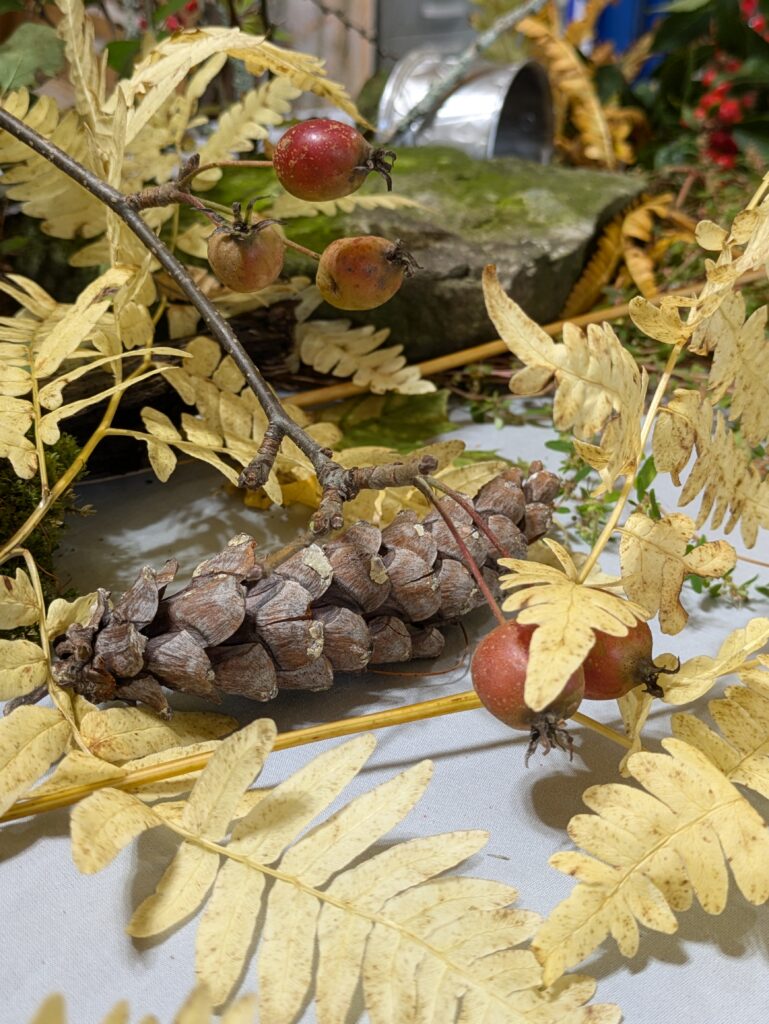
A variety of shapes, sizes, and textures is more important than content. That’s why I threw in the pewter and aluminum. In this instance a drape would be overkill, but don’t discount fabric as a shape- and pattern-maker.

There are times when I’m looking for contrast, and times I’m looking for closely analogous objects.
Composition is key
I spent as much time gathering and arranging this still life as I would spend painting it. True, it’s massive, but in some ways, that makes it easier.
- Do you have clearly articulated focal points?
- Have you layered objects to create depth?
- Is there a good pattern of lights and darks? Warm and cools? A good color pattern?
Don’t be afraid to keep fiddling right through your compositional sketch. You may find better ways of looking at the objects.
Lighting
I prefer natural light when possible, as it gives livelier color and a softer shadow pattern. Positioning your still life near a north window will give you the most stable light, but there are times when strong raking light is appropriate—but you must work faster.
Natural light is not always possible. If you set up artificial lights, don’t put them too close to the subject. Make sure there is fill light in the shadows, and think of the composition mainly in terms of the cast shadows.
Negative space
Negative space is the area surrounding and between the subjects. These interstices define and highlight the main elements, creating balance. Effective use of negative space creates interesting shapes and patterns, draws attention to the main subject, and adds depth to the overall piece.
Some artists use still life shadow boxes. I don’t because they excessively control light and composition. When I paint still life, I just ignore what’s behind it. That gives me the opportunity to create what I want in the interstices. It’s good practice in not being excessively driven by what you see.
Be inventive
I’ve painted pretty absurd still lives, including toilet paper, bubble wrap, bacon and a tin-foil hat. Still life is only as boring as you make it. Don’t be afraid to be weird.
Reserve your spot now for a workshop in 2025:
- Advanced Plein Air Painting, Rockport, ME, July 7-11, 2025.
- Sea and Sky at Acadia National Park, August 3-8, 2025.
- Find Your Authentic Voice in Plein Air, Berkshires, MA, August 11-15, 2025.
- Immersive In-Person Fall Workshop, Rockport, ME, October 6-10, 2025.