
Years ago when I was still having giclee prints made, my lab would bracket different exposures of the work as high dynamic range image (HDR) capture. It cost several hundred bucks a pop and was worth every penny.
Bracketing wasn’t a new idea; what was new was the ability to merge the images into a single HDR output. Today, you and I can do it ourselves, using the free, open-source photo editor GIMP. Even better, most new smartphones have HDR technology built into them. In most situations, that’s all that’s needed. Why mess around with a DSLR when you have HDR technology in your pocket? Just take a couple different exposures (see last Monday’s post) and Bob’s your uncle.
What is HDR and why should a painter care? A single image captured by a camera has a finite value range. Outside that range, tonal information is lost. Deep blues, purples, reds, and greens appear black; palest yellows and peaches look white. It’s frustrating for the painter to spend so much time on color temperature only to have our stupid cameras make our paintings look flat.
That, in a nutshell, is why cell phone photos of our paintings often look better than our DSLR photos. On the other hand, our pricey cameras have much better lenses, so they have the potential for more sensitive images of impasto and other subtle brush effects. If you’re working in watercolor or gouache you won’t care, but for oil painters and pastelists it can make a world of difference.
Adjusting your image with software will cost you detail
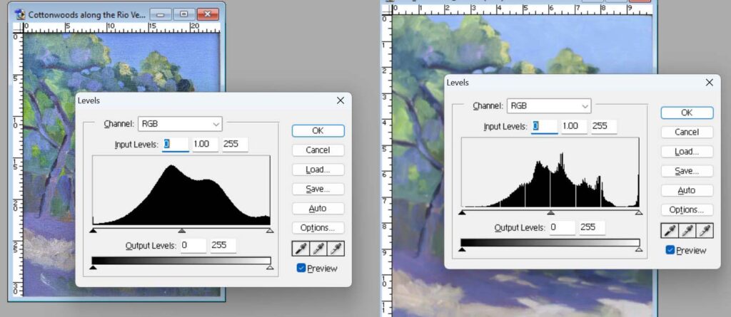
“But I can use Photoshop to fix the color,” you aver. Hah, and double hah. Let me introduce you to the histogram(s) of your photos. There’s a composite one, and one for each color channel. The histogram represents the tonal distribution of a photograph. It shows how many pixels are in each brightness level, from pure dark on the left to pure light on the right. An average-keyed painting’s histogram should be curved, skewed neither to left nor right. A nocturne will be skewed to the left; a high-key painting to the right.
Above I’ve given you histograms of the same painting shot with the same camera. The image on the left is a painting that was correctly exposed under proper light. The one on the right was properly exposed but without using photo floods. I adjusted it in Photoshop to visually match the painting’s color. This is a very small tweak.
The gaps indicate a lack of pixels within those tonal points. That means there are no details at those points. The jagged edges are caused by lossy (irreversible) compression, which also removes data. Neither is good for the sharpness of your image.
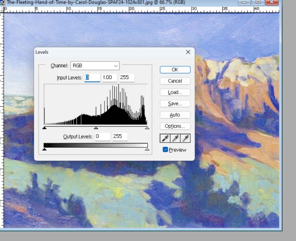
That was in the controlled environment of my studio. Now look (above) at the edits that needed to be made when a painting was photographed on a gallery wall. That picture was taken by a professional, but he had no control over the conditions.
That’s the above painting in its real color, with no color editing done. Note the amount of color information lost in the edited version.
The color of shadow affects your photography
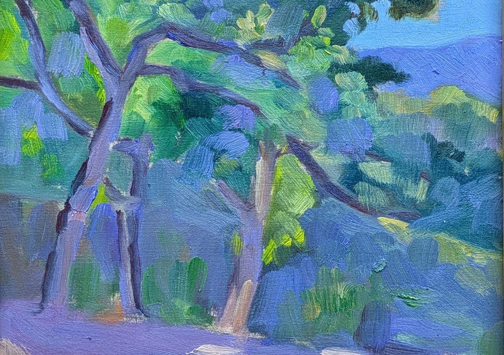
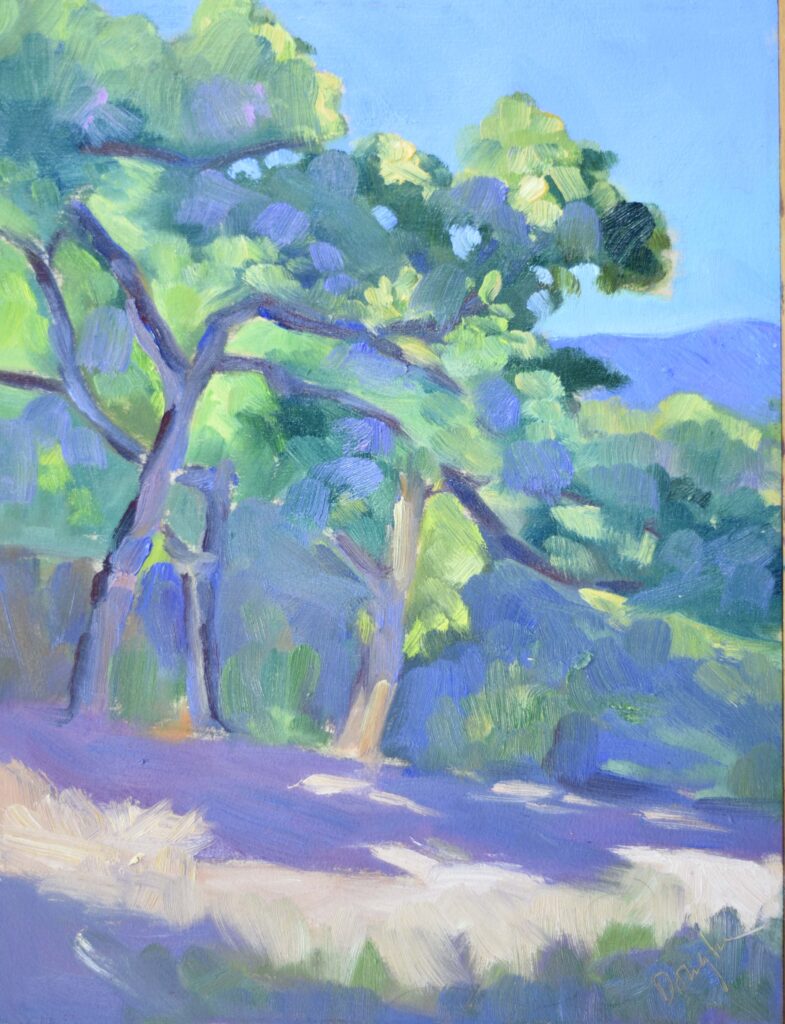
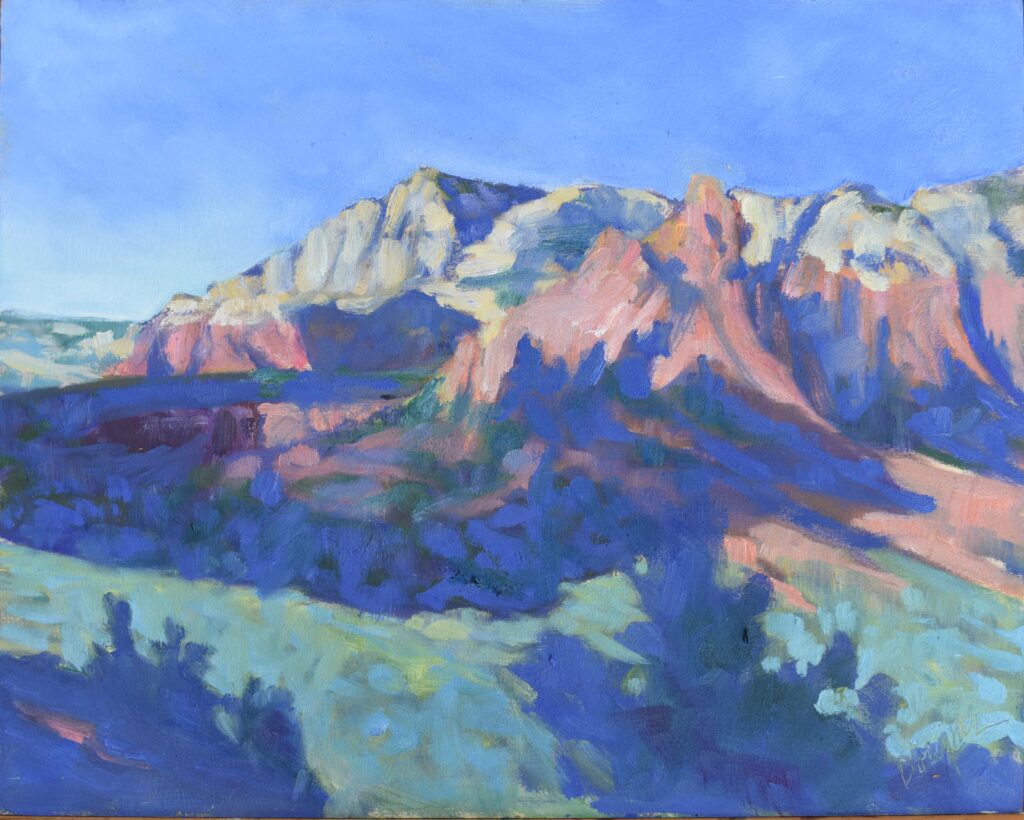
Because I had a photo of Cottonwoods along the Rio Verde that I took in the shade in Sedona, AZ, I could compare it to one I took under the photofloods in my studio, using Photoshop’s eyedropper tool. They’re close. But Sedona is about 34.9° N, vs. Rockport’s 44° N. Moreover, that was October. Today in Rockport, the sun will rise to a whopping 35° above the horizon. (It was 20.5° at the winter solstice. No wonder we’re all crazy.) In winter here, shadows are blue or bluer. It’s been a long time since I tried this at home, and it’s storming right now, but I found this old photo I took on my patio on an overcast day. That painting is blue… and it’s not because it’s cold. I can’t adjust that color to normal and not degrade the image.
If you want to take my next session of classes, they start with drawing (one seat left) tonight and painting (four seats left) tomorrow.
Reserve your spot now for a workshop in 2025:
- Advanced Plein Air Painting, Rockport, ME, July 7-11, 2025.
- Sea and Sky at Acadia National Park, August 3-8, 2025.
- Find Your Authentic Voice in Plein Air, Berkshires, MA, August 11-15, 2025.
- Immersive In-Person Fall Workshop, Rockport, ME, October 6-10, 2025.
Here’s an inexpensive hack for adjusting color balance. You can use a gray card next to the painting in the photo; it has a calibrated mid-level neutral gray color with known RGB levels. In your histogram editing software you can adjust the pixel samples in the gray card to match the actual RGB values and the rest of the image will follow. You can also use paint sample cards from a paint store and look up the RGB values for that brand on line and make your own set of gray cards with a range of values.
Thank you, Mike. Most DSLRs allow you to set white balance before you shoot the picture, but I think you’re out of luck with most cell phones. On a DSLR, there’s usually a white-balance button that you use to measure the white balance on a neutral white or grey card, and then you use your camera’s specific instructions to set it.
My goal is to do as little editing as possible with software to avoid losing detail and therefore sharpness in the final image.
Someone could write a book or at least a long magazine article on this subject. It won’t be me.