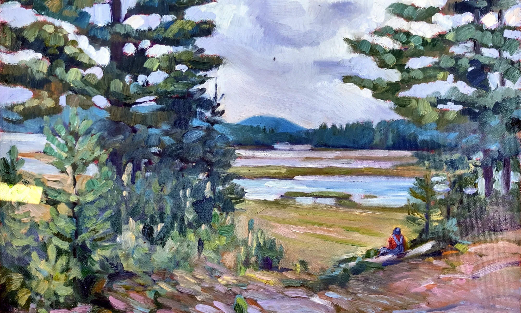
The essence of alla prima painting is to nail the color on the first pass.
 |
| The top of this canvas is a simple grisaille; the bottom is a single layer of paint applied right over that. This is the gist of alla prima painting. |
You cannot overstate the importance of valuein painting. Even when artists represent value with hue(a technique pioneered by the Impressionists) the dark shapes in a painting have a form. That form drives our perception and guides us through the painting. There are various ways to get this right, but the most common is a quick value sketch. I ask watercolor students to then make a value study in paint before they start their finished project. I have oil and acrylic students do their paint study in the form of a rough grisaille on their canvases. It has to be thin, and it has to be worked fairly dry, or you can’t paint over it.
Where early oil painters sometimes trip up is in making that bottom layer too dark, thick, or soupy. Then, they hope they can somehow lighten it up by adding white back in. Indirect painting works almost like this, so they may have seen something similar on a video. In indirect painting, the artist works into this dark layer; in modern direct painting, or alla prima, it’s there as a roadmap, so it’s applied more lightly.
 |
| Close-value mixing is the heart of painting, and the hardest mixing to do. |
Direct painting requires great skill in color mixing, because the goal is au premier coup, or to nail it on the first strike. That goes not just the for darks, but every color in the picture. Even a painting with wonderful shadows and lights will have many middle tones, often closely related in value. These are actually the most difficult colors to mix accurately. If you have a painting that isn’t working, ask yourself if it has a full tonal range, or is it simply hitting the highs and lows. When people get in trouble painting texture, it’s usually because they’re overstating the contrast.
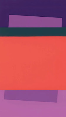
All color is relative, and that’s particularly true when it comes to value. Above see a plate from Joseph Albers’ groundbreaking Interaction of Color. The inner violets are the exact same value. But the framing color influences how we see those values, so one looks much lighter than the other. This is why oil painters should tone canvases, by the way.
I made the oil-painting sample at the top of this page for my students. The top is the value study; the bottom is a finished painting. I keep it around to demonstrate that when we say “darks to lights” we don’t mean a thick mask of dark paint; we mean that we think through our values in that order. (In watercolor, we do the same thing, but the application is reversed to go from light to dark.)
 |
| Copy and print me. |
To mix paint accurately you must become absolutely conversant with the colors on your own palette. You can download this pigment test chart and print it on watercolor paper (trimmed to size) on your laser printer. Or, just grid off a canvas or paper to match. (Don’t try doing this in watercolor on plain copy paper. It isn’t sized, and your pigment will just sink.)
Use the pigments you usually have on your palette (if there’s more than eleven, we may need to talk).
 |
| What is the natural value of your paint, straight out of the tube? Compare it to that scale above. |
 |
| Your finished exercise should look something like this. |
When you figure out the darkest natural position of that pigment, paint it in the appropriate position on your scale. Then make lighter steps to match the greyscale strip you’ve printed from the sample above. For watercolorists, that means dilution. For oil and acrylic painters, that means cutting with white.
There are three things to remember:
- These judgments are subjective. There’s no reliable way to measure the value of a color. The camera is as subjective as the human eye.
- You can’t get a color to go darker than its ‘natural’ value without distorting the hue or chroma. Thus, there is no natural dark version of cadmium yellow, so the shadows in a yellow object require a workaround.
- All pigments can make about the same number of discrete steps. While the yellows have a shorter range, the steps are more noticeable. Blues can mix from almost-white to almost-black, but the middle points are very similar.

