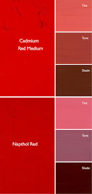
The imperfection of paint is what gives it its liveliness and depth, but it also makes mixing colors tricky.
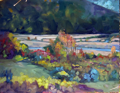 |
| Autumn, by Carol L. Douglas. This painting contains no reds. The red tones are a combination of cadmium orange and quinacridone magenta. |
Last week, I made a flippant remark about clashing colors. This weekend, I had an opportunity to see clashing at work, in an ottoman proposed for my living room. It was a cool rose tint and looked horrible with my sectional’s warm red cushions. I’m usually happy with putting closely analogous colors together but this combination would be terrible. The mass tones were fine; the undertones were all wrong.
A mass tone is the color a pigment is straight out of the tube, dense and unmixed with another color. No real-world pigment, however, is as pure as a color on a video screen. While two pigments may look the same to the naked eye, their behavior when mixed can be radically different.
Undertone is the color revealed when a paint is spread thin enough that light bounces back up from the substrate. Some pigments are fairly consistent when moving from mass tone to undertone. Others have significant color shifts. Not understanding those undertones tones can lead to muddy mixes.
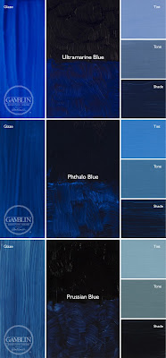 |
| Three blues that look similar out of the tube, but behave very differently. The ‘glaze’ on the left is the undertone. Courtesy Gamblin paints. |
Ultramarine, Prussian and phthalo blue are colors that shift radically from mass tone to undertone. They’re all so dark out of the tube that their differences aren’t apparent to the naked eye. But dilute them, and you’ll find a wide range of blues.
Undertones are why buying “hues” instead of pure pigments can be such bad value. Take, for example, cadmium red hue, which is usually a napthol red with a small amount of white added. Out of the tube, the two paints are indistinguishable, but they mix very differently.
Even paints with the same pigments can have different undertones depending on the manufacturer. I’m experiencing this right now with my quinacridone violets, which I’ve been replacing with whatever I can buy along the road. That comes back to the imperfectability of pigments and their essential complexity.
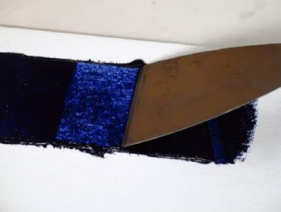 |
| A drawdown test showing a paint’s undertone. Courtesy Utrecht paints. |
If you’re considering two different pigments, or thinking about switching brands, you could test them. It’s fast and easy. To see their mass tone, put a small dab of paint on a smooth white board or glass palette and draw it down with a knife, creating a uniform, solid stripe that completely obscures the painting surface.
To see the undertone, draw the samples down again so they are translucent. You should be able to see minute variations in the color, and in the covering power.
To understand the behavior of each more fully, you now need to make tints, tones and shades of each sample.
- A tint is a color plus white.
- A shade is a color plus black.
- A tone is a color plus black and white.
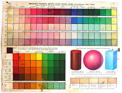 |
| This old paint chart from my studio explains tints, shades and tones. |
Even when the mass tone appears quite similar, two close colors will act very differently when mixed. Their unique qualities of tinting strength, chroma, undertones and color temperature come into play here. But mixing paint with white or black immediately adds another layer of complexity. Different blacks and whites have their own undertones. Titanium white has a cool undertone. Zinc white is warmer, but it’s also brittle and thin, making it a bad choice for general painting. Ivory black is slightly warm.

