Don’t be boring, I wrote last week. This is the first and greatest rule of composition. “What do you mean by that?” a reader asked in response. This, like obscenity, is one of those things that’s hard to define, but we know it when we see it.
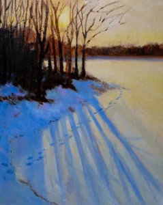
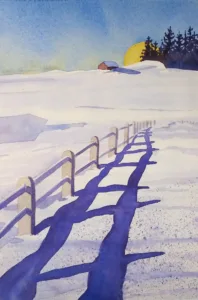
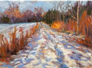
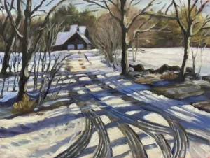
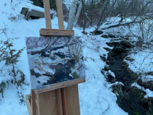
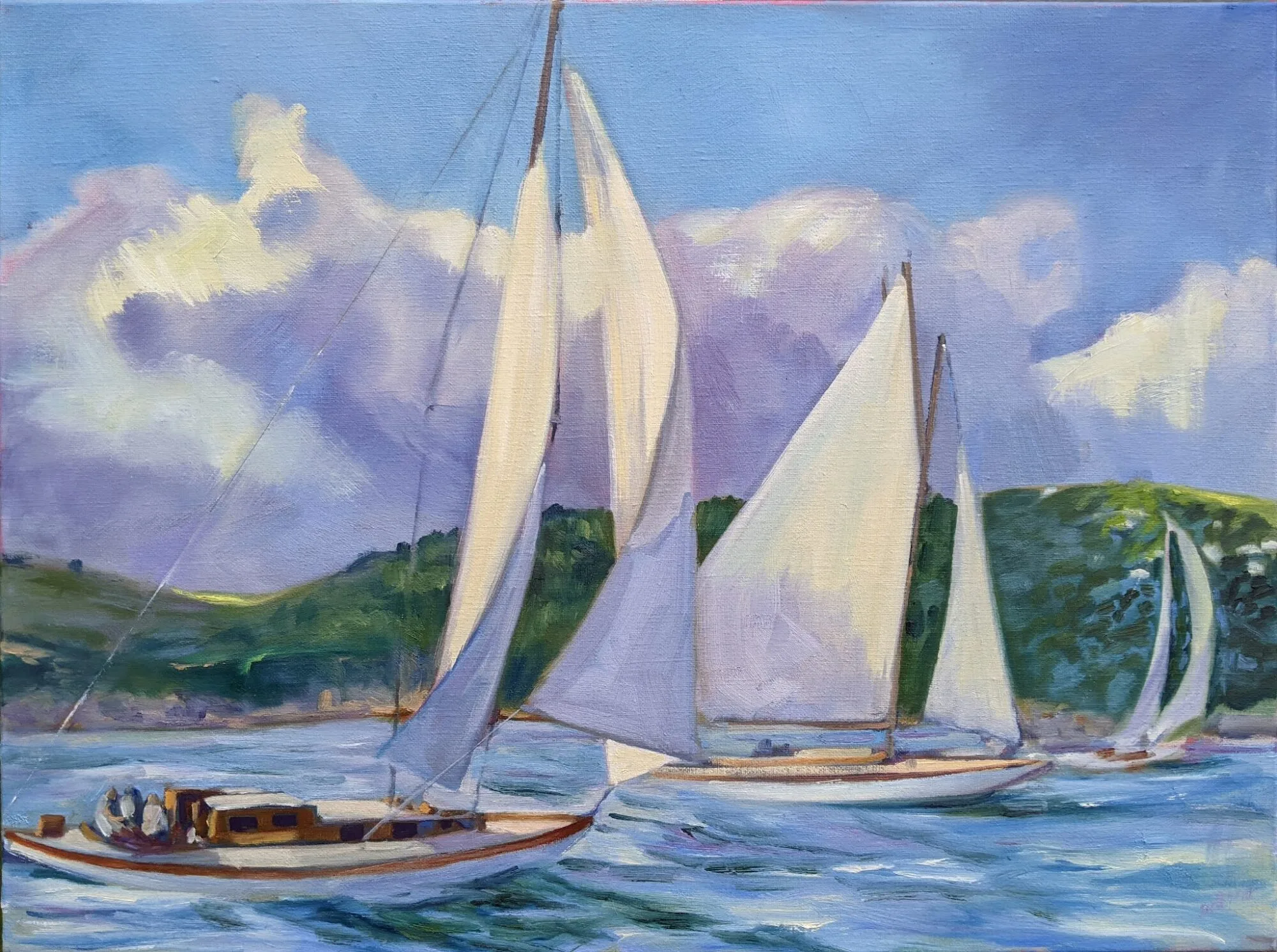
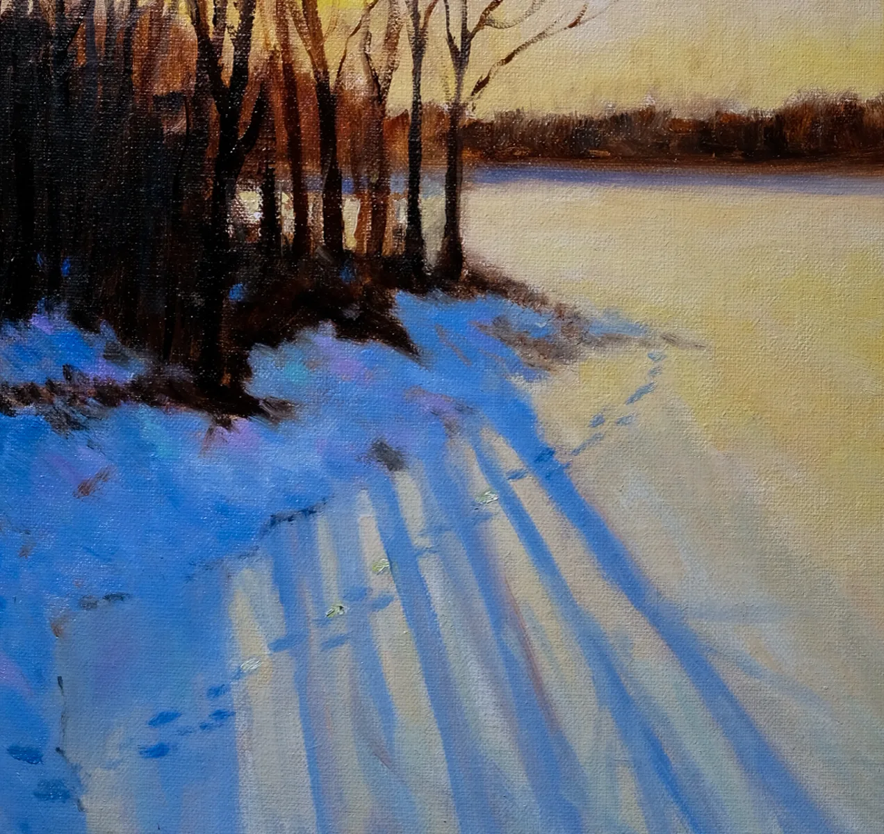
The subject is never the issue. We’ve all seen a thousand boring paintings of barns, but when Edward Hopper painted them, they were brilliant studies of light and shape. Very familiar subjects can be seen in new and arresting ways. I took the liberty of illustrating this post with paintings by my students; they all took common scenes in the northeast and finished them beautifully.
The easy out
We tend to draw what’s right in front of us without thinking too much of how changing the viewpoint might make for a better painting. Commit to an idea, and squeeze out every ounce of design you can by drawing it repeatedly in different arrangements. That’s as important in landscape as it is in still life. The time you spend trying out new compositions is the most important part of the painting process.
That is not just a question of large shapes, but of values. Even a typical arrangement of trees, point, and water can be made arresting through dark shapes running through them. Contrast draws the eye.
What everyone says is not necessarily true
You’ve heard of the rule of thirds, or that you should never center the subject directly on your canvas. What makes you believe these things? Someone told them to you.
Ideas of division of space are culturally-derived and quite complex. Tutankhamun’s golden mask is beautiful and perfectly symmetrical.
You will have an easier time creating a composition if you abide by these shibboleths, but that doesn’t mean you’ll make a better painting. A deep dive into space division is never wasted time. I think about the abstract paintings of Clyfford Still when I start to feel my compositions falling into dullness.
There are some verities
Defining your composition with long unbroken horizontal and vertical lines will make it start out rigid. Look to Frances Cadell for ways to break out of that. Likewise, you don’t want to lead the eye out the corners of your canvas, or put a focal point to close to an edge. ‘Respect the picture plane’ is a good general rule.
The human brain loves the insolvable. That’s why the Golden Ratio and Dynamic Symmetry work better than the rule of thirds in design. That doesn’t mean you need to spend a lifetime studying design arcana; just understand it and better placement will come naturally to you.
Things to avoid
No painting without a series of focal points can succeed. This is where the marsh painting usually fails. The eye needs to be able to walk through, into, and beyond the work. I’m not talking about anything as hackneyed as the winding path or river, but a series of points that draw your eye around the picture in a planned way. These details reward careful study and keep the viewer engaged for long periods of time.
Reserve your spot now for a workshop in 2025:
- Advanced Plein Air Painting, Rockport, ME, July 7-11, 2025.
- Sea and Sky at Acadia National Park, August 3-8, 2025.
- Find Your Authentic Voice in Plein Air, Berkshires, MA, August 11-15, 2025.
- Immersive In-Person Fall Workshop, Rockport, ME, October 6-10, 2025.
I love Rebecca’s fence painting!
I think “don’t be boring” is the point of all the compositional guidelines, which tend to overwhelm! Much better than “make it interesting”. Somehow the former is more to the point for me! Thank you for all your art nuggets! They come in pieces I can digest and hopefully incorporate!
Some gorgeous paintings here! I especially liked the first three by Smiley, Bense and Carr.
“Don’t be boring” is a good thing to remember. However, I tend to do best when I focus on what I want , rather than what i don’t! So for me, that translates into “focus on what’s beautiful or interesting to you”.
Wonderfully informative article. I like to consider it a: “gentle reminder”!!