This exercise teaches you to think of the three aspects of color as separate properties.
 |
|
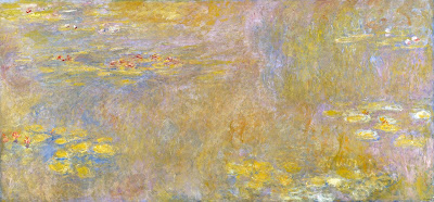
Water lilies (Yellow Nirwana), 1920, Claude Monet, courtesy the National Gallery, London. Much of Monet’s work was experimenting about the nature of color.
|
When we ask people, “what’s your favorite color,” we’re using the word color in a simple way, and we expect a simple answer. In fact, color has three basic characteristics:
Value – How light or dark is the color? Blue-indigo is the darkest color, yellow is the lightest. Red and green fall somewhere in the middle.
Hue – Where does it sit on the color wheel? All colors fall into one of the following hue families: red, orange, yellow, green, blue and violet. Within those families, however, are many subdivisions.
Chroma – How much intensity, or “punch” does the color have? Grey is low-chroma; fuchsia is high-chroma.
For more detail, see here.
Complementary colors are opposite positions on the color wheel.
Analogous colorsare a set of colors that sit next to each other on the color wheel.
This exercise teaches you to hold value and chroma steady and manipulate only hue. It’s hard to make these judgments subjectively, so your samples may not look exactly like someone else’s.
Go to the paint store and select paint chips in two different color schemes—complementary and analogous. I want you to choose paints with the same value and chroma but the hue will be different.
 |
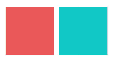
| Complements where the value and chroma are the same. |
They don’t necessarily have to be high-chroma combinations. Here’s a pair of complementary hues which have less saturation (lower chroma):
An example of an analogous color scheme where the value and chroma are the same for all three hues:
Once you’ve selected the three paint samples, chop them up and arrange them on a little card as a design. Glue them down in a pattern that pleases you. Try to leave no space between the different colored tiles so your finished work looks something like this:
 |
| Above: my chops. Below: Photoshop’s evaluation of how close I came with the values. (Remember, Photoshop is interpreting as much as I am.) |
I don’t care what kind of shapes you make or how complicated your design is. I just don’t want white showing between the sections.
If it proves difficult to get out, and you want to get started, you can always make your own paint swatches. But it’s fun to get them from the hardware store, cut them up and make patterns.


