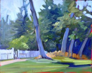
Formal critique of your own work allows you to disentangle yourself from your emotions and look at your painting’s strengths and weaknesses objectively. Since I’m teaching a 4-week critique session starting on Monday, I thought I’d demonstrate the process with one of my own paintings.
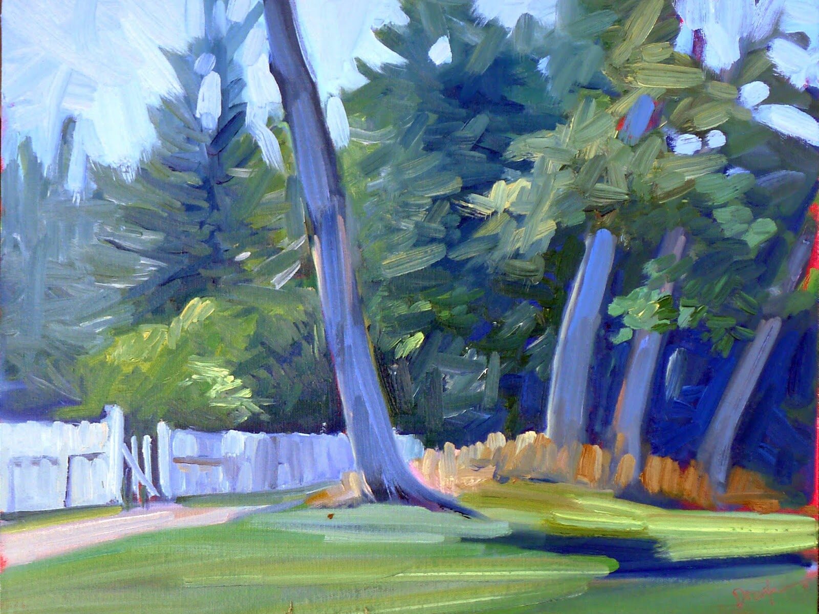
To avoid any bias in my selection, I did a search of my name and used the first image that popped up. There was once a party at the house Tom Sawyer’s Fence surrounds. Along with the champagne and canapes, the chatelaine invited her friends to whitewash her fence. After all, it was rather a long fence. That was such a brilliant move that I decided to paint the fence myself.
Size matters
It’s quite possible to critique paintings on the internet, but knowing the size helps you determine the work’s effectiveness. I no longer remember exactly, but I think Tom Sawyer’s Fence was about 14X18.
Focal point
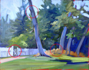
Is there a focal point and series of focal points, and is the viewer’s eye directed to them with contrast, detail and line?
You could argue there isn’t much subject matter to this painting. But don’t confuse subject matter with focal points; they’re two different concepts. There are two high-contrast areas that draw the eye, and a third, the gate, that isn’t as well defined. More contrast between the gate and the trees behind it would have made that third focal point pop more.
Line
Is line used effectively and reinforced in the painting?
This painting is all about line-the tree trunks at counterpoint to the fence and the grass, so I’d say that it’s a successful use of line.
Value
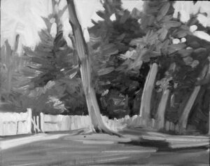
Does the painting have a solid value structure? Does it need to be restated or is it clear?
The best way to analyze value structure is in greyscale. There is a strong interrupted dark running behind the trees, supported by the shadow along the grass, so the overall composition is solid. However, a stronger dark pattern behind the fence would have supported the horizontal energy better.
Color
Is there a cogent color scheme? Is it expansive enough to be interesting?
This is a classic expanded-complement color scheme (green-blue-violet against orange) so it’s certainly cogent. There is a lower-chroma passage on the left, and high chroma on the right. (The red is my tone peeking out.)
Balance
Does the painting hit that sweet spot between static and riotous?
There’s symmetry between the left-leaning tree trunk and its three companions on the right, but, overall, there’s a lot of swing in this painting. The only static place is the sturdy upright tufted grass, which could have been painted more lyrically, especially as it’s the foil to the cool colors that dominate the canvas.

Shape and form
Are there interesting shapes in the painting? Does the brushwork suggest three-dimensional form?
Overall, there’s a good variety of sinuous, straight, large and small shapes. However, what’s missing is depth. There’s a sense of these shapes being cutouts laid over each other rather than being in a three-dimensional space that recedes and breathes. The only suggestion of space is the atmospheric perspective on the left side.
Texture
Is the brushwork compelling?
There’s bold, varied brushwork, including in the sky. This is not the brushwork I use today, but I still find it attractive. Someone more interested in detail might want smaller, more particular rendering.
Rhythm and movement
Is there energy driving you through the canvas?
Gosh, I sure hope so.
There are seldom absolute answers to any of these questions; however, the purpose of learning this system is to create a logical process to examine ideas and opinions about art. My current critique session is Monday evening, 6-9pm, Feb 19th to March 11th. Seats are limited, so register ASAP.
Reserve your spot now for a workshop in 2025:
- Advanced Plein Air Painting, Rockport, ME, July 7-11, 2025.
- Sea and Sky at Acadia National Park, August 3-8, 2025.
- Find Your Authentic Voice in Plein Air, Berkshires, MA, August 11-15, 2025.
- Immersive In-Person Fall Workshop, Rockport, ME, October 6-10, 2025.
Very nice, cogent synopsis with a great example. Good one, Carol. And remember: “It don’t mean a thing if it ain’t got that swing!” (Do-wop do-wop do-wop do-wop do-wop)
I learn so much from you. Thank you for sharing. Inspires me to keep learning and painting. I am loving the process