
It was the couch that upset me in this decorating story about Farrow & Ball’s Dead Salmon. “I like it,” my 31-year-old daughter told me.
Uggh, I shivered. It reminded me of this passage from Truman Capote’s In Cold Blood, which I read 52 years ago:
“As for the interior, there were spongy displays of liver-colored carpet… an immense modernistic living-room couch covered in nubby fabric interwoven with glittery strands of silver metal…”
Objectively, there’s nothing wrong with that brown-pink color; in fact, it reminds me of a mixture I added to my palette last year and dubbed Eric Jacobsen pink, because he uses it so much.
Lots of flowers come in that color, including pansies, irises, daylilies, columbines, chrysanthemums, roses, and carnations. Nobody hates them, least of all me. But as a decorating color, brown-pink reminds me of death and old ladies.
Involuntary memory
What caused my visceral negative reaction? It was a chained involuntary memory: the color evoked the smell of dusty, musty brownish-pink Herculon. (If you need a good cry, just look at how much that sofa you threw out is worth today.)
Our sense of smell works differently than our other senses. The other sensory apparatuses track through the brain’s thalamus before reaching the amygdala and hippocampus. In contrast, the smell system is hardwired to these memory and emotion centers, said Sandeep Robert Datta, a professor of neurobiology at Harvard Medical School. That’s why we often have emotional responses (like mine) to odor-related or -evoked memories.
Colors and memory
There have been many studies on colors and memory. These show that people remember images in color better than they do in black and white. However, they don’t remember falsely-colored natural scenes any better than they do those in monochrome.
“It appears as if our memory system is tuned, presumably by evolution and/or during development, to the color structure found in the world. If stimuli are too strange, the system simply doesn’t engage as well, or deems them unimportant,” said Dr. Karl Gegenfurtner.
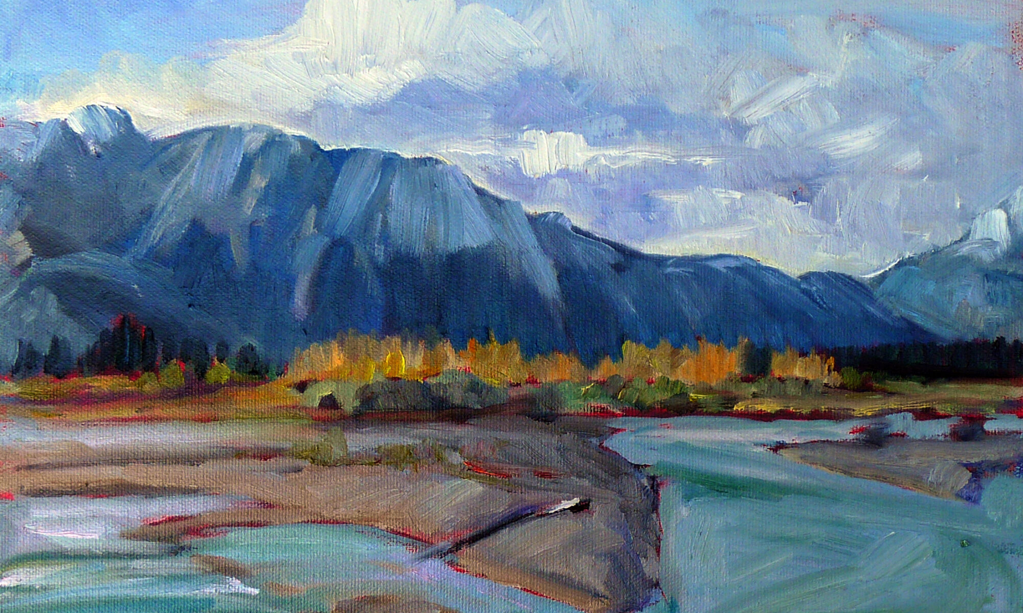
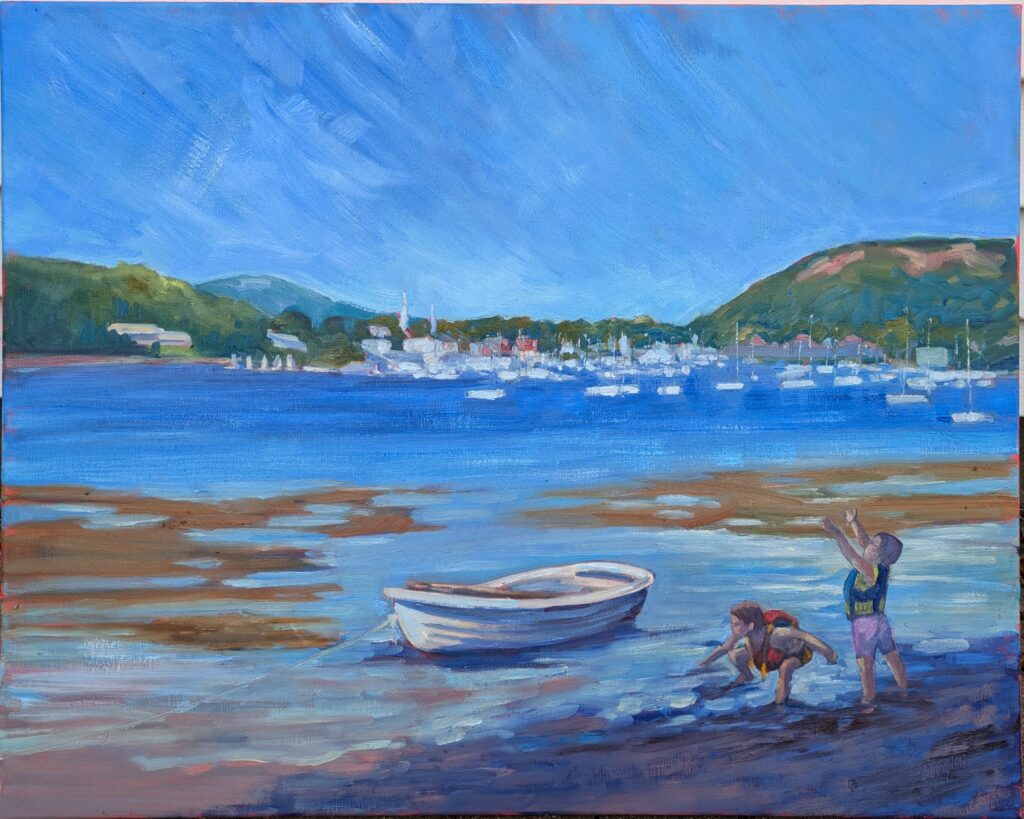
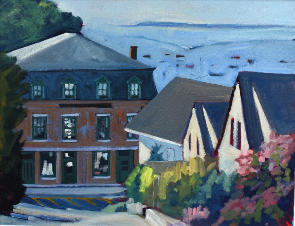
What does that mean for artists in our color-saturated world? I paint in a high chroma palette partly because I like those colors and partly because they’re the direction our mass media has moved the needle.
“Perhaps designers should be aware that, in order to engage or grab one’s attention (as in advertising), bright colors might well be most suitable,” said Dr. Felix A. Wichmann. “If, on the other hand, the aim is more to have an image ‘stick’ in the viewer’s memory, unnatural colors may not be suitable.”
I challenge you to name four or five paintings that you love, without using the internet for prompts. Now look them up. Are they high-chroma, dull, or in a natural chroma range?
Two upcoming classes
Yeah, I feel like I am nagging, but you’d be surprised how frequently people tell me, “I never saw that!”
Zoom Class: Beyond realism to expressive painting
Tuesdays, 6 PM – 9 PM EST
This class focuses on design and composition for expressive painting. Students will be encouraged to develop their own personal creative vision while working on refining their artistic skills through traditional studies.
Zoom class: design and drawing
Mondays, 6 PM – 9 PM EST
This class is targeted to the learner who has mastered measurement, shading, and perspective and wants to further develop skills in design and rendering.
Reserve your spot now for a workshop in 2025:
- Advanced Plein Air Painting, Rockport, ME, July 7-11, 2025.
- Sea and Sky at Acadia National Park, August 3-8, 2025.
- Find Your Authentic Voice in Plein Air, Berkshires, MA, August 11-15, 2025.
- Immersive In-Person Fall Workshop, Rockport, ME, October 6-10, 2025.