fbpx

Changing my support

If you don’t like how you’re painting, knock the struts from under yourself and see what happens.
Damariscotta Lake overlook, watercolor on Yupo, by Carol L. Douglas
I’ve been mulling over the color-shift I see between my oil paintings and my watercolors. My pigments are essentially the same. (Here are my supply lists for watercolorand for oil painting.) But my oil paintings of the same scenes always seem cooler. Is that because I’m toning in red? Or is something else at play?
David Dewey suggested the problem was, in a sense, all in my head. I’m so rooted in oils, he thought, that I’m more observational, and feel less free to depart from reality. My watercolors are a lark to me, so I give myself permission to experiment.
Since then I’ve been trying to be less bound to observed color. It’s too soon to say what the outcome will be, but I did look at a small painting in my studio yesterday—one that I thought was garish and overshot when I did it earlier this month—and thought, “That’s really not half bad.” There’s a lesson there, and it’s to not be too quick to judge your own work.
Damariscotta Lake overlook, oil on canvas, by Carol L. Douglas
Perhaps the problem is also the substrate. After all, my excitement about watercolor exploded when I discovered Yupo.
Because my residency oils were quite large, they were done on stretched canvases. For work under 24X20, I like RayMar panels. They’re solid, stable, archival—and pricey for beginning students. For them, I suggest a decent panel over a cardboard or MDF backing. As they grow more confident, they can move to a better-quality panel.
In May, I bought a bunch of different boards by different makers to test. Then I got busy with my season and forgot them. RayMar’s medium landscape cotton panel is a toothy board even after heavy toning. That makes for great control, and it’s a high mark for competitors to match.
Linen’s advantages over canvas mainly show on stretcher frames. Linen is highly reactive to the moisture in sizing and primer, and it’s very strong for its weight. It dries tight and it stays taut. Nothing is more satisfying to paint on than hand-stretched Belgian linen.
But those qualities are irrelevant in a glued linen panel. There isn’t much sense in paying a premium for linen to be glued down.
Still I’d bought a few linen panels from different makers in my assortment. I was pleasantly surprised by how much I liked the surface: it’s less toothy, which made it fun to slosh the paint around.
The problem with less-expensive boards is always their backing (although the gesso can be pretty thin, too). MDF and cardboard are perfectly fine in smaller sizes or for student work. But they aren’t as rigid as wood. Cardboard, particularly, bows and curls with time.
Poppy’s handmade birch panel.
On Sunday, as we were setting up for our last, quick,painting, Poppy Balser handed me a panel she’d made herself. It was clear birch, finished with two coats of Golden GAC 400 and clear gesso. She’d left the board unsanded, which gave it a better tooth than the manufactured versions of the same thing. And it was uncradled, which made it frameable for plein airevents.
I made a poor painting on it, but that was my doing, not the board’s. It’s the best new product I’ve painted on all year—of course, because it’s the most work. Still, I plan to make a few and keep playing.
Note: I’ve decided to teach one more plein airsession in Rockport. No, I’m not nuts. If it’s miserable, we’ll meet in my studio. But the light has been so fantastic in midcoast Maine, we might as well do another session before winter closes in for real.
Yesterday in Rockport.
I’ll be teaching a six-week plein air class on Tuesday mornings from 10-1. It runs from November 13 to December 18.

When weather permits, we paint at fantastic locations around the Rockport-Rockland-Camden area; rain dates are in my studio at 394 Commercial Street. Watercolor, oils, pastels and acrylics; all levels of painters are encouraged to join us. The fee is $200.

Autumn color is hitching up its skirts and getting ready to sprint

Interested in fall foliage? This is the ultimate road trip for a leaf-looker.
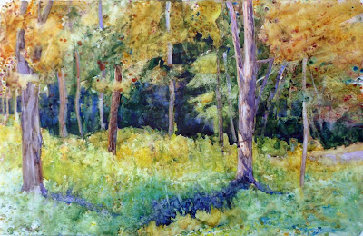
Glade #1, by Carol L. Douglas. Watercolor on Yupo.

We haven’t had a frost yet, but with each day I see a bit more color. To date, it’s mostly the sumacs and undergrowth, but the top of the birches are starting to glint gold.

Someone sent me this cool interactive fall foliage map. It’s probably a good, broad sketch, but I’m skeptical about the details. I know, for example, that Penobscot Bay is unlikely to change in tandem with Fort Kent, ME. Nor will Rochester turn side-by-side with the high peaks of the Adirondacks.
Maine’s official color-spotters agree with me. “Northern Maine is at or near peak conditions the last week of September into the first week of October. Central, and western mountains of Maine are at or near peak Columbus Day week/weekend. Coastal and southern Maine generally reach peak or near peak conditions mid-to-last October.”
Glade #2, by Carol L. Douglas. Oil on canvas.
If it were up to me, I’d be heading north to Canada’s Algonquin Provincial Park today, with my canoe. It’s not a western park, but it would give me aspen, tamarack and maples, set against black spruce.
Then I’d spend a few days in Ottawa, Montreal and Quebec City for a dose of Canadian city life. I’d continue to Halifax and spend a few days knocking about Nova Scotia’s eastern shore, reveling in ancient maritime Canada. Eventually, I’d head to Digby and the ferry to St. John, NB. I’d then roll south, making sure to stop at West Quoddy Head Light and the boreal trail at Quoddy Head State Park.
Marshes along the Ottawa River, Plaisance, Quebec, by Carol L. Douglas
Stop right there, Carol. “You just skipped mysterious, moody Eastport,” I admonish myself. Well, I also skipped Lunenburgand Peggy’s Cove in Nova Scotia, and the fossil cliffs of New Brunswick. Not to mention the superlative Group of Sevencollection at the National Gallery in Ottawa. It’s impossible to list the interesting stuff you’d see on this trip, but if you can’t blow four weeks driving from Algonquin to Boston, you’re not really trying.
It’s under 3000 km. The trip of a lifetime, I tell you.
Speaking of the Group of Seven, I’m finishing up my residency at the the Joseph Fiore Art Center with a classically Go7 exercise which I periodically attempt and at which I never excel. That’s painting a glade. I don’t want a dominant tree, or to use white birches as a foil for dark foliage. I’m looking for a deeper kind of compositional integrity, and, so far, I haven’t found it.
This tiny glade first attracted me because of the glitter of the lone yellow tree against all that green. It would have been difficult enough to paint it in sunlight. In the dripping gloom and mist and rain we’ve had this week, it’s been maddening. I don’t think either painting was a success, but they’re both interesting, and that’s all I really want for today.
We’re winding down now. Clif Travers and I agree that today is the last day it’s possible to paint in oils and have work that’s dry enough to move. I may paint in watercolor Saturday, or I may coo at my brushes and clean up my kit for my next big event.

A sense of place

I can’t get a painting out of my mind. That means the artist did an unusually good job.
Lobster dock, by Carol L. Douglas, watercolor on Yupo paper.

In September, our days often start with fog, as the cooler, longer nights of autumn dance with the warm ocean. “Season of mists and mellow fruitfulness,” John Keats called it. It’s exquisitely cool on the skin and a delight to paint. But I was having none of that joy on Sunday. In fact, I was miserable.

As the sky cleared, the day emerged perfect. There is a limpid, golden light from now until March in this latitude. Still, it’s not cold; a warm, gentle breeze floated across Damariscotta Lake. September is the most glorious month in Maine, and the knowledgeable holiday-makers know it.
They were out in force, zipping along the water on their jet skies, in power and pontoon boats. I like boats, and don’t generally begrudge them their fun on the water, but the engine sounds were drilling neat holes in my temples. After six hours, I capitulated to my awful headache and packed up my brushes.
I’m not a crank, I have hay fever. Really.
Yesterday morning I noticed that my eyes were swollen. The penny dropped. I used to have fierce autumn allergies when I lived along the Lake Plains. Here, my bedroom overlooks a hundred-acre hayfield. I have hayfever again.
I’d planned on meeting Bobbi Heath to paint in the pickerelweed above Damariscotta Mills. When I showed her my eyes, she suggested that we go, instead, to the shore, where the ocean breezes could clear my sinuses. That is how we ended up at Round Pond, and it suited me to a T.
Private Island, definitely unfinished, by Carol L. Douglas
I’m having fun with Yupo, and doing some interesting work with it, but the medium is driving my painting, rather than being subservient to any sense of place. That’s shifting, but it’s a slow process.
“Sense of place” is difficult to define. Most geographic places have strong identities, although some (like shopping malls) are interchangeable. But sense of place isn’t merely geographical. It’s also perception, based on history and feelings.
A sense of place needn’t be positive. Charles Dickens opened Great Expectations in a miasma of graveyard, swamp, and convict hulks on the river. Charles Burchfieldhas a tremendous sense of his adopted hometown of Buffalo, and it’s threatening. But in painting, sense of place is generally a positive thing.
In the national imagination, Maine has a strong place identity. That is why gazillions of ceramic lighthouses are flogged here every year. But a sense of place is deeper than simple media coverage and souvenir shopping. Digging to its essence is one of the trickiest jobs in landscape painting.
View from Mount Pisgah, by Deborah Lazar, has a tremendous sense of place. It comes from the brushwork as much as from the forms.
I’ve thought a lot about a painting I saw last month at Adirondack Plein Air that has a stellar sense of place. It was a tiny gem, almost unnoticed in the crush, but it’s resonated with me ever since. I asked its painter, Deborah Lazar, if I could share it with you.
Deborah has captured the Adirondacks’ essential color and form in simple terms. I can practically feel the wind in the looseness of her brushwork. She couldn’t have done that had she focused on style rather than content, because her mark-making would have overridden the movement of the wind. 
Style is often what’s rewarded by jurors. But this painting has stuck with me long after the prize-winners have faded from my memory.

Dancing in the rain

If I knew what would happen, I wouldn’t bother trying.
The float, by Carol L. Douglas. Same subject as yesterday.
Today is my 38th wedding anniversary; Wednesday was my granddaughter’s third birthday. I knew I’d miss these milestone events when I signed up for this residency, but had convinced myself that in the world of Skype and Snapchat, physical presence didn’t matter. It does.
I’m reminded that my grandmother came to this country expecting to never see her homeland or family again. Despite our national myths of intrepid independence, we are a nation built on homesickness.
Even the umbrella can’t save this painting from the rain.
My intention in this residency is two-fold: to explore the intersection of water, land and mankind, and to do some really big plein air landscapes in oils and watercolor. In the world of art, oil and water definitely do not mix; together they can create an archival disaster. So, being a concrete thinker, I plan to alternate them. Wednesday was an oil-painting day, Thursday was a watercolor day.
Rachel Alexandrou, the gardener-in-residence here, told me it would rain at 12:30. She was accurate to the minute. I hunkered down in my car, my salad on my lap, and watched the storm cross Damariscotta Lake. Excess humidity of any kind is tough on conventional watercolor paper. It turns out that it’s not good for Yupo, either.
A droopy, dreary day from within my car.
Yupo is a synthetic plastic substrate: cool, slick and contemporary. It’s the antithesis of organic. I like the way it takes watercolor, and its luminosity. However, it can be a jerk on a wet day. Water pools on the surface, and the paint is much more inclined to granulate than it does on paper.
Combined with intermittent rain, this made for nasty clumps of dark particles floating on the surface. The culprit appears to be what I thought was quinacridone violet. That’s not possible; that color isn’t granular at all. I have an imposter on my palette. I wonder what it is.
I switched to a quinacridone gold by QoR; it is clearer and brighter than whatever was on my palette.
I expected technical problems this first day, and I got them. My full-sheet drawing board, improvised from a folding presentation board, is too large for my swivel head easel. I don’t have my large brushes; they’re still in England.
There is a subtle change that happens when you finally relax and paint. You stop fussing at your materials and start translating what you see. I did eventually get there, or almost there. I hashed out a painting that’s mediocre in its drawing, rather muddy in its color, but interesting in its scribing. The beauty of Yupo is that it makes watercolor behave like no other paint.
What’s the end goal of this see-saw rotation of materials? If I knew what would happen, I wouldn’t bother trying. In this sense, experimentation with artist’s materials is vastly unscientific. We simply mix things up and watch. One in a hundred times it works, and when that happens, it’s magical.

Do you dread writing an artist’s statement?

The artist’s statement is, unfortunately, not optional.
The float, by Carol L. Douglas. This is my first work out the gate at Joseph A. Fiore Art Center. I struggled with the aspect ratio. Is it done? Beats me.

Last week I wrote about getting into galleries. The artist who prompted that post responded, “I would much rather discuss how I feel my work communicates the essence of wilderness and why it’s important to preserve wild places, than trying to convince them that I’m an accomplished painter and would be an asset to their gallery. I’d be much more comfortable discussing the importance of making sure people develop an appreciation for the wild places left on our planet, than the merits of my paintings.”

She’s hit on a topic that most artists (including me) approach with dread: the artist’s statement. I’ve been mulling that over this week, because a residency can be about figuring out where you’re going as much as it is about producing new work.
My Mabef easel may nominally hold a 24×36 canvas, but in practice it’s too heavy. So it’s back to the Gloucester easel for oils.
An artist’s statement can be dull as dishwater or it can hit you between the eyes. My correspondent above is clearly passionate about wilderness; I’d be interested in her work just from the few sentences above.
We want our work to transmit our ideas non-verbally. Still, we are expected to write these statements. Our gallerists and collectors need a starting point for discussion.
Today I move over to Yupo and watercolor paper.
An artist statement generally contains:
  • An overview of one’s ideas;
  • An explanation of materials and process;
  • A personal statement of beliefs/philosophy;
  • A closing statement.

As a plein airpainter, there’s not much I can say about my materials; however, I can talk about my strong preference for painting from life instead of photos.
The first and last sections are great opportunities for pomposity, clichés, sophomoric writing and irrelevant anecdotes. As experienced as I am at writing, I’ve fallen into those traps. I look back on some of my artist’s statements and cringe.
What questions could you address?
  • What compels you in your current work?
  • Why did you make this specific body of work?
  • What are the spiritual, moral, or experiential underpinnings of your work?
  • What do you want your audience to take away from it?
  • How does this work relate to work you’ve done before?
  • Who or what are your inspirations?
  • Is there something unique about your technique?
  • What is your place in art history? How are you building on what’s been done before?
  • Is your painting tied to a specific place, a specific history, or a group of people?
I was so taken by Yupo last month that I ordered twenty full sheets of it. Here’s hoping it works as well in that size.
What points should you avoid?

  • Talking about how much you love art. Everyone does.
  • Quoting famous artists and/or poetry.
  • A minute description of your process, especially when it’s the same as everyone else’s process.
  • Your personal experience, unless it ties in with a greater theme.
  • “My work is interesting because…”
  • Comparing yourself to a famous artist.

Be spare in your prose, direct, and honest. Refer to yourself in the first person, not as ‘the artist.’ And expect to work on it for a while. If you really and truly can’t write, hire someone to help you; the artist’s statement is, unfortunately, not optional.
In practice, I’ve found that I need several different versions of artist statement (which are of course strewn all over my hard drive). There’s the short one for show applications, the longer one for gallerists, and the painfully long one that gets incorporated into press releases.

Yupo this!

It has all the charm of a milk jug but takes watercolor beautifully.

Marshall Point, oil on Yupo vellum. The bottom right corner was spoiled by potato chip grease.

I’ve been carrying around a package of Yupo translucent watercolor paper all summer, but lacked an opportunity to work with it in any systematic way. Yupo is billed as an acid-free, archival synthetic surface. It has the hand-feel of a milk jug, and a similar milky translucent surface. That’s because it’s made from polypropylene pellets extruded in a factory in Chesapeake, Virginia. So much for my hemp-wearing Green credibility.

The initial wash for the above. It has possibilities.

I find the surface seductive and deep, for many of the same reasons I find cold-wax medium compelling. I’ve been turning over the idea of working with it during my residency at the Joseph A. Fiore Art Center at the Maine Farmland Trust. The point of a residency is exploration, after all.

A detail of the spruces before I started cutting back in. It’s all experimentation, but I liked them better at this phase.
Before I started planning a major project, I needed to prove to myself that the product wasn’t just a gimmick. My main watercolor palette contains a mish-mosh of different paints acquired over decades. That’s not very scientific, but I do know how they behave on both hot- and cold-press watercolor paper.
Brad Marshall got surprisingly similar intensities on the Yupo (left) and cold-press (right). That, I think, is a function of the paint he was using.
Brad Marshall’s scientific control was much better; he pulled out the same Winsor & Newton pocket field kit he used on Wednesday. That’s a good solid kit; I have a similar one. However, it tends to a lighter pigment load than my tube watercolors.
Brad didn’t much like the vellum, but he’s a far more controlled painter than me. I think it works better for the Pig-Pen temperament.
Marshall Point lighthouse. There was no glazing possible in the dark passages; the water simply lifted the paint and redistributed it.
The sheet marks very easily. Next time I work with it, I’ll mount pages on drawing boards while wearing cotton gloves. Yesterday, I worked straight on the tablet with no board at all. It was windy and I found myself using my forearm and fingers to prevent fluttering. My sunscreen and skin oils created a film resist that I could lift with a paper towel and much scrubbing. The potato chip grease, however, made a far more permanent mark. I let paint pool over, but it had absolutely no tooth.
Of course, the same bad practice would mark rag paper as well, waiting to wreck the paper over time.
More rocks at Port Clyde. I found the separation between foreground and background difficult to control. That may mean there are no midtones possible.
Yupo’s main selling point is that you can lift paint up, solving the most significant challenge in watercolor painting. It’s fun, but I don’t think it’s any substitution for thinking out a good value structure in advance. As with all watercolor paintings, lifting affects the paints next to the paint being lifted, and the edges it leaves can be over-pigmented and gummy.
Glazing is next-to-impossible; with few exceptions, it just lifts the bottom layer back up. Glazing is such a fundamental part of watercolor technique that this changes the process altogether. Resign yourself to getting the value and hue right the first time, because you won’t be able to do the small modulations that make watercolor painting such a joy.
In some ways, the process felt like alcohol-marker drawing. At the same time, it encouraged me to finer drawing than cold-press paper ever does. The manufacturer says the paint can be fixed with Krylon Matte Finish. I’ll try that, because some method of permanent fixing is necessary before this product is useful. Putting it under glass would obscure its beautiful surface.