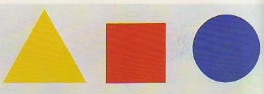
Color harmonies are easy enough for a kindergartener to understand, but devilishly difficult to apply in paint.
 |
|
Landscape at Saint-Rémy (Enclosed Field with Peasant), 1889, Vincent van Gogh, courtesy Indianapolis Museum of Art at Newfields |
In music, an accidental is a note that is not part of the scale indicated by the key signature. (The sharp, flat, and natural symbols mark them, so those symbols are also called accidentals.) Accidental notes make music more beautiful, complex and intriguing.
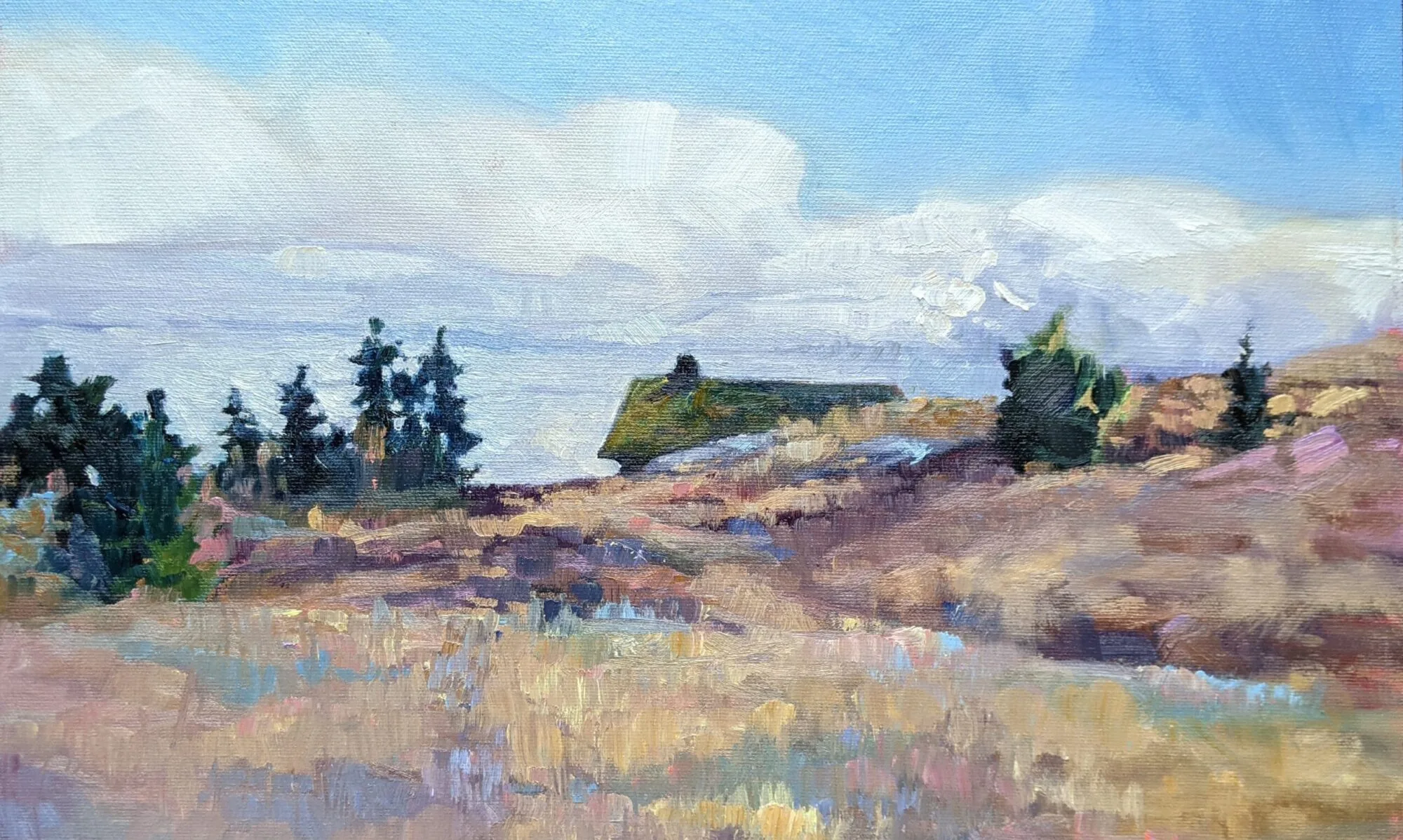
In art, we sometimes work within structured color in the form of color harmonies. But too strict a reliance on color harmonies may result in static painting. We need to deviate from these strict concepts with the addition of other color notes. I call these ‘accidental colors.’
 |
|
Half-Length Portrait of a Lady, Francis Campbell Boileau Cadell |
Color harmony isn’t a simple question of matching up complements or a triad. We respond to color emotionally and cognitively, just as we respond to music. We’re influenced by our age, gender, mood, culture, and our learned responses. Then there’s the question of context. Fashion has always played a big part in color awareness, as has the availability of pigments. In that the healthy human eye can perceive millions of variations of color, it’s impossible to quantify every possible combination.
 |
|
The Yellow Curtain, 1915, Henri Matisse, courtesy Museum of Modern Art |
When I was young, I learned that red was the color of rage, blue of calm. That was based on Wassily Kandinsky’s Concerning the Spiritual in Art. Kandinsky was under the influence of a 19th century cult leader, Madame Helena Blavatsky, and everything he wrote about color was total hokum, but it continues to be parroted to this day.
I mention this because there’s no real ‘science’ behind color harmonies as we currently perceive them, any more than there is behind the scales we use in Western music.
 |
|
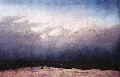
Moonrise by the Sea, 1822, Caspar David Friedrich |
Still, there are color harmonies that appear to work, so we continue to use them. They’re easy enough for a kindergartener to understand, but devilishly difficult to apply in paint. Two errors I commonly see are:
- Thinking that the color harmony you chose includes the only colors permissible in your painting, so you don’t put other colors on your palette;
- Thinking that the colors you chose are the basis of mixing. That’s just an extreme extension of limited palette.
 |
|
Winter comes from the Arctic to the Temperate Zone, 1935, Lawren Harris |
Most masterworks include color notes that are outside the strict color harmony chosen by the artist. When they don’t, it’s to set a mood, for example with nocturnes and sunset paintings.
This post originally appeared in August of this year, but I’m teaching on the subject again this week, so here it is!
