Throughout history, artists have subjected the human figure to canons of proportion. That means they’ve overridden what they see, in favor of what they think is beautiful or graceful. In fact, in some cultures (classical India, for example), drawing from life was not considered an advantage. And until the age of photography, subjects like squirming infants were difficult to draw.
Every flourishing culture has developed its own canon of proportion. The best known examples are the art of ancient Egyptand classical Greece, both of which had rigid standards of what was true and beautiful.
 |
|
Vitruvian Man, illustration in the edition of De Architectura by Vitruvius; illustrated edition by Cesare Cesariano, Como, Gottardus da Ponte, 1521 |
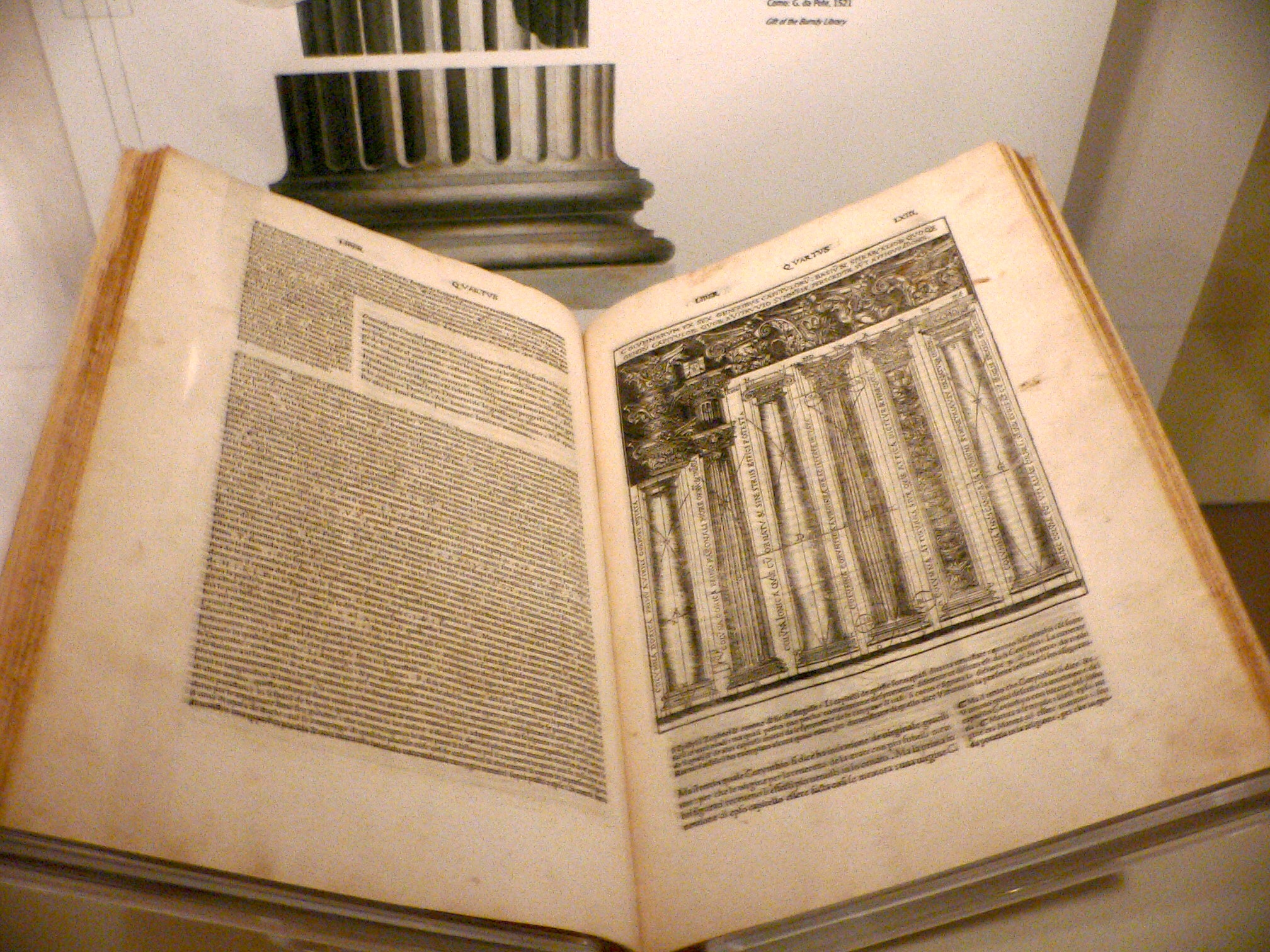
Marcus Vitruvius Pollio was a Roman architect and civil engineer whose ten-volume de Architectura profoundly influenced Roman building. He believed that beauty derived from nature, with universal laws of proportion and symmetry. He carefully measured the human (male) body, thinking it a model of natural proportional perfection. He demonstrated that the ‘ideal’ human body fitted into both a circle and a square, which illustrated the link between perfect geometry and the perfect body.
Leonardo da Vinci drew Vitruvian Man as a sort of rebuttal to this, since he knew there was no way the circle and square could have the same midpoint on the human form. He used his own measurements and idealized them into a system that’s written across his drawing.
His is, at least to modern eyes, a more beautiful scheme; compare it to an illustration from the 1521 version of de Architectura, which bears an uncomfortable resemblance to a crucified man.
Fast forward to our own times and our own canon. We’re taught that the human form is between 7.5 and 8.5 heads tall. As a child, I learned that the midpoint of the body is the hipbone, that the line from top of head to chin equals the line from chin to nipple line, from nipple line to natural waist, from natural waist to hips, and then an equal distance from there to the feet.
This of course is the measurement of a long-limbed person. A stockier person will have a bigger head, and the measurement will be more like 7 figures tall.
 |
|
Tableau Vivant by German actress Olga Desmond, c. 1908. I’ve taken the liberty of adding the hashmarks to demonstrate how variable those proportions are. |
Of course, what is considered beautiful changes with the generations. Consider the figure of Olga Desmond, a German dancer who performed nude at the turn of the last century. Even making allowances for her head being tipped down, she is significantly large-headed and short-waisted compared to the ideal of the 20th century. Her legs are three head-units long, rather than four.
Idealized proportions are a useful guide, especially when you’re drawing people from imagination. I probably sketched them a few hundred times as a kid, before I had access to models. They’re also useful for checking your work. If your drawing seems way out of proportion, check it against this standard.
But relying on memorized proportions will lead to lazy, generalized, generic drawings. It’s far better to measure carefully.
This is especially true in our polyglot American culture. A society that idolizes both Emily Ratajkowski and Lil’ Kim has no rigid standards of beauty, and that’s a great thing. The only generalization you can make about Americans is that we’re, by and large, well-fed.
Reserve your spot now for a workshop in 2025:
- Advanced Plein Air Painting, Rockport, ME, July 7-11, 2025.
- Sea and Sky at Acadia National Park, August 3-8, 2025.
- Find Your Authentic Voice in Plein Air, Berkshires, MA, August 11-15, 2025.
- Immersive In-Person Fall Workshop, Rockport, ME, October 6-10, 2025.


