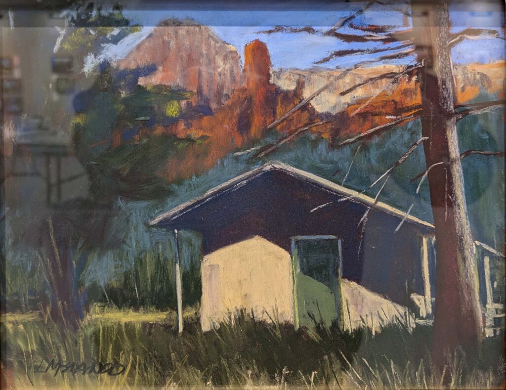
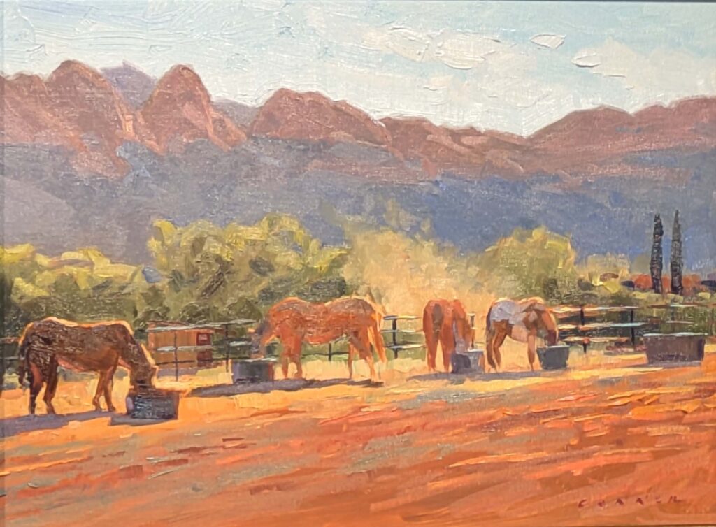
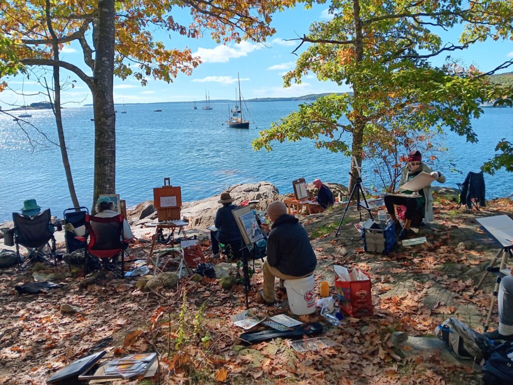
Instead of looking at my paintings, I thought you might appreciate seeing some other work from the 20th Annual Sedona Plein Air Festival. This is hardly complete; some painters hadn’t hung much work before I shot these photos.
What interests me in painting? Color, composition, and a unique viewpoint. This is a smattering without critical analysis, but I hope you enjoy it.
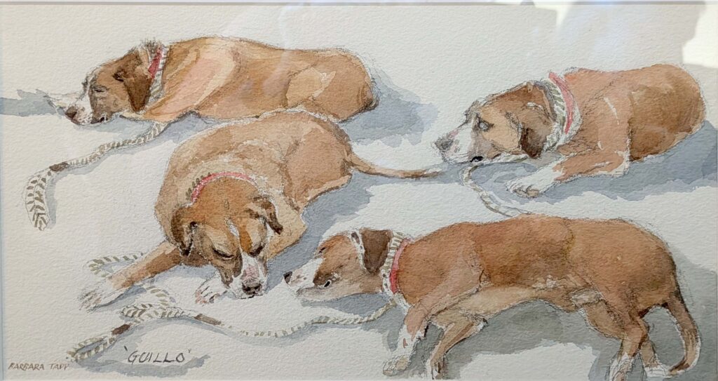
Guillo, Barbara Tapp. Of course I love it; that’s my dog!
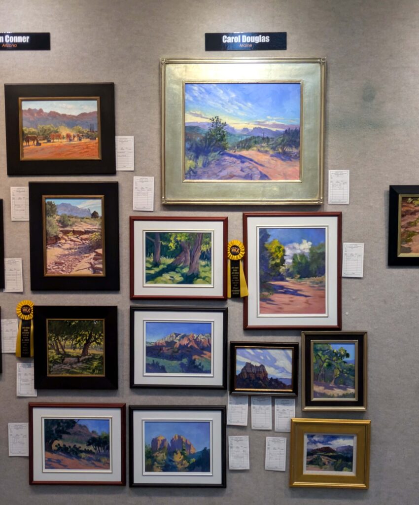
Here is my wall of finished paintings. As you can see, I’ve encroached on Tom’s space. Tomorrow I’ll choose my three favorites for judging, and I’d love to hear your opinion.
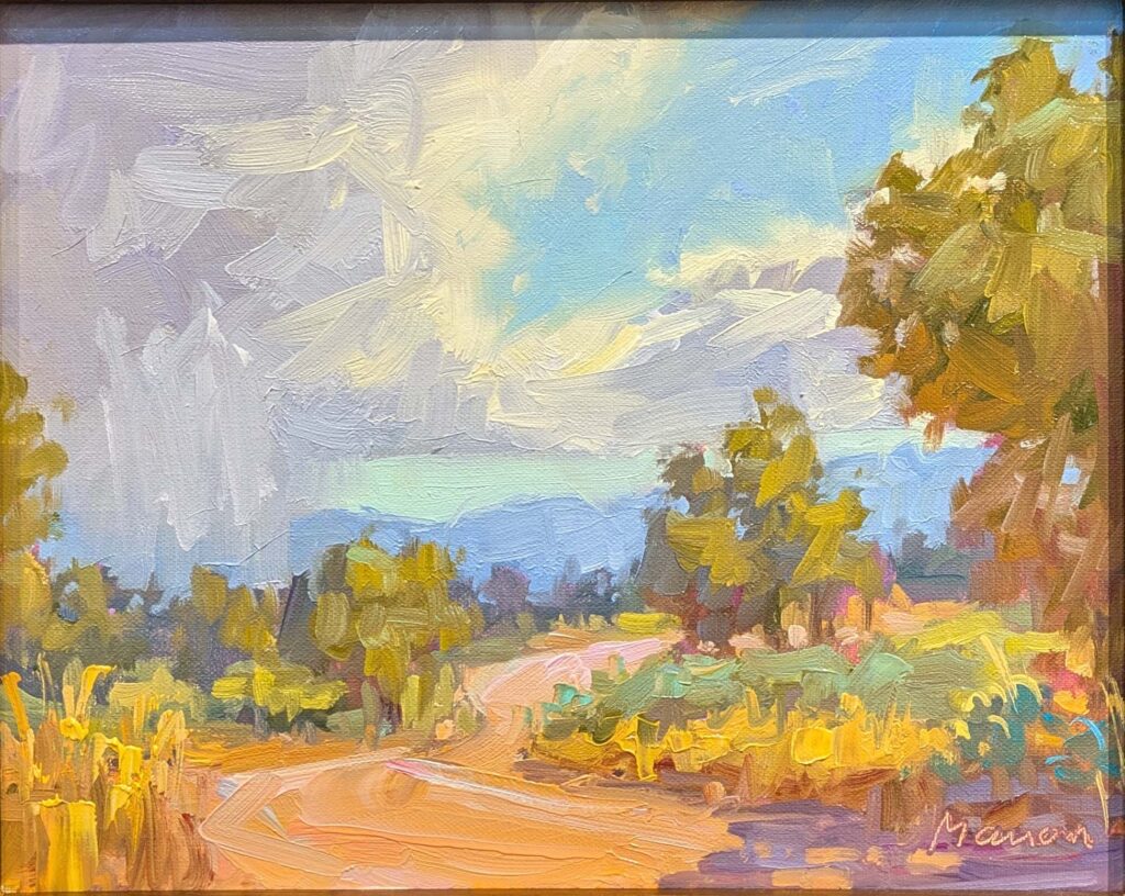
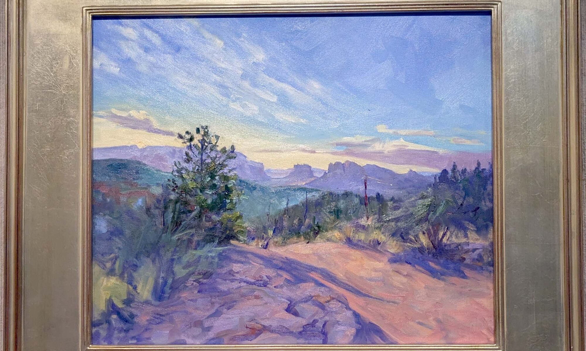
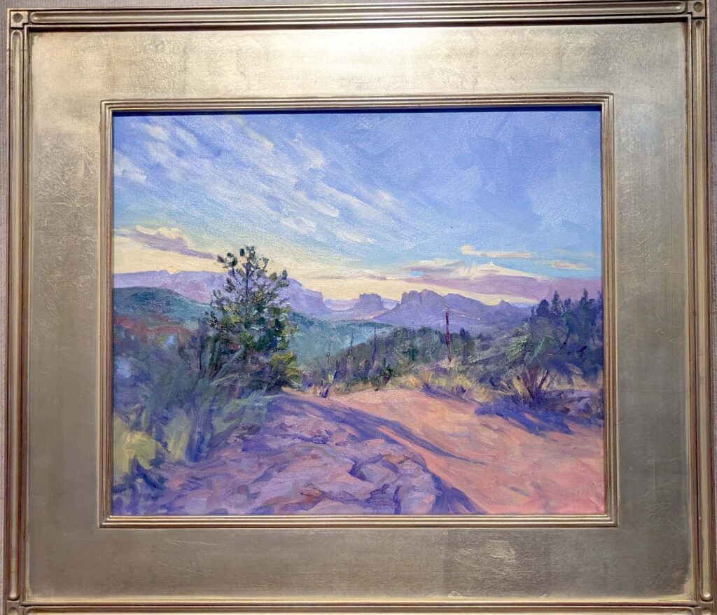
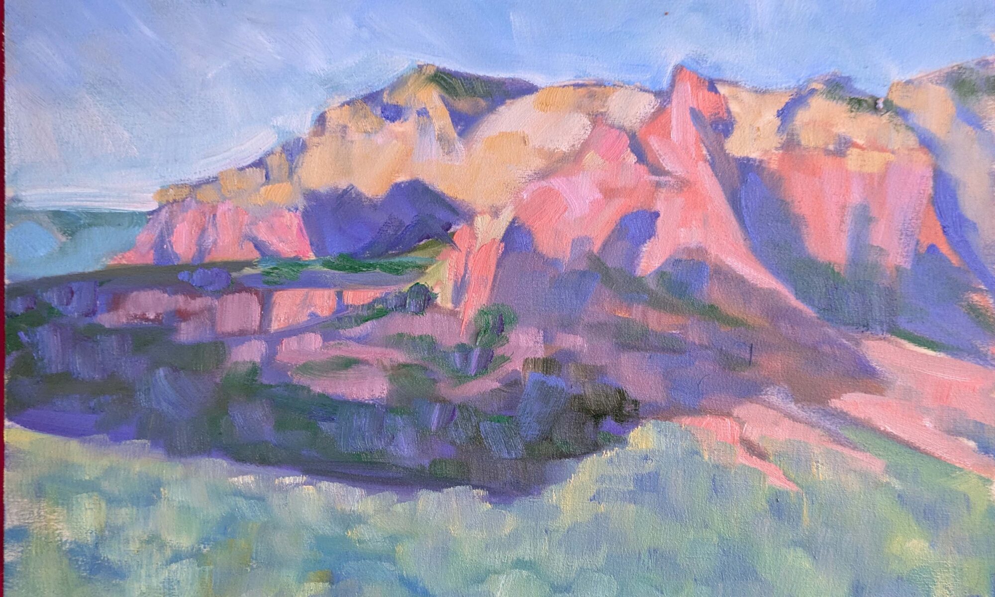
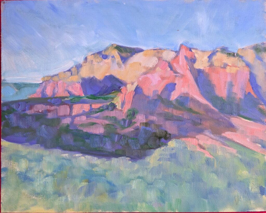
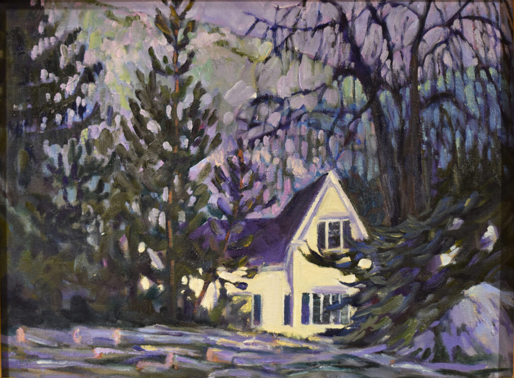
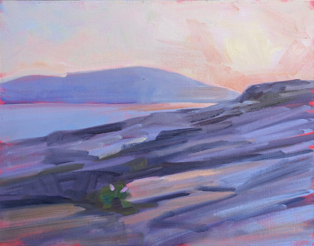
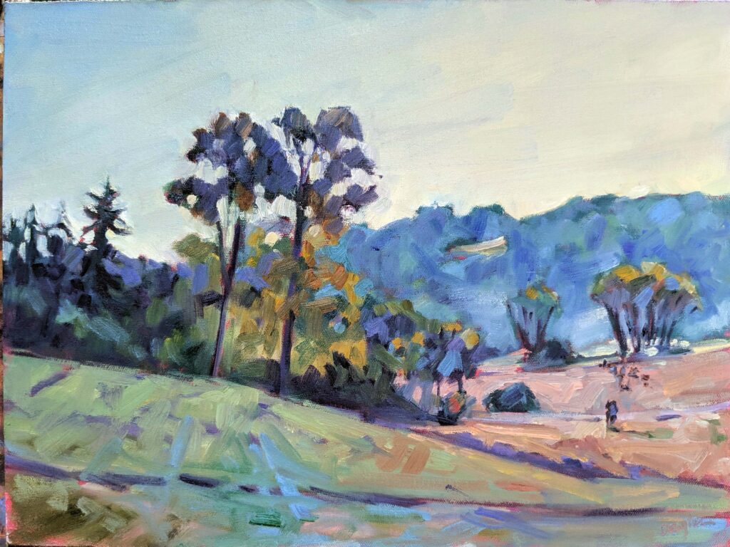
Dawn on Upper Red Rock Loop Road, 20X24, oil on canvas, available through Sedona Arts Center. Please excuse the awful photography. I haven’t remembered to photograph any of these before they were framed and hung.
Years ago, I took a master class from a nationally-known painter, through a nationally-known art institute. After a day, he asked his monitor, “who let these people in?” It was rude, but I saw his point. No effort had been made to ascertain whether students were competent to take a master class.
It was a waste of time and money for all involved. Neither the beginners nor the advanced painters benefitted, and the instructor was frustrated. (Not that I’m certain he had a lesson plan, but that’s another issue.)
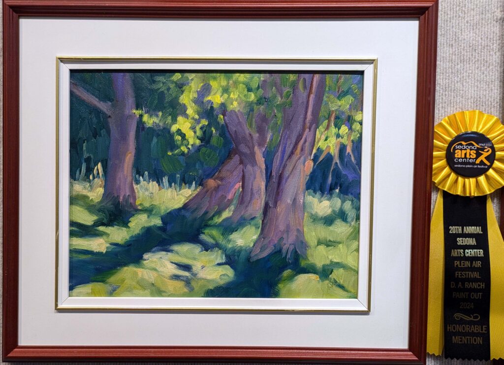
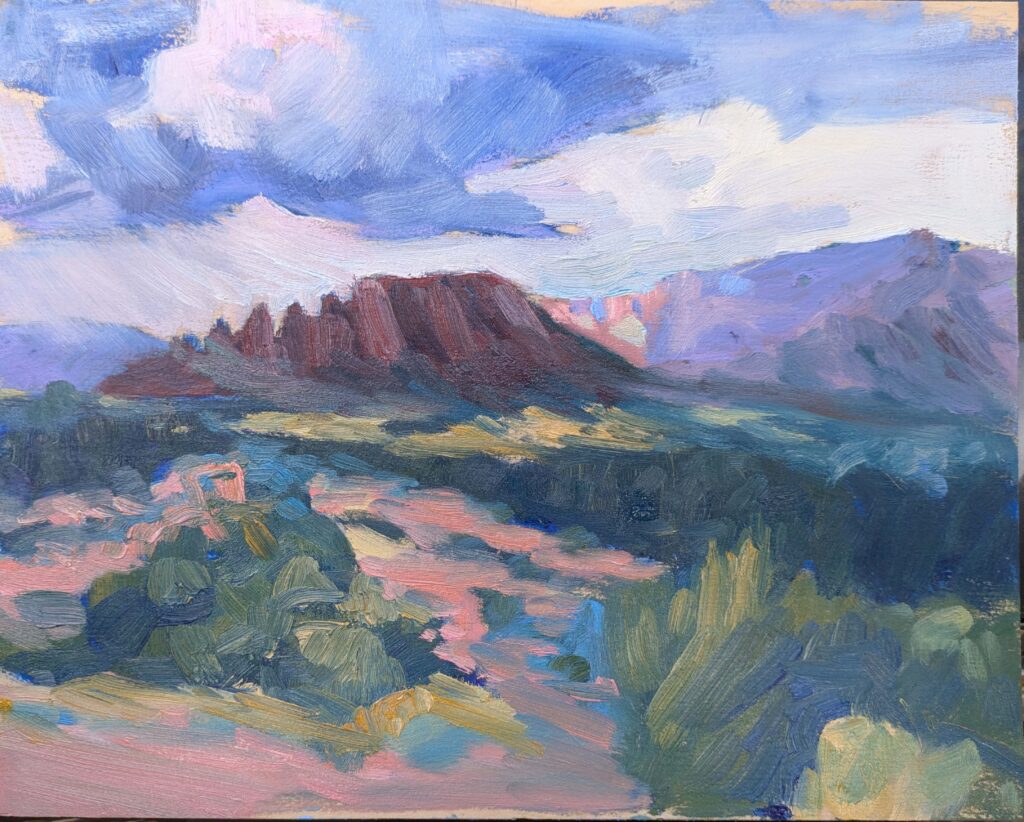
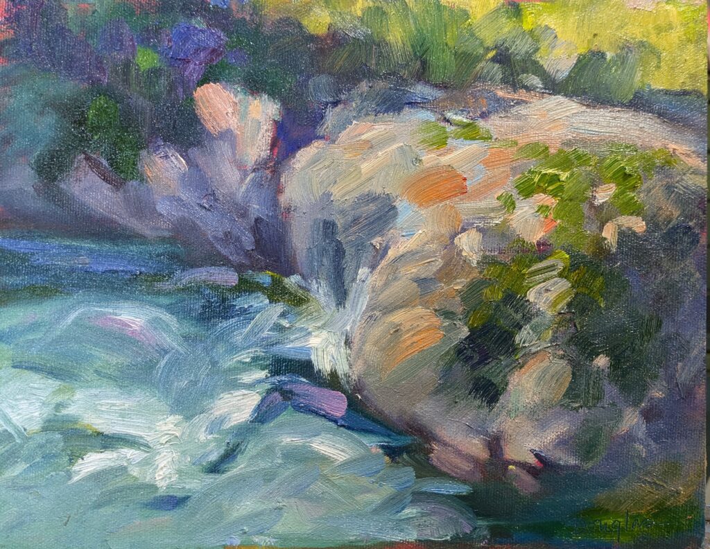
I honestly can’t remember the title, but they were three cottonwood trees casting magnificent shadows. Available through Sedona Arts Center. And, yeah, I won an award.
I’m teaching an advanced painting workshop next June, and I don’t want to repeat that mistake. I’m reviewing portfolios now. I hate hurting people’s feelings, and I know that some people will find the portfolio review process painful. However, I owe it to everyone to be straightforward. All my workshops benefit students at more advanced levels. Many professionals (by which I mean people who are regularly selling paintings) have taken them and benefitted. However, this particular workshop is directed toward people with a specific foundation in process and design.
This was a very enjoyable painting to do. They’re cottonwoods along the Verde River. Am I in a tree mode? I think so. Available through Sedona Arts Center.
What am I looking for in an artist portfolio?
Are the fundamental orders of operations of painting (which differ for different media) understood and respected?
Does the artist understand color theory?
Does the artist understand the fundamental rules of composition?
Is there mastery of technique?
Is there a coherent value structure?
Is there developed brushwork?
Is there consistency?
Don’t let that intimidate you
I’ll be absolutely honest with you about whether you should take this workshop or another one, but don’t let fear dissuade you. Many of you are finer painters than you realize.
I had an epiphany courtesy of Laura Bianco this week. She has been telling me for several years that she doesn’t care about the judging, or the competition. I found that difficult to understand until today. I suddenly realized that all that matters is that I’m here. Considering how long it’s taken me to arrive at that home truth, I can’t expect you to suddenly buy into it, but I promise I’ll write more about it later.
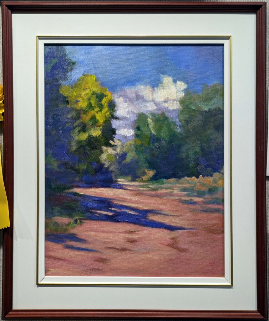
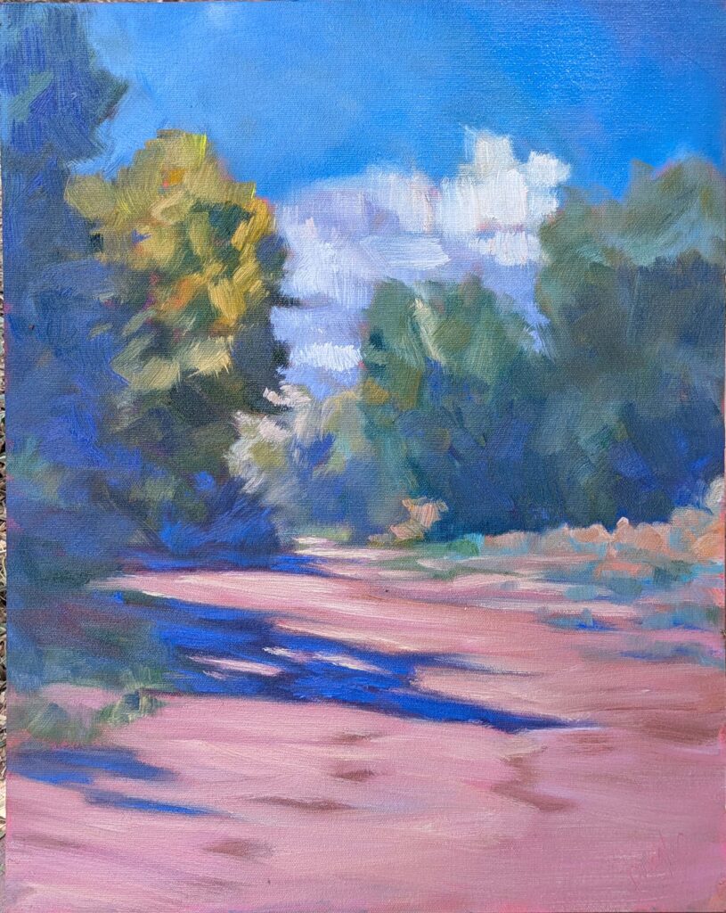
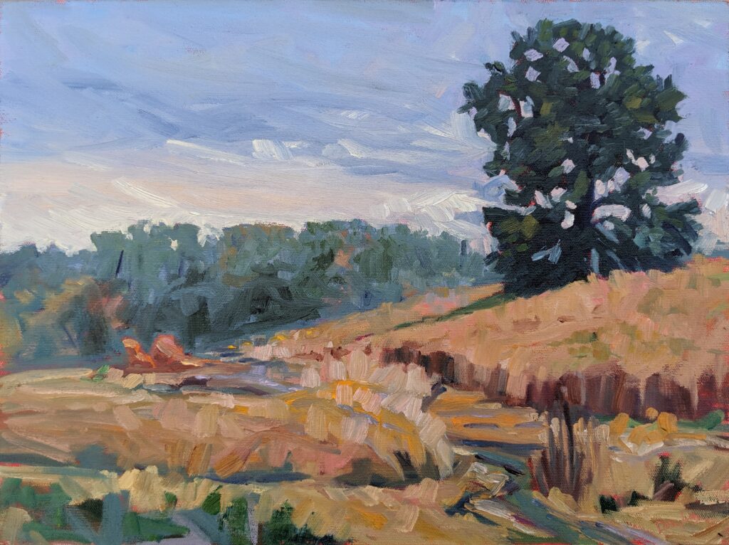
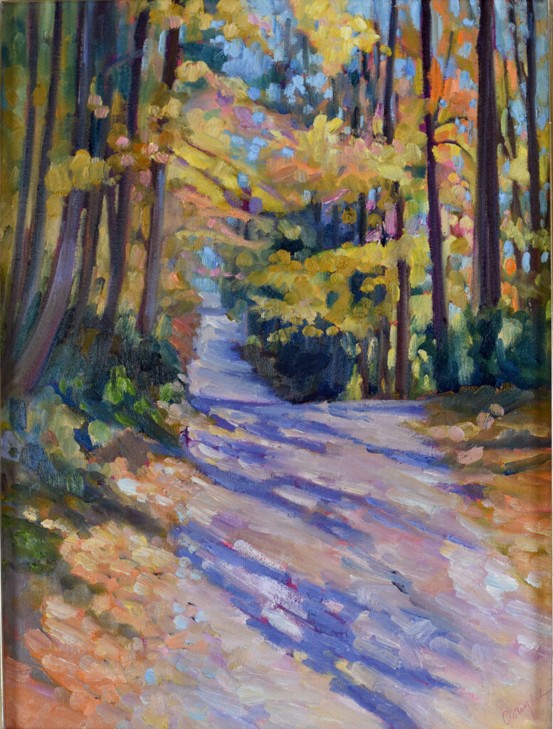
Country Road, 14X18, available through Sedona Arts Center. This is my favorite painting so far.
However, cut me some slack, timewise
I’m in the middle of a very long event, the 20th annual Sedona Plein Air Festival. I’m trying to get to emails and texts, but it’s an uphill slog. I spent 14 hours (you heard that right) on Dawn on Upper Red Rock Loop Road this week, and I’m beat.
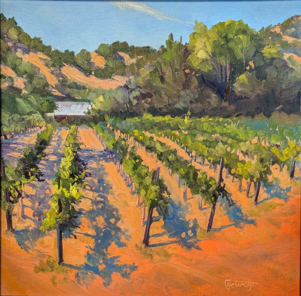
Country Road, 14X18, oil on archival canvasboard, available through Sedona Arts Center.
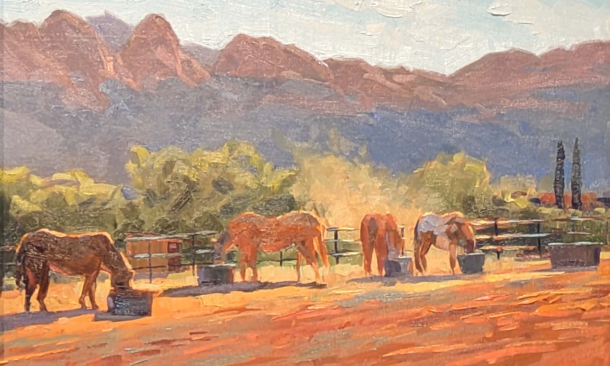
There is something about Casey Cheuvront and Upper Red Rock Loop Road. Last year, a woman parked herself in front of Casey and gave her clients a long spiel about the magnetic energy of the rocks, while rolling magnets around on a metal plate. Another guide occupied the same spot to talk about ley lines. It’s distracting to have people looming in front of you, obscuring the view.
On Saturday evening, Casey, Ed Buonvecchio and I set up to paint the sun dropping over Sedona. We were careful to follow the etiquette of a plein air festival, which includes:
Snoopy in the shade, 8X10, oil on birch, available through Sedona Arts Center.
Respect the venue, and follow any rules;
Don’t disturb others’ enjoyment of the natural surroundings;
Don’t plant yourself in the middle of a path;
Clean up after yourself;
Engage with interested passers-by;
Be considerate of other artists. This means giving fellow artists space to work, and not getting in their sightlines.
Casey was tucked into the shadow of a juniper, painting the sunset. A swarm of photographers suddenly surrounded her. It was a workshop. Despite there being tens of thousands of acres of open land around us, and paths leading in every direction, they were packed so tightly around Casey that she didn’t have room to move.
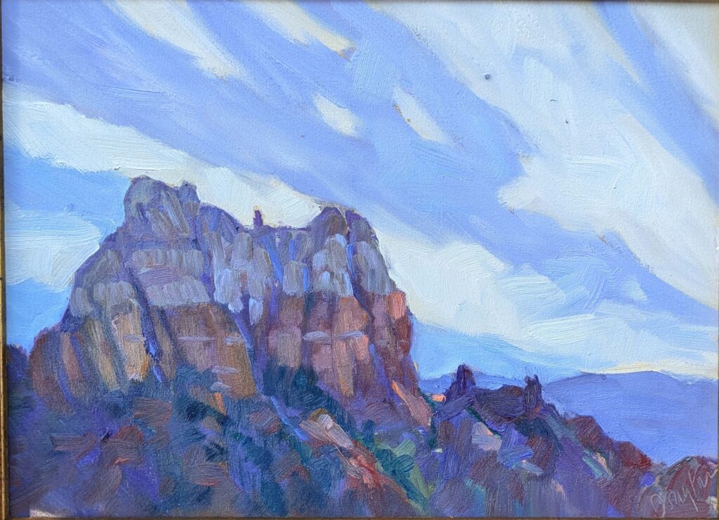
Hailstorm over Coxcomb, 9X12, oil on archival canvasboard, available through Sedona Arts Center.
“Do you mind?” the instructor asked. “We’ll only be a few minutes.” Forty minutes later, they finally shoved off, but the light, and the moment, had passed.
It all starts with drawing
“You don’t always do a value drawing, do you?” Ed asked me. On the rare occasions when I skip one, I regret it.
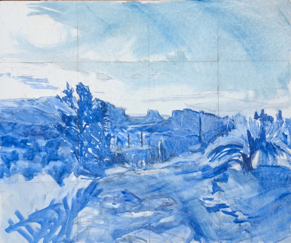
Unfinished painting of dawn. I spent a morning sketching options, a morning transferring my best sketch by grid. I’ll start adding color this morning.
I’ve been going out at 6 AM to paint the dawn. In two days, I’ve done several sketches and gotten my final idea transferred to canvas. (I still have some foreground issues to work out.) My canvas is gridded because, yes, I do a value drawing and then transfer it to my canvas.
That proved very handy last evening as the shadows changed by the minute. I was able to reference my drawing when the light had gone. When you think you don’t have time for a value drawing is when you need it most.
Painted at the speed of light, 11X14, oil on birch. I haven’t decided if it’s finished.
Show ponies
Hadley Rampton and I were sitting on a fence watching the scrum at our first quick-draw. “I think plein air festivals are like the rodeo,” I mused. “We all know each other, we all go around the same circuit, we compete for the same prizes.”
“I’ve thought about that,” she responded, “but I think we’re more like show ponies.”
And on that note, I’m off to paint the dawn again. I’m sorry these missives are so brief, but plein air festivals mean long days of painting.
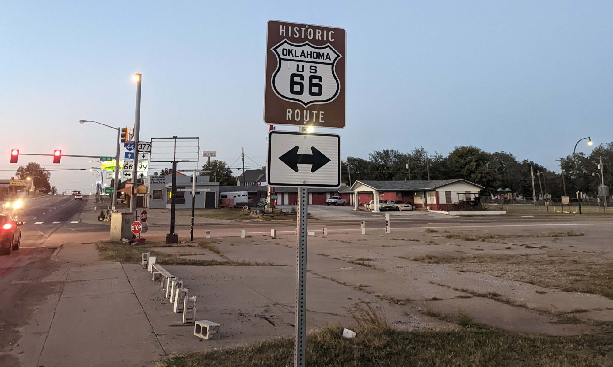
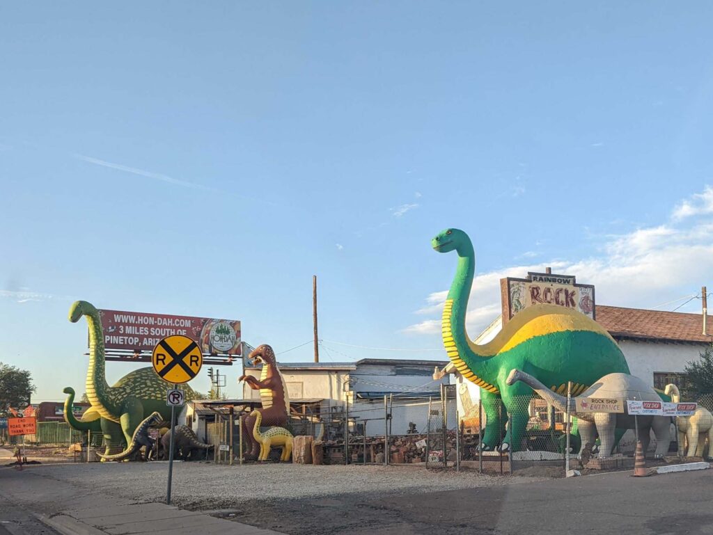
For much of its route, Rt. 66 has been obliterated and bypassed by I-40.
There are around 35 cities named Springfield in the United States, and I feel like I’ve been through most of them this week.
In fact, I only bagged five: Massachusetts, Ohio, Illinois, Indiana, and Missouri. I’m in Sedona, AZ for the 20th Annual Sedona Plein Air Festival, after driving more than 3000 miles in 4.5 days.
I asked the internet why Springfield is such a popular place name in the US, and the answers were all over the map. Springfield, MA was a major manufacturing area during much of our push westward, and so the name might reflect the optimism that one’s little settlement could be another powerhouse community. Or, they might have been named after the 16 Springfields in Great Britain. In some cases, there may even have been springs located in fields.
Holbrook, AZ, where I turned south for Phoenix, is a lovely pocket of mid-century Americana.
Springfield, Illinois is forever associated with Abraham Lincoln, and although I didn’t stop at his National Historic Site on this trip, I’ve visited it before. I missed his boyhood home in the Pigeon Creek Community, and I regret sailing past the Petrified Forest National Park at dawn. But needs must when the Devil drives, which my husband might think is preferable to my lead foot.
I did take a few minutes to drive down legenday Rt. 66 through Tucumcari, NM. It was a disappointment. Much better midcentury charm was to be had in Holbrook, AZ, and it was right on my way to Phoenix.
On that note, I’m off to get my boards stamped for the festival, and I’ll see you all on Monday.
Deadwood, oil on linen, 30X40, $5072.00 framed, includes shipping and handling in continental US.
“Non-creatives underestimate how much time we spend on non-creative tasks to support our creative output,” artist Cheryl Shanahan recently told me. She was varnishing paintings at the time, but I’ve been thinking about her comment this week. I’m in the middle of a 41-hour drive from Rockport, ME to Sedona, AZ for the 20th annual Sedona Plein Air Festival.
“But that’s on you, Carol,” you may be thinking. Over the past three years, it’s taken 24 hours for me to travel by air from my house to my friends’ house in Phoenix. That includes getting up in the middle of the night to drive down to Portland, layovers, and time spent foozling around renting a car. Driving may add another 16 hours, but when I get there, I have my own car, my own dog, and even my own chair.
And, rather annoyingly, last year my entire painting kit (retail value, ~$600) disappeared somewhere between Sky Harbor’s car rental return and my gate.
Beautiful Dream, oil on archival canvasboard, $1449 framed includes shipping and handling in continental US.
Two winters ago, my son and I contracted COVID in West Yellowstone, MT. Given a choice of feeling horrible in a hotel room for ten days or driving home and feeling horrible in the car, we elected to zip back to his apartment in New York, taking turns sleeping and driving. I learned a few things on that trip, including that COVID is slightly less horrible in a car than in my bed. Just as importantly, America is prettier on the ground than from the aisle seat of a plane.
I’m not planning on getting sick on this trip, but I still had a lot of prep work to do before leaving. That included closing my gallery for the season and wrapping and storing paintings. I won’t be home until early November, after all. In addition, I prepared archival painting boards, matched them to frames, made sure I had enough paint, and sorted and packed my tools and clothes.
I’m luckier than most because I have a 3-day-a-week administrative assistant. But even with that, non-creative tasks often threaten to swamp me. In addition to the Cheryl’s varnishing and my travel, here are some of the things professional artists do that you never see:
Preparing classes and workshops: I love teaching, both on Zoom and in person at workshops, but there’s a lot of lesson planning involved. Some of my students have been with me a long time, and I refuse to feed them warmed-over instruction.
Marketing and Promotion: I’ve had to learn things like SEO the hard way. While Laura manages my promotional materials, website and Google visibility, this blog is still 100% written by me, three days a week. The oldest posts on this platform are from 2007; I don’t know how much earlier I started it.
The Wreck of the SS Ethie, oil on canvas, 18X24, $2318 framed, includes shipping and handling in continental US.
Boring old admin: Someone has to read contracts, invoices, and routine emails. Worse, someone has to file state and Federal tax forms.
That includes paying the bills and keeping accurate records, which I do twice a month.
Art handling: Preparing artwork for exhibition includes framing, packaging, and transportation. And you don’t necessarily do it just once—frames get damaged in transit, or by people knocking into them. And they go in and out of style.
Documentation: We used to send work to professionals to be photographed and wait to get slides back. The modern artist photographs his or her own work and maintains records of sales and exhibitions.
Midnight at the Wood Lot, oil on archival canvasboard, $1449.00 framed includes shipping and handling within continental US.
“How long did it take you to do that painting?” is one of the most common questions we’re asked. We like to answer, “a few hours, plus the sixty years I’ve spent learning my craft.” A more accurate answer would include all that back-office work that you, the buyer, never see at all.
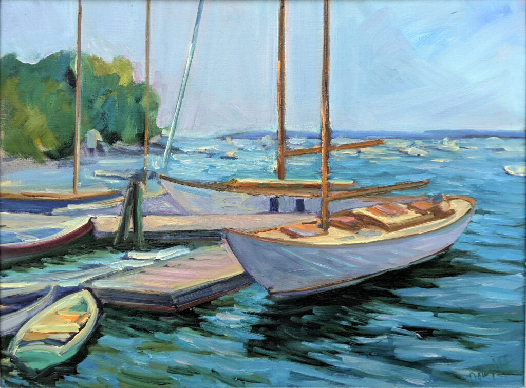
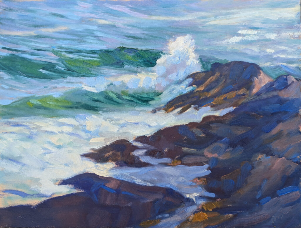
Surf’s Up is 12X16, on a prepared birch surface. $1159 includes shipping and handling in the Continental US.
Sea and sky
“You’ve used the term stochastic process twice this week,” one of my students told me. “What does it mean?” It means that the outcome is random, but vaguely predictable. There are too many variables to know exactly what’s going to happen.
Waves are an example of a stochastic process. Sitting on the shore and watching how they repeat, we realize they’re never exactly the same. But they’re close enough to see general patterns.
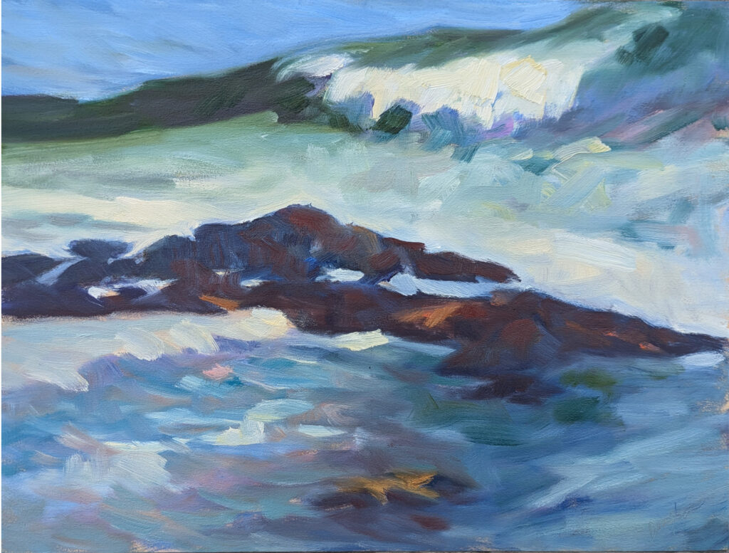
High Surf, 12X16, oil on prepared birch painting surface, $1159 includes shipping and handling in continental US.
Waves are generated by wind interacting with the surface of the water. Variations in wind speed, direction, and duration create a range of wave heights, patterns, and surface textures. Waves often interfere with each other, leading to more complex patterns.
Add to that the tide, currents, and the impact of storms. Science can model an average wave, but it can never tell you what the next wave is going to look like.
That’s why it’s so helpful to paint waves from life. In real life, you can bend them to your wishes, making them subservient to composition. In photos, moreover, there are ellipses and borders that are invisible to the naked eye.
The problem with copying these borders and ellipses in a painting is that they’re generally too fast to be seen with the naked eye.
Clouds are another natural phenomenon that is stochastic. Their formation is influenced by atmospheric conditions including temperature, humidity, and wind patterns. These often change rapidly and unpredictably, and that skews clouds’ shapes, sizes and densities. Topography also influences cloud formation, which is why I’m more likely to see a lenticular cloud in Wyoming than at my house.
Again, that’s helpful to the artist. Assuming you have the fundamentals right, cloud distribution can be a compositional element.
Sunset over Cadillac Mountain, oil on archival canvasboard, $869 includes shipping and handling.
Fractals
A fractal is a complex geometric shape that can be split into parts, each of which is a reduced-scale copy of the whole. Fractals are endlessly complex; you can continue to zoom in and discover new patterns without ever reaching a smooth or simple edge. Fractals are found in many natural phenomena, including:
The branching pattern of trees right down to twigs and leaves;
The crystalline structure of snowflakes;
The irregular shape of coastlines;
The rough, jagged profiles of mountain ranges;
The branching pattern of lightning;
The fronds of ferns.
Fractals, by the way, are why nobody can ever tell you the exact length of the coastline of Maine. The smaller the unit you use to measure, the more inlets and points there are, so the distance just seems longer and longer.
The pine nursery (Madawaska Pond), 12X16, oil on canvasboard, available.
Spirals
A spiral is a curve which emanates from a point, moving farther away as it revolves. Many sea and snail shells are logarithmically spiral, as are many plant parts, including sunflowers and pinecones.
There are spiral galaxies, and hurricanes follow a spiral pattern. Of course, our own DNA is a double helix, which is a double spiral.
The Fibonacci Sequence gives us a spiral that’s been used as a compositional tool for centuries. It’s closely related to the Golden Ratio. They both work because they divide space in ways that’s not easy for the human mind to parse.
Fooled you
Are you one of those artists who ‘can’t do math’? You’ve just followed three mathematical concepts. They didn’t hurt you one bit, and they’re important for observing and representing nature.
Autumn farm, oil on canvasboard, $1449 framed includes shipping and handling in continental US.
This evening marks the end of my 2024 gallery season. I’ll be celebrating with a reception for my current workshop students from 4-6, and I’d love to see you. On Saturday, I’ll dismantle the gallery, and on Sunday, I’ll head west for the 20th Annual Sedona Plein Air Festival.
Among my end of the year reflections is the realization that our stellar autumn is balanced by simply ghastly weather elsewhere. There’s been horrific loss of life and property during hurricane season and a nasty heat wave in the west.
Autumn Farm, Evening Blues, oil on canvasboard, $1449 framed includes shipping and handling in continental US.
Although there’s a definite nip in the air most mornings, this autumn has been glorious in the northeast. The dryness has meant that the tapestry of color has emerged early and brilliantly. We’re at that beautiful moment when leaves range from lush greens to amber, crimson and gold. The air is crisp and invigorating and carries a whiff of woodsmoke and fallen leaves.
None of that should preclude my praying for my Southern friends.
It’s cold enough that I’ve started lighting the woodstove at night, but we haven’t had a frost. And it’s apple season, so I’m baking an apple cake for tonight’s opening. It’s my mother’s recipe, and it’s reliably good.
Why am I closing now, when things are so lovely here? I’ll get back from my perambulations just before the holidays, during which we humans never seem to rest. But just as nature needs a dormant season in which to rest, so do we Maine artists. We’ve been flapping hard all summer. I’ll take those few weeks before Thanksgiving to reassess and reflect.
Beauchamp Point, Autumn Leaves, 12X16, oil on archival canvasboard, $1449 framed includes shipping and handling in continental US.
End of the year reflections
“Work smarter, not harder,” is something I’ve never really understood. I’ve worked as intelligently and as hard as I could. However, this year I turned 65. Although I have no intention of retiring, I’m finding my usual pace is more punishing than it was ten years ago.
That makes me evaluate what I’ve been doing. What benefits you and me the most? What is busy work? Do I have enough time to paint, or am I focused so much on teaching that I’m forgetting my first love? Is it fair to my family and friends to work nonstop every summer?
Just in case you think those colors can’t be real, here are my chickadees painting on Beauchamp Point on Tuesday.
Every opportunity comes at a cost. For example, in 2024, I taught a lot, but that meant I didn’t do many openings. Traffic in my gallery suffered. I need to do a cost-benefit analysis of each aspect of my business.
By the way, none of this end-of-the-year reflection means I’m cutting back on my blog. I get a lot of joy out of writing it and knowing it helps so many people.
Brilliant autumn day, 9X12, oil on canvasboard, $696 includes shipping and handling in continental US.
How about you?
End of the year reflections are a great tool. If you finished this plein air season without painting enough, you can plan time in your schedule to paint. If you keep doing other things instead, you can join a class or group to hold you accountable. If your spouse keeps interrupting you, you can use the winter months to get him involved in his own hobby. (Just kidding, honey.)
But, really, come out tonight
Student show Richards Hill Gallery 394 Commercial Street Rockport, ME 04856 4-6 PM Friday, October 11, 2024
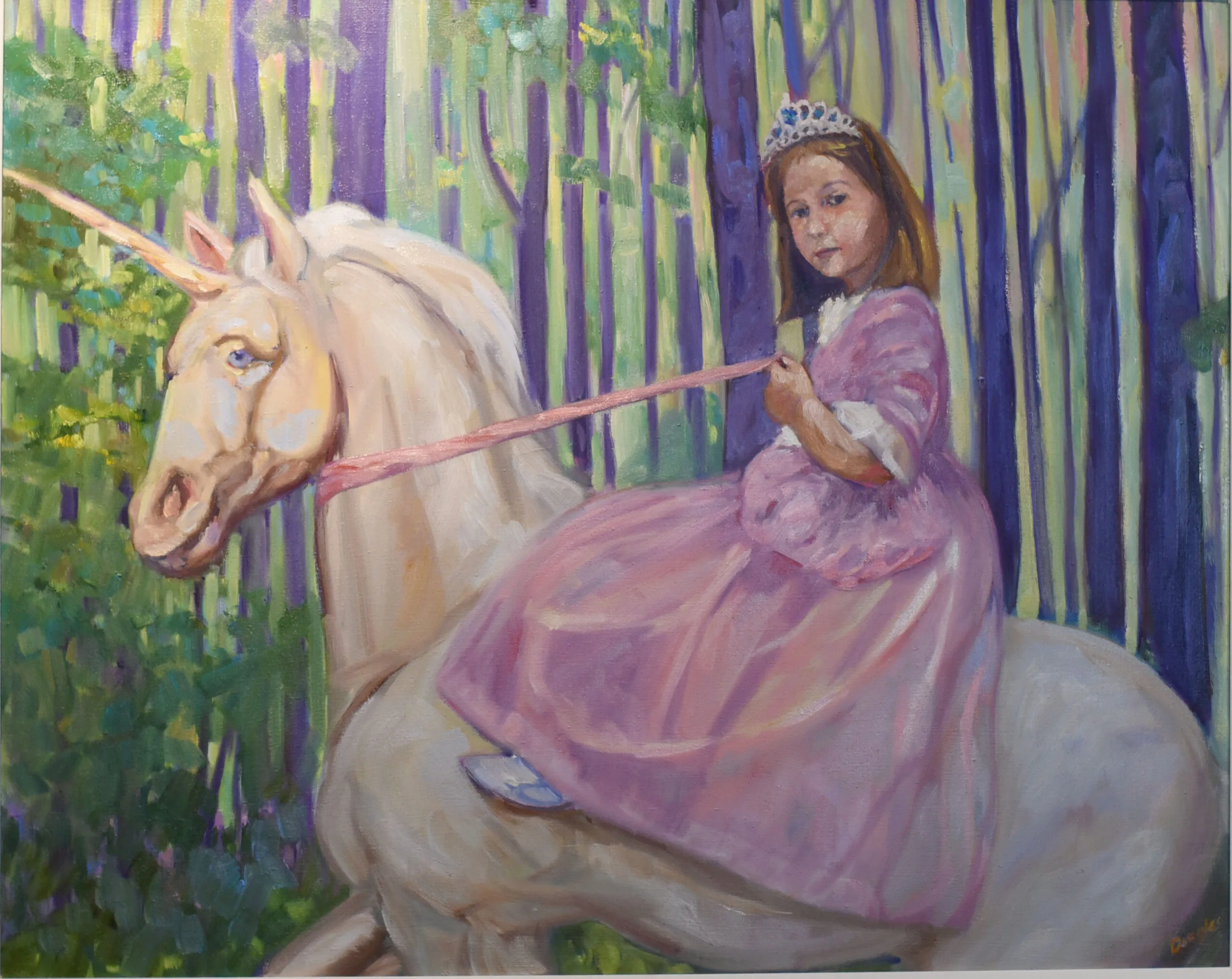
In Control (Grace and her Unicorn), 24X30, $3,478 framed, oil on canvas, includes shipping in continental United States.
Yesterday I spent a few minutes considering a painting that went nowhere in a recent event. Perhaps I should have extended the dark around the wave to make the composition more obvious, I thought. And then stopped myself before I got into a cycle of self-doubt. At its worst, that can lead you to wrecking a perfectly good painting.
My painting has good color, good composition, good line, and good brushwork. That the juror (a fine painter herself) didn’t love it doesn’t reflect badly on the painting; it reflects her priorities in art.
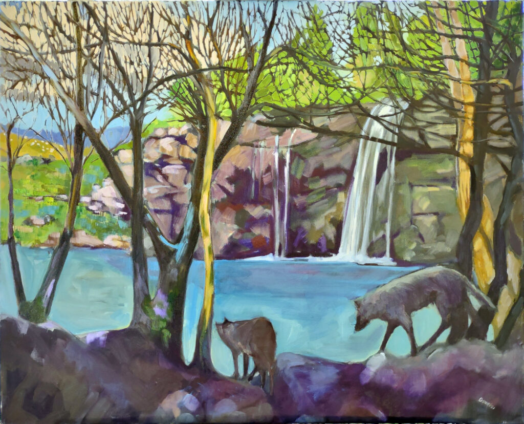
Ravenous Wolves, oil on canvas, 24X30, $3,478.00 framed includes shipping and handling in continental US.
It’s very difficult to not adjust your own thinking to group norms
I left Western New York in part because I can’t paint like a Hudson River School painter. It is a continuous tradition dating back two hundred years, and there’s absolutely nothing wrong with it. I admire it, but it’s not how I see the world.
There is a distinctive Maine style as well: higher in chroma, looser in execution, not as interested in modeling. It’s more painterly than linear. Not only do I like it better, it’s a better fit for me.
As long as I painted plein air in New York, I was subtly pushed toward painting like my peers. How does that happen? Galleries seek it out, jurors award it, painters you admire work that way. Above all, collectors buy it.
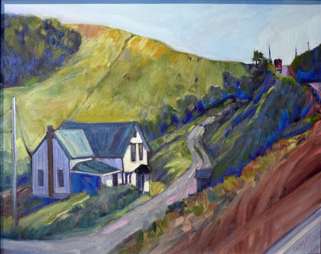
The Logging Truck, oil on archival canvasboard, 16X20, $2029.00 framed includes shipping and handling in continental US.
Why are we such suckers for group norms?
Human beings are social beings. We have a powerful need to belong. This makes us vulnerable to the influence of others. This is called normative social influence, or group norming, and it’s a powerful force in all social units from the family on up.
We’re herd animals. Group norming promotes social cohesion, which confers stability, safety, and harmony. But this cohesion has a cost, and that’s the sacrifice of individualism.
It can be extremely painful to be on the outs with your tribe. Whistleblowing is a prime example; it can lead to demotion, gaslighting, harassment, and the end of one’s career. Consider the story of Lindsey Boylan, the first woman to accuse Andrew Cuomo of sexual harassment. Cuomo was a star of Boylan’s own political party, the winner of an Emmy, the darling of celebrities and power brokers. Boylan was smeared in the press with the release of supposed confidential personnel records. Even Times Up leader Roberta Kaplan, nominally a spokeswoman for sexually-harassed women, colluded with the governor to discredit Boylan. It was not until five other women came forward with similar allegations that Boylan’s allegations were believed. And as recently as last week, there were fans of the ex-governor trying to whitewash her claims.
We give lip service to the idea of “thinking outside the box,” but in fact nobody much likes having their own pet prejudices challenged. Society routinely ostracizes those who dare to be different, and that’s as true in art as much as anywhere.
The Wreck of the SS Ethie, oil on canvas, 18X24, $2318 framed, includes shipping and handling in continental US.
Knowledge is your best defense
This is where a good knowledge of art history proves useful. It allows you to see over the lip of the basket you live in, to see where you fit in the greater scheme of things. If you’re constantly feeling wrong-footed or inadequate, perhaps the problem isn’t with you, but your tribe.
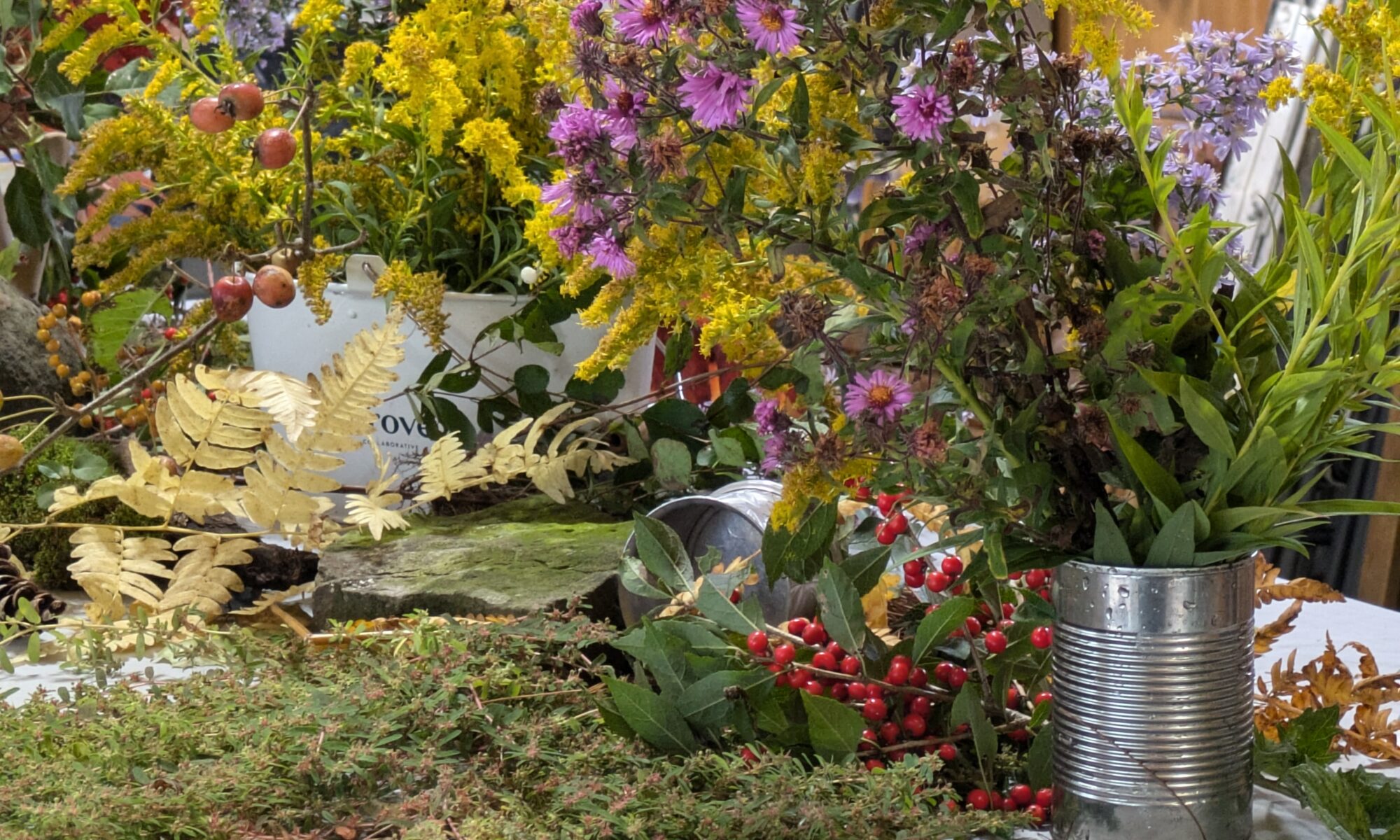
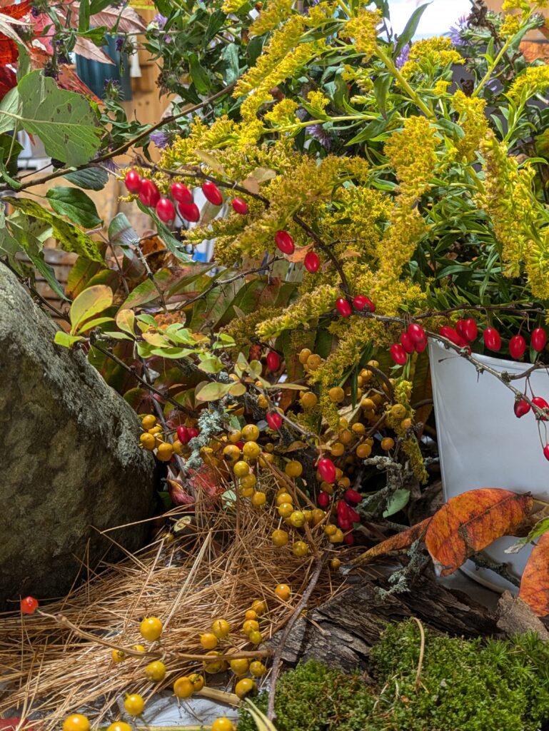
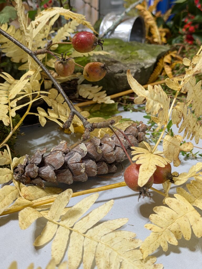
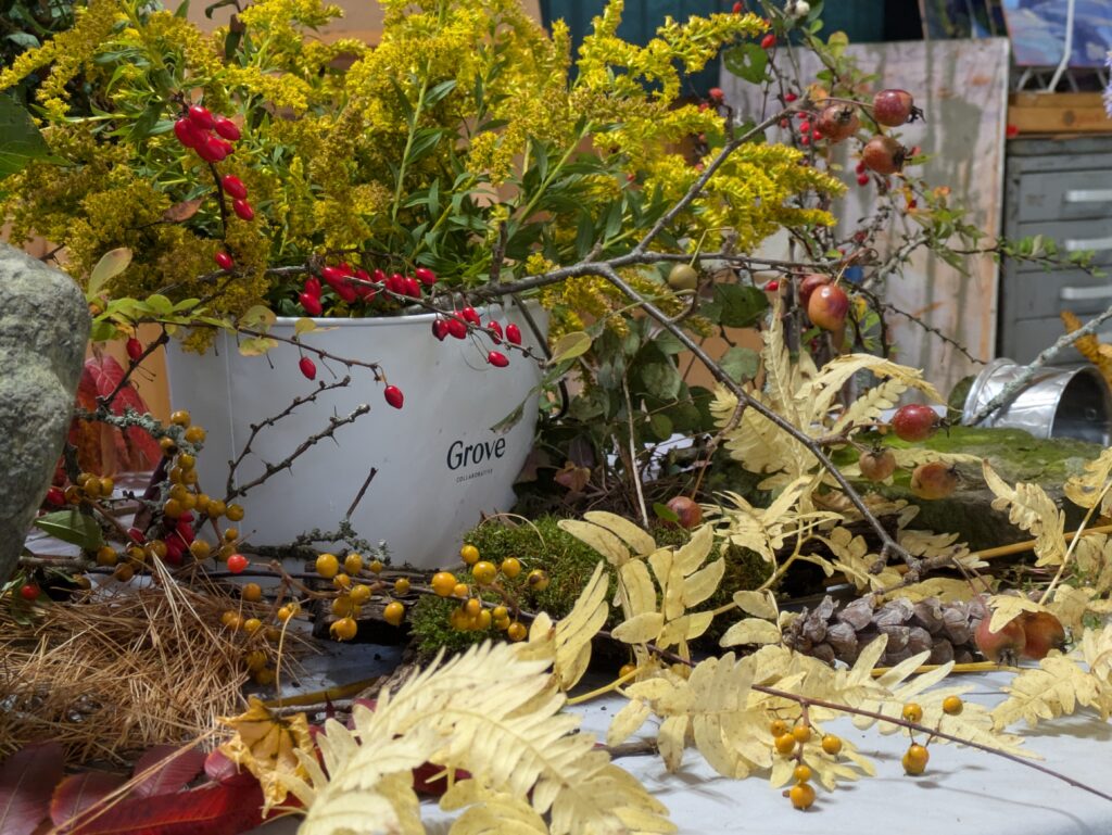
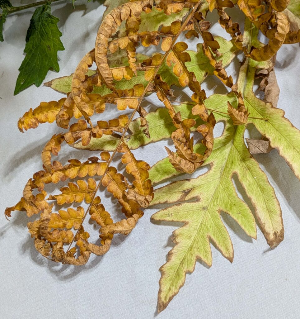
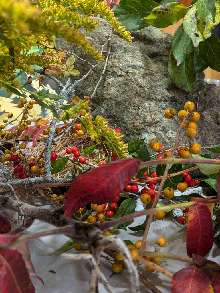
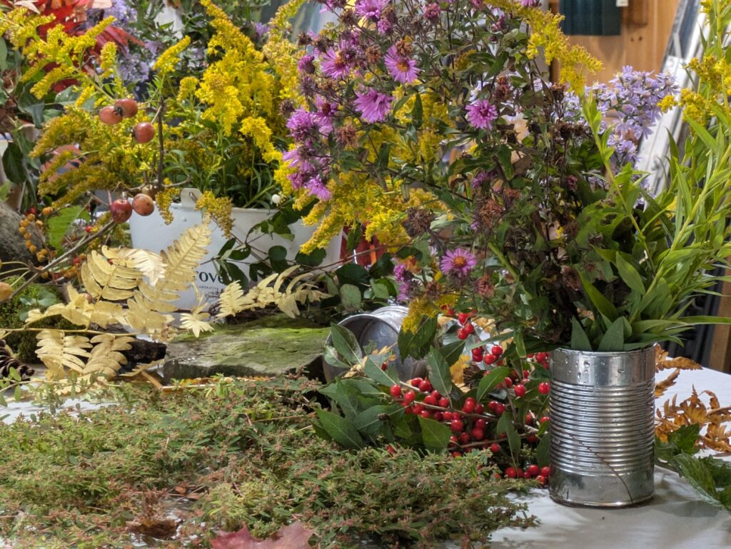
I start teaching my Rockport Immersive workshop tomorrow morning, and our forecast is for 100% chance of precipitation. I have a backup plan. Yesterday, in my amble through the woods, I cut various blossoms and berries.
Setting up a still life is great fun, but when you’re doing it for a roomful of artists, different rules apply. You treat it more like a still-life-scape, from which each painter can pull bits and pieces.
Whether you’re doing it for one or ten people, setting up a still life is excellent training. There was a period in my life where I painted a still life every morning, before I got on to my ‘serious’ work. It’s how I learned to paint with assurance.
Choose Your Objects
My theme for this still life was autumn, “season of mists and mellow fruitfulness.” Formerly, I’ve done still lives based on internet memes, nonsense my kids wandered around singing, or things I like to do. Even a simple book of matches can be an arresting still life.
Get in the mood
In autumn, the mood is lush; easy, peasy. Other still lives may not be so simple. They may be austere, luxurious, absurd or romantic.
The color scheme is an extension of mood. In this case, it’s purple and gold, reds, russets and yellow. If I were doing something romantic, it would be lighter and more ethereal. If I’m being snarky, all bets are off.
A variety of shapes, sizes, and textures is more important than content. That’s why I threw in the pewter and aluminum. In this instance a drape would be overkill, but don’t discount fabric as a shape- and pattern-maker.
Two closely analogous items.
There are times when I’m looking for contrast, and times I’m looking for closely analogous objects.
Composition is key
I spent as much time gathering and arranging this still life as I would spend painting it. True, it’s massive, but in some ways, that makes it easier.
Do you have clearly articulated focal points?
Have you layered objects to create depth?
Is there a good pattern of lights and darks? Warm and cools? A good color pattern?
Don’t be afraid to keep fiddling right through your compositional sketch. You may find better ways of looking at the objects.
Lighting
I prefer natural light when possible, as it gives livelier color and a softer shadow pattern. Positioning your still life near a north window will give you the most stable light, but there are times when strong raking light is appropriate—but you must work faster.
Natural light is not always possible. If you set up artificial lights, don’t put them too close to the subject. Make sure there is fill light in the shadows, and think of the composition mainly in terms of the cast shadows.
Negative space
Negative space is the area surrounding and between the subjects. These interstices define and highlight the main elements, creating balance. Effective use of negative space creates interesting shapes and patterns, draws attention to the main subject, and adds depth to the overall piece.
Some artists use still life shadow boxes. I don’t because they excessively control light and composition. When I paint still life, I just ignore what’s behind it. That gives me the opportunity to create what I want in the interstices. It’s good practice in not being excessively driven by what you see.
Be inventive
I’ve painted pretty absurd still lives, including toilet paper, bubble wrap, bacon and a tin-foil hat. Still life is only as boring as you make it. Don’t be afraid to be weird.
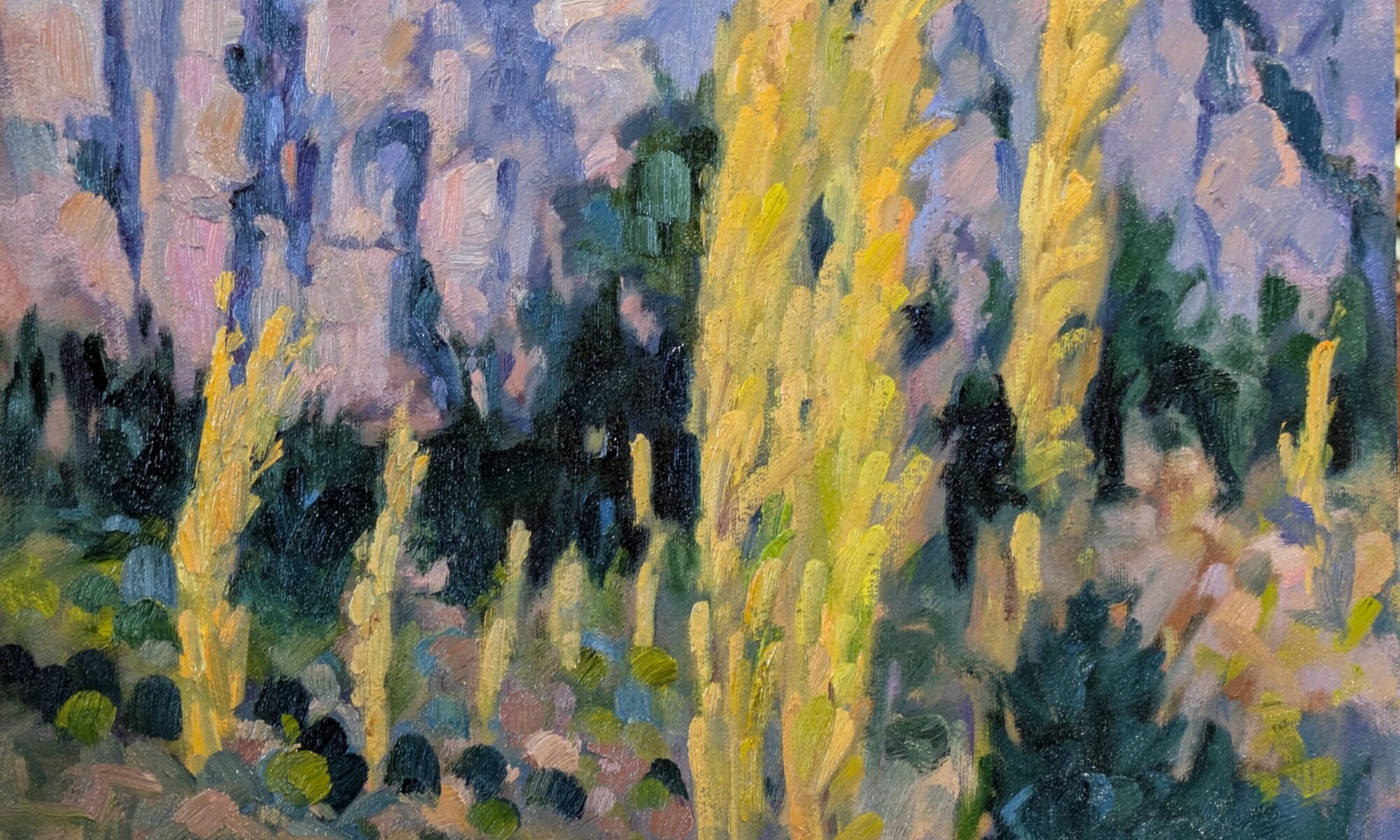
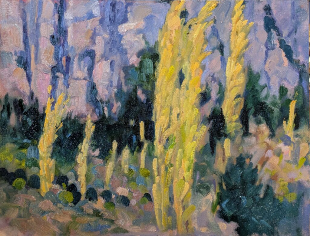
Poplars, 12X16, oil on archival canvasboard, available through Sedona Arts Center.
Going to Sedona Arts Center
I did about 95% of this painting while whooping it up with Ed Buonvecchio and Laura Martinez-Bianco in the Oak Creek Valley north of Slide Rock State Park. It was the last day of Sedona Arts Center’s 19th Annual Sedona Plein Air Festival. Ed wisely focused on the rocks rather than the trees. Laura and I waded into the foliage, looking for the abstraction that would define the place.
The scene has a flat meadow of dry grasses that cut straight across the base of the trees. Although the color was exquisite, I could find no way to include the grass without making a compositional blunder. Furthermore, black poplars are leggy and ungainly trees, although they were a magnificent golden color on that autumn day.
Claude Monet repeatedly visited poplars in a series of now-famous paintings. Nominally, these are about the trees, but their real subject is the interplay of light and pattern.
What I found so compelling (and difficult) about the scene was the repetition of the strong vertical motif in the trees and the rock spires behind them. I emphasized this by making the far-left tree bleed into the vertical chasm above it.
Sometimes we take risky decisions. Inevitably someone will come along and tell us how to correct our ‘mistakes’. I could have avoided the confluence of tree and rock, but it wouldn’t have been nearly as interesting to paint. Monsieur Monet never took the safe path; why should I?
Poplars is going with me to the 20th Annual Sedona Plein Air Festival later this month. I’m always happy to go to the Sedona Arts Center; not only do I get to see lots of my friends, but it’s a great organization.
Floof, 8X10, private collection.
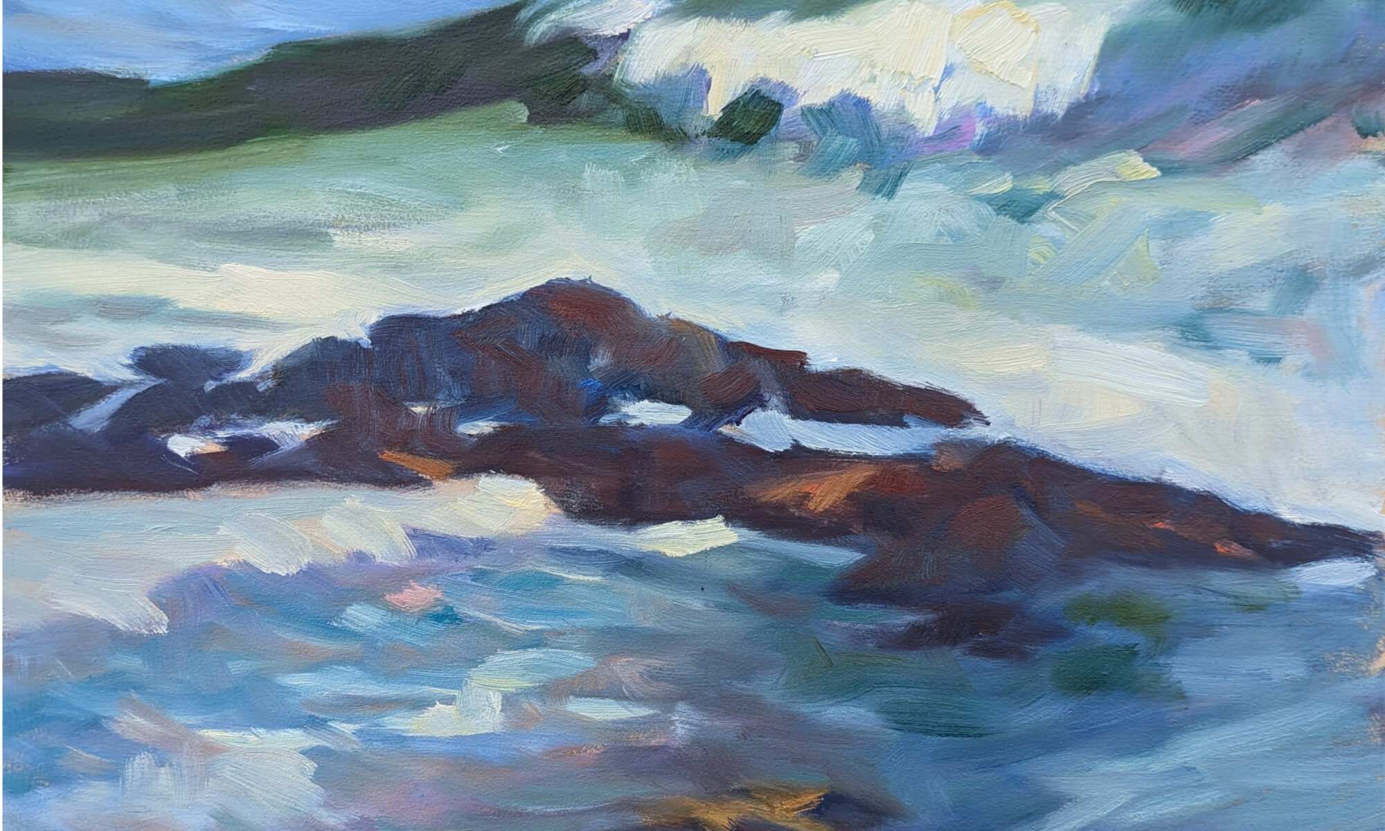
Floof!
This is going to a private collection out west. Its owner wanted a coastal Maine painting (who doesn’t?) so she’s getting this tiny confection of surf and rock, with a bit of pine in the top left corner. That’s pretty much what this state is all about, after all.
I am not sure why I called it Floof, except I kept saying that to myself as I churned the water up. As for the rocks themselves, they’re along the Bagaduce River in the town of Penobscot, ME.
A reminder
Student show Richards Hill Gallery 394 Commercial Street Rockport, ME 04856 4-6 PM Friday, October 11, 2024