fbpx

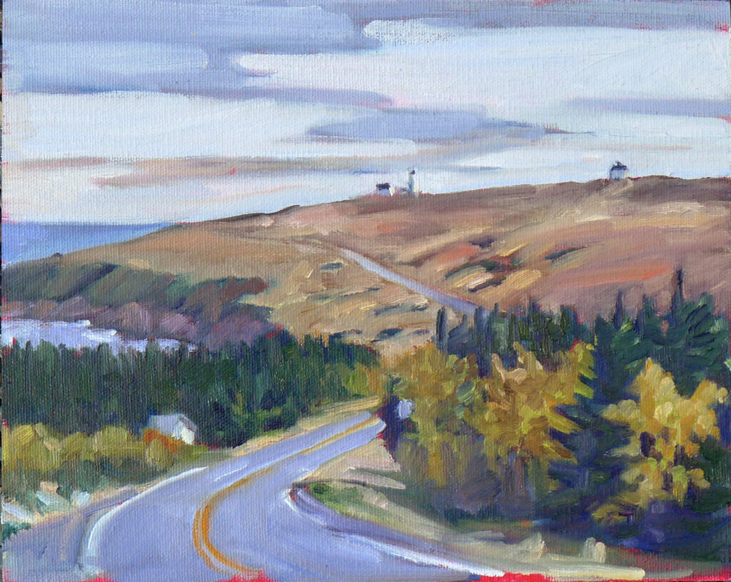
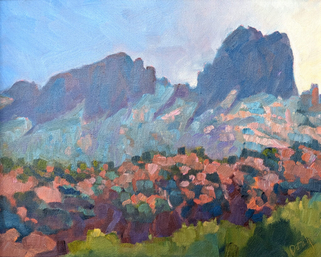
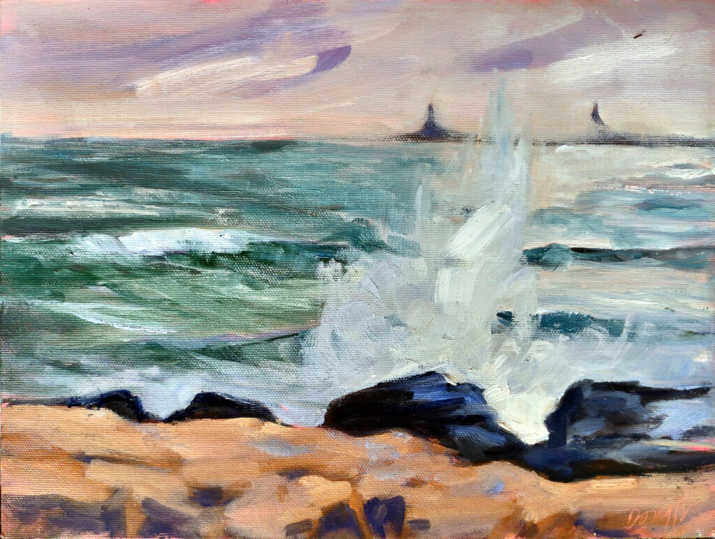
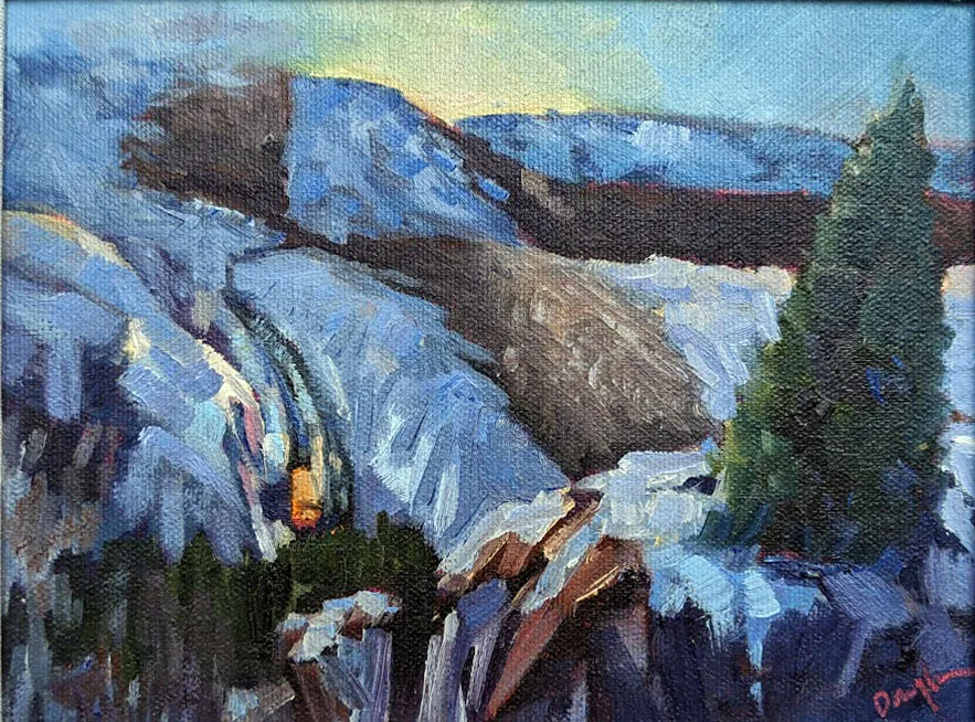
Sunset over Cadillac Mountain

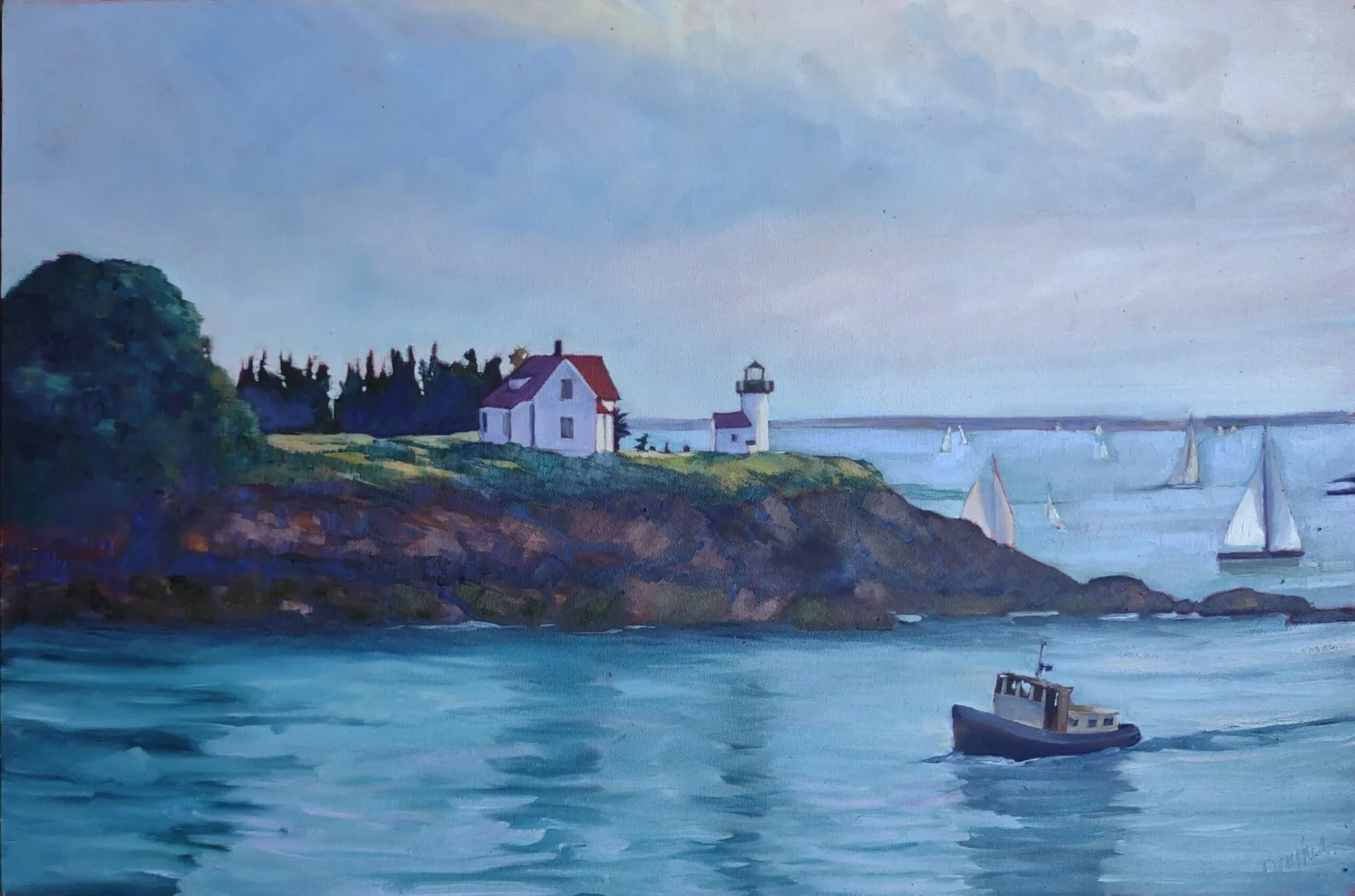
Sunset over Cadillac Mountain, oil on archival canvasboard, $869 includes shipping and handling.

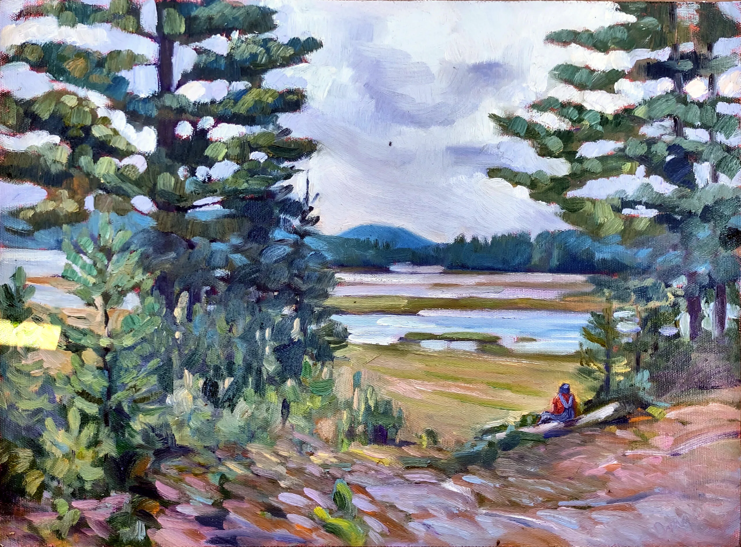
I’m not certain who among my students at Sea & Sky at Schoodic first suggested the twenty-strokes challenge, but it was so much fun that I asked my students at my Berkshires workshop to do the same thing. If you’ve never done it, it’s a great exercise for controlling the noodling that sometimes ruins a promising start. The only rule is that you do a painting in twenty strokes or less.

We all concentrated on making every shape count, including using a larger, well-loaded brush and filling in all the continuous areas in one shot. I was able to lay out the painting below in four carefully-considered strokes. The rest was just details. (Sadly, I didn’t photograph it before I added some extra emphasis brush strokes.)

Baby pine tree, 8X10, oil on archival canvasboard, private collection. While this final painting has a few more than the designated twenty strokes (I’m terrible at taking process photos) it’s not by a lot.

This was also an exercise to demonstrate that a centered composition is not inherently bad; it’s what you do with the rest of the space that counts. Centered compositions in themselves are imposing and serene. For proof that they work, see King Tut’s funerary mask or Arkhip Kuindzhi’s imposing Russian landscapes.

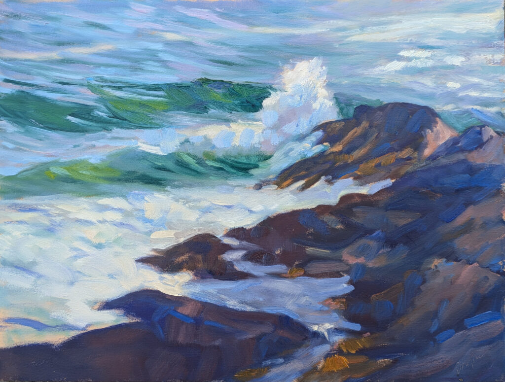
Before we did that fast-painting exercise, we went out to Schoodic Point to paint the sunset. None of us were counting strokes, but the sun dropping behind a mountain moves very fast. I doubt there are many more strokes in this than the prescribed twenty.

I took it home to my studio intending to finish it, but there is nothing I can do to improve on what’s there. It says everything one needs to say about the sun setting over Cadillac Mountain without a single extraneous brushstroke. Anything I add would diminish it.

How much is that painting worth, anyway?

Sometimes I am asked why a Cy Twombly scribble is worth $70 million. The high-end art market is complicated, being composed of talent, money laundering, speculation, rarity and social cache (and I have no opinion about the value of each).

The same question might be asked about why this painting is worth the same amount as Lacecap Hydrangea and Daylilies, which is the same size and a lot more complex. It’s not about how much I struggled to paint it (and the flower one was a terrific struggle), but about all the knowledge I brought into the painting.

Nocturne in Black and Gold: The Falling Rocket, 1874, James McNeil Whistler, courtesy Detroit Institute of Arts. This is the painting which so peeved John Ruskin.

James McNeil Whistler was panned by the legendary art critic John Ruskin, who by 1877 was no longer up to the challenge of modernity. Ruskin wrote, “I have seen and heard much of cockney impudence before now, but never expected to hear a coxcomb ask two hundred guineas for flinging a pot of paint in the public’s face.”

Whistler sued. He did not ask 200 guineas for two days’ work, he argued; he asked it for the knowledge he had gained in the work of a lifetime. He won, although he received only a pitiable farthing in damages. The case bankrupted Whistler and probably accelerated Ruskin’s mental decline. However, time has vindicated Whistler.

Art is not judged by the effort that goes into a particular piece, but by whether it ploughs new ground, challenges ideas, is technically skilled and provokes a response.

Reserve your spot now for a workshop in 2025:

Art heist, and this one was personal

The one that got away–Lauren Hammond’s color exercise, 9X12, that walked from our Berkshires workshop.

Last week I taught a delightful workshop in the Berkshires. I had demonstrated optical mixing (or broken color), and Lauren Hammond worked hard to execute the concept. Her finished painting was so lovely that I took a photo of it. She set it on the ground while she started something else. Thinking I knew better, I moved it to a nearby table so she didn’t inadvertently step on it. Our group was spread out over many acres, so most of the time, Lauren was alone at her easel.

“I think someone stole my painting!” she texted me. In decades of teaching, the closest I’ve ever come to that was when Sue Leo’s camera was lifted in Rochester’s Mount Hope Cemetery. But Mount Hope is near a sketchy neighborhood in a crime-ridden city. Lauren was in a place where I wouldn’t think twice about leaving my car unlocked.

“She’s just overlooking it,” I told myself, and I went back to help her find it. Other students helped us look and the venue manager contacted all her employees, all to no avail. It was gone. Lauren was the victim of an art heist.

The end of the evidence trail. I photographed it and then cleaned up the mess.

I’m an inveterate reader of mysteries, so I hunted for clues. Aha, I thought, here’s one—a painting imprint on another nearby table. But that, sadly, was where the trail ended. I’m no Miss Marple.

People have posited various alternative theories to me. Perhaps it was mistaken for garbage and thrown away. Perhaps they thought it was left there for someone else to take (as in the Acts of Kindness movement). Perhaps it blew away. Because I saw the scene of the crime, I can tell you with absolute assurance that none of these things happened.

Art heist losses are hard to estimate but they’re estimated at around $4-6 billion US per year. Money laundering in the art market is an even bigger problem. In comparison, Lauren’s painting is a drop in a very big bucket. But I take it personally.

Let this be a lesson to you.

Even the safest painting sites need just one bad person to cause trouble, and there are many worse outcomes than losing a painting. Be in the zone but be aware of what’s going on around you. If you’re at all in doubt, paint in pairs. I’ve painted all over the world and never had a problem, but then again I’ve never had a student’s painting stolen either.

Why you shouldn’t steal paintings. Really.

If you’re a regular reader of this blog, you already know this, but humor me. Stealing art is rotten because:

  1. The artist put time, effort, and years of training into creating that work. It’s no different from any other tangible object with value;
  2. Stealing a painting deprives others of the opportunity to experience the work;
  3. Stealing is a crime that usually affects the little guys. We’ve abolished hanging as the punishment for theft, but I sure do understand why stealing riled up our ancestors;
  4. Paintings are personal, so stealing one is personal, too.

But I would never do that!

Photographers are people too, so the next time you’re tempted to use someone else’s online photo as reference for your painting, consider their property rights. Go outside and shoot your own reference picture. If that’s impossible, check Creative Commons for open-access images.

Lauren’s last painting of the workshop. Nice broken color, more challenging design.

All’s well that ends well

My goal on the last day was to encourage Lauren to paint something even stronger than the one that got away. I think she did so. It’s more complex and adventurous in design, but the color is just as well-executed.

Reserve your spot now for a workshop in 2025:

Monday Morning Art School: the color of light

Is the light warm or cool in this painting? Two Peppers, oil on archival canvasboard, 6X8, $435.00

Additive and subtractive light refer to two different color systems, each operating under different rules. The difference between the two is fundamental in color theory. They both affect painting, as one influences what we see, and the other influences what we put down on our paper or canvas.

Is the light warm or cool in this painting? Tricky Mary in a Pea-Soup Fog, oil on canvas, Carol L. Douglas, courtesy private collection.

Additive Light

Additive color mixing involves combining different colors of light to create new colors. The more colors you add, the closer you get to white light.

The primary colors of additive mixing are Red, Green, and Blue (RGB). When you mix these three primary colors of light at full intensity, you get white. By varying the intensity of these lights, you can produce a wide range of colors.

This is the light system of computer screens, televisions, and stage lighting. More importantly, it’s the light system of the world that surrounds us, thanks to our sun.

Subtractive Light

Subtractive color is what happens in printing, painting, and any medium that relies on reflected light. In them, mixing means absorbing (removing) certain wavelengths of light to produce color. Pigments, dyes, and inks all absorb certain colors and reflect others.

The primary colors of subtractive mixing are, more or less, those you learned in kindergarten: cyan (blue), magenta (red), and yellow. In printing, black is added, creating the CMYK model.

Is the light warm or cool in this painting? Michelle Reading, oil on linen, 24X30, $3,478.00 framed, includes shipping and handling in continental US.

Color temperature

Color temperature is a measure of the color of light, expressed in degrees Kelvin (K). It describes the appearance of light and how warm or cool it looks to the human eye. Understanding color temperature is essential in painting.

At lower temperatures, the light appears red or orange (warm colors). As the temperature rises, the light shifts to yellow, white, and eventually blue (cool colors). Yes, that’s counterintuitive, because what we call warm or cool is influenced culturally, not by science.

Now that lightbulbs are tunable for color temperature, we may change how we feel about this, but historically, we’ve said:

-Warm light appears yellow/orange, and creates a cozy or sunlit atmosphere.

-Cool light appears blue/white, and creates a crisp and focused atmosphere.

-Neutral light: doesn’t have a color… and neither does its shadow.

Manipulating these in painting gives paintings an overall mood, which is why photographers covet the golden hours of early morning and late afternoon.

Is the light warm or cool in this painting? View from Bald Mountain, 24X36, oil on canvas, Carol L. Douglas, private collection.

The color of shadows

Shadows being the absence of light, they are also the complement of the light source (what’s left when the light is blocked). However, they’re not the complement within the subtractive light system, but the additive light system. It’s not as simple as saying “it’s gold light, so the shadow is purple,” although most people wouldn’t quibble about that.

Every color of light has RGB values, which are a system for representing colors on digital displays. We could find the complement, or shadow color, by subtracting the RGB values of the light from 255, which would give us a blue-violet. However, that would be an absolutely insane solution to the question. Instead, use your eyes, which will tell you that the shadows of evening are blue or violet. Or, better yet, use your imagination along with your eyes.

Bouncy, bouncy light

There are some surroundings where reflected color is so strong that it blows out this kind of light structure. The greens of the deep forest are one, sitting under an awning is another, and my studio with its natural wood paneling is a third. In these instances, the dominant color influences everything.

Learn more

I got home to find that I only have one more seat left in Applied Color Theory, which starts tomorrow. But there are always my workshops, below.

Reserve your spot now for a workshop in 2025:

Landscape paintings that are signposts

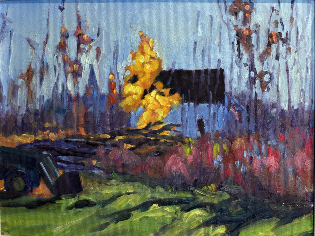
Autumn Farm, Evening Blues, oil on canvasboard, $1449 framed includes shipping and handling in continental US.

I don’t scrub out paintings I don’t like. Often, they are signposts for where I’m heading. This painting is slightly different, because I liked it when it was done, but it was different from much of my work at the time. However, it fits squarely into my oeuvre today.

“A real artist doesn’t need an eraser.”

I don’t know where this comment came from, but it’s destructive. Yes, I own an eraser and I use it all the time. That’s why I draw on Bristol instead of soft paper. ‘Real’ artists work and rework subject matter constantly.

What I think it is supposed to mean is, “don’t mind the imperfections and don’t overwork your paintings to get rid of all their perceived flaws.” I do agree with that. Just as we’ve blurred the line between real human bodies and the airbrushed bodies of influencers, we’ve all gotten used to online images with the weak spots airbrushed out. That can make our own efforts feel wonky to us.

Signposts

Fifteen years ago, I lived in Rochester, NY. It’s a city of indirect light. That tends to make for grey paintings. Today I live on the Maine coast, where things are much brighter. My palette has shifted to far brighter color.

When I first started moving in this direction, the heightened color felt garish. Today it feels natural. But to get to that point, I had to let go when things looked awkward. I’m talking here about color, but it’s true of every aspect of painting, from composition to drafting to mark-making. You won’t know if it’s a mistake until you spend time with it.

Is there such a thing as realism in landscape painting?

Gustave Courbet is considered the father of French realism, but it’s hard to not see the editorial in his work. The same is true of the English romantic John Constable and the American realist George Bellows. In fact, I can’t think of a single great landscape painter whose inner vision didn’t override what his eyes saw.

That’s a good thing, which is why we shouldn’t be too quick to snuff out what we see.

Horses

Some of my four-legged friends from Undermountain Farm in Lenox, MA

If you’ve spent any time with me, you know I love boats and the sea. I’m also rather partial to horses, which is why I set up to do this painting. In the distance, coming down the hill, is the Radnor Hunt, the oldest continuously-operated hunt club in the United States. Mostly, hounds and horses just milled around as they lost the scent, which is a far cry from what I thought the hunt was all about.

Reserve your spot now for a workshop in 2025:

Why I love plein air painting

Midsummer along the Bay of Fundy, 24×36, available.

Given a choice of painting the same subject en plein air or in the studio, I’ll always go outdoors. I think it makes for better paintings, but it’s also a better experience.

In general, painting from life is superior to painting from photos. Photography works out the subject, composition and color for you, and it’s hard to escape its bossiness. People can work from life within the genres of still life, interiors and figure painting, but the natural world is the biggest and best source of observed reality.

The Whole Enchilada, 12X16, oil on archival canvas, $1159 unframed.

Full immersion

Being surrounded by the environment that I am painting is a full sensory experience. Yes, that can include insects and jackhammers, but it’s more likely to include sweet smells on soft breezes and birdsong.

For every painting location, there are many potential subjects and compositions. I once stood on a hillside and painted in each cardinal direction. I didn’t begin to plumb the possibilities of that site.

Painting outdoors lets me experience natural light in its full color spectrum. Look at any photograph of a scene you know and love, and you’ll quickly realize how photos flatten and distort color. And painting indoors under bad lights is just horrible for your color perception.

I’ve painted in rainstorms, in withering heat and humidity, and in blasting Arctic cold. More commonly, I go out when the weather is moderate, but its changeability has taught me ways to control and adapt my painting, and above all, to work fast.

Dawn Wind, Twin Lights, 9X12, oil on archival canvasboard, $869 includes shipping and handling in the continental US.

The great outdoors

Being an outdoorswoman to my bones, I appreciate that plein air painting lets me work in beautiful places. Standing quietly in one place for hours allows you to see it in a different way from that of the typical tourist. People love the natural world but due to issues of time, money and mobility, they can’t always get to it. (I remind myself to be thankful every day I can climb Beech Hill.) Plein air painting is a way to bring nature to a world that’s increasingly insulated.

On the best of days, you can text a photo of a wood lily or an elk to a friend. That’s humbling.

Palm Tree and Sunlight, oil on archival canvasboard, $869 framed includes shipping and handling in continental US.

Some of my best friends are plein air painters

I know plein air painters from all over North America. The crush of plein air events means we’re often thrown together in ways that forge deep friendships. I might not see them for years, but we fall back into our old rhythms of friendship very easily.

I see this in my workshop students, too. There is something about standing on a rock with the same people for a week that fosters closeness.

Plein air is not limiting

Some of my friends love painting architecture; some like painting in large cities (that used to be me). Some are attracted to the bleak industrial wasteland. Some like the high desert, and others like the ocean. I’m easy, myself; I love the landscape I’m with. But there’s no wrong subject in plein air. Beauty is everywhere, and as long as I’m still mobile, I’ll still seek it out.

Reserve your spot now for a workshop in 2025:

Monday Morning Art School: what is color theory?

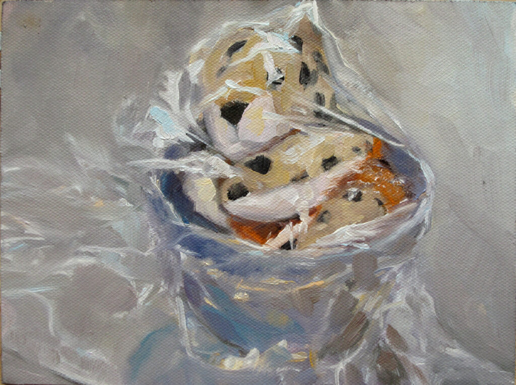
Toy Monkey and Candy, oil on archival canvasboard, $435 framed includes shipping and handling in the continental US.

As I write my next class, Applied Color Theory, I am building a framework of the most important aspects of color and light for the painter. Color theory is a comprehensive framework that starts with the color wheel and works out from there. If you know your way through the following concepts, you don’t need more color theory. If you’re fuzzy about them, perhaps it’s time for more study.

Hue, Chroma and Value These are the three properties of color.

Color Harmonies This is the idea that certain color combinations are more pleasing to the eye and can evoke specific moods or responses.

Color Context This includes how colors affect each other when placed side by side and the psychological effects of color.

Prom Shoes 2, oil on archival canvasboard, 6X8, $435.
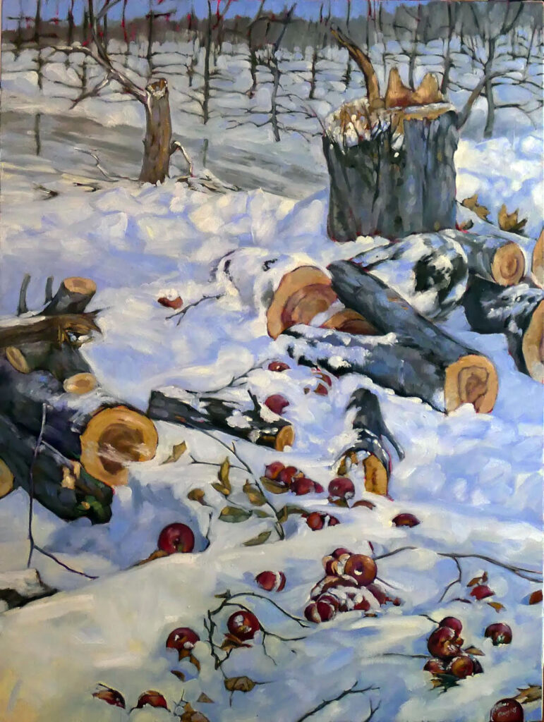
Color Systems and Models We all learned subtractive color (the classic color wheel) in school, but additive color behaves differently. Knowing how light combines will give you a better grasp on color temperature.
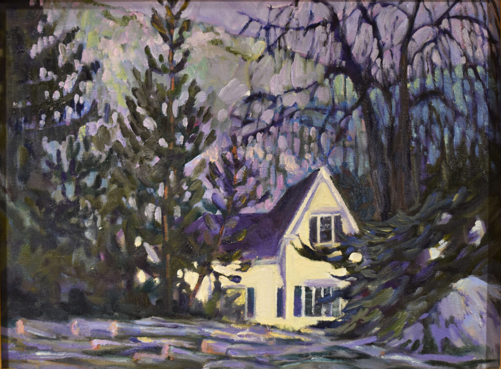
Color and Culture Colors have cultural overtones; for example, we believe red is ‘hot’, blue is ‘cool’ and closely-analogous colors ‘clash’. How important are these ideas to painting, and how much of our color sense is just fashion?

Color temperature All light has a color. All shadow has color. How do we figure them out?

Primary Shapes, 6X8, oil on archival canvasboard, $435 includes shipping and handling in the continental US.

Light direction and intensity Light and shadow are fundamental compositional elements. That includes whether light is soft and diffuse or hard and direct. Closely related is:

Reflectivity Whether an object is matte or shiny affects how it plays in the color sphere.

Transparency and Translucency The ability of a surface to transmit light affects how light is depicted. Transparent objects (like glass) and translucent objects (like frosted glass or thin fabric) have different light interactions from opaque objects.

Atmospheric Perspective Light behaves in predictable ways the farther you are from the object. Can you articulate the order in which color falls off?

Two Peppers, oil on archival canvasboard, 6X8, $435.00

Mood Light can significantly influence the mood and emotional impact of a painting. Bright, intense light can create a sense of drama or tension, while soft, diffused light can evoke calmness and serenity.

Time of Day and Season The color and quality of natural light change throughout the day and across different seasons, affecting how scenes are depicted.

Can I do all that in six weeks?

I’ll do my best. This painting class is open to all mediums and skill levels.

It will run for 6 weeks on Tuesdays, 6-9PM EST. Participants will be sent a zoom link.

Dates:

August 20, 27
Sept 3, 10, 24
October 1

I’m prewriting this before I hit the road to teach at the Schoodic Institute and in the Berkshires. I don’t know how many seats are available for this class by the time you read this. Check here; you won’t be able to register if it’s full.

Reserve your spot now for a workshop in 2025:

How to paint a forest fern

Cinnamon Fern, 9X12, oil on archival canvasboard, $869 framed includes shipping and handling in continental US.

I have no business complaining about the heat. My friend Pastor John Nicholson of Marion, Alabama recently texted me that it was 91° at 7:45 AM. But just as he’s not acclimated to subzero temperatures in winter, we’re not acclimated to 80° in summer. But that’s what we’ve been getting, and all in all it has been a magnificent summer here in the northeast.

When the temperature rises, I head into the woods. Painting in the forest is lovely on a hot summer day.

How to paint a forest, in a nutshell

  • Sort out a pattern of lights and darks;
  • Start with the composition—it’s easy to get lost in the jumble;
  • Concentrate on details; they’re easier to make sense of than the overall picture;
  • Think about texture.

Despite a lifetime of looking at northeastern ferns, I have a hard time identifying them, which is why I labeled the above painting as Bracken Fern for so long. A few years ago, a friend gave me a tutorial that ran the full 5.5 miles of the Round the Mountain Trail. I’m sharing with you, so you need never be embarrassed by ferns again.

With fronds like that, who needs anemones?

Maidenhair fern courtesy Doug McGrady, Warwick, RI, Wikimedia Commons

The Victorians were so crazy for ferns that they coined a word for fern madness: Pteridomania. Among their favorites was Maidenhair Fern, with its dark black stems, delicate foliage, and fan-shaped fronds. It’s the black stem that gives it its name, don’t ask me why.

Sensitive Fern courtesy Joshua Mayer, Madison, WI, Wikimedia Commons

Sensitive Fern volunteers next to my garage (and many other places). It looks indestructible with its coarse, leathery leaves, but like many apparent tough guys, it’s delicate. Its name comes from the fact that it dies at the first frost.

Interrupted Fern, courtesy Bibliothèque de l’Université Laval, Quebec

Interrupted Fern is a weird but handsome plant. Its fronds go from green pinnae at the base to brown spore-bearing pinnae in the middle, followed again by green pinnae at the top.

New York Fern, courtesy Wasp32, Wikimedia Commons

New York Fern, as you’d guess from the name, is an elegant fern that likes to colonize in tight, compact masses. A lot of them can fit in a small space, and they aren’t too picky about environmental conditions.

Christmas Fern, courtesy David J. Stang, Wikimedia Commons

The fronds of Christmas Fern emerge red in the early spring and mature to a glossy green. It takes its name from the fact that the leaves stay evergreen until the new year’s growth starts in spring.

Bracken Fern, courtesy Tylerfinvold, Wikimedia Commons

The blades of Bracken Fern grow almost horizontally, forming a dense canopy. Like many ferns, it’s somewhat allelopathic, meaning it produces biochemicals that suppress the growth of other organisms.

I’m still not sure after all these years whether what I painted above was Cinnamon or Bracken Fern. They look like Cinnamon in my painting, but I’ve revisited the site and found bracken there. But does it really matter? They’re beautiful either way.

Reserve your spot now for a workshop in 2025:

Making art inaccessible

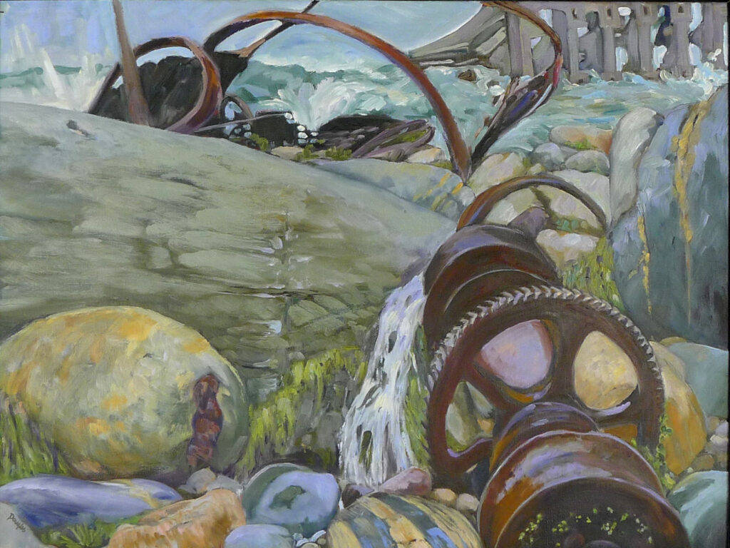
Winter lambing, oil on linen, 30X40, $5072 framed, includes shipping and handling in continental US.

I’m from Buffalo, New York, and I grew up visiting the Albright-Knox Art Gallery. My family lived nearby and I went to high school just a few blocks away. The Albright-Knox is where I came to understand art. No institution had a greater impact on my early art education.

Like all city residents, I knew there was no admission charge, just a plexiglass box into which you could stuff your donation. In my case, that was often small change or nothing.

In late 2019, the gallery started a massive expansion and renovation. Investor Jeffrey Gundlach gave $42.5 million. NYS ponied up another $20 million and the rest of the $125 million tab was expected to be met by ‘businesses, foundations, government groups, and individuals.’  It’s a beloved Buffalo institution, so I’m not surprised at the community support. The museum was also rebranded as Buffalo AKG Art Museum to reflect Mr. Gundlach’s contribution.

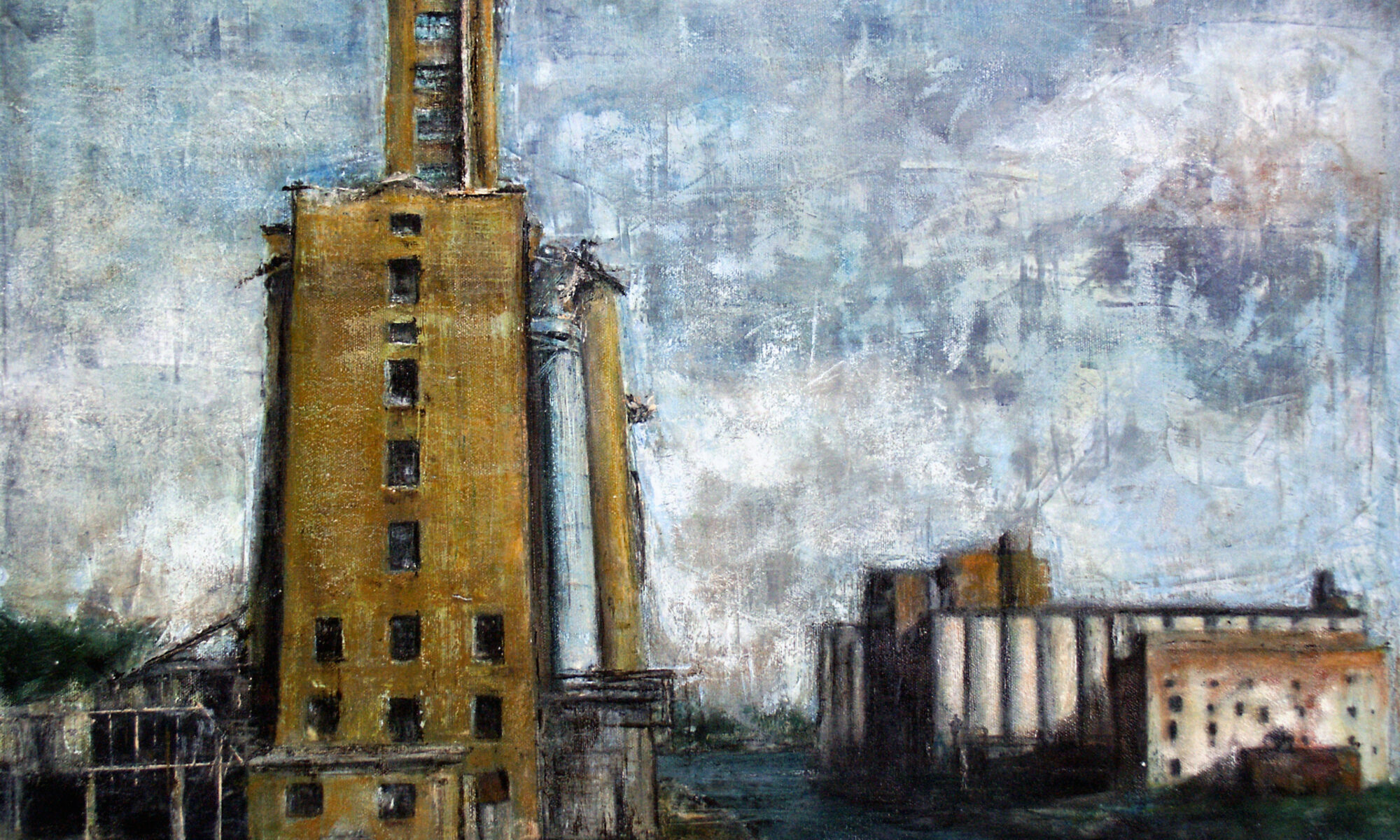
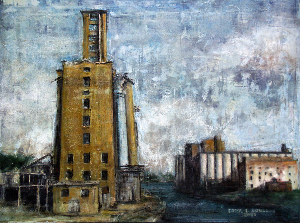
Grain elevators, Buffalo, NY, 18X24 in a handmade cherry frame. $2318 includes shipping in continental US.

My brother-in-law took his grandchild there last week. “It cost me $20 with my senior discount, $10 for Nora, and $12 to park,” he said. He can afford that, but a lot of Buffalonians can’t. The community ponied up all that money to make art inaccessible to any but its wealthier citizens.

The last reported salary for its director, Janne Siren, was $468,609 (2023). This is in a city whose median household income at the 2020 census was $24,536. (And, for the record, employees of the gallery voted to unionize in January, 2024, citing unfair labor practices.)

Why are museums so darned expensive?

The fees my brother-in-law paid are not, sadly, outrageous for American fine art museums. The MFA Boston is now $27 for an adult ticket, MoMA is $30, the Metropolitan Museum of Art (which has one of the nation’s largest endowment funds) is $30 and the Art Institute of Chicago is $32. I looked this up because my kids wanted to go to the MFA last weekend, but couldn’t afford it. Instead, they went to a nearby college gallery. “I saw a few cool things and I can still buy a house,” my daughter said.

Thunder Bay, 12X16, $1159 includes shipping and handling in continental US.

Arts access is important

School groups will still visit the gallery in their strictly-monitored tours, but gone are the days when we could just wander at will to visit our favorite paintings. For my parents and my siblings, an afternoon at the gallery would now cost $104 plus parking.

This is happening at a time when the broader culture is reducing arts education. That makes unfettered access to art even more important.

For kids, art helps develop imagination and cognitive, communication and problem-solving skills. It helps all of us reduce stress. It should not be only for rich people.

Coal Seam, 6X8, oil on archival canvasboard, $348 includes shipping and handling in continental US.

Community identity

The old Albright-Knox was a great example of how the public loved and cared for museums, and how museums enhanced our quality of life. It was built for the 1901 Pan-American Exhibition, along with its neighbor, the Buffalo History Museum (which is still pay-as-you-wish). They both face Olmstead-designed Delaware Park with its sparkling artificial lake. This whole complex was a source of great civic pride in my youth.  But, honestly, why would a young Buffalonian care if they can’t afford to go inside?

Reserve your spot now for a workshop in 2025:

Monday Morning Art School: human vision and color theory

Rachel’s Garden, ~24×35, watercolor on Yupo, museum-grade plexiglass, $3985 includes shipping and handling in continental US.

Is human vision subjective? Absolutely; so are cameras (although they cheat less than our eyes). We don’t perceive things as they really are, and the gap between what we do perceive and what is ‘real’ is probably unmeasurable. It’s no surprise that witnesses often report wildly different events.

Bunker Hill overlook, watercolor on Yupo, approx. 24X36, $3985 framed includes shipping and handling in continental US.

How our eyes work

No other organ is quite like our eyes; they’re really an extension of our brains. The retina and optic nerve develop from the same tissue as the brain and that direct connection is maintained through life. The eyes are not merely sensors; they’re processing information before sending it up to the brain. They use the same neurotransmitters and signalling mechanisms as the brain. No wonder they’re so good at fooling us!

The primary visual cortex processes and interprets the signals received from the retina. That gives us the interpretive part of vision, where we sort color, motion, and depth. It’s there that we integrate and interpret visual data into coherent images and meaningful information.

Clary Hill Blueberry Barrens, watercolor on Yupo, ~24X36, $3985 framed includes shipping and handling in continental US.

How our eyes trick us

All humans have tunnel vision, some of us more than others. We focus on what’s in the center of our vision. What’s peripheral falls off, to various degrees depending on the person. One of the great lies of painting and photography is that they smooth out this tunnel vision.

There’s also wide variation in the distribution and density of rods and cones, which affect how we perceive color. Then there’s the condition of our lenses and corneas. (That’s why I keep hoping I’ll qualify for cataract surgery, but it never happens.)

Once the eyes send their signals to our brain, the relationship to ‘reality’ becomes even more tenuous. It appears that different individuals process various aspects of vision differently in their visual cortex. Our interpretation of what we see is also influenced by our experiences, our mood, and the degree to which we’re attending. And of course, lighting affects how we see (and how we fill in what’s missing).

Context affects how we see color

Certain visual patterns can trick our brains into seeing things that are not there or misinterpreting what we think we see. This is the basis of optical illusion, and it’s helpful for the painter to understand. Colors look different depending on what’s around them. Prolonged exposure to a particular color can create afterimages that affect how we see subsequent colors.

Most importantly, our expectations alter our color perception. For example, knowing that a distant roof is red can mislead painters into painting it brilliant scarlet, even when the atmospheric color shift has made it a far softer tone.

Path to the Lake, ~24X36, watercolor on Yupo, framed in museum-grade plexiglass, $2985 includes shipping and handling in continental US.

How do we sort all this out?

If we could separate what we see from what we ‘know,’ we’d be left with simple patches of light and color, because that’s all vision is. It’s very hard to do that, but the more we strive for that, the better our representation is.

After all, in our field of vision, things are not inherently large or small, close or near; our brain sorts the data and makes these comparisons.

Why am I thinking about this stuff?

I’m swotting to teach a new class, Applied Color Theory, on Tuesday evenings, starting on August 20. And it all starts with the brain, so that’s what I’m thinking about first.

There are just a few seats left, so if you’re interested you should enroll as soon as possible.

Reserve your spot now for a workshop in 2025:

Should I buy a boat?

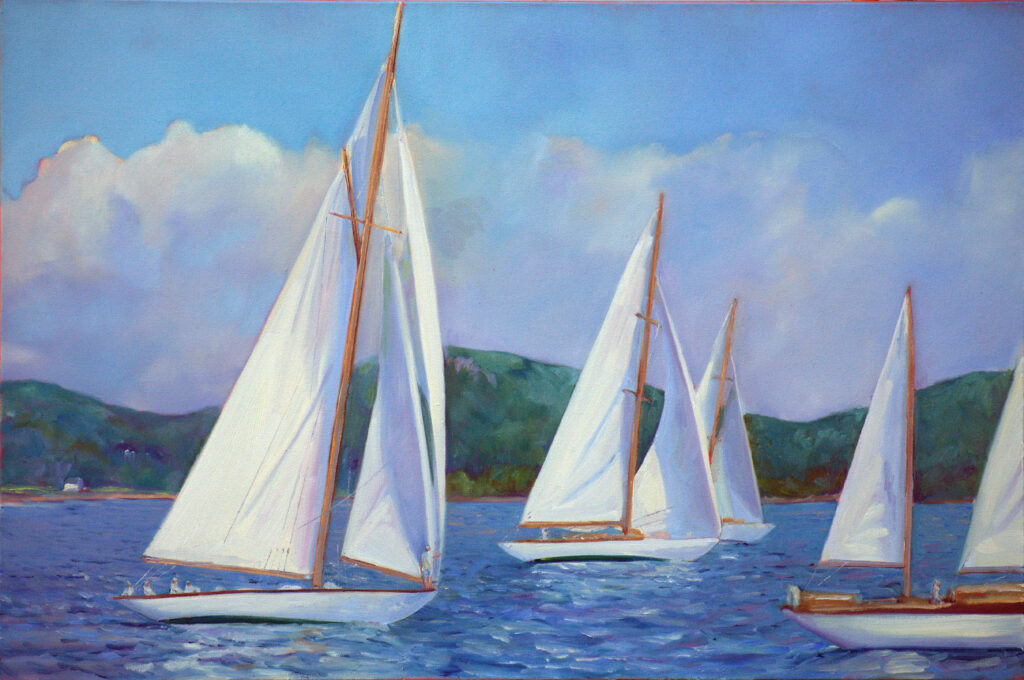
Skylarking II, 18×24, oil on linen, $1855, includes shipping in the continental US.

When I row in my local harbor, I always tell the person I’m with, “If you’re looking for something for my birthday…” I love rowing quietly around, lusting after sailboats. My heart’s desire is never a big boat, but it’s always beautiful, sleek and wooden. Something I can sail solo would be best.

Of course, this is pure nonsense. The mooring fee alone would scrap my budget. Add to that the work and expense of hauling and winterizing. I’m not talking through my hat here; we had a beautiful old wooden boat until I was in my late teens. Besides, my yard is already cluttered with a skiff, canoe and dinghy, none of which I have time for.

American Eagle rounding Owls Head, 6×8, oil on archival canvasboard, $348 unframed includes shipping and handling in the continental US.

I was reminded of this the other day while listening to the podcast Ridiculous Crime. The hosts were joking that the stupidest thing to do with lottery winnings was to buy a boat. “My father always said it’s a hole in the water into which you pour money,” said host Zaron Burnett. I’ll add two more jokes to his repertoire: “The two best days in a boat owner’s life are the day he buys a boat and the day he sells it.” And, “a friend with a boat is better than owning a boat.”

Should I buy a boat? I’m afraid not, although writing this post has darn near killed me. But there are other ways to enjoy them.

I have a friend who is a boat

I am buddies with a very big boat, the schooner American Eagle. Not only is she the best looking schooner in the fleet, she was impeccably repurposed by Captain John Foss and maintained by Captain Tyler King.

I get to go sailing on her once a year. Even better, my job isn’t night watches or deck swabbing. Instead, I teach watercolor painting. And if you go with us, you too can sail and paint and give no thought at all to cooking or polishing brightwork.

My daughter made a beautiful short reel for Instagram that catches the essence of this trip (above). Here’s another that captures a foggy day on the water. This isn’t sailing with carbon fiber sails that you can adjust with your key fob while surfing the web on your phone. This is sailing as it’s been done for centuries. It’s a wooden boat with traditional rigging, and the opportunities to sail like that grow fewer and fewer.

Hang a boat on a wall

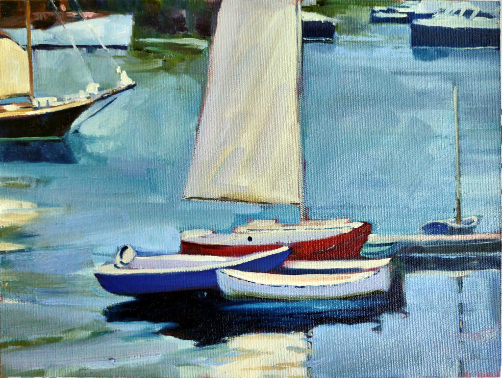
Drying Sails, 9X12, oil on canvasboard, $869 framed.

Another way to enjoy sailing is with a painting. I was in an oncologist’s waiting room the other day (for a routine check-up) and noticed that the walls are covered with boat art. They chose boats and the sea because they’re calming, and people in crisis need all the tranquility they can get. But so do you and I, every day.

I paint boats because I love them, and because their journeys are much like our journeys—we go through storms, we have larky bright mornings, and we rest at anchor. I think those are all good reasons to own a boat painting. And as Zaron Burnett would probably tell you, it’ll cost you a lot less to buy a painting of a boat than to keep a real boat. The maintenance is easier, and you’re likely to keep it longer, too.

Reserve your spot now for a workshop in 2025: