fbpx

What makes a painting valuable?

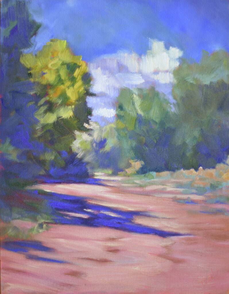
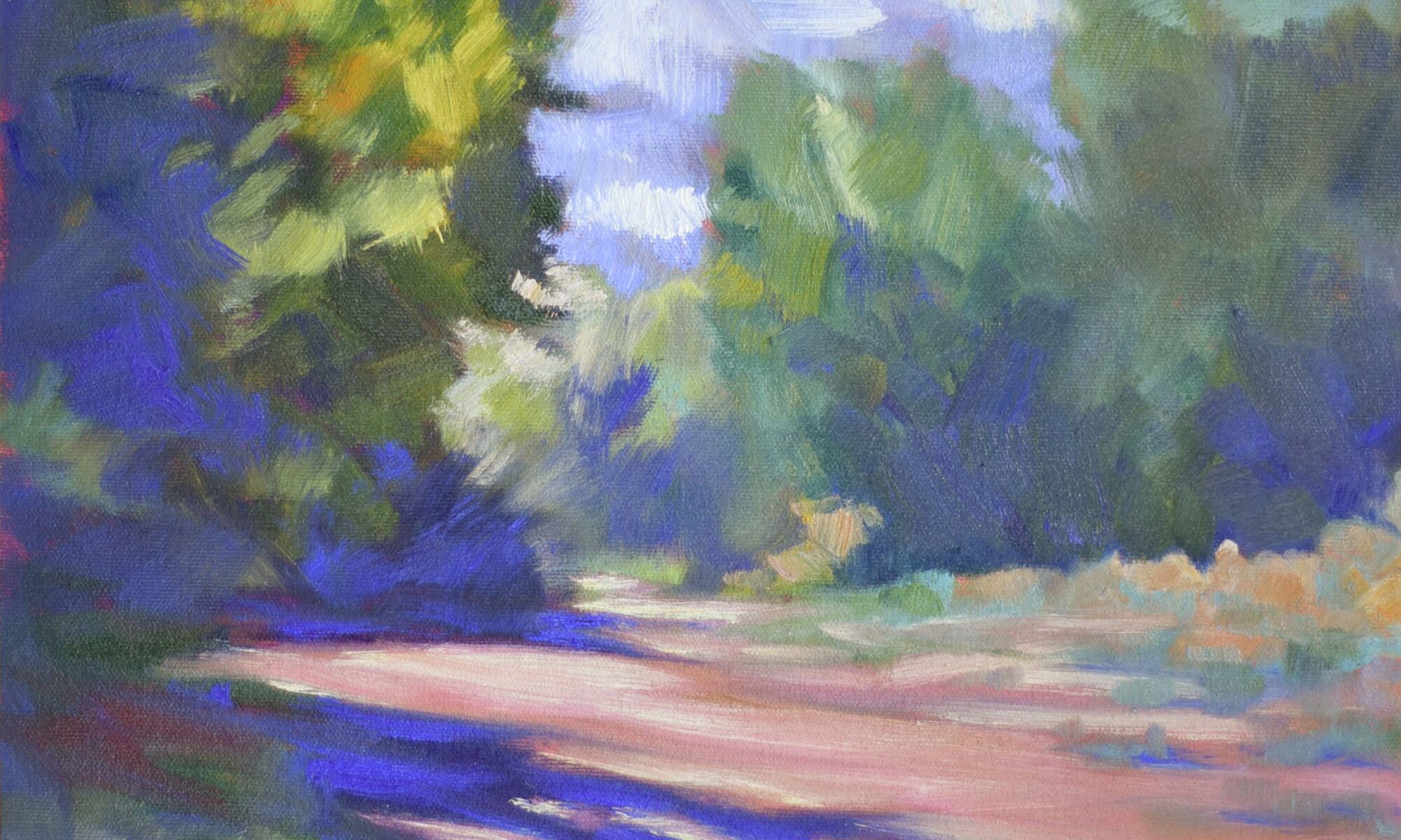
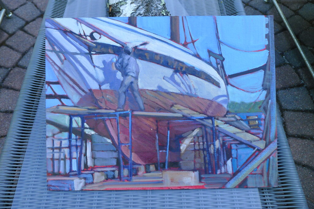
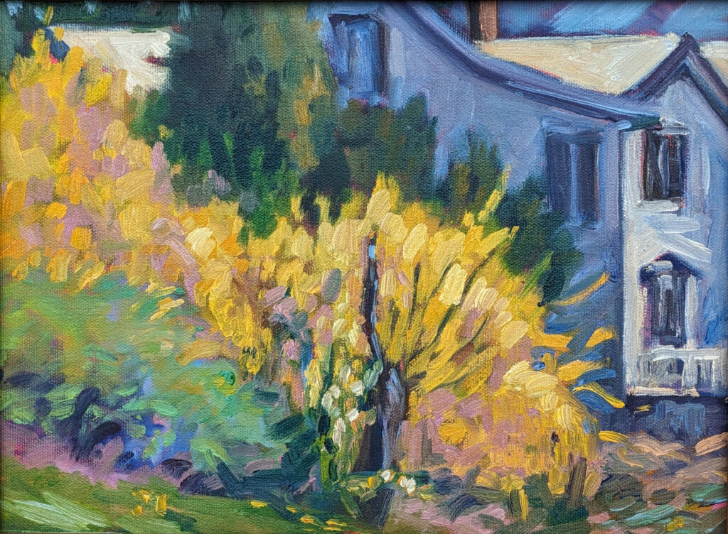
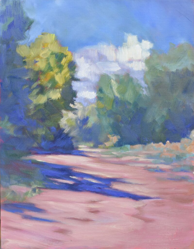
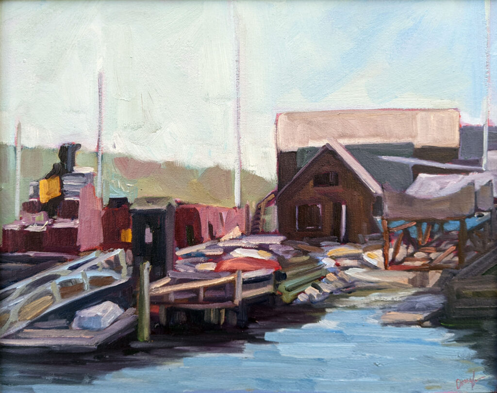
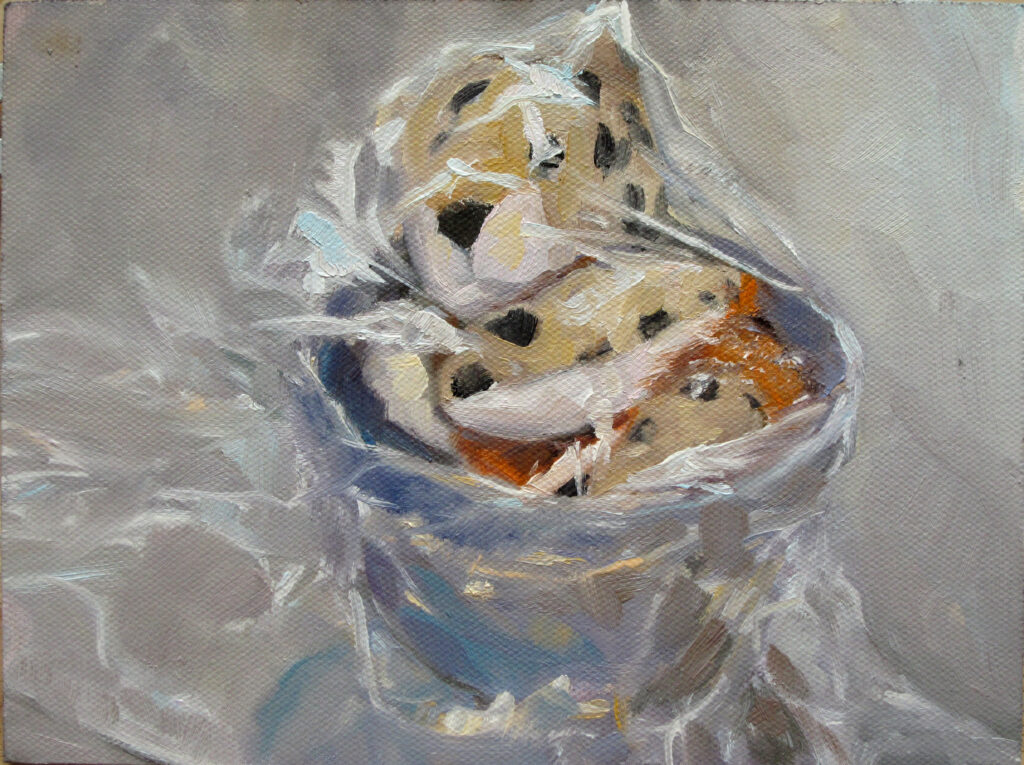
The Late Bus, oil on archival canvasboard, 6X8, $435.00 framed, includes shipping and handling in continental US.

“In the Rock-Paper-Scissors scheme of things, does acrylic ever top oil in terms of being taken seriously by collectors and curators?” Cheryl Shanahan asked me. It’s a great question. Although acrylics have been around since the middle of the last century (like me), they are not as commonly used as oils by the top tier of painters.

There are, of course, some acrylic painters who’ve been taken very seriously indeed: David Hockney, Robert Motherwell, Mark Rothko, Helen Frankenthaler, and Roy Lichtenstein, to name just a few. Acrylics lend themselves more to color field painting than they do to fine modeling. And until the advent of retarders, acrylics were difficult to use en plein air. Standard heavy-body acrylics are a constant struggle against premature drying when used outdoors.

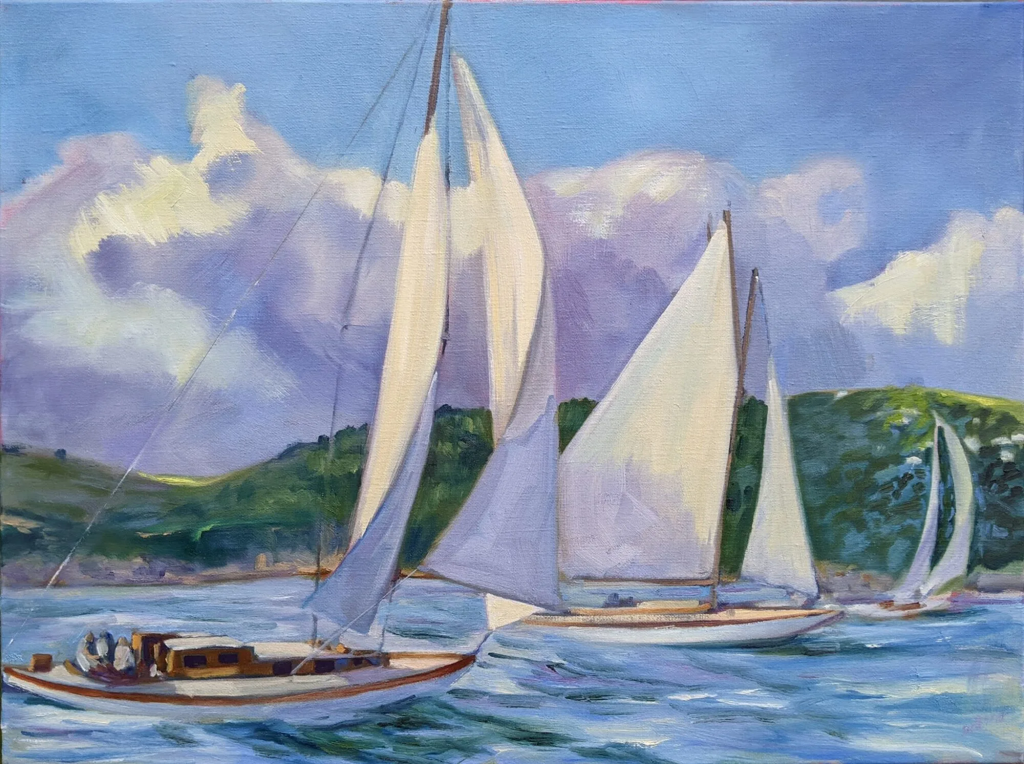
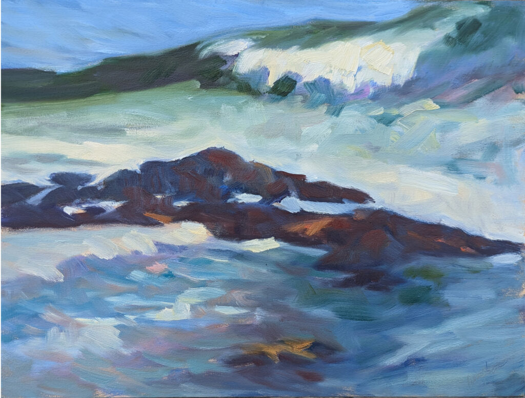
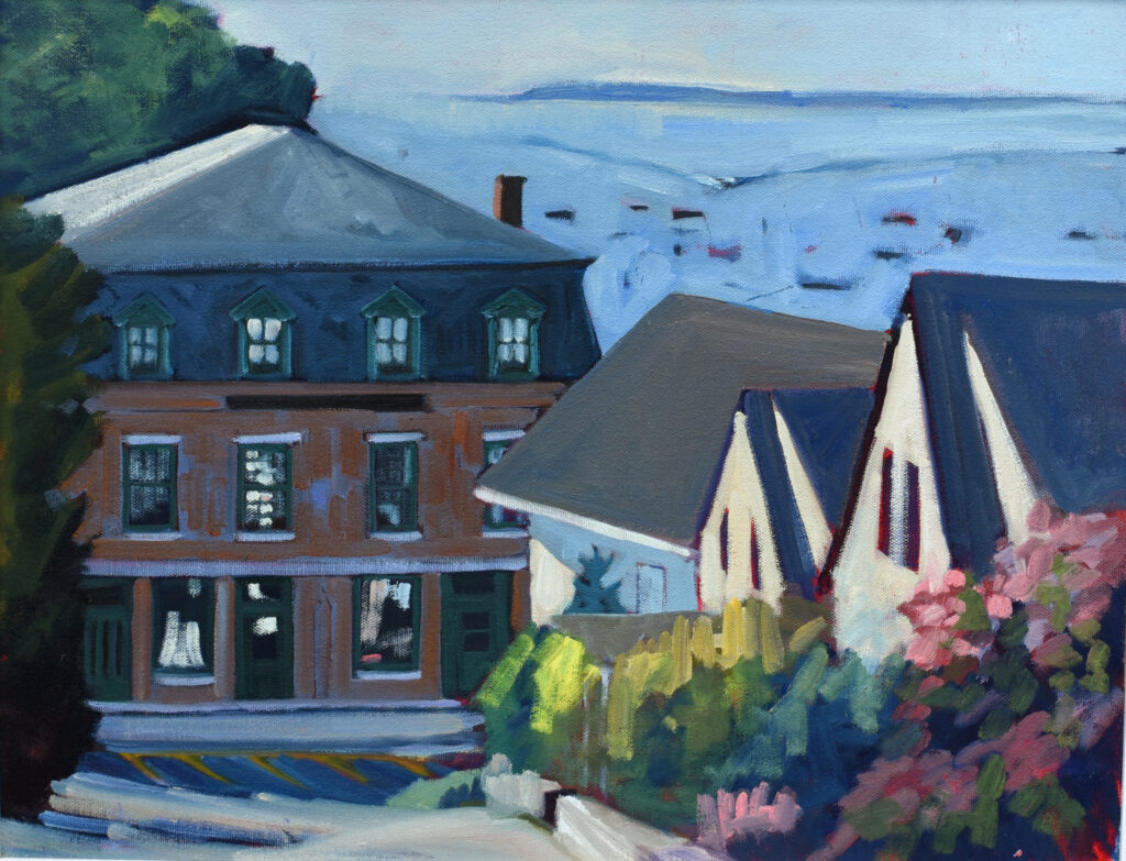
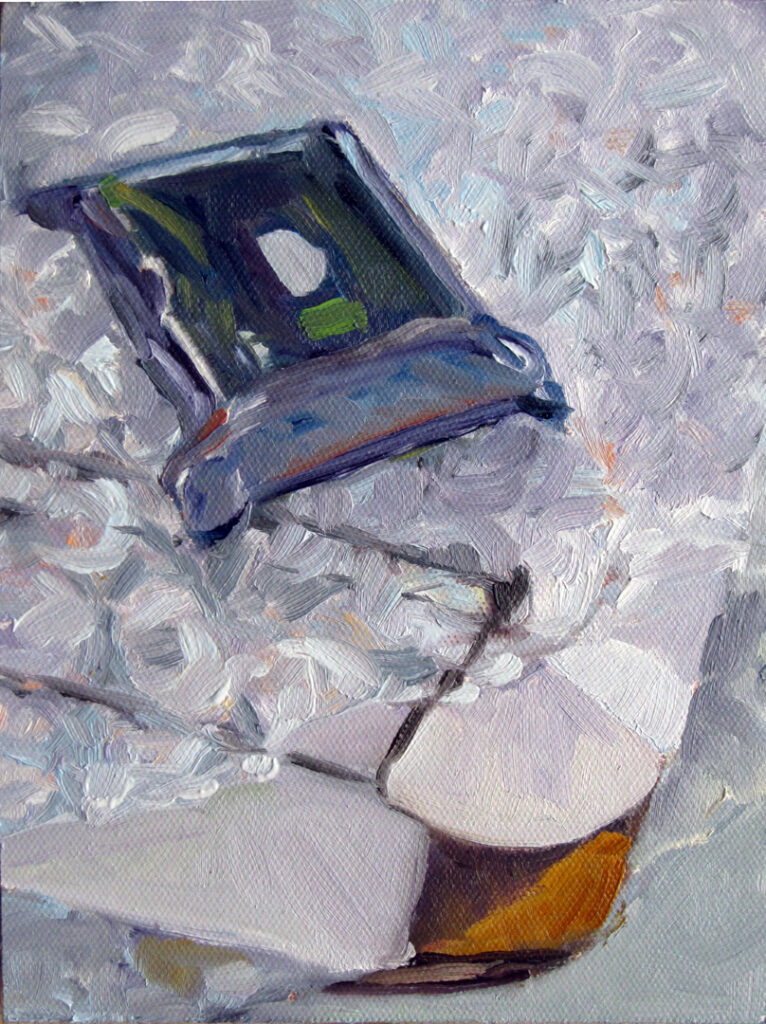
Early Morning at Moon Lake, 6X8, oil on archival canvasboard, $348 includes shipping and handling in continental US.

What makes a painting valuable?

The value of any work of art rests mostly in the name of its creator, a fact which has infuriated artists since the advent of art. Of course, if he or she is dead, the supply of new work has dried up, which drives prices up. That’s why I’m so tempted to fake my own death.

In 2019, an exhaustive study of the works of Joan MirĂł noted, “Miró’s works command higher prices, ceteris paribus *, when they were painted on canvas, were sold at Sotheby’s and in New York City or London, were traded during the evening session and depending on the period in which they had been painted, the size of their surface area, the number of words used to describe the respective lot and whether they had appeared in an art book. The prices of Miró’s paintings increased substantially between 2003 and 2008 and then declined, coinciding with the global financial crisis of 2009.” You can’t discount market manipulation when considering what makes a painting valuable.

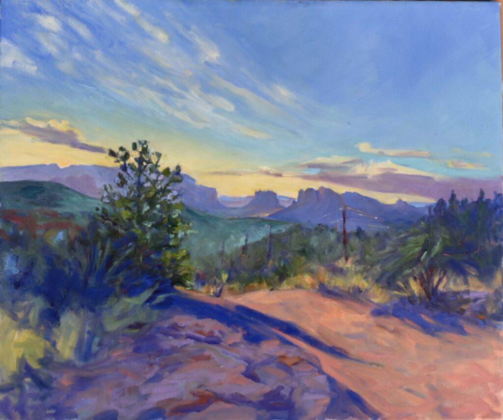
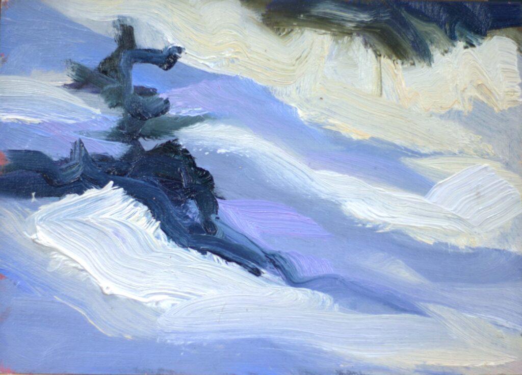
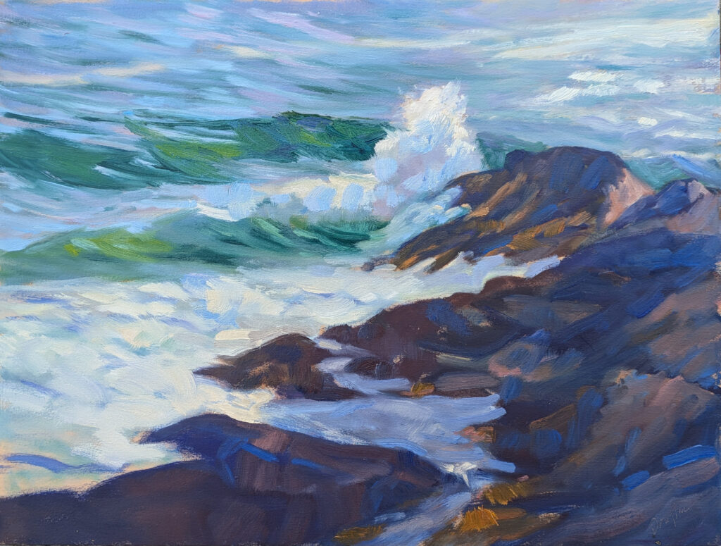
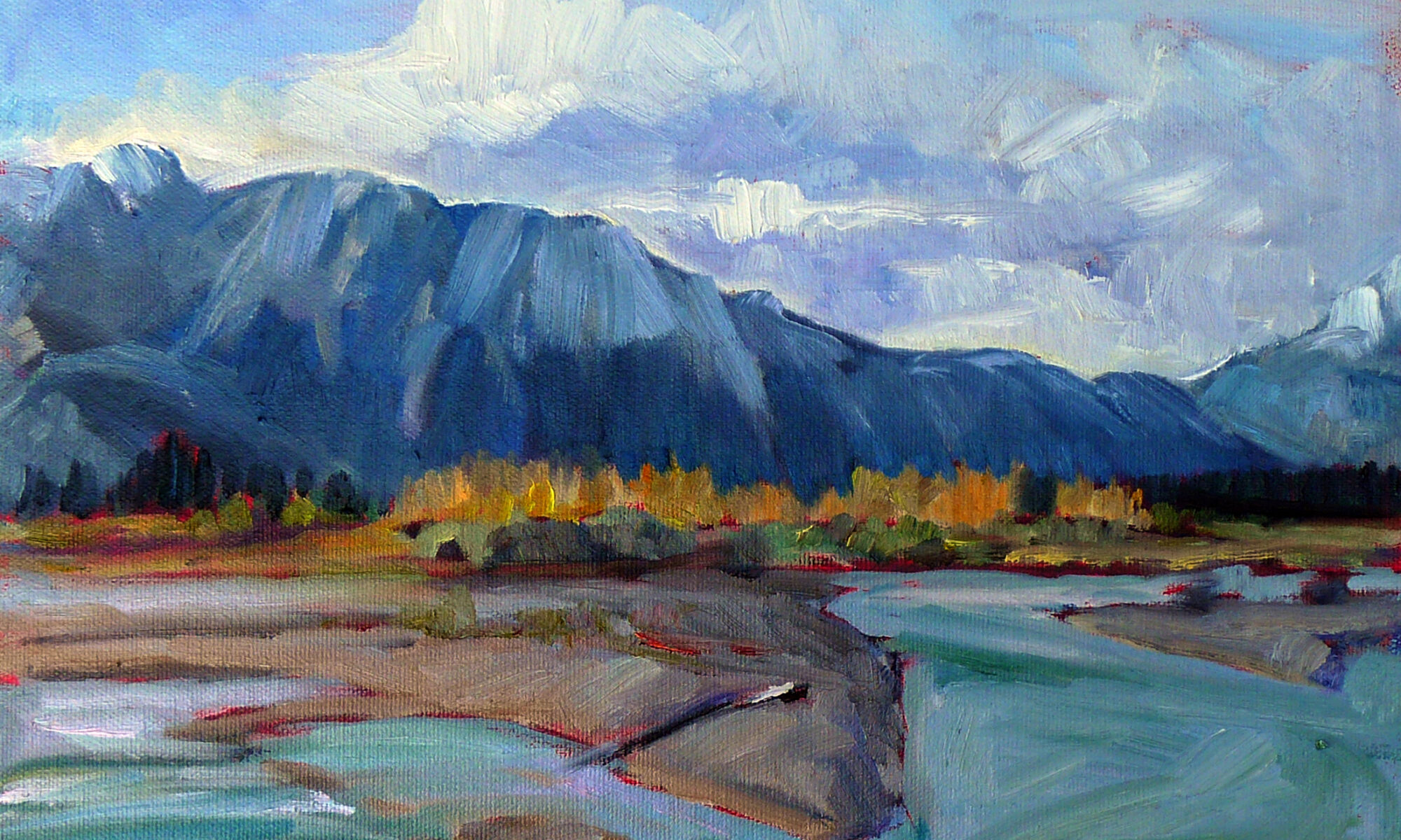
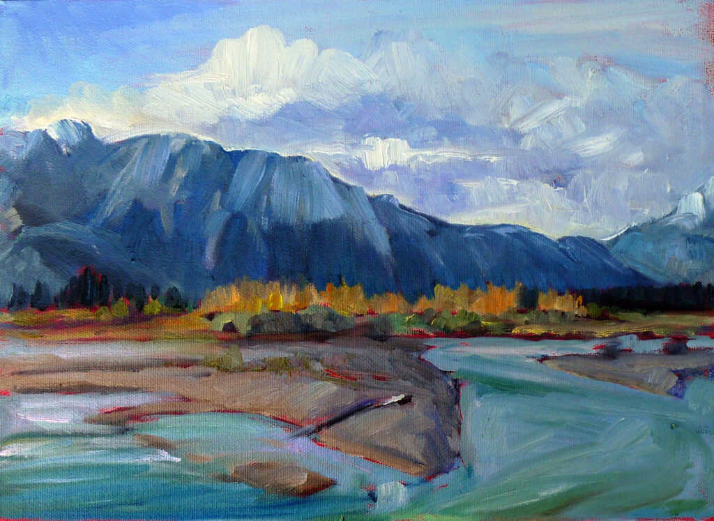
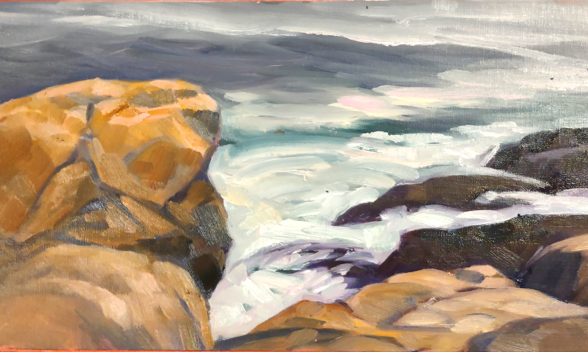
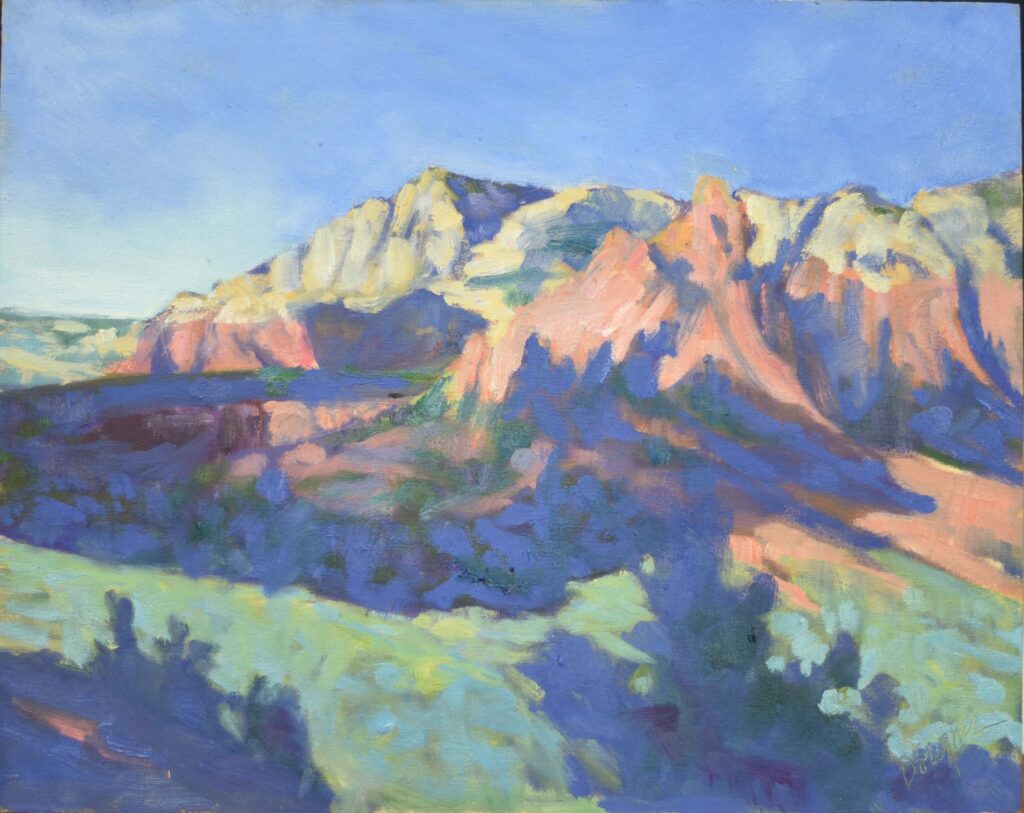
Last light at Cobequid Bay, 6X8, oil on archival canvasboard, $348 includes shipping and handling in continental US.

There are oil painters who will tell you there’s a hierarchy of mediums. “I had a watercolor friend who attended a plein air convention and she felt as if the oil painters were dismissive,” Cheryl said. “I listened to another oil painter friend on a podcast, and she was poo-pooing acrylics a bit. Her take was that galleries she was interested in were showing only oils.”

In my experience, many gallerists are already saddled with too many artists and will tell importuning artists the first thing that comes to mind to get rid of them. No gallery would reject a tempera painting by Andrew Wyeth, a watercolor by John Singer Sargent, or a house-paint drip painting by Jackson Pollock.

Having said that, there is some justification for the price differential between media. Some mediums are more time-consuming and the materials cost can be higher.

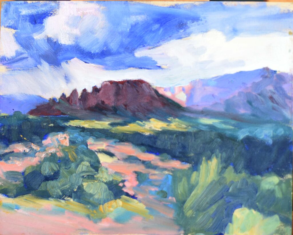
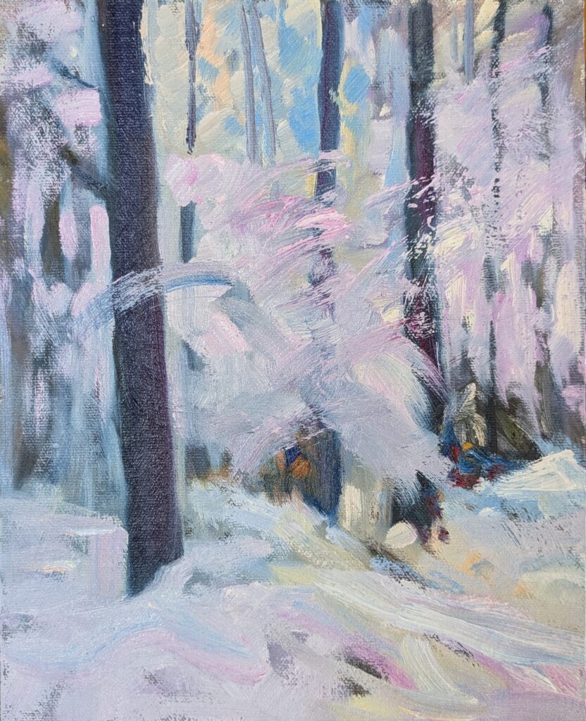
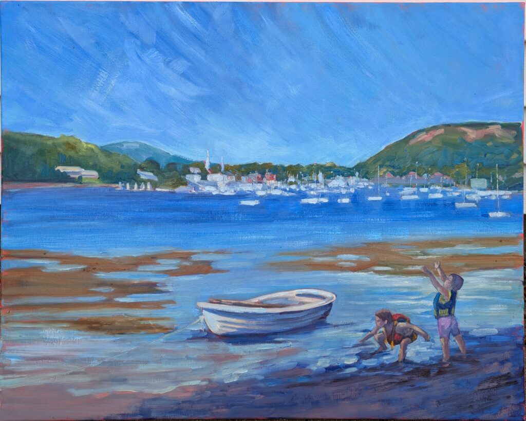
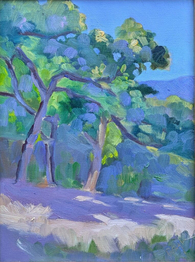
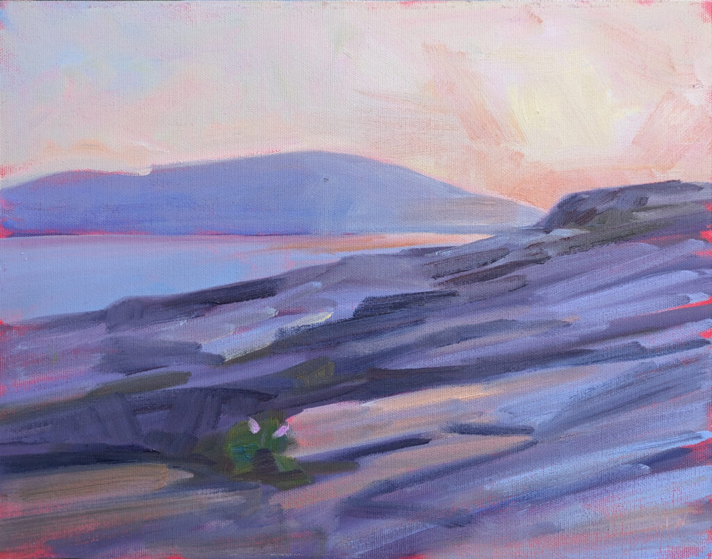
No Northern Lights Tonight, 6X8, oil on archival canvasboard, $348 includes shipping and handling in continental US.

Having taught many students in oils, acrylics, watercolor, and pastel, I have never been able to figure out what makes a person gravitate to a specific medium. They’re each capable of being either painterly or linear. But although I’m reasonably facile in them all, I gravitate to oils, followed by watercolors. It’s not that I think they’re better; in fact, if I were twenty again, I’d probably be using spray paint. It’s simply that it’s easiest to pick up the same kit day after day. If I flitted between them, I’d spend all my time setting up and none of it painting.

*That’s just a fancy way of saying, ‘everything else being equal.’

Mark next Friday on your calendar

Grand opening
Carol L. Douglas Gallery at Richards Hill
Friday, September 13, 5-7 PM
394 Commercial Street, Rockport, ME 04856

For more details, see here.

Reserve your spot now for a workshop in 2025:

Monday Morning Art School: do you see what I see?

Marshes along the Ottawa River, Plaisance, 8X10, oil on archival canvasboard, $522 includes shipping and handling in continental US.

There is a young maple tree that I watch from my living room. This morning, it’s green overlaid with bronze. The maple behind it has a golden hue where it’s hit by the sun, but the part in shadow is a very dull blue. Closer to my house, the neighbor’s tree is developing dull violet overtones.

We old-timers say that maple trees start turning color before the kids go back to school. That’s not strictly true, because maple trees change their color throughout the season, starting with the brilliant red buds that we recognize as one of the first signs of springs. New leaves are chartreuse and mature into the full-throated, deep, dull “wall of green” that’s the undoing of many painters. There summer sits for a few hot weeks before it begins to slide inexorably into the cooler air and warmer tones of fall. By autumn’s end, all the deciduous leaves will be gone except those of the young beeches and oaks, which will dry yellow and bronze on their stems and create a quiet susurration in the winter woods.

The Pine Tree State, 6X8, oil on archival canvasboard, $435.

But ask us what color a tree’s leaves are, and we’ll invariably say, “green.” We won’t specify the glossy dark green of summer oak leaves, or the delicate light green of the katsura tree. (I have one in my back yard, and as the leaves dry and fall, they smell like apple pie.)

The green that many painters use for foliage bears about the same relationship to the natural world’s green as Gatorade does to juice.

The Vineyard, oil on linen, 30X40, $5072 framed, includes shipping and handling in continental US.

Do you see what I see?

Sometimes I paint with sunglasses on, because I like painting contre jour and the light hurts my eyes. As much as people tell you not to do that, I never notice much problem matching values; my glasses are limiting the light reflecting from my paint and canvas as much as they are the light bouncing off the ocean. (Where they make a difference is in specular highlights, but forewarned is forearmed.)

Visual perception varies from person to person, but within our own brain, we make consistent adjustments. If you always see things as pinker than I do, you’ll see your paints that way, too, and unconsciously make the correction. Not that we really know what anyone else sees; how could we measure that?

Are you looking or thinking?

We humans are too smart for painting. We paint with our reason rather than our eyes. For example, we ‘know’ that the irises of the eye are round. We paint that without noticing that for most of us, our top lids cut off a wedge of this pie shape. We know that barns are red, so we don’t notice that the bright red barn on a far hill is in fact objectively brown; our minds interpolate the color for us.

“Eastern Manitoba Forest,” Sandilands National Forest, Manitoba

What do you really look like to others?

“Who is this old woman looking at me in the mirror?” my mother once asked me. Most of us carry around a mental snapshot of ourselves that’s a combination of all our prior selves, real or imagined. That can make a candid photo or unexpected compliment tough to take.

That’s, I think, the same phenomenon as described above. Our inner selves know us rather than see us objectively.

What’s the solution?

Time and practice are the great healers for this problem. Meanwhile:

• Consciously look at things as if you were seeing them for the first time. 
• Take the time to measure; that forces you to be objective.
• Draw or paint the same subject from different angles.
• Look for subtle color shifts and patterns.
• Observe light and shadow without thinking about what object you’re drawing.

Mark next Friday on your calendar

Grand opening
Carol L. Douglas Gallery at Richards Hill
Friday, September 13, 5-7 PM
394 Commercial Street, Rockport, ME 04856

For more details, see here.

Reserve your spot now for a workshop in 2025:

Weeds, pests and other good design

First intimations of fall, 8X10, oil on prepared birch surface.

We’re in a long run of beautiful weather here in Maine. Ken DeWaardEric JacobsenBjĂśrn Runquist and I have been out plein air painting as much as possible. I really need to do some paperwork, but there’s no rain on the forecast. How do people in southern California get anything done?

Here in New England, we know that any long stretch of warm, sunny, rain-free weather is the exception. Like squirrels storing up nuts for winter, we’re storing up visual memories of these warm days.

Overgrown, 8X10, oil on archival canvasboard.

I haven’t concerned myself with results. I’ve just painted fast and immersed myself in the process. Are any of these finished? Absolutely not. But they’re better than what was on those boards before.

For some reason, it’s been all about the weeds for me this week. I’m a big fan of God-as-gardener; I don’t think artificial gardens can touch wild meadows for beauty.

Nature’s palette shifts as the season progresses. Spring starts with delicate pastel blossoms blooming alongside the lilacs and dog roses. By midsummer, the blossoms grow more colorful, with crown vetch, clover and fireweed (and the brief, glorious burst of red wood lilies). Now that we’re approaching our first frost, we see radiant spirals of white and purple asters among the goldenrod. All are punctuated with the dried husks of milkweed and other earlier-blooming plants.

An unmowed field, 9X12, oil on archival canvasboard.

Purple loosestrife is, of course, an invasive pest and noxious weed; the experts all tell us that. They suggest pulling the plants before they can set seeds or, if it’s not in a wetland, spraying with an herbicide. (However, it likes its feet damp, so it avoids wholesale chemical slaughter, for the most part.)

It’s been around longer than I have, but its press is so bad that I’ve avoided painting it. However, the color is like nothing else in nature, and it complements goldenrod wonderfully.

The heck with it, I decided. If Eric doesn’t mind that it’s growing in his back field, neither do I. “The bees love it,” Eric told me. And anyways, I’m kind of an invasive species here, myself.

Sunbathers at Beauchamp Point, 9X12, oil on archival canvasboard.

I’ve painted boats at Beauchamp Point many times, since Rockport is a haven for wooden-boat enthusiasts. This week, I was distracted by a group of sunbathers, laughing and talking in the sweet evening air. There’s no sand on this ‘beach’, just rocks and bigger rocks, but there’s something satisfying about stretching out on a sun-kissed boulder. Pro tip: if you want people to leave, just start painting them.

Yesterday afternoon, Björn and I were finishing up, the others having moved along. An onshore breeze picked up. The temperature dropped, the leaves showed their undersides; a large flock of gulls pirouetted over our heads. “Where I’m from,” I told Björn, “the leaves turning over means a weather change.” He’d heard that too, but no such weather change is on the forecast.

After a lifetime in western New York, I could predict the weather from the sky, the wind, and even the smell of the air. Even after a decade, I have no such ability in Maine. I once asked Captain John Foss, what signs he looked for to predict a weather change. “I listen to the weather forecast,” he told me.

Mark next Friday on your calendar

Grand opening
Carol L. Douglas Gallery at Richards Hill
Friday, September 13, 5-7 PM
394 Commercial Street, Rockport, ME 04856

For more details, see here.

Reserve your spot now for a workshop in 2025:

Looking at summer in my rear-view mirror

Mature white pine at the Olson House, Cushing, ME, one of three things I painted on Thursday. Being contrarian, I refused to paint either the iconic view or the iconic house.

In past years, painting with Ken DeWaard, Eric Jacobsen and Björn Runquist wouldn’t have been worth a mention. This year I didn’t manage it until last Thursday. My summer has been terribly overbooked, something I’ve been complaining about for decades. That’s a pity when one lives in the northeast, where summer and fall are the best seasons.

I recently suggested to my daughter that we make a pact to not work more than 45 hours a week on non-family things. “I can’t possibly!” she responded. She’s a third-generation over-scheduler; my mother was the same way. When I was 35, my mother tried to get me to stop it, with about the same success. At 65 I begin to see what she was talking about. You don’t do anything well if you’re trying to do everything.

Having unsuccessfully laid down the gauntlet to my daughter, I spent the Labor Day weekend wrestling with myself about where I’ll cut down.

Brigantine Swift in Camden Harbor, 24X30, oil on canvas, framed, $3478 includes shipping and handling in continental US. Yes, this was painted en plein air, and if you want to see it in real life, it’s at Lone Pine Real Estate, 19 Elm Street, Camden, ME

What good is a teacher who doesn’t paint?

I sometimes feel as if I’m potting along in a Chevy Aveo while my friends pass me left and right in their Corvettes. I love teaching and I’m good at it. But that makes it too easy to sacrifice painting for teaching time. Painting should be constant revelation, change and discovery, and you can’t do that without a brush in your hand.

This, of course, is nobody’s fault but my own.

As I always tell my students, painting in the studio is good, but painting outdoors in natural light is the best possible training for an artist. In Maine, summer and fall are the best seasons, but, dang, they’re short!

Athabasca River Confluence, 9X12, $696 includes shipping and handling in continental US. I might crank about travel right now, but this is a place I’d go back to in a nanosecond.

I’m limiting my 2025 workshops.

I’m only going to teach four workshops in 2025, and none of them will involve flying.

Advanced Plein Air Painting (Rockport, ME), July 7-11, 2025

This is an opportunity for more advanced painters to work on the complex concepts in painting, like directing the viewer’s eye, narrative flow, serious drawing, etc. If you’ve already studied with me, email me to ask if you should take this workshop. If not, send me some sample work as per the course description.

That’s the only workshop that’s only for advanced painters. The rest are open to students of all levels (and I like a mixture of experience; it makes it livelier for everyone).

Sunset over Cadillac Mountain, oil on archival canvasboard, $869 includes shipping and handling. There’s a reason this is my longest-running workshop.

Sea and Sky at Acadia National Park, August 3-8, 2025

This is an opportunity to spend time at America’s first national park. I’d encourage you to live in if possible; it becomes a bonding and immersive experience. However, I always have commuters and they seem to benefit as well. I’ve been teaching this workshop longer than any other, because it’s a personal favorite.

Find Your Authentic Voice in Plein Air, Berkshires, August 11-15, 2025

This is centered in historic Lenox, MA. I chose this location because it’s in easy driving distance of NYC (3 hours) and Boston (2.5 hours). The Berkshires are relaxed, agricultural, historic and scenic. Plus, you can get good cider doughnuts. It’s the only workshop I teach where I also have been known to go shopping.

Immersive In-Person Fall Workshop, Rockport ME, October 6-10, 2025.
This is the height of fall color, for which of course New England is famous. Add the tang of the ocean and the peculiar reds of blueberry barrens and it’s downright otherworldly. I throw in a few curveballs, like a model in the landscape and a visit to the Farnsworth Art Museum in Rockland.

(By the way, if you want to do this in 2024, I still have a few openings.)

What does that mean for you?

It means that only 59 people will have the opportunity to study with me in person in 2025. (I’ll still be teaching on Zoom, of course.) I’ll be promoting these workshops all fall, but if you know you want to take one, you might as well register and make your deposit now.
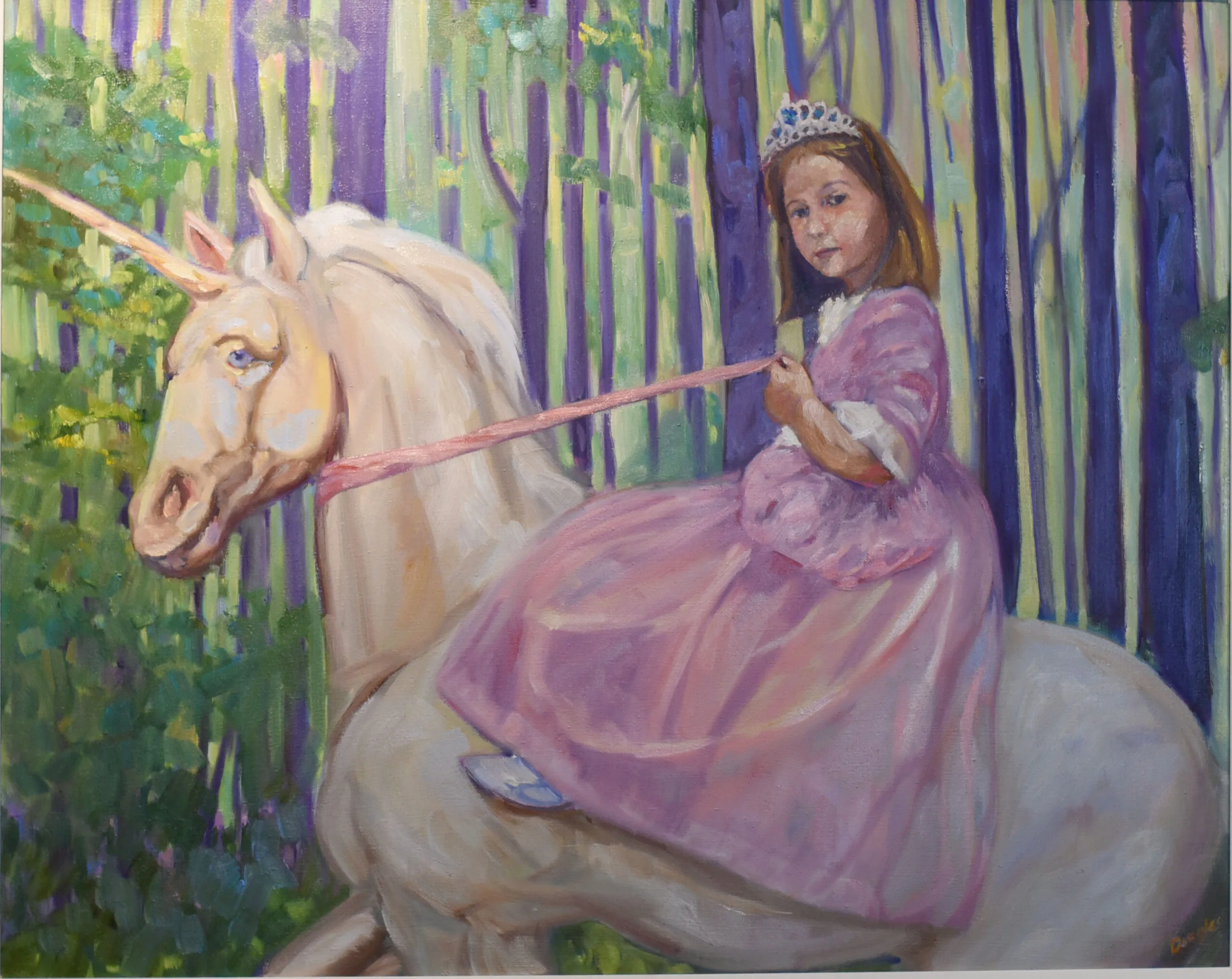
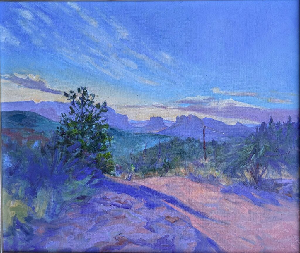
Reserve your spot now for a workshop in 2025:

Nothing lasts forever

The pine nursery (Madawaska Pond), 12X16, oil on canvasboard, available.

Beth Carr, who is both my student and my friend, is planning a trip to Jay, in Essex County, NY. As she knows the Adirondacks were once my Happy Hunting Grounds, she asked me for recommendations of places to paint. I suggested a few, but more importantly, I introduced her to the doyenne of Adirondack plein air painting, Sandra Hildreth.

Two years ago, Sandy took me for a long ride into the forest—north from Paul Smiths, NY and then eight miles down a rough logging track. From there we shouldered our backpacks and hiked a scant eighth of a mile to a point overlooking Madawaska Pond. The money shot (of course) was a view of Buck Mountain in the distance. But what interested me most was the tree nursery in the foreground.

I’d like to go back. Alas, Sandy tells me the road is washed out. I guess nothing lasts forever.

I’ve painted many things that are now gone, including the beaver dam at Quebec Brook and the lobster pound at Tenants Harbor. I suppose I could cultivate a Buddhist detachment, but usually these losses surprise me and make me sad.

The upside to this is that rotten times don’t last forever, either. Like everyone, I occasionally get into a funk where I wonder why I ever thought I could paint. I’ve been around long enough to realize that these too shall pass. I don’t particularly like Ecclesiastes; it’s depressing. However, Solomon is right in saying that there’s a time for everything. Plus ça change, plus c’est la mĂŞme.

Which leads me full circle to those baby trees—I wonder how they’re doing?

Reserve your spot now for a workshop in 2025:

Top ten painters of all time

Portrait of Sir Thomas Elyot, c. 1532–34, Hans Holbein the Younger, courtesy Royal Collection, Windsor Castle. Drawing is important, especially if you’re the artist to a famously murderous king.

I’m certain that as soon as I publish this, one of my pals is going to say, “but what about ___? You love his work!” But here’s my list of the top ten painters of all time, in date order.

The ‘ten’ thing is a joke, of course. This is after I weeded it down to 33.

Jan van Eyck (1390-1441). If he’d never painted anything but the Ghent Altarpiece and the The Arnolfini Portrait, he’d still rank in the top tier of art history.

Albrecht DĂźrer (1471-1528). His engravings and woodcuts dazzle with their perspective, complexity, delicacy and religious sensibility.

Hans Holbein the Younger (1497-1543). If you love Tudor history, you’ll love Holbein. Not only did he paint the definitive portraits of Henry VIII and his movers and shakers, his painting of Anne of Cleves changed the course of history.

Pieter Bruegel the Elder (1528-1569). He taught me the difference between subject and focal point in a painting.

Bronzino, (1503-1572). I’m not sure which I like more, his treatment of fabric or the arrogance of his models.

Michelangelo Merisi da Caravaggio (1571-1610). Yeah, he’s the best of the Baroque tenebrists, but it’s the gritty realism of his religious paintings that slays me.

Sir Peter Paul Rubens (1577-1640). Everyone carries on about his plump women, but I think his action paintings are the forerunner of modern comic books.

Diego VelĂĄzquez (1599-1660). Tenebrism with a saturnine Spanish twist, and oh, so human.

El Perro, c 1819-23, Francisco de Goya, oil mural on plaster transferred to canvas, courtesy Museo del Prado. Accidental or not, this was the birth of modernism.

Francisco Goya (1746-1828). He was a bit of a misery-guts, but he depicted the horrors of war like no other artist ever.

William Blake (1757-1827). He was eccentric to the point of madness and singular in his beliefs and he gave us the words to the hymn Jerusalem.

Caspar David Friedrich (1774-1840). You could write him off as just another Romantic, except his symbolism is so deep it’s narrative.

Jean-Auguste-Dominique Ingres (1780-1867). It’s all about the fabric, although I do think Napoleon I on his Imperial Throne is brilliant social commentary.

Seascape Study with Rain Cloud, c 1824, John Constable, courtesy Royal Academy of Arts

John Constable (1776-1837). He invented plein air, and then went to France and explained it to the Barbizon School. His field studies are as fresh as any modern painter’s.

Frederic Edwin Church (1826-1900). Nobody could build a showstopping theatrical painting like Church.

Édouard Manet (1832-1883). Yes, his social commentary is incisive, but I’m also moved by the little still lives he did while dying.

Winslow Homer (1836-1910). He painted two of my favorite places—the Adirondacks and the Maine coast—and he taught me everything I know about diagonals in composition.

Claude Monet (1840-1926). Everything we know about optics and color can be credited to him.

Jules Bastien-Lepage (1848-1884) I love his Joan of Arc for the way it weaves visions into the landscape, but he also had a real feel for the French peasantry.

Vincent van Gogh (1853-1890). The older I get, the more I appreciate him as a color and brushwork revolutionary. I just wish he could have been happier.

JoaquĂ­n Sorolla (1863-1923). He edges past the other two greats of Edwardian-era painting, John Singer Sargent and Anders Zorn. It’s the color of the light.

The Teamster, 1916, George Bellows, courtesy Farnsworth Art Museum

George Bellows (1882-1925). Whether he was painting in New York or on the Maine coast, he was a man of the people. Which is not to downplay the importance of his color or composition.

Arthur Streeton (1867-1943). He’s my favorite of the Heidelberg School painters for his ethereal depictions of the Australian bush.

David Davies, (1864-1939) runs a very close second to Streeton, particularly for his bush nocturnes.

Maynard Dixon (1875-1946) He’s on my list for the way he organizes the chaos and color of the western landscape.

John F. Carlson (1875-1947). His gloomy winter skies, flat landscapes and sweeping woods are a dead giveaway that he grew up in my hometown of Buffalo, NY. Somehow, he manages to make them look good.

Tom Thomson (1877-1917) He treats a subject I love (the woods and water of Ontario) with a raw, vital and uniquely North American version of Impressionism.

Rockwell Kent (1882-1971). He was a brilliant designer, and a painter, printmaker, illustrator, writer, sailor, and adventurer. That’s a life to emulate.

Francis Cadell (1883-1937) is my favorite of the Scottish Colourists, both for his impeccable design and for his light and lovely depictions of Iona.

Greenland Mountains, c. 1930, Lawren Harris, courtesy National Gallery of Canada

Lawren Harris (1885-1920). Of all the Group of Seven, he’s the one who took the longest stylistic and spiritual journey, and most revered the notion of the Great White North.

Sir Stanley Spencer (1891-1959). He was too soft to protect himself against a designing woman, but his depictions of English life, his Biblical narratives and his paintings for the Sandham Memorial Chapel are all moving.

Clyfford Still (1904-1980). Whether you’re a figurative or abstract painter, you can learn so much about design from him.

Wayne Thiebaud (1920-2021). Everyone knows him for his pies, lipsticks, cakes and hot dogs, but he was a brilliant landscape painter.

Lois Dodd (1927-present). She’s a keen observer who knows how to simplify exactly the right amount. She never gets stuck in the weeds.

What painters have influenced you? Who did I miss on my list? Who would you have never included? And why?

Reserve your spot now for a workshop in 2025:

Monday Morning Art School: what is alla prima painting?

Cinnamon Fern, 9X12, oil on archival canvasboard, $869 framed includes shipping and handling in continental US.

Occasionally, I’ll hear someone fumble for a description of a painting and come up with plein air style. Plein air isn’t a style or technique; it simply means painting outdoors instead of in a studio. Plein air allows an artist to capture natural light and colors from direct observation, and it’s a very important movement in art history, starting with John Constable and still popular today.

What these people are groping for is the term alla prima. The confusion lies in the fact that most (although not all) plein air painters also use alla prima technique.

American Eagle in Drydock, 12X16, $1159 unframed includes shipping and handling in continental US.

What is alla prima?

Alla prima (also called au premier coup, wet-on-wet, or direct painting) is a technique where the artist applies paint directly onto the canvas without letting earlier layers dry. This contrasts with indirect painting, which I describe below.

Alla prima is used mostly in oil painting, but it has its equivalent in wet-on-wet watercolor. In alla prima painting, the artist strives for fast, incisive brushwork. It requires skill to avoid making mud, and the artist must work with confidence and speed.

Alla prima has been in use since the Early Netherlandish painters. It became popularized with the rise of Impressionism, but painters as disparate as Frans Hals, Claude Monet, Vincent van Gogh, John Singer Sargent, Chaïm Soutine and Willem de Kooning have all painted directly. Rembrandt van Rijn painted indirectly for the most part, but pointed up his work with alla prima passages.

Skylarking, 24X36, oil on canvas, $3985 framed includes shipping and handling in continental US.

Alla prima paintings are not necessarily completed in one session, although the goal is to not let the bottom layers dry before adding more paint. There is minimal layering, and the focus is on capturing the essence of the subject with bold, confident strokes. It prioritizes expression and immediacy over meticulous detail.

This lends itself to a more expressive, loose style, with visible brushstrokes and a sense of movement. In fact, when people tell me their goal is to ‘get looser,’ what they generally mean is that they want to master alla prima painting.

Indirect painting

Before we had oil painting, we had egg tempera, encaustic, fresco and distemper, none of which lend themselves to bravura brushwork. It’s no surprise, then, that meticulous, detailed painting was the first form oil painting took. Just as tempera is layered, so was early oil painting.  

In indirect painting, the artist builds up the image with transparent layers. Each layer dries completely before the next one is applied. Indirect painting allows for a high level of control and detail. Artists can build up subtle transitions of color and light, creating a realistic, highly polished finish. Indirect painting’s great virtue is that it creates luminosity that’s impossible to achieve with direct painting. That comes, however, at the expense of brilliant color and brushwork.

Belfast Harbor, oil on archival canvasboard, 14X18, $1,275 unframed includes shipping and handling in continental United States.

Indirect paintings start with a monochromatic underpainting or grisaille: While most direct painters do this as well, the grisaille in an indirect painting is intended to show through subsequent layers. This establishes the composition and tonal values retained throughout the piece.

This base layer is allowed to dry and is followed with diluted, transparent layers of paint (called glazes). These are applied over the underpainting to modify the color. Each glaze layer dries before the next is added. White is lousy for glazing, so in a well-painted indirect painting, the light is reflecting through the paint from the grisaille layer.

Indirect painting was widely used during the Renaissance and Baroque periods. (It’s the only way to achieve true chiaroscuro.) There are artists using it today, but they’re doing so almost self-consciously, as a throwback to earlier periods in painting history.

Back in the last millennium, I learned indirect painting first, alla prima second. (Rembrandt’s style was undergoing a miniature renaissance then.) Today, there are far more modern painters pursuing alla prima than indirect painting, but one isn’t inherently better than the other. In fact, with new materials solving the age-old problems of chroma and cracking, who knows if indirect painting is due for a rebirth?   

Reserve your spot now for a workshop in 2025:

Sunset over Cadillac Mountain

Sunset over Cadillac Mountain, oil on archival canvasboard, $869 includes shipping and handling.

I’m not certain who among my students at Sea & Sky at Schoodic first suggested the twenty-strokes challenge, but it was so much fun that I asked my students at my Berkshires workshop to do the same thing. If you’ve never done it, it’s a great exercise for controlling the noodling that sometimes ruins a promising start. The only rule is that you do a painting in twenty strokes or less.

We all concentrated on making every shape count, including using a larger, well-loaded brush and filling in all the continuous areas in one shot. I was able to lay out the painting below in four carefully-considered strokes. The rest was just details. (Sadly, I didn’t photograph it before I added some extra emphasis brush strokes.)

Baby pine tree, 8X10, oil on archival canvasboard, private collection. While this final painting has a few more than the designated twenty strokes (I’m terrible at taking process photos) it’s not by a lot.

This was also an exercise to demonstrate that a centered composition is not inherently bad; it’s what you do with the rest of the space that counts. Centered compositions in themselves are imposing and serene. For proof that they work, see King Tut’s funerary mask or Arkhip Kuindzhi’s imposing Russian landscapes.

Before we did that fast-painting exercise, we went out to Schoodic Point to paint the sunset. None of us were counting strokes, but the sun dropping behind a mountain moves very fast. I doubt there are many more strokes in this than the prescribed twenty.

I took it home to my studio intending to finish it, but there is nothing I can do to improve on what’s there. It says everything one needs to say about the sun setting over Cadillac Mountain without a single extraneous brushstroke. Anything I add would diminish it.

How much is that painting worth, anyway?

Sometimes I am asked why a Cy Twombly scribble is worth $70 million. The high-end art market is complicated, being composed of talent, money laundering, speculation, rarity and social cache (and I have no opinion about the value of each).

The same question might be asked about why this painting is worth the same amount as Lacecap Hydrangea and Daylilies, which is the same size and a lot more complex. It’s not about how much I struggled to paint it (and the flower one was a terrific struggle), but about all the knowledge I brought into the painting.

Nocturne in Black and Gold: The Falling Rocket, 1874, James McNeil Whistler, courtesy Detroit Institute of Arts. This is the painting which so peeved John Ruskin.

James McNeil Whistler was panned by the legendary art critic John Ruskin, who by 1877 was no longer up to the challenge of modernity. Ruskin wrote, “I have seen and heard much of cockney impudence before now, but never expected to hear a coxcomb ask two hundred guineas for flinging a pot of paint in the public’s face.”

Whistler sued. He did not ask 200 guineas for two days’ work, he argued; he asked it for the knowledge he had gained in the work of a lifetime. He won, although he received only a pitiable farthing in damages. The case bankrupted Whistler and probably accelerated Ruskin’s mental decline. However, time has vindicated Whistler.

Art is not judged by the effort that goes into a particular piece, but by whether it ploughs new ground, challenges ideas, is technically skilled and provokes a response.

Reserve your spot now for a workshop in 2025:

Art heist, and this one was personal

The one that got away–Lauren Hammond’s color exercise, 9X12, that walked from our Berkshires workshop.

Last week I taught a delightful workshop in the Berkshires. I had demonstrated optical mixing (or broken color), and Lauren Hammond worked hard to execute the concept. Her finished painting was so lovely that I took a photo of it. She set it on the ground while she started something else. Thinking I knew better, I moved it to a nearby table so she didn’t inadvertently step on it. Our group was spread out over many acres, so most of the time, Lauren was alone at her easel.

“I think someone stole my painting!” she texted me. In decades of teaching, the closest I’ve ever come to that was when Sue Leo’s camera was lifted in Rochester’s Mount Hope Cemetery. But Mount Hope is near a sketchy neighborhood in a crime-ridden city. Lauren was in a place where I wouldn’t think twice about leaving my car unlocked.

“She’s just overlooking it,” I told myself, and I went back to help her find it. Other students helped us look and the venue manager contacted all her employees, all to no avail. It was gone. Lauren was the victim of an art heist.

The end of the evidence trail. I photographed it and then cleaned up the mess.

I’m an inveterate reader of mysteries, so I hunted for clues. Aha, I thought, here’s one—a painting imprint on another nearby table. But that, sadly, was where the trail ended. I’m no Miss Marple.

People have posited various alternative theories to me. Perhaps it was mistaken for garbage and thrown away. Perhaps they thought it was left there for someone else to take (as in the Acts of Kindness movement). Perhaps it blew away. Because I saw the scene of the crime, I can tell you with absolute assurance that none of these things happened.

Art heist losses are hard to estimate but they’re estimated at around $4-6 billion US per year. Money laundering in the art market is an even bigger problem. In comparison, Lauren’s painting is a drop in a very big bucket. But I take it personally.

Let this be a lesson to you.

Even the safest painting sites need just one bad person to cause trouble, and there are many worse outcomes than losing a painting. Be in the zone but be aware of what’s going on around you. If you’re at all in doubt, paint in pairs. I’ve painted all over the world and never had a problem, but then again I’ve never had a student’s painting stolen either.

Why you shouldn’t steal paintings. Really.

If you’re a regular reader of this blog, you already know this, but humor me. Stealing art is rotten because:

  1. The artist put time, effort, and years of training into creating that work. It’s no different from any other tangible object with value;
  2. Stealing a painting deprives others of the opportunity to experience the work;
  3. Stealing is a crime that usually affects the little guys. We’ve abolished hanging as the punishment for theft, but I sure do understand why stealing riled up our ancestors;
  4. Paintings are personal, so stealing one is personal, too.

But I would never do that!

Photographers are people too, so the next time you’re tempted to use someone else’s online photo as reference for your painting, consider their property rights. Go outside and shoot your own reference picture. If that’s impossible, check Creative Commons for open-access images.

Lauren’s last painting of the workshop. Nice broken color, more challenging design.

All’s well that ends well

My goal on the last day was to encourage Lauren to paint something even stronger than the one that got away. I think she did so. It’s more complex and adventurous in design, but the color is just as well-executed.

Reserve your spot now for a workshop in 2025:

Monday Morning Art School: the color of light

Is the light warm or cool in this painting? Two Peppers, oil on archival canvasboard, 6X8, $435.00

Additive and subtractive light refer to two different color systems, each operating under different rules. The difference between the two is fundamental in color theory. They both affect painting, as one influences what we see, and the other influences what we put down on our paper or canvas.

Is the light warm or cool in this painting? Tricky Mary in a Pea-Soup Fog, oil on canvas, Carol L. Douglas, courtesy private collection.

Additive Light

Additive color mixing involves combining different colors of light to create new colors. The more colors you add, the closer you get to white light.

The primary colors of additive mixing are Red, Green, and Blue (RGB). When you mix these three primary colors of light at full intensity, you get white. By varying the intensity of these lights, you can produce a wide range of colors.

This is the light system of computer screens, televisions, and stage lighting. More importantly, it’s the light system of the world that surrounds us, thanks to our sun.

Subtractive Light

Subtractive color is what happens in printing, painting, and any medium that relies on reflected light. In them, mixing means absorbing (removing) certain wavelengths of light to produce color. Pigments, dyes, and inks all absorb certain colors and reflect others.

The primary colors of subtractive mixing are, more or less, those you learned in kindergarten: cyan (blue), magenta (red), and yellow. In printing, black is added, creating the CMYK model.

Is the light warm or cool in this painting? Michelle Reading, oil on linen, 24X30, $3,478.00 framed, includes shipping and handling in continental US.

Color temperature

Color temperature is a measure of the color of light, expressed in degrees Kelvin (K). It describes the appearance of light and how warm or cool it looks to the human eye. Understanding color temperature is essential in painting.

At lower temperatures, the light appears red or orange (warm colors). As the temperature rises, the light shifts to yellow, white, and eventually blue (cool colors). Yes, that’s counterintuitive, because what we call warm or cool is influenced culturally, not by science.

Now that lightbulbs are tunable for color temperature, we may change how we feel about this, but historically, we’ve said:

-Warm light appears yellow/orange, and creates a cozy or sunlit atmosphere.

-Cool light appears blue/white, and creates a crisp and focused atmosphere.

-Neutral light: doesn’t have a color… and neither does its shadow.

Manipulating these in painting gives paintings an overall mood, which is why photographers covet the golden hours of early morning and late afternoon.

Is the light warm or cool in this painting? View from Bald Mountain, 24X36, oil on canvas, Carol L. Douglas, private collection.

The color of shadows

Shadows being the absence of light, they are also the complement of the light source (what’s left when the light is blocked). However, they’re not the complement within the subtractive light system, but the additive light system. It’s not as simple as saying “it’s gold light, so the shadow is purple,” although most people wouldn’t quibble about that.

Every color of light has RGB values, which are a system for representing colors on digital displays. We could find the complement, or shadow color, by subtracting the RGB values of the light from 255, which would give us a blue-violet. However, that would be an absolutely insane solution to the question. Instead, use your eyes, which will tell you that the shadows of evening are blue or violet. Or, better yet, use your imagination along with your eyes.

Bouncy, bouncy light

There are some surroundings where reflected color is so strong that it blows out this kind of light structure. The greens of the deep forest are one, sitting under an awning is another, and my studio with its natural wood paneling is a third. In these instances, the dominant color influences everything.

Learn more

I got home to find that I only have one more seat left in Applied Color Theory, which starts tomorrow. But there are always my workshops, below.

Reserve your spot now for a workshop in 2025: