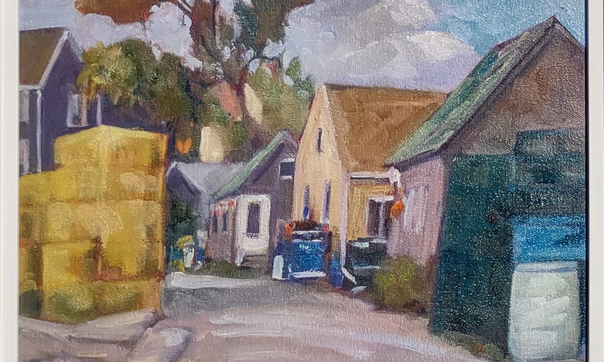
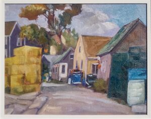
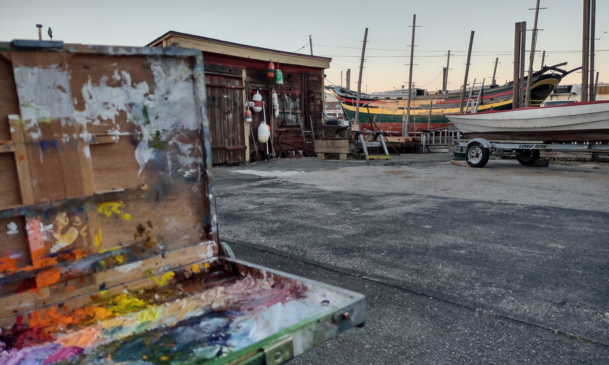
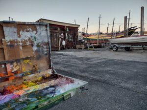
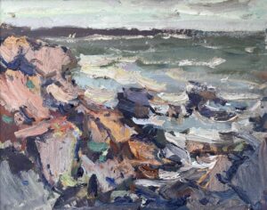
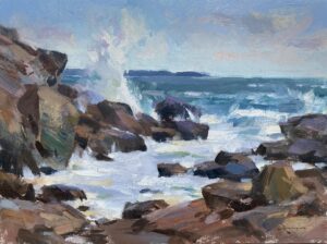
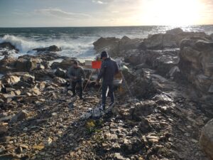
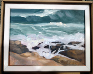
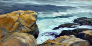
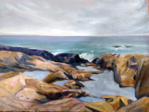
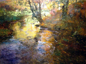
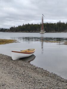
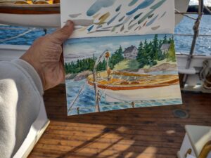
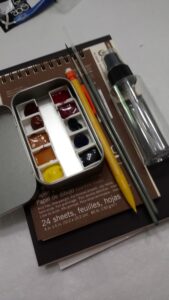
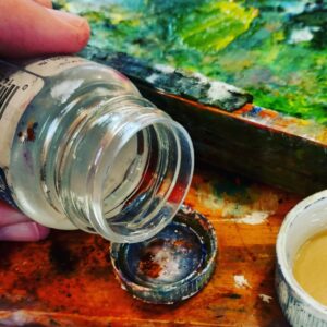
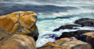
fbpx

God Save the Queen

Here in the countryside, her subjects love her.


Shop window display in Cumbria


Every small town we’ve walked through has been decorated for the Jubilee. That’s not with big-box generic dĂ©cor, either, although there are Jubilee flags and bunting everywhere. Every little shop window and many, many front gardens sport tributes from the heart—handmade signs, memorabilia from the Coronation, and many, many teacups of the kind your grandmother collected.

A laundromat in Haltwhistle, Cumbria

It's not my country, she’s not my Queen, but the sentiment chokes me up. This is England’s famous red wall, the Labour heartland that went Conservative in the last election. In other words, it’s in political flux. There are both conservative and workingmen’s pubs in these villages, but none of that touches the Jubilee. The Queen truly transcends politics in a way Americans don’t understand. This Jubilee is her celebration.

Every pub is decorated for the Jubilee.

I am an unabashed fan of the Queen. She reminds me of my mother and all the women of her generation—stoic, composed, hardworking, redoubtable and dignified. I miss them, terribly.

The Jubilee is tied with memories of WW2, which are made more poignant by the current Ukraine war.

The Washington Post opined recently that the Queen should retire. We Americans are not entitled to an opinion (something we should practice saying regularly about a whole host of things). The British monarchy has had no impact on America for 250 years. Any road, the question of whether she’s ‘fit’ for the role is absurd. The modern monarchy is largely her creation, and for all we know she’ll keep on defining it.

The Queen Bee and her subject bees in Gilsland.

I will be in Yorkshire for the Jubilee celebrations proper, but there could be no better place to observe them than right here in Brampton, Cumbria—or any of the other little villages we’ve passed through. There will be prayer vigils and parties for the old people. Tomorrow night, there will be beacons lit across England, including along Hadrian’s Wall. These will range from “private bonfires to full-blown spectaculars with fireworks, choirs, pipers, and buglers.”

The Queen's corgis in a large yarn-bomb in Brampton, Cumbria.

I’ve been to Britain before, but always to big cities or World Heritage Sites. This time, I’m waiting out the rain in country bus stops and drinking in rural pubs. This England is to London as Pecos, NM is to New York. I had breakfast yesterday with a Shropshire farmer. We discussed the labor shortage, just as I might with my Maine neighbor.

In the window of an Indian restaurant in Brampton.

Two nights ago, we stayed at The Centre of Britain in Haltwhistle. It’s in a stone building that wraps around a 15th century Border Reivers' Pele Tower. It’s ridiculously atmospheric, and it’s for sale for a fraction of the price of a boutique inn in Maine. You’d have to deal with muddy boots, but if you want to throw over your current life for one in a small English village, email the proprietors here. The beer, I promise you, is very, very good.

Many people have pulled out treasured memorabilia from the Coronation in 1952.

The care and feeding of your dogs

Poppy discovered the joys of manure, but my feet were thoroughly blistered.

The beautiful Northumbrian landscape.

This is what I’d call ‘hill-walking’ but my friend Kenny—who was raised on the shores of Loch Linnhe, just a hop, skip and a jump from Ben Nevis—thinks of as a doddle. Shortly after leaving the Tyne at Newburn, we started the long slog up to Heddon-on-the-Wall. There is no urban sprawl here—just long agricultural vistas and Constable skies.

These small Northumbrian villages are Cotswold-beautiful, built of golden-brown stone and perched on high hills with magnificent vistas in every direction. Still, all the beauty in the world doesn’t prevent one from being parched and in need of a pee by midmorning. There was a public house but it seemed a bit early, even for me.

The ever-polite British have deferred the 1900th birthday celebrations for the wall until September, so as to not take away from the Queen's Jubilee.

“Look for a Methodist church,” said Alison, and she was right. They had a bathroom, and they offered us coffee, tea, and cheese scones. We had a lovely sit in their garden before we went to look at our first section of unreconstructed wall. Thank you, lovely Methodists!

From there we walked a section of military road planned by Field Marshal George Wade following his inability to move artillery and troops cross-country in pursuit of Bonnie Prince Charlie. The old wall was torn out and used as the base for the highway. The British were pretty sick of the Jacobites by that point.

Our first glimpse of the wall since Wallsend.

After crossing the A69, we dropped down into a peaceful meadow where Poppy discovered the joys of cow dung. Poppy is a well-bred lass from Edinburgh but that didn’t stop her from rolling ecstatically. Fifteen minutes and a package of baby wipes later, we’d fairly evenly distributed the manure among our human persons, with only a moderate amount left on the dog.

Rural England is crisscrossed by public rights-of-way, but they’re shared with livestock. I don’t mind cows; they’re generally leery of people. Horses so far have been behind fences; that’s good as they’re far too canny to be trusted with daypacks.

Rudchester Farm.

At Rudchester, we crossed a sheepfold, the site of the fourth fort along the Wall, Vindobala. The only reminder of its existence was the unnatural flatness of the farmyard—and the ancient stone walls, undoubtably made of reclaimed stone. As we gathered to read the explanatory sign, Poppy found sheep manure and joyfully worked it with her muzzle.

I am an assiduous hiker who does 4.5 miles up Beech Hill every morning before breakfast. I’d hoped that would prepare me for this walk, but by midafternoon, my own poor dogs were blistered. They were sliding forward with every downward step. At lunch, Martha cleverly relaced my hiking shoes for me, but the damage was done. I limped the remaining distance.

The path is very well marked, and surprisingly busy.

Kenny is very kind. For the last four miles, he promised me that there was a pub just another half mile along.

It worked.

The Perfect English Holiday

I dipped my feet in the North Sea. It rained. I ate an ice cream. There was a dog. How much more British can you get?

Dipping my toes in the North Sea, with the requisite British dog. Her name is Poppy and she's a gem.

Last week, I wrote here and here that nothing lasts forever. In Britain, is sometimes turned on its head; antiquity seems to pop up everywhere.

The Moray Estate was built in the early 19th century on a steep slope above the Water of Leith. Ownership is by feu, a feudal land tenure system peculiar to Scotland. The freeholder is somehow a vassal to the mesne lord, in this case the Earl of Moray. This is all pretty vestigial at this point, but it seems to confer some rights, including the beautiful gardens of the Moray Estate.

Portrait of Dr. Martha Vail Barker, 2019, Carol L. Douglas.

I came to Scotland in 2019 to paint a portrait in one of these townhouses, located on Great Stuart Street. In the end it became as much a portrait of the rooms as of the subject. I’d heard the townhouse had sustained serious flooding last year, but the scale of the damage shocked me. There is nothing left of the rooms but the radiators, the fireplace and the wooden shutters. The ornate plaster ceiling friezes have been restored; but the floors are gone completely. The ground floor has been restored, with just a few fiddly bits left to finish, but the first floor is uninhabitable. Nothing lasts forever.

The Moray Estate was built to house Edinburgh’s rich and famous, but the only one that truly interests me is the Scottish Colourist, Francis Cadell, whose family home was at 22 Ainslie Place. Cadell used that interior in many of his paintings, so I play Peeping Tom whenever I walk by.

Interior, The Orange Blind, c. 1914, Francil Cadell

My goal for this trip is actually England, not Edinburgh. Yesterday, we traveled by train to Newcastle-upon-Tyne. The East Lothian landscape would serve up a lifetime of painting in itself. Quietly rolling, impossibly green, dotted with sheep and cattle, it lies along the North Sea. Unlike America, every inch of shoreline has not been coopted by the rich.

We spent the afternoon dutifully touring the Roman ruins of Segedunum. There are only so many clay pots and bronze brooches I can take, but the cavalry barracks were touching. Each man lived back-to-back with his horse in adjoining rooms and stalls. How do they know this? On one side of the wall were the remains of cooking hearths. On the other, horse piss and manure.

The Spanish City in its heyday.

The seaside holiday resort of Whitley Bay is dominated by the Spanish City, a pleasure hall that opened in 1910. It once included a concert hall, ballroom, funfair, restaurant, tea room and roof garden, but all are closed. Now there’s a gift shop, a restaurant, and a wedding venue.

I ate an ice cream on the lido and dipped my toes in the North Sea. It rained. In short; it was a perfect English holiday.

Today we start our walk in earnest—11.5 miles through Tyneside. We’ve been promised that this is the most boring part of the walk, as we’re essentially crossing the city. The upside, as I reminded my partners in this venture, is that we can lunch in a pub, and that will include a half pint of Newcastle Brown Ale.

Boys will be boys

Boys must be boys

The ick factor in art history is compounded by our own era’s obsession with sex and power.

The Milkmaid, c. 1600, Johannes Vermeer, courtesy Rijksmuseum

During Monday’s class, I zipped quickly through Vermeer’s oeuvre on line, when a sentence about Vermeer’s The Milkmaid stopped me cold. This is one of the most well-known paintings in western art, so familiar that it’s become background noise.

“For at least two centuries before the painting was created, milkmaids and kitchen maids had a reputation as being predisposed to love or sex, and this was frequently reflected in Dutch paintings of kitchen and market scenes from Antwerp, Utrecht and Delft. Some of the paintings were slyly suggestive, like The Milkmaid, others more coarsely so.”

This interpretation apparently came from a 2009 show at the Metropolitan, curated by the late Walter Liedtke, because most of the text was lifted verbatim from his catalog.

“The physical appeal of the ‘milkmaid’ is sensed naturally,” wrote Liedtke, “like the taste of milk or the touch of bread. Rough sleeves reveal bare arms, where the skin (unlike that of the wrists and hands) is rarely exposed to sunlight. The ruddy wrists and face, the woman's generous proportions, and her warmth, softness and approachability are qualities not found in Vermeer's more refined young ladies. They too are alluring, but the kitchen maid is frankly so.”

Kitchen Scene, 1620s, Peter Wtewael, courtesy Metropolitan Museum of Art

There are certainly coarse Dutch kitchen scenes—the Peter Wtewael kitchen scene, above, is a compendium of every sex reference that can be crammed on a canvas. Dutch painting of this time was full of jokes and bawdy comic references. Frans Hals’ laughing faces contrast vividly with the rest of Europe’s dour demeanor in Baroque portraiture. Art history tells us that the Dutch drank copiously.

Yes, the 17th century Dutch Republic was Calvinist. Prostitution and adultery were against the law. That didn’t stop the Dutch from recognizing the realities of life, and laughing at them.

The Laughing Cavalier, 1624, Frans Hals, courtesy the Wallace Collection

But Peter Wtewael’s kitchen scene is the attraction of equals. That’s very different from the class abuse of men like Samuel Pepys groping their maids.

These paintings are no longer in middle-class Dutch homes. They have been moved to palaces and museums, where their caretakers and interpreters are the wealthy, educated and powerful. It’s no surprise that their own privilege subtly colors the work they analyze.

To Liedtke, the wide-mouth jug in The Milkmaid was a symbol of feminine anatomy. “By inserting a foot warmer and, next to it, a Delft tile depicting Cupid, Vermeer intimates that love and desire, as well as work, are burdens the maid must bear
 Foot warmers do not heat rooms. They heat feet and, under a long skirt (as in Van Loo's Wooing), more private parts.”

Ick.

The Procuress, c. 1622, Dirck van Baburen, courtesy Museum of Fine Arts.

This is not to say that there wasn’t an erotic underpinning to Dutch art, or that servants weren’t the objects of male lust. “I am perfectly willing to believe that you are knowledgeable in the delectable art of preparing stews / But I feel even more appetite for you / Than for the stew that you are preparing,” read the French caption for an engraving of Gerrit Dou’s A Girl Chopping Onions.

It’s just that the ick factor is compounded by our own era’s obsession with sex and power.

Vermeer was just too intelligent to have played this game of simple parts. His mature paintings show keen psychological insight. His milkmaid is a dignified, moral presence. It’s obscene to suggest otherwise.

One last road trip in the Eco-Warrior

I’m off on a harebrained excursion to nowhere in particular.

On this trip, I put four easels, three painting kits, one pastel kit, three chairs, three umbrellas, luggage for three people for eight days, a solo art show, three computers, and three passengers in the Prius.

When your adult child says, “do you want to go on a harebrained excursion to nowhere in particular, immediately, and damn the torpedoes, full speed ahead,” you should say yes. That child will soon be entangled in family and mortgages and too busy to be silly.

But if you ask yourself, where does he get these ideas, you already know the answer.

Blizzards? This car has known a few.

I like nothing better than long drives to far-off places, in the company of people I love. That’s how I ended up trekking 10,000 miles across Canada with my daughter Mary, and in a Land Rover tooling around the Hebrides with my family. It’s not why I ended up driving across Patagonia with Jane Chapin, but the net result was the same.

As you’re reading this, I’m gliding west in my youngest kid’s car, heading for Yellowstone. As with that fateful drive with Mary, I’m in a very tired car. In this case it’s the same 2005 Prius I drove for 16 years, now in his custody. That gives me a certain amount of confidence, because I know the car intimately. I’ve driven it in all kinds of places a low-slung hybrid sedan shouldn’t go–through tidal streams and down muddy back roads. Last week it was in the Adirondacks and had an unfortunate incident with a snowbank. My son reports that it shook itself off and continued on.

It was days like this that earned the Prius the nickname, ‘eco-warrior.’

“We could take my truck,” I ventured, but that met with a resolute no. The Prius is about to go over 300,000 miles, and my kid knows I want to celebrate that. Perhaps we’ll stop and buy the old dear a cupcake.

This car was one of the first 30,000 second-generation Priuses sold in the United States. I calculated that if gasoline stayed above $1.85 a gallon and I drove it 100,000 miles, I’d pay for the difference between it and a compact gas-engine car. It turned out to be a great wager. This model was designed and built meticulously to prove to American buyers that Toyota’s hybrid technology was reliable. It’s been remarkably trouble-free.

The back roads of Maine finally convinced me I needed a truck.

I always thought that I’d drive it to 300,000 miles myself, but my life changed. I moved to Maine, where I’m often on rough roads or, worse, no roads. The Prius is an urban and highway car. When Dwight needed a car, I bought a full-size truck, and he bought the Prius from me.

Unlike most young men’s first cars, this one came with welfare checks from the former owner. “Did you change the oil?” “That ‘check-engine’ light is serious; don’t ignore it.” “How are your tires?”

Roadside painting, using a large red canvas for a safety cone. Now I have a truck and a real safety cone.

With a car that old, you have to be prepared for trouble along the road. Mary’s Suzuki Gran Vitara should have been euthanized in Alaska, but we nursed it across Canada. We always knew that if worse came to worst, we could have it towed away and rent a vehicle to get home. The Prius is in much better shape, but it pays to be prepared.

And, yes, I’m bringing a sketchbook and watercolors, but I really hope to use my non-driving time writing and working on my website. Oh, and talking to the kid.

Train like a Roman

Currently, the average American can expect to spend 20 years in retirement. That’s long enough to make significant contributions to art.

Apple Blossom Time, 9x12, oil on canvasboard, $696 unframed.

To become a Roman legionary, one needed to be male, between the ages of 17 and 45, and a citizen. One also needed to be extremely fit. Legionaries marched at grueling speeds while maintaining perfect alignment with their fellows. Ordinary pace was twenty Roman miles in five hours, and fast pace was 24 Roman miles in the same time. They did this while wearing 70-lb packs on their backs.

A legionary signed up for a 25-year tour of duty, which meant the youngest they could hypothetically retire was at age 42.

Men signed up because the Roman Legions were one of the few paths of upward mobility in the Roman world. The army was an honorable profession with steady pay and great retirement benefits. Make it to the end of your 25 years, and you’d get a land grant equal in value to twelve years’ wages.

Roman historians were not concerned with the lifestyles of the poor and irrelevant, but Roman skeletons in Britain offer tantalizing glimpses. Of the Roman skeletons unearthed at Cirencester, about half were arthritic.

Spring Greens, 8X10, oil on canvasboard, $522 unframed.

Old Romans—like us—suffered from a panoply of illnesses including nerve damage, injuries that failed to heal properly, and intractable diseases like cancer. Their doctors were savvy about pain management. Ice packs and frigid water decreased swelling. Hot baths decreased muscle spasms. Doctors recommended exercise and weight loss. They prescribed good food, including protein, dairy, fruits, vegetables and grains. When things got bad, they had herbal remedies, up to and including opium.

But opium was for the end-stage sufferer. How did the typical legionary deal with the aches and pains of encroaching old age? Willow bark (aspirin’s precursor) and turmeric helped, but mostly they just worked through it.

I remember reading, long ago, about a legionary cure for joint stiffness: go out for a run. Exercise warms up the muscles, which in turn takes the stress of the joints. That sounds a lot like what one does at the beginning of a modern physical therapy session. In fact, Galen’s emphasis on diet, fitness, hygiene and preventive medicine sounds a lot like modern alternative medicine. (The bloodletting and vivisection, not so much.)

Spring Break, 10X10, oil on canvasboard, $645 unframed.

An old (2010) study showed that Americans averaged about 5100 steps a day, or just 2.5 miles of walking. That probably overstates our movement, since wearing pedometers tends to motivate us. We’re a nation of couch-potatoes, and we’re also a nation that pops pills. 55% of us take prescription medications, and we average four prescriptions apiece.

What does this have to do with painting? In our culture, painting has become the province of retirees. With the exception of undergraduate art programs, painting ateliers are populated by grey-hairs.

Friendship spring day, 9x12, oil on canvasboard, $696 unframed.

The good news is, we tend to live a lot longer. The bad news is, many of us live those last years badly.

For the Roman legionary, retirement didn’t mean a rest; it meant finally being able to take up farming. Roman soldiers worked their bodies hard into extreme old age.

Currently, the average American can expect to spend 20 years in retirement. That’s long enough to master painting, to make significant contributions to art. But to do that, you need to maintain your fitness. I’m not suggesting that you strap a 70-lb pack on your back, but keep moving, for art’s sake.

Know thine own palette

What you learned about primary colors in elementary school is only partially true.

Jack Pine, 8X10, by Carol L. Douglas.

Today’s project is designed to help you learn more about the colors you’ve chosen and to give you more confidence in mixing colors. You can do this in any liquid medium: oils, acrylics, gouache, or watercolor. The examples were done with a Winsor & Newton field kit by my student Sheryl in my Rockport, ME class.

My wheel, above, is an approximation. Every manufacturer formulates its colors differently. Still, I’ve tried to match a pigment name with each spot on the wheel. The biggest circles are what we call the primary colors, followed in size by the secondary colors, and then the tertiary colors.

I encourage students to make their own color wheels based on the pigments they use. But if you want to buy one, Stephen Quiller’s color wheel is excellent.

The outside of the wheel represents the highest chroma (intensity) colors. The center of the wheel represents low-chroma neutrals. The circles in the middle are the common earth pigments.

Start by drawing two circles, one inside of the other, on a piece of paper or a primed white canvas. Then draw a triangle inside the circle to help position your colors.

Sheryl’s watercolor palette, interpreted on the color wheel above. Note how lacking her palette is in cool tones.

We’re going to start with paint straight out of the tube. The colors on the outside of the wheel are modern pigments. They’re the highest chroma. The earth tones are historic pigments and less intense. Black falls in the middle.

Use only the paints you carry in your paint kit. No painter has everything. One point of this exercise is to find the holes in your color space.

Find the closest thing you have to true red, blue and yellow. Choose paints that don’t have overtones of other colors. You might not have a color that is a true primary. Don’t force another color into that spot. Sheryl’s kit didn’t have a clear blue. She put both her blue dots to the left of the primary blue square, because they were both a little on the violet side. Another common paint is cadmium yellow medium. It’s actually pretty orange, so it goes to the side of true yellow. Label your colors, if you know their names.

Sheryl’s finished wheel, showing various mixes of pigments. Yours should look something like this.

You will have some tubes in your paint kit that don’t belong on the outside of the color wheel at all. Besides the earth tones, tubes that contain more than one pigment are less intense than straight pigments. (Pigments are usually listed on the tube.) Approximate where they go. For example, Sheryl has sap green, which is mix. She put it slightly inside the pure-pigment wheel, because it’s on the dull side.

Check your color wheel to see where you have gaps. Sheryl’s paint wheel is strongly weighted toward the warm colors—reds and yellows—and short on the blues and violets.

Draw a dotted line from two pigments on the outside of your color wheel—say quinacridone rose to ultramarine blue. Then make a mixture of those two colors and put a circle of that paint between the two. These are the neutrals you can make with your palette. Repeat this with different combinations until you get bored.

The complements you choose will have a big impact on the end result. Raw sienna is warmer than burnt sienna, so the final greys are warmer too.

You should notice three things:

  • Mixing across the color wheel gives you beautiful neutral tones. They are far more interesting than mixing black and white to get grey;
  • You can never mix a paint that’s more brilliant than the straight-from-the-tube paints you started with. If all your paints are on the dull side, your finished painting will be dull too;
  • What you learned about primary colors in elementary school is only partially true. I remember my disappointment while trying to mix purple as a kid; that was because the paints I had weren’t true blues or reds.

Books for the art lovers on your Christmas list

A student asked for book recommendations for Christmas. I’ve gone over my own bookshelves in my mind’s eye. If the binding is worn from overuse, or it’s a new acquisition I’m excited over, I’m recommending it.

I frequently recommend Art & Fear: Observations On the Perils (and Rewards) of Artmaking, by David Bayles and Ted Orland. It lays out the fundamental rule of artmaking: if you want to be an artist, you have to make art, lots of it, over and over again.

Drawing is a skill, not a talent. Not being able to do it holds you back as a painter. Sketching from Square One to Trafalgar Square, by Richard Scott, is a series of exercises that will take you from simple measurement to complex architecture.

Art of Sketching will help you expand your drawing to be more intuitive and spontaneous. The Practice and Science of Drawing is a classic Harold Speed text from Dover Art Instruction. It’s dated (especially in its opinions of ‘modern’ art) but contains much useful information on drawing technique.
If you’re looking for similar exercises in figure drawing, I recommend Drawing the Human Form, by William A. Berry. It’s based on anatomy, not style.

Every art studio should have one anatomy textbook. I love Atlas of Human Anatomy, by Frank H. Netter. Netter was both a doctor and an artist, and he did his own beautiful illustrations. There are other, art-targeted, anatomy books, but this provides all the information I need. Since you’re not practicing medicine, you can buy an outdated copy.

Landscape Painting Inside and Out, by Kevin Macpherson, is a clear, concise guide to getting paint from the tube to the canvas.

I have a shelf full of watercolor books, but my primary pigment reference is a website, Handprint, by Bruce MacEvoy. This has replaced the classic Blue and Yellow Don’t Make Green, by David Wilcox. There are many different ways to get watercolor on paper. If you want to buy only one book on the subject, try The Complete Watercolorist’s Essential Notebook, by Gordon MacKenzie.

There are two color books I love. The first is Josef Albers’ Interaction of Color, which is filled with exercises to understand how color works. It’s fifty years old. The writing is dense to our modern sensibilities, but stick with it.

Bright Earth: Art and the Invention of Color, by Philip Ball, is a brilliant, readable treatise on how chemistry and technology have combined to influence art. (It’s far better than Victoria Finlay’s Color, which is merely a travelogue.) When you’re done reading it, you should have a firm handle on the differences between earth, organic and twentieth-century pigments.

I have shelves full of catalogues raisonnĂ©, museum guides, and other illustrated histories of art, but following are a few of my favorites:

The Group of Seven and Tom Thomson, by David Silcox, deals with the painters who’ve most influenced me as a landscape painter. Growing up in the shadow of the Albright-Knox Art Gallery, I had no concept of twentieth-century realism, but there it was, being made right across border from me.

John Constable: The Making of a Master, by Mark Evans, illustrates a simple truth of landscape painting: it all starts outdoors. I also have Constable’s Skies by the same author. It’s a beautiful picture book.

America after the Fall: Painting in the 1930s, by Judith Barter, et al, is a catalog of Depression-era paintings by some of America’s most important painters. If you’re a fan of Regionalism, you’ll like it.

William Blake’s Watercolors to the Divine Comedy, 2000, by David Bindman is only available on the used-book market now, but it’s one of my favorite books. Of course, I’m energized by Blake and Dante; if you’re not, you won’t care.

I keep returning to Dover Publications’ Albrecht DĂŒrer woodcut and engraving books. They should be subtitled, “so you think you can draw?”

F.C.B. Cadell by Alice Strang, is a book I refer to for composition inspiration. He’s my favorite of the Scottish Colourists.

Frederic Remington: The Color of Night, by Nancy Anderson, et al. One could argue that Remington invented the nocturne. Certainly, nobody did it better.

Vital Passage: The Newfoundland Epic of Rockwell Kent with a Catalogue Raisonne of Kent’s Newfoundland Works, by Jake Milgrem Wien, is a book I just purchased and love. My buddy Stephan Giannini tells me I should also read Kent’s own travel memoirs, which are extensive. I just haven’t gotten around to it yet.

N. C. Wyeth: New Perspectives by Jessica May, et al, is a catalog for a show originating at Portland Museum of Art and Brandywine Museum. Wyeth was, of course, much more than an illustrator.

(As ever, I am not getting a spiff for these recommendations. I used Amazon links for convenience, but by all means order these from your local bookseller instead.)

Private lessons aren’t the best way to learn to paint

“You cannot step twice into the same stream, said Heraclitus (more or less). That’s true of painting, too.

I no longer remember what Catherine Bullinger and Brad VanAuken were laughing about.

“What do you charge to teach a private lesson?” a fellow teacher asked me. I never teach them, I responded. They aren’t the best way to learn to paint.

In a perfect-size class, the group works like an ensemble and there’s a great exchange of information. For me, that’s between 9 and 12 students in the studio and 6 to 12 in the field. Any more and I’m not giving enough attention to each person’s questions, problems and successes. By necessity, a larger class is based more on demos and lectures and less on one-on-one support.

But a too-small class has its problems too. It’s hard to develop a rhythm.

Learning to paint is not like learning a musical instrument. There, the creative impulse is mostly borrowed, in the form of the musical score. The teacher’s job is to help his student render that music with fidelity, but also with joy, life and meaning.

As you play through your piece, he watches and listens with great concentration. He notes awkward fingerings, flagging rhythms, wrong notes, and peculiar interpretations. Then he takes you through those problematic passages again and again until you get them right. It’s your job to go home and practice until your technique is encoded in muscle memory.

That need for one-on-one attention would make it difficult to teach a roomful of piano students simultaneously. And, of course, it would be utter cacophony.

I may dictate the subject, but each interpretation will be radically different. 

In painting, however, the student is the primary creative force (which is why those paint-and-sip nights are so awful). Yes, I dictate what my students will paint. But their interpretation is always personal, starting from the moment their charcoal hits the paper.

“You cannot step twice into the same stream, said Heraclitus the Obscure. Unlike a pianist, a painter never navigates the same passage twice. I may talk with students about brushwork, demonstrate it, and even have them copy a technique on small corners of their paintings. But as soon as they’re back on their own, they’re in a thicket of their own devising. My role is to advise them, based on my own experience as a painter.

That involves lots of waiting to see what’s going to happen. If the class is too small, I find myself interrupting too frequently. Suddenly, I own the process, not my students.

Teressa Ramos in a class along the Erie Canal.

I was reminded of this in yesterday’s (perfect-sized) Zoom class. I’ve been talking with one student about loosening up and making big, wet washes for water and sky. She is a happy-go-lucky person, but that wasn’t coming through in her brushwork. She did six iterations of clouds. They were all just too tight. She seemed frustrated and on the verge of giving up for the day. I walked through what I meant once more and moved on, hoping that she would hang in there and try again. On that seventh try, she made a lovely, energetic painting of clouds. She simply needed time for the concept to click.

Students learn a lot from each other, too. In a group of twelve, everyone hears what I’m saying to the other students. Usually, the questions and answers are universally applicable. And if nothing else, they’re bound to be entertaining.

Monday Morning Art School: nullification

Don’t fuss endlessly with passages you’ve already laid down. This sucks all the life out of your painting.

Blueberry barrens, Clary Hill, oil on canvas by Carol L. Douglas. Available through Maine Farmland Trust Gallery, contact Karen Giles

“Don’t nullify,” wrote watercolorist Stewart White. “Know the mark you want to make before you make it. And once it’s made, don’t try to erase it; it just gets muddy otherwise. Watercolor reveals everything.”

That’s excellent advice. Nullification is bad in every medium, not just watercolor. It leads to weak painting.

By nullification, I don’t mean just scrubbing or wiping out. I also mean repeated overpainting and reworking of the same passages.

Blueberry barrens, Clary Hill, watercolor by Carol L. Douglas. Available through Maine Farmland Trust Gallery, contact Karen Giles.

Francis Baconscrubbed intentionally, using the technique to depersonalize his portraits. You could say he’s the exception that proves the rule, since his technique points out how badly we view nullification.

In most cases, painters nullify because:

  • They haven’t planned sufficiently, or
  • They don’t like their brushwork.

Processprotects us from the need to nullify. By working out errors in a study phase, you avoid splashing them out on a big canvas. But even the most carefully-conceived paintings will have errors. Unless it’s a real whopper, just leave it. The human mind loves mysteries, and what happens between you and your paint is sometimes the greatest mystery of all.

Clark Island Rocks, oil on canvas, by Carol L. Douglas, available through Carol L. Douglas Gallery, 394 Commercial Street, Rockport, ME.

Yes, you can lift watercolor with a scrubber, but it leaves an unpleasant softness in the paper. (Frank Costantino reminded me recently that scrubbing works better on hot-press paper.) In oils, you have more leeway: you can scrape with a palette knife and then wipe off the residue with a cloth. But even so, any alterations in alla prima painting will result in softening the line and contrast.

Nullification is not to be confused with the subtle modifications we do at the end of a painting. That’s often where real artistry comes in, in the heightening of contrast or subduing of less-important passages. One of the reasons I hate hearing students tell each other, “not another brushstroke!” is that it doesn’t respect these critical, end-of-the-painting choices.

But painters do sometimes endlessly fuss with passages they’ve already laid down. This sucks all the life out of their painting. Sometimes we do it because we haven’t got the color right, and we want to modulate it. If the value is right but the hue is wrong, it’s probably best to just leave it alone.

Bracken Ferns, oil on canvas by Carol L. Douglas, available through Carol L. Douglas Gallery, 394 Commercial Street, Rockport, ME.

Just as often, painters nullify because they don’t like their brushwork. The basic requirements for good brushwork are as follows:

  • You’re using decent brushes (that doesn’t mean expensive);
  • You’ve amply experimented with all the directions your brush can travel and the ways it can make lines;
  • You know how to properly marry edges where appropriate;
  • You can draw with a brush as easily as with a pencil;
  • You’re not dabbing or poking dots with the point of your brush;
  • You can make both long and short strokes.

Brushwork is as unique as handwriting. If you can do the things noted above, the problem may be that you just don’t recognize the good qualities in your own brushwork. In that case, “not another brushstroke” is actually appropriate. You need to give yourself time to become accustomed to your own mark-making before you can see its beauty.

Your assignment this week is to do a small painted study that takes you less than one hour. The subject is immaterial. Then, set it aside for two weeks. After that, I want you to look at it and analyze it against the requirements for brushwork above. And ask yourself, do you like it better than you did the moment you finished it? If yes, then learn to embrace your own brushwork. If no, then figure out why.