fbpx

Am I part of the problem?

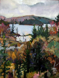
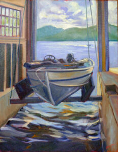
Beauchamp Point in Autumn, oil on canvasboard, available.

I’m no fan of the Guardian, but this recent (unsigned) piece is one more argument about a well-known problem in the art world. Women’s art sells at a shocking 10-to-1 markdown from men’s work—"for every £1 a male artist earns for his work, a woman earns a mere 10p.” That should come as no surprise to readers of this blog; I’ve written about it here, here and here, among other places.

Women artists earn less than their male counterparts; they are collected less by institutions, and—this is something that surprised me—if they sign their work, the value goes down.

Autumn farm, evening blues, oil on canvasboard, $1449 framed.

Meanwhile, in blind tests, viewers can’t tell the gender of painters by the work alone. My pal Chrissy Pahucki was so taken by that question that she replicated the blind study using plein air paintings by artists she knew. Her results came in about the same as the original study; i.e., the same as guessing.

Gender disparity is something I track as I watched the prizes being given in juried shows. So how did I fare as a juror at Adirondack Plein Air? I’d promised organizer Sandra Hildreth I’d set my own biases aside. With few exceptions I did not know who the work was by. (Although artists are told to not sign their work in advance, that’s difficult to enforce.)

Of the nine prizes I gave, overall, three were to women. The top three all went to men. Ouch. That’s hardly a large-enough sample to convict myself over, but it is cause for reflection.

Blueberry Barrens, Clary Hill, 24X36, oil on canvas, $3985.

I stress the formal elements of design over mood and evocativeness. (I scarcely know how one would judge those subjective values.) Perhaps that gave the edge to men. Does that mean that quantification, classification, and structure are somehow male thinking? That’s an argument that troglodytes on both sides of the culture wars might happily embrace. I reject it myself; I have the brain that God gave me, and he made me female.

This concept of a male-female divide is in some ways stronger than it was in the benighted 1950s and 1960s. Back then, nobody went on about some inner standard of male and female that our outer bodies might be in misalignment with. In fact, nobody spent a great deal of time analyzing our minds unless there was something starkly wrong with us.

Clary Hill Blueberry Barrens, approx. 24X36, watercolor on Yupo, available

I may not have been allowed to wear trousers to school until the seventh grade, but there was no pink-and-blue differentiation in kids’ clothing in my youth. Outside of school, we all wore the same mud-stained shorts and shirts. We had the same toys. We played sandlot baseball together.

At the same time, artists like Lois Dodd struggled mightily against a system that denigrated her work in comparison to her peers. While I wish I could stuff Barbie-culture back in the hole it came from, I never want to go back to the days of ignoring women artists.

That ship has started to turn. “Even though prices for work by female artists are starting from a far lower base, they are currently rising 29% faster than for art by men,” said the Guardian. “For canny investors who want a bargain and a higher return, it’s a no-brainer.”

Why pay for it when you can get it for free?

Autumn Farm, Evening Blues, $1449 framed.

In our impecunious youth, bar owners were notorious for offering bands the ‘opportunity’ to play for exposure (and maybe a free beer). According to my bass-player husband, it’s a practice that continues to this day. “All you need is to learn three chords and you can call yourself a blues band,” he said. “And 90% of the people in the audience won’t know the difference.”

Of course, art buyers are not usually as drunk (or rowdy) as a Saturday night crowd in Buffalo. But the basic mechanism is the same. We’re often asked to give away the very thing that is our livelihood. If we don’t, some other artist—hungry for success—will step in to do so. Since the audiences for these events are not art-centered, they often can’t tell the difference between a masterpiece and something that will look good in their bathroom.

Autumn farm, oil on canvasboard, $1449 framed.

General auctions are not to be confused with events where a non-profit organization mounts an exhibition or plein air event, such as Cape Elizabeth Land Trust’s Paint for Preservation. These are generally well-run and pay both the artists and organization.

If the organization can give an artist exposure to the kind of people who will be future art buyers, it’s not a bad business plan to occasionally give away a painting. This introduces the emerging artist to the world of selling art and helps them learn to price their work. But the value to the artist is extremely limited.

You won’t be able to deduct the value of the painting on your taxes. Artists are not entitled to take deductions on charitable donations of artwork. In fact, the IRS limitations on donating art are extremely restrictive.

Beauchamp Point, Autumn Leaves, $1449 framed

Non-profit organizations are perpetually fundraising, and general auctions are a favorite way of doing it. They assign a committee to gin up donations, and one or two people always seem to know artists. When it was my late friend Dean and the organization was Ducks Unlimited, I said sure. I like conservation and I loved Dean.

Believing in the mission of the organization isn’t enough. Often, your artwork is not a good match to the audience, so the work sells for a fraction of its value. A fisheries organization used to ask artists to paint wooden buoys for an annual fundraiser. I believe in their mission, so I participated. It was an interesting challenge, but also a lot of work. The buoys sold at such a discount I would have been far better off just writing them a check.

A Woodlot of Her Own, 9X12, $869 framed

Colin Page is doing a similar fundraiser for the AIO food pantry in Rockland. It has a much greater chance of success. Artists painted wooden bowls that are available through silent auction at the Page Gallery at 23 Bay View Street in Camden from September 3-10. Colin’s a local celebrity, the cause is critical, and—most importantly—the venue is art-centered. It’s an example of how to do this right.

Monday Morning Art School: five compositional no-nos

There’s more to composition than just avoiding these no-nos, but respecting the bounding box is a good place to start. Treat the edges as if they’re an important part of your composition.

Don’t cut off the corners

This can sometimes be difficult when running an S-curve to the corner of the page, but will make a painting feel boxed in. If you absolutely can’t avoid it, bring the contrast in that corner way down.

Don’t let a line exit through a corner

That’s a variation on the same problem—the energy in the line slams against the corner and is trapped. The viewer’s eye follows with the same effect. Again, if you absolutely can’t avoid it, bring the contrast way down.

Don’t run an unbroken parallel line with the sides of your painting

Nobody told Renaissance painters this, but even Caravaggio gave it up as he matured. An edge at the bottom, an unbroken horizon line, etc., just creates a box-within-a-box. Unless you have a op-art reason for doing it, it results in dead space within your canvas. And it’s a wasted opportunity to use angles beautifully, as Francis Cadell did with his still lives.

Don’t put a focal point on the edge of your painting

Focal points are an invitation for the viewer’s eye to linger, to be drawn in. A focal point at an edge is an invitation for them to just leave.

Avoid shapes just skimming the edge of your canvas

Either bring it in comfortably inside the picture frame, or let the object extend past it. And don’t scrunch trees trying to avoid hitting the edge; that robs them of their majesty. It’s better to start over.

My fall teaching schedule

Towpath on the Erie Canal

Towpath on the Erie Canal, 30X40, oil on canvas, private collection.

My painting student from Austin is in Maine briefly. We hiked up Beech Hill together. This is a great way to socialize—the dog gets his workout, you’re outdoors, and you’ve earned a big breakfast at the end.

“Everybody,” he told me, “is jumping on the Zoom teaching bandwagon.” That’s true, but I don’t much like the dominant formula that’s being touted. It’s too much like those social sip-and-paint places, where everyone is assigned the same painting and the instructor leads you through preformatted steps.

I’m not sure what you learn from that, except that potables and paint have a long, sometimes unhappy, relationship with each other. A painting is far more than the pigments that are swished around the canvas. It is choice, composition, focus, line, and color relationships. You don’t learn any of that by having the subject of your work preselected.

I try to tailor my classes to what my students need, instead. This fall I’m teaching three sessions.

Lobster fleet at Eastport, ME, 24X36, oil on canvas, $3985 in a gold-leaf frame.

The Figure in the Landscape

Monday evenings starting September 26

The Figure in the Landscape is meant to address a problem I’ve noticed recently: many excellent painters are unsure of how to add human figures to their paintings. They either avoid them altogether or wash them in as wisps in the distance.

Adding the figure starts with some knowledge of drawing and painting the figure. Then, there’s the question of using people as part of an arresting composition, not as an afterthought.

The American Impressionist Childe Hassam used people, carriages and horses in his landscapes, and today we see a glimpse of turn-of-the-century life from his paintings. They are everyday scenes made real because there is activity in them.

This class is for intermediate and advanced alla prima painters only. To qualify, you must either have taken a class with me and gotten my OK, or you need to submit a portfolio for review. If you have questions, contact me.

Coast Guard Inspection, plein air, oil on canvasboard. 6x8, $435 framed.

Mixing interesting color

Tuesday evenings starting September 27

For those who need instruction on the fundamentals of color and paint application, I’ll be offering Mixing interesting color. It's not enough to simply reproduce what you see; your painting's color structure must invite the viewer into your world. Alla prima painting rests on the idea of getting it right on the first strike, so we’ll delve into color theory as well as the practical business of making and applying color with confidence.

This class is for early-intermediate painters who have been introduced to the process of painting but haven’t completely mastered the design/application protocol. If you have questions, contact me.

The world's best classroom.

Live in midcoast Maine: Plein air short session

Tuesday mornings starting September 27

If you can drive to Rockport, you can take this class. It meets in various beauty spots in the region on Tuesdays from 10 AM to 1 PM. This is the only class where I can handle beginning painters, so if you’re wanting to try painting, it’s a good place to start. (The schooner American Eagle is another, and I understand there’s still a berth open for my September workshop. That comes complete with a good-quality watercolor kit.)

There is simply no better way to learn painting than en plein air (with still life a close second, and figure after that). Maine in Autumn is beautiful, so if you’re still here, plan to join us.

For the details on these classes, see here.

Memory and judgment

Midsummer along the Bay of Fundy, 24×36, $3188 unframed, available.

“Sometimes I just have such a wonderful, fulfilling time painting a certain place, I conclude it must be my best painting ever, because I had such a good time,” a reader wrote. “Then when nobody seems interested in it, I realize I was just getting all those good vibes from the painting but other people didn’t, because it actually wasn’t such a good painting. I have been trying to still keep my focus on making a painting a ‘good’ painting, and not just a record of my fun. Just because I had a good time doesn’t mean I produced a good painting; that still requires work.”

I have a related problem: the more a painting or situation challenges me, the better I believe the painting to be. Thus, a painting that I had to hike for, or one where the subject refused to compose itself are the ones that continue to fascinate me.

Viewers seldom agree, because I haven’t necessarily defeated the challenge; often it has defeated me.

My own experience painting with Sandra Hildreth and Nancy Brossard at Madawaska Pond bears out the idea that memory colors our critical judgment: my painting skips right over its putative focal point so the composition is awkward. The treeline is disjointed. However, it’s a recording of a lovely day, far from the madding crowd. There’s a wee little figure (Nancy) in it, so I like it. I won’t pitch it or sand it out just yet.

Fog over Whiteface Mountain, 11×14, $1087, available.

Meanwhile, Sandy’s painting of the same subject (which you can see here), was right on the money: it accurately depicted the open sky, the enormity of the watershed, and the mood of the place. The public agreed; she sold it before the evening was out.

By and large, painting is not performance art. We hope to bring a whiff of mountain air into our work, or the raking light of evening, but these are illusions and memory.

Yet I still can’t bring myself to believe that the ancillary experiences that went into a painting’s making do not somehow inform the final result. Nor do I think that we or the immediate public are always the best judges of whether a painting is good or not. Had Vincent van Gogh relied on contemporary public opinion to judge his work, he’d have been dead wrong.

Quebec Brook, 12×16, oil on canvasboard, $1449 available.

I did another painting with Sandra Hildreth years ago. This one was of Quebec Brook, on the same watershed as Madawaska Pond but many miles away by road or canoe. It was a sunny summer day and I again had a lovely time. I was relaxed enough that I didn’t worry that my focal point-the beaver dam-was at the very bottom. Being chill allowed me to take a compositional risk.

The painting at the top of this post, Midsummer, was done from the edge of a cliff in Port Greville, Nova Scotia, over two days. The soil being soft, I managed to slide over the edge with my easel, landing in a patch of alders about ten feet from the rim. Had nature not put that ledge near the top of the ridge, I’d have splatted on the road below me. Yes, that experience has changed my view of the painting, but for good or ill, I cannot say.

Monday Morning Art School: scaling up a field study

Vineyard, 30X40, oil on canvas, $5072 framed.

“I'm wondering if you would do or have done a blog post about transitioning from in-the-field studies to larger studio paintings of the same subject. Or is it better to paint larger in the field?” a reader asked.

If you have the time and stamina to do a large field painting, they’re a great experience. Everyone should try it to see if they (and their equipment) are up to the challenge. However, there are limitations. You can’t finish a large painting in less than one very long day. The light, the tide, and even the weather will change. You can break the painting into two or three morning or afternoon sessions, but you’ll often be painting in radically-different conditions.

Keuka Lake vineyard study, oil on canvas, 9X12, private collection.

My go-to field easel is an Easy-L pochade box. It can hold a canvas up to 18” high. To go larger, I switch to a Take-It easel, which can hold a very large painting. In high winds, that sometimes needs to be pegged down, or it will go sailing.

In watercolor, I work small on my lap. When I work larger, I use a Mabef swivel-head easel because it can hold a full sheet of paper and it swings absolutely flat in a second.

These are expensive options. If I were testing whether I wanted to work big outdoors, I’d lug my studio easel outside, or borrow a friend’s easel to try.

Henry Isaacs simply throws his work at his feet. “I never use an easel, whether the canvas is 8x8″, or 80x80″. I simply place the canvas on the ground, sand, or grass, and continually walk around it painting from all sides, all at once,” he said.

The Tangled Garden, JEH MacDonald, courtesy National Gallery of Canada.

Even with equipment and stamina questions answered, there are good reasons to start small and work your way up. Small studies are an excellent way of understanding the subject. They capture light and form better than a photograph. They allow you to work on the edge of abstraction, not overworking the material.

When scaling up the painting, it makes sense to grid up from your drawing instead of from a photograph. Make your grid on a bit of plexiglass or clear acrylic instead of on the original painting. I once did a study of boats in watercolor in a notebook and put crop marks over it in Sharpie. Later, I realized it was a bad crop, but it’s unrepairable. You can see that watercolor in this post about the mechanics of scaling up a painting.

Study for The Tangled Garden, JEH MacDonald, JEH MacDonald, courtesy National Gallery of Canada.

The Indigenous and Canadian collection at the National Gallery of Canada has an excellent collection of small Group of Seven field studies. Among these are JEH MacDonald’s study for his iconic The Tangled Garden. The study is small, around 8x10” and done on cardboard mounted on plywood. The finished painting is wall-sized, around 48x60”. MacDonald worked out his design, including the complementary color scheme and graceful arching sunflowers, in his field study. The large painting is remarkably faithful to his original idea.

Sometimes it makes sense to add elements to the larger painting to break up the expanses. I’ve included a field study of my own along with its larger painting, at top. The subject was a vineyard along Keuka Lake in New York’s Finger Lakes. I enlarged the tree and added the characteristic rock scree of the Finger Lakes to the foreground. I’m not sure I’d do the same thing today.

Therein lies another lesson: the way we approach painting is constantly evolving, or we become a caricature of ourself. I look at old paintings and often think, “I’d do that differently now.” That doesn’t necessarily mean better; it just means I’ve changed.

Obsessed by baby trees

Herdsmaid, 1908, Anders Zorn, courtesy Zornsamlingarna

There were three titans of fin de siècle realism: the Spaniard Joaquín Sorolla, American ex-pat John Singer Sargent, and Swedish Anders Zorn. They were almost exact contemporaries and all three mined the same material—figure and landscape, heavily larded with the society portraits that paid the bills. Each was known for the assurance of his brushwork and for capturing light with a minimum of fuss. With our bias toward Anglo-American culture, we know Sargent best, but all were deservedly famous in their day. Do I have a favorite among them? Whichever one I’m looking at, at the moment.

Baby Spruce and Pine, 6X8, oil on canvasboard, private collection.

Ever since I first saw Herdsmaid, above, I have been obsessed. Zorn’s handling of the lass is wonderful, but it’s the baby pine that haunts me. It’s a dead ringer for the young Eastern White Pine that’s Maine’s state tree and blankets so much of the Adirondacks and northern New England. Zorn manages to convey the soft bristles with a single brushstroke that connects both light and dark. I’ve never even come close.

Jack Pine, 8x10, oil on canvasboard, private collection.

Most painters are entranced by mature evergreens. Their angular, buffeted forms stand tall and dark against the horizon, making them a naturally-pleasing compositional form. Perversely, I love their fluffy babies. They cluster in little nurseries at their parents’ feet, fifty or so at a time. They cast no shadows, so ephemeral is their foliage. The teenagers are gawky, with long slender stems and curious tufts of needles. Zorn caught that perfectly.

The pine nursery (Madawaska Pond), 12X16, oil on canvasboard, available.

I tried again on Wednesday. Sandra Hildreth took me for a long ride into the forest—north from Paul Smiths and then eight miles down a logging track. From there we shouldered our backpacks and hiked a scant eighth of a mile to a point overlooking Madawaska Pond. The money shot (of course) was a view of Buck Mountain in the distance. But what interested me most was the tree nursery in the foreground.

I tried to include both, and it was an error. The tree nursery on the left had no shadows, no distinct colors, and no interstices between the crowded trees, so it melted into nothingness against the big picture. It can’t stand up against the contrast of the mature pines that shelter it. No, it’s not a failure as a painting, but it didn’t meet my goal. I’d like to go back. Alas, there isn’t time.

St. Gabriel's Church, 12X16, oil on canvasboard.

There’s another tree nursery in Paul Smiths that I’ve painted before. It sits by a ramshackle old church called St. Gabriel’s. The church is in no better shape than last time I visited, but someone has wisely yanked the baby pines away from the foundation. Those in the nearby woods have grown taller than me. Sadly, they will now begin a fight to the death, for only some can survive. It’s the sad side of natural selection.

Sentinel pines, 11X14, oil on canvasboard, available.

There are always little pines along the roadside, where they’re regularly mowed down by road crews. Perhaps I’ll take my safety cones and paint some on my way to Saranac Lake this afternoon. Today is the day I jury the 14th annual Adirondack Plein Air Festival. If I give up any hope of being elegant for the reception tonight, I can sneak in a painting on my way to town. Really, which is more important?

Slipping the bonds of mere technique

This painting of the VIC's Barnum Brook Trail was purchased by a gentleman from Vermont several years ago. He surprised me by taking my workshop this year.

I drove from Paul Smiths to Saranac Lake, NY, in a morose mood. Here is the gulch where Kari Ganoung Ruiz parked and painted; here is the cemetery where Laura Martinez-Bianco and Crista Pisano clowned around; if Chrissy Pahucki were in town, we could go to Donnelly’s for ice cream. I was on my way to a meet-and-greet for Saranac Lake ArtWorks’ 14th annual Adirondacks Plein Air Festival at the Hotel Saranac. I’m don’t enjoy large parties; feeling sorry for myself wasn’t helping.

That was absurd, of course. I ran into Kathleen Gray Farthing, Patrick McPhee and Tarryl Gabel as soon as I walked in. Lisa BurgerLenz and I reminisced about contracting giardiasis together back in the bad old days; there’s nothing like diarrhea to bond friends for life.

The Dugs was painted in Speculator, NY, in the lower Adirondacks.

I’ve promised organizer Sandra Hildreth that I can remain objective in the jurying, and I’m fairly certain I can do that with personalities. With artistic style, it will be more difficult. We all fit somewhere on the continuum between abstraction and realism. We tend to respond to paintings with a similar outlook. I must look past my stylistic prejudices to see more universal qualities. This is where a rubric for formal criticism is helpful.

As much as I stress design and execution, there ought to be something in painting that transcends mere technique. We may have said otherwise in the crazy days of the twentieth century, but a painting really ought to mean something. Otherwise, it’s no more important than a square of designer fabric.

Whiteface makes its own weather is one of several paintings I've made of the clouds that hang around this peak.

I’m intimately familiar with the Adirondack Preserve. I know its history, the terrain, and the people who live and work here. I am grounded in the spirit of the place. That makes it easy to assess these painters’ core message. But what if I were jurying in, say, Florida, where I have no affinities? I’d be thinking in stereotypes, which raises the risk of missing deeper insights altogether.

That’s the conundrum for event organizers. They want jurors from away, so that they’re not swayed by friendship. At the same time, these same jurors must judge not only the formal qualities of paintings, but their inner spark of meaning.

One of the best contemporary paintings I’ve seen of the Adirondacks was a nocturne by Sandra Hildreth. She painted it at a campfire at a lean-to on Black Lake. It had a strong, simple design and captured an experience most back-country people have shared. A few years later, Chrissy Pahucki and I attempted the same idea by renting a campsite and painting by firelight. I have Chrissy’s version hanging in my kitchen. It is powerfully evocative.

Adirondack Spring was painting in Piseco, NY, in a light snowsquall. The colors of spring and fall in the mountains are sometimes indistinguishable.

I’m a strong proponent of process. I don’t think you should be teaching or critiquing unless you can break your technique into discrete steps. As much as I strive to be objective, however, painting is ultimately communication, and that’s one of the great mysteries of human life.

Done well, painting slips the bonds of mere technique and enters another realm altogether. On Friday, when I’m jurying this show, I’ll be focusing on the technical side of painting, but I pray that I’m never so earthbound that I fail to see what’s transcendent.

Monday Morning Art School: quiet passages

Bracken Fern, 9x12, oil on archival canvasboard, $869.

I’m in Paul Smiths, NY, teaching for Saranac Lake ArtWorks. Yesterday, student Mark Gale asked, “What should I do about this passage,” gesturing to a dark line of spruces. He was, at the time, bookended by Beth Carr and me. She’s been my student for several years, and is a crackerjack painter with impeccable judgment.

“Nothing,” we said in unison. “It's the quiet that allows the rest of the painting to sing,” Beth added.

I spend a lot of time talking to students about patterns of darks and lights, motive lines that drive energy through the painting, and focal points. These are such difficult concepts that I never seem to move on to quiet passages, but every painting has them and needs them. They exist in counterpoint to areas of motion, and they’re equally important.

Spring Greens, oil on archival canvasboard, 9X12, $869.

A quiet passage isn’t an empty passage. It may include figures, trees, brooks and other objects. However, it’s not detailed and doesn’t have high contrast. It’s more of an invitation to imagine than a statement in full.

It needn’t be dark, either. Consider Claude Monet’s haystack paintings. There are passages of luminous color that, nonetheless, recede. They’re not high-contrast or line-driven, but they shimmer with chroma and careful mark-making. “What keeps my heart awake is colorful silence,” he said.

The quiet passage allows the mind to rest. It acts as a foil for the main object.

Quiet passages can be destroyed by excess noodling. Here plein air painters have an advantage—they’re typically worn out long before they can cover every inch of canvas with information. But not always, and the impulse to fill these empty spaces later in the studio can sometimes be overwhelming. It’s one reason I’m not a fan of excessive touch-up of plein air paintings—it can ruin a previously-wonderful design.

Fog over Whiteface Mountain, 11X14, oil on canvasboard, $1087.

Yesterday I had my students paint in the boreal bog at Paul Smiths VIC. It’s a landscape of stunted larches and spruces, pitcher plants and sundews, with a lazy river chugging through it. It’s heavy on color and light on structure, making it a challenging subject to paint. My monitor had painted trees and figures along the boardwalk, and asked me what she should do with the rest of the space. There was no way she could fill it in with every tiny tree.

“Essentially, nothing,” I said. It was already shimmering green. Had we had more time, I’d have suggested a bit more in the way of soft brushwork, but the facts were already there, and the quiet of her greens set off the figure on the boardwalk.

Lobster pound, 12X16, oil on canvas, $1594.

Silent passages are where the mind fills in what isn’t there. The human mind seems to rebel against having everything spelled out for it; it loves mystery. Even so-called photorealism uses silent passages; we aren’t even aware of the artist’s judicious editing.

I often use Johannes Vermeer’s The Girl with the Red Hat as an example of the lost-and-found edge, but it’s also a fabulous example of the power of silence. Much is not stated: the drapery in shadow, the carving on the chair, even the modeling in most of the face. These stand as powerful foils for what is stated: her sensuous lips, the feathering of her hat, and her lace collar.

My 2022 workshop schedule can be found here. That includes the beautiful red rocks of Sedona, urban painting in Austin, TX, June and September workshops aboard schooner American Eagle, mountain vistas in the Berkshires, and our ever-popular Sea & Sky at Schoodic in Acadia National Park.

Intimations of Autumn

Autumn Farm, Evening Blues, oil on canvasboard, $1449 framed.

Here in the northeast, we’re seeing the first intimations of autumn-the earliest scarlet leaves starting to drop on the forest floor, staghorn sumac sporting red velvety fruit, goldenrod and fireweed popping up in unmowed fields.

There is a subtle difference in the color of leaves. In a dry summer, that’s exacerbated, but by the third week in August, there will always be maples sporting a halo of red, and the birches have tempered into olive-green.

Autumn farm, oil on canvasboard, $1449 framed.

Even evergreens change color with the seasons. New growth is a very different color from the dormant needles of midwinter.

I’m leaving this morning to teach in the Adirondacks. It’s even cooler in Paul Smiths, New York (41 F as I write this) then here in coastal Maine. That should kick the swamp maples into their absurd fuchsia finery. It also means I’m going to repack my suitcase with warmer clothes before I take off.

We’ll be concentrating on the shift in greens. My students are familiar with all the exercises I give them to mix greens, because doing it accurately makes all the difference to eastern landscape painting. (The inverse, the ability to mix reds, is equally important in New Mexico and Arizona.)

Even in the height of autumn in leaf-peeping country, green remains the predominant color. But it will not be the same green as in May or July. These subtle changes will ground a painting with a sense of season, as well as a sense of place.

Beaver Dam, Quebec Brook, oil on canvasboard, $1449 framed.

I take great joy in weather, even when it’s hot or bitterly cold. I love being outside, feeling air on my skin. Recently, I’ve found my enjoyment is sometimes blunted by the endless, repetitive news cycle of catastrophic or record-breaking heat waves or winter storms. (I’m from Buffalo. I’ll see your snowstorm and raise you a blizzard.)

This is not to deny that the climate is changing-it is, and that will continue. But most weather records are relatively recent things, meaning it’s not hard to get windier, colder, hotter, or wetter than what we’ve already measured.

Bunker Hill Overlook, watercolor on Yupo, approx. 24X36, $3985 framed.

Poppy Balser and I were both raised on family farms. During the last heat wave we talked about haying, as it even harder than painting in beating sun. Putting up hay the old-fashioned way, with square bales, is the essence of summer heat. It may not be particularly enjoyable to stand in a hay loft, drenched in sweat, covered by infinitely small and scratchy particles of hay dust, sneezing. But it is memorable, and I’m glad I grew up doing it. In fact, I’d do it again if they’d just make bales that weighed fifteen, rather than fifty, pounds.

Weather is far more pleasant if you experience it. It’s still hot where you live? Go get an ice-cream cone and enjoy it. Autumn is really just around the corner.