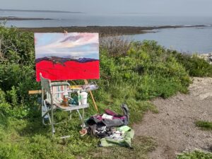

Every morning I do a fast hike from Erickson Field to the summit of Beech Hill and back, about 4.5 miles. It’s not steep but I try to bring it in at an hour and a half. A twenty-minute mile is a fast pace for hill-walking. As I approach the summit, it can be unpleasant, particularly if the trail is icy or the wind is howling.
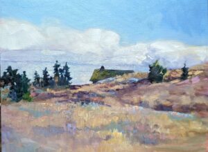
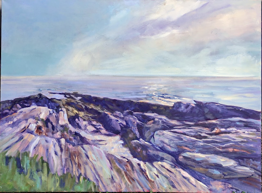
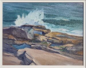
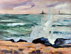
Then I round the bend and Penobscot Bay is laid out at my feet. On particularly ratty mornings, there is the faint glimmer of Owls Head Light, faithfully bringing mariners in to safety as it has for almost two hundred years. On a clear day, you can see north to Acadia and as far out to sea as Matinicus. The sea may shimmer, glimmer, scowl, or be obscured by fog, but it’s always beautiful.
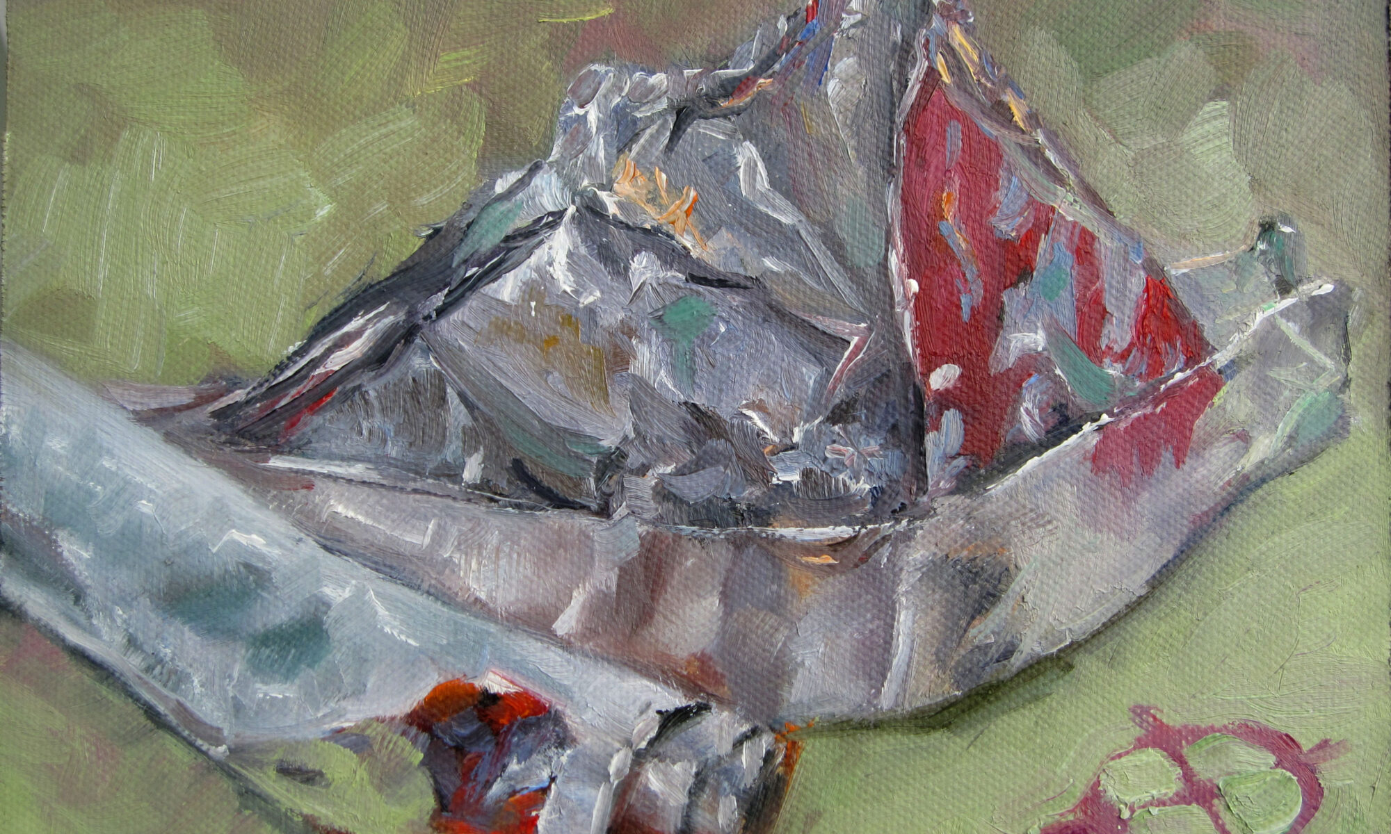
“I dream a lot. I do more painting when I'm not painting. It's in the subconscious,” said Andrew Wyeth. My daily jaunts up the hill serve the same purpose. They’re a positive input in a world full of negativity.

You are what you eat
This weekend, my hometown of Buffalo braces itself for yet another blizzard. It’s being called a “once in a generation event.” Perhaps they’re right. But there’s inflationary hype around storms. It’s been blizzarding in Buffalo since long before someone invented the term ‘bomb cyclone’.
That inflationary hype is true across the news, not just the weather. Most of us now get our news on the internet. That’s a crash site. Even assuming what you read is true (and, sadly, that may not be the case) it’s heavily slanted towards tragedy.
Back in the era of daily papers, we read about our own communities. That included positive news. Now we’re fed a steady diet of kidnappings in Kentucky, mayhem in Mississippi, or crime in California. This gives us the false sense that the world is spinning out of control. It’s just spinning, the same as it always has, but in the past we weren’t trying to absorb all the world’s tragedies before breakfast.
If you regularly ingest a diet of bad news, artificial drama, and hostility, you’re going to feel depressed, anxious and angry.

“You can’t ignore reality,” a friend retorted. But this bad news is no more real than the good news and peace that surrounds us all. We’re being sold it to keep our eyes glued to our screens. We can turn it off.
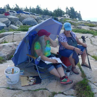
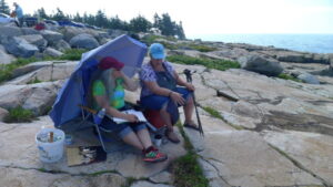
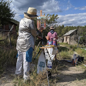
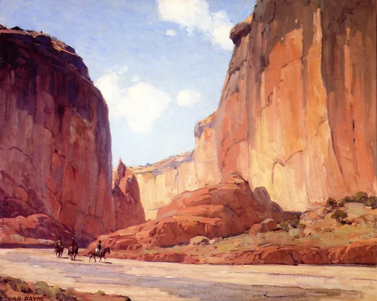
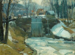
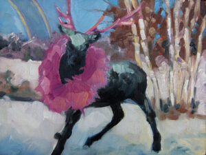
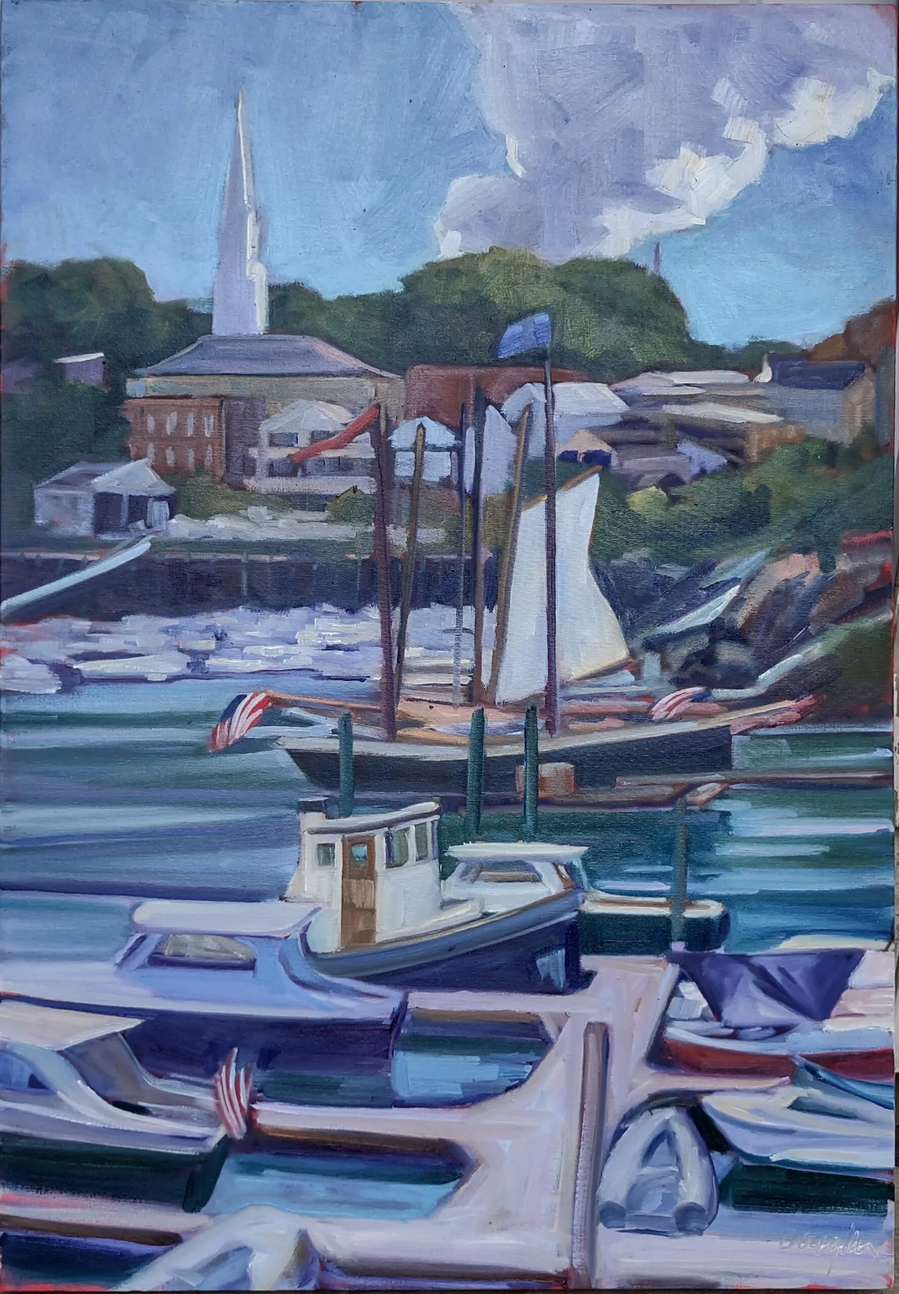
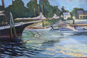
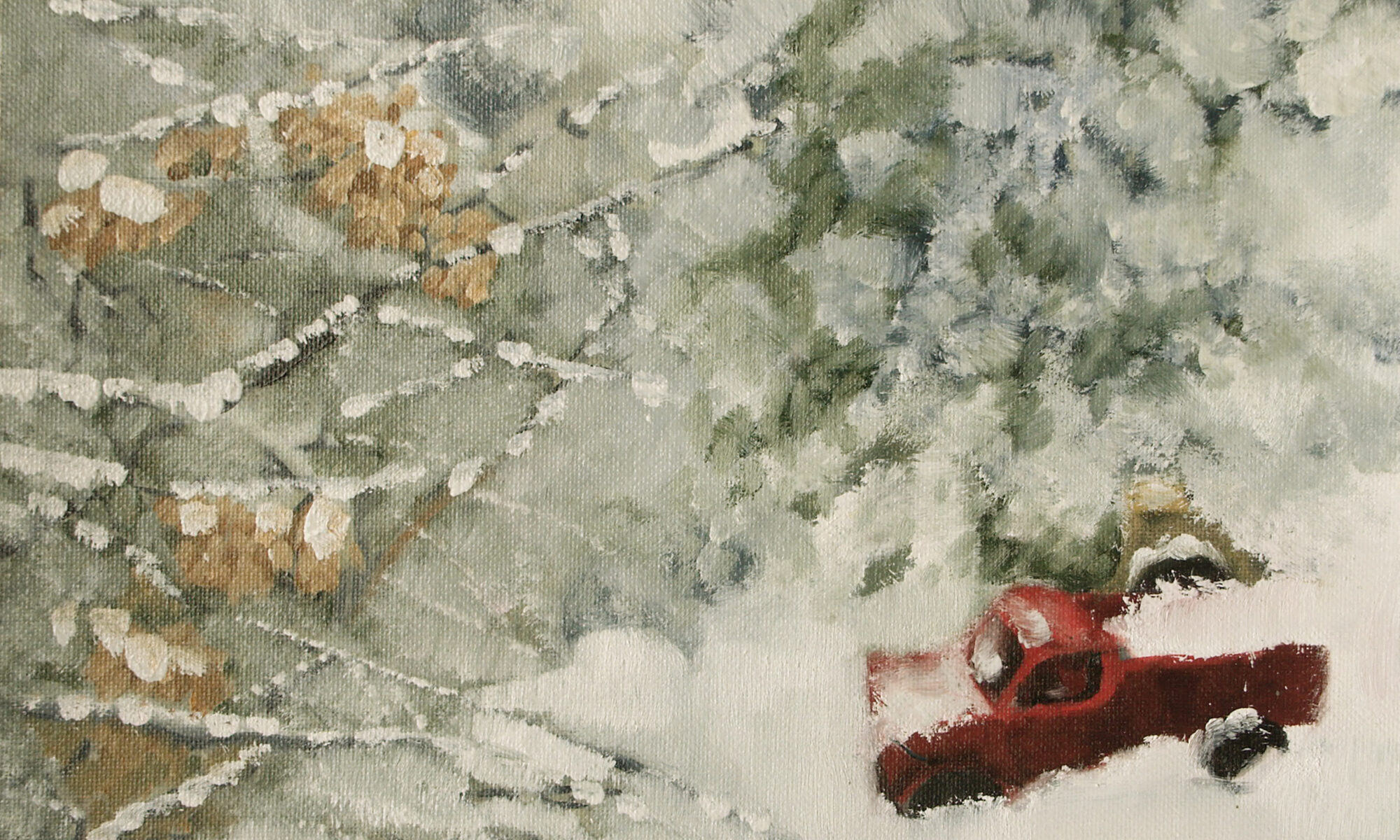
We can choose what we look at. It’s why I climb a hill every day, and why I go to church. How can I paint what’s beautiful if I haven’t focused my mind on what’s beautiful?
The news is driving us crazy
It’s no wonder that so many of us take antidepressants, which, incidentally, don’t seem to improve quality of life. My father and paternal grandmother both died in the grip of long-term depression. To be fair, they both had good reason for it. As did I. But I’m not a depressive, despite years of thinking otherwise. What changed? My focus.
There is much to be said for lifting our eyes to the hills, both literally and metaphorically. Hiking has physical benefits that include improving mood, of course. So does spending time actively seeking beauty. But an outward focus also includes the people around us. Self-focused naval-gazing is demoralizing.
Tomorrow, we enter the Christmas season. The greatest gift you can give yourself is to actively seek out beauty—in creation, in others, and in yourself.
And don’t forget, here’s a quiz for you to discover the kind of workshop that suits you best. There’s no obligation, of course; it’s all in fun.