fbpx

Monday Morning Art School: how important is drawing, anyway?

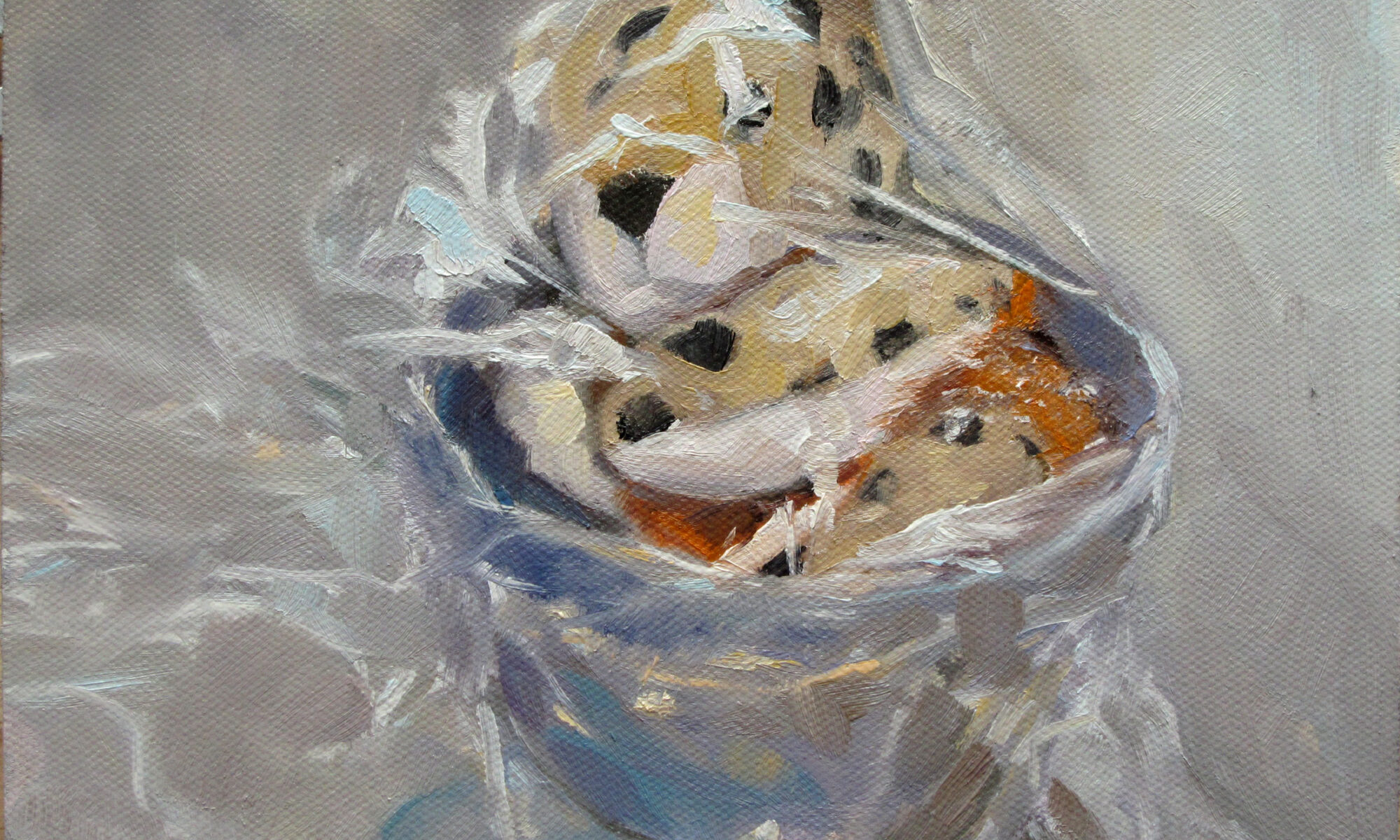
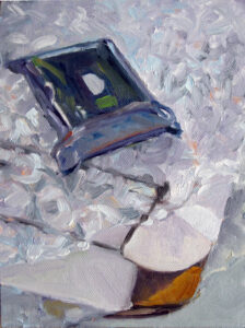
Toy Monkey and Candy, 6×8, oil on archival canvasboard, $435 framed.

I sometimes have students tell me, “I hate to draw!” What they usually mean is that they’re afraid of drawing. Part of this is because of the lie our culture tells us about drawing, that it’s an innate skill rather than a learned discipline. These students worry that when God was handing out the talent, they were elsewhere. That’s a horrible misunderstanding of how drawing works.

As with language, we all have different fluidity with drawing, but very few of us can’t do it. I once did an experiment where I taught Dr. Amy Vail to draw over her protestations of incompetence. “I thought measuring was cheating,” she told me. If you are not mentally handicapped and you have an interest, you can learn to draw.

Dish of Butter, 6X8, oil on archival canvasboard, $435.
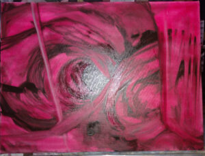
Modern art must take part of the blame here

Much 20th and 21st century art has the knack of looking like the artist can’t draw, when the exact opposite is true. Ann Trainor Domingue uses simplified forms of people and boats but don’t be fooled; I’ve sailed with her and she draws beautifully. That simplification is the endpoint of a lifetime of drawing, not its beginning.
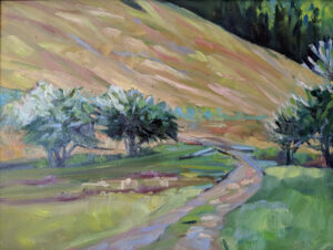
Possum, 6X8, oil on archival canvasboard, $435.

Painting is drawing

What drawing-resistant students don’t realize is that painting is just drawing with brushes. It’s easier to understand some of drawing’s principles in graphite than in messy paint. Fixing mistakes is a lot faster with an eraser than a scraper.

Feeling the relationship between the brush and the pencil makes for better, lighter brushwork. They’re two variations of the same basic tool.

Think of drawing as the grammar of art, and color as art’s vocabulary. Just as with language, many of us understand grammar intuitively, but we need education to lift it to its highest level. We all start with some vocabulary, but that expands with reading and study.

That’s not to downplay the mysterious part of the brain that makes language and art possible. It’s just that we all have the basic tools imprinted in us.

In art school, students spend a year on the fundamentals of drawing and color theory before they ever start painting. In a way, this mirrors our natural experience of picking up a pencil or crayon long before we discover the brush.

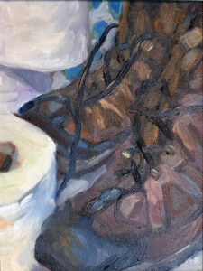
Hiking, 6X8, oil on archival canvasboard, $435.

But I don’t have a lifetime to learn to draw!

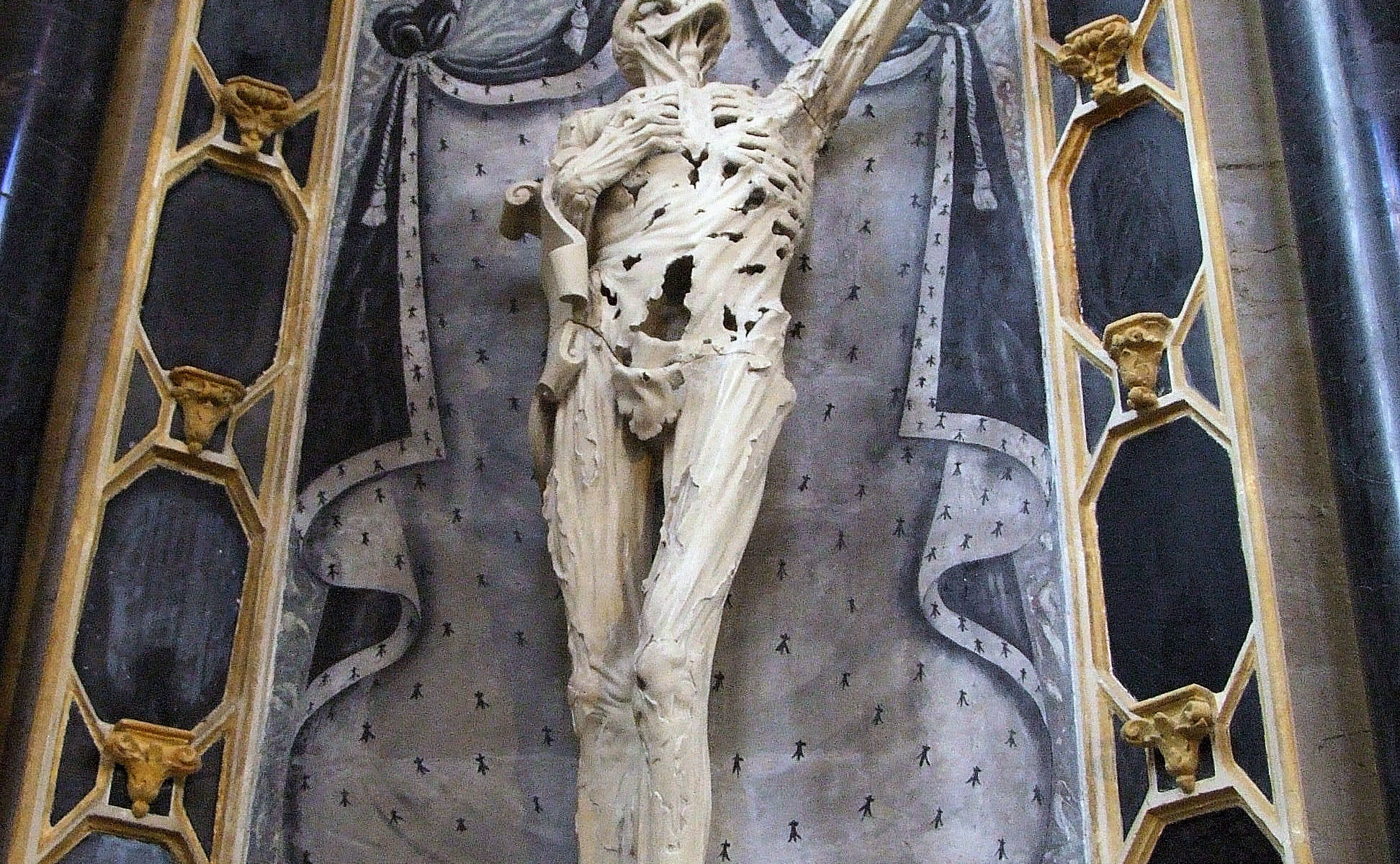
I don’t expect you to spend a year drawing an extremely foreshortened skeleton. But understanding measurement, perspective, and shading will make your painting better. I’ve written innumerable posts on drawing-just go over to the box on the right and type in “how to draw” and start reading.

But reading isn’t enough. You must practice. The good thing is, drawing is easy and cheap. I like Strathmore’s Visual Journal and a #2 mechanical pencil. If you want more refinement, my readers and I recommended fancier products here.

Stick two pencils in the ring binder of your sketchbook and toss it in your backpack or purse. Pull it out whenever you have fifteen minutes to kill. The ‘news’ on your phone will remain unchanged whether you spend that time scrolling or drawing, and you’ll have something to show for your time if you draw instead.

Drawing from life is better than drawing from photos (because it’s more difficult) but any drawing is good practice. Just a few minutes a day is all you need.

Drawing is my personal refuge

I may not always make it to my easel, but I can always draw. Even a few moments with my sketchbook clears my mind, gives me ideas, and makes me feel creative again.

I’m watching a close friend struggling with early-onset dementia. She may not remember what she told me last week, but she can still draw beautifully. A habit of sketching and drawing has given her a vocabulary independent of words.

Reserve your spot now for a workshop in 2025:

Traveling with more than one medium

American Eagle rounding Owls Head, 6×8, oil on archival canvasboard, $348 unframed.

One of my tasks this week was booking my air travel to my workshops in Sedona, AZ and Austin, TX in March. The price of rental cars and airfare have both dropped substantially from last year. That makes travel easier on everyone.

Often, workshop students will ask me about bringing a second medium with them. I encourage that. Watercolor and gouache kits are small and you can easily slip them in a bag with your other tools.

Mark Gale, who will be my monitor in Austin, recently bought a travel watercolor kit. At first, he was hopelessly confused by it; now he is thinking of bringing it on his next RV trip. It’s portable and dries fast. Some mediums are more appropriate for specific purposes than others.

Painting in multiple media has a loosening effect in your work. Once you get past the shock of thinking about values ‘backwards’, moving between oil and watercolor will lighten up your brushwork. Pastels can teach you to lay up colors in sparkling fields like an Impressionist, providing you don’t get sidetracked into blending. Acrylics will help you learn to not get bogged down in the weeds of modeling.

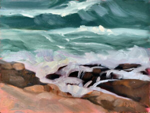
The Wave, 9X12, oil on archival canvasboard, $869

However, you have to carry this stuff

Each of these, however, requires its own set of tools and substrates, so you can’t bring them all. When I travel to workshops, I bring two suitcases. My carry-on has my personal belongings. My checked bag has my tools, canvases and paints.

Travel is always a compromise between canvas size and practicality. The less variation in size, the easier it is to pack. I like to paint big, but space is at a premium. Knowing I might bring home wet paintings, I’ll limit myself to 11/14 and 9/12. I’ll also bring a 9/12 Arches Watercolor Block and my watercolor kit.

Unless I have multiple pastel students, I don’t carry my full pastel kit. It’s too cumbersome. Instead, I can bring a small kit of NuPastels and some sanded paper. That’s enough to get my point across.

Wreck of the SS Ethie, oil on canvas, 18X24, $2318 framed.

Oil painters who travel should be familiar with Safety Data Sheets (SDS). The flash point is in section nine, Physical and Chemical Properties. This tells you what you can and cannot fly with. A flash point at or below 140° F (60° C) indicates it is a flammable liquid and may not be carried in airline baggage. You’ll have to hunt, but all vendors are required to provide SDS for every product.

Turpenoid has a flash point of 129° F (54° C), so it can’t fly. Gamsol’s flash point is 144°F (62°C) so it’s legal. I buy a fresh small bottle and wrap it in its SDS with the flash point highlighted. Remember to completely empty and clean your brush washing tank before flying.

Most painting mediums have drying agents added. This gives them a flash point of under 140° F, so they can’t fly. I’ve switched to using linseed oil instead. Again, I wrap the bottle in its SDS with the flash point (500° F) highlighted.

American Eagle in Drydock, 12X16, $1159 unframed.

A small tube of oil paint is 37 ml. or 1.25 oz, so is safe for your carry-on. A large tube is 150 ml., or 5 oz. It must be in your checked luggage or it will be confiscated. I pack this handy label with my oil paints.

Watercolor tubes are tiny and harmless, but the only trouble I’ve ever had flying with paints was with watercolors. Now I squeeze out what I need for the week into a palette and leave the tubes at home.

It’s very easy to forget to wash your oil painting brushes on the road, and dried brushes are unredeemable. If you can do nothing else, rinse them thoroughly in solvent and wipe them down until you can treat them properly. I sell a brush soap that I can recommend without hesitation; my daughter makes it for me.

There are several portable painting racks available, but when painting on the road, I simply lay my paintings out on a flat surface, with newspaper underneath. Unframed work gets separated with waxed paper, taped together, and packed in my checked luggage. If the paint isn’t too thick, it won’t be harmed.

Reserve your spot now for a workshop in 2025:

Looking at paintings on your video screen

A Sunday Afternoon on the Island of La Grande Jatte, 1884-86, by Georges Seurat, is ten feet across. All those dots shimmer in real life. Courtesy Art Institute of Chicago.

Frederic Edwin Church’s Heart of the Andes is a monumental work in every sense of the word. At 10 feet wide and 5.5 feet tall, it takes up an entire wall in the Met. It’s intricately detailed, but that is not what makes you suck in your breath when you first see it. It’s the sheer audacity of the work, its scale.

Imagine the response at its unveiling in April, 1859 in New York. In a massive, theatrical frame that increased its breadth and height, it was artificially lit in a darkened chamber. An epic success, it drew 10-13,000 viewers a month, each shelling out 25¢ for the privilege. (Church went on to sell the painting for $10,000, setting a record for the highest price ever achieved by a living American artist. Yay, Church!)

The Heart of the Andes, 1859, Frederic Edwin Church, courtesy Metropolitan Museum of Art

And yet, if you’ve only ever seen it on your computer screen, it looks-well, meh. It’s a lovely example of the picturesque, that English ideal of beauty, but it’s hardly moving. It’s only when you experience it in person that you begin to understand what the excitement was all about.

Rembrandt’s The Night Watch is even more colossal, at about 14 feet wide by 12 feet high. The Rijksmuseum published a 44.8 gigapixel image of it in 2020, right after it was restored. I’ve crawled over that image. It allows me to get closer to the painting than I ever could to a ‘live’ Rembrandt. But what it can’t do is give me the sense of scale of the actual painting. I’ve been to the Met innumerable times, but, alas, I’ve never been to Amsterdam.

The Night Watch, 1642, Rembrandt van Rijn, courtesy Rijksmuseum

How we see

Humans have tunnel vision compared to other animals, but our peripheral vision is still important. It is not acute, and it gets worse as we get to ‘the corner of our eye’. Peripheral vision helps us perceive sudden changes, like cars veering into our lane of traffic. More importantly, we ‘know’ what’s happening in our peripheral vision because we know what the images on the edges ‘mean’ without needing to focus on them. Our brains interpolate and fill in the information. When they can’t, we turn our heads and figure it out. It’s an irresistible impulse.

When we look at a painting in real life, we’re using every part of our visual field-both the focus and the periphery. We flick through the painting’s focal points with our tunnel vision, just as we would flick through a natural scene. That gives us a sense of reality. That’s far different from when we look at a painting on a screen, especially when the screen is tiny, as on our phones. Then we’re just seeing it with our narrow tunnel vision. We lose the spatial sense that our eyes are designed to use.

The Water Lilies – The Clouds, 1920-26, Claude Monet, courtesy Musée de l’Orangerie. At 14 yards across, it simply can’t reproduce on the small screen.

That’s not even considering the color inaccuracies and loss of detail that are inevitable in photographs. Large canvases can look overworked and stilted in photographs even when the brushwork is lyrical in real life. A small photo reduces brushwork to an afterthought.

The 21st century artist must constantly think of his work in relation to the small screen, in addition to its real-life appearance. In some ways, that’s healthy, because it drives good composition. But it does change our approach to painting. How would Monet’s Water Lilies series have turned out had he had one eye on our phone screens?

I love living in a time where I can tour the world’s museums at a click of a mouse, but that should never be confused with the tactile experience of paintings.

Reserve your spot now for a workshop in 2025:

Monday Morning Art School: ruthless pruning

Prom Shoes 2, oil on archival canvasboard, 6X8, $435.

Sorry about my absence last week, but it was a lovely vacation.

A major part of learning to paint is learning to see, and in the process, learning to draw. This means not getting caught up in the details, but seeing the big shapes and how they fit together. This is fundamental to painting.

This means we stop thinking of the object we’re looking at as something we can identify, and start to see it as a series of shapes, or more accurately, a light pattern. That’s difficult, and even experienced painters can be tripped up.

Two Peppers, oil on archival canvasboard, 6X8, $435.00

Oops! My bad.

A few years ago, my student Sheryl drew the lobster-boat Becca & Meagan, which is moored year-round at Rockport Harbor. It’s painted a signature red, and I have painted and drawn it many times. Sheryl measured and drew, and I patiently corrected her. This went on for most of the class, until Sheryl finally insisted that I sit down and take measurements with her.

Whoops! It wasn’t Becca & Meagan at all. Its owner had launched a new boat, Hemingway. She was painted the same red and moored at the same buoy, but with her own unique configuration. I was so used to seeing Becca & Meagan there that I had stopped really seeing at all. I was drawing what I ‘knew’, not what was there.

Back It Up, 6X8, oil on archival canvasboard, $435.

It’s not what you know, it’s what you can see.

If I set a teacup in front of you, you’ll be guided in part by what you know about teacups: they’re rounded, squat and hollow. That gives you some checks on your drawing, but it also allows you to make assumptions about measurements and values. That can lead you astray.

To draw it successfully, you must stop reading it as ‘teacup’ and start seeing an array of shapes, planes and values. For most of us, that takes time. My process is two-fold. First, I sketch to figure out what I’m looking at. That’s investigative. Then, I ruthlessly prune, forcing my drawing into a series of shapes and values.

All objects can be reduced to a certain, limited number of shapes. These build on each other to make a whole. When you see things as abstract shapes, you expand your possible subject matter. A plastic pencil case is not inherently much different in shape from a shed. A shed, in turn has the same forms as a house. If you start with a pencil case, you can ramp yourself up to Windsor Castle in no time.

Primary Shapes, 6X8, oil on archival canvasboard, $435.

Notan and all other value studies are, above all, about cutting the picture frame into shapes, what Arthur Wesley Dow called “space cutting.”

Dow wrote the definitive 20th century book on composition, which sets down fundamental principles still used today. He taught his students to restrict the infinite range of tonal values in the visible spectrum to specific values-perhaps black, white and one grey. He wanted students see all compositions as structures of light and dark shapes. The success or failure of a painting rests on whether those shapes are beautiful.

Students sometimes chafe at being asked to do still life, but it’s the best training to learn space cutting. Just as important, it’s easy to set up and execute quickly, so you can practice on paper in just a few spare moments.

Reserve your spot now for a workshop in 2025:

Contemporary impressionism done right

Banks of the Oyster River, Eric Jacobsen, oil on panel 16 x 20, regular $2300, sale $1150

I brought my laptop with me intending to write my blog on my vacation, only to realize the combination of camping and nine people has outdone me. (Not my dumbest move yet this week; I also brought my summer nightgown. To camp. In the Nevada wilderness. In February.

Orange and Blue, Eric Jacobsen, oil on panel 16 x 20, regular $2300, sale $1150

I’ll be taking off, but meanwhile I want to alert you to a Truly Great Deal. Eric Jacobsen is one of the best impressionist painters of our generation, and also my good buddy. He’s one of the few painters I’d like to study with right now, to steal all his secrets of brushwork.

Rocky Beach, Eric Jacobsen, oil on panel 16 x 20, regular $2300, sale $1150

Eric’s having a half-off sale on selected works on his website, which you can find here. Some of them he painted with me around, lucky fellow.) There’s not a huge selection, and when they’re gone, they’re gone. Enjoy!

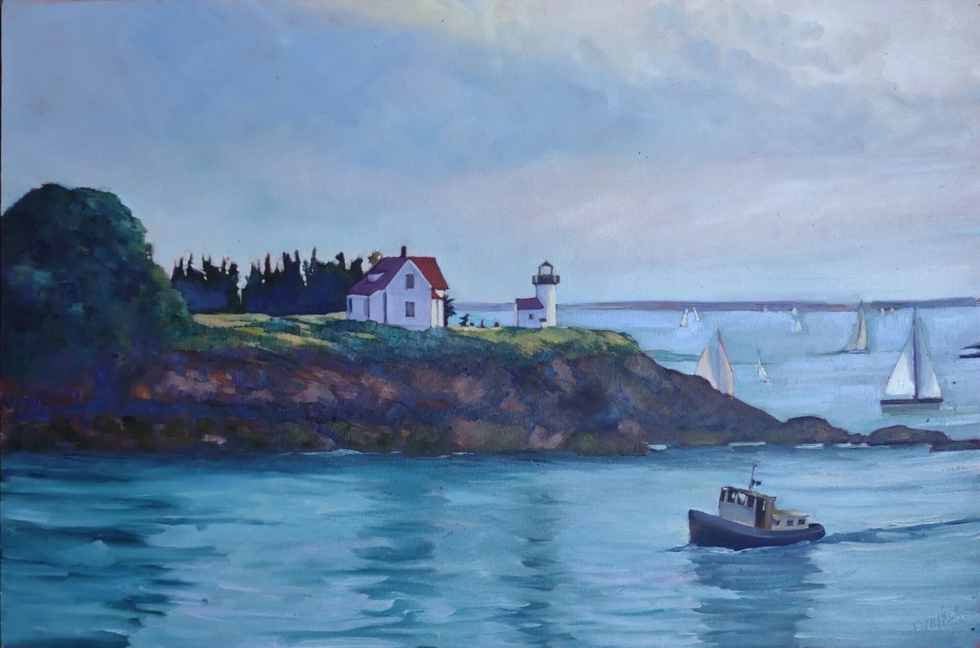
Pemaquid Point Lighthouse, Eric Jacobsen, oil on panel 16 x 20, regular $2300, sale $1150

Reserve your spot now for a workshop in 2025:

Selling art online

Tilt-A-Whirl, oil on canvasboard, $869 framed and shipped.

In the old days, you worked with a gallerist who scheduled regular openings of your work. You spent up to a year prepping for a show, spent a small fortune on frames, and then shipped or trundled them to the place. On that night, you put on your uncomfortable glad rags and put on makeup or shaved (because in those days, those were mutually-exclusive). You braced yourself for an evening eating canapes and maintaining your sobriety in the face of nail-biting nerves and plentiful, terrible wine. A smart artist turned out for his peers’ shows, too, so even the most anti-social of us might be out a few evenings a month, pressing the flesh and fervently longing for home.

Then, despite your effort and prayers, you sold one, or two, or three works. “The market is down.” “Construction on Main Street is killing us.” “We didn’t get the press we’d expected.” “There’s another opening down the street.” Then COVID came along and we forgot how to do anything in person.

The bogus art buyer is a sad function of our times.

Tell me, you really think social media is so onerous?

The overall art market is expected to contract slightly in 2023. As the economy drifts, so do art sales. NFTs are negligible, even moribund, until cryptocurrencies figure themselves out. Meanwhile, the online art market continues to expand. It had a sharp bump at the start of COVID, and has grown steadily since. This year it’s expected to reach nearly $6.5 billion US.

It does not come without its hassles, however. “I actually observed my wife has been viewing your website on my laptop,” starts one well-known scam.

This is a mild example of the countless invitations to porn I get through IG. They’re often obscenely detailed.

Then there are the bots on Instagram, which are my own bête noire. I can almost tolerate the flurry that automatically post in response to my posts, but the ones that send me porn really irritate me. They’re so bad that I’ve let my Instagram feed become almost moribund, even though it’s an excellent tool for selling paintings.

To succeed in selling on the internet, however, you’ll need two things. The first is time, and the second is some familiarity with analytics. Google Analytics, when properly set up, will tell you who is visiting your site, what they look at, where they came from, and how long they stay. (It is migrating to GA4 by July, however, so read up before you sign up.)

Give some thought to how your potential customers are going to pay you. I use Square and I like it very much, but the fees with all online payment systems are almost all the same, so choose the one you’re most familiar with. I only accept checks from people I know, thanks to the aforementioned scammers.

Analytics are an artist’s best friend. They tell you as much about your viewers as a good gallerist could in the old days.

“But I don’t want to do all that,” you say, and it’s true-it will leave you little time for actual painting. Consider a turnkey operation like Art Storefronts, Fine Art America or FASO. But do something; not having a working website in 2023 is like not having business cards was, back in the millenium.

Lastly, don’t rule out bricks-and-mortar galleries entirely. The best-run ones support your online sales. I have my own, of course, and I’m going back into a cooperative gallery this season, the Port Clyde Art Gallery. Susan Lewis Baines is a skilled and smart gallerist, so her involvement was an unqualified recommendation.

I have two seats left in my next online class, Big Shapes and Bravura Brushwork. It is on Monday nights, 6-9 PM ET, and the dates are February 27; March 6 and 13; April 3, 10, and 17. If you’re interested, email me and I’ll give you a link to register. (My classes have so much demand that I can’t have an open link to register, or it’s a free-for-all.)

Reserve your spot now for a workshop in 2025:

Only in it for the money

Falling Tide, 11X14, oil on archival canvasboard, $1087 framed.

Recently, my friend and student Becky Bense disagreed with my statement that “It’s not just that they were in it for the money; everyone is just in it for the money.”

Becky is herself incredibly generous, including a neat volunteer thing called tags4peace, where she converts your old holiday cards into gift tags. The profits go to Turning Points Network, which helps victims of domestic abuse and sexual violence in Sullivan County, NH.

I’m not arguing that people don’t volunteer; in fact, I believe that any balanced and worthwhile life includes service to others. However, in the case of artists, our culture intentionally blurs the line between work and hobby, wages and volunteerism. If you’ve been painting for any length of time, you’ve been asked to donate either your work or your time to a non-profit. “It’s great publicity,” they say, and in some cases, that may be true. Do it if you believe in the organization; ignore it if you wouldn’t give them an equal amount of cash. And set a firm limit; mine is one per year, maximum.

Drying Sails, 9X12, oil on canvasboard, $869 framed includes shipping.

How the lines got blurred

The 18th century was full of dedicated amateurs who contributed to science and culture, including Thomas Jefferson, Benjamin Franklin and Joseph Priestley. The accomplished lady amateur artist was another phenomenon of the 18th century. There were no rules or prejudice against amateurs exhibiting in prestigious shows; however, their status as non-paid artists was clearly defined. The arts were a fundamental part of the gentleman’s and -woman’s education, and that included drawing and painting.

Of course, wide-ranging and varied interests required leisure time to pursue. They were very much the province of the moneyed classes. Modern American culture can’t support that kind of polymathy, since it’s the most overworked nation in the world. However, there are artists out there who work full time at other endeavors but use every spare moment to pursue art. Just as in the 18th century, the exchange of money is no indicator of whether their work is good or not.

Fog over Whiteface Mountain, 11×14, $1087 framed includes shipping.

But it’s also possible that a professional artist can be equally brilliant. The laborer is worthy of his hire, and that goes for artists as much as anyone else. Consider the career of Charles Dickens. He remains the most widely-read of all Victorian novelists, and his social commentary influences our culture to this day.

When Dickens was 12, his father was sent to debtors’ prison. Young Charles quit school and went to work in a boot-black warehouse, working ten-hour days for six shillings a week. A young man from such a background does not have the luxury of writing for love. Dickens pioneered the serialization of fiction, writing most of his great novels in weekly installments in magazines. He, importantly, was paid by the word.

Another great craftsman who was in it for the money was William Shakespeare. Initially derided as an uneducated upstart challenging such university-educated playwrights as Christopher Marlowe, he concentrated on making the theatre a paying proposition. At the time of his death at 52, he was a wealthy man, but he also produced immortal prose.

Early Spring on Beech Hill, oil on canvasboard, Carol L. Douglas, 12X16, $1449 framed includes shipping.

Vincent van Gogh is often cited as an example of the gifted amateur painter, one who worked without remuneration. That was not for lack of trying; he simply died before he achieved acceptability. His brother Theo was an art dealer who supported Vincent until his premature death. Had both brothers lived, they would have successfully flogged Vincent’s paintings in the marketplace. That, however, was left to Theo’s widow.

Artist statements attempt to justify our work, as if the work itself wasn’t justification enough. Can’t we just say that we’re only in it for the money?

Reserve your spot now for a workshop in 2025:

Monday Morning Art School: tones and shades

The Servant (36X40), oil on linen, $4042, shipping included.

“Never use black!” is a mantra that many artists have heard and probably repeated. There’s some truth behind it. We see dark things and perceive black, just as we see light things and perceive white. Shadows, for example, aren’t black, or even particularly grey. If you want to understand that spend time looking at the shadows in Wayne Thiebaud’s work.

The trouble is, the no-black rule is throwing the baby out with the bathwater. Back before black was banned from the palette, we had tints, shades and tones.

  • A tint is a color plus white.
  • A shade is a color plus black.
  • A tone is a color plus black and white.

Obviously, you should never make grey by mixing black and white. It’s lifeless. But there are many subtle colors available only through black admixture.

What we consider acceptable in color-mixing is style-driven, just like everything else. The Permanent Pigments Practical Color Mixing Guide of 1954, above, tells you how to make tints, shades, and tones. That they emphasized this is a hint as to why many mid-century paintings looked so grey.

Today, many painters use straight-out-of-the-tube high-chroma colors. There’s nothing inherently wrong with that, but it won’t serve you well when you need to mix flesh tones or the subtlety of a reptile’s skin.

Masstones, tints, tones and shades.

Masstone and undertone

A masstone is the color a pigment is straight out of the tube, dense and unmixed with another color. While two pigments may look the same to the naked eye, their behavior when mixed can be radically different.

Undertone is the color revealed when a paint is spread thin enough that light bounces back up from the substrate. Some pigments are consistent when moving from mass tone to undertone. Others have significant color shifts.

One of the most important things in learning to mix tints, tones and shades is what they reveal to you about the undertones on your palette.

Beautiful fleshtones can be made by making tones of the warm colors on your palette.

Beautiful flesh tones

When I was teaching figure, I had students do the flesh tone mix above. What they were doing, essentially, was making tones of the warm colors on their palettes. This would in turn net them all the midtones in human flesh. The cool thing about this exercise is that it’s true for people of all races; it’s just a question of how much white you add.

Put a burnt sienna tempered with ultramarine (or ivory black, if you want to do it like Rembrandt) in the darks, and you’re well on the way to having all the colors of human flesh.

Vineyard, 30X40, oil on canvas, $5072 framed.

Greens

David Wilcox’ Blue and Yellow Don’t Make Green had a profound influence on my understanding of color. It’s obsolete today, because the information on pigments can be found online (applicable to both watercolors and oils, in almost every case).

My green matrix.

Wilcox taught me to make a beautiful green with black and yellow, as well as to avoid convenience mixes and hues. His point was that there are many routes to the same destination, and that to really mix colors, you need to understand what pigments you’re using, not work from trade names for colors.

That’s why today I don’t use any tubed greens, but rather mix my own. And black plays a big part in this.

A watercolor exercise mixing warms to make neutrals. Note how anemic the sap green mixtures are.

Exercises

You can make either a tint, tone, shade chart of the colors on your palette, as above, or a warm-cool chart, as done in watercolor immediately above. Either will help you develop facility in mixing the colors you’re using, on your palette.

Reserve your spot now for a workshop in 2025:

The first rule is, there are no rules

Kisses for Wayne T, by Jennifer Johnson, courtesy of the artist.

As usual, I’m the behindest of artists at my own party. It’s the tenth morning of the 45-day-triple-watercolor challenge and I’ve finished… exactly four paintings. I think. Maybe it’s three.

Mary Silver’s keyring, courtesy of the artist. At least she can find her key now… it’s in her sketchbook.

I’ve lost count of how many people are playing, but it’s a good turnout. As usual, Robin Miller has gone off the rails, this year creating a character named Mrs. Quince, who collects things. “Everything was cross-referenced to avoid confusion. For instance, squashed soda cans would be listed under ‘S’ for ‘soda’, ‘F’ for ‘flattened’, and ‘E’ for ‘environmental nuisance’. Mrs. Quince also had her missing husband Sam entered in the computer. Sam was lost at sea in 1988 after joining the Merchant Marines. He was filed under ‘S’ for his name, ‘L’ for lost, and ‘M’ for memories.”

Robin Miller’s Mrs. Quince, who collects things, courtesy of the artist.

It would be a great boon for culture if Robin would retire from her day job and take up art full time.

I can’t publish everyone’s work here; there are too many people playing. I thought I’d give you a cross section instead. It isn’t necessary to be a watercolorist to play this game; Mark Gale of Austin bought his first watercolor kit last week and dove right in. On the other hand, there’s Mary Silver from San Antonio, who’s extremely polished. Texas seems to have a lot of people playing, including Judi Beauford and Cindy Schiffgens, whom I just met because she’s taking my workshop in Austin next month.

Cindy Schiffgens’ school bus, courtesy of the artist.

I can’t remember what prompted Becky Bense and I to start this game. I suspect one or both of us was suffering from painter’s block. Neither of us can manage the Strada challenge, which requires a new painting every day for a month. That’s not to knock it; those who finish it in the spirit in which it was intended will reap great benefits in brushwork and composition. However, it’s not always possible to devote several hours a day to painting-a-day. I did it once for a year and it was all-consuming.

Sandy Sibley is painting the contents of her purse. Courtesy of the artist.

Becky and I created the lazy-man’s version, and a big part of the idea was to discourage perseverating. That can be the death of watercolors, which benefit from quickness and a light hand. This challenge was intended to encourage quickness: three studies of a few minutes each, in pencil, monochrome and then color. We’re supposed to spend no more than a half an hour on the whole process. It’s a value-driven exercise that should leave room for spontaneity.

Mike Prairie’s dog biscuits, courtesy of the artist.

However, if there was ever a duo who color outside the lines, it’s Becky and me. So, the first rule is, there are no rules. If you only finish three paintings in 45 days (which is about where I came in last year), that’s okay. You’re three ahead of where you would have been if you didn’t do any. If you don’t start until the 15th and you go until March 1, that’s okay too.

Judi Beauford’s pages are as beautifully-designed as her paintings. Courtesy of the artist.

If you feel like perseverating, go ahead. Jennifer Johnson started painting three Hershey’s kisses and ended up finishing a careful tribute to Wayne Thiebaud. That was more than okay, that was excellent.

“Paint what’s right in front of you,” I suggested, and Corinne Kelly Avery did just that. Courtesy of the artist.

Sure, you can start today! Read the instructions, and then post your work here. Or just enjoy what other artists are doing. It’s all fine by me!

Reserve your spot now for a workshop in 2025:

AI-generated art vs. the human soul

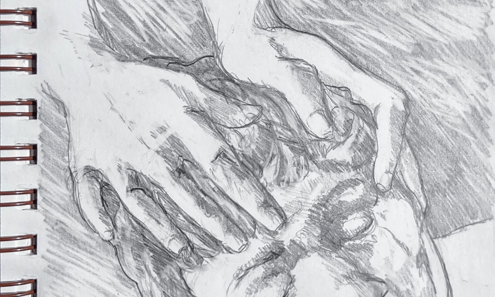
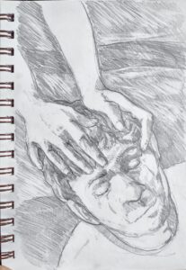
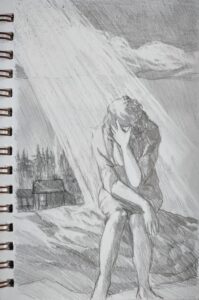
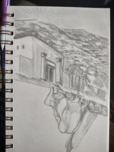
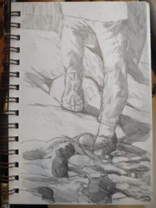
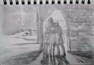
Drawing in church by Carol L. Douglas

A few weeks ago, I wrote on the highly-forgettable nature of AI-generated art. That got a response from painter Carey Corea. He’s involved in the Art & Spirit Forum. Would I be interested in speaking to their group online? “Of course!” I said. That’s this Thursday, February 9, from 6:30-8 PM. Admission is free but you must register through Eventbrite.

Acts 18:3 tells us that Paul was a tent maker by trade (in an era when they were massive structures, not little nylon things). I’m a painter by trade, and my landscape paintings are no more ‘religious’ than Paul’s tents were.

Drawing in church by Carol L. Douglas

Our beliefs inform our work

Still, our beliefs and behaviors can’t help but inform our work. This is why I have a difficult time with Pablo Picasso’s paintings; the same misogyny that characterized his relationships with women bleeds through his canvases. How different that is from the slightly-older Henri Matisse, who was equally obsessed with the female form, but in a positive way.

Volumes have been written Picasso’s and Matisse’s relationships. That covers the ‘who’ and ‘what’ but it only scratches the surface on the ‘why.’ Why does one artist end up victimizing women and another, like Sir Stanley Spencer, end up the victim? Our personal histories are too complex to write off as the result of family, background, genes, or experience, although all those things are factors.

Drawing in church by Carol L. Douglas

AI doesn’t have beliefs

We’ve all seen examples of AI-generated text that reads like polished, human-written copy. Kept within narrow parameters, AI can do a passable job of assembling data into pleasing paragraphs. But that’s where it ends.

Last night, I asked ChatGPT some questions that another human being would have no trouble with, things like, “Do you love me?” “What is love?” and my favorite, “How do you know I’m a sentient human being?”

Elizabeth Barrett Browning has nothing to worry about.

If we’ve met in person, you know I’m a sentient human being because… well, you just know. (It’s also true if you’ve only seen me on a screen or read this blog, albeit to a lesser extent.) That’s the soul talking, and it’s the part AI-generated art doesn’t get. You may not believe in God, but it’s hard to deny that human beings have souls. Otherwise, our flesh bags would not respond as they do to our contacts with others. We experience this indefinable reaction both through intense connections, such as with a lover or child, and in transitory experiences like paying the cashier at McDonalds.

Drawing in church by Carol L. Douglas

If anything, AI validates traditional religion. Christian doctrine teaches that we are triune beings, composed of body, soul, and spirit. The body is our physical self; the soul is our humanity; the spirit is that part of us that’s in contact with God. On the surface it appears that we differ from AI because we have a body, but it’s our soul and spirit that differentiate us from machines.

I’m going to talk about AI-generated art, including examples made by photographer Ron Andrews, which are frankly more interesting than mine were. I’m also going to talk about some of my own work, the things that I don’t generally show. That starts with my sketchbooks. I hope you join us!

Drawing in church by Carol L. Douglas

Art & Spirit Forum
Thursday, February 9
6:30-8 PM.
Admission is free but you must register through Eventbrite.

Reserve your spot now for a workshop in 2025: