fbpx

Talk about a frustrating commission

American Commissioners of the Preliminary Peace Agreement with Great Britain (unfinished oil sketch), c. 1783-84, Benjamin West, courtesy Winterthur Museum

On Wednesday, I mentioned that Norman Mailer finished the first volume of a planned trilogy right before his death at age 84. Sometimes things just don’t go as planned.

Benjamin West was a British-American painter best known for historical scenes, including the highly-romanticized The Death of General Wolfe. West was born in Springfield, PA, near Philadelphia, the youngest of ten children. He was entirely self-taught as an artist, but even from his youth, he attracted the interest and admiration of collectors.

Perhaps it was the persona in which he cloaked himself. Later in England, he reminisced that as a child, he was taught by Native Americans to mix paint using clay and bear grease. Today, that story would get you laughed right into Congress; the indigenous people had been pushed out of the lower Delaware River before he was born.

Still, West taught himself to paint, and he did so very well, being widely acclaimed as the first Colonial artist of serious skill. He began to attract the interest of wealthy collectors. At age 22 he set off for a Grand Tour, paid for by two sponsors. At the time, anyone with pretensions to be a gentleman or serious artist went to Italy to moon over the art and architecture. West used his time productively, making copies of Renaissance paintings and expanding his network of friends.

Self-portrait of Benjamin West (c. 1763, copy), courtesy National Gallery of Art

A detour

Three years later, West stopped in England for a short visit on his way home. In fact, he never moved on. After pottering about in Bath and Reading, he settled in London, eventually sending back to Pennsylvania for his fiancée. West went on to become one of the founders of the Royal Academy, and earned the patronage and custom of King George III himself.

That didn’t mean he didn’t consider himself a Colonial. He frequently revisited North American themes for his grand-scale history paintings, including the bizarre General Johnson Saving a Wounded French Officer from the Tomahawk of a North American Indian. When the British and Americans came to hammer blows in 1776, he maintained a careful neutrality.

The Death of General Wolfe is West’s most famous painting. Courtesy National Gallery of Canada.

Peace breaks out

Perhaps his idea behind The Treaty of Paris was, “never mind that, we’re all friends again.” However, it didn’t work out as planned. It was intended to be the first in a series on the American Revolution, in the same vein as his cycles of historical paintings at Windsor Castle. It was intended to commemorate the commission that negotiated the end of the American Revolution. On the American side, that was John Jay, John Adams, Benjamin Franklin, Henry Laurens, and William Temple Franklin (Benjamin Franklin’s grandson).

The Americans were easy. All but Benjamin Franklin agreed to sit for him, and Franklin’s likeness was easy enough to find. West drew him from an engraving; once you realize that, you can see how he was slotted in to the composition.

The British representatives were a Scottish merchant and slave trader called Richard Oswald and his secretary, Caleb Whitefoord. Whitefoord was a beautiful young man, judging by his portrait by Sir Joshua Reynolds. Oswald flat out refused to sit. He said he had a bad eye, and a previous portrait made him look ugly.

We don’t have the pictorial evidence to judge, but I’d like to believe that a slave trader with sharp business practices was ugly, inside and out. However, there also must have been a fair amount of bad feeling on the part of the British envoys at that moment. Who really wants to commemorate losing a war?

Benjamin Franklin Drawing Electricity from the Sky, c. 1816, Benjamin West, courtesy Philadelphia Museum of Art

“As I very strongly expressed my regret that this picture should be left unfinished, Mr. West said he thought he could finish it,” John Quincy Adams later wrote in his diary. “I understood his intention to be to make a present of it to Congress.”

Instead, it languished, and West’s Revolutionary War painting cycle never got off the ground. Still, it’s more accessible and interesting in its half-finished state than it ever would have been had it been finished and presented to Congress.

Reserve your spot now for a workshop in 2025:

Painting can help you live longer

Self Portrait at the Age of 63, 1669, Rembrandt van Rijn, courtesy National Gallery

T. is the only artist I’ve known who’s ever retired. Most of them paint their way forward into extreme old age. And T. couldn’t stay retired-in the last year she’s picked up her brushes again, done a solo show, and sold a few pieces.

“Why would I stop doing what I love?” asked pastellist Diane Leifheit in response to Transcending Popular Culture.

Three Machines, 1963, Wayne Thiebaud, courtesy de Young Museum

Old age often produces great work

By modern standards, Rembrandt didn’t live long, but 63 beat his contemporary odds by a long shot. His last self-portrait, painted the year of his death, is both technically confident and psychologically insightful.

Norman Mailer finished his last novel, The Castle in the Forest, right before his death at the age of 84. It was both very long and very good, and was the first volume of an intended trilogy.

The superstar of working into extreme old age was American pop artist Wayne Thiebaud, who died on Christmas Day 2021 at the age of 101. Earlier that year, he recorded a conversation with curator Karen Wilkin and Lois Dodd, about working into old age.

“It has never ceased to thrill and amaze me,” Thiebaud said, “the magic of what happens when you put one bit of paint next to another. “I wake up every morning and paint. I’ll be damned but I just can’t stop.”

Lois Dodd, of course, we claim as Maine’s own favorite daughter. She’ll celebrate her 96th birthday this year, as will her fellow modernist Alex Katz.

Equilibrium, 2012, Carmen Herrera, courtesy Metropolitan Museum of Art

Carmen Herrera didn’t have her first solo show until she was in her mid-50s, although she’d sold her first work while in her teens. She was almost 90 when she was ‘discovered’ by the New York art scene. She lived until age 106.

A list of major artists who’ve reached their centenary is too long to reprint here, but mention must be made of Anna Mary Robertson “Grandma” Moses. She was a hardscrabble farmer’s wife who didn’t start painting until her mid-70s. She died at age 101, having carved out a second career that was far more successful than her first one.

“I look back on my life like a good day’s work, it was done and I feel satisfied with it. I was happy and contented, I knew nothing better and made the best out of what life offered,” she said.

Hoosick Falls in Winter, 1944, Anna Mary Robertson “Grandma” Moses, courtesy Phillips Collection

Science says

The anecdotal evidence I’ve related above is supported by science. British researchers found that people over 50 who regularly engaged in the arts were 31% less likely to die during a 14-year follow-up than peers with no art in their lives. A World Health Organization review found that both passive engagement with the arts (like visiting a museum) and active participation (making art or music) had health benefits.

Why don’t more people engage in art, then? We start devaluing it in school, where it’s the first thing cut, despite manifest evidence of its health and intellectual benefits. It’s no wonder that by middle age, most of us are more likely to be watching TV than picking up a brush or singing in a choir.

But as Grandma Moses demonstrated, it’s never too late to start painting. Or singing, playing the harmonium, or taking up interpretive dance. Why not give yourself a health boost, and have fun at the same time?

Reserve your spot now for a workshop in 2025:

Monday Morning Art School: don’t be boring

Linda Smiley used the big shapes of shadows to draw us across a very familiar lake scene.

Don’t be boring, I wrote last week. This is the first and greatest rule of composition. “What do you mean by that?” a reader asked in response. This, like obscenity, is one of those things that’s hard to define, but we know it when we see it.

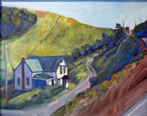
The subject is never the issue. We’ve all seen a thousand boring paintings of barns, but when Edward Hopper painted them, they were brilliant studies of light and shape. Very familiar subjects can be seen in new and arresting ways. I took the liberty of illustrating this post with paintings by my students; they all took common scenes in the northeast and finished them beautifully.

Most people would paint the fence from the side, but Rebecca Bense drove us right into the picture plane with that shadow.

The easy out

We tend to draw what’s right in front of us without thinking too much of how changing the viewpoint might make for a better painting. Commit to an idea, and squeeze out every ounce of design you can by drawing it repeatedly in different arrangements. That’s as important in landscape as it is in still life. The time you spend trying out new compositions is the most important part of the painting process.

That is not just a question of large shapes, but of values. Even a typical arrangement of trees, point, and water can be made arresting through dark shapes running through them. Contrast draws the eye.

Beth Carr used the chop of snow shadows to create great texture.

What everyone says is not necessarily true

You’ve heard of the rule of thirds, or that you should never center the subject directly on your canvas. What makes you believe these things? Someone told them to you.

Ideas of division of space are culturally-derived and quite complex. Tutankhamun’s golden mask is beautiful and perfectly symmetrical.

You will have an easier time creating a composition if you abide by these shibboleths, but that doesn’t mean you’ll make a better painting. A deep dive into space division is never wasted time. I think about the abstract paintings of Clyfford Still when I start to feel my compositions falling into dullness.

Cassie Sano crossed the tire tracks and the tree shadows to create a weave of interest.

There are some verities

Defining your composition with long unbroken horizontal and vertical lines will make it start out rigid. Look to Frances Cadell for ways to break out of that. Likewise, you don’t want to lead the eye out the corners of your canvas, or put a focal point to close to an edge. ‘Respect the picture plane’ is a good general rule.

The human brain loves the insolvable. That’s why the Golden Ratio and Dynamic Symmetry work better than the rule of thirds in design. That doesn’t mean you need to spend a lifetime studying design arcana; just understand it and better placement will come naturally to you.

Stephen Florimbi didn’t beat the details to death in this lovely creek painting, instead, concentrating on the patterns of light and dark.

Things to avoid

No painting without a series of focal points can succeed. This is where the marsh painting usually fails. The eye needs to be able to walk through, into, and beyond the work. I’m not talking about anything as hackneyed as the winding path or river, but a series of points that draw your eye around the picture in a planned way. These details reward careful study and keep the viewer engaged for long periods of time.

Reserve your spot now for a workshop in 2025:

Transcending popular culture

Daybreak, 1922, Maxfield Parrish

One of my students chatted with me recently about Maxfield Parrish. “I erroneously dismissed him as a pop artist for too long,” I told her. “He was that and much more.”

“What’s the difference between a fine artist and a pop artist?” she asked.

It was a bad choice of words on my part. There was a 20th century movement called Pop Art, which encompassed the likes of Roy Lichtenstein and Andy Warhol. It was fine art commenting on popular culture, rather than a part of popular culture. (The difference between Warhol’s Brillo boxes and the ones made by the soap company was that Warhol’s were in museums. Now even that distinction is blurred.)

I was talking about of the art equivalent to pop music, and I don’t think there’s a word for it. Parrish was part of the Golden Age of American illustration, along with N.C. WyethHoward Pyle, Jessie Willcox Smith and others. Our modern concept of illustration doesn’t begin to encompass the range of their work. They were riding a revolution in printing technology, and they were visionary.

Sheep Pasture, Cornish, New Hampshire (sketch), 1936, Maxfield Parrish

A world now gone

Parrish’s Daybreak was the most popular art print of the 20th century. At one time, one in four households had purchased one. Printing is so cheap for us today that we can hardly imagine what it meant a hundred years ago for working-class people to afford a color picture for the dining room, or to read books and magazines with color illustrations.

Today’s illustrators work to someone else’s idea. When Time orders up a caricature of the president for next week’s issue, the artist has little scope or time. In their heyday, magazine covers were self-contained paintings, often narrating a little story of the artist’s own invention. The Saturday Evening Post discovered Norman Rockwell, who went on to create more than 300 covers for them, and John Philip Falter, who did 120 covers. All the best magazines, ranging from Harper’s Bazaar to Life to Boys’ Life to Popular Science, hired top illustrators for their covers.

Hill Top Farm, Winter, 1949, Maxfield Parrish

The best of them, including Parrish, were wildly successful. It’s not just that they were in it for the money; everyone is just in it for the money. It’s that they succeeded in making a great deal of it.

Today magazines are filled with photography. The only major magazine still using stand-alone art on its cover is The New Yorker. Meanwhile, there’s a surfeit of wall decoration available to us, ranging from bad department-store art to high-quality prints of masterpieces. There’s no room in the market for pop painters in the style of Maxfield Parrish.

Birches in Winter, undated, Maxfield Parrish

Parrish can be credited with many things, including the craze for androgyny that has bedeviled fashion for a hundred years, and for introducing a shade of blue that now bears his name. He was a consummate commercial artist, but he could also really paint. In 1931, he told the Associated Press, “I’m done with girls on rocks,” and focused exclusively on landscapes, particularly those of his adopted home state of New Hampshire. They were never as popular as his nymphs, but he still made money. He painted until he was 91 and lived to a few months shy of 96. That’s a recurring trait among successful artists; painting is a healthy vocation.

Reserve your spot now for a workshop in 2025:

Relax and have fun

Sometimes It Rains, oil on canvasboard, private collection.

I’m my own cameraman, sound producer, lighting supervisor, and writer, and I’m inexperienced with all of them. I also see to my hair and makeup, things that haven’t concerned me since I was fourteen. Fifty subsequent years of living and working outside have given me wrinkles like the Badlands and a coiffure of frizzy, weathered snakes. They look awful on camera. I was texting while struggling with all this the other morning, when my buddy signed off with the message, “Have fun!”

I’m almost certain I have a personality, but you’d never know it when I’m confronted by that silent, owlish camera lens. Yet, the more I do it, slowly, imperceptibly, a rhythm emerges. I haven’t cracked a joke yet, but I am starting to believe that sometime soon, I might start to enjoy this.

This, I mused, must be what learning to paint feels like. I throw a bewildering array of terms at my students. I tell them that it isn’t just mindless dabbing on a canvas, but a process that’s been refined over hundreds of years, with a specific order and protocol. They encounter difficulties they never imagined, and I keep sending them back to first principles. Fun? Not.

That’s a face that’s seen a few miles. And a bit “peely-wally,” as my Scottish friend says.

Fun, or challenge?

‘Fun’ means lighthearted amusement. Playing cornhole at a picnic is fun, but it’s hardly memorable. Painting is deeply satisfying, but like all significant achievements, it rests on a lot of hard work.

I imagine this is how my kids felt in dance class- “Arms up… higher, HIGHER, more rounded please… bellies in, lift your head, please, left foot farther forward, no, LEFT!… okay, that looks good, now RELAX!”

We humans are drawn to challenge as much or more than we’re drawn to fun. Challenge is where we experience mastery. The greater the challenge, the headier that feeling. Taken objectively, there was little lighthearted amusement in the last day of our hike across Britain last spring-it was blisters, exhaustion, and annoying cows. And yet reaching Bowness-on-Solway was a moment I’ll remember forever.

Painting with Mitch Baird and Eric Jacobsen is definitely fun.

We still need fun

Challenge feeds our sense of self-esteem and our belief in our own ability to overcome adversity. Often the skills we learn along the way are surprisingly fitting for other disciplines. All of that is important, but we still wouldn’t do it if we didn’t have fun along the way.

On that last long day of hiking, there was a perfect Pimms Cup with our lunch. A hiker chatted us up whose shorts had, ahem, slipped. A party of cyclists in a pub wore crowns and robes over their gear. Without laughter, challenge can be unendurable.

Without fun, our painting will grow rigid and anxious. Fun is the lubricant that allows great ideas to bubble up.

Classes, workshops, and painting groups provide fun through camaraderie and friendship. But sometimes we are on our own, and we need to remind ourselves to have fun. That’s my goal for today; what’s yours?

Reserve your spot now for a workshop in 2025:

Monday Morning Art School: composition starts at the beginning

Spring Greens, 8X10, oil on canvasboard, $522 unframed.

It’s been said that a painting needs to be compelling at three inches, three feet and thirty feet. That’s simple enough, but how does the artist make that happen?

Looking at a painting from a distance (or on the tiny screen of your phone), you’re not compelled by brushwork or even-mainly-by subject matter. You’re drawn by the internal structure and abstract masses of value and hue on the canvas.

Music, sculpture, poetry, painting, and every other fine art form relies on formal structure to be intelligible. This is easiest to see in music, where even the rank beginner starts by learning chords and patterns. These patterns are (in western music, anyway) pretty universal, and they’re learned long before the student transforms into another Bach or Ray Davies. In other words, you start at the very beginning.

This structure has nothing to do with the subject matter and everything to do with inherent beauty. It starts before the artist first applies paint, in the form of a structural idea-a sketch, or a series of sketches in monochrome, that work out a plan for the painting.

Larky Morning at Rockport Harbor, 11X14, on birch board, $869 unframed.

It starts at the beginning

What composition isn’t is the sudden realization, when you’re halfway finished, that you have a lot of boring canvas with nothing going on. Slapping a sailboat in there isn’t going to fix an essentially deficient construction.

Music is an abstract art because it’s all about tonal relationships, with very little realism needed to make us understand the theme. (Think of the cannonade in the 1812 Overture, which comes at the very end, but we’ve all gotten the point long before that.) A composer doesn’t need little bird sounds to tell us he’s writing about spring, although they can be cute. Done right, the painter doesn’t need to festoon little birdies on his canvas to tell us he’s painting about spring, either. That should already be apparent in the light, structure and tone of his work.

Stone Wall, Salt Marshes, 14×18, $1594 framed.

Abstraction is harder for the representational artist to grasp, even when we understand the critical importance of line and abstract shapes. We still must stuff a huge three-dimensional reality into a two-dimensional picture plane. That’s a big job and it must be handled with deliberation.

Just as with everything else, some of us are naturally better composers than others, but that only takes us so far. We all fail when we don’t put composition at the beginning of our painting process.

Mountain Fog, 12X9, oil on archival canvasboard, $696 unframed.

Building better paintings

All of us have closets full of bad paintings we can’t resolve. (“How long did that take you?” “Just the ten bad ones I did before I did this one good one.”) In almost every case, the problem is far deeper than modeling or paint application-it comes from ignoring the fundamentals of composition.

How can you avoid this and reduce the number of bad starts in your painting collection?

Respect the picture plane: the four ‘walls’ of your canvas are the most important lines of your painting. All composition must ultimately relate to them.

Armature: the fundamental lines of movement that connect the main elements of the painting must be dynamic and clearly articulated;

Abstract shapes: these are the building blocks of painting; they must relate as values and colors before they ever become real objects.

Don’t be boring: If you’ve seen that combination of tree, hill and sky a thousand times, do something to make it your own.

Then, and only then, can you move on to specific subjects and painterly detail.

“Remember, that a picture, before it is a picture of a battle horse, a nude woman, or some story, is essentially a flat surface covered in colors arranged in a certain order,” wrote one of the fathers of modern painting, Maurice Denis. As the direct heirs of Modernism ourselves, we would do well to listen.

Reserve your spot now for a workshop in 2025:

This post originally appeared in March, 2021, and has been lightly edited.

Real art in the age of selfies

The Late Bus, 8X6, oil on canvasboard, $435 framed.

When Antiques Roadshow was all the rage, didn’t you ever wonder what you’d do if you found an Albrecht DĂĽrer woodcut in your attic? I regretfully concluded that I’d have to sell it. However, I do have lots of original art in my home, made by contemporary artists I respect.

DĂĽrer’s woodcuts were originally intended for middle-class people like me. Time, scarcity, and the murky movements of the international art market have rendered them impossibly valuable.

Prom Shoes 2, oil on archival canvasboard, 6X8, $435.
Reader Sandy Sibley sent me this interesting video, by someone calling himself People’s Republic of Art (PRA). In places it’s naĂŻve; for example, there have been celebrity art ateliers churning out work since the Renaissance. But overall, it’s an accurate picture of the current forces shaping the global art market.
That’s huge: $65.1 billion US in 2021. Most of that money is not making its way into the pockets of working artists. It’s spent on commodified art. That means either old masterworks that have become stratospherically valuable, or new art by celebrity artists.

This world of art money-laundering or buying shares in art assets has nothing to do with us working artists. We’re out here in the hinterlands beavering away, and the fat cats are in New York and London moving massive amounts of dollars. The two worlds never meet.

American Eagle rounding Owls Head, 6×8, oil on archival canvasboard, $348 unframed.

How that affects you

However, PRA also talks about a shift in how art is appreciated. That does affect us. Art museums have gone from being a collection of individual works to be admired in their own right, to being a stage-set for social media. That in turn is changing how art is made.

We’ve all seen images of people taking selfies with great paintings, or the scrum in front of the Mona Lisa. I’ve experienced something related, being used as the backdrop of tourists’ selfies.

But PRA’s talking about creating art that’s designed upfront to produce great profile pictures for the wanna-be influencers of this world. Art made for selfies is a real thing. Galleries and museums are as driven by ROI as the rest of us, as I wrote recently, so they give the people what they want.

That affects everyone in the food chain, including us. I’ve dabbled with florescent paint, tiny lightbulbs, and backlighting my substrate. Ultimately, I’m drawn back to just painting. It’s a devilishly difficult puzzle. Nobody who truly engages with it can ever feel like they’ve achieved total mastery.

Sunset Sail, 14X18, oil on linen, $1594 framed.

The fundamentals remain

Long before there was a stock exchange, people were drawn to art to surround themselves with beautiful and edifying things. That impulse is deep in the human soul. It remains with us even after we’ve gone home from the Immersive Van Gogh, and hopefully even after we turn off the television.

My young friends are collecting posters and curios just as we were at their age. But PRA raises a good point: instead of decorating your room with posters of famous art that sold for millions, buy original art that moves you.

The difference between $200 and $800 may seem enormous when you’re thirty years old, but real art has levels of meaning and experience that its mass-produced analogs can never provide. There’s the search, when you visited galleries and art shows and thought about what the paintings meant and how well they would stand up over time. There’s the craftsmanship, which will throw up detail and meaning to you for years to come. There’s identification with a real person: the creator. And if chosen well, that real painting will have value long beyond when the print is consigned to the dustbin-just as that DĂĽrer woodcut does today.

Reserve your spot now for a workshop in 2025:

Your daily rejection

In Control (Grace and her Unicorn), 24X30, $3,478, oil on canvas.

Eric Jacobsen sent me a cartoon. A little boy is drawing on the kitchen floor. “Thank you for your submission,” it reads. “We regret to inform you that your work was not selected for the fridge.”

The late great real estate columnist Edith Lank was eulogized in her hometown newspaper yesterday. “She understood that the way to get to 100 newspapers was to write to 500,” said her son, Avrum Lank. “She wrote letters and letters and letters. Her father told her to paper her the walls of her bedroom with her rejection letters.”

We hate rejection, but it’s a fact of life in the arts. The disappointment varies. I don’t have much emotional investment in most national shows (except that the entry fees chip away at my bottom line). But when I was rejected last year from a local event I’ve done many years running, my distress was brutal.

Michelle Reading, oil on linen, 24X30, $3478

Process your emotions

‘It happens to all of us’ or ‘jurying is subjective’ wasn’t that helpful at that moment. What I needed was my utterly loyal pal who said, “They must be total idiots.” We both know that isn’t true, but there was time later for self-analysis.

I once received an incredibly nasty newspaper review. In retrospect, I wish I’d saved it. It is so rare for an individual artist to be trashed in a group show that I must have hit a nerve somehow.

At the time, though, I was in a slough of despair. I called my friend Toby and cried on her shoulder. That’s the normal human reaction to rejection. What’s important is what we do after that.

Rejection is a part of life

Some artists reject the hurly-burly of the marketplace entirely. That may be less scary now, but ultimately it means no growth. We experience rejection when we push limits.

Best Buds, 11X14, oil on canvasboard, $1087 framed

Don’t get wrapped up in your disappointment

We’ve all heard the expression, “Get back on the horse that threw you.” The longer we dwell on a failure, the bigger that failure looms. There’s a national show I coveted. I was rejected the first year, when a friend was the juror. After that, I applied every year, knowing the odds were stacked against me. Imagine my surprise when I was accepted.

Healthy habits help us surf over bad times. After I was done crying at Toby, I took my daily walk, fed the kids and sent them off to school, and went back to my studio. The rhythm of my day had a soothing effect.

Pinkie, pastel, ~6X8, $435 framed.

Rejection doesn’t define you

The art market is huge. There are times I look at work and wonder, “who on earth would buy that?” And yet, almost every idea has a corresponding following. If that show or gallery doesn’t love you, someone else does.

Learn from the experience

I recently kvetched at Colin Page that the last time I painted something I liked was in 1990. This is the season where we’re applying to upcoming shows and suddenly nothing in our portfolio pleases us.

Later, sorting paintings in my studio, I realized this throwaway comment was a red flag to myself. In 1990, I was shooting pictures of my work with an SLR. Today I use my cell phone. What I don’t like now is the bad quality of my photos, not the work itself.

Reserve your spot now for a workshop in 2025:

Monday Morning Art School: don’t worry about AI just yet

Gathering Storm, Ivan Ayvazovsky, 1899, courtesy Sothebys

The sublime

The 18th century brought the concept of the sublime into our consciousness. That means a quality of greatness beyond counting-what the religious might call the presence of God. It is harmony and horror in equal measure, and it’s meant to apply to every sphere of human endeavor and experience. You might experience the sublime standing on the lip of the Grand Canyon, where your appreciation of the sunrise is informed by your awe in realizing that there’s no barrier between you and that huge hole. It is a meeting of our emotional selves with the wonders of creation.

In painting, that experience is articulated in Caspar David Friedrich’s Wanderer above the Sea of Fog. It has its parallels in every art form. In the 20th century, the advent of unparalleled efficient death-in-warfare made it appear in poetry, like Wilfred Owen’s tragic, beautiful Dulce et Decorum Est.

“Art is for seeing evil,” writes philosopher Agnes Callard. “Evil’ in this sense includes: hunger, fear, injury, pain, anxiety, injustice, loss, catastrophe, misunderstanding, failure, betrayal, cruelty, boredom, frustration, loneliness, despair, downfall, annihilation.” In short, she’s talking about whatever is the opposite of goodness, beauty, and virtue.

I think that art is for more than that, but it’s a component.

My first attempt to replicate the theme of Gathering Storm with an AI image generator.

AI generated art

A reader asked me my thoughts about Artificial Intelligence (AI)-generated art. I have little experience with it; I’ve tinkered with ChatGPT. It creates a facsimile of human writing, strings of language that are fundamentally meaningless. It’s perfect, then for advertising copy.

What can an equivalent image generator make? If recent news is to be believed, very brilliant facsimiles of artwork. But can this work make intelligent paintings? I decided to try my hand with an easily-available online generator.

My second attempt looks like an evening sail in Penobscot Bay. No drama whatsoever.

I used as a reference, Ivan Ayvazovsky‘s Gathering Storm, above. This painting operates at two levels-first, our sheer terror at the beauty and violence of the sea. Then we notice that the boat appears to be floating rudderless within the storm. It’s both a beautiful painting and a perfect metaphor for aspects of our human existence-the epitome of the sublime in painting.

I thought up a set of descriptors for Aivazovsky’s painting: evening ocean storm squarerigger. The app came up with the image above. Cute, but cartoonish.

On the surface, perhaps, it would make a decent painting, but there’s nothing terrifying or profound about it. I refined that by changing keywords, ending up by adding “bleak,” which just gave me a low-chroma version of the prior iteration. My succession of images are as they appear in this post.

Upping the ‘wild sea’ adjectives just made me lose the boat. And the composition is nothing to write home about.

Tinkering might lead me to much better apps online. But while these images are good, they’re devoid of human emotion or ideas. Yes, they can occasionally get lucky and come up with an image that ‘means’ something, but that requires a human curator to discern. They’re just like Google Image Search with filters.

Adding ‘bleak’ just made me lose the chroma.

The greatest ability we have in painting isn’t our technical skill (as important as that is) but our human intellect, both rational and emotional. The 20th century movement towards content-free art is over, because it can be done better and faster by machines. It doesn’t matter if you’re painting abstraction or landscape; start thinking about what the higher meaning of your work is. If it’s not there, you can be replaced by a computer.

Reserve your spot now for a workshop in 2025:

Selling out, or selling art

Coast Guard Inspection, plein air, oil on canvasboard. 6×8, $435 framed.

On Wednesday I wrote that NFTs were the logical descendants of conceptual art. Reader Pam Otis responded by asking, “What kind of return on investment do museums get from owning/showing works like that? How much does having a certain piece drive traffic through their doors or attract benefactors with deep pockets?” It’s a great question, because that’s what makes a pile of candy on the floor worth $7.7 million.

American Eagle in Dry Dock, plein air, 12X16, oil on canvasboard, $1159 unframed.

What is ROI?

Return on Investment (ROI) is the value of an investment versus its cost. Every person makes ROI calculations constantly. “Is it worth my time to put the Christmas decorations away, or should I make some frozen meals for next week?” is an ROI calculation.

ROI is why my friend Ken DeWaard doesn’t paint plein air on cloudy days; those paintings are hard for him to sell. It’s why commercial galleries don’t carry work their clients won’t be interested in, as worthy as that work might be. Museums may think of themselves as educational institutions, but they give us blockbuster shows of Van Goghs, Sargents, and Sorollas to bring in the punters.

Skylarking 2, 18×24, unframed $1855, oil on linen.

Treading a fine line

It’s easy to get too focused on money and only produce work that buyers will love. That’s how artists end up being parodies of themselves, churning out variations of the same tired theme. There’s also the opposite tendency, to make omphalocentric work with a complete disdain for the market.

Vincent Van Gogh is often cited as an example of an artist who produced brilliant work without thinking about selling. That’s not true; his brother (who supported him) was an art dealer. His correspondence shows that he did have an eye to the main chance, and only his early death prevented him from being a commercial success in his own lifetime.

Professional artists must tread a fine line between being true to our inner vision and being comprehensible. “Give me something I can hold on to,” I told a very talented student who resisted that idea. She thought I was asking her to sell out; I wanted her to help me find a way to understand her work.

Skylarking, 24X36, oil on canvas, $3,188 unframed

Selling out

The phrase sell out, meaning to prostitute one’s ideals, dates from 1888. It probably arose with 19th century socialism and utopianism, which presented the idea of markets as evil. That idea of not selling out is sadly pervasive today.

We can think of the marketplace as the other half of a conversation we started by creating art. The market tells us things about our work. Sometimes they’re things we don’t want to hear. If instead of getting mad, we listen, we can learn a lot.

That can be very tough when one’s ego is on the line. Do I really have the emotional courage to look at the work that got in a show when mine was rejected and figure out why?

It sometimes seems that the art market is irrational. For example, jurors and buyers respond emotionally to subject matter. While their response is subjective, that they do it is a fact. Knowing it helps you develop strategies to succeed.

When our work doesn’t sell, it means one of two things:

  • It isn’t different, meaningful, or beautiful enough to engage buyers;
  • It isn’t properly marketed.

It’s up to us to figure out which, and then to do something about it.

Speaking of marketing

On Monday I start teaching a six-week session on Atmospherics. You didn’t hear about it because it was sold out before it was advertised. I’ve got only six workshops scheduled for 2023, and that’s all the live, in-person teaching I’ll be doing this year. (The rest will be by video and Zoom.) If you want to take a live class from me, hie on over to my website and sign up! When they’re gone, they’re gone.