I brought my laptop with me intending to write my blog on my vacation, only to realize the combination of camping and nine people has outdone me. (Not my dumbest move yet this week; I also brought my summer nightgown. To camp. In the Nevada wilderness. In February.
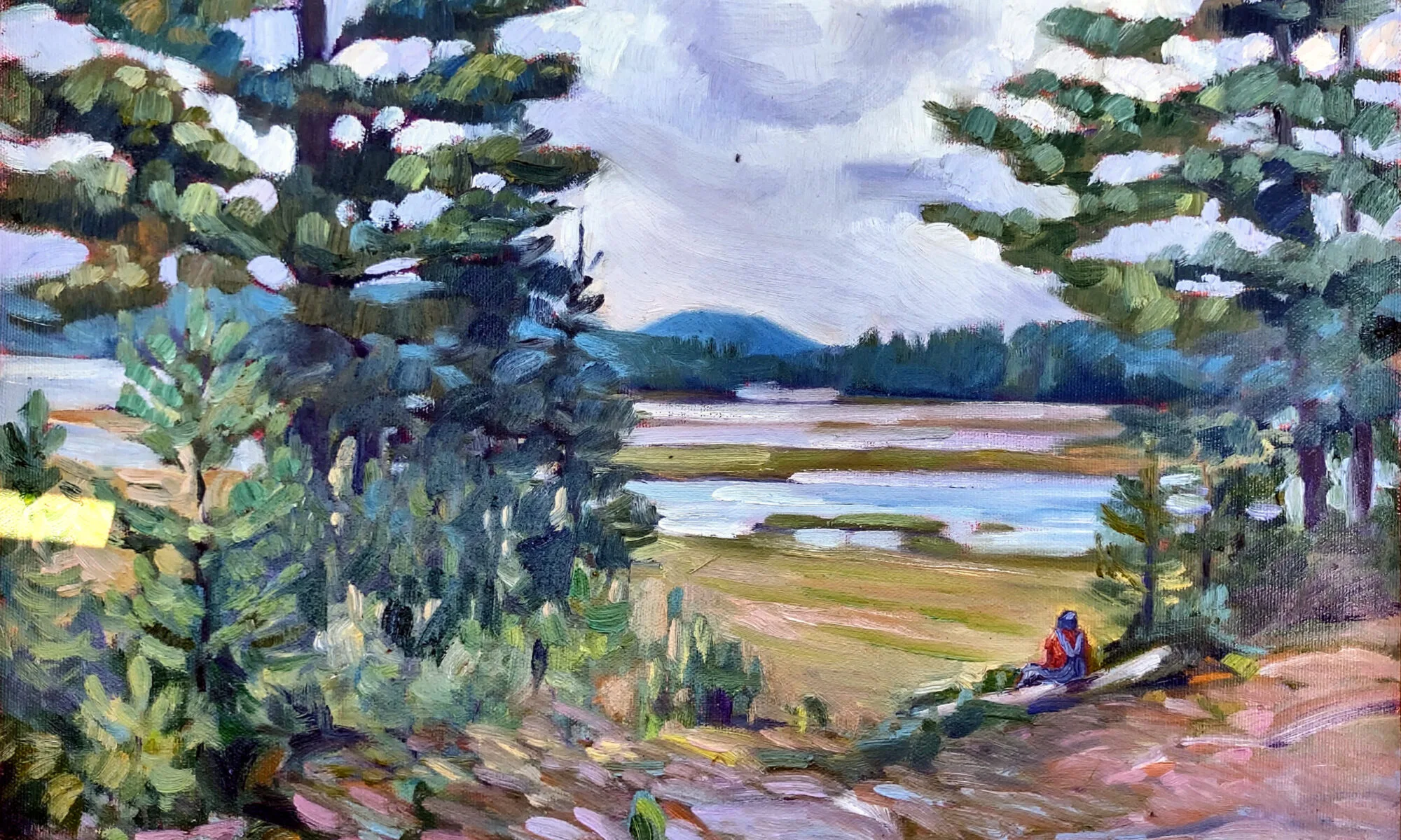
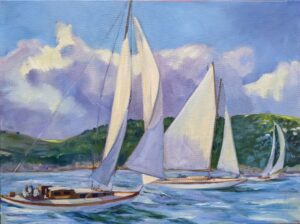
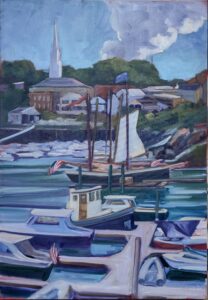
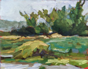
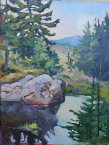
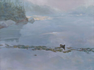
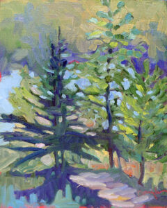
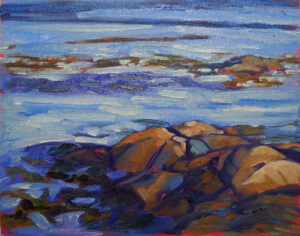
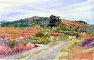
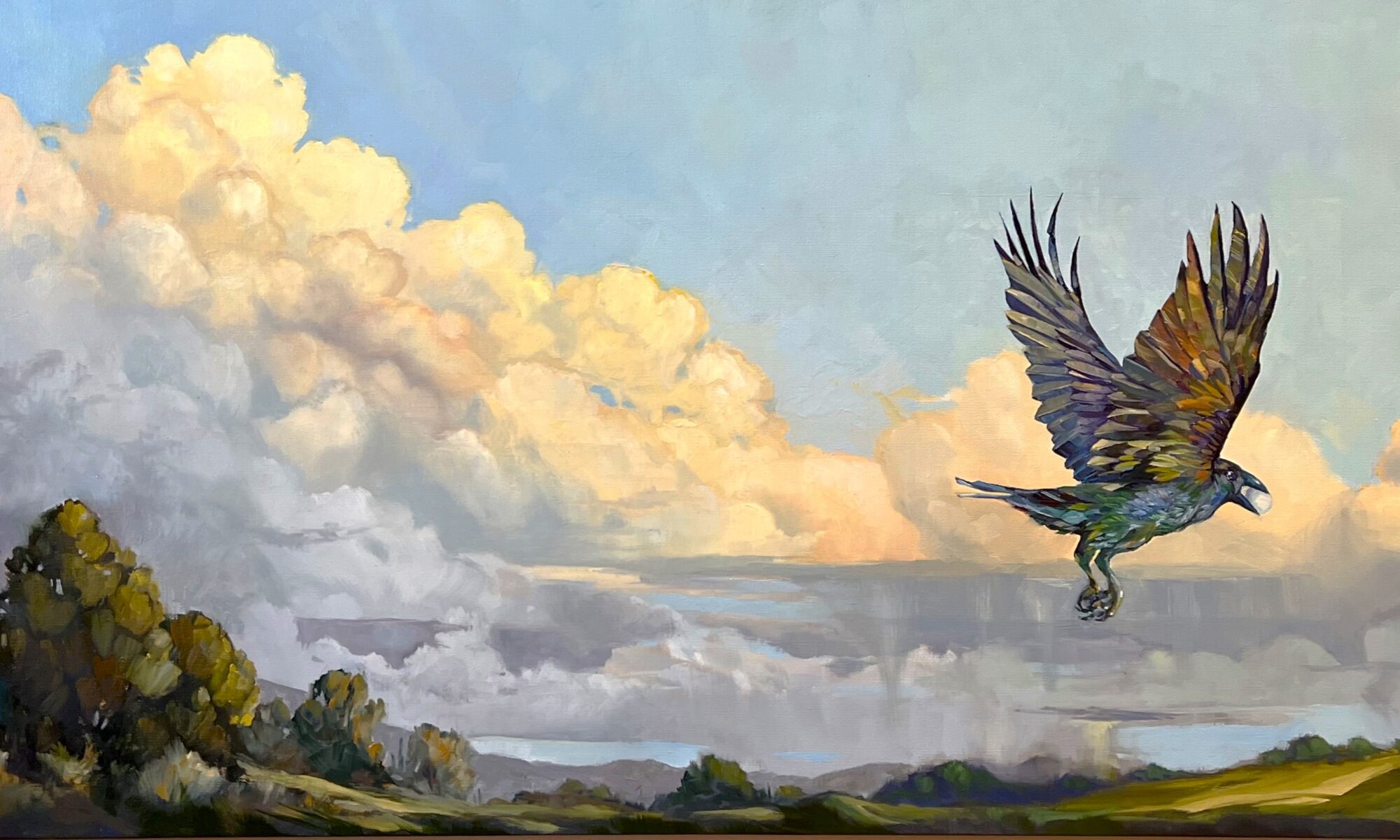
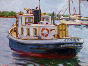
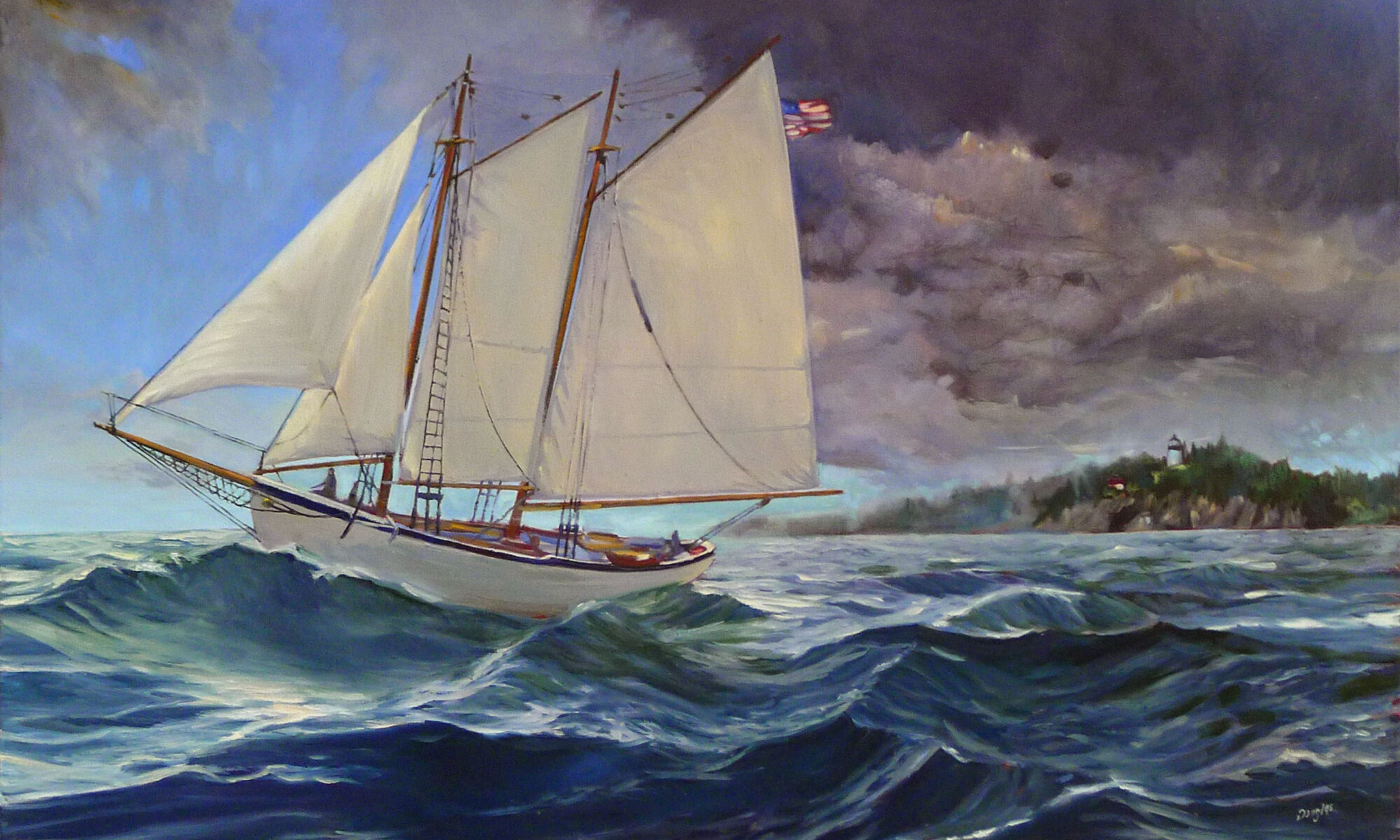
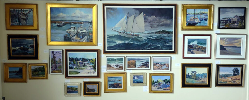
I’ll be taking off, but meanwhile I want to alert you to a Truly Great Deal. Eric Jacobsen is one of the best impressionist painters of our generation, and also my good buddy. He’s one of the few painters I’d like to study with right now, to steal all his secrets of brushwork.
Eric’s having a half-off sale on selected works on his website, which you can find here. Some of them he painted with me around, lucky fellow.) There’s not a huge selection, and when they’re gone, they’re gone. Enjoy!
In the old days, you worked with a gallerist who scheduled regular openings of your work. You spent up to a year prepping for a show, spent a small fortune on frames, and then shipped or trundled them to the place. On that night, you put on your uncomfortable glad rags and put on makeup or shaved (because in those days, those were mutually-exclusive). You braced yourself for an evening eating canapes and maintaining your sobriety in the face of nail-biting nerves and plentiful, terrible wine. A smart artist turned out for his peers’ shows, too, so even the most anti-social of us might be out a few evenings a month, pressing the flesh and fervently longing for home.
Then, despite your effort and prayers, you sold one, or two, or three works. “The market is down.” “Construction on Main Street is killing us.” “We didn’t get the press we’d expected.” “There’s another opening down the street.” Then COVID came along and we forgot how to do anything in person.
Tell me, you really think social media is so onerous?
It does not come without its hassles, however. “I actually observed my wife has been viewing your website on my laptop,” starts one well-known scam.
Then there are the bots on Instagram, which are my own bête noire. I can almost tolerate the flurry that automatically post in response to my posts, but the ones that send me porn really irritate me. They’re so bad that I’ve let my Instagram feed become almost moribund, even though it’s an excellent tool for selling paintings.
To succeed in selling on the internet, however, you’ll need two things. The first is time, and the second is some familiarity with analytics. Google Analytics, when properly set up, will tell you who is visiting your site, what they look at, where they came from, and how long they stay. (It is migrating to GA4 by July, however, so read up before you sign up.)
Give some thought to how your potential customers are going to pay you. I use Square and I like it very much, but the fees with all online payment systems are almost all the same, so choose the one you’re most familiar with. I only accept checks from people I know, thanks to the aforementioned scammers.
“But I don’t want to do all that,” you say, and it’s true-it will leave you little time for actual painting. Consider a turnkey operation like Art Storefronts, Fine Art America or FASO. But do something; not having a working website in 2023 is like not having business cards was, back in the millenium.
Lastly, don’t rule out bricks-and-mortar galleries entirely. The best-run ones support your online sales. I have my own, of course, and I’m going back into a cooperative gallery this season, the Port Clyde Art Gallery. Susan Lewis Baines is a skilled and smart gallerist, so her involvement was an unqualified recommendation.
I have two seats left in my next online class, Big Shapes and Bravura Brushwork. It is on Monday nights, 6-9 PM ET, and the dates are February 27; March 6 and 13; April 3, 10, and 17. If you’re interested, email me and I’ll give you a link to register. (My classes have so much demand that I can’t have an open link to register, or it’s a free-for-all.)
Becky is herself incredibly generous, including a neat volunteer thing called tags4peace, where she converts your old holiday cards into gift tags. The profits go to Turning Points Network, which helps victims of domestic abuse and sexual violence in Sullivan County, NH.
I’m not arguing that people don’t volunteer; in fact, I believe that any balanced and worthwhile life includes service to others. However, in the case of artists, our culture intentionally blurs the line between work and hobby, wages and volunteerism. If you’ve been painting for any length of time, you’ve been asked to donate either your work or your time to a non-profit. “It’s great publicity,” they say, and in some cases, that may be true. Do it if you believe in the organization; ignore it if you wouldn’t give them an equal amount of cash. And set a firm limit; mine is one per year, maximum.
How the lines got blurred
The 18th century was full of dedicated amateurs who contributed to science and culture, including Thomas Jefferson, Benjamin Franklin and Joseph Priestley. The accomplished lady amateur artist was another phenomenon of the 18th century. There were no rules or prejudice against amateurs exhibiting in prestigious shows; however, their status as non-paid artists was clearly defined. The arts were a fundamental part of the gentleman’s and -woman’s education, and that included drawing and painting.
Of course, wide-ranging and varied interests required leisure time to pursue. They were very much the province of the moneyed classes. Modern American culture can’t support that kind of polymathy, since it’s the most overworked nation in the world. However, there are artists out there who work full time at other endeavors but use every spare moment to pursue art. Just as in the 18th century, the exchange of money is no indicator of whether their work is good or not.
But it’s also possible that a professional artist can be equally brilliant. The laborer is worthy of his hire, and that goes for artists as much as anyone else. Consider the career of Charles Dickens. He remains the most widely-read of all Victorian novelists, and his social commentary influences our culture to this day.
When Dickens was 12, his father was sent to debtors’ prison. Young Charles quit school and went to work in a boot-black warehouse, working ten-hour days for six shillings a week. A young man from such a background does not have the luxury of writing for love. Dickens pioneered the serialization of fiction, writing most of his great novels in weekly installments in magazines. He, importantly, was paid by the word.
Another great craftsman who was in it for the money was William Shakespeare. Initially derided as an uneducated upstart challenging such university-educated playwrights as Christopher Marlowe, he concentrated on making the theatre a paying proposition. At the time of his death at 52, he was a wealthy man, but he also produced immortal prose.
Vincent van Gogh is often cited as an example of the gifted amateur painter, one who worked without remuneration. That was not for lack of trying; he simply died before he achieved acceptability. His brother Theo was an art dealer who supported Vincent until his premature death. Had both brothers lived, they would have successfully flogged Vincent’s paintings in the marketplace. That, however, was left to Theo’s widow.
Artist statements attempt to justify our work, as if the work itself wasn’t justification enough. Can’t we just say that we’re only in it for the money?
“Never use black!” is a mantra that many artists have heard and probably repeated. There’s some truth behind it. We see dark things and perceive black, just as we see light things and perceive white. Shadows, for example, aren’t black, or even particularly grey. If you want to understand that spend time looking at the shadows in Wayne Thiebaud’s work.
The trouble is, the no-black rule is throwing the baby out with the bathwater. Back before black was banned from the palette, we had tints, shades and tones.
A tint is a color plus white.
A shade is a color plus black.
A tone is a color plus black and white.
Obviously, you should never make grey by mixing black and white. It’s lifeless. But there are many subtle colors available only through black admixture.
What we consider acceptable in color-mixing is style-driven, just like everything else. The Permanent Pigments Practical Color Mixing Guide of 1954, above, tells you how to make tints, shades, and tones. That they emphasized this is a hint as to why many mid-century paintings looked so grey.
Today, many painters use straight-out-of-the-tube high-chroma colors. There’s nothing inherently wrong with that, but it won’t serve you well when you need to mix flesh tones or the subtlety of a reptile’s skin.
Masstone and undertone
A masstone is the color a pigment is straight out of the tube, dense and unmixed with another color. While two pigments may look the same to the naked eye, their behavior when mixed can be radically different.
Undertone is the color revealed when a paint is spread thin enough that light bounces back up from the substrate. Some pigments are consistent when moving from mass tone to undertone. Others have significant color shifts.
One of the most important things in learning to mix tints, tones and shades is what they reveal to you about the undertones on your palette.
Beautiful flesh tones
When I was teaching figure, I had students do the flesh tone mix above. What they were doing, essentially, was making tones of the warm colors on their palettes. This would in turn net them all the midtones in human flesh. The cool thing about this exercise is that it’s true for people of all races; it’s just a question of how much white you add.
Put a burnt sienna tempered with ultramarine (or ivory black, if you want to do it like Rembrandt) in the darks, and you’re well on the way to having all the colors of human flesh.
Greens
David Wilcox’ Blue and Yellow Don’t Make Green had a profound influence on my understanding of color. It’s obsolete today, because the information on pigments can be found online (applicable to both watercolors and oils, in almost every case).
Wilcox taught me to make a beautiful green with black and yellow, as well as to avoid convenience mixes and hues. His point was that there are many routes to the same destination, and that to really mix colors, you need to understand what pigments you’re using, not work from trade names for colors.
That’s why today I don’t use any tubed greens, but rather mix my own. And black plays a big part in this.
Exercises
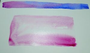
You can make either a tint, tone, shade chart of the colors on your palette, as above, or a warm-cool chart, as done in watercolor immediately above. Either will help you develop facility in mixing the colors you’re using, on your palette.
As usual, I’m the behindest of artists at my own party. It’s the tenth morning of the 45-day-triple-watercolor challenge and I’ve finished… exactly four paintings. I think. Maybe it’s three.
I’ve lost count of how many people are playing, but it’s a good turnout. As usual, Robin Miller has gone off the rails, this year creating a character named Mrs. Quince, who collects things. “Everything was cross-referenced to avoid confusion. For instance, squashed soda cans would be listed under ‘S’ for ‘soda’, ‘F’ for ‘flattened’, and ‘E’ for ‘environmental nuisance’. Mrs. Quince also had her missing husband Sam entered in the computer. Sam was lost at sea in 1988 after joining the Merchant Marines. He was filed under ‘S’ for his name, ‘L’ for lost, and ‘M’ for memories.”
It would be a great boon for culture if Robin would retire from her day job and take up art full time.
I can’t publish everyone’s work here; there are too many people playing. I thought I’d give you a cross section instead. It isn’t necessary to be a watercolorist to play this game; Mark Gale of Austin bought his first watercolor kit last week and dove right in. On the other hand, there’s Mary Silver from San Antonio, who’s extremely polished. Texas seems to have a lot of people playing, including Judi Beauford and Cindy Schiffgens, whom I just met because she’s taking my workshop in Austin next month.
I can’t remember what prompted Becky Bense and I to start this game. I suspect one or both of us was suffering from painter’s block. Neither of us can manage the Strada challenge, which requires a new painting every day for a month. That’s not to knock it; those who finish it in the spirit in which it was intended will reap great benefits in brushwork and composition. However, it’s not always possible to devote several hours a day to painting-a-day. I did it once for a year and it was all-consuming.
Becky and I created the lazy-man’s version, and a big part of the idea was to discourage perseverating. That can be the death of watercolors, which benefit from quickness and a light hand. This challenge was intended to encourage quickness: three studies of a few minutes each, in pencil, monochrome and then color. We’re supposed to spend no more than a half an hour on the whole process. It’s a value-driven exercise that should leave room for spontaneity.
However, if there was ever a duo who color outside the lines, it’s Becky and me. So, the first rule is, there are no rules. If you only finish three paintings in 45 days (which is about where I came in last year), that’s okay. You’re three ahead of where you would have been if you didn’t do any. If you don’t start until the 15th and you go until March 1, that’s okay too.
If you feel like perseverating, go ahead. Jennifer Johnson started painting three Hershey’s kisses and ended up finishing a careful tribute to Wayne Thiebaud. That was more than okay, that was excellent.
Sure, you can start today! Read the instructions, and then post your work here. Or just enjoy what other artists are doing. It’s all fine by me!
Acts 18:3 tells us that Paul was a tent maker by trade (in an era when they were massive structures, not little nylon things). I’m a painter by trade, and my landscape paintings are no more ‘religious’ than Paul’s tents were.
Our beliefs inform our work
Still, our beliefs and behaviors can’t help but inform our work. This is why I have a difficult time with Pablo Picasso’s paintings; the same misogyny that characterized his relationships with women bleeds through his canvases. How different that is from the slightly-older Henri Matisse, who was equally obsessed with the female form, but in a positive way.
Volumes have been written Picasso’s and Matisse’s relationships. That covers the ‘who’ and ‘what’ but it only scratches the surface on the ‘why.’ Why does one artist end up victimizing women and another, like Sir Stanley Spencer, end up the victim? Our personal histories are too complex to write off as the result of family, background, genes, or experience, although all those things are factors.
AI doesn’t have beliefs
We’ve all seen examples of AI-generated text that reads like polished, human-written copy. Kept within narrow parameters, AI can do a passable job of assembling data into pleasing paragraphs. But that’s where it ends.
Last night, I asked ChatGPT some questions that another human being would have no trouble with, things like, “Do you love me?” “What is love?” and my favorite, “How do you know I’m a sentient human being?”
If we’ve met in person, you know I’m a sentient human being because… well, you just know. (It’s also true if you’ve only seen me on a screen or read this blog, albeit to a lesser extent.) That’s the soul talking, and it’s the part AI-generated art doesn’t get. You may not believe in God, but it’s hard to deny that human beings have souls. Otherwise, our flesh bags would not respond as they do to our contacts with others. We experience this indefinable reaction both through intense connections, such as with a lover or child, and in transitory experiences like paying the cashier at McDonalds.
If anything, AI validates traditional religion. Christian doctrine teaches that we are triune beings, composed of body, soul, and spirit. The body is our physical self; the soul is our humanity; the spirit is that part of us that’s in contact with God. On the surface it appears that we differ from AI because we have a body, but it’s our soul and spirit that differentiate us from machines.
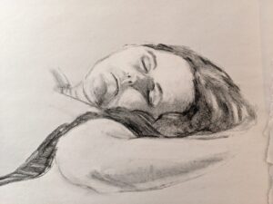
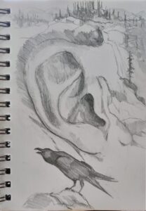
I’m going to talk about AI-generated art, including examples made by photographer Ron Andrews, which are frankly more interesting than mine were. I’m also going to talk about some of my own work, the things that I don’t generally show. That starts with my sketchbooks. I hope you join us!
Artists use the term ‘greeking’ to describe writing that isn’t writing, text that isn’t text, in a painting. The term comes from typography. There’s a famous passage that starts, Lorem ipsum dolor sit amet… It gets subbed in anywhere where the words aren’t already available to the designer.
This text comes from an essay by Cicero, and has been used by typesetters for this purpose almost since the start of moveable type. I don’t know which surprises me more-that typesetters in the 15th century knew Latin, or that so many of us today can recite a fragment of Cicero without having a clue about its meaning.
Medieval scribes were schooled in Latin, but not Greek. When they encountered Greek in a passage, they would note, graecum est; non potest legi (It’s Greek, so it can’t be read). Today we say, “it’s all Greek to me,” meaning it’s in a foreign language. Thus, a Latin placeholder ends up being called greeking. Makes perfect sense.
When is greeking appropriate?
Actual words are powerfully potent in visual imagery, as advertising attests. For a more high-brow example, think of Robert Indiana‘s famous LOVE icon and how it immediately changes the landscape when in sculptural form.
There are times when words can stand alone. For example, you might paint nocturne of a bar and put the single word ‘bar’ over the transom, to convey something about the destination to your viewers. That would read differently than if you carefully scribed Poosie Nansies, etc. on the wall of a painting of that Scottish inn. In the photo above, we’re instantly drawn to the text at the expense of the people, road, and fabulous chimney pots. The photographer couldn’t help it, but we painters have the option to deemphasize the writing in favor of the longer view.
We greek words to avoid overemphasizing their meaning at the expense of your overall design.
How do I do it?
In oils, greeking is very simple. You simply scribe in some approximation of text and then push the background colors against it. You can do that neatly, as in Ken DeWaard‘s example above, or mushily, as in mine, at top.
In watercolor it is a little more difficult, since you can’t push the paint around in quite the same way. If the text you’re greeking is darker than the background, just scribble it in. If you have to reverse it, I find it’s easiest to write it in with your light color, let it dry, and then push the background in around it.
Try it; it’s fun!
My 30 Watercolors in 45 Days Challenge is an excellent opportunity to try greeking. Anything packaged in your home is bound to have words on it. Or, paint a sign in a landscape and experiment with how muddled or clear you want it to be. How does the painting read differently with different levels of clarity in the text?
Jeff Koons has done more to keep intellectual-property lawyers busy than any other living artist. He’s won some and lost more, both here and in France. Koons has also returned the favor, accusing a bookstore of infringement for selling copies of his Balloon Dogs. Their attorneys argued, “As virtually any clown can attest, no one owns the idea of making a balloon dog, and the shape created by twisting a balloon into a dog-like form is part of the public domain.” Koons dropped the suit. Some images are so universal that they cannot be copyrighted.
Koons has very deep pockets and can afford to keep a lawyer on retainer. You and I don’t. It behooves us to respect others’ copyright. Furthermore, we should do unto other artists as we would have them do unto us.
In 2011, Shepard Fairey and the Associated Press (AP) settled a case debating who owned the rights to Fairey’s 2008 Hope portrait of President Barack Obama. Fairey copied an AP photograph and then lied about it. He also destroyed evidence. For that he was sentenced to two years of probation, 300 hours of community service, and a fine of $25,000.
Material changes or ripping the photographer off?
What Fairey and Koons unsuccessfully argued was that they made material alterations to the original work. This is a defense, but it’s subjective, interpreted differently by different courts.
The question of material changes has as much to do with structure as it does with detail. If you were to combine five different photos of white pines in the Adirondacks into one pastiche painting, you would probably sail happily under the radar. You might even include an old Grumman canoe floating poignantly on the water, since you would have to substantially rework it to match the lighting, angle, etc. However, if you included a child in a canoe taken verbatim from a photograph of the same, you’d be stealing someone else’s content.
Copyright in the US is for created works. It doesn’t protect ideas or processes. You can’t sue for an undeveloped scribble on a card in your dresser drawer; you must have executed the work. Copyright is an inherent state that occurs at the time the work was created; registering it just provides one form of legal evidence that you created the work. For visual artists, registering every painting or photograph would be both absurdly expensive and unnecessary; you would only do it if you needed to sue someone.
That means any photo or illustration you find in books, magazines, newspapers, and even on the internet is automatically protected by copyright law.
Protect yourself
The best way around this is to take your own reference photos. That’s important for more reasons than just copyright, starting with the greatly-expanded understanding we all have of places we’ve been to and people we’ve known.
Sometimes, sadly, that’s impossible. You’re on the other side of the country or the boat has sunk. If a client sends you their own photo for a painting, you can presume permission. If it’s not their own photo, do some investigating. “He said he got the photo from his cousin,” is not much of a defense.
If you use someone else’s photo, protect yourself by obtaining written permission from the photographer.
You can use photos that are in the public domain. Copyright doesn’t run forever, no matter what some museums try to tell their website visitors. Copyright expires when the original creator has been dead for more than seventy years. Just google “public domain images” and the word for which you’re searching, like “clouds” or “Grand Canyon.”
Creative Commons also has photos available for reuse, although the terms of use are different for each photo (and exhaustively spelled out).
To old-timers-by which I mean people hundreds of years older than me-tomorrow is Candlemas. This is the official end of the season of Christmastide and one of the oldest dates on the Liturgical Calendar. Pennsylvania Dutch celebrated Candlemas as Dachstag, or Badger Day. That comes down to us as Groundhog Day.
Candlemas was gussied up by saying it celebrated the Presentation at the Temple, but the simple truth is that February is a desperate time in northern climes. A festival of lights seemed perfect. (Our medieval ancestors had around 60 holy days a year, compared to 11 Federal holidays for modern Americans. We’re doing something wrong.)
It doesn’t matter if the groundhog sees his shadow
Candlemas marks the midpoint of winter. There have been seven weeks since the winter solstice, and there will be seven more weeks until the vernal equinox. That’s set in the orbit of the earth. It doesn’t matter what the groundhog sees.
Nevertheless, some parts of the country will have warming temperatures long before the vernal equinox. Here in the northern tier of the country, the chill won’t depart until the end of March.
My friend Eric Jacobsen was out painting yesterday, the daft bugger. “I would join you,” I told him, “except that I don’t have my truck this week.” Yeah, right.
The person who first said, “there is no bad weather, only bad clothes,” was an idiot. I have snow boots and winter coveralls, but extreme cold still seeps in. Standing in one spot painting is very different from snowshoeing or skiing, where you keep warm by moving. Eric compensates by bringing a clever little portable woodstove with him (above), in front of which he can thaw out his hands and paint tubes. But even he was complaining yesterday.
I once committed to painting outdoors every day for a year. Snowstorms, although good in studio work, result in horrible plein air paintings, and western New York gets a lot of snow. This was before cell phones, so when my battery died from the cold, I had to trudge to the nearest farmhouse for help.
That year turned me into a professional artist. I had a gigantic stack of paintings and no idea what to do with them, so I sold them. Today, I no longer feel the need to prove my toughness. I’ll paint plein air a few times over the winter, but it must be sunny and warm.
This is no week for plein air painting
I’d like to believe that the worst is behind us; after all, the days are getting noticeably longer. However, we’re settling into a deep freeze this week. Our nominal temperature is predicted to drop to -15° F. on Friday night and bounce back up to a high of 5° on Saturday. That’s going to be accompanied with gusts up to 45 mph, which should give us a wind-chill of somewhere around absolute zero. In those temperatures, even oil paints will stiffen until they’re unworkable, although they won’t really freeze until they hit -4° F.
I finished a commission and sent a photo to the client yesterday. “That’s beautiful! That’s just what I was hoping for!” he wrote back, eager to collect his painting. “I’m not going out on Saturday, though, it’s going to be beyond cold.” It wouldn’t be good for the painting to move it in this weather, either.
Despite the beautiful snow, I won’t be painting outdoors this week. If you’re looking for something to do that doesn’t involve freezing to death, consider joining us for the 30-watercolors-in-45-days challenge instead. It’s fun, fast, and will help develop your watercolor skills.
When the top layer of oil paint has been lost to the layer underneath, the surface of the painting can turn grey and lifeless.
The siccative oils in oil paint don’t dry from evaporation; rather they harden in the presence of oxygen. This is the fundamental reason for the fat-over-lean rule. Ignoring it will create other long-term preservation problems besides the ghostly greys settling over your paintings.
Sinking appears slowly over time. A painting that was once boisterously colorful turns dull. The different drying times of pigments means that color will sink unevenly across the canvas, giving it an irregular, blotchy look. Details that were once subtly beautiful will disappear.
That dull film is the pigment granules standing alone, without their enveloping oil. Yes, pigment gives oil paint its color, but without a rich bath of oil to surround it, pigment just looks dull and grey.
In most cases, the entire painting won’t be affected. There will be passages that look dull to the eye sitting next to glossy, normal paint. Sinking is most visible in the dark passages, particularly when they’ve been applied thinly, as most traditional teachers recommend.
Since sinking only appears in dry paint, you will often see it in paintings you’ve set aside for a few weeks or months. You can quickly tell if you have a sinking-in problem by wiping the offending passages with a light layer of odorless mineral spirits (OMS). If color comes back, it was sunk. Don’t try this on a recently-painted work; the solvent can dislodge not-quite-cured paint.
By the way, underpainting should sink if you leave it unfinished-it’s part of the fat-over-lean rule that you don’t use oils in this layer.
How to prevent sinking-in
Sinking has three common causes:
Too much solvent-the painter has not mastered the art of using unadulterated paint or painting mediums in the top layer. He relies too much on solvent instead of mediums to get good flow. The OMS takes the place of the linseed oil binder and then evaporates. That leaves the pigment particles isolated, with no oil surround. Air doesn’t have the same refractive index as linseed oil, so pigments that look dark and beautiful in solution looks dull and grey when the binder disappears.
Not enough oil in the top layer of paint-there’s enough oil in modern paints to make a solid top layer, but only if applied in proper thickness. If you want to paint thin, you must cut your paint with an oil-based medium, not with OMS.
Over-absorbent grounds-acrylic gesso is more absorbent than oil gesso, but a well-prepared acrylic ground is fine. However, a very inexpensive board may not have enough ground to stop oil from seeping through. An aftermarket coating of gesso is a good cure. Non-traditional grounds like paper and raw fabric need very careful preparation.
What to do about sinking
Sinking is a case of an ounce of prevention being worth a pound of cure, but it is fixable.
Sometimes, you can see that a passage is sinking while you’re still working on the painting. If this has happened in a bottom layer, ignore it-that’s how it’s supposed to work. If the passage is finished, oiling-out is your best option. Simply brush a very thin layer of medium across the surface in the areas that have turned grey. Then remove the excess with a lint-free painting cloth. You can paint straight onto this slightly tacky surface, or wait for it to dry.
If you find sinking in a thoroughly-dry painting, varnish is your best option. Unlike oiling-out, varnish creates an entirely-separate layer that won’t give future conservators fits.