fbpx

Monday Morning Art School: How do I get started in painting?

Bonnie and Laurie had never painted before. By the end of the trip, they had a system in place to keep working and improving.

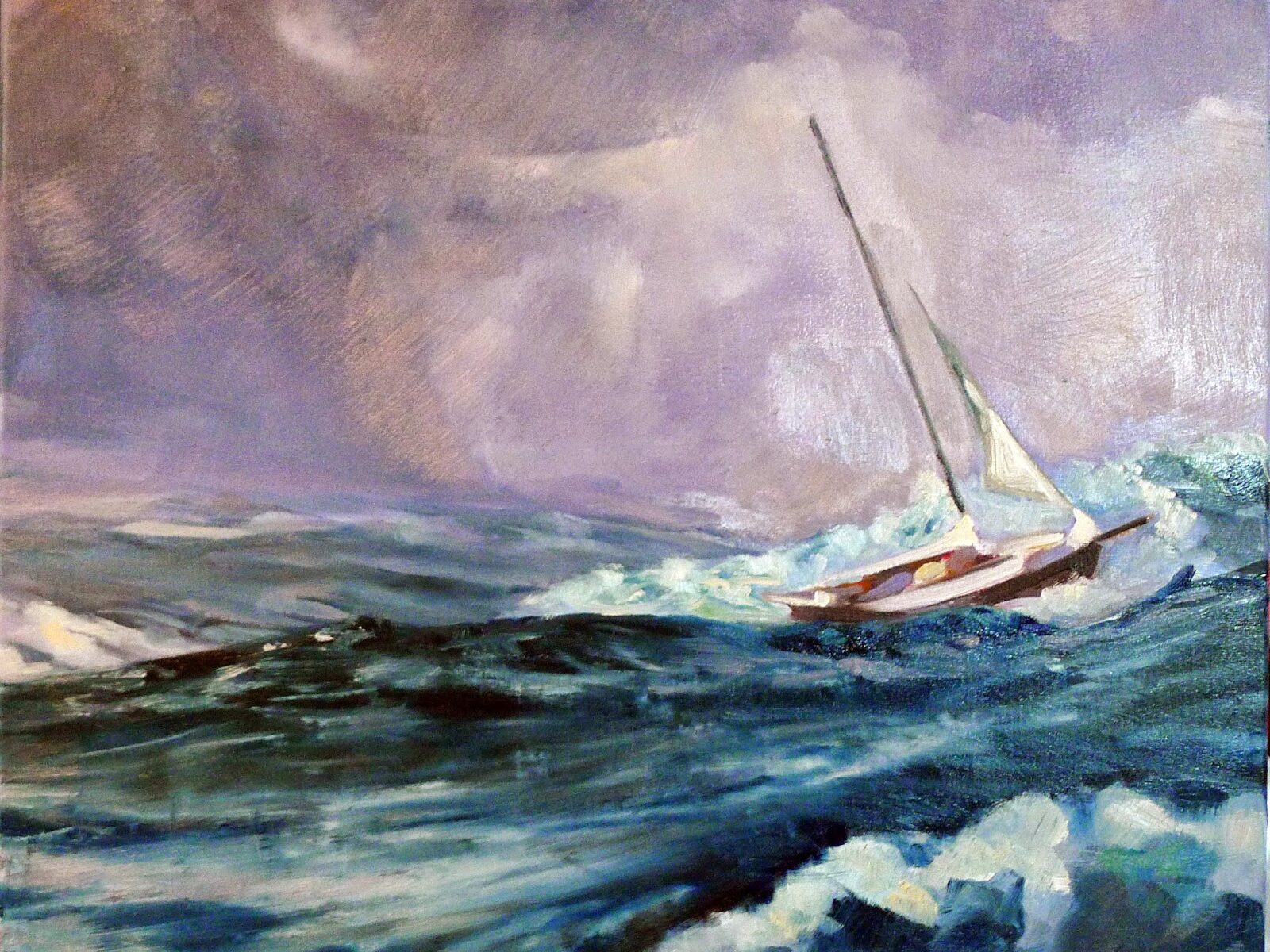
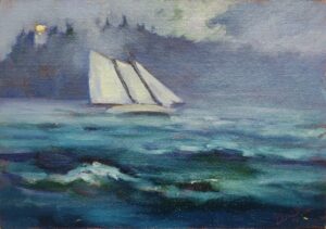
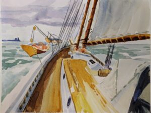
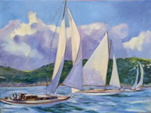
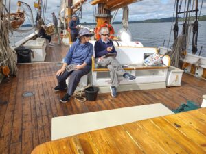
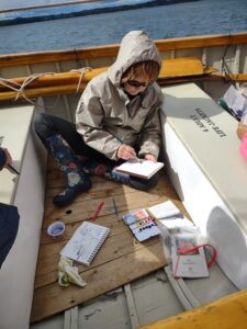
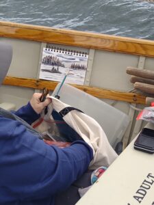
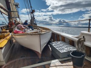
I just got off schooner American Eagle, where I was teaching watercolor. (Next year’s workshop will be September 15-19, but the details aren’t solid.) I always have a few beginning painters mixed in this group. They start not believing they can do it, and end by feeling they’re on the road to mastery. Painting is hard, but anyone can learn it.

Materials

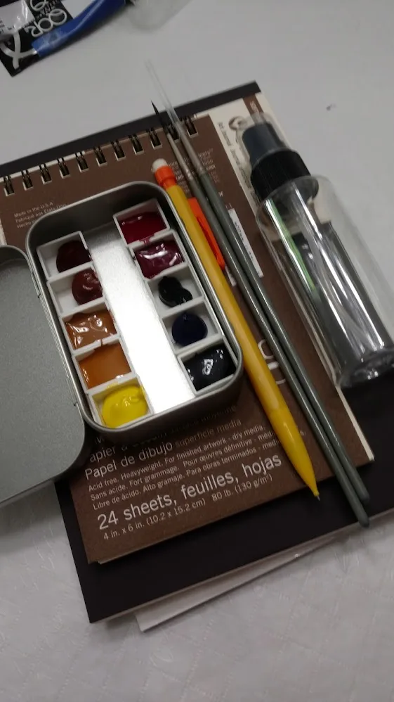
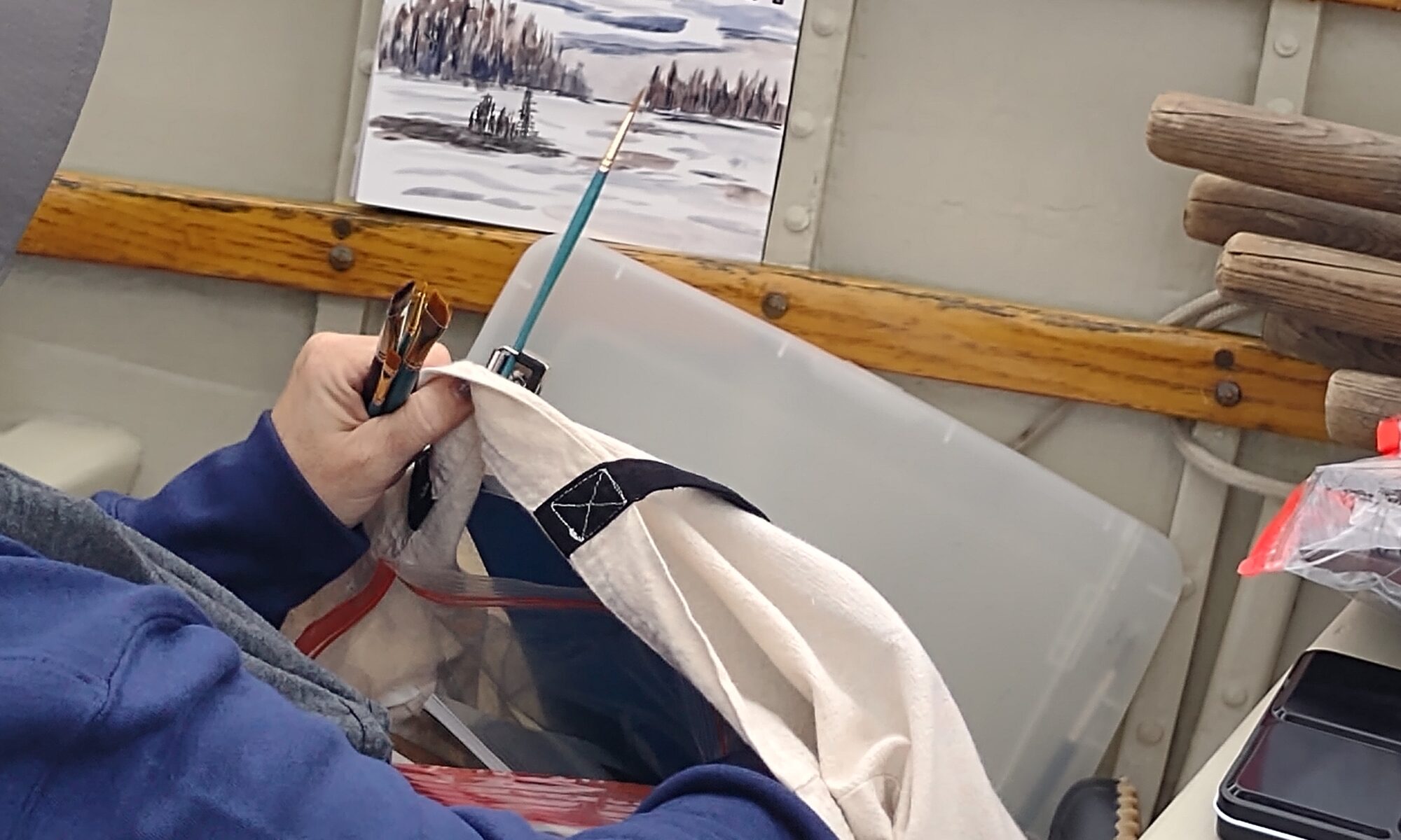
This is an area where beginning painters can go spectacularly wrong, buying hundreds of dollars’ worth of stuff they don’t need and won’t use.

Often, beginning painters will buy cheap materials because they’re worried they might not like painting. That’s akin to buying a kazoo and deciding that you can’t make music. Bad art supplies will just frustrate you.

The inverse of that is buying lots of stuff you don’t need, because you’re not sure what is necessary. I freely distribute my supply lists for watercolorsoilspastels and acrylics. If you stick with them, you can paint for the lowest cost possible.

My online class, The Perfect Palette, is meant for oil painters, but beginning painters in any media will benefit from learning how pigments work.

The seine boat is a surprisingly comfortable place to paint.

Drawing

Drawing is the human’s basic tool of communication, and it’s never more important than when planning a painting. The good news is, anyone can learn to draw. If there’s not a class near you, start with this book.

Classes and workshops

Classes and workshops are enormously helpful, which is why I teach so many of them. But a class is only as good as its teacher, so ask around. If you’re not interested in a classical style, an atelier might not be the right place for you to study. Likewise, a loosey-goosey class will drive a serious student mad. There are plenty of good, conscientious teachers out there who steer a middle course. Wherever you go, make sure the teacher follows an accepted protocol of painting and knows how to teach it.

Don’t rule out an online class. I’ve been teaching online since the pandemic, and I believe students learn more from it than from live weekly classes, because the interaction is, paradoxically, closer.

A grisaille is a way to simplify color decisions and work out your composition before you commit to a painting.

Inspiration

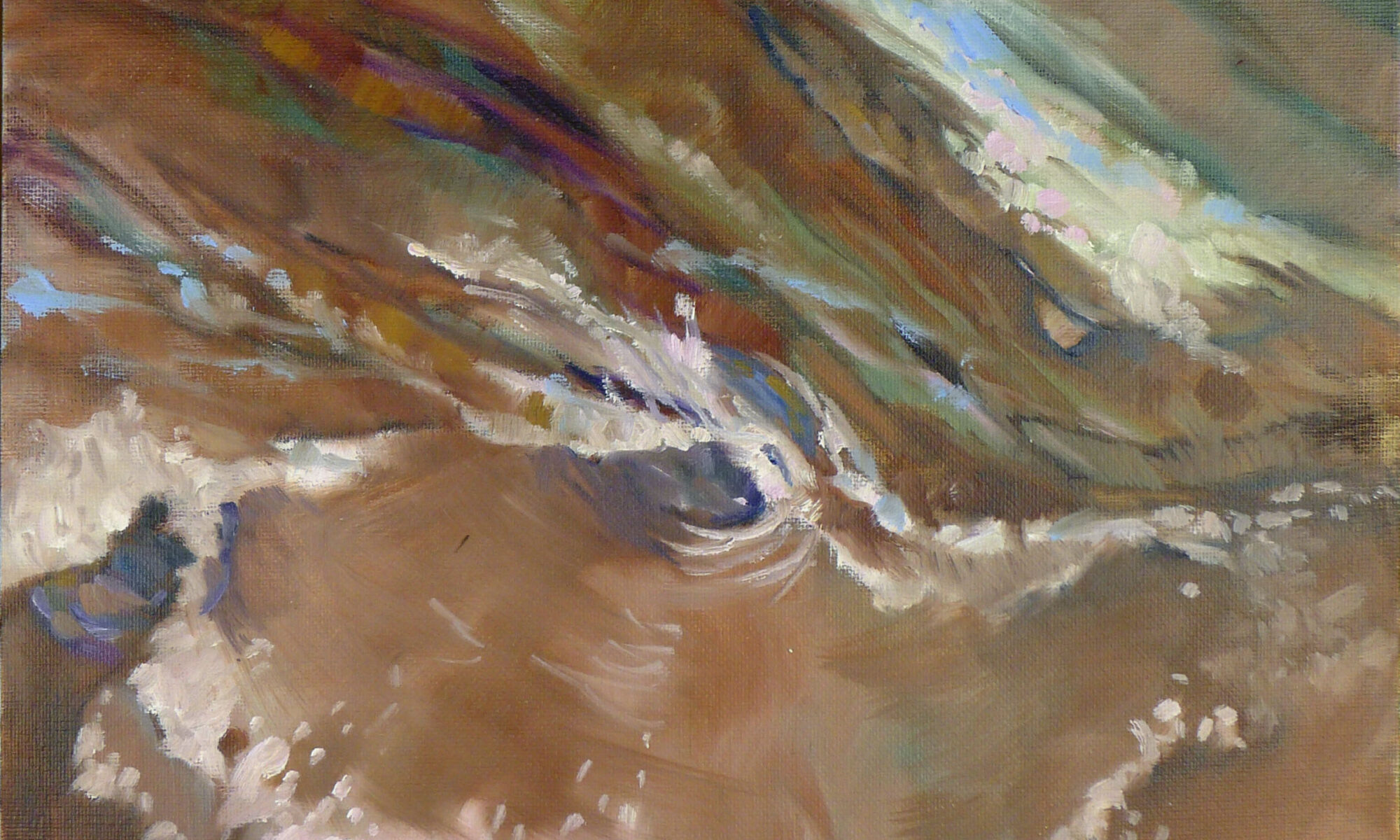
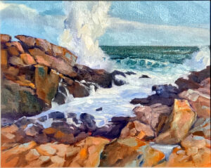
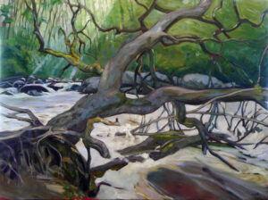
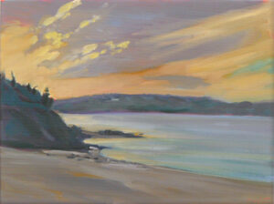
Most new painters start working from photographs. However, painting from life is much more instructive. Photos distort size relationships and colors, and they do all the thinking for you. Even experienced artists can find themselves slavishly following the photo instead of using it as a starting point.

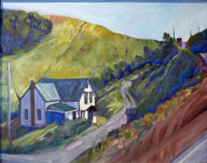
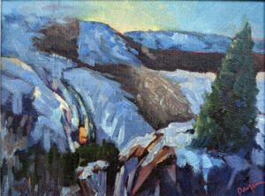
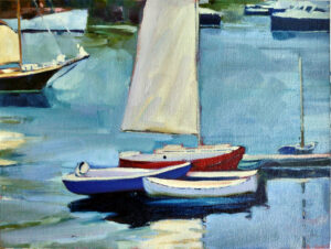
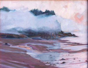
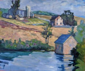
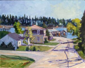
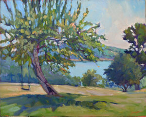
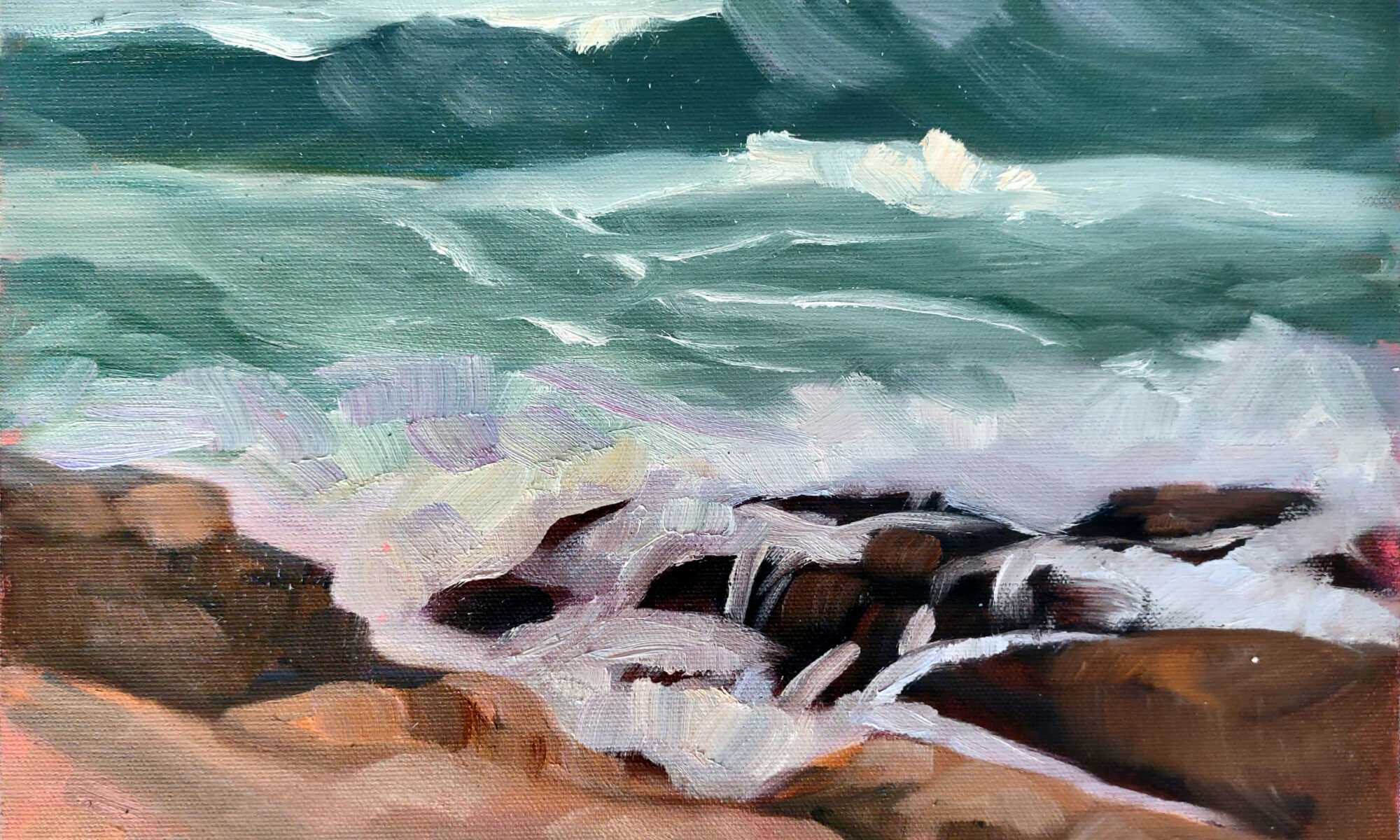
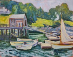
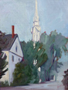
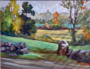
You can paint any subject for practice: the house across the street, your tree, or an old barn you love. Seek out a plein air painting group in your area to give you the courage and camaraderie to paint in public. If the weather is bad, set up a still life in a corner of your studio and paint that. Anything can be a still life, including your sleeping dog, the jacket you threw over a chair, or your kids’ toys.

Peas in a pod: painters in the seine boat, soaking up the sun.

Developing your own unique style

In short, don’t worry about style. It comes from assured brushwork and color management, and those come from practice. Seeking a style in the early days of painting just puts you in a box that’s hard to escape. Instead, let it develop naturally, over time.

Reserve your spot now for a workshop in 2025:

I haven’t got room for another painting

My painting in a town house in Edinburgh, Scotland. Isn’t that screen lovely? Ampersand Interiors, interior design; Susie Lowe Studio, photography.

I was chatting with a gallerist friend when we got on the subject of people saying, “I really love it, but I haven’t got room for another painting!”

“That drives me crazy,” she said. She pointed out to me how, over time, we inevitably stop seeing the paintings on our walls (and everything else that’s part of our day-to-day existence).

I have a lovely little landscape by Tom Conner in my living room. It’s been hanging at the foot of my sofa, where I can look at it whenever I’m curled up with my laptop. Tom’s brushwork is similar to mine, so occasionally someone will say, “I love that painting. Did you just do it?” Each time, I look up and appreciate once again the dusty grandeur and serenity of the Sedona landscape as Tom saw it. Then I’m sad that so much time has gone by without my even noticing it.

That painting is on the same wall as a still life by my goddaughter. I recently switched them around. It’s interesting how much more evocative they both are, just by being in different spaces. Moving paintings around is a simple way to rekindle your joy in your art collection.

Don’t let the serious mein of that custom-designed bookshelf fool you; the homeowner is probably curled up on that chaise longue reading Jane Austen. Ampersand Interiors, interior design; Susie Lowe Studio, photography

The joy of deaccessioning

I’m not averse to collecting something new and carefully wrapping and storing a painting that no longer catches my eye. There comes a point, however, when we just don’t want more stuff to store. Why not introduce a young person to the joys of collecting art by giving them paintings that are surplus to requirements?

Young people have studied less art history and appreciation, in general, than our generation. Because of wage stagnation, they have far less purchasing power than we did at their age. They’re buying houses, having babies, and at an earlier point in their careers. Taken together, these factors mean they don’t always have the spare cash to buy fine art, or the nous to know the difference between real art and the department-store imitations that are what they think they can afford.

You can help foster their art education by giving them a painting that is no longer important to you. That frees you up to acquire the one you really want.

The lesson I learned here is that it doesn’t really matter if the painting ‘matches’ the room; if it’s well-painted and has an emotional punch, it will fit in anywhere. (House available through Lone Pine Real Estate; paintings by me.)

Those aren’t my colors

Realtor Rachael Umstead asked me to hang some paintings in a sweet little house she has for sale in Camden, ME. With the warm floors and beautifully austere walls and cabinets, I thought something in red and orange tones would look great. Last week a client asked to see those paintings. I had to swap something else for them. I had two others in cool tones of blues and greens. I apologized to Rachael because I thought I was giving her a second-best option.

I was surprised and pleased to see that the cool paintings look just as good in that room. We sometimes get so hung up on matching our interior design scheme that we lose our perspective.

I would never have thought to put a blue painting on a blue wall, but the combination works.

I set a painting on my kitchen counter to wrap for storage. I realized it looked great there, so I put it on the wall for a while. If I hadn’t set it down, I never would have believed it could look so good in that very blue space.

This post includes two shots from an interior design project that included one of my paintings. The painting wasn’t intended for this setting; the home was significantly damaged by flooding a few years ago. A good painting can be the anchor for a series of rooms, for generations in fact. Its color scheme is almost immaterial, as long as it is well-executed and exerts an emotional pull.

Reserve your spot now for a workshop in 2025:

Were the ancient Greeks colorblind?

Heavy Weather, Carol L. Douglas, 16X20, oil on canvas, private collection.

In his fabulous book Bright Earth: Art and the Invention of Color, Philip Ball muses on what Homer meant by ‘the wine dark sea.’ Homer liked this epithet a lot; he used it five times in the Iliad and twelve times in the Odyssey. The only other time Homer used that word for wine, it was to describe reddish oxen.

A sea can suddenly turn red for brief periods with algae bloom, or a glass of wine can turn blueish if the pH is raised, but Homer was using the term to describe stormy weather: what we might describe as an ominous, slate-blue sea.

Our man Homer, Roman copy of a lost Hellenistic original of the 2nd c. BC, courtesy British Museum

This paradox of archaic Greek has baffled linguists for a long time. British statesman William Gladstone published an exhaustive study in 1858, where he was the first to note that the Greeks didn’t use the word ‘blue’ in the same way as modern writers. The word kyanós (which comes down in English as ‘cyan’) in later Greek meant blue. But for Homer, it almost certainly meant dark, since he used it to describe the eyebrows of Zeus.

Greece is full of sapphire seas and clear blue skies. It’s odd that they didn’t have words to describe a range of blues, let alone one.

Gladstone proposed that archaic Greek focused on value, not on hue. (For a primer on the meaning of these terms, see here.) Gladstone was immediately misunderstood to be saying that ancient Greeks couldn’t see color. That’s something he never wrote or believed.

The Torah (approximately the same age as Homer’s epics, and much better preserved) is a little better on color. It mentions black, white, crimson, blue and purple. However, most of its color references are by way of precious stones or metals.

Ancient Greek pottery in the Antikensammlung Berlin, By Sailko – Own work, CC BY 3.0, https://commons.wikimedia.org/w/index.php?curid=40890658

Which came first, language or perception?

Many social scientists have debated whether color recognition is an innate human trait or whether it’s culturally-derived. Some believe the language a person speaks affects the way he or she thinks. But if you accept that, does language determine perception or perception determine language? (I’m not sure how you get a paying gig thinking about this stuff, but it’s sure interesting.)

More basic is the question of whether human biology is the same for all of us, a discussion that has led to some pernicious racist beliefs over the centuries. If we’re all made the same, we should see (and talk) about color the same. Practically speaking, we don’t; even in the modern world, there are differences in how cultures describe color.

Ludwig Wittgenstein wrote, “The limits of my language means the limits of my world.” If so, how does that affect our perception of color?

Chinese Ritual tripod cauldron (ding); circa 13th century BC; bronze, courtesy Metropolitan Museum of Art

The word ‘blue’ is missing from many ancient languages. There is no distinct word for the color in ancient Chinese (where blue and green were interchangeable) or Sanskrit. Egyptians, however, did have a distinct word for blue. Not surprisingly, they also developed the first blue dye, which was related to their early production of glass beads.

Other colors such as black, red, white, and yellow are all mentioned by Homer. Perhaps not coincidentally, black, red and yellow are the primary colors of archaic Greek pottery. Perhaps color terms were based on material culture and not on nature.

Group of 16 amulets strung as a necklace, in the typical bright faience blue, Late Period, courtesy Walters Art Museum

In English, we’re told, we have 11 basic color terms: black, white, red, green, yellow, blue, brown, orange, pink, purple, and grey. That’s absurd. We have pink; to a scientist, that might just be a light form of red, but everyone else understands exactly what it means. We have coral, mauve, periwinkle, chartreuse, indigo, and countless other color terms. Homer used about 9,000 words total in his two epics; modern English has more than 170,000. It doesn’t mean we experience that much more color; we just have a lot more language to describe our perception.

Reserve your spot now for a workshop in 2025:

Monday Morning Art School: thinking outside the box

The Logging Truck, 16X20, oil on canvas, $2029 includes shipping in continental US.

Bob the Builder was making humorous suggestions about how a surgeon might fix my husband’s spine. A little expanding foam, some nuts and bolts strategically deployed…

“Ah, thinking outside the box, are we?” Doug laughed.

“Nope, just being silly,” Bob answered. “Unless you can build the box, define the box and work inside the box you're not thinking outside the box. You're just being random.”

Albert Einstein challenged classic Newtonian physics by arguing that time and space are relative, but he did so after earning a doctorate in physics. Elon Musk is a business disruptor, but he holds degrees in physics and business (from the Wharton School). Warren Buffett acquired an incredible $121 billion with value investing but he’s another Wharton School (and Columbia Business School) graduate. And the list goes on and on.

The Late Bus, 8X6, oil on canvasboard, $435 framed.

There are two kinds of behavior that aren’t thinking outside the box. The first is excessive orthodoxy. In investment, medicine and—yes—painting, that’s a strategy that inevitably leads to failure. “No change is itself change,” my friend Lois Geiss was fond of telling me.

The second problem is more common among artists, and that’s confusing technique with hidebound conservatism. Those who’ve made the greatest intellectual leaps in painting, like Einstein, Musk, and Buffett, first learned the conventional way it’s done.

I’m not advocating for a college degree in art here—in fact, with prices as they are I think private art colleges are bad value for money. But I am advocating for learning traditional technique.

Dance of the Wood Nymphs, by Albert Pinkham Ryder. It was probably a lovely painting when he finished it, but his disregard of commonly-accepted protocol meant it was an archival disaster.

Creativity rests on technique

Once a friend was fretting about how she couldn’t find an uncomplicated muffin recipe. “But they’re all just lists of ingredients,” I said. “You always assemble them in the same order: sift the dry ingredients together, beat the wet ingredients together, and then fold the two mixtures into each other.”

I mentioned this to Jane Bartlett, who remarked that when she taught shibori she frequently told her students that nobody owns technique. This is a very apt observation for both baking and the fine arts. There is nothing one can patent about artistic technique, any more than one could patent the order of operations for baking.

Painting is so straightforward that departing from the accepted protocols is often foolish. For example, there’s excessive oiling-out or painting into wet glazes. The tonalist Albert Pinkham Ryder did something similar in the 19th century, and his works have almost all darkened or totally disintegrated.

One can learn a lot from books, but one can’t learn everything.  A decade ago, my goddaughter told me she was going to make an apple pie. Her parents ran a Chinese restaurant, so all of them are excellent cooks. However, pie wasn’t in their repertory. Imagine my surprise when this was what she came up with:

Elegantly layered, but it’s not an apple pie. Not everything can be learned from books.

Ten years later, Sandy’s helped me make many apple pies. She knows what one looks like and tastes like. It helps to have assembled an apple pie under someone else’s tutelage. The same is—of course—true of painting and drawing. Yes, one can learn a great deal about technique from books, videos, and visits to art galleries, but a good teacher really does help.

Batten down the hatches!

The Ocean has its Eye on You, 14X18, oil on canvasboard, $1087 includes shipping and handling within continental US.

I opened McKinsey & Company’s daily email digest to read, “Resilient organizations prepare for the storms…” They were referring to metaphorical storms, but I laughed, because I’ve done nothing for the past 24 hours except prepare for what will possibly be the first hurricane to make landfall in Maine since 1969.

While I’m a dab hand at blizzards, I have no experience with hurricanes. I usually consult the Bible when faced with the unknown, but building an ark is impractical. Instead, I read the advice in our local papers and consulted my buddy Sarah, who hails from Louisiana.

My outdoor gallery doesn’t usually close this early. However, it is in a tent, and by nature not wind-proof. My husband and I wrapped and packed and toted, removed the interior display walls, and finally dropped the canvas at 8 PM on Wednesday.

Blown off my feet, 16×20, $2029 includes shipping and handling in continental US.

My arms and legs were aching. Our neighbor Paul ambled over and helped Doug move the dinghy and canoe to a spot between the garage and shed. That timely assistance was precious; I couldn’t lift another thing.

“How heavy does something have to be to stop it from being a projectile in 70 MPH winds?” my friend Linda asked. She lives in Stonington, which is more exposed than Rockport. “The big fear here is a breach of the causeway,” she added. That would effectively cut Deer Isle off from the mainland.

I’m just a few hundred feet from the ocean, but there’s heavily-wooded land between us and the sea. I’ve spent years saying we need a targeted hurricane to improve our view. The fancy houses are the ones below us, with the woods acting as a barrier between them and the hoi polloi, by which I mean me.

Deadwood, 30X40, oil on linen, $6231 framed includes shipping and handling in continental US.

Last Christmas, my buddy Dave answered an emergency call in Owls Head. It wasn’t even a tropical storm, just a garden-variety gale. It breached the seawall, causing extensive damage to his clients’ house. Watching that unfold, I was cured of any desire to own waterfront property. We’re sitting pretty in an old farmhouse on a bluff high above the sea. Our ancestors weren’t as naive as we are. They built their fishing shacks and boat houses at the water’s edge and their homes higher up.

That doesn’t mean I can ignore the storm warnings. High winds, especially coming off the water, can cause lots of damage. We’ve had an extraordinarily wet summer which has resulted in tree stress. Squishy ground, a lot of pines and spruces with shallow roots, stressed trees and high winds-what could go wrong?

I protested at putting away the patio furniture, as September is the loveliest month of the year here. Instead, we lashed it together and put weights on it. The grill gazebo is dismantled, and all our planters are sheltering under the edge of the house. That, I think, makes us ‘shipshape and Bristol fashion.’

American Eagle rounding Owls Head, 6×8, oil on archival canvasboard, $348 includes shipping and handling in continental US.

Meanwhile, our harbormasters are asking anyone who can, to haul their boats out now. Dinghies are coming out of the water; so are floating docks. Acadia National Park will close their ring roads and campgrounds tomorrow morning.

“Pray for the best and prepare for the worst,” as they say. We’ve done our best.

Reserve your spot now for a workshop in 2025:

Why we buy art supplies

Nova Scotia Sunrise, 12X16, oil on canvasboard, $1159 unframed. The Bay of Fundy has high bluffs, but I can’t imagine a storm surge coupled with forty-foot tides.

My Zoom class was discussing ways to manage anxiety. “Is buying more and more art supplies a sign of painting anxiety?” Pam asked.

“Don’t judge me!” someone else laughed.

I’m cleaning my studio involuntarily. As of last night, Hurricane Lee was on track to nick Cape Cod and graze Maine on its way to the Bay of Fundy. Unless that hurricane does a 180, we’re due for, at a minimum, high seas. Normally I’d sit back with a glass of wine and watch the fun, but I’m supposed to be teaching watercolor aboard schooner American Eagle starting on Saturday.

The students in my watercolor workshop aboard schooner American Eagle get QoR paints, Princeton brushes, and Strathmore paper. You can’t begin to learn with bad materials, but nor do you need a surfeit of stuff.

“The time for taking all measures for a ship’s safety is while still able to do so,” wrote Admiral Chester W. Nimitz (in response to three ships of the Pacific Fleet being lost in a typhoon). “Nothing is more dangerous than for a seaman to be grudging in taking precautions lest they turn out to have been unnecessary.”

Captain Tyler King and reservationist Shary Cobb Fellows have roughed out a plan. We’ll stay in port another day, and the first day of the workshop will take place in my studio. Nobody needs to be bobbing around Penobscot Bay in high seas, including the boat herself, which is on the National Register of Historic Places.

Every September, my studio is, frankly, a mess. I’ve been using it as a staging ground all season. It’s not just cluttered, it’s filthy, and there’s no way I’m hosting a workshop in it the way it looks right now.

That led me to sorting art supplies. I’m a reformed shopper; I haven’t bought a tube of paint or a canvas that I haven’t needed for twenty years. But before that, oh, boy, did I have a problem.

The deck of the schooner American Eagle. We’ll get out there, but probably not on Saturday.

Added to that, people tend to leave things at my studio and they give me art supplies as gifts. Some are extremely useful, like the Rosemary brushes my students bought me a few years ago, or the charcoal Karen brought me from France. Others, not so much, but I’m very sentimental.

In my experience, people tend to buy unnecessary materials for three reasons:

  1. In lieu of actually buckling down to do the work. I’m not pointing fingers here, but a man I know always makes the first step of any job going to Home Depot. He may or may not get any farther.
  2. Because they’re frightened of actually painting. Shopping for art supplies is a lot easier than facing their fears.
  3. To experiment. That’s why I have a tube of liquid graphite, oversized chalks and various colored pens in my studio-none of which I use very often. On the other hand, that’s also why I have watercolor pencils, which I find indispensable.
Breaking storm, 48X30, oil on canvas, $5,579 framed. I know I just used this painting in my blog, but it seems somehow too appropriate, as that’s American Eagle rounding Owl’s Head.

I  freely distribute my supply lists for watercolors, oils, pastels and acrylics. If you stick with them, you can paint for the lowest cost possible. Still, I get many letters from experienced painters, like L, who wrote, “I’m always trying to decide if I am missing some beautiful mixes by limiting my colors too much.” That’s FOMO, or fear of missing out.

You can spend hundreds of dollars buying paint and supplies that are useless or redundant. My online class, The Perfect Palette, is meant to steer oil painters away from this. But perhaps even more important is to analyze why you’re going shopping in the first place.

Reserve your spot now for a workshop in 2025:

Monday Morning Art School: Painting the ocean

Breaking storm, 48X30, oil on canvas, $5,579 framed includes shipping in continental US

“How do you paint water?” is probably the most common question I’m asked. It reminds me of that old joke:

“Where does an elephant sleep?” 
“Anywhere he wants.”

Water is so immense, slippery, and mercurial, that it is impossible to nail it down into a schtick. And thank God for that.

Instead, the painter of water must rely on observation. Reflections are a distortion of the surrounding environment. That’s true whether you’re painting them on the ocean, or in a glass of water. These reflections are never going to be consistent but they will follow the laws of physics.

Camden Harbor, Midsummer, oil on canvas, 24X36 $3,985 framed includes shipping in continental US.

Imagine an ocean that is perfectly flat, and that you can walk on water. Looking at your feet, you can see straight down into the water. It’s not reflecting anything. Looking at a rubber ducky floating ten feet away, you’re looking at the surface at about a 26° angle. You’ll see a reflection of the ducky, the sky, and a glimpse of what’s under the surface. As you look farther away, the angle gets smaller and smaller, and all you see is the reflected sky.

Reflection involves two rays – an incoming (incident) ray and an outgoing (reflected) ray. Physics tells us that the angles are identical but on opposite sides of a tangent. This is why the reflection of a boat needs to be directly below the real object in your painting. You can add other colors into that area, but the reflection can’t be wider than the object it’s reflecting.

Water is transparent, but it has a shiny surface. Some rays of light make it through and bounce back at us from the sea floor. Reflections in glass work the same way. You can see through the glass in the surface that’s facing you, but the curving sides reflect light from around the room. Because glass is imperfect, these reflections will be distorted.

Drying Sails, 9X12, oil on canvasboard, $869 framed.

The ocean complicates matters by being bouncy. Even on the calmest day, the surface of water is never perfectly flat; it’s wavy or worse, just like a fun-house mirror. Waves are a series of irregular curves. How they reflect light depends on what plane you’re seeing at that nano-second. It seems like the easiest thing to do is to capture it in a photo and paint from that, but what we see in photos is sometimes very different from what we perceive in life.

Instead, sit a moment with and watch how patterns seem to repeat. They’re never exactly the same, since waves are a stochastic process (think random but repeating). But they’re close enough to discern general patterns.

Solid objects can also trip you up in their reflections. Consider the humble spoon. It’s concave. That distorts its reflections. There’s no point in trying to predict what you might see; it’s best to just look. Likewise, a mirror only reflects straight back at you if you’re in front of it.

Fogbank, oil on archival canvasboard, 14X18, $1594 framed includes shipping in continental US

There are times when the ocean makes no reflection at all. Only smooth surfaces reflect light coherently enough to make reflections. That’s why burlap has no reflections. Sometimes, when water is being wind-whipped, it doesn’t have reflections either. To paint such a sea, keep the contrast low. A grey, windy day, or a turbulent sea will have a surface too broken up to reflect anything but the most general light.

It’s always best to paint the reflections at the same time you’re doing the rest of the painting, rather than adding them as an afterthought. They’re a fundamental part of the design.

Some people say that reflections should be lower in chroma than their objects, but I don’t think that’s true. Often, the ocean seems to concentrate color. Sometimes, the water will be lightest at the horizon; other days there will be a deep band there. However, the farther away, the more its colors shift toward blue-violet.

Reserve your spot now for a workshop in 2025:

Quantity vs. quality

Home Farm, oil on canvas, 20X24, in an elegant copper frame with white fillet, $2898 includes shipping in continental US.

“I realize that my goals as an artist conflict with what I like and what I’ve learned,” a thoughtful reader wrote (in an actual letter, with a first-class stamp). “While I like to call them plein air ‘festivals’, I know they’re competitions designed to provide income to the host of the festival.” They’re promoted to artists as a way to sell paintings, but not all of them deliver equally.

I’ve been corrected when I’ve called these events ‘competitions’, but that’s exactly what they are. If artists aren’t competing directly for prize money, they’re competing for sales.

Main Street, Owls Head, 16X20, oil on gessoboard, $1,623 unframed.

My correspondent is learning to integrate value sketching and grisaille before going to color. “Taking time to sketch and check values on what I will paint goes against the idea of finishing five or six paintings in five or six days. As it is, I generally finish just three or four paintings in a one-week plein air event!

“Oh, well, I have six to eight months before I apply to one again. That’s plenty of opportunity to speed up my process.”

There’s no doubt that the more you do something, the faster it goes. I am quite capable of doing a value sketch, grisaille and good moderate-size oil painting within a three-hour window, but I’ve been at this a long time.

Another reader visited a large regional festival earlier this year and wrote, “I don’t get why people in the competition bang out crappy paintings in two or three hours instead of spending a day or more doing one good one. You could do four good ones versus six or more crappy ones.

“The current plein air frenzy misses the point of why artists painted outside, historically, and what they really achieved.”

“I think plein air competitions have lowered the quality of plein air painting,” a professional artist told me. He is not talking through his hat; he’s been a prize-winner at top-notch national shows. “That relentless push for quantity floods the market with frankly-mediocre work.”

Blown off my feet, 16×20, $2029, includes shipping in continental US.

What’s ironic is that this friend is, himself, a very fast painter, easily capable of hammering out an excellent painting in three hours. But he’s also very tough on himself, and doesn’t submit work that he doesn’t think is up to his own standard. Painting one fast painting is not the same as pounding out half a dozen or more paintings in a week under pressure. That has a way of dulling your compositional and color sensibilities.

No matter how you go about executing your work for a plein air event, quality, not quantity, ought to be the overriding concern.

“Apple Tree with Swing,” oil on canvas, $2029 framed.

My personal preference is the event in which each artist can submit only one work. These affairs usually give the artist a few days to execute one painting, and the selling prices are, generally, commensurate. I’m able to relax and think carefully about my approach. Furthermore, 35 painters producing 35 works means sales are more consistent than in a show where forty artists each knock out half a dozen works. Many of the resulting 240 paintings are never sold.

Yesterday I quoted a student complaining about mundane landscape paintings. However, that doesn’t answer the greater question, which is: if it’s not any good, what’s the point in painting it?

I like plein air festivals, and I’m sorry that my current schedule doesn’t allow me to participate in more of them. But I also recognize their potential to be corrosive to the very spirit of plein air painting.

Reserve your spot now for a workshop in 2025:

Does the world need one more landscape painting?

Seafoam, 9X12, oil on archival canvasboard, $869 framed includes shipping in continental US.

“While standing dumbstruck (again), gazing at the Tetons, I was wondering how one could ever paint them and do them justice,” a student emailed me. “Values and composition could be perfect and not capture the clouds swirling around the peaks or the fleeting rays of sun highlighting the face of a cliff.

“Day after day, I see mundane paintings of places like this. I see painters resorting to garish colors or blocky shapes. They don’t seem driven by the quest to capture the magical essence of these places. They just want to do something ‘different’.”

The Hudson River School painters, Thomas Moran, and even the Group of Seven were partly explorers, partly documentary painters, and partly evangelists for national identity. Today, exploration and documentation are dead pursuits. As for forging a national ethos, that seems hopeless in an age of ever-fracturing social values.

Larky Morning at Rockport Harbor, 11X14, on birch board, unframed, $869 includes shipping in continental US.

What, then, is the role of landscape painting?

There are times when I ask myself, “does the world need one more landscape painting?” Landscape painting is the unloved child of the contemporary art world, looked down on by its mandarins. It’s so traditional, and so beloved by middle-class people, that it just can’t be good, right?

Sea Fog, 9X12, oil on archival canvasboard, $696 unframed includes shipping in continental US.

Looking in vs. looking outward

We live in an age of omphaloskepsis. Our ancestors would never have imagined that our solutions, our meaning, or indeed even our troubles originated within ourselves. That’s what gave us expressionism, an art movement that presents ideas subjectively, distorting them based on our emotional state. That could never have flown prior to the 20th century (although the term is sometimes erroneously used for earlier passion/mystical painting).

Abstraction and expressionism have greatly influenced landscape painting, with painters interpreting the outside world through their internal lens, such as with distorted color or extreme simplification. The first people to do this, such as Georgia O’Keeffe or Charles E. Burchfield, were very innovative indeed. However, it’s been done to death. It is only applauded today because artists and art critics are-despite what you think-very much herd animals. They’re no more courageous than any other discipline.

So, do we all have to paint like Albert Bierstadt?

Albert Bierstadt was a great painter, but he was born nearly two hundred years ago. Even the Group of Seven were painting a century ago. Their realities are not our reality, their concerns are not our concerns.

Landscape painting became significantly less important after World War I.  Many of its major practitioners, including O’Keeffe and Burchfield, along with Alex KatzMilton Avery, and David Hockney, were chiefly concerned with applying abstraction and/or expressionism to landscape. That meant that great landscape painters like Edgar Payne were never marquee names.

That’s both a problem and an opportunity. Landscape painters have the same kind of academic barriers to break through that their Impressionist ancestors did. But we also have an opportunity to develop a whole new vocabulary of landscape painting without tradition tying us down.

Stone Wall, Salt Marshes, 14×18, $1594 framed includes shipping in continental US.

Does anyone ever need to paint another wave?

I’m glad nobody ever asked Frederick Judd Waugh or Winslow Homer that question, for the art world would be immensely poorer without their surf paintings. The same can be said of Frederic Remington‘s nocturnes, John Carlson’s snow paintings, or all those haystacks Claude Monet painted. None of them painted those subjects as a schtick; they were working their tootsies off to develop as painters. And the legacy they’ve left us is priceless.

Reserve your spot now for a workshop in 2025:

What’s your default setting?

Wreck of the SS Ethie, oil on canvas, 18X24, $2318 framed includes shipping in continental US.

“My default setting is no,” Z- told me during Sea & Sky at Schoodic. What she meant was that ‘no’ is her automatic reaction when asked to do new things. It explained her reluctance to try new approaches to painting, and it was an insight I wish I’d had when I was raising my kids. I have one child whose default setting was ‘absolutely not!’ Had I understood that when he was four, eight, or twelve, I would have sidestepped many battles.

That’s because my default setting is extreme-yes. That’s just as problematic. I’ve taken many reckless chances in my life, some of which still manage to wake me up in a cold sweat. Even at my advanced age, I’m inclined to rely on intuition instead of reason. “I like making decisions,” I once told my friend Christine. That doesn’t mean I’m good at it; I just like the churn of change.

The Wave, 9X12, oil on archival canvasboard, $869, includes shipping in continental US.

Age tends to mitigate the worst of our excesses in either direction, but it’s helpful to understand where we fall on the spectrum.

Do you:

  • Enjoy unpredictability?
  • Get bored easily?
  • Engage in extreme sports or other adventure activities?
  • Make decisions quickly, without overanalyzing detail?
  • Have a high tolerance for failure?
  • Challenge conventional thinking or social norms?
  • Drive fast?

If you answer yes to most of these things you are probably a risk-taker. If you answer no, you’re probably more like my child. Of course, there are lots of people who fall somewhere in the middle.

I’ve spent a lifetime teaching myself to think before acting. Being married to a linear thinker has helped. But in art, being a risk-taker is not such a bad thing.

American Eagle rounding Owls Head, 6×8, oil on archival canvasboard, $348 unframed.

Stepping out of your comfort zone

If your default setting is no, how do you gradually expand your tolerance for risk? I vividly remember the first class Z-took with me. She called me on the phone a few hours before it started to tell me she couldn’t do it. To her great credit, she pushed herself through her self-doubts.

She was using a recognized strategy for success: she took a manageable risk (a class with people she didn’t know). That’s grown her confidence, and now she’s applying for shows and residencies.

What is the worst that can happen? You’ll make a fool of yourself? Nobody else is paying attention anyway, a fact I remind myself of, regularly.

Z-‘s desire to learn to paint overrode her anxiety. That is a cost-benefit analysis by another name, even if it’s drenched in sweat.

Skylarking II, 18X24, oil on linen, $2318 includes shipping in continental US.

Listen to yourself

Many of us run a soundtrack of negative thoughts without even being aware of it. We’d all benefit from stopping and listening to the voices in our heads. If they’re consistently pessimistic, we need to challenge our bad ideas. Would we say that to anyone else? Would we stand by and let someone else speak like that? Once you start to see a pattern of negative thinking, you can begin to replace that script with a more realistic assessment. And if you can’t find a way to redirect your thinking, it’s worth seeking professional help. (I’m from New York, where all the best people have had therapy.)

The importance of friends

Above all, a supportive painting community can do wonders for the risk-averse. “I think all painters are looking for a connection,” Z- told me. It’s a very rare person who can weather the storms of painting completely solo, so why even try?

I’m offering a class called Building on Success starting September 11. It’s about replacing those negative voices with something more positive. There are three seats left, so let me know if you’re interested.

Reserve your spot now for a workshop in 2025: