fbpx

Monday Morning Art School: the color of light and shadow.
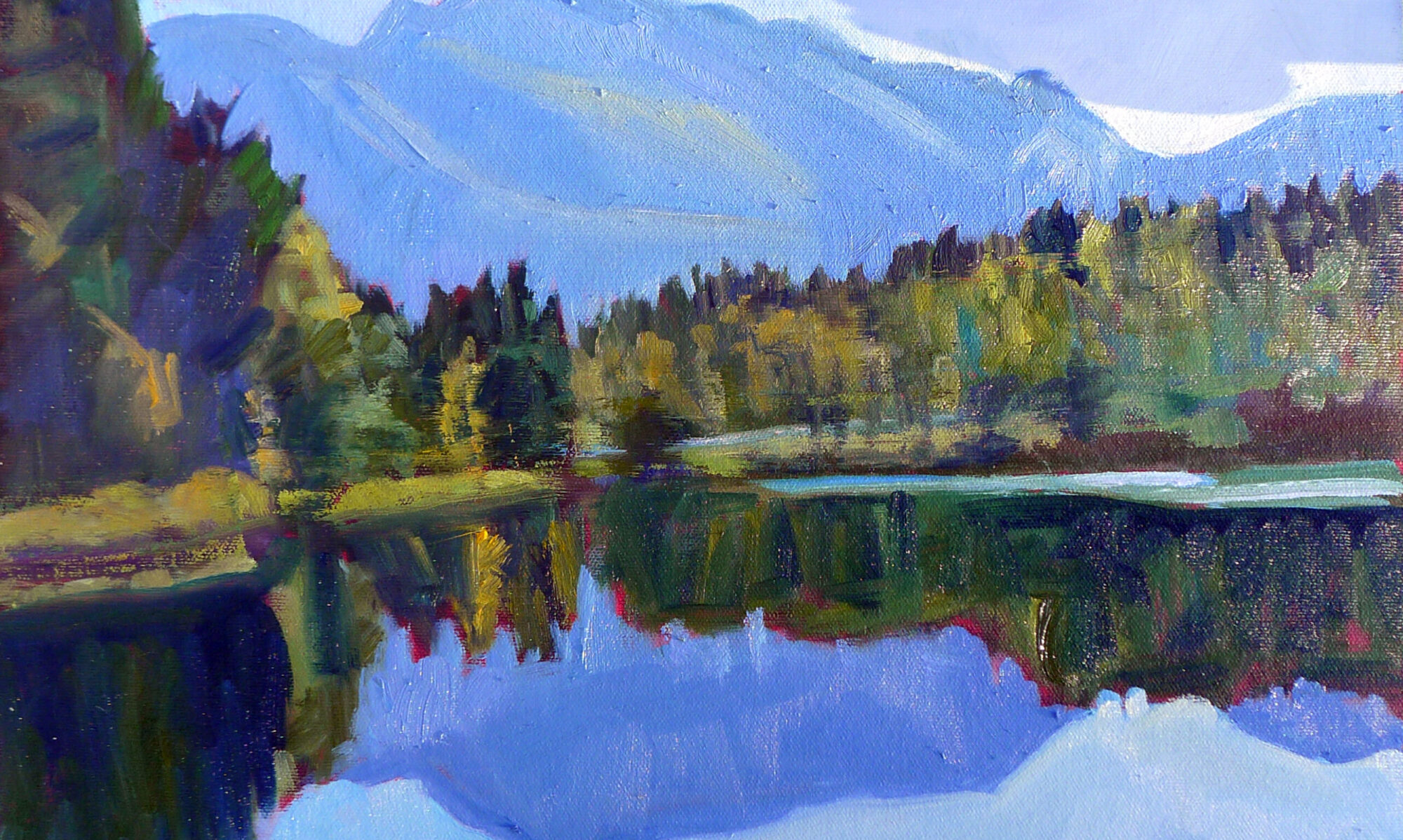
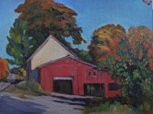
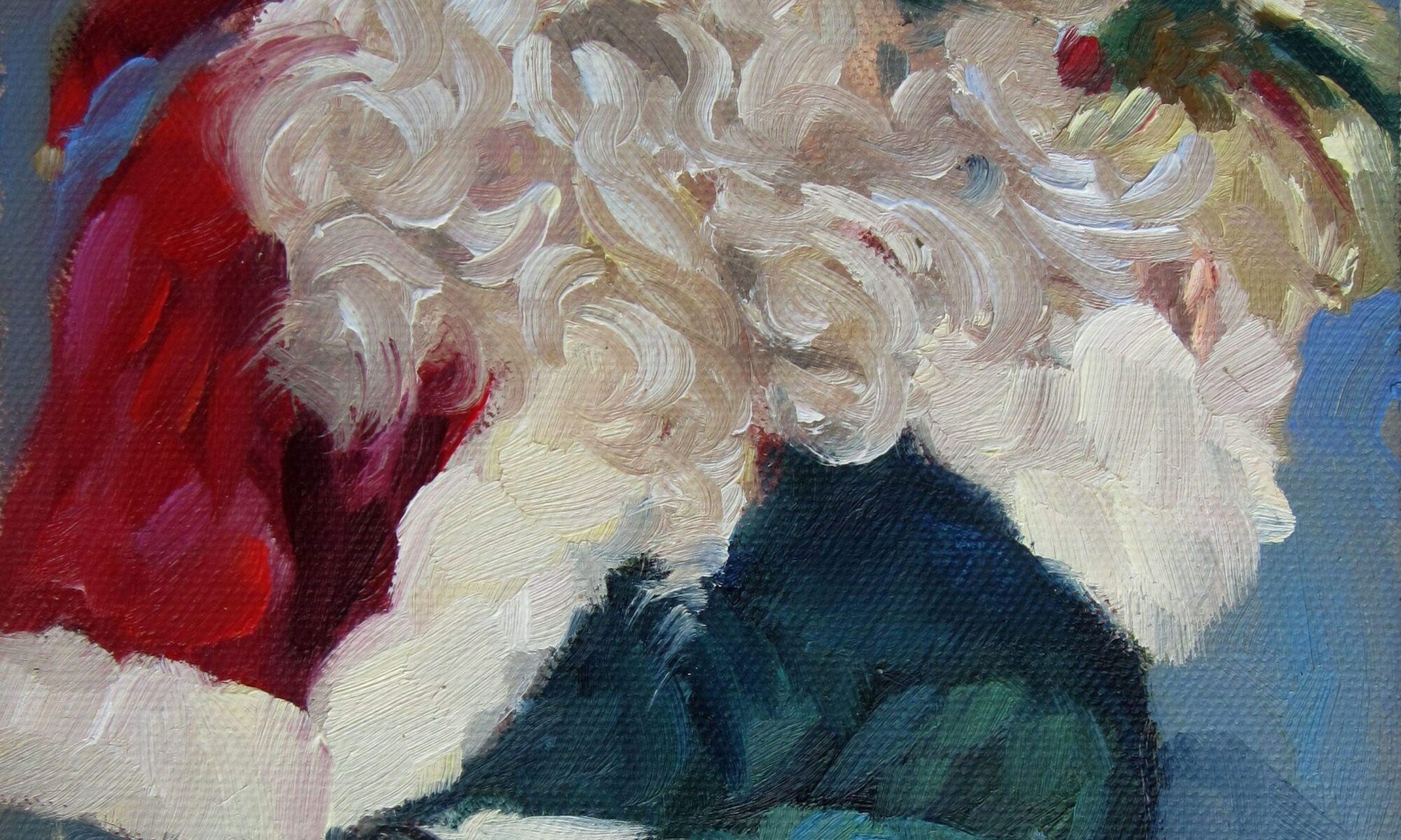
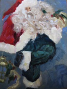
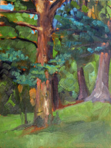
Spring Greens, 8X10, oil on canvasboard, $652 framed, includes shipping in continental US.

The ‘golden hour’ is that period after dawn and before sunset when the light is warm and the shadows are long and blue. The farther north you go, the longer the golden hour lasts. in midsummer in Maine, we have very little of that ‘dead light’ that so bedevils painters in more southerly climes.

Sunlight is composed of a spectrum of colors, which we observe when it passes through a prism, as when raindrops create a rainbow. This dispersion reveals the visible (to humans) spectrum of light. Combined equally, these colors make white light. But sunlight is seldom pure white. It is generally some tint of color – often a warm yellow, depending on the time of day and the weather.

There are instances when natural light can appear quite cool; for example, on an overcast day or at sea, when the reflected blue water and sky can tint everything blue. At midday in midsummer, when the sun is at the highest point in the sky, the light can be so blindingly white that it looks cool.

When light shines on an object, that object absorbs certain wavelengths of light and reflects others. The warmer the ambient light, the warmer the light bouncing back at us from that object.

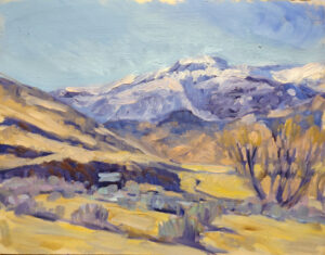
Walnut tree, stone wall, 8X16, oil on linenboard, $903 framed includes shipping in continental US.

What color are shadows?

Shadows do not have an inherent color of their own. When an object casts a shadow, it blocks some of the light from reaching the area behind it. The shadow will be a different hue than the lighted part, because the shadow is not illuminated directly by the light source. Its hue is influenced by the absence of the reflected light and by the colors of the surrounding environment.

As a matter of mental shorthand, we say that the shadows are the complement of the light source, but this is not exactly true. We think the complement of yellow light should be violet, but that’s in subtractive color (the same system of color that gives us paints and inks). The primary subtractive colors are red, blue, and yellow, and their complements are green, orange, and violet.

However, light creates additive color, with different primaries and complements. The primary colors are red, green and blue, and their complements are cyan, magenta, and yellow.

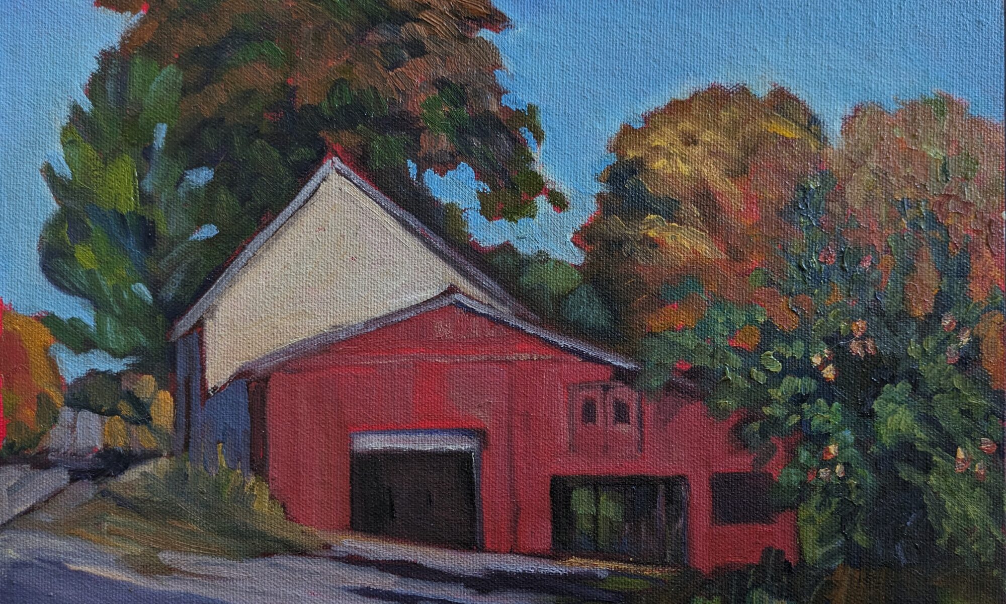
Autumn farm, evening blues, oil on canvasboard, $1449 framed includes shipping in continental US.

That means the complement of our yellow light is blue, and the complement of peachy light would be more on the greenish-blue side. However, there’s another aspect of light at play. Just as distant objects can appear blue-violet because of the scattering of blue light, shadows can sometimes look blue-violet due to the scattering of shorter wavelengths of light.

Three photos of the golden hour, courtesy of Jennifer Johnson

Your eye-brain connection sees things interpretively. You may see the same blue shadows in the three photographs at top, but I’ve sampled them and they’re not the same at all. In fact, they’re not even blue, but rather three variations of a soft blueish-grey. Your mind perceives the lack of warmth in the shadows as coolness. In this case it’s better to trust your mind than the hard ‘facts’ of camera and laptop.

Generally, we warm up the shadows in figure to stop the model from looking cadavaresque. The Servant, oil on linen, 36X40, $4042.50 includes shipping in continental US.

You’ll outsmart your audience if you just remember that if the light is warm, the shadows will be cool, and vice-versa. Landscape painting tends to have warm light and cool shadows, while figure and portrait painting tend to use cool light and warm shadows. (There are of course many examples disproving this general rule.)

The exception to this is filtered light. Its shadows and lighter passages will be variations of the same color temperature. This is how we instinctively know that something we’re seeing is under an awning, for example.

Study the Spanish painter JoaquĂ­n Sorolla to understand the color of light. He was the master of warm and cool passages.

Reserve your spot now for a workshop in 2025:

You can’t put a price on art, or can you?

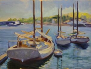
My painting for the 2022 Camden on Canvas, called So Many Boats! 24X36, oil on canvas, Private collection.

“I think when we ‘paint for ourselves,’ that’s when growth can happen. Our work just might push to a different level,” Barb Walker commented recently on Facebook.

“The whole burden of making a living selling artwork can have a devastating effect on one’s work,” Eric Jacobsen responded. “It keeps us in repetition mode and causes us to play it safe. Charlie Movalli posed a great question once. He asked, ‘Do you paint to be understood…or do you paint to understand?'”

My 2021 painting for Camden on Canvas, called View from Bald Mountain, 36X24, oil on canvas, private collection.

I’ve had times where I stopped selling entirely to concentrate on improving my skills, and times when I produced very personal work that will never sell in my lifetime. But I’m more cynical than Eric and Barb. I need to eat, and I’m not much good at anything else. I either sell paintings or take a job as a greeter at Walmart.

Somehow our culture has created the myth that artists are above thinking about the business of art. “I’ve never been in it for the money,” said one friend (who nonetheless has a family to support). Nobody expects their doctors or lawyers to be motivated by altruism, and most of my painting buddies have spent at least as much time learning their craft as a professional-school graduate. (The BFA is just the beginning, friends.)

Ever-changing Camden Harbor, 36X24, oil on canvas, $3,188.00 includes shipping in continental US.

It’s counterproductive for artists to buy into this myth. If we don’t set a high value on our artwork, who will?

Above it or afraid?

Sometimes, people refuse to engage in the marketplace because they’re afraid of failure. Painting for public consumption can make us better painters, however, as we strive to connect with an audience.

It doesn’t help that there’s some stupendously awful work out there masquerading as ‘art.’

This week a reader sent me a photo of an object painted by an ‘artist’ as a fundraiser. It was incompetent by every measure of design and execution. “It seems almost like satire. It highlights the unfortunate reality that anyone can call themselves an artist, and far too many do,” my reader commented.

I spend a great deal of time teaching painters the objective criteria for critique. I wish someone would do the same for art fans. “I don’t know art but I know what I like,” is a great starting point. However, it’s not enough. If you want a painting that will continue to speak to you for years to come, it helps to understand what makes a good painting. And that’s not opinion; it rests on a thousand years of tradition and critical thinking.

As with every philosophical endeavor, understanding starts with a common language. When artists carry on about things like lost-and-found line or pictorial depth, they’re not just trying to sound smart and smarmy. These are real factors that affect the staying power of a painting. And they’re as relevant in abstraction as in figurative art.

Camden Harbor, Midsummer, oil on canvas, 24X36 $3,985.00 framed includes shipping in continental US.

Two events this week

Kay Sullivan, Eric Jacobsen, Jill Valliere and Jim Vandernoot will be featured at the Red Barn Gallery‘s Strictly Invitational show this evening from 5-7 PM. That’s located in the heart of scenic Port Clyde village, across the street from the General Store. They’re a powerful lineup that’s worth driving out to see.

Camden on Canvas is next weekend, July 21-23, in the equally picturesque village of Camden, ME. There are too many great artists to list them by name here, but Colin Page, in particular, deserves a shout-out. Each year, he wears two hats, as organizer and participant. He and the library staff have put together a fantastic event in just a few short years. I strongly encourage you to come out and see the art.

Reserve your spot now for a workshop in 2025:

Paralyzing performance anxiety

Sunset Sail, 14X18, oil on linen, $1594, Carol L. Douglas

“My friend is paralyzed at the thought of painting something that does not turn out good,” a reader wrote. “I keep telling her that experimenting is liberating and the goal is not to end up with a masterpiece every time.”

Everyone experiences performance anxiety occasionally. It may be prompted by demoing, by being in a competitive event, or even just when we encounter a tricky passage in a painting. “I’ve experienced it a few times when I am far into the painting and it looks good but it’s not finished yet,” my correspondent added. “This leads to a ‘don’t mess it up now’ attitude that affects the result.

“How can I help my friend get past this?”

Skylarking II, 18X24, oil on linen, $2318.00, Carol L. Douglas

Process, not results

Focusing on the results instead of the process is a great way to rob yourself of the joy of creativity. Many years ago, I had a student who announced at the beginning of each class who she planned to give her painting to. She was setting herself up for failure, week after week. Her painting would get all bound up in her fear of disappointing someone she loved. It’s no surprise that she didn’t stick with it.

We call concentrating on process being ‘in the zone.’ It’s a transcendent feeling, and worth striving for.

Drying Sails, oil on archival canvasboard, 9×12, $869, Carol L. Douglas

Desensitization

The more you do something, the less anxious you’ll be. I used to be terrified of public speaking, so much so that I needed beta blockers to do any kind of presentation. Years of teaching have burned that out of me. Today I can comfortably speak to large groups. Through repeated, escalating exposure, I desensitized myself to my trigger.

Desensitization is a powerful tool in Cognitive Behavior Therapy, so we know it works. How can we apply it to painting? By starting with the small steps – drawing, color mixing, and thumbnail paintings – we can slowly build our confidence for more expansive works. That’s yet another good reason to draw every day.

Of course, it helps to ask what is the root of your fear. Is it lack of knowledge? That’s fixable. Perfectionism? It helps to realize that there’s nothing perfect in art; in fact, that’s its charm.

Are you telling yourself that you can’t rise to the occasion? I do this when I clean my house. “It’s too much; I’ll never finish this!” I say, and then I’m mad. If I can shut off those negative thoughts and just concentrate on the work itself, I have a fine time scrubbing.

One of the best ways to reduce anxiety is to be prepared. Whether that means learning to draw or mastering the steps of painting, the more confident you feel, the less anxious you’ll be.

Ever-changing Camden Harbor, 24X36, oil on canvas, $3,188.00, Carol L. Douglas

Is it anxiety or excitement?

Both make your heart race and give you butterflies in your stomach. A little nervousness can be helpful; it can elevate your performance. The difference is that when you’re anxious, you worry about everything that can go wrong, instead of seeing the potential for success. Instead of trying to calm yourself down (which never works anyways) try to channel that energy into excitement.

How do you rate your overall well-being?

I’m a proponent of physical exercise. We all know it releases endorphins (whatever they are), but it also calms us down. People frequently comment about my dog’s perfect deportment; he is well-behaved because he does many trail miles with me every morning. As a bonus, I’ve survived two cancers and have no blood pressure, blood sugar, or cholesterol problems at the grand old age of 64.

Seek Support

If you are still unsure and troubled, take a class or workshop. The best of them are supportive communities that will help you master technique and feel great about doing art.

Reserve your spot now for a workshop in 2025:

Monday Morning Art School: neat lines in watercolor

Sampler on Arches natural cold-pressed paper: a straight-edge was used for the straight lines, and the curves were drawn freehand. An ultramarine blue wash was laid over the mask, and a glaze of cadmium yellow was added after the mask was removed. Where it is still pink, the masking fluid is still in place. (All photos courtesy Michael Prairie.)

I have an aversion to frisket, or masking fluid, for watercolor. I’m unable to apply it elegantly. It wrecks brushes, leaves lumpy marks, and in general always seems like more trouble than it’s worth. Instead, I wet my paper carefully around the items to block out and then apply the paint using capillary action to direct it. That has its problems as well, so when Michael Prairie shared this method of applying frisket using an old-fashioned ruling pen, I was gobsmacked. (Mike’s an engineer, so it’s no surprise that he found a solution to this technical problem.) Without further ado, I’ll let Mike explain it:

Masking fluid mixed with a dab of quinacridone magenta

I had my father’s old ruling pen (he was a machinist and did some mechanical drawings). It was beat up a bit, so I tuned it up. Here are a couple useful links that I found, one of which really helped me tune the tip:

 How to use a ruling pen

 Steel ruling pens 

I can tint the fluid with a bit of watercolor pigment, and it hasn’t stained the paper. Some fluid is available in blue, but this lets you use different colors if you want.

The ruling pen works well with the watercolor paint itself. It is a great way to paint long lines of uniform thickness.

Ruling pen dipped in masking fluid, and the outside of the tines wiped dry.

Dipping the tip in thick masking fluid and wiping the excess off outside of the channel works well, but with thinner watercolor paint it tends to wick out of the channel. For that, I found I can load the pen with a loaded watercolor brush by scraping it across the edge higher in the channel. I also got an eye dropper to load the pen, and that works well.

For using a straightedge to draw lines, the edge should be lifted above the paper so the fluid or paint does not wick under the edge. Some straightedges are designed with a notch (or a rabbet in woodworking parlance) for “inking,” but a couple layers of masking tape set back from the edge will do the trick.

Ruling pen filled with juicy ultramarine blue with an eyedropper (to keep the outside of the pen dry).

The ruling pen can be used freehand as well. With the tips tuned so they are sharp and parallel, the line will follow the direction of the two edges on the tip. If the pen is held without rotating the handle, the line will be straight, but if the handle is rotated while drawing, it can be steered to make smooth curves.

Some people use nibs (from fountain pens). I haven’t tried that, except for a crude nib I made with a plastic drinking straw. It worked okay for scrubby applications of masking fluid.

I ruined an old paintbrush by not dipping it in Dawn dishwashing soap first-and I don’t know what the soap will do to the paint if residue is left behind.

I also tried some silicone brushes and found that they were good for dropping small semi-controlled blobs of masking fluid and moving it around into desired shapes, but they don’t come close to what I can do with a ruling pen for straight lines.

Sampler on Strathmore Bristol smooth sketchbook paper, i.e., hot-pressed.

You can get a ruling pen at Dick Blick, or a cheaper one at Amazon, but not all drafting tools are created equal. I didn’t want a cheap knock off, so I went to ebay where I found a used Staedtler Mars one for eleven bucks including the shipping. That means I will find my old one shortly, right?

Reserve your spot now for a workshop in 2025:

Are you intimidated by art galleries?

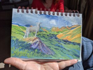
Spring Greens, 8X10, oil on canvasboard, is available through the Red Barn Gallery.

The first person in the door of Red Barn Gallery in Port Clyde yesterday was a lovely lady from Industry, ME. She told me she often feels uncomfortable entering an art gallery, especially since she doesn’t intend to buy. Why is that, I asked her. She couldn’t give me a clear answer but said, “this place doesn’t make me feel that way.”

I think I’m typical as a gallerist in that I like people stopping by to talk art, both at the Red Barn Gallery and my own space at 394 Commercial Street in Rockport.

Even though my job at the gallery was dusting, I skirted around Shelley Nolan’s exquisite glass. Yes, I was intimidated.

Susan Lewis Baines (who’s both a gallerist and artist) put it this way:

  • Come on in and say hi;
  • Look at and admire the work;
  • Ask about the artists;
  • Bring your coffee from Squid Ink across the road;
  • Bring me one [you can skip that step with me];
  • Come to our openings and meet our members and guest artists;
  • If you see a piece of art you really like, buy it. I have never known anyone who regretted buying a piece of art that spoke to them;
  • And lastly, don’t ever, ever, feel obligated to buy. And don’t let that keep you away from us.

There’s nothing pompous or intimidating about the Red Barn Gallery-it’s in a converted barn, above a bar. That probably helped my visitor relax, and it’s a heads-up to anyone designing a gallery space to not be too obsessed with design and fashion. It’s a pity when anyone who loves art feels daunted by galleries. I turned our conversation over, trying to think of reasons why it might happen.

Intimidation: Galleries sometimes have an air of exclusivity and luxury, which can be intimidating to those of us from more practical backgrounds. When they’re overly opulent, they can make us feel ill-at-ease.

Price perception: We read all the time about high-end art that sells for absurd prices. Art fanciers may assume they can’t afford art at all, or fear they’ll be judged if they don’t buy anything. The reality is that most art is made by middle-class artists for a middle-class audience. Yes, it’s more than you’d pay at TJMaxx, but it’s not stratospherically expensive, either. You could spend more on a handbag than most of the pieces at the Red Barn Gallery, and they’ll have far more lasting power.

My wall at Red Barn Gallery. It’s neat, well-lighted, easy to look at, and definitely not intimidating.

Self-consciousness: Some people may worry about being judged by the staff or other customers if they don’t look affluent. I have felt that myself in some Manhattan galleries, but it’s not much of an issue here in Maine, where we choose between flannel shirts and Sunday-go-to-meetin’ flannel shirts.

Sales pressure: You’re very likely to get attentive customer service in a gallery, but don’t assume that means we’re pushing you into a purchase. It’s just that (see above) we like talking about art.

If I ever get bored while working, there are fabulous views out the front and back windows. Port Clyde is lovely!

My personal bĂŞte noire is disinterested or supercilious gatekeepers. And therein lies the paradox of galleries. What’s right for a $300 or $3000 painting is probably not right for a $300,000 painting or a $3 million painting. The same thing that turns me off might make a person interested in a six-figure painting feel more pampered and exclusive.

Reserve your spot now for a workshop in 2025:

Plagiarism

Spruce and pine from Barnum Brook Trail, Carol Douglas, 12X16, private collection. This is a well-known scene painted by many artists. It would be difficult to prove ownership of a reference photo.

A well-known western painter sent me three images: her own reference photo, her watercolor, and a copy made by another artist. The copier had posted it on social media, cheerfully outlining her process with no hint of credit to the original artist. “She even copied my mistakes!” sputtered my correspondent.

Luckily, this resolved without lawyers. When challenged, the infringer agreed to take the work down and never sell it. That’s the only reason I’m not calling her out here.

Lake Tear of the Clouds (Headwaters of the Hudson), 30X40, Carol L. Douglas, private collection. I painted this picture twice.

Is it OK to copy artwork?

My correspondent was right in not asking the infringer to destroy the work. It’s legal to copy other work. It is illegal to sell, publicize or publish that copy without permission from the copyright owner.

Many artists over time have copied others’ work, including Vincent van Gogh in his time in the asylum. This is a way to deeply engage with the original artist’s technique and intentions. Many teachers-including me-set our students to copying masterpieces. But this is a learning exercise only, and the work is never intended to be shown or sold, even when the original is out of copyright.

Young spruce and pines, 6X8, Carol L. Douglas, private collection. I painted this twice because I lost the first iteration.

Pieter Bruegel the Elder churned out several copies of his own Massacre of the Innocents. It must have been very popular because his son made more copies of it. That made perfect sense at a time when the only way to reproduce a painting was to copy it brushstroke by brushstroke.

But that was then, and this is now. Copyright in the US is strict and enforceable. It’s there to protect creators, but, equally, you don’t want to get on the wrong side of it.

What is copyright?

Copyright is an inherent state that occurs at the time the work was created; registering it just provides one form of legal evidence that you created the work. For visual artists, registering every painting or photograph would be absurdly expensive and unnecessary; you would only do it if you needed to sue someone.

That means any photo or illustration you find in books, magazines, newspapers, and even on the internet is automatically protected by copyright law.

Sunset near Clark Island, 8X10, Carol L. Douglas, available through the Red Barn Gallery, Port Clyde. I’ve painted this scene multiple times, but always from life.

Protect yourself

The best way around this is to take your own reference photos. That’s important for more reasons than just copyright, starting with the greatly-expanded understanding we all have of places we’ve been to and people we’ve known.

Sometimes that’s impossible. You’re on the other side of the country or the boat has sunk. If a client sends you their own photo for a painting, you can presume permission. If it’s not their own photo, do some investigating. “He said he got the photo from his cousin,” is no defense.

If you use a third-party’s photo, protect yourself by obtaining written permission from the photographer.

You can use photos that are in the public domain. Copyright expires when the original creator has been dead for more than seventy years. Just google “public domain images” and the word for which you’re searching, like “clouds” or “Grand Canyon.” Creative Commons is an excellent source for public-domain images.

What if someone copies your work?

What if it’s your work being copied without permission? My correspondent contacted the infringer and asked her to withdraw the painting from the marketplace. She could have done this more formally through a cease and desist letter, but it turns out that she’d done all that was necessary.

If the infringer doesn’t agree to take the work down, it’s time to call a lawyer. In the US, copyright holders can sue content infringers for damages. Hopefully, it will never go that far, but it’s nice to know you have that tool at your disposal.

Reserve your spot now for a workshop in 2025:

Monday Morning Art School: watercolor brushes

Clary Hill Blueberry Barrens, watercolor full sheet, $3985 framed.

Watercolor brushes are softer than oil-painting brushes. The most expensive are sable brushes. Natural bristles combine strength with suppleness and hold more paint than synthetics. However, there are some fine synthetic brushes out there. Several of my go-to brushes are Princeton Neptunes.

Unlike oil-painting brushes, watercolor brushes should last a lifetime, so buy the best you can afford. The only absolute rule is to never leave them standing in water. Set them down flat between brushstrokes and rinse them thoroughly when you’re done. Unless you’ve done something ghastly, they need no soap or detergent and very little agitation to clean.

The more vertical the brush, the more flow.

In general, watercolor brushes drop more pigment the more vertically they’re held. You can use this to move from a filled area to a broken one in one brush stroke. In all the following examples except for the mop, I’ve held the brush both ways. A good rule is to carry the vertical brush slowly and in a controlled manner; pull a horizontal brush more rapidly to get the least amount of paint contact with the paper.

A flat gives you a good even wash. Used on its side, it can give you a controlled line.

The brush I used for the photo montage above is a 2″ flat synthetic mottler or spalter brush. I like this shape for both oils and watercolor. It’s a relatively inexpensive brush that gives a beautiful wash. It’s useful for covering large areas quickly, but with precise edges.

Made with the synthetic spalter brush, above.

Flats and brights give you nice flat washes, but can be used to make expressive lines as well. Brights have more control and carry less paint, just as they do in oil painting. Turn them on their sides to make a controlled line. Twisting the brush while painting gives an infinite variety of shapes. So too does varying the ratio of paint and water.

And that would be the bright. More punch, less pigment.

Because of the way watercolor bleeds, its brushes can be used in ways not possible in any other medium–a long blend of different pigments, or by painting a shape in clear water and then dropping pigment into it.

You can’t do either of these things in any other medium.

I don’t normally carry riggers with me in either watercolor or oils. (They’re meant to paint perfect lines, and my world-view doesn’t include many perfect lines.) Most of my line work is done with rounds. They do not give as much control on long lines, but they are very expressive.

Round brushes are just more lyrical than flats.

Squirrel mops are the most uniform wash brush you can use. It’s virtually impossible to make them skip, so use them where a lovely flat wash is a goal.

But a good mop can also point, hold vast amounts of paint and sweep across the paper in style.

A mop brush makes a perfect wash, but it does so much more as well.

Natural sea sponges are multi-purpose painting brushes. Use them to apply or remove paint. They can be as subtle or bold as you wish.

One of my favorite tools, a natural sponge.

Of course, for plein air painting, a little goes a long way. If I could carry only one watercolor travel brush, it would be the Escoda Reserva Kolinsky-Tajmyr Pocket Brush. It’s compact, comes in a protective tube, and makes an outstanding range of marks. A close second, at a lower price point, are the Da Vinci Cosmotop Spin Travel Brushes. A hat tip to Heather Evans Davis for introducing me to them.

Paint lifted (left) and applied (right) with a sponge.

Your brushwork contributes immeasurably to the quality of your painting. Don’t dab or be diffident; plan your strategy and then execute it with boldness. To do this, of course, you must practice. Take lots of practice shots on scrap paper; they’ll never go to waste.

Reserve your spot now for a workshop in 2025:

Gallery representation

Inception, Casey Cheuvront, 24X48, courtesy of the artist.

Arizona artist Casey Cheuvront has no flies on her when it comes to selling her work. She kindly agreed to answer some questions:

How long have you had gallery representation?

If you are counting co-ops or vanity galleries, about 6 years. This has been a game of musical chairs for me, with some being seasonal and some going out of business. Others I left because I did not like the fit. Currently I am in the Sedona Arts Center Fine Art Gallery and Legends of the West, Santa Fe. I hope to be in both for some time to come. I was in a local co-op but the service commitment, the gallery rules, the lack of traffic and other factors made me feel it was not a good fit for me.

Desert Skies, Casey Cheuvront, 18 x 12, courtesy of the artist.

How have you sought gallery representation? Have they approached you? Cold calling on your part? Through an event?

Yes, yes, and yes. One gallery responded to a congratulations I sent by inviting me to submit. Another invited me after a couple of plein air events; they’ve been a strong seller for me since. A third solicited me. I cold-called a fourth on the recommendation of another artist friend showing there; so far, no dice.

What do you think makes for a good gallerist?

A combination of open-mindedness, discretion, strong curation skills, sales skills, marketing skills, professionalism (that is crucial) and knowing her market.

What do you look for in your own paintings when you pitch them?

First, is it a good painting? Would I hang it in my home? Is it my best effort? Could it be better? Is it nicely presented (framing etc.)? Is it priced reasonably? (I don’t mean cheap; I mean, is the pricing in keeping with my other works and what’s currently showing there.) Is it in keeping with the overall style already in the gallery? Does it ‘fit’? e.g. I would not offer seascapes in Sedona or Santa Fe; and I probably wouldn’t try to sell cactus landscapes in Maine!

The Great Escape, Casey Cheuvront, 10X10, courtesy of the artist.

What does your presentation packet look like?

Everything I have is digital. I used to have a folder full of expensively-photographed, 4×6 or 5×7 prints, but that ship has sailed. I have a website which I work hard to keep current, a decent bio, a list of accomplishments (shows, awards, judging, workshops, demos, etc.) and of course I keep a file of recent available works which I can send out or put on a thumb drive quickly. “Go digital or go home” is the thing these days. I also always keep business cards with me (you never know) even when painting in the field.

How do you massage your social-media presence to support your galleries?

I have a strong following on Facebook, a lesser one on Instagram. If I have, say, a featured-artist showing or something I of course promote that through social media. When I send a piece to a gallery, I’ll share that. I keep my gallery list current on the website and send newsletter announcements periodically.

Almost Home, Casey Cheuvront, 6X12, courtesy of the artist.

Do you ever pull the plug on galleries? If so, why?

I have done that four times. In one case it was bad communication on the owners’ part, and being treated as a second-class citizen by her store personnel. In another case a co-op owner simply could not deliver the goods; the gallery was mismanaged from day one, promises were not kept, and though I admired her presentation I found the execution sorely lacking. A local art league had a gallery and while I sold OK there, one artist treated the establishment as her personal gallery. No one else was allowed to work or demo while she was there, which made the mandatory work days a real drag. The last co-op I left because I felt it was just not a good fit; while a couple of artists had pricing like mine, I noticed big, inexpensive, bright/splashy pieces selling (including one I pulled when I left) and thought they would do better with another artist in that space. I’m happy to report they are doing ok, have expanded their space, and have a huge roster of artists there.

Co-op/vanity galleries make rent on selling wall space, so they tend to be really crowded, and often there’s no real oversight on who’s in and who’s not as long as they have a checkbook. Certainly, that’s not true everywhere, and there are some great co-ops around. I have a friend who’s been in one in Northern California for many years and sells a bundle; she’s shared some of the work there and it’s all top notch.

I’d rather be the new kid in a great gallery and hang with people who are really good, than the best in town in a gallery showing moderate-to-mediocre work.

Reserve your spot now for a workshop in 2025:

Putting yourself in the frame

The Fog Warning, 1885, Winslow Homer, 30 Ă— 48.5 in., courtesy Museum of Fine Arts, Boston.

In our narrative painting class on Monday, Bobbi Heath told us about a man who didn’t want anyone in the dinghy in his painting. “I want to be able to imagine myself in it,” he said.

In addition to portraiture, there are several ways in which one can approach the figure in painting, including:

  • A specific individual serving as an archetype, as in Mary Whyte‘s paintings.
  • Through a vague, implied, incomplete or anodyne figure, as in Andrew Wyeth‘s Trodden Weed or Winslow Homer‘s The Fog Warning, above.
  • Through objects or settings that suggest an imminent arrival, as in that empty dinghy or George StubbsA Saddled Bay Hunter, below.
A Saddled Bay Hunter, 1786, George Stubbs, 21 3/4 Ă— 27 3/4 in, courtesy Denver Art Museum

It’s one thing to paint a pretty picture. It’s another to blur the line between the audience and the scene, to paint something where the viewer can step into the frame and build a relationship with the work.

Leonardo da Vinci’s Mona Lisa is important to art history because of its use of landscape, its sfumato and its anatomical accuracy. That doesn’t explain its enduring popularity. Mona Lisa resonates because we engage with her.

The subject makes eye contact with us, with a rather penetrating gaze. She’s not demure, she’s not dreamy, and she’s not dressed to advertise her femininity, wealth or power. (As an aside, I’m sure this is why we get the periodic daft theory that it is a concealed self-portrait of the artist; after all, what mere woman could be that self-assured?)

Mona Lisa invites you to have a parasocial relationship with the subject. That’s a modern term for a one-sided relationship with a person we don’t know, usually an influencer, celebrity, or fictional character. We project attitudes, values, and beliefs onto them, just as we project them onto Mona Lisa.

The Allegory of Painting, c. 1666-1668, 47.2 Ă— 39.3 in, Johannes Vermeer, courtesy Kunsthistorisches Museum

The word ‘voyeur’ wasn’t created until a few centuries after Johannes Vermeer was painting. His intent wasn’t to titillate in that modern sense, but to create the kind of genre paintings that were so popular in his time. However, his perfect drafting and the subtle interactions of his figures make us feel like we’re looking through a peephole. That drags us almost violently into his paintings.

Edward Hopper picked up where Vermeer left off. Works like Hotel Room or Room in New York leave us feeling almost as if we’re peeping toms. It’s unlikely that in the early 1930s, that was Hopper’s intention. Incandescent lighting was just becoming widespread in New York . Hopper was fascinated by it, and by the jewel-like, illuminated scenes it created through city windows. But art has overtones that shift and change over time, regardless of the artist’s intentions.

Hotel Room, 1931, Edward Hopper, 152.4 Ă— 165.7 cm, Museo Nacional Thyssen-Bornemisza, Madrid, included under fair use exemption of the US Copyright Law and restricted from further use.

In Hopper’s paintings we come full circle to the same incomplete or anodyne figures of Winslow Homer or Andrew Wyeth. If the woman on the bed in Hotel Room was detailed and realistic, she’d be almost unbearably vulnerable. Stylizing her preserves her, and our, dignity.

Reserve your spot now for a workshop in 2025:

Monday Morning Art School: swinging on anchor

Cadet, 9X12, oil on canvasboard. Private collection.

“I noticed a boat just off the pier where I was sitting,” pastor Tommy Faulk told us. “As I sat there and watched, I realized there were parts of the boat I hadn’t noticed in my first look. The boat was drifting around the point where it was anchored, making every side visible.”

Tommy was making a point about our limited human perspective, but it’s something that everyone who draws boats has noticed. When I asked him if I could quote him, he laughed and told me that it came from a drawing exercise he did on a wilderness trip with Mountain Gateway.

It’s a great idea in figure drawing to get up and move on a regular basis. Willow charcoal, ~18X24.

That didn’t really surprise me. There are several art school variations of this exercise. My favorite was one I did with the late Nicki Orbach at the Art Students League. Our goal was to ‘see’ right through the figure to imagine what it looked like from the other side. For example, if you were facing the figure’s front, you’d try to interpolate what the back would look like, drawing on your knowledge of anatomy. If you were mindful of the shape of the trapezius from the back, you weren’t likely to ignore their influence on the front of the neck.

More typically, art students might draw the model from every position in a circle, moving around the room in ten-minute increments. Or, they might draw figures dancing to music. These are all exercises designed to help the student think of the human form as three-dimensional, rather than as a two-dimensional cutout.

You don’t need to be in a figure class to do these exercises-you can them with still life or objects in the landscape. They will expand both your imagination and your sense of three-dimensional space and form.

1. My coffee cup from memory; 2. one-minute observational drawing of my coffee cup; 3. another one-minute observational drawing of my coffee cup; 4. My coffee cup from memory after the observational drawings.

They’ll also improve your attention to detail and your visual memory. Here’s a simple exercise: imagine any object you handle regularly. Without looking at it, draw it from memory. Plop it in front of you and draw it from two different angles, each time for just one minute. Set it aside and draw it from memory again.

Your second memory-drawing will be far more accurate than your first one. And that memory lasts. How long? The more you exercise your visual memory, the better, longer and more specific your recall will be. The more you draw a specific object, the easier it is to draw it accurately from memory.

I can draw all this whacked out stuff in church because I’ve spent years drawing from life. It’s developed my visual memory.

Perceived vs. real form

What you imagine the form to be before you ever start drawing is its perceived form. That’s never exactly what it looks like. When you start to examine the object through exhaustive drawing from all sides, you come closer and closer to understanding its true form.

Human perception is subjective. Camera perception isn’t subjective, but it is distorted by technical limitations. Within reason, though, your camera can be a useful guide in checking how accurately you draw. Compare a photo of the subject to your drawing, side by side. Just be aware that your camera can be as much of a liar as you are. Especially with cell-phone photography, there will be fish-eye and wide-angle distortion and exaggerated contrast. You’re best off photographing the object from a moderate distance to eliminate the worst lens distortion.

Drawing from photos

Note that I say nothing about drawing from photographs. There are times it’s necessary, but a photo has already been compressed to two dimensions. You will learn little or nothing about three-dimensional form from copying it. Drawing from photos is a crutch, and you’ll feel so much freer when you stop doing it.

Reserve your spot now for a workshop in 2025: