fbpx

Seven weeks in a shipyard

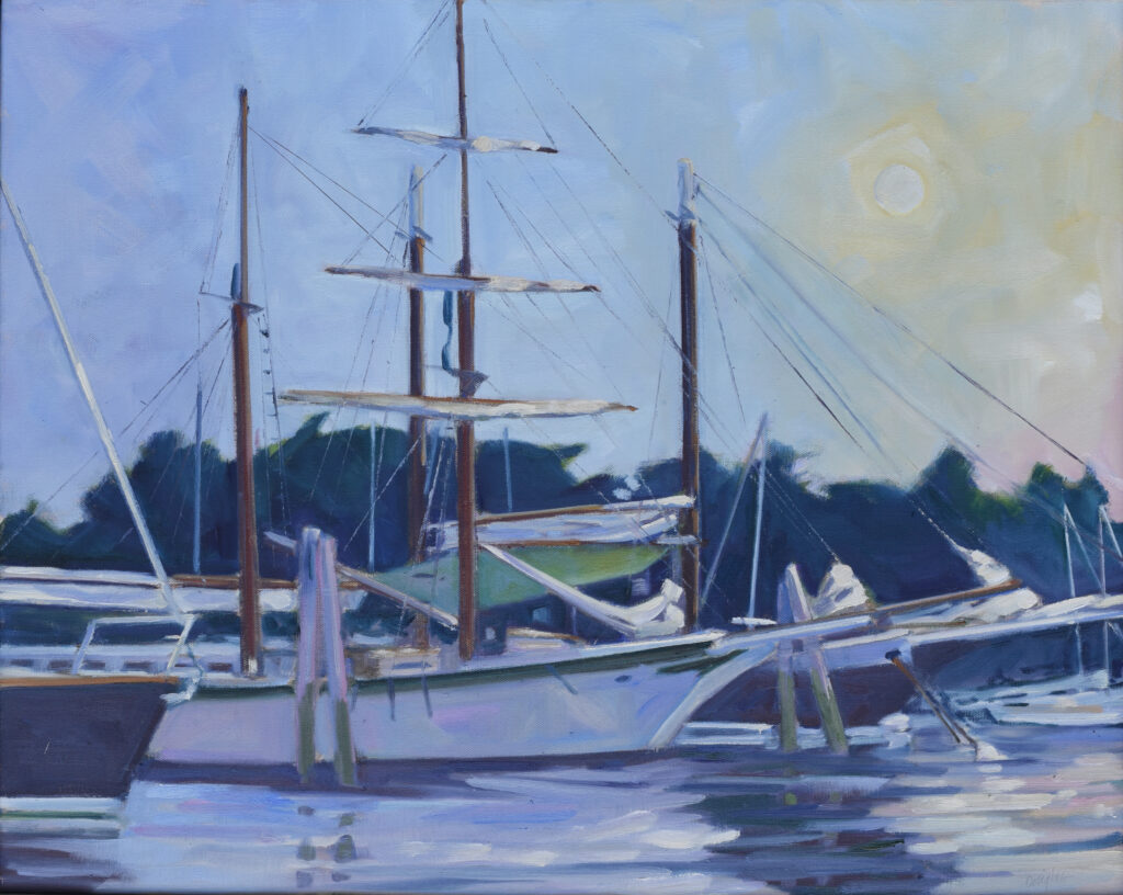
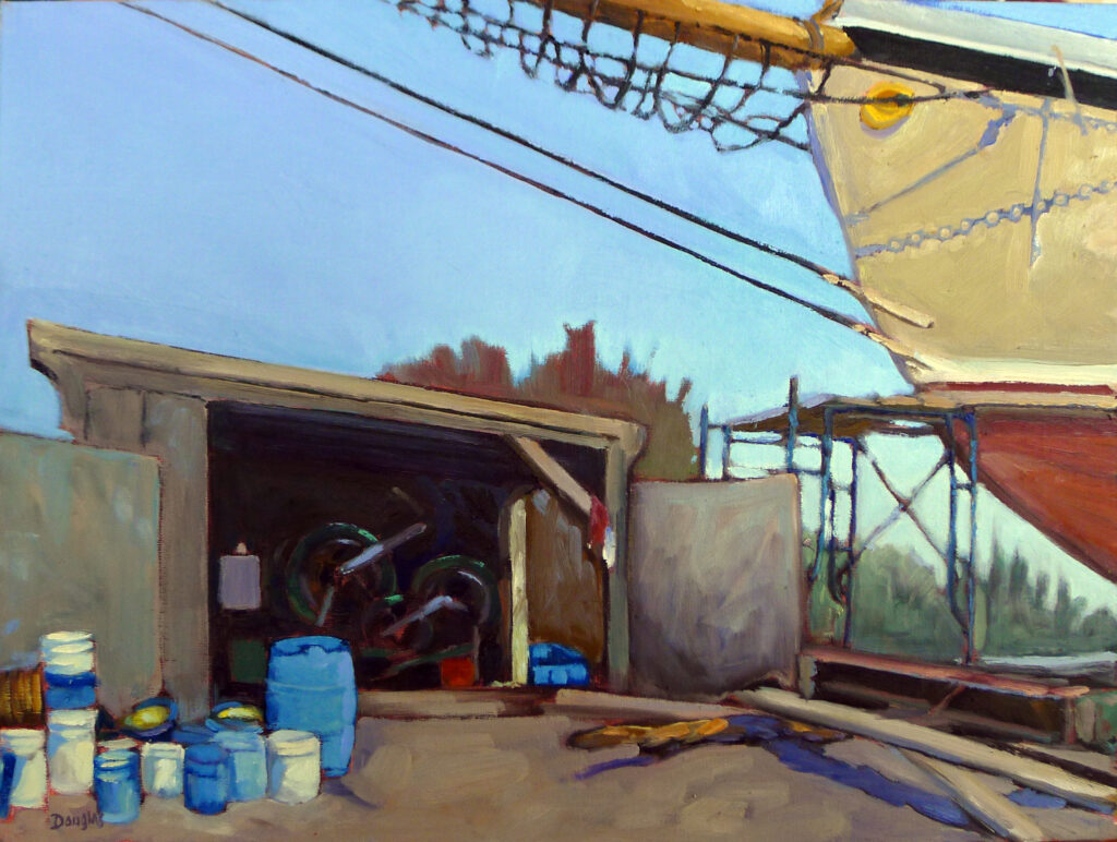
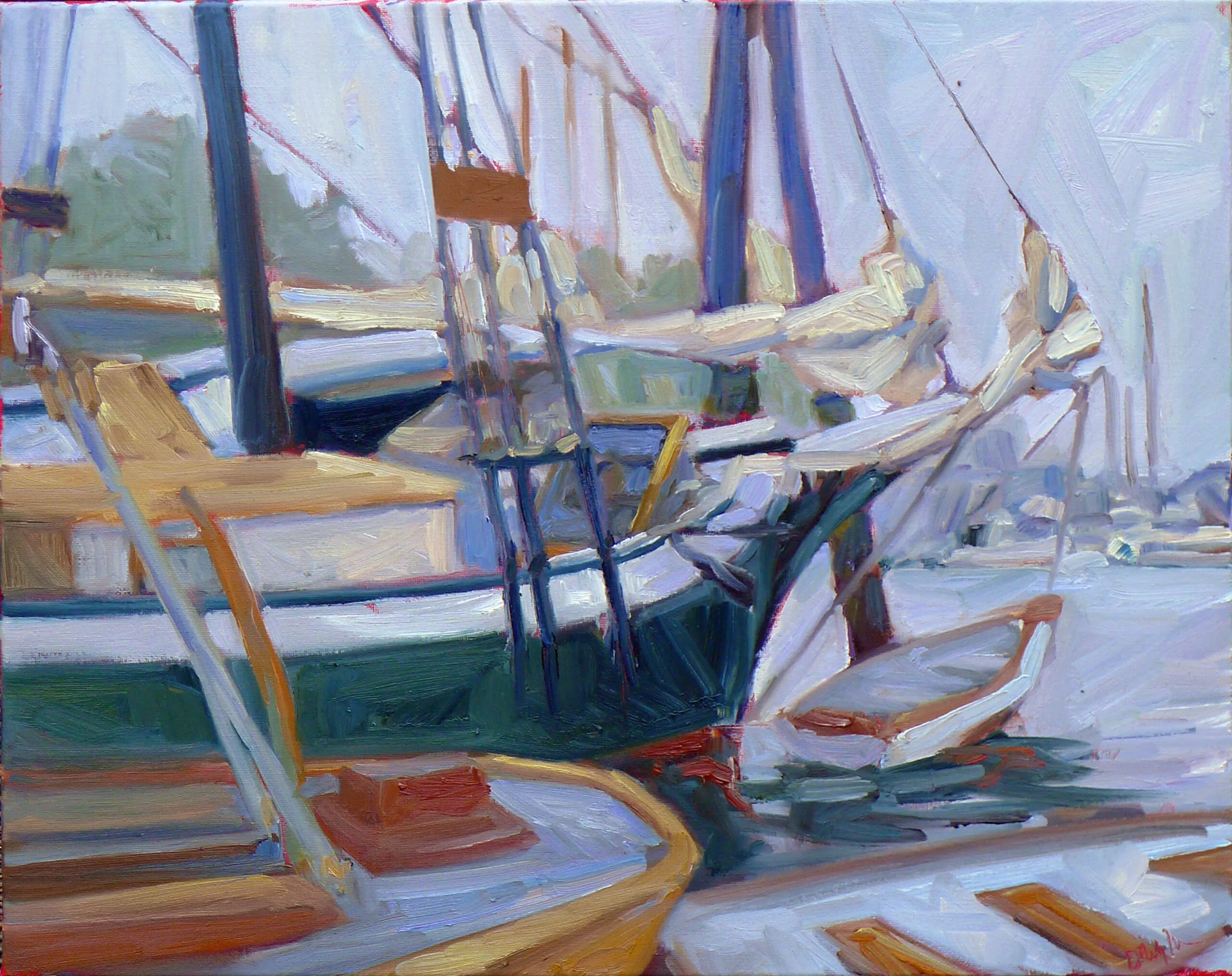
American Eagle in Drydock, 12X16, $1159 unframed includes shipping and handling in continental US.

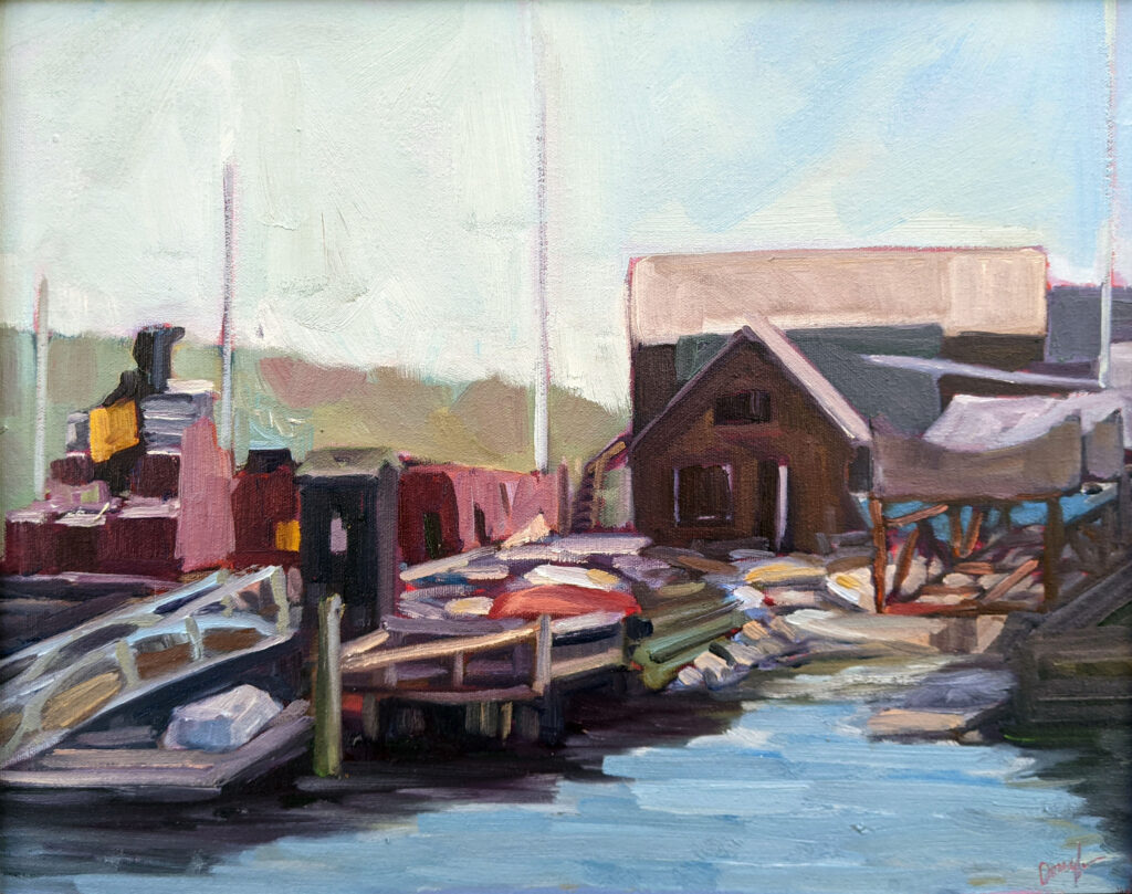
In the muck of a muddy Maine spring in 2016, I wandered into the North End Ship Yard, where I met Captain John Foss and the crews of Heritage and American Eagle. I spent the next seven weeks documenting the annual ritual of hauling schooners from the water onto the ways.

Smaller vessels spend the winter months on land, but these big schooners stay in the water. While our harbors do freeze, it’s more a form of thick slush than rigid ice. (And there’s nothing so fascinating as watching ice ripple on a cold winter’s day.) The Atlantic is only marginally colder in winter than in summer, so below decks it is warmer in the water than out. The hulls are better supported in the water, and there’s no risk of the planks drying out.

In the old days they made prisoners pick oakum as a punishment. It still needs to be done, and in the absence of debtors’ prisons, we’re left with crew.

They do come out briefly each spring, however, when they’re readied for the coming season. There’s a device called a marine railway, which is essentially a cradle that’s winched out of the water with the boat aboard. North End Ship Yard has one of these, which is powered by an old quarry engine that’s older than dirt.

The hulls are scraped, caulked and painted, planking is replaced, and the Coast Guard comes by and looks things over. A few days later they slide gently back into the water, where the real business of sanding, scraping, varnishing, mending, tarring, polishing, etc., commences. ‘Fit out’ is much like aging actors slapping on the greasepaint and adjusting their stays for another arduous summer performance.

I love this winch engine almost as much as I love the boats.

For the crew, it’s exhausting work. “I would love to work on a schooner for just one season,” I recently told Candice Kuchinski of the ketch Angelique. At her look of horror, I explained that I wasn’t looking for a job. My back is too darn old for fit out. Hoisting sails is hard enough; fit out is brutally difficult.

“How much does a Maine windjammer cruise cost?” people sometimes ask. That depends on the length of the cruise, its home harborage, and whether there are specialists (musicians, ecologists and, yes, artists) aboard to enhance the trip. But having watched the months of preparation that happen before these behemoths ever take on a passenger, I’d say they’re worth every penny.

Reserve your spot now for a workshop in 2025:

How to start painting (again)

Windsurfers at La Pocatière, 6X8, oil on archival canvasboard, $348 includes shipping and handling in continental US.

Sue Leo is a graphic design professor who has been my gallerist, my student, and of course my friend. She recently told me a story that should encourage all of you who’ve dropped your art and aren’t sure how to pick it back up. It’s about music, but it’s applicable to how to start painting again, for all of you who once loved art but lost the thread.

Sue’s always loved music. As a junior in college, she had a part-time job as a choir director. “I was probably the most affordable applicant,” she laughed. “I was just eighteen years old, however, I’d studied piano for thirteen years and had sung in choir my entire life in church.”

Marshall Point, oil on archival canvasboard, 9X12, $696, includes shipping and handling in continental US.

Fast forward, and life got in the way, as it always does. A rupture in her life made her a wanderer for many years. She moved from job to job, town to town, and church to church. Opportunities to sing or play were few, until she settled at Benedictine College in Atchison, KS. “So many things I missed,” she mused about her years in the wilderness. “However, all these things were waiting in the wings to return to me.”

In Atchison, Sue joined a local church and choir. Her choir is generally conducted by students under the aegis of a professor, who also conducts during breaks and high holidays. Sometimes, however, there are substitute directors.

“I am one of the oldest members and have been silent in comparison to the energy and enthusiasm of the young people. We have many strong voices, and over the last two years have attracted even more excellent singers.”

Quebec Brook, oil on archival canvasboard, $1449 framed includes shipping and handling in continental US.

One day last September, the choir director didn’t show up for their 8 AM warm up and practice. There was no organist, so the whole service was to be sung a cappella (which is far more challenging than leaning into the organ).

“Somebody asked, ‘has anyone texted her?'” Yes. Any answer? No.

Tick, Tok. Tick, Tok.

Finally, Sue spoke up.

“I volunteered to direct the choir that morning,” she said. “At first, I think, people thought I was kidding.” But, desperate, they took her up on her offer.

“It was kind of like riding a bike. You don’t lose your sense of rhythm and tempo. It felt and sounded great to me, and as I was coming back up to the choir loft, someone whispered to me how beautiful the singing was.”

The punchline? Sue’s now the substitute director of that choir.

Dawn Wind, Twin Lights, 9X12, oil on archival canvasboard, $869 includes shipping and handling in the continental US.

Do you remember what it felt like to draw when you were a child? You were totally in the moment, unconcerned with whether the world liked your work or not. That child is still within you somewhere. Sue’s experience is a reminder that your love of artistic expression is never completely extinguished. Are you wondering how to start painting again? Just pick up a brush.

Reserve your spot now for a workshop in 2025:

Monday Morning Art School: How do I get more out of social media?

Maynard Dixon Clouds, 11X14, oil on archival canvas board, $869 includes shipping in continental US.

“I’m a 73-year-old artist and I’m having trouble expanding my social media reach. Can you give me any ideas, not just to drive more traffic to my art website, but to make the process less miserable?”

I don’t think consistent social media posting is fun for anyone, but if we predate the internet, we don’t always appreciate the whole parasocial thing. I’m the person who told my kids not to talk to strangers on the internet, and now I do it all the time-and some of those people have become my besties.

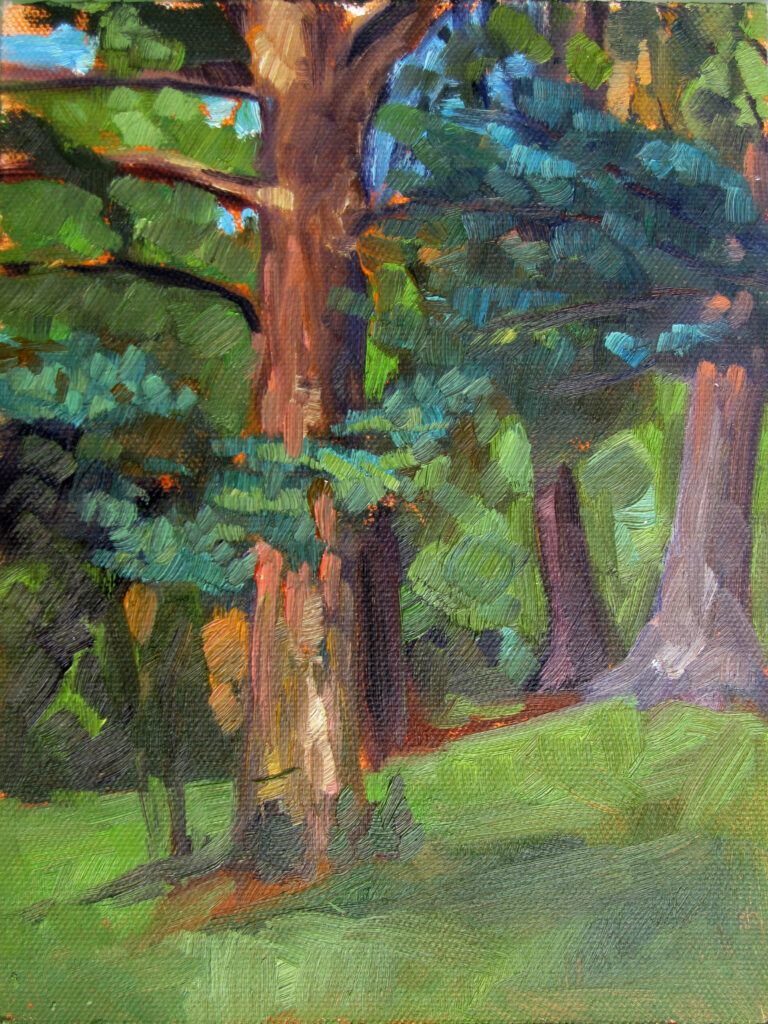
Spring Allee, oil on archival canvasboard, 14X18, $1594.00 framed includes shipping and handling in continental US.

First, the basics:

Post consistently. Regularly share your artwork on platforms like Instagram, Twitter, Facebook, Threads, and Pinterest. Consistency is the number one rule of social media. I blog three times a week for a reason.

Engage Interact with your followers by responding to comments, asking questions, and participating in others’ discussions. Build genuine connections.

Hashtags Relevant, trending hashtags make your posts more discoverable. How do you find them? Ask Google “best hashtags for __”

Share your process People like watching the creative process, so share photos or videos of your studio, work in progress, or what inspires you.

Collaborate Collaboration cross-pollinates lists. A great way to do that is to tag fellow artists at events. Or do something interesting together.

Early Light is 11X14, oil on archival canvasboard, $869 includes shipping and handling in the continental US.

Giveaways Your freebee doesn’t need to be expensive; it could be as simple as a ‘top ten color pathways for 2024’ handout. (Do I do this? Um, no.) The ‘price’? Their email address.

Guest blogs or interviews There is no such thing as bad publicity, so when someone asks you a question for their own blog or article, be sure to answer in an articulate manner. Or write for others. Just make sure the publisher links back to you; that strong network of links makes you attractive to Google.

SEO Ensure that your website is optimized for search engines by using relevant keywords in your content, image descriptions, and meta tags. If this means nothing to you, start here.

Give readers something meaningful. That’s why I write this blog; it’s my version of ‘exclusive content’ and it brings people to my website.

Cross-promote. Promote your social media profiles on your website and vice versa.

Don’t let AI generate your content If you really don’t have anything to say, say nothing at all. Google has tools to weed out the nonsensical fluff, so it’s a waste of time.

That sounds time-consuming, doesn’t it?

Path to the Lake, ~24X36, watercolor on Yupo, framed in museum-grade plexiglass, $2985 includes shipping and handling in continental US.

Let’s make it more fun:

Spill Don’t limit your social media presence solely to promoting your artwork. Share your hobbies, interests, and experiences. If you’re a regular reader of this blog and don’t know everything about me, I’m doing something wrong. (Or you’re not paying attention.)

Be funny Share anecdotes or witty commentary related to art or your daily life. Humor humanizes your brand and makes you more relatable.

Host live streams This is a lot of work, which is why I don’t do it often, but I’m happy to do online demos for art groups. It’s a great way to build a sense of community and connection.

Interactive content I don’t do this enough either, but interactive content like polls, quizzes, or challenges makes social media feed more dynamic and encourages engagement.

Showcase your students or the buyers of your work You can also feature artwork or photos shared by your social media followers. This acknowledges and appreciates their support and fosters a sense of community and collaboration.

Tell stories (I can’t seem to help doing this.) Storytelling engages your audience. Share the inspiration behind your artwork, memorable experiences from your artistic journey, or anecdotes from your daily life.

Celebrate yourself Yeah, that sounds a lot like bragging, but if you don’t tell them about your achievements, who will?

Be you Above all, be authentic and genuine in your interactions on social media. (If you’re never funny, I’m so sorry.) Openly share your thoughts, feelings, and experiences, no matter how introverted you are. Social media is all about bridging the barrier of the screen.

Of course I don’t do all those things; no one person can. Focus on a few that work for you.

That’s all I can think of. Fellow artists, can you add any tips? What works for you?

Reserve your spot now for a workshop in 2025:

Happiest when painting boats

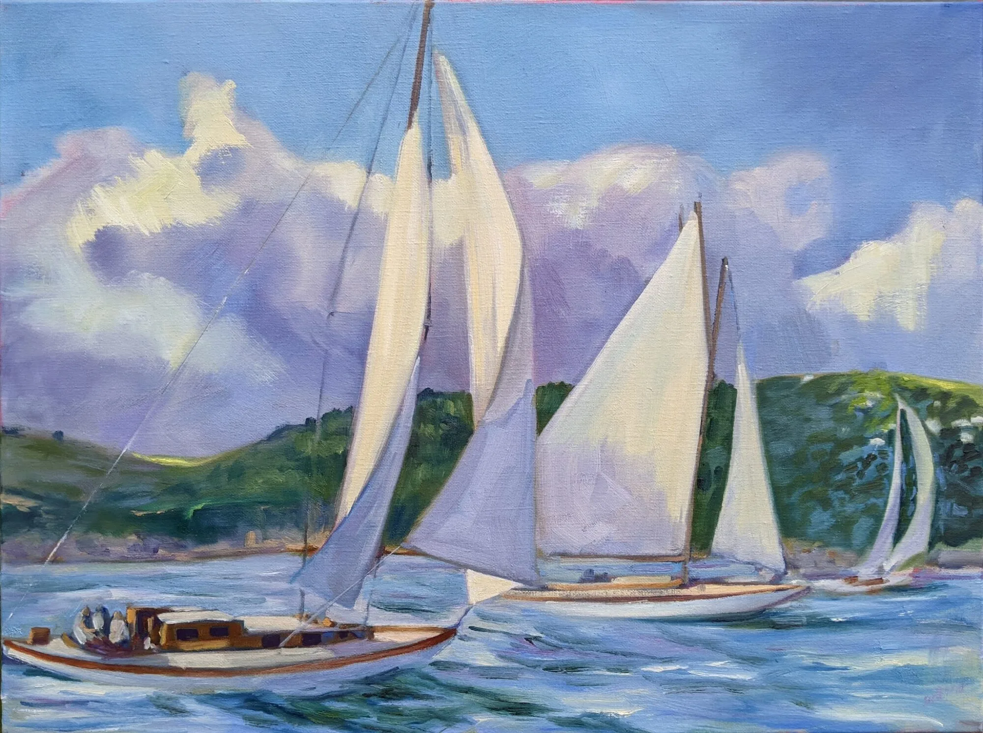
Skylarking II, 18×24, oil on linen, $1855, includes shipping in the continental US.

Yesterday I talked to someone about taking my watercolor workshop aboard schooner American Eagle. We discussed some critical issues, like whether her husband was allowed to come with us. Snoring, I told her, is not a deal-breaker. (That, by the way, is the second most commonly-expressed concern after the food, which is fantastic. The answer is, nobody cares if you snore.)

She’s been out on the water herself many times. I hardly needed to tell her that Penobscot Bay is a transcendental experience. The ocean’s kaleidoscopic, mercurial change is part of what drags me back to painting boats over and over.

To me, boats represent the human condition-we sail on breezy days, through storms, and through the doldrums. We believe that, as captains of our own ships, we choose our own destiny, but that’s only marginally true. Skylarking II is a happy day; not all of my boat paintings are.

More than fifty years ago, long before the invention of modern weather forecasting and reporting, my dad was caught in a line squall on Lake Ontario. (Those were the bad old days when sailing on the Great Lakes was genuinely risky. With modern weather forecasting, it’s safer today.) That storm nearly swamped him. A year later, my family was caught in a personal tragedy that nearly swamped all of us.

Rainbow over Penobscot Bay. Yes, it rains in life, but that’s a necessary precondition for the rainbow.

On the flip side, I’ve taken personal risks that have worked out wonderfully. And I’ve stood on deck after a thunderstorm and watched the sky blossom with rainbow. The stories of boats and people often intersect.

I’m working on yet another boat picture in my studio, this time of the ketch Angelique. It’s no more based in reality than any of my other boat pictures. As always I’m having a great time working from imagination. The only real reference I have for my current painting is a photo of a nun, and even that has been significantly messed around.

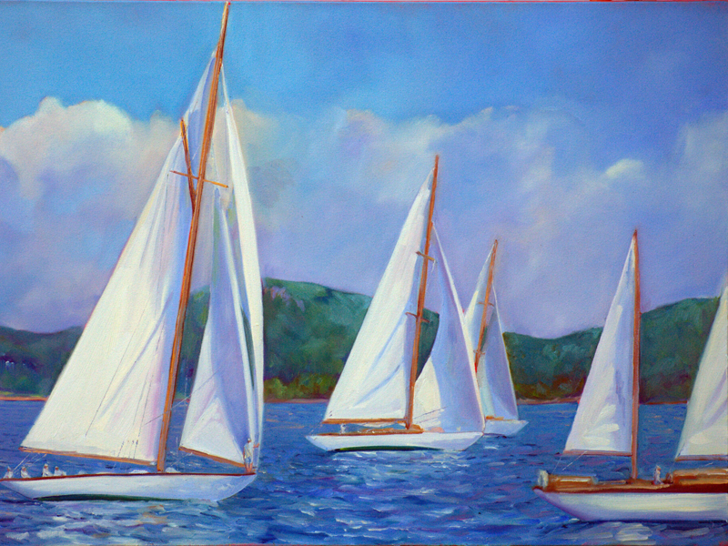
“Why are these boats on different reaches?” an astute sailor once asked me about Skylarking II. The answer is, artistic license, of course. I wanted different sail shapes, although I can see how it would drive a purist crazy. But that’s not the point-the bouncing light, the clear green of the Camden Hills, and the sheer happiness of the day are what mattered to me. If painting boats brings you half the joy it brings me, my work here is complete.

Reserve your spot now for a workshop in 2025:

Let’s talk limited palette

Sunset sail, 14X18, oil on linen, $1594 framed includes shipping and handling in the continental US.

Last week I mailed a small sample of paints to a student in South Carolina. She was frustrated with her paints and I was equally frustrated watching her try and fail to hit color notes. What I sent her was a simple, primary-color limited palette: QoR brand Ultramarine Blue, Nickel Azo Yellow, and Quinacridone Magenta. This is what she did with them:

A color chart done with just three pigments: ultramarine blue, nickel-azo yellow, and quinacridone magenta.

There are disadvantages to limited palette-for example D. couldn’t hit a brilliant green because the red tones in her blue and yellow partially cancel out green. (I’ve explained that in greater depth here.) But the range she did hit is amazing.

Quality, please

You’re far better off with a high-pigment-load, professional-quality limited palette than a dozen badly-chosen paints. Yes, I know the lure of the bargain bin at the art store, but those pigments are in there because they’re unnecessary or, worse, useless.

Sometimes you’ll read rapturous nonsense about pigments. For example, cobalt violet is sometimes described as “deep, richly glowing, and unmatchable by mixing.” I like the color but not enough to bypass my desire to avoid metal pigments wherever possible. Cobalt violet has a lovely weightiness in oils, but it’s hardly unmatchable. In fact, D. did it in the second column from the right, with just magenta and blue.

Clary Hill Blueberry Barrens, watercolor on Yupo, ~24X36, $3985 framed includes shipping and handling in continental US.

Tastes differ

I like my paint to be able to hit intensely saturated colors, because you can always kill chroma, but you can never intensify it. A more traditional palette, like my Winsor & Newton field kit, never seems brilliant enough. It has convenience mixes like Sap Green and Payne’s Grey, along with umbers and alizarin crimson. Those colors cannot compete with knockout 20th century pigments. When I weigh the convenience of sliding a palette in my pocket vs. having the colors I want, I invariably come down on the side of more color.

Autumn Farm, Evening Blues, oil on canvasboard, $1449 framed includes shipping and handling in continental US.

I’ve observed that the more experienced I get, the less stuff I buy. I know what I need, and I’m not tempted to deviate. Having said that, I recently updated my supply lists to replace Prussian blue with phthalo blue. Their color profiles are very similar, but phthalo is just a little clearer than Prussian. The downside is that phthalo is a more heavily-staining pigment. But after dithering for years, I’ve finally decided that clarity outweighs staining. Of course, both are excellent pigments, and can easily substitute for each other (except in acrylic, where Prussian blue is not available).

I make my supply lists for watercolors, oils, pastels, acrylic and gouache freely available to my readers (although this is copyrighted material; you don’t have permission to appropriate them and pass them off as your own). These are paired primary palettes with limited earths added, just because they’re cheap and useful. I have an entire cabinet of samples, gifts and bad purchases myself; I never touch any of them. These pigments are sufficient.

Reserve your spot now for a workshop in 2025:

Monday Morning Art School: framing your work

This is a simple moulding I buy from Omega Moulding, on a painting called Drying Sails.

In response to last week’s post, people asked me to write about framing your work. Even if you never plan to do it, you’ll understand why good framing is expensive.

Unless you are a skilled woodworker, don’t build your own frames. You need a miter saw, corner clamps, and a joiner of some kind. You’re unlikely to recoup the cost of your investment if you don’t already have those things, and you’ll waste time and materials learning. You can, however, buy precut kits from some moulding suppliers. That’s a good option if you don’t like the selection available in premade frames. (I do make my own frames at times, but I’d rather be painting.)

Cutting and assembling your own frames requires expertise and tools that most painters don’t have. I only do it when I can’t find the style I want in a premade frame.

Measuring

Premade canvases and archival painting boards come in standard sizes. These conveniently match up with premade frames. Years ago, I knew an artist who worked only in one size. Not only did it make framing a snap, she could tear down and pack a show in minutes. I can’t bring myself to do that, but I seldom deviate from what I can frame off-the-shelf.

In addition to the nominal height and width of a frame, there’s the rabbit depth. That’s the depth of the recess at the back of the frame into which the board or canvas slides. Most plein air frames have a shallow rabbit, which means if you’ve painted on canvas, you might need offset clips to install the painting. A canvas framed like this will stick out from the wall.

Offset clips come in various depths, and allow deep canvases to go into shallower frames.

Choosing a frame

Frame styles come in and out of fashion, and there are regional differences in what buyers want. I can’t tell you what will work for your painting, but it makes sense to go to local galleries to expand your thinking on the subject.

What do you need?

Watercolor painted, matted and framed by Pam Otis.

Acrylic or glass glazing is needed for watercolors, pencil, and pastel work. Watercolor and pastels are often framed with acid-free paper mats (although I prefer mine free-hanging). All works on paper need an acid-free backing board, to which the work is lightly adhered with acid-free tape.

Pastels need acid-free spacers, which are thin strips of mat board to keep the pastel from touching the glazing. (I make my own from scraps of matboard.) If you’re planning on shipping framed work, the glazing must be acrylic. In its museum-quality form, it’s more expensive than ordinary glass. There’s also non-reflective glass if you aren’t planning on shipping the work. For pastels, there’s one more expense: a static brush and/or anti-static acrylic cleaner.

I use this old hand drill for pilot holes because a power drill is likely to zip right through the front of the frame.

In addition, you’ll need the following tools:

  • A hand drill to start pilot holes. Using a power drill almost guarantees you’ll put your pilot hole right through the front of your frame, as you don’t have the fine control;
  • 3/32” drill bit for hardwood frames;
  • Wire nips;
  • A point driver (never carry this in your carry-on luggage);
Point driver in action.

And the following consumables:

D-ring with wire twisted and nipped.

Framing your work

After cleaning the frame and glazing (with ammonia-free glass cleaner), place the frame upside down on a soft towel to avoid scratches. If you are using glazing, place it in the frame next, carefully avoiding new fingerprints. If using a mat, that goes in next, to be followed by spacers if necessary. Next comes artwork. If there’s any flexibility in this ‘sandwich’, you may need to double the backing board.

Next, drive points in. It’s not necessary to go overboard. I put one in about a 1-2″ from each corner and space them about 6″ apart. I tuck a business card in the bottom right corner. Before there were point drivers, people put paintings in frames using tiny brads. It’s a pain in the neck, so if you plan to frame work often, a driver is an excellent investment.

Mending plate in lieu of offset clip.

Offset clips are installed with the same #6 x 1/2″ wood screws that you will use for D-rings. These can be driven directly into the back of the canvas stretcher if needed. I sometimes use mending plates if the rabbit is the same depth as the canvas.

The D-rings should be mounted one-third from the top of the frame. (In other words, if the frame is 15″ tall, the D-rings should be 5″ from the top.) If the frame is hardwood, you’ll need to drill pilot holes for the screws. It’s easy to slip and drill right through the front of the frame, which is why I use a hand drill. If you’ll only ever use the drill bit for this purpose, you can put a masking tape cuff on the bit as a guide.

There are different D-rings for different picture weights. Do not use sawtooth hangers for professional artwork; many galleries will not accept them.

If the wire is too loose, the painting will sag away from the wall.

Your wire should be a loose S-curve the width of the painting. Make sure the wire is not too loose or the painting will dangle away from the wall. Wind the wire ends tightly and trim with your wire nips.

Bumpers help frames hang straight.

Attach bumpers to the two bottom corners. This will prevent the sliding that causes paintings to go cattywampus every time you brush by.

Reserve your spot now for a workshop in 2025:

It’s wicked hard to paint a rainbow

Downpour, 6X8, oil on archival canvasboard, $348 includes shipping and handling in continental US

Stop me if you’ve heard this before, but it’s raining. I love these spring rains; it’s chilly but not cold, and the plants begin their rebirth. But as Ken DeWaard says, who needs another grey painting?

Actually, I disagree. Sea fog can be very beautiful, as I hope I’ve demonstrated below. And if you don’t believe me, ask the great Romantic painter Caspar David Friedrich.

Sea Fog, 9X12, oil on archival canvasboard, $696 unframed.

Painting rainbows is tough. They’re luminous, shimmering, and there’s really no shift in value. Double rainbows are even harder; they have a slightly darker passage between the color bands, which looks ridiculous in paint. Not that there’s anything wrong with being ridiculous.

Frederic Church pulled off a great rainbow in Rainy Season in the Tropics, but that is another of his enormous studio blockbusters. Mine was painted fast at the end of a very wearing lockdown in El Chaltén, Argentine Patagonia. It’s a completely different kind of painting. (And, yes, I can paint detail when I want to.)

Toy Reindeer with double rainbow, oil on archival canvasboard, 6X8, $435 framed, includes shipping in continental US.

That day started with a halfhearted rain and moved to a downpour, much as yesterday and the day before (and so many other days this spring) have done here in Maine. It’s impossible to paint outdoors in these conditions, even in oil. The mist beads up on your palette and emulsifies with your paint. So, on that day, I painted through a window. The angle wasn’t great, and I only caught a small smidgeon of sky, which is why it has that deep central vee. However, the things that matter are all there: the southern beeches, the pinnacle rock formations, and, of course, the rainbow.

Reserve your spot now for a workshop in 2025:

Shunpiking and painting in the north woods

Somewhere in Baxter State Park, watercolor sketch on hot press, 8.5X5.5

I was scheduled to teach on Monday evening, but with the path of totality going directly over the important viscera of our country, several of my students were busy. I’m awfully glad we rescheduled, since I’m not sure what my schedule is like for 2044.

My truck and I had a history long before I bought it in 2021. Jane Chapin and I once nearly drove it off a cliff-edge. We then backed out through a thicket of piñons. It’s only fitting that those scratches are now my scratches, and I think I just added some new ones. When I’m venturing into unknown territory, I prefer this vehicle to our hybrid SUV, which is a wuss in comparison.

My truck after carousing in northern Maine.

On my way through Camden, I saw Colin Page painting. He told me he wanted to “skip the masses.” It was only later that I thought that you could pour the entire populations of downstate New York and New Jersey into the north woods and it would still be empty.

Federal Route 2 is the country’s northernmost east-west highway, but as with so many roads in Maine, its nominal direction bears little resemblance to where it actually goes. From Old Town it heads north until it makes its last desperate dash for the border at Houlton. If you choose speed and efficiency, you drive I95, but then you miss breathtaking views of the broad, wild Penobscot River.

In places near an I95 exit, there were crowds. Near Baxter State Park, where you could see the mighty, snow-covered flanks of Katahdin, for example, people lined the roads. Every little town was busy. It was the first truly lovely day after a miserable start to spring. Kids were off school, tourists checked into cabins that are usually still shuttered in early April, and restaurant parking lots were full. I hope that some of these visitors realize how beautiful the far north is and come back in the summertime.

Still, it was no trouble for us to find a lonely trailhead, complete with babbling brook and open sky, and there we settled in to wait.

The sky grew dingy and then black.

The ice is not out in the north interior yet, so my little waterfall held back ice in a small pond. Painting it made a good diversion as I waited. I quickly developed a routine: stand up every six minutes, look at the sun, and then return to my seat. “I can tell the sky is getting dingy because it no longer matches my painting,” I told my husband. A small breeze picked up and the light went out more quickly than I ever imagined.

Coming home was not anticlimactic. I decided to go cross-lots over to US 1 and then south toward home. “How did you choose that route?” a friend asked, certain it was that old, old GPS story. No, it was my trusty Maine Atlas and Gazetteer that led me through knee deep snow and fallen trees. My daughter Mary, with whom I drove the Dalton Highway in Alaska, wouldn’t have turned a hair.

The sun-full now-was sinking in the west. We considered heading back toward I95 but a glance at Google Maps told me it was bumper-to-bumper traffic. We continued east to Baileyville and then headed south on Maine Route 9, the Airline. This is a charming road in the daytime, and a nailbiter in twilight, especially in the spring. But with sufficient caffeine and good night vision, we pulled in to our own driveway just twelve hours and 428.4 miles later.

That was, by the way, my first true plein air painting of the season.

Reserve your spot now for a workshop in 2025:

Monday Morning Art School: how to hang an art show

Sue Leo teaches Sandy Quang to hang artwork. Note that Sue has the wall bisected with one chalk line and another runs horizontally. Chalk lines can be brushed off when you’re done with them.

“Do you have any blog posts on how to hang an art show?” my correspondent asked. “One of my students has her first solo show coming up. I’m looking for articles with guidelines or general best practices.” Here goes.

Plan the layout: Before hanging anything, research the exhibition space and plan the layout. That can be as simple as visiting and taking measurements or as complex as drawing a plan. Consider factors like the size and shape of the room, traffic flow, lighting, and any architectural features you must work around. Don’t forget frame sizes when you’re calculating what will fit where!

Consider what you’ll include: Is this a portfolio show? New work? Landscapes? The work doesn’t have to be all alike, but grouping things thematically or visually makes it easier for viewers to engage.

Think in terms of focal point: A particularly striking piece should go in pole position, and other work should be arranged around it to promote a sense of unity. In a larger show, there may be more than one focal point, but just as with your paintings, one should lead.

Pay attention to scale and proportion: Consider the size of the artwork in relation to the exhibition space. Avoid overcrowded walls, and if you’re hanging salon style (where multiple pieces are hung from floor to ceiling), make sure you don’t place important artwork too high or too low.  Aim for a balanced distribution of sizes and shapes throughout the space.

A chalk line is a two-person job.

Arrange artwork on the floor first: Laying work out on the floor right in front of the wall where it will be hanging is the easiest way to set the horizontal space divisions, especially if the paintings are not all the same size. I always make some adjustments to my plan at this point.

Use the proper tools: You need a tape measure, a level, a chalk line, and a hammer.

I made these measuring sticks so I can quickly figure out the distance the wire takes up. I just hold the painting up on them, squiggle a mark with erasable marker, and measure that distance and subtract it from my centerpoint number. There are two for paintings that require double hangers, but you need a friend for that.

Set the vertical centerline, and adjust accordingly: The middle of your paintings should be eye-height for an average person. (I go with 5’4″.) Mark that height off on both ends of the wall and then snap a chalk line. If the work is 20″ tall in its frame, the center should be at 10″. But you need to measure the distance from the hanging wire (fully extended) to the top edge, and subtract that amount from the 10″.

Don’t worry; I do this wrong a lot, myself. And don’t forget to adjust for hangers if you’re using them instead of nails.

Professionally-hung artwork is neatly spaced and perfectly aligned. Yes, those are my paintings. No, I didn’t hang them.

Use proper hanging hardware: Nails work, but picture hangers are more stable and less destructive.

Check the level of hanging pieces: I don’t generally bother until I have everything up, since pounding nails makes paintings dance.

Adjust lighting: Adjust spotlights or track lighting to highlight specific pieces and create visual interest. Avoid lights that are too close and cause glare. You may have to bounce lights across corners or from the other side of the room to avoid this.

Lighting will need adjustment when the work is in place.

Make professional labels: They should include the title, name of the artist, date, and price, and should be typewritten. I print mine using a document merge with Microsoft Excel and Word. Be nice to your host and hang these on the wall with museum adhesive, not tape. Make two copies and tuck the second copy in the back of the frame if it’s a busy venue. Mistakes happen.

Leave a price list and business cards: Most places will ask you for this anyway, but it makes life easier for everyone. And you can use your own copy of the price list as your inventory control sheet.

Promote the heck out of your show: I don’t care if you’re a genius; nobody will notice if you don’t plug your own openings through social media, blogs, local event listings, and emails. And, obviously, show up at your opening and be willing to talk to strangers. If you’re old enough to drink, don’t (at least until your guests go home).

Reserve your spot now for a workshop in 2025:

If all your friends jumped off a cliff, would you, too?

The Whole Enchilada, 12X16, oil on archival canvas, $1159 unframed.

Yesterday marked four years since we got home from our ill-starred trip to Patagonia, which just happened to coincide with the start of COVID. I’ve written about it starting here, and I don’t need to retell that awful and awesome adventure. However, struggling through spring snow yesterday reminded me of how anxious we were to leave El Chaltén as winter closed in on the southern Andes.

The Whole Enchilada was my second to last painting before we finally left the glaciers. My final one will remain forever unfinished because I was too ill with giardiasis to paint. Ironically, it’s taken four years to entirely clear that from my system, too. Last month, my PCP thought it was just possible that my gut symptoms were caused by my old parasite friend. Thankfully, it seems she was right. That’s one bad memory of Argentina that I can finally put to sleep.

This painting was done in the stupidest possible manner. After two weeks of looking at glaciers from river valleys, Jane ChapinKellee Mayfield and I climbed a mountain to get a different view. Being sensible outdoorswomen, we hared straight up the steep hillside. None of us had rappelling gear and we were suddenly in a maze of granite ridges.

Just a short break among the endless switchbacks. We’re there somewhere.

“If all your friends jumped off a cliff, would you, too?” is a famous parental question. Well, duh. Yes, obviously. Faced with a choice of being left behind or staying with your buddies, you soldier on. The good news is that none of us fell, even descending into a wicked headwind. The view from up above was sublime. We hunched down behind boulders as the wind increased in force. All of us painted well, although there can be no detail when your easel is bucketing in a fierce wind. It’s also hard to carry a wet canvas down a cliff when you’re worried about falling.

Argentina is a large and beautiful country, but the flip side is that I saw very little of it on our ill-fated trip. Will I go back? Certainly, especially if I can talk Jane into it. But not tomorrow, for sure. This winter has lasted long enough.

Reserve your spot now for a workshop in 2025: