fbpx

The Royal Coronation Portraits

Coronation portrait of Queen Camilla, 2025, Paul S. Benney, courtesy National Gallery

By the time you read this, King Charles’ and Queen Camilla’s coronation portraits will have been picked over by the media. They aren’t innovative, thank goodness, because official portraits shouldn’t be.

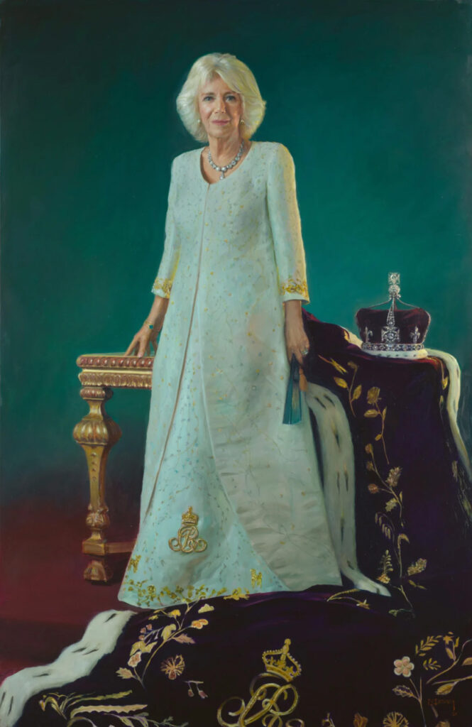
Camilla’s coronation portrait is more accessible, but then again, she takes the better photo. Her painting has long sweeping diagonals and painter Paul S. Benney has managed to give her a hauteur she never achieves in life. There’s just enough pattern in the regalia to set off the simplified form of dress and background.

Coronation portrait of King Charles III, 2025, Peter Kuhfield, courtesy National Gallery

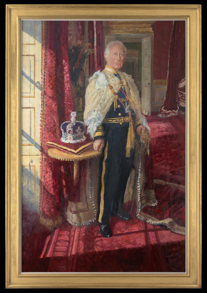
Charles’ coronation portrait, by Peter Kuhfield, is more complicated, and I think that makes it a better psychological portrait. His regalia is wearing him, which is how I picture him each time he makes a public appearance in his three-piece grey suit, top hat, umbrella, tie pin, boutonniere, pocket square and glace shoes. He’s always dapper, but ever so slightly rumpled (unless he’s in a kilt). His clothes seem like outfits from another century.

In the portrait, his face is in shadow, without distinct modeling. He’s been struggling with cancer for two years. For Kuhfield to have captured that sense of fading away is insightful, sad and terrible.

Pity the poor person tasked with doing a portrait of a king or queen. Portraits are difficult enough. Add to that the demands and demanding schedules of princes of the realm. Clothing and figure will done with stand-ins or mannikins (as was the case with Nelson Shanks’ portrait of Princess Diana).

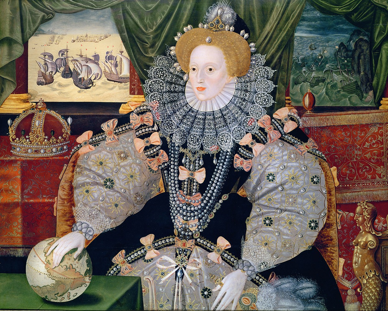
Hans Holbein did a drawing of Henry VIII which was widely copied by other artists in lieu of getting the king to sit at all. In his older years, the king was infamously irascible, cruel, and intolerant, with a noted inclination toward murder. It’s no surprise portrait painters kept their distance.

While not a coronation painting, the Armada Portrait, c. 1588, is a fierce statement of Elizabeth I’s authority. The globe represents England’s imperial might. Black and white was Elizabeth’s color scheme and represented her chastity and constancy. She faces the calm English seas, and away from the storms of Catholic Europe. And the mermaid symbolizes her power to sink those Spanish ships. The imperial crown represents the claim made by the Tudors that they were descended from Brutus of Troy, who was by legend descended from Aeneas, the mythical founder and first king of Britain. It asserts Elizabeth’s right to rule. And all those pearls associate her with Artemis.

Until the age of photography, all we knew about kings and queens was what we learned from their paintings. Thus we believe Anne of Cleves was beautiful because Holbein painted her that way. That was despite Henry complaining that, “She is nothing so fair as she hath been reported…  [if] it were not that she had come so far into my realm, and the great preparations and state that my people have made for her, and for fear of making a ruffle in the world and of driving her brother into the arms of the Emperor and the French King, I would not now marry her. But now it is too far gone, wherefore I am sorry.” What a mensch.

Queen Elizabeth II, semi-mette cibachrome print, 2 June 1953, Cecil Beaton, courtesy Victoria and Albert Museum, London. While this was taken on the day of Queen Elizabeth’s coronation, it was actually shot at Buckingham Palace. Beaton dubbed in the Lady Chapel at Westminster Abbey in his darkroom.

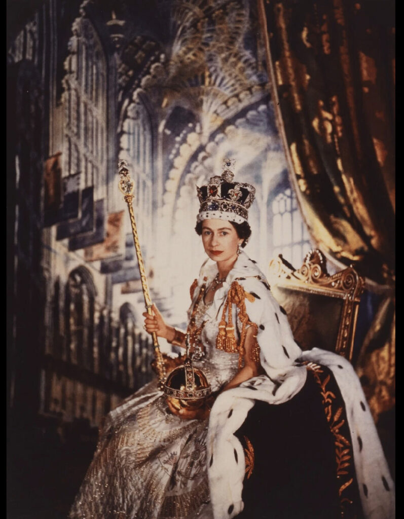
Queen Elizabeth’s coronation portrait

Queen Elizabeth II had some real stinkers painted of her, among the worst being by Lucien Freud in 2001. Freud’s error, I think, is in trying to impose a psychological state on her portrait. A famously private woman, she wasn’t giving anything away to strangers. The best are the 1955 Pietro Annigoni portrait and Andy Warhol’s 1985 screenprint. Neither try to be something they can’t.

But it’s in her photographic portraits by fashion photographer Cecil Beaton that we see something of the woman behind the throne. Theirs was a long relationship. Elizabeth first sat for Beaton in 1942. Over the next three decades he photographed the Queen on many significant occasions, including her Coronation Day in 1953. But he also took pictures of her family life, and there’s an intimacy to his pictures that paintings don’t seem to capture.

Reserve your spot now for a workshop in 2025:

Caravaggio and the Papal Conclave

The Pope’s favorite: The Calling of Saint Matthew, c. 1599-1600, Caravaggio, courtesy Contarelli Chapel, Church of San Luigi dei Francesi

I watched eagerly as Cardinal electors arrive for the Papal Conclave in Rome, which starts today. Although I’m not Catholic, the Papal Conclave is a fascinating glimpse into history. The College of Cardinals have been doing this (with periodic irruptions) since 1059 AD. Only four have been held in my adult lifetime.

Much hay has been made recently about the late Pope Francis’ love of Caravaggio, in particular The Calling of St Matthew. Michelangelo, painter of the Sistine Chapel, is the artist most associated with the Vatican, but so also are Raphael, Caravaggio, Bernini, and Leonardo da Vinci.

The difference between those others and Caravaggio isn’t his chiaroscuro, as radical as it is. It’s the humanity of his figures. Although his figures are dressed in late 16th century finery, there’s an everyman quality to them that we recognize immediately.

Conversion on the Way to Damascus, 1601, Caravaggio, courtesy Cerasi Chapel, Santa Maria del Popolo

Francis’ love of Caravaggio is ironic, considering the difficulties the artist had with his sometimes patron, Cardinal Scipione Caffarelli-Borghese. Borghese was the nephew of Pope Paul V. When Paul V was elected Pope, Borghese was made a Cardinal, the papal secretary and the effective head of the Vatican government. Of course, he amassed great power and wealth. With that came the capacity to steal vast collections of art.

Included were several Caravaggios. Among them, Borghese appropriated Caravaggio’s Madonna and Child with St. Anne, commissioned in 1605 for a chapel in the Basilica of Saint Peter’s. It was rejected by the College of Cardinals, allegedly because of its earthly realism and unconventional iconography. However, archives show that Borghese rigged the deal from the start so that the altarpiece would end up in his own collection.

Virgin and Child with Saint Anne (Madonna with the Serpent), 1606, Caravaggio, courtesy Galleria Borghese

Caravaggio was temperamental to start with, but his treatment by Borghese couldn’t have helped. In 1606, he fled to Malta after murdering a gangster in a street brawl. I recently saw two of his paintings there: The Beheading of Saint John the Baptist (which is enormous and dark) and Saint Jerome Writing (which is intimate and accessible). These are in St John’s Co-Cathedral in Valletta, which was one of many exuberantly-Baroque churches, basilicas and cathedrals we toured. At the end of my visit, I felt if I spent much more time in all that gilt and paint, I’d be an atheist.

This is of course, unfair. I’m a New England evangelical, which means my church style is austere.

Saint Jerome Writing, 1607, Caravaggio, courtesy St. John’s Co-Cathedral, Valleta

Having said that…

I’ve heard people say that the gold in St. Peter’s should be melted down and the money given to the poor. That’s absurd on the face of it, since every bit of gilt there is in the form of artistic masterpiece, worth many times the nominal value of the metal.

The truth is that without the church, there would be no western art. All artistic expression from the Middle Ages until the Enlightenment hangs from the power and energy of the church. The church created modern western art as we know it, including that which followed the church age.

The Reformation unleashed a wave of iconoclasm across Northern Europe and England in the 16th century. The result was the destruction of more paintings than were ever saved. The church not only commissioned great art, it has preserved it. That was sometimes in the face of danger, as in the case of the Ghent Altarpiece.

Let the games begin

Meanwhile, the Papal Conclave begins its stately procession to elect the 267th recognized pope. Let the intrigue, speculation, false starts, and rumor begin!

Reserve your spot now for a workshop in 2025:

Monday Morning Art School: what we can learn from JMW Turner

The Fighting Temeraire tugged to her last berth to be broken up, 1838, J. M. W. Turner, courtesy National Gallery

We’ve just marked the 250th birthday of Britain’s great Romantic artist, Joseph Mallord William Turner. As with so many great painters, Turner really didn’t become Turner (the prefigurer of modern painting) until he was closing in on old age. While there are many lessons to be learned from his work, here are two that stand out to me:

The Fighting Temeraire

The Fighting Temeraire was once voted Britain’s favorite painting. It’s featured on the £20 banknote, which also includes the Turner quote, “Light is therefore colour.”

The painting shows the 98-gun HMS Temeraire being towed up the Thames by a paddle-wheel steam tug, to be broken up for scrap. The Temeraire was one of the last second-rate ships of the line left from the Battle of Trafalgar in 1805. Her role had been pivotal in the deadly sea battle between the British Royal Navy and the fleets of Spain and France. Vice-Admiral Horatio Nelson was killed when his flagship, HMS Victory, was battered by the French ship Redoutable. In response, Temeraire surged forward, raking Redoutable with grapeshot, causing her to strike her colors. The victory confirmed British naval supremacy and prevented Napoleon from ever again considering invading England.

The Fighting Temeraire is generally taken as an elegy for faded national glory. But modern interpretations focus on Turner’s admiration for newness, as epitomized in Rain, Steam and Speed—the Great Western Railway. In that view, Turner was actually painting the steamship and arguing for leaving the past behind.

The Slave Ship, 1840, J. M. W. Turner, courtesy Museum of Fine Arts, Boston

The focal point is not always the subject

Yes, the main focal point of The Fighting Temeraire is inarguably the steamship; it’s the passage with the greatest contrast. (It, and the amorphous shape in the foreground right and the sun on the horizon are the three focal points, forming a strong triangular composition.) But that doesn’t make it the subject of the painting. Turner explicitly tells us otherwise with his title and the careful prep work he did for the painting. The moonlight, the wrecker’s flag (not the Union Jack) and the detail on the Temeraire tell us we’re to read this all of a piece, together. Long before anyone talked about focal points and subject, he was playing them against each other to make a complex statement.

Rain, Steam and Speed – The Great Western Railway, 1844, J. M. W. Turner, courtesy National Gallery

Making the jump from linear to painterly

Painterly vs. linear is not a quality distinction, but rather a stylistic distinction.

A painting is linear when it uses skillful drawing, shading and contour to create the illusion of dimensionality. Painterly means there are visible brushstrokes, less control, and more impulsive color. While there have always been artists on the painterly side of the divide, the real historic divide is with the Impressionists, who slewed off into painterliness in the latter half of the 19th century. We have, for the most part, stayed on that side ever since.

Like his peers, Turner was a linear painter until sometime in the mid-1830s, when suddenly he wasn’t anymore. The mature Turner stopped painting line and became a painter of mass, tone and light. He treated land, air, and water, as if they were all one. “Indistinctness is my forte”, he said. This being the onset of Victorian England, with its rising tide of realism and of sentimental Landseers and Pre-Raphaelites, it’s hard to imagine how he struck out in such a unique direction.

Turner when he was linear: Cologne, the Arrival of a Packet Boat in the Evening, c 1826, J. M. W. Turner, courtesy The Frick Collection

Did Turner wake up one morning and decide to make soft miasmas of color? No; you can see hints of this in earlier paintings. Somehow, by poking at it, day in and day out, he came up with something new to himself and everyone else. We can learn a lot about painterliness from studying his paintings, but ultimately we have to do the studio time, too.

Reserve your spot now for a workshop in 2025:

What is style in art?

Athabasca River Confluence, 9X12, $696 includes shipping and handling in continental US.

Mystery writer Ngaio Marsh studied painting at the Canterbury College School of Art in her native New Zealand. Artists figure in several of her novels. As you might expect, she had intimate familiarity with their habits and careers.

“Don’t try to acquire a manner till you’ve got a little more method,” painter Agatha Troy tells a student in Marsh’s 1938 novel Artists in Crime. It’s an important idea, since style grows naturally from technique.

Marshall Point, oil on archival canvasboard, 9X12, $696, includes shipping and handling in continental US.

What is style in art?

Style has different meanings depending on context, but we all know it when we see it. The major families of painterly style are:

  • Realism, representing the subject as accurately as possible.
  • Impressionism, focusing on fleeting impressions of light and color.
  • Expressionism, emphasizing the emotional and psychological.
  • Abstraction, or non-representational painting.

Within them, however, are myriad other subdivisions, defined by the choices we make in each of the elements of design.

Lobster pound, 14X18, oil on canvas, $1594 framed includes shipping and handling within the continental US.

Don’t overthink your own style

I’m all for understanding our own points of view; that’s the deepest discipline in painting (and life). Yes, style ties our work together in one body, and it ties us to a specific time and place. It’s the art historian’s best tool for classifying artwork.

But style should develop naturally. Forcing it stymies development. While we should study the technique of great painters, imitating their style is a sure path to irrelevance.

It takes some deep scratching

Good painters choose truth over stylishness, even to the point of seeming awkward to their contemporaries. They investigate thorny questions, not just about the world, but about painting itself. When they’re answered, these artists move on. Often, by the time they get through the cycle of making and mounting a body of work, they’re no longer that interested in it. There’s another struggle engaging them.

Owl’s Head, 11X14, oil on archival canvasboard, $1087 framed includes shipping and handling in continental US.

Each time we pick up the brush, there’s variation in how we approach painting problems. That’s why it’s important that you have facility with big brushes, small brushes, palette knives, detail, broad strokes, and tiny strokes. Even if they’re not part of your regular repertoire, they increase your versatility and scope.

Don’t box yourself in

‘Embrace your style’ is a trap that painters may not be able to escape.

There’s a difference between style and being stylish. I enjoy fluid, assured brushwork. That’s not styling; it’s self-confident skill.

Direct and unconscious

Sometimes, what people call style is just technical deficiency. Style for its own sake can be a ruse to cover up badly-conceived paintings. “People often mistake verbose for skill,” a reader once mused. “The best writing is direct and almost unconscious. I think the same thing is true of painting.”

Mature artists don’t generally think about style so much. At that point, style is the gap between what they perceive and what comes off their brush. That’s deeply revelatory, and it can be disturbing when we see it in our own work.

Some of us try to cover that up with stylings, not realizing that those moments of revelation are what viewers hunger for. They, and not the nominal subject of the piece, are the real connection between the artist and his audience.

Reserve your spot now for a workshop in 2025:

When words matter most

Back It Up, 6X8, oil on archival canvasboard, $435.

My friend Clif Travers and I did a residency together at the Joseph A. Fiore Art Center. That was an opportunity to meet artist Lois Dodd, who came by one night for supper, along with painter David Dewey. I was rather starstruck, since I’m an unabashed fan of Dodd (and Dewey, for that matter).

Dodd proceeded to give a short, pithy and entirely constructive critique of one of my paintings. She made her point without in any way making me feel bad, and I walked away having new ideas and even more respect for her talent.

Compare that to a critique I’d had fifteen years earlier, by a pastelist and faculty member at a distinguished American university. “It looks like an immature Chagall,” she said. I went home and destroyed the painting by trying to make it more abstract.

(Sadly, I can’t find images of either work, although the corpses might be lying around here somewhere.)

Stuffed animal in a bowl, with Saran Wrap. 6X8, oil on archival canvasboard, $435.

When words matter most

I’ve regretted wrecking that painting ever since. As a much more experienced painter, I think her criticism was simply wrong. She was simply saying, with her New York fin de siècle myopia, that while dreams and memory were fine, she had no time for highly-representational painting. (I no longer love that smoothly-rendered realism myself, but she had nothing to do with that development; plein air did.)

The part of that story that embarrasses me is not what she said, but my response to it. I should have set it aside and tried again on a different canvas. But I rushed into revisions while not even realizing how angry I was.

I was an experienced painter at the time; what made me flare up so badly?

Possum, 6X8, oil on archival canvasboard, $435 includes shipping in continental US.

Most artists are sensitive about their work; it’s deeply personal. Making it exposes our most private thoughts and feelings, which are in turn wrapped up in our identity and worldview.

Furthermore, we put a significant amount of time, energy, and dedication into our work. We can laugh when the uninformed say, “my kid could do that,” but when a respected practitioner dismisses it without care, that’s another issue entirely.

Art is also a means of communication, so negative feedback can strike at a deeply personal level. That’s especially true if the work is part of a creative leap forward, when we’re already feeling a sense of risk. Or, in the case of my painting, when the subject is deeply important.

Tin Foil Hat, 6X8, oil on archival canvasboard, $435 includes shipping in continental US.

Watch what you say

Artists are, believe it or not, human. Harsh or careless criticism is demoralizing.

There’s often a power imbalance between the critic and the subject, which shouldn’t be taken lightly.

I was once panned in a newspaper review, and it made me cry. There’s a difference between helpful feedback and tearing something down. Good criticism helps artists grow; careless or mean-spirited commentary stifles creativity.

Reserve your spot now for a workshop in 2025:

Monday Morning Art School: what medium should I choose?

Apple Blossom Time, oil on archival canvasboard, $869 framed includes shipping and handling in continental US.

I’m often asked about the best medium for the beginning artist. That’s like assuming that there’s a one-size-fits-all catsuit.

No medium is inherently easier or more difficult than another. They all have their challenges and rewards. Similarly, no medium is inherently more toxic than another; the toxicity of paint lies in the pigments, not the binder. You can avoid toxic pigments in any medium. And, perhaps most importantly, once you get past the entry-level supplies, they all hit an expense plateau, so you might as well choose what you like.

But don’t be surprised if you end up working in more than one medium. I use them all, and my great regret is that I don’t have more time to experiment.

A tiny painting done with Golden Open Acrylics.

Acrylics are fast-drying and versatile. You can layer and finish paintings quickly. They clean up well with soap and water, and inexpensive acrylic paints are available at most department stores at a low price (although you get what you pay for).

That same quick-drying characteristic is a minus when it comes to working slowly or en plein air, which is why most manufacturers now offer retarders. Retarders help, but never give you the open time of oils. Acrylics can also darken as they dry, and their final feel is more plasticky and less buttery than oils.

You can work acrylics leanly, but adding too much water breaks down the bonds. If your goal is transparency, you need to use an acrylic medium designed for glazing.

Rachel’s Garden, ~24×35, watercolor on Yupo, museum-grade plexiglass, $3985 includes shipping and handling in continental US.

Watercolors are the most portable medium. With a travel kit, a brush and a sketchbook, you can paint anywhere.

Watercolors have a luminous quality that comes from the paper reflecting back through the pigment. They’re fast and spontaneous, and you needn’t worry overmuch if you screw something up; just paint something else. Cleanup is, of course, absurdly simple. Just rinse your brushes, wipe off your palette, and head home.

Of course, that’s all true until you set out to create something brilliant. The downside of watercolor is that errors are hard to fix. Once pigment sets, it’s often there to stay. That means you need to plan ahead. And getting consistent results takes practice and patience.

And good watercolor paper ain’t cheap, as my friend Becky constantly reminds me.

Oils offer the richest, most vibrant colors. Since they dry very slowly, you have tons of time to work, blend, tweak, and perfect your transitions, if that’s your thing. Oils have a centuries-long track record for durability without fading, and you can go from thin glazes to thick impasto with the same material.

Oils can take anywhere from a few hours to a few days to dry to the touch, but don’t be fooled; that painting is still wet inside, which is why it can’t be varnished immediately. You will need odorless mineral spirits and a good brush soap to clean your brushes. The cleanup is a bit finickier than with other mediums, but it needn’t ruin your life.

Gouache is just opaque watercolor. It dries to a matte finish, and can cover underlying layers. It’s reworkable and fast-drying. It’s an excellent learning medium and is often used by illustrators because it’s quick.

Once dry, the paint layer can be easily scuffed or reactivated by moisture, so varnishing can tricky. Colors don’t always dry accurately, and gouache doesn’t blend well.

You need to work on a stiff board or paper, because gouache will crack if laid down too thickly or not on a proper support.

Shenandoah Valley, long time ago and far, far away… in pastel.

Pastels are expressive and tactile and support a wide range of styles.

There’s no need to learn brushwork with pastels, since there aren’t any brushes. Blending is simple and intuitive, as is layering and creating texture. Pastels, like oil paints, have a good record of longevity.

Finished pastel paintings are fragile, and need to be framed or fixed (which may change the colors.) Pastel dust is also potentially hazardous; more so, in fact, than any paint-bound medium. So pastelists should work in well-ventilated areas and wear some kind of gloves, since pigments can be absorbed through the skin.

My Tuesday class is sold out, but there’s still room in the Monday evening class:

Zoom Class: Advance your painting skills

Mondays, 6 PM – 9 PM EST
April 28 to June 9

Advance your skills in oils, watercolor, gouache, acrylics and pastels with guided exercises in design, composition and execution.

This Zoom class not only has tailored instruction, it provides a supportive community where students share work and get positive feedback in an encouraging and collaborative space. 

Reserve your spot now for a workshop in 2025:

Art and morality

The Late Bus, oil on archival canvasboard, 6X8, $435.00 framed, includes shipping and handling in continental US.

Should an artist’s behavior change how we see his work? I have a hard time tolerating the work of Pablo Picasso, because I sense his misogyny shining through his work. Paul Gauguin, it has been argued, was merely following Polynesian culture in his sexual relationships with teenaged Tahitian girls. I think that’s a terribly abusive, colonialist mindset.

The question of art and morality came to mind this week with the passing of Pope Francis.

Fr. Marko Rupnik has evaded justice for six years for documented sexual abuse of nuns. The appointment of his canonical judges, ironically, coincided with the death of Francis, who some critics accused of protecting Rupnik. (Francis later lifted the statute of limitations so Rupnik could be tried, so it’s complicated.) Hopefully, the trial won’t be forgotten in the current crisis in the Holy See.

Last light at Cobequid Bay, 6X8, oil on archival canvasboard, $348 includes shipping and handling in continental US.

What does this have to do with art?

Besides being a priest, Marko Rupnik is an artist whose mosaics and other art grace many Catholic churches, chapels, and shrines around the world. They’re not my cup of tea; to me they look derivative and expensive. But someone must have liked them or they wouldn’t be everywhere. Given that the Vatican has already determined that Rupnik did, in fact, abuse these sisters, what are those sanctuaries going to do with those monstrously large mosaics?

That’s a timeless question, and it relates to that which we also have to answer any time we look at art by a disturbed or disturbing individual. It’s a question that sits at the intersection of art, ethics, and personal values.

No Northern Lights Tonight, 6X8, oil on archival canvasboard, $348 includes shipping and handling in continental US.

The aesthetic autonomy argument

Some argue that once a work is created, it stands alone. The artist’s personal behavior, no matter how flawed, shouldn’t affect how we interpret or value the work. This view emphasizes the art itself—its technique, message, emotional impact—over the biography behind it.

That’s easier to do when more time has elapsed. Very few of us, for example, know anything about the personal life of, say, Benvenuto Cellini, but we can recite chapter and verse about Taylor Swift.

Context

We could argue that Caravaggio’s propensity for violence (after all, he killed a man in a brawl) is a lens through which we understand the gritty realism of his work. He was also systematically ripped off by his putative patrons, the Borgheses. Edgar Degas’ antisemitism, while reprehensible, was sadly in line with popular sentiment in late 19th century France. There are situations where context doesn’t excuse behavior, but it does make it more understandable.

Windsurfers at La Pocatière, 6X8, oil on archival canvasboard, $348 includes shipping and handling in continental US.

Our own ethics as viewers

We make ethical choices every time we buy something, and art is no exception.

That is magnified in the case of Rupnik, whose art is in places of worship worldwide. I’m not Catholic but I like what Bishop Jean-Marc Micas of Tarbes and Lourdes, France, said about it:

“My role is to ensure that the Sanctuary welcomes everyone, and especially those who suffer, among them, victims of abuse and sexual assault, children and adults.

“In Lourdes the tried and wounded people who need consolation and reparation must hold first place.”

My Tuesday class is sold out, but there’s still room in the Monday evening class:

Zoom Class: Advance your painting skills

Mondays, 6 PM – 9 PM EST
April 28 to June 9

Advance your skills in oils, watercolor, gouache, acrylics and pastels with guided exercises in design, composition and execution.

This Zoom class not only has tailored instruction, it provides a supportive community where students share work and get positive feedback in an encouraging and collaborative space. 

Reserve your spot now for a workshop in 2025:

Spring flowers

Forsythia at Three Chimneys, oil on archival canvasboard, $869 framed includes shipping and handling in continental United States.

I was chuffed to get home from Malta to find hyacinths blooming along my driveway. The pieris japonica along my patio is singing its heart out, and the forsythia is starting to color up. Long delayed, the first signs of spring are finally here in midcoast Maine.

“What will you be teaching in the first class of Advance your Painting Skills?” a student asked. “I want to know what we’re painting!”

As I’ve mentioned, this is a bespoke class, based on students’ needs, but there are certain things every painting class should stress. Color is critical, and what better place to start than early spring flowers?

Lilacs, 12X12, private collection,

Learning how to paint, for the midlevel painter

We have six three-hour classes, which isn’t a lot of time to get things done. But here are the fundamental concepts that I will be stressing in this class:

Project workflow

That’s a fancy way of saying the artist has a process in place from idea to finish. That includes preparatory sketches and an order of operations appropriate for your specific media. For watercolors, that usually means light to dark. For oils and other solid media, that means dark to light and fat over lean. For everyone, it means big shapes to small shapes.

While there are exceptions to these rules, they should be locked down before you start puttering.

Bridalwreath spirea, private collection. They’re just starting to bud out now.

Color theory

That’s where we’ll be starting Monday night. Color theory is more than just the color wheel (important as that is). It includes warm vs. cool colors and color harmonies.

Mixing paint

Using the right color from the start is the secret to not flailing around. It’s a question of method.

Composition and design

If there’s one thing I natter on about, it’s composition. That includes balance, rhythm, movement, value, and focal points.

Brushwork

Brushwork, like handwriting, is highly individual; we don’t need the equivalent of the Palmer method. However, grip, angle and bristle type have a big effect on the results.

Miss Rumphius’ garden, private collection.

Working from life

Working from life is the best way to become adept at painting. While we can’t always avoid reference, we’ll learn how to simplify and strengthen our designs based on the real world. And we’ll explore the difference between working from life and working from photos.

The ability to critique our own work

I like to think of this as developing executive function in painting—to see how things are going wrong before they’re a disaster and to fix the problems in midstream.

An art vocabulary

Learning how to paint should include developing an art vocabulary and a familiarity with the canons of art. Seeing how master artists executed important concepts helps us understand how to apply those same ideas in our work. In every class, I try to show students great works of art that illustrate key concepts in every class.

My Tuesday class is sold out, but there’s still room in the Monday evening class:

Zoom Class: Advance your painting skills

Mondays, 6 PM – 9 PM EST
April 28 to June 9

Advance your skills in oils, watercolor, gouache, acrylics and pastels with guided exercises in design, composition and execution.

This Zoom class not only has tailored instruction, it provides a supportive community where students share work and get positive feedback in an encouraging and collaborative space. 

Reserve your spot now for a workshop in 2025:

Monday Morning Art School: basics of painting

Happy Dyngus Day! This marks the first real day of spring in my home city of Buffalo, where “everyone is Polish on Dyngus Day.”

Dawn Wind, Twin Lights, 9X12, oil on archival canvasboard, $869 includes shipping and handling in the continental US.

There are some fundamental principles that every painter should know. Even if you’re an experienced painter, you might benefit from reviewing these basics of painting:

Materials:

  • Understand the basic differences between oil, acrylic, watercolor, gouache, oil and chalk pastels, and tempera. Know which can be used in multimedia applications such as printmaking or collage, and which will cause chemical reactions that lead to decay. Understand how your specific media works in terms of open time, opacity and blending. (And, yes, I realize I’ve never written about this, so I’ll get right on it.)
  • Know how to read a paint tube and understand the difference between popular names and the pigments actually in the tube. Know the difference between what you want and what you need.
  • Know what kind of brushes are appropriate for your media, and your method of painting. There is a vast range of bristle material out there, and they are suitable for specific mediums and specific methods of painting.
  • Know what surfaces (supports) are suitable for your media, and what kind of sealant you need if you use an incompatible support.
  • Understand the difference between medium and solvent, where each are appropriate, and how they affect viscosity, opacity and drying time.
Seafoam, 9X12, oil on archival canvasboard, $869 framed.

Drawing fundamentals

Value

Peaceful tidal pool, 9X12, $869,

Color Theory

Fundamentals of composition

Nocturne on Clam Cove, 9X12, oil on archival canvasboard, $869.00 framed includes shipping in continental US.

Observation and reference

Maintenance

  • If painting in oils or acrylics, clean your brushes properly after each use. If painting in watercolor, rinse your brushes thoroughly after each use, especially if painting with salt water.
  • Store your materials someplace other than the back of your car (which is one of my worst habits).

If this is all review, congratulations! If not, you might consider taking one of my classes below this spring:

This spring’s painting classes

Zoom Class: Advance your painting skills

Mondays, 6 PM – 9 PM EST
April 28 to June 9

Advance your skills in oils, watercolor, gouache, acrylics and pastels with guided exercises in design, composition and execution.

This Zoom class not only has tailored instruction, it provides a supportive community where students share work and get positive feedback in an encouraging and collaborative space. 

Zoom class: Signature series

Tuesdays, 6 PM – 9 PM EST
April 29-June 10

This is a combination painting/critique class where students will take deep dives into finding their unique voices as artists, in an encouraging and collaborative space. The goal is to develop a nucleus of work as a springboard for further development.

Reserve your spot now for a workshop in 2025:

Bespoke: the advantages of online learning

Breaking Storm, oil on linen, 30X48, $5579 framed includes shipping and handling in continental US.

“What will you be teaching in your Zoom class, Advance your painting skills,” asked a prospective student. Unlike most of my classes, I haven’t laid out the curriculum in the online class offering. That’s because it’s, as our British cousins say, going to be a bespoke class. That means it will be tailored to you—your strengths, your weaknesses, your needs, your aspirations.

I’ve been teaching painting online since the world’s annus horribilis, when COVID shut us all up in our little nuclear cells. At first, I thought I’d hate teaching online, but I rapidly became a convert.

Skylarking, 24X36, oil on canvas, $3985 framed includes shipping and handling in continental US.

The advantages of online learning

In the old days, I’d tour my studio, quietly commenting on work, mentioning what was good and what needed improvement. If Beth overheard what I said to Lynda, that was a bonus, but most people remained in their own little working bubble. Occasionally, if I saw an essential truth that needed mentioning, I’d raise my voice, but that is tiresome for everyone.

That doesn’t happen in Zoom classes. If I tell Lynda, “You should restate the darks,” everyone in the class hears it and consciously or subconsciously checks their pattern of darks.

Students in my classes have come from the United States, Canada and Great Britain—in fact, anywhere there isn’t a language or time barrier. They’ve developed an esprit de corps that would be impossible in the old world of physical classes.

My students have access to recordings of the class, which means that if they must miss one, they can make it up at their leisure. Or, they can review it the class when they need to. That ability to access the content at any time going forward is invaluable. Students can just rewatch the videos until it clicks.

Skylarking II, 18×24, oil on linen, $1855, includes shipping in the continental US.

From the teacher’s standpoint, it’s helpful to see students working in their own environment, on their own easels. I have many times caught ergonomic issues in students’ setups that were hampering their ability to paint and draw.

And, of course, people can attend in their pajama pants—and dogs and cats are always welcome.

The internet sometimes gets terrible press… and I get it. There are problems with social media, but the availability of online art classes is a great boon. I started writing this post in Manchester, England, finished it in Reykjavik, Iceland, and you are reading it wherever you are on the globe. Isn’t that cool?

Dinghy Dock, 8X10 on archival canvasboard, $522 unframed includes shipping and handling in the continental US.

Why am I offering Advance your painting skills?

I’ve had a core group of students with me since I started teaching online in 2020. Many of them are now selling their work, making them professionals. I think it’s a feather in my cap to have helped so many students get to that level, but I need to make room for the next generation of great painters.

That’s why I’ve broken my offerings this spring into two sections. Signature series is intended for those advanced students to develop specific themes in their work. Advance your painting skills is intended to get the next group of painters to that level. You can start as a good emerging artist or a hesitant beginner; there’s a place for you here. Wherever you’re starting, in whatever medium, it’s an opportunity to take a step forward into better technique.

This spring’s painting classes

Zoom Class: Advance your painting skills

Mondays, 6 PM – 9 PM EST
April 28 to June 9

Advance your skills in oils, watercolor, gouache, acrylics and pastels with guided exercises in design, composition and execution.

This Zoom class not only has tailored instruction, it provides a supportive community where students share work and get positive feedback in an encouraging and collaborative space. 

Zoom class: Signature series

Tuesdays, 6 PM – 9 PM EST
April 29-June 10

This is a combination painting/critique class where students will take deep dives into finding their unique voices as artists, in an encouraging and collaborative space. The goal is to develop a nucleus of work as a springboard for further development.

Reserve your spot now for a workshop in 2025: