fbpx

Monday Morning Art School: the architecture of trees

To paint trees, you have to know trees. That doesn’t mean you need to memorize species, but you do need to be able to see the differences.

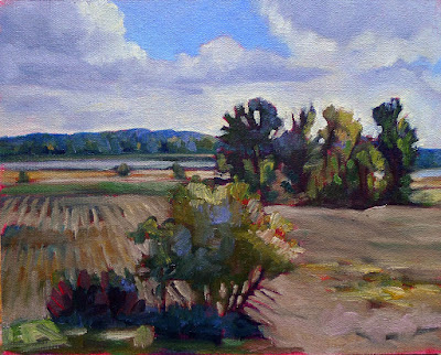
Along the Ottawa River, by Carol L. Douglas. You don’t need to be able to identify species at 200 paces, but you do need to be able to recognize how trees differ.
Trees, clouds and rocks are all frequently abused in the same way: the oblivious painter never thinks about their individual characteristics but paints them interchangeably. That’s a mistake.
There is a major division in the forest world between conifers (the trees with needles) and broadleaf trees. Most, but not all, conifers are evergreens; the biggest exception being the larches (tamaracks), which turn a delicious yellow-gold in autumn. Which are dominant in your landscape? Even in the Pine Tree State, the distribution of conifers to deciduous trees is about 50/50.
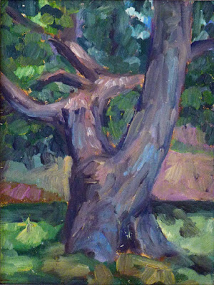
Old Bones, by Carol L. Douglas

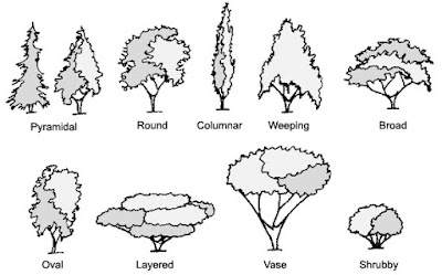
For broadleaf trees, the most important distinguishing characteristic is the branching pattern of the tree, which defines the shape of its canopy. Silver maples are large trees with open, vase-like canopies. Oaks have large spreading crowns; beeches have similar crowns that appear to have melted. Most broadleaf trees branch alternately but maple, ash, dogwood and horse chestnut branch in opposite pairs.

Pines have fewer branches than spruces or firs, and their branches grow in circular whorls on the trunk. As they age, they develop an open, jagged canopy. Spruce branches grow in an upturned direction; as youngsters, they look the most like ‘Christmas trees’. In their dotage, they turn a fine, weathered figure to the wind. Firs have wide lower branches and a downcast mien. Notably, their cones point upward.
Most scenes will include a variety of canopy shapes.
(Something that puzzles me: why do people find ancient trees more beautiful than their offspring, but prefer looking at young people over the elderly?)
Conifers are most easily identified by their needles. Pine needles grow in clusters of two, (red pines), three (yellow pines), or five (white pines), held onto the stem with a tiny papery wrapper. Spruce needles are short, stiff and grow individually from twigs. Fir needles are soft and flat. Cedars have flat, scale-like leaves and stringy bark. Junipers (including, confusingly, the Eastern Red Cedar) have berrylike, bluish cones on the tips of their shoots.
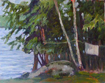
Along Kiwassa Lake, by Carol L. Douglas
Many people can identify the common broadleaf trees by their leaves, and I’ve included a chart to help you. The important part for the painter, however, is to see the differences in color. Silver maples have a lovely grey-silver color. Sycamores are garbed in military-fatigue green. Black spruces are dark while Eastern White Pines are fair and soft in their coloring.
This is why I discourage my students from using tube greens and encourage them, instead, to mix a matrix of green colors.
Basic broadleaf leaves.
Too often, we painters ignore young trees, something I tried to rectify (with varying success) last season. Young trees often look radically different from their aged ancestors, but they have a beauty of their own.
To be a convincing painter, you don’t need to memorize the species of trees, but you do need to learn to distinguish between them. Any plausible landscape will contain a variety of them, with different bark, branch structures, and leaf colors.
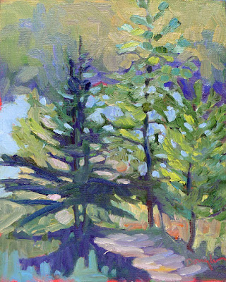
Baby black spruce and pines, by Carol L. Douglas
It’s almost the end of Early Bird discounts for my summer workshops. Join me on the American Eagle or at Acadia National Park this summer.

This column was originally published on May 18, 2018. 

Monday Morning Art School: painting fall foliage

Autumn has started its great transition; here are some tips to paint it in a believable way.
Catskill Farm, pastel, by Carol L. Douglas. The light is definitely warm in Autumn, but the predominant landscape color is still green.
In the northeast, soft maples start to turn orange and pink at the end of August. There are similar phase changes happening throughout the north. For example, in the Canadian west the aspens are starting to turn yellow-gold and the larches prepare to shed their needles.
 
The transition from summer green to November’s dun will take roughly ten weeks, but the daily changes are incremental.
 
The Dugs, oil on canvas, by Carol L. Douglas. The earliest foliage change in the northeast is in the soft maples.
Don’t delete the greens
 
Until late fall, the predominant local color remains fairly cool: there is the blue of sky and water, and plenty of green leaves. Trees change at different rates. There are some that never change at all, but simply drop their leaves. Mowed grass remains green all year long. And, of course, there are evergreen spruces and pines.
Adirondack Spring, by Carol L. Douglas. The same colors that appear in early spring return in the fall, but in a brassier way.
There are far more colors than just red and gold
 
The same colors that appear in early spring foliage are repeated in autumn, but in a brassier way—reds, pinks, golds, chartreuse, teals, purples. In early fall, tinge the tops of trees with these hues; as the season progresses, they will become more dominant.
 
Know how trees change color
 
Where I live, the brilliant soft maples and ashes change first. Later, the oaks and beeches rattle mournfully in the wind. Each species has a characteristic color as well as a specific time to turn. Observe these changes, rather than just dashing color around.
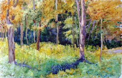
 
Glade, watercolor, by Carol L. Douglas. This painting is at the Jackson Memorial Library, Tenants Harbor, ME, through September.
Pay attention to the understory
 
There are wildflowers blooming on the edges of fields—goldenrod, asters, blue chicory, and Queen Anne’s lace. These are less brilliant than their early-season counterparts, but the overall effect is a beautiful spangle against dried grasses. Meanwhile, hayfields are still bright green and there are apples in every hedgerow.
 
Underpaint the sky in last
 
When we put the sky in first, we have a tendency to paint it darker and brighter than it is. (That’s because of how our eyes respond to light.) It’s easy to then make the whole painting too dark.
 
That’s a great argument for the dark-to-light rule of oil painting, but what should watercolorists do? Start with a monochrome value study, so you hit the blues properly the first time out.
 
How dark are the leaves?
 
Trees are often among the darkest features of the landscape, especially when we’re below them. But yellows and golds are naturally light colors. That makes us perceive fall foliage as lighter than it is. We need to take care to check the value of foliage in the design phase.
 
Avoid white in your foliage mixes, except to articulate a sun-struck passage. Darken yellow-gold with yellow ochre rather than with its complement, or you’ll kill the chroma. And check the leaf values against tree trunks; in some cases, they may not be that different.
Keuka Vineyard, Carol L. Douglas, available through the Kelpie Gallery. This shows the earliest autumn changes, which in New York are in late August.
How intense is fall color?
 
It’s easy to overstate the chroma in any season. It’s especially easy in autumn, because we’re responding to unusual brilliance. But Nature has a wide variety of chromatic intensities, from the delicate robin’s egg blue of a winter sky to the dazzling reflections off the ocean. There are plenty of greys in the landscape, especially in autumn.
 
There are other ways to convey the brilliance of autumn than to just use bright colors. Set the subject tree against more neutral tones, or place an intensely warm tone against a cool tone.
 
Autumn has its own color temperature
 
Above, I wrote that autumn colors were still predominantly blue and green. But the overall color temperature is warm, because the sun spends a lot more time on the horizon than it does in midsummer.
 
Autumn is known for its magical lambent light—the “season of mists and mellow fruitfulness/Close bosom friend of the maturing sun,” as John Keats said.
 
Color temperature is a lengthy subject, and I’ve written about it here, here, here, hereand here(that’ll keep you out of the bars). The basic rule is that the color of the shadow is the complement of the color of the light. If light is golden, shadows are cool.
 
This was originally posted in September, 2019. Happy Labor Day, my friends!

Reserve your spot now for a workshop in 2025:

A sense of place

Everything that you paint should tell a real story, one that is authentic to you.
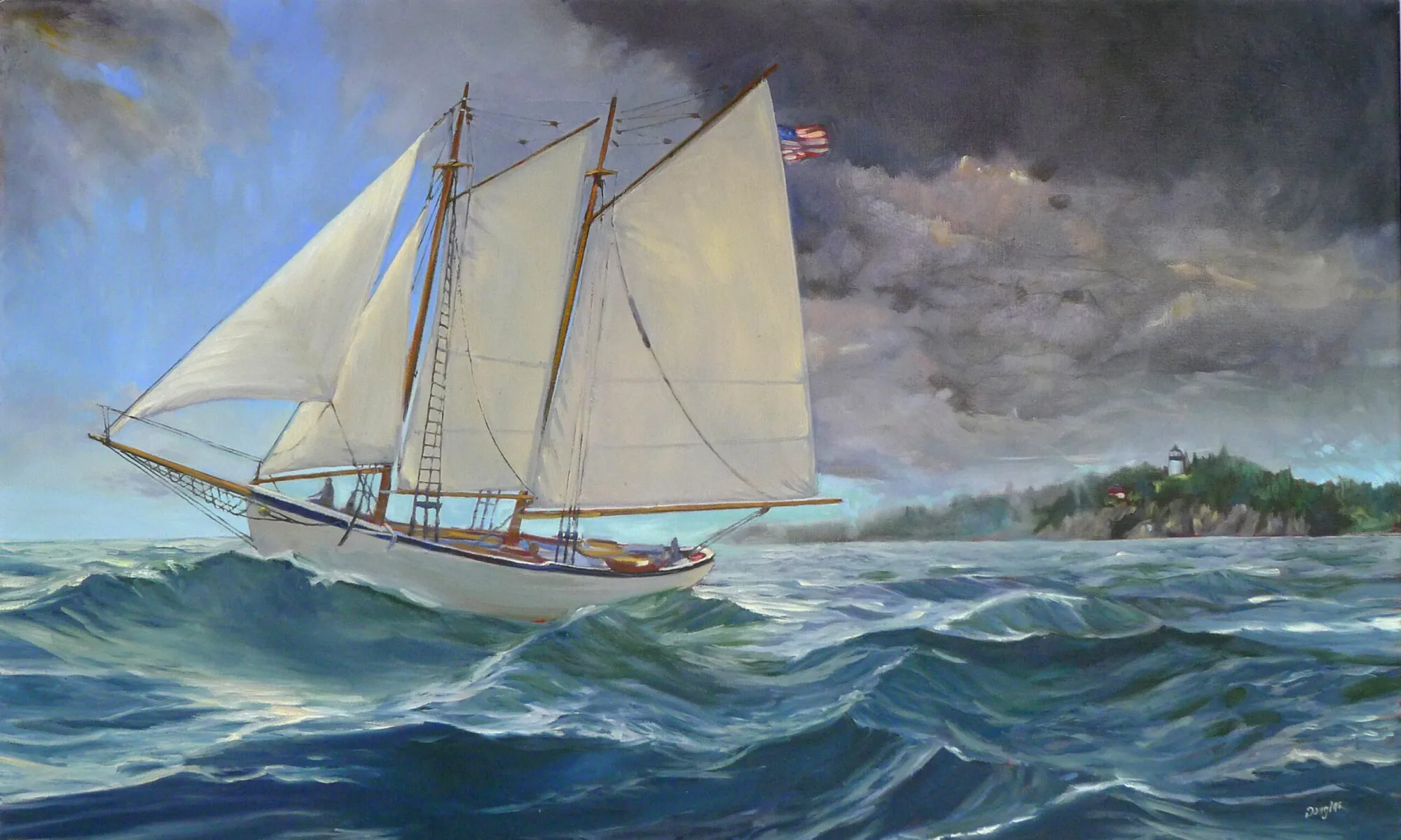
Big-boned, by Carol L. Douglas. As soon as I finish my taxes, I’ll be back at the boatyard painting schooners.

There is something about being in our favorite place that transcends detail. We know it by feeling rather than by specifics. As artists we are attempting to recreate that sense of place using only visual cues. That requires specificity and accuracy.

Artists become expert in oddly arcane matters. Marilyn Fairman can identify all the birds that sing in the understory. She told me she learned from one of those silly clocks they used to sell with a different bird call for every hour. And she paints without headphones on, so that she can hear the sounds of nature.
Sandra Hildreth of Saranac Lake is expert on the topography of the High Peaks region. She got that way because she has hiked all over the Adirondacks. Likewise, Bobbi Heath knows lobster boats because she’s spent serious time cruising and painting the waters of Maine.
Winch, by Carol L. Douglas
I can’t say I know any of those things encyclopedically, but I’m pretty strong on trees and rocks. So if you bring me a painting with brown, undefined lumps where the granite of Maine or the red sandstone of the Minas Basin should be, I’m bound to say something.
Isn’t the important thing that you create a pleasing painting? That’s true, but squidging the details is amateurish. What’s the point of painting the Canadian Rockies if they end up looking like New Mexico? Last week, I mentioned Paul CĂ©zanne’s sixty paintings of Mont Sainte-Victoire. He experimented in all of them, but the mountain remains recognizable.
Coast Guard Inspection, by Carol L. Douglas
“Sense of place” is a phenomenon that we can’t define, but we all know when we see it. As individuals, families, and a culture, we set aside certain places as being exceptional. It’s why we have World Heritage Sites, National Parks, and National Scenic Byways.
When a place is without character, we sometimes say it is “inauthentic.” Once again, we can’t define that, but we all seem to know them when we see them: shopping malls, fast food restaurants, or new housing tracts. As Gertrude Stein once said, “There is no there there.”
More work than they bargained for, by Carol L. Douglas
How does a scene achieve a “sense of place” in our consciousness? It acquires a story, which is a finely- crafted pastiche of memory, events, and beauty. Our childhoods, in particular, shape our adult response to the physical world. Psychologists call the setting of our childhood our primal landscape. It becomes the bar against which we measure everything we see thereafter.
All of this argues against painting an anodyne landscape. And it argues for landscapes with lodestars. If you’re honest with your feelings, a lighthouse or grain elevator will not end up being clichĂ©d.
Everything that you paint should be something that you’ve experienced. It should tell a real story, one that relates back to you. Your canvas is not just a rectangle that you fill up with generic ‘nature’. It should be a little slice of a place.
Note: my websiteis completely updated. It’s new work and a new, mobile-friendly platform, too. Won’t you take a peek?

Monday Morning Art School: the architecture of trees

To paint trees, you have to know trees. That doesn’t mean you need to memorize species, but you do need to be able to see the differences.
Along the Ottawa River, by Carol L. Douglas. You don’t need to be able to identify species at 200 paces, but you do need to be able to recognize how trees differ.
Trees, clouds and rocks are all frequently abused in the same way: the oblivious painter never thinks about their individual characteristics but paints them interchangeably. That’s a mistake.
Old Bones, by Carol L. Douglas
There is a major division in the forest world between conifers (the trees with needles) and broadleaf trees. Most, but not all, conifers are evergreens; the biggest exception being the larches (tamaracks), which turn a delicious yellow-gold in autumn. Which are dominant in your landscape? Even in the Pine Tree State, the distribution of conifers to deciduous trees is about 50-50.
Most scenes will include a variety of canopy shapes.
For broadleaf trees, the most important distinguishing characteristic is the branching pattern of the tree, which defines the shape of its canopy. Silver maples are large trees with open, vase-like canopies. Oaks have large spreading crowns; beeches have similar crowns that appear to have melted. Most broadleaf trees branch alternately but maple, ash, dogwood and horse chestnut branch in opposite pairs.
Pines have fewer branches than spruces or firs, and their branches grow in circular whorls on the trunk. As they age, they develop an open, jagged canopy. Spruce branches grow in an upturned direction; as youngsters, they look the most like ‘Christmas trees’. In their dotage, they turn a fine, weathered figure to the wind. Firs have wide lower branches and a downcast mien. Notably, their cones point upward.
Along Kiwassa Lake, by Carol L. Douglas
Conifers are most easily identified by their needles. Pine needles grow in clusters of two, (red pines), three (yellow pines), or five (white pines), held onto the stem with a tiny papery wrapper. Spruce needles are short, stiff and grow individually from twigs. Fir needles are soft and flat. Cedars have flat, scale-like leaves and stringy bark. Junipers (including, confusingly, the Eastern Red Cedar) have berrylike, bluish cones on the tips of their shoots.
Basic broadleaf leaves.
Many people can identify the common broadleaf trees by their leaves, and I’ve included a chart to help you. The important part for the painter, however, is to see the differences in color. Silver maples have a lovely grey-silver color. Sycamores are garbed in military-fatigue green. Black spruces are dark while Eastern White Pines are fair and soft in their coloring.
This is why I discourage my students from using tube greens and encourage them, instead, to mix a matrix of green colors.
Baby black spruce and pines, by Carol L. Douglas
Too often, we painters ignore young trees, something I tried to rectify (with varying success) last season. Young trees often look radically different from their aged ancestors, but they have a beauty of their own.
To be a convincing painter, you don’t need to memorize the species of trees, but you do have to learn to distinguish between them. Any plausible landscape will contain a variety of them, with different bark, branch structures, and leaf colors.
It’s about time for you to consider your summer workshop plans. Join me on the American Eagle, at Acadia National Park, or at Genesee Valley this summer.