fbpx

The glamorous life of an artist

It’s easy to forget I’m a painter when I’m up to my elbows in minutiae, but it has to be done. Still, so does painting or I’ve lost my raison d’etre.

Clary Hill Blueberry Barrens, Carol L. Douglas. This is one of the pieces I’ve decided (provisionally) should go to New York. Until I change my mind again, that is.

I’ve taken to carrying my to-do list around on my phone. This is probably good organizationally, but it burns a hole in my pocket. As is the way with to-do lists, it never gets any shorter. The advantage of lists on paper is that they’re easier to lose.

I had a visitor in my studio at the first of the year. “I’m drowning in admin,” I told her, as an explanation for the disorder. She’s a successful businesswoman and was, frankly, incredulous. “Admin what?” she asked. After all, I’m an artist. Everyone knows art isn’t about business.

At least they’re neat. That’s not always true.

In fact, it’s totally about business. That’s something you need to know if you’re contemplating crossing from amateur and professional status. It’s about taxes and inventory and planning shows a year or more in advance. It’s very easy to fall into a trap where your painting occupies less and less of your time, while you become more of an entrepreneur. If you want to make a living as an artist, the business of art has to be front-and-center in your consciousness.

I talked to Ken DeWaardon Wednesday. He was booting around Port Clyde looking at stuff (an important part of the plein air painter’s job, and best done with a cup of gas-station coffee in hand). I was torn. It was heavily overcast and pissing snow. On the other hand, talking to him was the closest I’d gotten to a brush all week.

There’s a queen-sized bed under all that stuff. By the time I was done, I had paintings stacked in all three bedrooms and the bathroom.

I was pulling every single painting out of my storage closets, choosing inventory for an upcoming show at the Rye Art Center in New York. It doesn’t open until March, but a good solo or duo show requires a lot of advance preparation. The paintings—which are huge—have come down to my studio, where their frames will get a beady-eyed examination before they’re wrapped for shipping.

Tom and Peggy Root have a show at Ringling College, called Parallel Visions: The Paintings of Tom + Peggy Root. “I told the art handlers that if somewhere in Georgia they are overtaken by a car with flashing lights, it just means I’ve changed my mind again about another painting,” said Tom. That indecision is a powerful impulse.

Once art gets to a certain point, ‘good’ or ‘bad’ or ‘brilliant’ is irrelevant. The real question is whether they support the narrative. Then there is the question of how the work will hang together. Paintings have to get along with their neighbors.

Meanwhile, the fiscal year has ended. People ask me why I do my own taxes. I counter that the tax preparation is the easy part (and I have Laura Turner to answer all my esoteric questions). It’s the record keeping that kills me. Today my 2019 records go up in the attic, to be replaced by pristine 2022 folders. It’s easy, but it takes time.
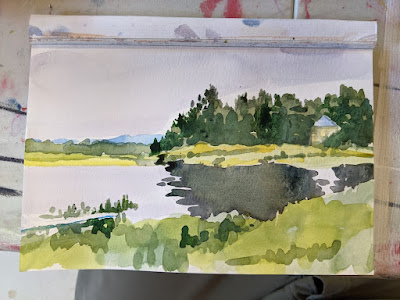
Sometimes all you have time for is a quick watercolor doodle, but that’s better than nothing.

It’s easy to forget I’m a painter when I’m up to my elbows in minutiae, but it has to be done. Still, so does painting or I’ve lost my raison d’etre.

After I talked to Ken, I gave myself a good shake and went into my studio, where I spent 15 minutes with my watercolors, doing a quick-and dirty-sketch for 45 Day Triple Watercolor Challenge. That’s a Facebook group my students started last year to get us out of the doldrums. If I don’t need it right now, who does?

What is essential?

That’s a question that operates on both the technical and the spiritual planes.

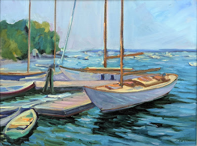
Beautiful Dream, oil on canvasboard, 12X16, $1449 framed.

Tom Root recently attempted to make a pithy saying about simplification. “It’s not simplification, it’s essentialization,” he wrote. While that’s unlikely to be printed on tee-shirts, it does get to the nub of the matter.

When I told him I wanted to share his quote with my students, he elaborated that he was riffing on a quote from the teacher and painter Henry Hensche: “I have never liked the word simplify, because it makes people think simplistically, there is nothing simple about what we are trying to do, I prefer ‘to eliminate all but the essential,’ and the essential is achieved by suppressing or eliminating as much detail as possible.”

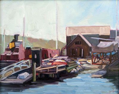
Belfast Harbor, oil on canvasboard, 14X18, $1594 framed.

What is essential in painting? That’s a question that runs on two tracks, the tangible and the intuitive. In tangible terms, we need to look at the classic design elements of art:  color, tone, line, shape, space, and texture. We might call this ‘objective critique,’ since there are standards for each of those elements against which we can measure a painting’s success.

In intuitive terms, we could have asked:

“What do you notice first? Second?”

“Does this evoke a feeling or response in you?”

“What is the point of this work?”

While we might have to work harder to come up with answers to this latter set of questions, they’re equally as important. A work can be technically perfect but pointless.

Skylarking 2, 18X24, oil on linen, $2318 framed.

The idea that both are equally essential is one that comes from western philosophical thought. Traditionally, Christianity understands that there are spiritual and material matters, but it rejects any division between the two. That’s Dualism. It’s always treated as heresy, and for good reason. It inevitably elevates one side of creation and devalues its counterpart.

When art rejects meaning, or art rejects formal structure, it too elevates one side of its being and devalues the other. That’s how we end up taping bananas to walls or having to look at the impossibly-overloaded kitsch of Thomas Kinkade. What is essential, then, must be a combination of the two.

Penobscot bay overlook, 9X12, linen, unmounted, $250.

That doesn’t mean that you, the artist, have to be able to put into words what is essential about your painting. Visual art and writing operate on two separate tracks, and your ability (or lack thereof) to spin words has nothing to do with your ability to paint.

My students are going to do a 45-day watercolor challenge in the new year, but I also like my pal Peter Yesis’ New Year’s Resolution. He’s going to do a daily sketch every evening. Since drawing is the basis of all painting, he’s definitely on to a good idea.

Simplification—essentialization, as Tom Root called it—is the net result of hours and hours of practice. Perhaps in the New Year, you can commit to a discipline that will get you closer to the essentials in your painting.

Monday Morning Art School: the human face

The best portrait painters drag us into the emotional space of their sitters.

Henry VIII at 49, 1540, Hans Holbein the Younger, courtesy Gallerie Nazionali d’arte antica, Palazzo Barberini, Rome 

My students will be painting self-portraits this week. One of them asked me for a masterpiece to copy. Without hesitation, I recommended the Tennessee painter Tom Root.

My pal Eric Jacobsen calls Tom Root “a national treasure.” His Holiday (Rest on the Flight to Egypt) is one of the few paintings that carries the western tradition of religious painting successfully into the modern era. He’s technically superlative and keyed into the contemporary zeitgeist. Since I want my students to paint in the modern idiom, it’s best that she studies a modern painter.

La Monomane de l’envie (Insane Woman), 1822, Theodore Gericault, courtesy Museum of Fine Arts of Lyon

The best portrait painters drag us into the emotional space of their sitters. That is why we can look at a Renaissance painting and feel that sudden start of connection. This is an absurdly truncated list that misses many masterpieces, but it’s a start for any student who wants to study portraiture.

Albrecht Dürer’s Self-Portrait at Twenty-Eight could be subtitled, “Look at me and my glorious hair.” Dürer chose to present himself with the iconography usually reserved for Christ, but he’s not saying he’s a god. Rather, he’s telling us that all followers of Jesus are imitators of Christ, and that his own talents are God-given.

How very different is the lesson in Bronzino’s Portrait of a Young Man with a Book. Bronzino was a Medici court painter, and his portraits are all assured, stylish and reserved. This haughtiness reflects the rarified atmosphere in which he worked, but he still reveals the underlying vanity of youth in this young scholar whose name is lost to time.

The Jester Don Diego de Acedo, c. 1644, Diego VelĂĄzquez, courtesy Museo del Prado

Jan van Eyck is known to most of us for the Arnolfini Portrait, truly one of the most beautiful and enigmatic paintings ever made. Its complex iconography, perspective and rare attention to detail are absolutely clear, and yet we have no idea what the painting actually means.

In his day, he was best known for history painting, but the French romantic Theodore Gericault was a sensitive portraitist. He painted a series of ten portraits of the insane, on the encouragement of Dr. Ă‰tienne-Jean Georget, a pioneer in psychiatry. His best portraits are the inverse of Bronzino’s—humble, sensitive and honest.

Hans Holbein‘s art is superlatively realistic, and he was able to capture likenesses with rare facility. He had a penetrating understanding of character, and combined technical skill with allusion and symbolism. He must have been a skilled courtier himself, to have survived the intrigues of the English court as well as he did.

The Daughters of Edward Darley Boit, 1882, John Singer Sargent, courtesy Museum of Fine Arts, Boston

Sir Anthony van Dyck was a Flemish Baroque artist who became the next great English court painter. He was a favorite of Charles I, and for good reasons: his keen observation, the liveliness of his depictions, and his ability to portray that most elusive of characteristics, majesty.

No list of portrait painters would be complete without Diego Velázquez. Hired to paint popes and princes, his affinity was to the court dwarves and jesters who were kept as enslaved human pets. That doesn’t mean he didn’t understand his regal subjects; his portrait of Pope Innocent X is the penetrating gaze of an ambitious and self-satisfied man.

Rembrandt is considered the greatest painter of the Dutch Golden Age. He was prolific in many genres, but particularly as a student of the human face—especially his own, which he used as a map of the human condition. His Self-Portrait with Beret and Turned-Up Collar is a masterly disquisition on the subject of aging. With age comes wisdom—and sagging jowls.

And then there’s John Singer Sargent, whose motto had to be “Give the people what they want.” He captured the incredible wealth of the Gilded Age, but it’s never clear that he likes his models. In many cases, he reduces them to mannikins, but in The Daughters of Edward Darley Boit, he makes a poignant statement about the role of women and girls in society. The girls recede into space in order of age, with the eldest (Florence, age 14) almost enveloped in the darkness of the drawing room.

Monday Morning Art School: color harmony

Color harmony is not just a question of placing or finding objects that look good together; it means using those colors within your painting to build a great composition.

Rachel Carson Wildlife Refuge, by Carol L. Douglas

Nearly all beginning painters focus primarily on matching local color. That’s an important skill, but it is just a bare beginning. To make paintings sing, one must think carefully about color schemes. Sometimes a subject can achieve color harmony naturally, but most of the time we need to think through our color choices and placement.

In painting, local color means the natural color of an object, unmodified by lighting. Leafy trees are green, for example. But there are circumstances where they can appear black (at sunset, for example), golden or even orange. There are other circumstances in which, for compositional purposes, it is better to paint them blue or lavender. The rookie error is to persist in what we know—that trees are green—instead of what we see or would be more visually appealing.

Self portrait, by Tom Root. Courtesy of the artist.

Colin Page is a master of color harmony; I encourage you to study his work. Above is another excellent example, a recent self-portrait by artist and teacher Tom Root. He’s a fabulous portrait painter; I’d take a workshop from him.

I could go on and on about the virtues of this painting, which are legion. For now, I’ll talk about his color use.

Isolated colors from Tom Root’s painting, above.

The background and shirt are tied together in a tight arrangement of blues and greens. The face and jacket, meanwhile, are equally tightly-grouped. Photoshop allows me to check the inverse of any color. The blue-greens and flesh tones are almost exact complements, making this a classic complementary color scheme. These complements are arranged in a pleasing, slightly asymmetrical triangle. Tom’s drawing, in a blue-violet, stands outside this color scheme, giving it great impact.

Monochrome reduction of the painting above.

Tom uses hue as much as value to model. (If you need a refresher on what this means, see here.) That gives his painting a solid contemporary feel. But that doesn’t mean he uses no value. In fact, if you look at the monochrome reduction of the painting, you’ll see a beautiful sweep of darks from the bottom left to the upper right. That creates contrast to drive our eye to the most important part of his painting: the face.

I didn’t ask Tom how he arrived at this color scheme; by the time you’re at his level of expertise it’s intuitive anyway. But it doesn’t start off that way. To master color harmonies, you must spend a great deal of time thinking about color and practicing it.

All color schemes rest in the standard 12-color wheel that’s been kicking around for centuries. I’m a fan of the Quiller Wheel because it’s based on paint pigments, but you can just as easily make your own. That gives you the advantage of understanding the paints you’re actually using. (Many store-bought wheels are overloaded with useless information, making them more trouble than they’re worth.)

Tinfoil hat, by Carol L. Douglas. The color scheme shouldn’t be primarily about the objects, but about how you use the colors in your painting.

Here’s a link that gives you a complete description of the classic color harmonies, but let’s review them here:

Complementary

These are colors that lie opposite each other on the color wheel. The most famous example is Christmas’ red and green.

Analogous

Analogous color schemes use colors that lie next to each other on the color wheel. Using analogous colors can make what might be a garish scene (a sunset, for example) more serene.

Peppers, by Carol L. Douglas. Every once in a while I paint something very realistic, just to remind myself that I know how.

Equilateral Triad

This uses colors that are evenly spaced on the color wheel. The most well-known example is the primary combination of red-blue-yellow.

Harmonic triads

This variation counts 3-4-5 in either direction on the color wheel. Start with a key color, and count from there. This is a sophisticated variation on the equilateral triad.

Split-Complementary

This is a variation of complementary colors. It either substitutes for the complement or includes the complement’s adjacent hues.

Double complements

The rectangle or tetradic color scheme uses four colors arranged into two complementary pairs. The colors can be in a rectangle or in a square.

As nice as that information is, color cannot be learned from reading, but only through trial and error. Your assignment this week is to set up a small still life in one of these color schemes and paint it, paying careful attention to how the lighting unifies the scene.  Remember, it’s not just a question of placing objects in a pleasing array; it’s a question of using colors within your painting to make a great composition.

This post originally appeared on May, 4 2020.

The Zeitgeist

We’re all saying something with our paintings. Do we have the courage to buck the times and paint reverence, happiness, and kindness?

American Eagle in Drydock, 12X16, oil on canvasboard, sold. I’ll be down at the boatyard this morning to paint Heritage on the ways.

This month’s discussion of the picture plane in painting inevitably ended up including Philip Pearlstein, who wrote:

“Photographs do not break the picture plane, and so they parallel one of the great dictums of 20th century modernist art, which is that form follows function. The paper is flat, that is, the picture plane is flat, therefore the artist must keep his picture flat. Therefore the photograph is accepted as modernist art. Therefore one of my aims in painting is to break the picture plane.”

Striping, 6X8, oil on canvasboard, $435 framed.

By which—practically speaking—he let heads, arms, etc. escape out of the picture, in much the same way as a child takes a snapshot.

“I was strictly interested in the way ordinary people looked.  And that became part of the kind of philosophy in a sense, to paint the ordinary, the everyday, not to go out of my way to make them tell some kind of story,” he saidin 2006.

Pearlstein is a lauded American painter, on the forefront of modern realism, and he deserves credit for that. But I cannot look at his huge canvases of naked people and not wince. They’re technically admirable, and yet they’re so unlikeable. Human beings, he seems to say, are just so much meat spread around the room. That’s especially true in canvases with more than one figure, pointedly not engaging with each other even when they’re buck naked in a small space. When their heads are cut off, their character, emotion and dignity are rendered inconsequential. We humans interact mostly through our faces, after all.

Captain Doug Lee (chasing the rats), 6X8, oil on canvasboard, $435 framed.

That is, of course, the Zeitgeist, the spirit of our age, so Pearlstein gets full marks for relevance. The German Romantics who coined that phrase had some strange ideas, and they were talking of a literal, invisible force that shaped the time and place. Today we think of it as our common ethos, but either way, we’ve been living in a demeaning culture for decades now.

I don’t watch TV, but my goddaughter tells me that the heroes of modern television are sarcastic and cynical. “Nasty” is the word she used. Certainly, you see that in our so-called leaders, and it’s in full bloom in popular music.

I occasionally reference the painter Tom Root, who my pal Eric Jacobsen calls “a national treasure.” His Holiday (Rest on the Flight to Egypt) is one of the few paintings that carries the western tradition of religious painting successfully into the modern era. Technically, he’s superlative—far more assured, in fact, than Pearlstein. And yet he labors in far greater obscurity than does Pearlstein, with all his honors.

Rising Tide at Wadsworth Cove, 12X16, oil on canvasboard, $1159 unframed.

Root paints the dignity of the human being, and that’s just contrary to the spirit of our age. Not that he can help it; he can no more embrace nihilism than I can. But it raises the question of how much we conform to our times, and why. People do that, of course, for reasons other than fame or fortune.

I don’t suggest that people should steer away from difficult subjects in paint. I spent several years painting on the subject of misogyny. They’ll be at the Rye Arts Center in 2022, by the way.

We’re not mere products of our times, we also shape them. The painter may hide behind the non-verbal nature of our art to deny responsibility for the culture, but we’re all saying something with our paintings. Do we have the courage to buck the times and paint reverence, happiness, and kindness?

Monday Morning Art School: the silhouette

Want to paint like John Singer Sargent? Start by learning to draw like him.

Singer with a Glove, 1878, pastel, Edgar Degas, courtesy Fogg Museum

In Edgar Degas’ Singer with a Glove, above, the model’s hand has no volumetric form. There is almost no shading in that hand, merely a silhouette. Yet our minds can immediately decode the image. We understand it because of its context and the accuracy of its drafting. It’s a silhouette of a hand, and it illustrates an important point in painting. The accuracy of drawing matters.

In this painting—so remarkable in many ways—there is, in fact, a carefully-plotted harmony of silhouettes. There are the dark outlines of her cuff and bodice, the inverted triangle of her torso, and the long stripes of color in the background. In fact, very little of this painting relies on modeling; most of it is a series of shapes. Volume is secondary to that dazzling array of shapes and color.

The Valpinçon Bather, 1808, Jean-Auguste-Dominique Ingres, courtesy the Louvre

I used this painting as an example because it’s overwhelmingly obvious. However, in the context of painting, silhouette does not mean a solid shape of black. It means the major shape(s) within a painting. In Ingres’ The Valpinçon Bather, above, the body is the silhouette—solid and tangible. You could almost cut it out with scissors and paste it in a book.

To lead with silhouette, the artist must get the line as perfect as possible from the beginning. That means drawing a proper line, with all its jots and tittles. Want to paint like John Singer Sargent? Start by learning to draw like him.

W. B. Yeats, charcoal on paper, 1908, John Singer Sargent, Private collection.

The two ideas—volume and silhouette—are the fundamental elements of painting. The silhouette is simply the outer contour of the modeled shape. If you draw it perfectly, you can suggest the form with minimal modelling. But it’s through modeling that the form becomes expressive and we have a sense of reality.

In general, artists choose to emphasize either volume or silhouette, but they both exist in most paintings. You can see that co-existence quite clearly in Bruegel’s Peasant Wedding, below. It’s a positive cornucopia of dazzling shapes. Still, the faces are fully formed and evocative, and the figures have volume.

The Peasant Wedding, 1566-69, Pieter Bruegel the Elder, courtesy Kunsthistorisches Museum

It’s tempting to think of silhouette as intellectual and volume as intuitive, because in practical painting, that’s often how they progress. We work from big shapes down to little shapes (‘modeling’) and as we progress, we’re drawing more and more from our non-intellectual reserves.

This post was drawn from a long Facebook discussion between artist Tom Root and his friends. Thanks, Tom!

Hard-earned ease

It’s a paradox: we achieve looseness by mastering the small, precise details of our craft.

Tom Sawyer’s Fence, oil on canvas, Carol L. Douglas

Painting students often express the desire to paint more loosely. That’s not easy to attain. Painter Tom Root described it best when he called it “hard-earned ease,” likening it to a ballet dancer with bloody feet.

It’s paradoxical, but dancers achieve grace and fluidity by practicing a bone-aching number of precise movements. It’s the same in painting: we achieve lyricism by mastering the small details of our craft.

That starts with drawing. It’s shocking how many people try to be painters without mastering this basic skill, and how many teachers let them get away with it. Drawing is the basic reverse-engineering process of art. It’s how we analyze an object before we rebuild it on canvas.

Clouds over Whiteface, oil on canvasboard, Carol L. Douglas

You can’t develop fluid style if you can’t draw. You will flail around, guessing where things are, and then overstating everything with excessive, tight brushwork. You won’t be able to express depth or distance if you haven’t explored where depth and distance start and stop.

Conversely, if you take the time to learn to draw, your painting has room to be looser. In my class on Tuesday, a student drew a complex Anasazi pot with astounding fidelity. She was able to put the pot down in a few brushstrokes because she’d already done the hard business of figuring it out with her pencil.

Best Buds, oil on canvasboard, Carol L. Douglas

Drawing is actually easy. It doesn’t require ‘talent’; it’s for the most part a mechanical measuring process. There are many good books on the subject, and I’ve also gone into it extensively; just go to the search box to the right on this blog and type in “how to draw.” The investment is minimal; a mixed-media Strathmore Visual Journal is around $5 at our local job lots store. Use any #2 pencil with an eraser. Anything else is just refinement.

The second requirement for fluidity is process. For some reason, the arts have a reputation for attracting non-conformists, but I don’t know a single successful painter who doesn’t repeat a process with every painting. These have variations, but the components—at least in painting—are nothing new. The basic order of operations has been set in stone for centuries; only the materials get updated.

Bracken Fern, oil on canvasboard, Carol L. Douglas

If you want to find your true authentic voice, start by mastering the process. For most of us, the easiest way to do this is with a teacher, but there are fine videos and books out there as well. Practice your process so many times that it becomes second nature. Then—and only then—you will find your own, loose brushwork emerging.

Notice that I said nothing about style. It’s important, but elusive. It emerges when one has done the grunt work of developing good technique. Don’t try to pin it down too early, or you’ll box yourself into something you can’t grow past.

I’m off to Tallahassee on Sunday to teach my last workshop of the season. Next year’s dates (so far) are now on my website. Here’s hoping that 2021 is a better year for all of us!

Monday Morning Art School: color harmony

Color harmony is not just a question of placing or finding objects that look good together; it means using those colors within your painting to build a great composition.

Rachel Carson Wildlife Refuge, by Carol L. Douglas
Nearly all beginning painters focus primarily on matching local color. That’s an important skill, but it is just a bare beginning. To make paintings sing, one must think carefully about color schemes. Sometimes a subject can achieve color harmony naturally, but most of the time we need to think through our color choices and placement.
In painting, local color means the natural color of an object, unmodified by lighting. Leafy trees are green, for example. But there are circumstances where they can appear black (at sunset, for example), golden or even orange. There are other circumstances in which, for compositional purposes, it is better to paint them blue or lavender. The rookie error is to persist in what we know—that trees are green—instead of what we see or would be more visually appealing.
Self portrait, by Tom Root. Courtesy of the artist.
Colin Pageis a master of color harmony; I encourage you to study his work. Above is another excellent example, a recent self-portrait by artist and teacher Tom Root. He’s a fabulous portrait painter; I’d take a workshop from him, if we ever get to take workshops again.

I could go on and on about the virtues of this painting, which are legion. For now, I’ll talk about his color use.

Isolated colors from Tom Root’s painting, above.
The background and shirt are tied together in a tight arrangement of blues and greens. The face and jacket, meanwhile, are equally tightly-grouped. Photoshop allows me to check the inverse of any color. The blue-greens and flesh tones are almost exact complements, making this a classic complementary color scheme. These complements are arranged in a pleasing, slightly asymmetrical triangle. Tom’s drawing, in a blue-violet, stands outside this color scheme, giving it great impact.
Monochrome reduction of Tom Root’s painting above.
Tom uses hue as much as value to model. (If you need a refresher on what this means, see here.) That gives his painting a solid contemporary feel. But that doesn’t mean he uses no value. In fact, if you look at the monochrome reduction of the painting, you’ll see a beautiful sweep of darks from the bottom left to the upper right. That creates contrast to drive our eye to the most important part of his painting: the face.
I didn’t ask Tom how he arrived at this color scheme; By the time you’re at his level of expertise it’s intuitive. But it doesn’t start off that way. To master color harmonies, you must spend a great deal of time thinking about color and practicing it.
All color schemes rest in the standard 12-color wheel that’s been kicking around for centuries. I’m a fan of the Quiller Wheel because it’s based on paint pigments, but you can just as easily make your own. That gives you the advantage of understanding the paints you’re actually using. (Many store-bought wheels are overloaded with useless information, making them more trouble than they’re worth.)
Tinfoil hat, by Carol L. Douglas. Remember, the color scheme shouldn’t be primarily about the objects, but about how you use the colors in your painting.
Here’s a linkthat gives you a complete description of the classic color harmonies, but let’s review them here:
Complementary
These are colors that lie opposite each other on the color wheel. The most famous example is Christmas’ red and green.
Analogous
Analogous color schemes use colors that lie next to each other on the color wheel. Using analogous colors can make what might be a garish scene (a sunset, for example) more serene.
Peppers, by Carol L. Douglas. Every once in a while I paint something very realistic, just to remind myself that I know how.
Equilateral Triad
This uses colors that are evenly spaced on the color wheel. The most well-known example is the primary combination of red-blue-yellow.

Harmonic triads

This variation counts 3-4-5 in either direction on the color wheel. Start with a key color, and count from there. This is a sophisticated variation on the equilateral triad.

Split-Complementary

This is a variation of complementary colors. It either substitutes for the complement or includes the complement’s adjacent hues.

Double complements

The rectangle or tetradic color scheme uses four colors arranged into two complementary pairs. The colors can be in a rectangle or in a square.
As nice as that information is, color cannot be learned from reading, but only through trial and error. Your assignment this week is to set up a small still life in one of these color schemes and paint it, paying careful attention to how the lighting unifies the scene.  Remember, it’s not just a question of placing objects in a pleasing array; it’s a question of using colors within your painting to make a great composition.

God save the Queen

One may be the Queen of England, the other a cleaner, but they’re both ladies of a certain age.
Ena, by Ruskin Spear, available through Chris Beetles Gallery.

Tom Root is a portrait artist I know only from Facebook. He—like many other artists—occasionally uses Facebook to post paintings that catch his eye. This is how I first saw postwar Briton Ruskin Spear’swork.

While Spear painted many typical portrait commissions of public figures great and small, he was attracted to the simplicity of ordinary people in ordinary dress. Ena, above, is a bustling little woman who appears ready to jump off the canvas and get back to work. Spear concentrated his modeling on her strong, stout arms, but the central motif is her formidable English handbag.
Spear had a thing for cats, which he painted being coddled and on their own doing kitty things. Wheelchair-bound due to childhood polio, he would have presented an inviting lap for felines. It’s clear he returned the affection.
Sleeping Cat, by Ruskin Spears, courtesy Somerset Museums Service.

Queen Elizabeth II recently unveiled a new portrait by Benjamin Sullivanfor the 100th anniversary of the Royal Air Force Club. The Queen has been photographed and painted countless times, by personages as varied as Cecil Beeton, Andy Warhol, and Lucien Freud. The only one I have truly loved was her 2008 portrait by Annie Leibovitz. Most of the others have been either colorless or nasty. She deserves better.
Portrait of Queen Elizabeth II by Benjamin Sullivan, courtesy of the Royal Air Force Club.
Sullivan’s portrait is lovely, and not just for the ubiquitous Launer handbag at her feet. The painting is sympathetic, yet honest about her advanced age, which is visible in the slight swelling of her ankles, her lined face, and those beautifully folded hands. Moreover, it captures her steadfast tenacity, the trait that’s made her Britain’s longest-living monarch.
“It’s where she put it, and I thought I could take it out,” Sullivan said of the purse, “[B]ut then I thought—actually it’s quite a nice thing, a personal thing.” It’s really more than that: it’s her staff of office and her own personal seal. It is her sisterhood with Spear’s Ena. They were worlds apart socially, but they are also two redoubtable women from Britain’s finest hour. God save the Queen.
Postscript: Last night I got home to a note from an artist demanding that I take down her work immediately. The post was old, from a time when it was difficult to link to the artist’s website (because they didn’t have them). Still, there was nothing illegal in my use of the images. I thought about writing back and explaining the Fair Use Exemption to American copyright law. However, that wasn’t her biggest problem.
Most artists are overjoyed to get good reviews. Either she doesn’t understand the value of publicity or hadn’t taken time to read the piece. Unfortunately, in the ensuing years, I’d lost my taste for her work. It’s gone now, the first post I’ve ever deleted at the request of an artist who objected to free publicity.