fbpx

Monday Morning Art School: applying to a plein air event

Judging art is very subjective. You canā€™t take the results personally, or the process will chew you up.
Tom Sawyer’s Fence, by Carol L. Douglas

This weekend, a reader asked for help in choosing slides to apply to her first plein air event. She recognizes that her favorites might not be a jurorā€™s favorites. Every artist feels like he or she could be better at this, including me. Iā€™ll share what Iā€™ve observed, but Iā€™d welcome your input.

Apply for shows that match your level of experience. Think of these events like applying to college: there are dream, target and safety schools. Later on, you can throw money away applying to dream schools, but for your first event, a safety or target school is a smarter choice. How can you tell what level the event is geared to? Look at the prize money. The bigger the prize money, the fiercer the competition to get in.
Look at last yearā€™s participants. Are they painting at a level you feel comfortable challenging? If not, find a different event to start with. There are many of them out there, and youā€™ll have a much better experience if youā€™re not thrown at the first hurdle.
Parrsboro Sunrise won a prize but I can’t seem to make it photograph well.
Take good photos of your work. One of my best paintings from 2018 wonā€™t be in my submissions because I donā€™t have a decent photo of itā€”it was gone before I got a color-balanced picture. Itā€™s very difficult to take a good photo of a very wet oil painting in the back of your car, but try your best. The photo should meet the minimum pixel requirements of  the application. If all you have is a low-res cell phone photo, send something else.
I did a few paintings in 2018 on very smooth boards, just to experiment. One of them won a prize at PIPAF, so the board has nothing to apologize for, but it has no tooth. That meant that my paintings have little impasto, and that in turn makes them look out-of-focus in photos. Itā€™s maddening, because theyā€™re beautiful in life, just not so nice in the digital world.
Jonathan Submarining apparently made me happier than it made anyone else (except Jonathan’s grandmother, who bought the painting).
Ask a trusted friend to look over your submissions. I have a painting from a few years ago that I adore, Jonathan Submarining. It was of a bunch of kids in a sailing lesson on a riotous day, and it was painted very fast, standing in the tide, with a fierce wind threatening to knock over my easel. But nobody scanning hundreds of photos will ever know what was involved in getting that painting right.
It took a disinterested friend to point that out to me. Sometimes, weā€™re the worst judges of our own work. We see the struggle instead of the finished product.
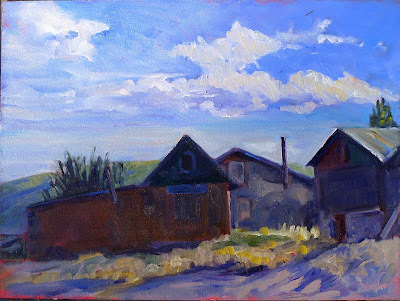
Santa Fe Sunset, by Carol L. Douglas.
Look at your work as thumbnails first. If a juror has a hundred applicants and has to look at five slides each, that may be all they ever see of your workā€”unless something about it really stands out to them.
Familiarize yourself with the entry juror, if that information is public. Iā€™m not saying you should paint like him, but you ought to understand whatā€™s important in his work. If every painting he does is carefully drafted and includes buildings and canyon walls, donā€™t send three structure-free marsh paintings and expect to be his favorite. If heā€™s a luminist, heā€™ll respond to light, and if heā€™s a brilliant compositor, heā€™ll respond to design.
Even so, I think itā€™s a mistake to pitch too closely to the entry juror. A lot of shows donā€™t identify the entry juror at all. Some use a committee. In any case, try to mix it up. If you can handle radically different subjects well, you demonstrate your versatility and your drawing chops.
Best Buds is a favorite from my 2018 season. While it was within the parameters of the show it was done in, it wasn’t actually done outdoors, so I won’t be using it for my slides.
Consider the order of your images. Online jurying systems allow you to define the order in which slides are viewed. If the entry juror is looking at your slides in sets, heā€™s going to read them left to right, just as he reads text. Make the first and last images particularly compellingā€”the first one to catch his interest and the last one so youā€™re remembered.
For heavenā€™s sake, donā€™t cheat. There are all kinds of carefully formulated ā€˜rulesā€™ about what constitutes plein air, and most of them are hot air. But if you didnā€™t do the painting outdoors, on location, donā€™t include it among your slides.
Donā€™t feel bad if you donā€™t get in, even if youā€™re a much better painter than some of the people who did. There are often factors involved in jurying that you donā€™t know about, such as a need to have more watercolorists, or geographical representation. Or, the juror just woke up hating sunsets that morning. Judging art is a very subjective experience and you canā€™t take the results personally, or the process will chew you up.

What should I paint?

Getting past the iconic into the intimate means working out what you love about a place.

Apple tree with swing, by Carol L. Douglas

In 2013, I spent a few hours ambling around Castine with my friend Berna. I havenā€™t spent much time on foot there since. Iā€™m always too busy.
This year, I managed to separate myself from my car keys. While I waited for my husband to drive up from Rockport, I took a quiet walk around town. I poked my nose into places Iā€™ve never investigated.
Flood tide, by Carol L. Douglas
Things look different on foot. A marine creature broke the surface behind the Perkins House. The sweet tones of a flute drew me to a gate Iā€™d never noticed before. The sea sparkled through the garden below.
I had time to ponder Castineā€™s Post Office. Established in 1794 and in the same building since 1833, itā€™s one of the nationā€™s oldest. Itā€™s painted in the bilious yellow-and-rose-brown color scheme that was traditional before New England clapboard turned white. Iā€™ve seen it many times, but never noticed the wooden baskets carved on each corner.
High tide, by Carol L. Douglas
Nor had I ever noted that the fine yellow Georgian on Main Street has brick side walls and a clapboard front. Thatā€™s the reverse of the usual pattern, so itā€™s a curiosity.
At breakfast, Harry and Berna and I pondered another question. If 40 artists each produced six paintings a year for five years, weā€™ve done 1200 paintings. Castineā€™s year-round population is 1,366. Weā€™re close to a painting per person.
AM from Jim’s deck, by Carol L. Douglas
My math, of course, is absurd. There havenā€™t always been 40 artists; we donā€™t always finish six paintings; many non-residents attend the show. But we have certainly painted Castineā€™s icons many times.
This presents both a problem and an opportunity. The problem can only be solved in one of two ways: either go farther abroad or dig deeper. This year, I painted two works off-the-neck, on properties overlooking the Bagaduce River.
Penobscot Early Morning, by Carol L. Douglas
Opportunity lies in going deeper. I started to notice apple trees. They were everywhere: leaning over an old stone wall, curving over a picket fence, in lawns, straggling along Battle Avenue. They are as much a part of our history as Castineā€™s fine old churches and houses.
The roots of plein airpainting include the 18th century equivalent of picture postcards. Itā€™s easy to fall into that trap, but itā€™s no longer necessary. 

Adams School, by Carol L. Douglas
Paul CĆ©zanne famously painted Mont Sainte-Victoire over and over, using it as a template on which to work through ideas. There is much to be learned from getting past the iconic into the intimate, and working out what you truly love about a place.

How to choose a view

Writers are told to write about what they know. What should artists depict?
The Red Truck, by Carol L. Douglas
Yesterday I stopped to sit for a few minutes on a stone wall in Rockport. In my solitude, I noticed the beautiful asymmetry of the house across the street. Its white clapboard and modest door were framed by dark spruces and a dandelion-studded lawn.
Most people zip down this street with no more than a passing glance at the historic homes and the harbor below. Yet there are many quietly memorable moments: a brook burbling over granite, ancient gnarled beeches, sunlight glancing off cedar shakes. The only way to see them is to get out of the car and walk.

ā€œYes, well, views are very nice, Hastings. But they should be painted for us so that we can study them in the warmth and comfort of our own homes. That is why we pay the artist for exposing himself to these conditions on our behalf.ā€ (Poirot: The Adventure Of The Clapham Cook)

Drying Sails, by Carol L. Douglas.

 ā€œHow and why do you choose the views you paint?ā€ a reader asked. The answer depends, in part, on why Iā€™m painting. If Iā€™m in a plein air event or on the road, the views I choose will tend to be more iconic. Here in mid-coast Maine, I have the luxury of intimacy.

Anything can be the subject of a painting. That doesnā€™t mean content is unimportant. I paint what matters to me: boats, rocks, water, skies, earth and trees. This was never a conscious choice, but the impulse is so strong that it drove me from Western New York to Maine.
Keuka Lake, by Carol L. Douglas
I donā€™t think you can force this choice. Most artists experiment with subject matter before finding their mĆ©tier. Piet Mondrianā€™s windmills and Vincent Van Goghā€™s dark peasant studies are two examples.
Composition must drive any painting. In Rochester last week, a student showed me her first design, of a row of peonies marching at a diagonal across her page. I suggested she move 90Ā° to catch the slight S-curve in the row. The difference was staggering.
Castine Lunch Break, by Carol L. Douglas
Closely tied to this is the question of light. Sunlight is the major organizing principle in landscape painting, but we canā€™t always order it up. In todayā€™s drear, Iā€™m going to suggest to my plein air class that we concentrate on close-ups rather than vistas. The architecture of objects can partly cover for the absence of light.
ā€œThere are no lines in nature, only areas of colour, one against another,ā€ Edouard Manet said. The northeast is overwhelmingly cool in color: blue or grey skies against similar seas and green foliage. I look for color patterns within that, particularly those with a flash of warmth: the orange line in the seaweed, the pink of granite, a yellow glint in the sky. After light, color patterns are paramount.
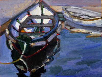
Dinghy, Camden Harbor, by Carol L. Douglas
I also think about meaning. This is old-fashioned, but I donā€™t see the point of painting if my work says nothing. I hope that my paintings speak about the relationship of man to his environment, about the enduring qualities of the earth, and about simple joy.
Rocks at the American Yacht Club,by Carol L. Douglas.
Addendum: if youā€™re a landscape photographer, you might be interested in this contest sponsored by Machias Savings Bank.