fbpx

The mysterious perfection of watercolor

It can be either deliciously finicky, or wildly out of control. Or, in a perfect world, both.

St. Elias Mountains, Yukon Territory, by Carol L. Douglas. Think you can’t paint from a boat? This was done from the passenger seat of a car. 

Yesterday I got an e-blog that read, ā€œWant looser watercolors? Pour your paint.ā€ Well, I like pitching, throwing and otherwise making a mess with watercolors, so I opened it in great anticipation. What it was really talking about was drawing a meticulous cartoon, blocking off the light areas with masking fluid, and then setting the darks with a wallowing, graduated wash that gets a little bit psychedelic by virtue of watercolorā€™s great sedimentation qualities.
Thatā€™s a beautiful technique, but nothing that starts with masking fluid can be described as loose. We can’t use these shadowy washes in field painting, unless weā€™re willing to hang around all day reblocking paper and waiting for it to dry.
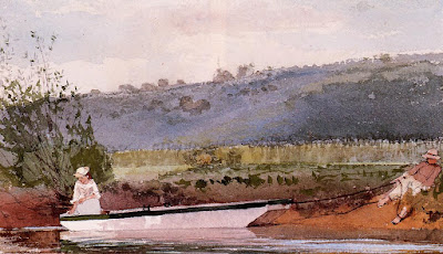
A field sketch of Houghton Farm (New York) by Winslow Homer.
Watercolor is a curious medium. Itā€™s quite capable of the ultimate control, as in Albrecht DĆ¼rerā€™s Large Piece of Turf, 1503. Itā€™s equally capable of insouciance, as in Maurice Prendergastā€™suntitled seascape, below. You can go anywhere you want with it.
Untitled seascape by Maurice Prendergast.
Frank Costantino is a painter who manages to pull off meticulous renderings in watercolor in plein air events. Frankā€™s drawings are spot-on and his framing is clever. On the other end of the spectrum is Elissa Gore, whose field sketches always burble in the style of Ludwig Bemelmans.
You know my pal Poppy Balser, who shares my adoration of boats, the sea, and color. Although sheā€™s primarily an oil painter, Mary Byrom does lots of sketching in watercolor.
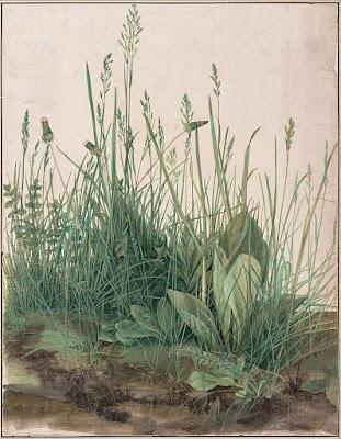
Large Piece of Turf, 1503, Albrecht DĆ¼rer. 
There hangs the moral of my tale. Every one of these painters works in more than one mediumā€”in Frankā€™s case, watercolor and colored pencil, in the rest of them, watercolor and oils. Thatā€™s true of me, too.
I first learned to paint in watercolor. That was standard procedure in the mid-century, when no right-minded teacher was going to hand a kid a box of toxic chemicals and tell her to go to town. It’s a private possession for when I travel or when Iā€™m thinking. I never sell my watercolors, and I don’t intend for them to be shown. Watercolor, for me, is deeply personal.
Preparatory sketch of Marshall Point, by Carol L. Douglas.
But itā€™s also the perfect travel medium, which is why I took it to Australia and to London and plan to bring it along to Alabama, Louisiana and Mississippi in March. When itā€™s just you, your suitcase and a Prius, you want to travel light.
All of this has been much on my mind recently as Iā€™ve debated the best sketchbooks to buy for my Age of Sail workshop on the American Eagle, in June. Iā€™ve tried many myself. As with everything else, each one has its plusses and minuses. One friend suggested that I cut down sheets of paper and make my own, but I want every student to have a takeaway book with a nice binding.
I plan to have students working in both gouache and watercolor. I need to find the right paper for both. So every time a friend posts a new work in a sketchbook I query him or her relentlessly on the materials. And Iā€™m narrowing it down, slowly but surely.
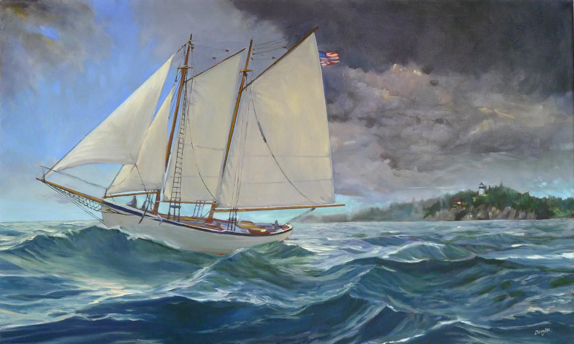
Old subject, new technology

Yesterday I went all digital on a schooner. Allowing for the learning curve, this has potential.

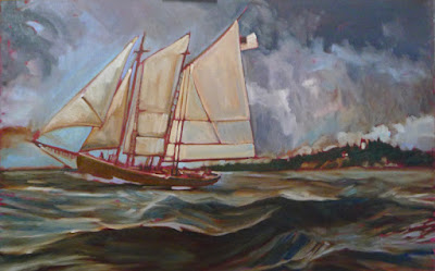
Underpainting of American Eagle passing Owl’s Head, by Carol L Douglas
Iā€™ve toyed for a while with the idea of doing a large, Fitz Henry Lane-influenced scene of the American Eagle under sail. A large canvas of a boat in motion is not something you do en plein air, but the studies Iā€™ve done in harbor certainly influence it.
A student recently asked me if I like painting ā€˜just water.ā€™ I do, indeed, because to me thereā€™s no such thing as ā€˜just water.ā€™ Thereā€™s light, reflection, movement, the skipping of the wind, clouds, and promise. I showed him the wave study I did while cruising on the American Eagle last spring. That is the closest I get to a purely personal painting, one that has meaning for me and nobody else.
This field study of waves from last summer was the genesis of the painting above.
It was also the genesis of this larger idea. What better landform to use as a background than Owlā€™s Head, which sits just outside Rockland harbor, and where I paint many times every season?
When enlarging a sketch to a final composition, I generally use gridding, which Iā€™ve explained here.  Itā€™s laborious and time consuming. Itā€™s also extremely accurate and allows you to execute a pretty decent grisaille on the fly, depending on how much time you want to spend.
The horizon has to be straight on a nautical painting, or else the oceans will run dry.
My daughter gave us a cast-off video projector last year. Yesterday I decided to experiment with it. I havenā€™t used projection to enlarge a sketch since the demise of 35mm slides. 
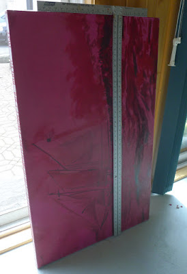
These projectors are designed to shoot an image high on a wall, so they are set up to correct for the keystone effect, which is the distortion you get when you project an image at an angle. Once I managed to undo that correction, squaring the image was relatively easy. Making it exactly the size of my canvas was harder.
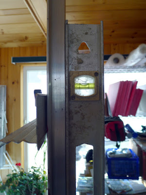
Level and square relentlessly.
I started with relentless leveling and squaring. The easel was perpendicular to the floor, the canvas leveled, the two lower corners the exact same distance to the projector. Even with all those preparations, the image was slightly canted. Fixing that took a lot of fussing.
From there, it was just a question of tracing the lines in the original sketch. However, my ability to see differences in value was vastly reduced.
I couldn’t see values but it was a neat optical effect.
Lest you think tracing is the answer to all your drawing problems, itā€™s still possible to make drafting errors. Note the slight sag in the bowsprit. Iā€™ll fix that in the next iteration.
With all my fussing, I was able to finish underpainting this 30X48 canvas in a single day. Thereā€™s promise there.
It’s anemic compared to my usual gridding, but I still think it has potential.
I tell my students to use a combination of ultramarine and burnt sienna for their initial drawing, but in practice I generally use leftover paint for this step. The exact color isnā€™t nearly as important as the value. Yesterday, I chose an old tube of Williamsburg Brown Pink. I donā€™t use this brand because I find the pigment load in the blues to be too low for my style. 
That wasnā€™t true with this color. This morning my whole studio is swimming in a butternut-colored haze. There is brown stain everywhereā€”creeping along the canvas, in my brushes, on my hands, possibly in my hair.