fbpx

Monday Morning Art School: pigment and race

We all know race is an artificial construct, yet we persist in using it anyway. It’s not even skin deep. It doesn’t exist at all.

The Servant, Carol L. Douglas, is on display at the Rye Arts Center for the month of March.

There is nothing that worries me more about the future of our democracy than Daylight Savings Time. It serves no practical purpose and disrupts our sleep schedules twice a year. Yet we can’t seem to get our corporate act in gear and rid of it.

I don’t just say that because I forgot to reset the clock on the coffee-maker last night.

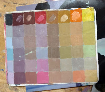
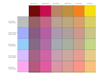
This week I’ll be teaching my classes to mix and use a variety of skin tones. The actual mixing is fairly simple; there’s a complete chart just below that will get you to every color you might need. It’s the application that’s so fascinating and difficult.

There are darker and lighter people, of course; to catch their color, just adjust the amount of white (or water) you use. There are also warmer and cooler skin tones. That’s why my chart has different rows. If your model is more olive, stick with a row that gives you more green tones. If pinker, choose a row that tends in that direction. You don’t need to mix all these colors for each model; it’s just a guide to set you in the right direction.

My original painted chart is ratty and worn but I also included it so you can see what the colors look like in paint rather than Adobe Illustrator.

Natural light hitting the human skin is far more variable than we see indoors. We live (and paint) under artificial light. That narrows the color range dramatically, which is why painting the model under spotlights is poor practice. Photography also narrows the chromatic range of human skin. However, painting from life in natural light is not always possible.

There are greens, purples, and yellows in every person’s skin. The ears, face, fingers and toes all tend to pink; there’s blood closer to the surface. Some of us have visible traceries of blue veins. There are lovely greens and mauves in shadows. In fact, the only difference between my landscape palette and my studio palette is that red always makes an appearance inside.
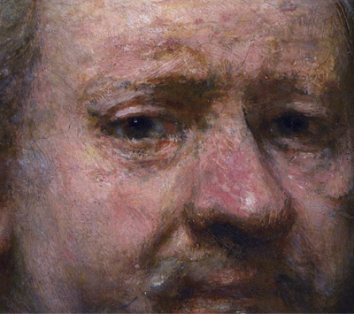
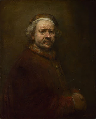
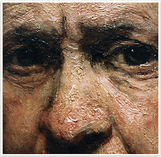
Self-portrait at the age of 63 (detail) Rembrandt van Rijn, 1669, National Portrait Gallery

Rembrandt was a master at capturing these subtle, varying colors in the human skin, as shown in the detail from his last self-portrait, above. He did this with the narrowest of palettes—essentially earth pigments with white. And yet he fools us into seeing a whole range of colors including blues and greens.

Rembrandt also painted Two African Men, below. Unfortunately, its surface is in such bad repair that it’s impossible to see what colors he saw in their skin. However, he would have used the same paints as he used in his own self-portrait. They’re all he had available.
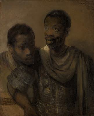
Two African Men, 1661, Rembrandt van Rijn, courtesy Mauritshuis

Our actual skin color is based on just one pigment, melanin. Lighter people just have more blue-white connective tissue and hemoglobin showing through.

We talk of Asians as having ‘yellow’ skin. That’s a modern lie. In the 13th century Travels of Marco Polo, the people of China are described as white. Eighteenth century missionaries also called Japanese and other East Asians white.

The ‘yellow’ label can be laid squarely at the feet of science. The father of modern taxonomy, Carl Linnaeus, first used the label fuscus (dark) to describe the skin color of Asians. Later, he began calling them luridus instead. That translates to ‘pale yellow’, ‘wan’, ‘sallow’, ‘lurid’—with a dash of ‘horrifying’ attached.

The father of comparative anatomy, Johann Friedrich Blumenbach, used the word gilvus, which translates to ‘yellow’. (He’s also the guy who started calling Asians ‘Mongolians’.) By the nineteenth century, westerners were completely sold on the idea that Asians were yellow. Thanks, Science.

The farther down the Italian boot you go, the more you find genetic mixtures with Greeks, North Africans and Middle Easterners. That’s no surprise; the Mediterranean was the original melting pot. Southern Italians and Greeks are often very dark in color. 

It’s no surprise that neither were considered quite white in 19th century America (although they had that designation for naturalization purposes). In fact the largest mass lynching in American history was of Italian-Americans. What’s more peculiar is that some people didn’t consider Irish-Americans white, either.

We all know race is an artificial construct, yet we persist in using it anyway. Paint-mixing shows us that the similarity in our coloration is far greater than the differences. Race isn’t skin-deep; it doesn’t exist at all.
Monday Morning Art School: is that painting finished?

Our hectoring superegos are not always the best judges of painterly quality.

Self Portrait with Disheveled Hair, 1628-29, Rembrandt van Rijn, courtesy Rijksmuseum

In my studio, there are more than a hundred unfinished paintings in drying racks. I’d feel bad about that, except that most plein air artists I know store up unfinished pictures like squirrels store nuts. We say we’re going to work on them during the winter, and sometimes we do. Other times, we just go out and start more paintings.

There is another stack on the other side of my studio. These are paintings I’ve either decided aren’t first rate or that I won’t ever bother to finish. I periodically go through them with the intention of winnowing them down. Often, I’m surprised that they’re actually not bad at all.
Self Portrait at the Age of 63, 1669, Rembrandt van Rijn, courtesy National Gallery, London

“Ah, a procrastinator,” you might say, but you’d be wrong. I’m actually disciplined in my work habits. I’ve just learned to trust my subconscious more than I did as a younger person. Twenty years ago, I thought a painting was finished when it achieved the effect I was striving for. Today a painting is finished when I’m sick of working on it. I’ve learned to be less critical of myself. My hectoring superego is not always the best judge of painterly quality.

The division between brilliantly-raw and plain-unfinished is highly subjective. That line often changes over the course of an artist’s career. Paul Cezanne’s paintings of Mont Sainte-Victoire done in the 1880s are significantly more refined than those done from 1904-6. Rembrandt’s youthful Self Portrait with Disheveled Hair is an amazing exercise in chiaroscuro, but the brushwork is much tighter than his Self-Portrait at the Age of 63 (the year of his death). The changes in Claude Monet’s final paintings are usually blamed on his failing eyesight, but they are also the culmination of a career-long path toward looser, more audacious painting.

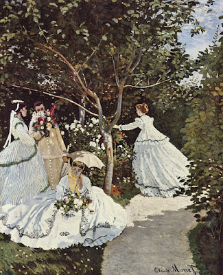
Women in the Garden, 1866–1867, Claude Monet, courtesy MusĂ©e d’Orsay

That is not to say that every artist becomes looser as they age. Grant Wood painted in the same precise style until his death of pancreatic cancer at age 51. Of course, we have no idea how he might have painted had he lived longer. The same is true of Caravaggio, who only made it to 39. On the other hand, Titian, who lived until his late eighties, spent his last years as an impossible perfectionist. He returned to older works and repainted them, fixed up copies made by his students, and kept some paintings in his studio for more than a decade of tweaking—all of which must give art historians the vapors.

The difference lies in what drove these artists in the first place. Cezanne, Rembrandt and Monet were never interested in a high degree of finish, but rather in the effects of paint. The culmination of their efforts was looseness. In contrast, Caravaggio, Titian, and Wood were what we call linear painters, interested in creating the illusion of three-dimensional space through careful modeling. For them to suddenly become interested in dynamic brushwork would have been a complete repudiation of their life’s work.

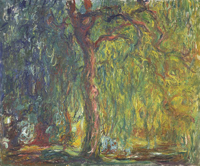
Weeping Willow, 1918–19, Claude Monet, courtesy Kimball Art Museum

One of the cliches of art instruction I particularly hate is, “Not another brushstroke! Don’t overwork it.” Nobody else can tell you positively that your painting is finished, because nobody else knows your intentions. We can engage you in dialog and help you clarify your thinking. But the only legitimate judge of whether you’re done is you, the artist. 

I have found that when I can’t finish a painting, the best thing I can do is to set it aside. Sometimes, my skills aren’t up to the effect I was trying to achieve, and I need to practice. Sometimes I don’t know how to finish it, and I need to think. Sometimes it’s a lousy painting, and it belongs in the reject pile. And sometimes a period of reflection reveals that the painting was, in fact, finished all along.

Monday Morning Art School: brushwork

Mark-making can be loose and gestural or very controlled. It’s personal, but it’s also something you can learn.

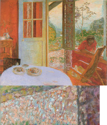
Dining Room in the Country, 1913, Pierre Bonnard, courtesy Minneapolis Institute of Art. Bonnard used small brush strokes, intense colors, and close values.

Brushwork is, on one hand, the most personal of painting subjects. It’s also (especially in watercolor) highly technical. Much of what is called ‘style’ comes down to what brushes we choose and what marks we make with them. I wrote about that here.

Modern viewers are immediately captivated by bravura brushwork; it’s a sign of self-confidence and competence. It comes from lots of practice. It also must rest on a firm foundation of proper color mixing and drafting. Flailing around to fix something negates the freshness and decisiveness of good brushwork.

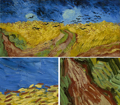
Wheatfield with Crows, 1890, Vincent van Gogh, courtesy Van Gogh Museum, Amsterdam. The motion in the painting is created by his brush strokes.

The best, most immediate, brushwork lies on a foundation of careful planning. Continuous modification, glazing, changing color, etc., make for diffident marks.

Let’s talk about how not to do it:

  • Unless you’re doing close detail, don’t hold your brush like a pencil. It’s a baton, and holding it to the back of the center-point (away from the ferrule) gives you more lyrical motion. Your grip can still be controlled by your thumb, you can hold it loosely, or even clutch it in your fist. The important thing is to let your arm and shoulder drive the movement of the brush, rather than just your wrist and hand. The farther back you hold the brush, the more scope of movement. To loosen up, blast some music and pretend you’re the conductor and that brush is your baton.
  • Don’t dab. By this I mean a pouncing/stabbing motion with the tip of your brush. It’s amateurish in oils, anemic in acrylics, and hell on your brushes.
  • Don’t use brush strokes that go in all one direction. Learn to apply paint in the round. This is a rule that can be broken, but make sure you’re doing so intentionally, not just because you don’t know how to paint in every direction.
  • Don’t bury your line. Much of the power of Edgar Degas’ mature work comes from his powerful drawing; he was the most accurate draftsman of his age, and he let that stand prominently in his work.

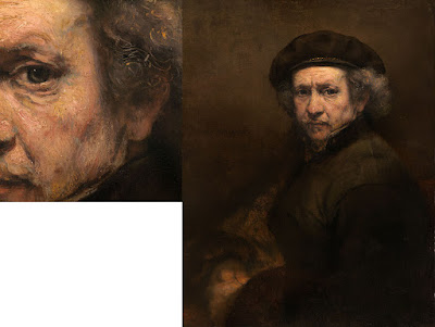
Self Portrait with Beret and Turned Up Collar, 1659, Rembrandt van Rijn, courtesy National Gallery of Art, Washington, DC. Pay close attention to the economy of the brushwork in the hair, and the expressive, unfinished brushwork in the face. In this way, Rembrandt was able to create a powerful focus.

There are many painters whose brushwork I admire, but there’s little point in trying to copy them in my own work. Brushwork is as personal as handwriting. It’s where the artist expresses—or suppresses—his feelings. There’s value in attempting to copy passages by great painters, and I suggest you do so with the samples I’ve attached to this blog. But don’t try to paint like Sargent or Van Gogh or Rembrandt; use what you learn to create your own mature style.

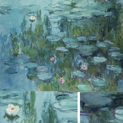
Waterlilies, c. 1915, Claude Monet, courtesy Neue Pinakothek, Munich. Monet makes no attempt to hide his drawing in this painting. The brushstrokes are wet-over-dry.

Style is the difference between our internal vision and what we’re capable of. We often don’t like our own brushwork when we lay it down; I think that’s because it’s too personal. Don’t continuously massage your brushstrokes hoping to make them more stylish. If the passage is accurate in color, line and precision, move on. You may come back to realize it’s wonderful.

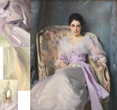
Lady Agnew of Lochnaw, 1892, John Singer Sargent, courtesy Scottish National Gallery, Edinburgh. Note that the transparent sleeves are not produced by glazing, but with direct, long brushstrokes.

Use your brushwork to highlight the focal points in your painting. Sharp, clean, contrasting marks draw the eye, where soft, flowing, lyrical passages encourage us to move through. Let there be dry-brush texture and unfinished passages in your painting.

Your brush is not a pencil

Mark-making can be loose and gestural or very controlled. It’s personal, but it’s also something you can learn.

Dining Room in the Country, 1913, Pierre Bonnard, courtesy Minneapolis Institute of Art. Bonnard used small brush strokes, intense colors, and close values.

In this week’s painting classes we worked on mark-making and brushwork. This is, on one hand, the most personal of painting issues. It’s also (especially in watercolor) highly technical. Much of what is called ‘style’ comes down to what brushes we choose and what marks we make with them.

Modern viewers are immediately captivated by bravura brushwork; it’s a sign of self-confidence and competence. It comes from lots of practice.

Wheatfield with Crows, 1890, Vincent van Gogh, courtesy Van Gogh Museum, Amsterdam. The motion in the painting is created by his brush strokes.

First, let’s talk about how not to do it:

  • Unless you’re doing close detail, don’t hold your brush like a pencil. It’s a baton, and holding it to the back of the center-point (away from the ferrule) gives you more lyrical motion. Your grip can still be controlled by your thumb, you can hold it loosely, or even clutch it in your fist. The important thing is to let your arm and shoulder drive the movement of the brush, rather than just your wrist and hand. The farther back you hold the brush, the more scope of movement. To loosen up, blast some music and pretend you’re the conductor and that brush is your baton.
  • Don’t dab. By this I mean a pouncing/stabbing motion with the tip of your brush. It’s amateurish in oils, anemic in acrylics, and hell on your brushes.
  • Don’t use brush strokes that go in all one direction. Learn to apply paint in the round. This is a rule that can be broken, but make sure you’re doing so intentionally, not just because you don’t know how to paint in every direction.

Self Portrait with Beret and Turned Up Collar, 1659, Rembrandt van Rijn, courtesy National Gallery of Art, Washington, DC. Pay close attention to the economy of the brushwork in the hair, and the expressive, unfinished brushwork in the face. In this way, Rembrandt was able to create a powerful focus.

There are many painters whose brushwork I admire, but there’s little point in trying to copy them in my own work. Brushwork is as personal as handwriting. It’s where the artist expresses—or suppresses—his feelings. There’s value in attempting to copy passages by great painters, and I suggest you do so with the samples I’ve attached to this blog. But don’t try to paint like Sargent or Van Gogh or Rembrandt; use what you learn to create your own mature style.

Waterlilies, c. 1915, Claude Monet, courtesy Neue Pinakothek, Munich. Monet makes no attempt to hide his drawing in this painting. The brushstrokes are wet-over-dry.

The best, most immediate, brushwork lies on a foundation of careful planning. Continuous modification, glazing, changing color, etc., makes for diffident marks. For the same reason, if you’re happy with the color and form of what you’ve laid down, refrain from ‘touching it up.”

Use your brushwork to highlight the focal points in your painting. Sharp, clean, contrasting marks draw the eye, where soft, flowing, lyrical passages encourage us to move through. Let there be dry-brush texture and unfinished passages in your painting.

Lady Agnew of Lochnaw, 1892, John Singer Sargent, courtesy Scottish National Gallery, Edinburgh. Note that the transparent sleeves are not produced by glazing, but with direct, long brushstrokes.

Above all, don’t bury your line. Much of the power of Edgar Degas’ mature work comes from his powerful drawing; he was the most accurate draftsman of his age, and he let that stand prominently in his work.

Monday Morning Art School: Mark Making

Mark-making can be loose and gestural or very controlled. It’s personal, but it’s also something you can learn.
Dining Room in the Country, 1913, Pierre Bonnard, courtesy Minneapolis Institute of Art. Bonnard used small brush strokes, intense colors, and close values.
When I was a student, I often left heavy edges in my paintings. A teacher told me, “That’s your style.” Well, it wasn’t; I’d just never learned to marry edges. It was a deficiency.
Our marks are our handwriting. I’d rather see them develop naturally, so I generally avoid teaching much mark-making. But sometimes students fall into traps that severely limit their development. It’s better to understand all the ways your brush works and then settle down into something that reflects your character, rather than have to break bad brushwork down the road.
Self Portrait with Beret and Turned Up Collar, 1659, Rembrandt van Rijn, courtesy National Gallery of Art, Washington, DC. Pay close attention to the economy of the brushwork in the hair, and the expressive, unfinished brushwork in the face. In this way, Rembrandt was able to create a powerful focus.
Let’s first talk about how not to do it:
  • Unless you’re doing close detail, don’t hold your brush like a pencil. It’s a baton, and holding it to the back of the center-point gives you more lyrical motion.
  • Don’t dab. This means a pouncing/stabbing motion with the tip of your brush. It’s amateurish in oils, anemic in acrylics, and only possible with any elegance with a wet watercolor brush.
  • Don’t use brush strokes that go in all one direction. Learn to apply paint in the round.
All these rules are successfully broken by great artists. You may go on to break them yourself, but it behooves you to learn the full range of motion of your brush before you do so.
Wheatfield with Crows, 1890, Vincent van Gogh, courtesy Van Gogh Museum, Amsterdam. The motion in the painting is created by his brush strokes.
Mark-making can be loose and gestural or very controlled. It’s not just pertinent to painting; it applies to any material applied to a surface, including three-dimensional and digital art. It’s purely personal, and can be where the artist expresses—or suppresses—his feelings about the subject.
Waterlilies, c. 1915, Claude Monet, courtesy Neue Pinakothek, Munich. Monet makes no attempt to hide his drawing in this painting. The brushstrokes are wet-over-dry.
Mark-making is an important aspect of abstract art, including the kind where the mark-making is not done with a brush (as with Jackson Pollack or Gerhard Richter). But tight brushwork is just as much a hallmark of modern painting—see pop art, for example.
Lady Agnew of Lochnaw, 1892, John Singer Sargent, courtesy Scottish National Gallery, Edinburgh. Note that the transparent sleeves are not produced by glazing, but with direct, long brushstrokes.
I’ve included five great artworks in this assignment. Each has one or more close-ups with it. Your assignment is to try to figure out the brush used and copy the brush-strokes as accurately as you can on an old canvas. Note that I’m not asking you to make a painting; that would be too confusing. I’m just asking you to try to mimic the brushwork.

If it was good enough for my grandfather

Was litharge in earlier paintings, or did Rembrandt just get lucky?
Rembrandt’s impasto.
I’m constantly railing about using time-tested technique in your painting. Painters have been experimenting with weird additives in their paints for centuries. The results are often disastrous. Rembrandt van Rijn may be the exception that proves the rule.
Now, 350 years later, we tend to think of Rembrandt as the model of traditional art. That’s especially true since, through most of the 20thcentury, his indirect painting techniques were taught as a sort of ‘purer’ painting in reaction to the volatility of Abstract-Expressionism.
It’s easy to forget that he and his Dutch Golden Agefellows were highly innovative, creating whole new genres of painting and challenging the Baroquestatus quo.
Portrait of Marten Soolmans, 1634, is one of three Rembrandt paintings in which plumbonacrite has been found. Courtesy of the Louvre.
Rembrandt’s is probably the most-studied technique in art history. We know his palette: lead white, ochre, Cassel earth, bone and ivory char, vermillion, madder lake, yellow lake, lead-tin-yellow and very limited use of azurite and ultramarine blue.
We know that, in his later paintings, he used moody glazes of dark color punctuated by fat impasto passages of pure light, often modeled with a soft brush after they were laid down. These impasto layers were then glazed with color.
Susanna and the Elders, 1647, is one of three Rembrandt paintings in which plumbonacrite has been found. Courtesy of the Staatliche Museen zu Berlin.
For that he needed a thick, fast-drying white. The danger with that is brittlenesss and cracking. Adding lead and heat-treated oils kept the paint layers more pliable over time. So Rembrandt used a combination of lead white, chalk, and smalt (ground glass). His paintings look great today.
Recently, researchers have found traces of a lead carbonate mineral— plumbonacrite—in three of Rembrandt’s best-known paintings. They’re terrifically excited, because the previously earliest-known appearance of plumbonacrite was in Vincent Van Gogh’s Wheat Stack under a Cloudy Sky (1889).
Wheat Stacks under a Cloudy Sky, 1889, Vincent Van Gogh, Kröller-MĂŒller Museum
Since lead is cheap and plentiful, it’s been used in paints since antiquity. But it can darken or fade other pigments. In 2015, chemists were trying to figure out what was damaging the red lead pigment in Van Gogh’s picture. In the space between the sample’s reddish-orange Pb3O4 core and the light blue PbCO3 layer that surrounds it, they found plumbonacrite. That was the first time it was ever seen in a pre-20th-century painting.
How did Rembrandt manage to get plumbonacrite into his paintings two centuries before it came into common use? “[O]ur research shows that its presence is not accidental or due to contamination, but that it is the result of an intended synthesis,” wroteVictor Gonzalez of the Rijksmuseum and Delft University of Technology.
Bathsheba at her Bath, 1654, is one of three Rembrandt paintings in which plumbonacrite has been found. Courtesy of the Louvre.
Their best guess is that it came from litharge, which is an oxide of lead used to refine silver. In the seventeenth century litharge was made by pumping a set of bellows to send very hot air across molten lead, creating the oxide and sending it flying into a nearby receptacle. If this sounds dangerous, it is.
Litharge did create some pretty colors. Litharge of gold is litharge mixed with red lead, which may have been how Van Gogh acquired it. Litharge of bismuth is a brownish silver color—just the kind of color that would appeal to Rembrandt, in fact.
Why would Rembrant have even considered adding litharge to his paint? The most obvious possibility is that it was in use all along, and appears in other, earlier paintings that scientists haven’t examined yet. Or, Rembrandt was messing around and got lucky.

There’s nothing new under the sun, and that includes glazing

Is it true that the fat-over-lean rule is suspended when using alkyd paints and mediums?

Grain Elevators, by Carol L. Douglas, is an example of a cold-wax medium painting. I used it to add the rough texture of a beaten down industrial setting to the sky.
 Oil paints are pigments suspended in vegetable oil. These drying oils are most commonly linseed oil but also may be walnut oil or tung, poppy, or perilla seed oils. They do not dry by evaporation, but by oxidation. To speed up the drying process, metal salts are sometimes added. 
In my youth, we made our own medium with equal parts linseed oil, turpentine, damar varnish and a few drops of cobalt drier. After seeing the condition of some 20th century masterpieces, cracked and brittle after less than a century, I stopped making my own and started to use commercially-prepared medium instead.
Alkyd mediums have almost completely taken over the industrial coating world. They dry more quickly than old-fashioned drying oils. There are many ways to make an alkyd medium, but they all involve cooking a vegetable oil with a polyol like glycerine. Before you consider eating the results, however, alkyds generally have Xylene added to control the viscosity. Alkyds for decorative painting have extra oil cooked in to lengthen the oil strands and to make a more durable finish.
The Sacrifice of Isaac, c. 1527, by Andrea del Sarto, courtesy of the Cleveland Museum of Art, shows a painting at the pre-glaze point.
I’m seeing more and more students come to class with alkyd-based products like Galkydor Liquin. I’ve used both and like them well enough; they don’t feel significantly different from conventional media. But I’m skeptical of replacing something proven with something unproven to save dry time, which is relatively unimportant in alla prima painting. Classic painting mediums last for centuries when properly applied.
It’s claimed by some teachers that alkyd media allow you to ignore the fat-over-lean rule in painting. That’s the principle that higher-oil paints (i.e., mixed with medium) belong on the top levels, whereas lower-oil mixes (i.e. cut with turpentine or OMS) belong in the initial underpainting. 
The Sacrifice of Isaac, c. 1522, by Andrea del Sarto, courtesy of the Prado, shows the same subject in what del Sarto would have called its finished form, after meticulous glazing.
Pigments affect the dry time of paints as much as the oil binder does. However, as a general rule, the more oil, the longer it takes for paint to dry. The less oil, the faster the paint dries, but this produces a more brittle film. That’s one reaason we use thin layers at the bottom and save the juicy paint for the top.
There’s been a trend toward painting techniques using glazing layer after glazing layer of thin pigment dissolved in alkyd media. I’ve even seen paintings done by laying down layers of alkyd medium and then painting into that. None of that is proven technology, and won’t be in our lifetimes. It will take another few generations before the durability of indiscriminate alkyd glazing is proved.
Self-portrait, c. 1655, Rembrandt van Rijn, courtesy Kunsthistorisches Museum. His technique involved painting impasto passages above transparent ones, or the opposite of glazing.
Glazing has been used since oil painting was invented. It was traditionally done by applying transparent colors over an opaque monochromatic grisaille or colored foundation. That doesn’t mean the masters just indiscriminately glazed everything. Most passages were painted alla prima, just as we do today. Glazing was restricted to dynamic passages and fine modulations.
To do it right is very tricky; I’ve never mastered it. It’s hard to predict how a passage will look when dry. You get no second try at the underpainting, so if it’s wrong, too bad. And the thickness of the glaze affects not only the paint’s tonal value, but its surface finish.
Still, pigment suspended in a binder is very beautiful. If you’re interested in this effect, you might try cold-wax mediuminstead. Unlike encaustic, which uses heat to thin the wax, cold-wax medium is whipped with mineral spirits. It has a milky, soft, appearance. You can sand it, scrape it, and rework it to your heart’s content, and it’s thoroughly modern in its final appearance.

The trouble with nocturnes

Modern nocturnes document only the contrast between bright lights and the void. There are so many other cool things that go bump in the night.

Nocturne in Blue and Gold: Old Battersea Bridge, c. 1872-1875, James Abbott McNeill Whistler

Yesterday, a student was describing a late-evening sky she had seen, with the objects bathed in an unusual warm light. “I’m sick of nocturnes always being done in Prussian blue fading to black,” she complained. Since she has an MA in art history and works in a gallery, she’s not talking through her hat.

“We always paint nocturnes wearing headlamps,” said another student. “The human eye takes about 25 minutes to fully adapt from bright sunlight to complete darkness, and the headlamp continuously interrupts that. Cameras lie, too, about what darkness looks like.”
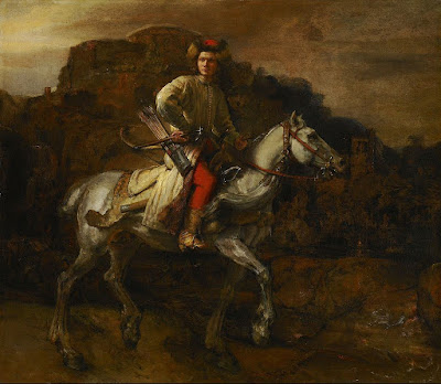
The Polish Rider, 1655, Rembrandt van Rijn 
She had just explained the technical problem with painting nocturnes in a nutshell. They are driven by our current technology—headlamps and easel lights—just as the high contrast of Frederic Remington’s nocturnes were driven by camera technology of his day. Headlamps and easel lights exaggerate the contrast between dark and light because they’re constantly stimulating our eyes to stay in a photopic(daylight) state.
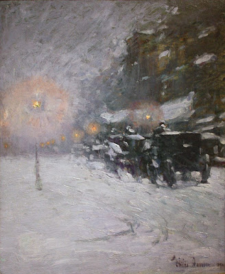
Winter, Midnight, 1894, Childe Hassam
Human night vision is limited to discriminating between different values of black and white, and the resolution and contrast are poorer. But there are many steps between light and true darkness, and most nocturnes are in fact painted using mesopicvision, which we use when we’re faced with a combination of lighting.
Moonlight, Ralph Albert Blakelock
When we transition from day to night, our eyes create photopigments in the cones and rods to increase sensitivity. The adaptation period is different for rod and cone cells. Cone cells can do this in about ten minutes of darkness, but rods require between 30-45 minutes. There are, of course, differences in how fast each of us can make the adaptation. Old age, as with so many other things, slows us down.
Snow in New York, 1902, Robert Henri
The transition from dark to light happens much more quickly. It takes about five minutes for the eyes to bleach out the photopigments they created to see in the dark.
The Call for Help, Frederic Remington
Humans are color-blind in true low-light situations. However, at twilight, when most nocturnes were painted, we suffer from something called the Purkinje shift. During the daytime, people are most sensitive to light that is greenish-yellow. At night, people are more sensitive to greenish-blue light.
The Tornado, 1835, Thomas Cole
The rods in our eyes (which are more light-sensitive and thus more important in low-light situations) respond best to green-blue light. The cones in the retina, which respond to colors, don’t work well in lower-light situations. As the light gets lower, our ability to see reds falls off.
Moonrise, 1894, David Davies
Scientists and tinkerers have long understood that red lights don’t trigger our eyes into photopic vision. That’s why they’re used in control rooms or the nocturnal animal displays at the zoo.  
Starry Night Over the RhĂŽne, 1888, Vincent Van Gogh
Historically, nocturnes were about solitude, or sometimes, bad behavior. In our jazzed, electric world, they’re more likely to focus on lighting and energy. The modern nocturne is always a description of civilization overtaking nature. It is a brightly-lit subject set against an empty field of blackness. By definition, that’s urban, and it contrasts our desires against our fears. The best modern nocturnes create a place to go to escape encroaching darkness. I’d say there’s more to that than just how our eyes work, but our vision certainly plays a part.
Nocturnes are very popular right now, both with painters and with buyers. I don’t paint them often, because I’m not a night person, but several of my friends do, and do it well.
Hiawatha, 1870, Thomas Eakins
Today’s post is absurdly larded with illustrations, but I wanted to show you the many ways in which people painted nocturnes before we had headlamps.

How do people stay awake to paint nocturnes?

At their best, nocturnes strip away all extraneous detail, leaving us with powerful impressions and nothing more.
Nocturne in Gray and Gold, Westminster Bridge, c. 1871-1874, James Abbott McNeill Whistler. Courtesy Glasgow Museums.

I’m preparing for my workshop at Schoodic Institute, which starts on August 6. There will be a full moon on August 7. According to the Farmer’s Almanac, this is known as the “Sturgeon Moon” because Native Americans fished for these big brutes at that time. Why they wanted sturgeon in the first place is not explained. Perhaps they fed it to their enemies.

If the weather cooperates, we’ll be painting a nocturne one night that week. We haven’t had that opportunity for several years. The jack pines and thundering surf should make excellent foils for the moon over the water.
The Artist’s Studio in an Afternoon Fog, 1894, Winslow Homer, courtesy Memorial Art Gallery of Rochester
As delicious as this sounds—and I’m quite looking forward to it—it’s also the most worrisome part of the workshop for me. I’m the antithesis of a night owl. By 8:30 PM I’m yawning uncontrollably. Luckily for me the moonrise is going to be at 7:49 PM. I ought to manage a few brushstrokes before I’m fast asleep.
It’s a pity, because I love nocturnes. They’re mysterious, edgy, moody. In fact, I’m working on one right now—on the easel in my studio, where I can look at it in the full light of day.
The Polish Rider, c. 1655, Rembrandt van Rijn, courtesy Frick Collection.
“Nocturne” started out as a musical term; it was introduced to painting by James Abbott McNeill Whistler. His nocturnes are reductions to value studies and focus on composition.
Whistler did not invent night painting. It’s integral to chiaroscuro, meaning that it was used by everyone from Caravaggioon. Rembrandt famously used it in The Night Watch, (1642).
Moonlight Wolf c. 1909, Frederic Remington, courtesy Addison Gallery of American Art.
Frederic Remington started his career as an illustrator, gradually moving to fine painting and sculpture. Around 1900 he started a series of paintings focusing on the color of the night. By his death in 1909, he had painted more than seventy nocturnes. They are filled with color, but they also shroud his illustrative temperament in mystery.
One of my favorite paintings of Maine, Rooms for Tourists by Edward Hopper, wasn’t painted in Maine at all. It’s 142 Bradford Street, Provincetown, MA. While it exists today, it’s awfully swank compared to its 1945 incarnation.
Rooms for Tourists, 1945, Edward Hopper. Courtesy Yale University Art Gallery. 
At the time he painted it, it was a private residence. By cloaking it in darkness, Hopper could strip away all extraneous details, leaving only a coastal boarding house.
The Artist’s Studio in an Afternoon Fog (1894) features Winslow Homer’s trademark diagonal composition, but is pared down to its essential form. We must imagine the rocks, sea, and the color of fog.
Moonrise, 1894, David Davies, courtesy National Gallery of Victoria, Melbourne
Historically, nocturnes were about solitude. In our jazzed, electric world, they’re more likely to focus on lighting and energy. Contemporary painter Anthony Watkins is particularly good at nocturnes. He painted a brace of them at Ocean Park and sold them all in a whirl. I love them; I just can’t see how he can stay up all night painting.

If you haven’t got anything nice to say…

By now, I assume you’ve seen the video, above, of the art student who lost her temper at her classmate’s inane and snarky critique. Although she has been characterized as unstable and over-the-top, I feel her pain. Nasty criticism is everywhere, and, sadly, young artists often lead the pack.

I remember the first time my work was reviewed for publication. The writer—a successful, middle-aged gallery director—was snarky and destructive. I felt it keenly. 

Conversion on the way to Damascus, Caravaggio, 1600-1. This was the moment when Paul stopped being rigid, inflexible, discontented and critical. For most of us, however, it’s a far more gradual process.
This past Sunday, Pastor James Laughlin talked about the characteristics of St. Paul that made him such a formidable evangelist. It occurred to me that they were applicable to teaching and criticism as well.
St. Paul, Georges de la Tour, 1615
Paul comes down to us as one of the most influential people of antiquity, and certainly the most important figure of the Apostolic Age. That’s pretty amazing considering that after he gave up his Pharisaical career, he spent the rest of his life as a peripatetic tent-maker, preacher, prisoner, and letter writer.
St. Paul in Prison, Rembrandt van Rijn, 1627
Philippians 4:10-20 reveals a writer who was affirming, content, flexible and confident. He exhorts his friends in Philippi, he talks freely of his own challenges, but he’s always optimistic.
His success as an evangelist ought to encourage us to imitate him as critics and teachers. And yet so often teaching and criticism takes exactly the opposite approach—it demeans.

People are capable of wonderful things, but our society routinely discourages people from daring to be great. When someone disregards all the voices telling them they can’t do something, and they challenge themselves with hard work and dedication, they ought to be encouraged.

Let me know if you’re interested in painting with me on the Schoodic Peninsula in beautiful Acadia National Park in August 2015. Click here for more information on my Maine workshops! Download a brochure here.