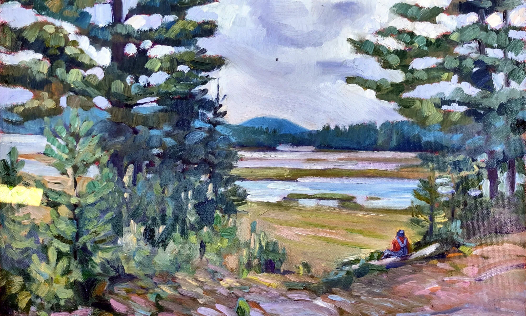
Be honest or sanitize the view? What’s actually there can be a hard sell.
 |
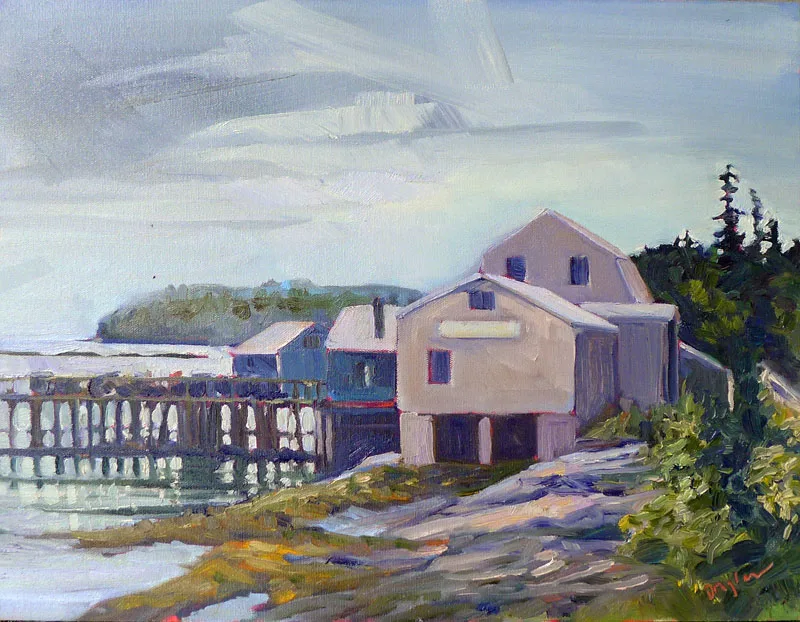
| Lobster Pound at Tenants Harbor, Carol L. Douglas, available. |
I painted the above, of a lobster pound at Tenants Harbor, ME, just a few years ago. These days, a backhoe is clearing the property. This is no paeon to a lost way of life, because lobstering is a healthy $1 billion business in Maine (although it is currently is threatened by Federal regulation). It’s just an observation that things change. Paintings can be a way of marking what was once there.
But that’s only if we’re honest. Years ago, I painted the upper falls at Letchworth (below). There has been an old steel railroad bridge above it for as long as I can remember. I wanted to minimize it as much as possible, as I thought it was an ugly, ominous intrusion into the landscape. Still, it needed to be there. It was as much a part of the place as the rocks and water.
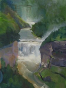 |
| Upper Falls at Letchworth, Carol L. Douglas, private collection |
In 2017, the bridge was replaced with a newer, squatter, safer model. Last year, a visitor from New York saw my painting. “That’s the old railroad bridge!” he enthused. What I thought was annoying was, to him, a part of history.
Landscape artists—myself included—have a tendency to minimize the effect of people in the landscape and to paint what is already obsolete or rustic. We paint lobster boats but delete the shiny white cruise ships in the harbor. We delete cars, in part because they’re difficult to draw, and in part because they’re ubiquitous.
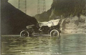 |
| A 1917 postcard of a car accident below the Upper Falls, showing the railroad bridge. Eleven people were in that car when it tumbled off the gorge wall. Two died. |
This has always been the case. Artists have the same ideas about what’s beautiful as the rest of humanity. There are exceptions, of course. Childe Hassam used carriages and cars as motifs in his paintings. George Bellows nearly rubs our face in the humanity of the early 20th century. But for the most part, landscape artists paint a romanticized, sanitized version of reality.
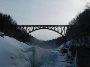 |
| The new bridge changes the view forever. |
In earlier times, that meant the horse manure and mud were removed from the street and steam engines and coal didn’t deposit soot everywhere. Today we excise power lines, fire hydrants, bus stops and plastic kids’ toys.
Why? Mostly, I think, because our audience demands it. Landscape art is in many ways an escape from reality. It is a reflection of what we as a society want, not what is.
Consider Daniel Greene’sseries on the New York subway. Yes, we get a sense of its subterranean light, utilitarian architecture and fabulous tile walls. However, he omits the filth, dripping water, ubiquitous crazy people, and the overall crush of humanity. These are portraits of the subways as some future archeologist might see them, not as they really are.
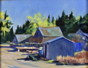 |
| Fishing shacks at Owls Head, Carol L. Douglas, available. |
Would these have been better paintings had he included reality? I think so, but they might not have sold so well.
Attention to prosaic reality is not without its risks. There are exceptions of course, like Rackstraw Downes or Linden Frederick, but mostly it doesn’t pay. Buyers aren’t that keen on truth-telling.
I used to do an annual event with a painter who has a wonderful heart for working-class life. Year after year, he turned out well-designed paintings of local landmarks in all their utilitarian beauty. They languished at auction compared to highly romanticized views of sea and woods in gilt frames. Yet, by any critical standard in painting, they were superior paintings. There’s a lesson in that, and it’s not a pretty one.
