 |
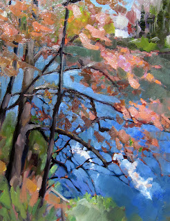
| Look, Ma! No red! The red tones are made of quinacridone violet and cadmium orange. (Finger Lakes marshes in autumn, 14X18, oil on canvasboard)
|
JG writes: What red do you like for plein air painting? Are there any substitutes for cadmium red that work as well but are cheaper?
Dear JG: I have pigments I like that others will find incomprehensible. That’s not just a question of personal taste; it is also a matter of where you live and the colors of the rocks, the soil, the foliage and the light.
I stopped using cadmium red many years ago because I could never use it up before the tubes hardened. It seems like a pricey paint to use as a modulator for greens. Where I live, there are few naturally-occurring true reds, even in the headiest autumn days, and cadmium red always seemed to obtrude unnecessarily. For a time I substituted naphthol red. It’s cheaper, tends to harden in the tube less quickly, and is less chalky when mixed with white. However, it tends (like cadmium red) to make muddy violets.
A few years ago, I stopped using red completely, and now I mix a combination of quinacridone violet and cadmium orange as an approximate substitute for red in the landscape. (I still use cadmium red for figure painting.) That gives me the weight of cadmium red, but it’s slightly less glaring, and the quinacridone violet permits me to mix to the blue-violet side without muddiness.
 |
| And while we’re on the subject, there are no greens in this painting, either. (Catskill waterfall, 11X14, oil on canvas)
|
CB writes: I bought a paint labeled “Cerulean Blue Hue” that was a lot cheaper than the Cerulean Blue. What’s the difference?
Dear CB: A paint that is called a “hue,” such as “cadmium red hue,” is made of a blend of less-expensive pigments. There is nothing inherently wrong with these pigments, but they don’t behave the same as the more expensive ones, and you should at least know what you’re buying.
Every tube of paint made by a reputable manufacturer has a Color Index Name in really tiny type. This—rather than the seductive and often romanticized paint name—is what you should pay attention to. It’s a simple code, and no chemistry knowledge is necessary.
The vast majority of paints start with the letter P, which means it’s a pigment. Following that is a letter that indicates the basic hue family: R for red, O for orange, Y for yellow, G for green, B for blue, V for violet, Br for brown, W for white, Bk for black. Then there’s a number referring to the specific pigment itself. This is the best
chart I know for paint pigments; it was designed for watercolor, but the pigment characteristics are the same through all media.
Generally speaking, there’s little to be gained by buying a hue mimicking a more expensive pigment. If you are comfortable painting with Cerulean Blue’s proximate, then it behooves you to learn what’s in it and mix it yourself, since you always have the greatest flexibility by working with pure pigments (rather than mixes) out of the tube.
If you’re interested in joining me for a fantastic time in mid-Coast Maine this summer, check here for more information.


