fbpx

What is plein air painting?

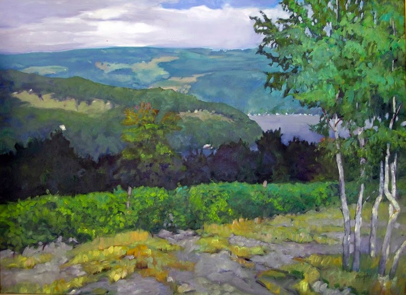
A painting of Keuka Vineyard, by Carol L. Douglas
Keuka Vineyard, by Carol L. Douglas. That’s the studio version. Courtesy the Kelpie Gallery.

John Morra recently wrote an excellent essay examining the nature of plein air painting. I’m assigning it to all my students; it’s that good.

Most of us have been in a competitive plein air event and seen something passed off as outdoor painting that was clearly not painted from life. How do we know this? Because we were there. The atmospherics were wrong, that person was never in that spot, or—mirabile dictu—the oil paint has already set up.

But mostly, we know because there’s a sort of static perfection to a studio painting that is never there in plein air. A painting done on site is never as balanced or stately as a studio landscape. The plein air painting expresses a longing for the natural world that just isn’t there in the studio.
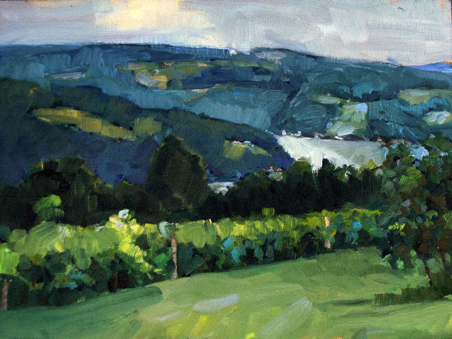
A painting of Keuka Vineyard by Carol L. Douglas
Keuka Vineyard, by Carol L. Douglas. That’s the plein air version. (Private collection.)

Morra makes the point that we tend to over-edit in plein air painting. We’ve had two hundred years of being told that objective observation is not painterly. Until I read this, I hadn’t considered how much I’ve been programmed to think non-objectively. I came of age during the heyday of abstract-expressionism. I’m still half-apologizing for liking realism. That colors every brushstroke I make.

Still, I constantly emphasize editing in my classes and workshops. Composition is one of the hardest skills in painting. The rules of reading a composition are the same whether the piece is done in studio or in the field. We edit because we’re working around environmental distractions.
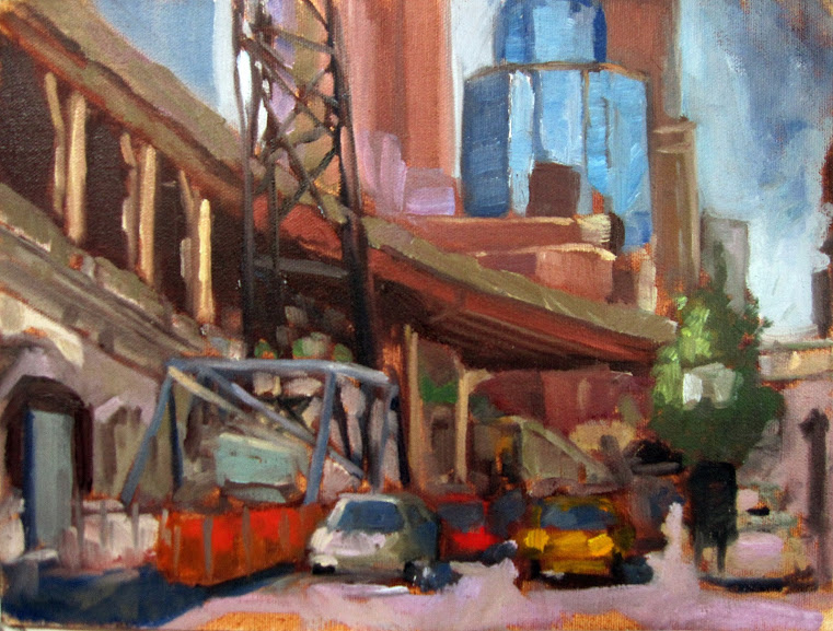
A painting called Queensboro Bridge Approach, by Carol L. Douglas (plein air)
Queensboro Bridge Approach, by Carol L. Douglas (plein air). The built environment is part of our landscape too.

But that kind of editing can easily go overboard. Consider the lowly car. Many of us delete them—frankly, because they’re hard to paint. But today’s Toyota Corolla is really no different from Childe Hassam’s hansom cabs were in 1890. His paintings would be far weaker without them.

In fact, a lot of modern plein air is excessively planed down to a conceptual idea. We can call that style or schtick, depending on how charitable we’re feeling. Either way, too much style gets in the way of the scene. The first time I see a painter employing crepuscular rays or the silhouettes of birches or a monochrome passage in a composition, I’m dazzled. The fifth time, I realize the artist is using them for a crutch. It’s no more impressive than Thomas Kinkade’s flaming cottages.

“A plein air painting should be painted quickly,” Morra stated. This is the only point on which I disagree. Fast, expressive brushwork is the trope of our age, but it’s by no means the only way to paint. Consider the great Rackstraw Downes, for example. He paints meticulous, beautifully-drafted scenes of industrial America, and he does it observationally, working outdoors. His work is no less plein air than a fast scribble is.

Another modern painter who works meticulously is Patrick McPhee. He paints in great detail without losing luminosity or freshness. He bases his style on the first American plein air painters, the Hudson River School painters. They didn’t slap it down either.

Float, by Carol L. Douglas. If you can’t draw, you’re going to have a hard time painting en plein air.

In fact, modern plein air painting is often so fast it sacrifices drawing. A badly drawn house or person is a rookie mistake. My own preference is for fast painting paired with meticulous drawing. Want a great contemporary example? Check out Marc Grand Bois.

Reserve your spot now for a workshop in 2025:

Group norming

Feeling out of place, like a failure? Perhaps the problem isn’t you, but your tribe.

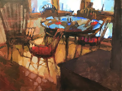
Five Chairs, by Pamela Hetherly, courtesy of Kelpie Gallery. This painting stopped me yesterday. The color is beautifully integrated, something that’s lost in the photo.

I spent a few hours yesterday at the Kelpie Gallery in S. Thomaston. I’d meant to drop paintings off and leave, but it is a very restful place with a clean, open atmosphere. I always spend more time there than I expect to. Susan Lewis Baines, the owner, is so interesting and interested that before you know it, the day is half over.

It’s an airy, light space with grey walls, a grey tiled floor and lots of white trim. What little furniture there is, is elegant and subservient to the art. I look at Sue’s handmade desk (no, it’s not for sale) and wonder if I need one like it. Then I remember that I live in an old farmhouse and it wouldn’t match at all. As a decorator, Sue is light years ahead of me. That’s a great quality in a gallerist.
Sometimes I See, by Kay Sullivan, courtesy of the artist. Kay’s works are small, active, and yet somehow peaceful.
She represents a small stable of painters. These include vibrant small pastels by Kay Sullivan, the austere abstractions of Ann Sklar, mystical landscapes of Julie Haskell and Beth London, moody interiors by Pamela Hetherly, and the idiosyncratic landscapes of the late Erik Lundin. On first glance, the work is widely disparate. but the visitor notices that they all hang together well. They are united by a common color sensibility and composition. That makes it possible for high realism to hang side-by-side with abstraction and have the combination complement both paintings.
As different as the paintings are, there’s definitely a group norm at work, and it’s bound to provoke a response from the visitor.
A crow painting by Beth London, available through the Kelpie Gallery.
I tell people I left New York because I can’t paint like a Hudson River Schoolpainter. It is a continuous tradition in New York, dating back two hundred years. In any other place, painting with that golden light and attention to detail would be an annoying affectation. But in New York, it has some wonderful modern practitioners, including Tarryl Gabeland Patrick McPhee.
Mary Byrom is at the Smithsonian American Art Museum this week. Yesterday, she commented about Abbott Handerson Thayer’s Roses, “Such a wonderful quiet stillness, from before these modern times. It makes a difference.” Tarryl and Patrick can still tap into that stillness, and they have many fans because of it.
Untitled, by Erik Lundin. Courtesy of the Kelpie Gallery. His disinterest in selling made him the most unaffected of painters.
I don’t feel things in that way. I’m thoroughly the product of my time, which means less value modeling and more color and brushwork. As long as I stayed in New York, I was subtly pushed toward painting a different way. Galleries liked it, jurors liked it. And I found it personally disheartening. I needed to seek out my own tribe. I did that by going on the road, and later by moving to Maine.*
This is where a good knowledge of art history proves useful. It allows you to see over the lip of the basket you live in, to see where you fit in the greater scheme of things. I like the basket I have moved to, but if I felt confined in it, I’d be exploring other places and other representation.
————————
*An exception to this is Adirondack Plein Air, which is not style-driven. In fact, I find this true of plein air events in general. They usually attract a much wider variety of painters than from the local catchment area.