fbpx

Mixing beautiful greens

The rookie error for summer is to paint all foliage using the same basic color. You lose more points if it’s sap green.

Bracken Fern, by Carol L. Douglas, 9X12, oil on canvasboard, $869.

This weekend, the mercury climbed to 70° F., which forced the “wall of green” into budding. New England is now in her summer raiment, although it will get a bit deeper and more solid. It’s time to talk about mixing pretty and varied greens.

Michael Wilcox published a famous watercolor pigment guide called Blue and Yellow Don’t Make Green. It’s where I first got the idea to add back the banned black.

Mixed greens. Almost a salad.

His point was that there are many routes to the same destination, and that to really mix colors, you need to understand what pigments you’re using, not work from trade names for colors. Consider sap green, for example—a staple of many plein air painters’ toolkit. It’s really a convenience mix. The same is true of Hooker’s Green in watercolor.

The single-pigment (‘true’) greens available are chromium oxide green, viridian, and cobalt green. Chromium oxide green is a lovely, heavy, natural green. Unfortunately, it outweighs everything it’s mixed with. Viridian and cobalt green are lovely, but expensive. Beware viridian hue—it’s just another phthalo in disguise.

Chart courtesy of Victoria Brzustowicz

The rookie error is to paint all your greens using the same hue, modulating lighter or darker for highlights and shadows. You’ll have much more life in your trees if you know all the different ways you can get to leafy green. One of the most useful greens is black plus cadmium yellow lemon (or Hansa yellow).

The best way to navigate the colors of foliage is to avoid greens out of a tube altogether. A system of paired primaries gives you more options, avoiding the acidity of phthalo, the weight of chromium oxide green, or the soul-sucking darkness of sap green.

In my experience, bad paint mixing causes paintings to go wrong faster than anything else. Constantly over-daubing to modulate the paint color distorts the original drawing and makes a grey mush. If you’re confident of the color, you can apply it fast and accurately.

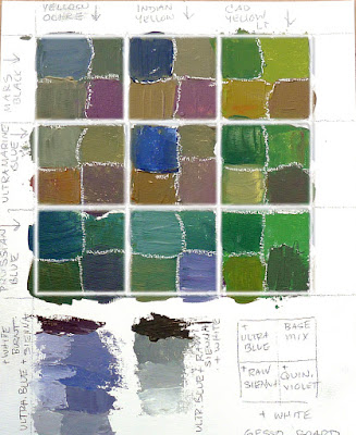
I make my greens on a matrix, which I’ve shown you both mixed and on a chart. Note that blue/black pigments are much stronger than the yellows. You need about half the amount of blue or black as you do yellow.

Swatches by Jennifer Johnson

First mix greens according to the chart, and then modulate your resulting greens with tints (meaning a mix of white and a color). The specific tints are unimportant, but the most useful one for landscape is a mix of white, ultramarine and quinacridone violet, making a pale lavender. It is great for atmospheric perspective.

Your assignment is to hit paint swatches as closely as you can. 
The second exercise involves stopping at your local hardware store for a few paint swatches. These are Benjamin Moore brand, but you should be able to find similar ones elsewhere. There are two off-whites: one cool and one warm. There’s yellow, green, and two soft blues. Your assignment is to mix until you think you’ve hit the exact color. Then put a dot of it on the card to see how close you got. (If you’re working in watercolor, the dot goes on paper instead.)
Detail of Jennifer's chart, above.

I also have my students make neutrals using combinations of ultramarine blue with burnt sienna and raw sienna. I use ultramarine blue and burnt sienna as my standard dark-neutral, because it can go to the warm or cool side depending on how it is mixed. Raw sienna plus ultramarine is my go-to starting point for granite and the sands of our northern beaches.

My 2022 workshop schedule can be found here. That includes the beautiful red rocks of Sedona, urban painting in Austin, TX, June and September workshops aboard schooner American Eagle, mountain vistas in the Berkshires, and our ever-popular Sea & Sky at Schoodic in Acadia National Park.

Monday Morning Art School: why these specific paints?

All real-world limited palettes have gaps in them. Paired primaries work best.

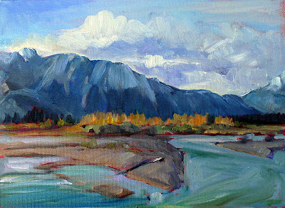
The Athabasca River, by Carol L. Douglas
Savvy folk in the far north often reserve their peregrinations until March. That way, winter’s back is broken by the time they arrive back home. I knew that meant my current painting class would be scattering to the four winds soon. I had a neat little map of lessons laid out for them before they left town. Then my new grandson arrived early, and they didn’t get them in order. I’ll try to correct that here.
The three primary colors we learned in primary school are red, yellow and blue. Forget about any other color space you’ve learned about; they’re not relevant to painting.

Above are the three primary colors in subtractive color. This is the color space in which painters work, and it predates modern color theory. These three colors are the foundational building blocks on which all other colors are made.


Mention this to your nearest teenager, and he’s likely to pepper you with comments about other color systems. Ignore him. This is the color system in which pigments work.
Mix the primary colors in the first illustration with their neighbors and you end up with the secondary colors. A secondary color is always across the color wheel from a primary color.
Back in elementary school, we learned that if you mix a primary color with one adjacent to it, you get the secondary colors:
  • Green (blue and yellow)
  • Orange (yellow and red)
  • Purple (red and blue).

Importantly, a secondary color is always across the color wheel from a primary color. When you want to dull down (reduce the chroma) a color in a hurry, the fastest way to do it is to mix it with whatever’s sitting across the color wheel.
All blues are not created equal: the wavelengths of common painting blues, from Multispectral Imaging of Paintings in the Infrared to Detect and Map Blue Pigments, by John K. Delaney, Elizabeth Walmsley, Barbara H. Berrie, and Colin F. Fletcher, Scientific Examination of Art: Modern Techniques in Conservation and Analysis, the National Academies Press, 2005
All limited palettes are based on a simple red-blue-yellow color scheme. Unfortunately, in the real world, there are no pure paint pigments. They’re either warm or too cool, or they have overtones that muddy them up in certain mixes. This means that all real-world limited palettes have gaps in them, places you just can’t get to with the available pigments.
In practical terms, this can be useful to the beginning artist, as limited-palette paintings always feel integrated. That’s because they hit a limited range of notes. For the beginner, that avoids discordance, but it also means that he or she will never learn how to mix through the whole color universe.
The colors on my palette are a variation of primary colors. It’s the same principle, but there’s a warm and cool version of each of them.
This is why I use paired primaries on my palette. I have a warm and a cool blue, warm and cool red, and warm and cool yellow. This allows me to go almost anywhere on the color wheel without sacrificing chroma.
Why, then, do I have four more tones: yellow ochre, raw sienna and burnt sienna, and black? You don’t need these colors, actually; you can mix to get to any of these points. I use these iron-oxide pigments because they’re cheap and they make great modulators in places where white is inappropriate.
This allows you to go anywhere you want on the color wheel without sacrificing chroma (intensity).
All the colors on my color wheel are modern synthetic pigments (with the exception of the cadmium orange, which is a 19th century organic pigment). Conversely, the iron-oxide pigments are the most ancient pigments known to man. We know they’re not fugitive. Engraved ochre has been found that dates from around 75,000 years ago.

Monday Morning Art School: don’t buy ‘hues’

The imperfection of paint is what gives it its liveliness and depth, but it also makes mixing colors tricky.
Autumn, by Carol L. Douglas. This painting contains no reds. The red tones are a combination of cadmium orange and quinacridone magenta.

A “hue,” is made a blend of less-expensive pigments that mimics more expensive ones. There is nothing inherently wrong with these pigments, but they don’t behave the same as the more expensive ones, and you should at least know what you’re buying.
Generally speaking, there’s little to be gained by buying a hue mimicking a more expensive pigment. If you are comfortable painting with a hue, then learn what’s in it and mix it yourself. You always have the greatest flexibility by working with pure pigments (rather than mixes) out of the tube.
How do you know if something is a hue, not a true pigment? First, ‘hue’ is often in the name, as in ‘cadmium yellow hue’. But you should learn to read the paint tubes, too. I’ve spelled that out in How to read a paint tube. It’s information every painter should know.
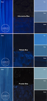
Three blues that look similar out of the tube, but behave very differently. The ‘glaze’ on the left is the undertone. Courtesy Gamblin paints
A mass tone is the color a pigment is straight out of the tube, dense and unmixed with another color. No real-world pigment is a pure color. While two pigments may look the same to the naked eye, their behavior when mixed can be radically different.
Undertone is the color revealed when a paint is spread thin enough that light bounces back up from the substrate. Some pigments are fairly consistent when moving from mass tone to undertone. Others have significant color shifts. This is where painting with hues can lead to muddy mixes, because they will not behave the same way as the original pigment.
Ultramarine, Prussian and phthalo blue are colors that shift radically from mass tone to undertone. They’re all so dark out of the tube that their differences aren’t apparent to the naked eye. But dilute them, and you’ll find a wide range of blues. Luckily, they’re all inexpensive pigments, so they’re never mimicked.
But they can be used to make hues of other colors—particularly phthalo, which is often found in viridian hue. Real viridian green (PG18) is a moderately staining, moderately dark and moderately dull blueish green. Viridian hue is terrifically staining and powerfully bright, because of its phthalo component.
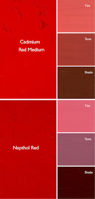
Cadmium Red Hue is usually made with napthol red and a little white. They mix very differently, which is why the hue is a bad substitute for the real pigment. Courtesy Gamblin paints.
Cadmium red hue is usually a naphthol red with a small amount of white added. Out of the tube, the two paints are very similar, but they mix very differently. There’s nothing wrong with naphthol red; it’s my red of choice, but it doesn’t behave much like its cadmium cousin.
Even paints with the same pigments can have different undertones depending on the manufacturer. That comes back to the imperfectability of pigments and their essential complexity.
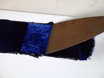
A drawdown test showing a paint’s undertone. Courtesy Utrecht paints.
If you’re considering two different pigments, or thinking about switching brands, you can test them. It’s fast and easy. To see their mass tone, put a small dab of paint on a smooth white board or glass palette and draw it down with a knife, creating a uniform, solid stripe that completely obscures the painting surface.
To see the undertone, draw the samples down again so they are translucent. You should be able to see minute variations in the color, and in the covering power.
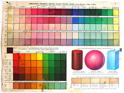
This old paint chart from my childhood explains tints, shades and tones. It’s so old, it’s from before they banned black. 😉
But to understand the behavior of each more fully, you need to make tints, tones and shades of each sample.
  • A tint is a color plus white.
  • A shade is a color plus black.
  • A tone is a color plus black and white.
Even when the mass tone appears quite similar, two close colors will act very differently when mixed. Their unique qualities of tinting strength, chroma, undertone and color temperature come into play here. But mixing paint with white or black immediately adds another layer of complexity. Different blacks and whites have their own undertones. Titanium white is cool. Zinc white is warmer, but it’s also brittle and thin, making it a bad choice for general painting. Ivory black is slightly warm.

Monday Morning Art School: the warm and cool of it all

Mixing paints is simple if you understand how pigments work.
Tilt-a-Whirl, by Carol L. Douglas. Painted plein air.
Let’s start with some simple review of the color wheel. Red, blue and yellow are the primary colors. Across the wheel from a color is its complement—the color that completes the circle. The complement of a primary color is always a secondary color. A secondary color is one made by mixing two primary colors.
The color wheel.
In theory, you can paint with just four pigments: red, blue, yellow and white. For beginning painters this is sometimes a good idea, because it’s the fastest way to learn color management in a hurry. It simplifies the thought process so you have only one decision to make at a time, and it is easier to get a more unified color scheme.
But there is a big limiting factor, and that’s the impurity of pigments. They all have overtones that muddy them up in certain mixes. That’s why your local paint dealer uses many, many more pigments than just red, blue, and yellow.
The takeaway lesson here is that different pigments may look similar out of the tube, but they reflect light (and thus mix) very differently. From Scientific Examination of Art: Modern Techniques in Conservation and Analysis, 2003, National Academy of Sciences.
Claude Monet’s palette shifted over time, but included these paints:
  • Chrome yellow
  • Cadmium yellow
  • Viridian green
  • Emerald green
  • French ultramarine
  • Cobalt blue
  • Madder red
  • Vermilion
  • Flake white
  • Ivory black (before 1886)

These are sets of paired pigments. That means he has a warm and a cool of each color. Gamblinmakes a modern version of this impressionist palette. It includes:
  • Cadmium yellow light
  • Cadmium yellow medium
  • Cadmium red light
  • Alizarin permanent (actually anthraquinone red)
  • Ultramarine blue
  • Cerulean blue hue (actually phthalo blue plus white)
  • Viridian
  • Ivory black
  • Flake white replacement (or titanium white)
Paired primaries.
Both Monet’s and Gamblin’s palettes are paired primaries plus green, white and black. I use paired primaries as well, omitting the green but adding in some other earths. (Here are my supply lists for oils,  acrylics, and watercolors.)
The distinction between warm and cool colors has been important in painting since the Impressionists. Warm colors are said to be hues from red through yellow and cool colors are said to be the hues from green through violet. Each hue around the color wheel also has a warm and a cool version.
  
There’s no factual hot or cold point because this is a poetical description that works, rather than a scientific fact. Much of what we believe about the psychology of color is hocus-pocus, but it’s true that if the light is what we call “warm,” the shadows are what we call “cool,” and vice versa.
When we say that lemon yellow is cooler than cadmium yellow deep, we mean that if you are trying to mix a greenish yellow, you’ll get a clearer shade with the lemon than you will with the cadmium. The warm-cool language is just a convenient way of saying that.
Different pigments may look the same when squeezed out of the tube, but there the similarity ends. Pigments are impure, and you have to learn and work around those impurities.
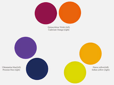
Today’s lesson is an experiment in working through those color shifts. I want you to make the above color chart, using three sets of paired primaries:
  • Prussian blue—Ultramarine blue
  • Quinacridone violet—Cadmium orange
  • Indian yellow—Lemon yellow

The purpose of this exercise is to understand how paired primary pigments work together, so that you can make neutrals when you want them, and avoid mud when you don’t.

Draw the chart onto a canvas, and then mix across and down for each square. The left column and the top row should be pure pigments. Fill it in, then, just like the multiplication tables of your youth. For example, the intersection of cadmium orange and ultramarine blue should be a 50-50 mix of those two colors.
Unless you’re painting in watercolor, the result should be opaque.
Let me know if you have any questions. And have fun!

Buying too many paints is a classic rookie error

Mix, don’t buy, your colors.
Grand Bahama palms, by Carol L. Douglas. There’s really no reason to buy any greens for oil painting, and just one will do for watercolors.

“[Our] watercolor instructor wants us to buy every color we need for a painting. I think it is unnecessary because you can mix colors to get the same or similar results. What is your opinion?” a reader asked.

I ask my students to buy a specific palette based on paired primaries, but that is very different from asking them to buy a specific pigment for a painting. An artist who regularly switches out his or her paints is akin to a pianist who rearranges the keys for each song.
Buying too many paints is a classic rookie error. It’s easy to get pulled into a revel of paint-buying when you’re feeling unsure. We’ve all done it.
Tomatoes, by Carol L. Douglas, was painted without any red or green on my palette. The red you see is violet and orange.
The clear leader in marketing romance, as Handprintcalls it, is Daniel Smith. I sometimes go to their website to feel the verbiage wash over me. “The mineral for our Red Jasper Genuine comes from India’s Gwalior region and is colored a rich red from iron. Historically it was often carved as amulets, vases and other decorative items.  India’s red jasper was one of stones used to beautifully embellish the Taj Mahal with other semi-precious stones that were carved and inlaid into the white marble in curvilinear flower forms… Spiritually, red jasper is associated with the base or root chakra and helps to ground and energize/heal the body and provide balance and protection.”
I can infer it’s an iron oxide red. Not as romantic, but cheap and commonly available.
Headlights, by Carol L. Douglas. No black here, either. It’s ultramarine blue and burnt sienna.
Daniel Smith loves to tell people how to use each pigment: “Red Jasper Genuine is a wonderful color for landscapes, birds like the male common chaffinch and reddish egret, as well as animals who have a medium to light reddish coat like the red panda.” I imagine a studio with hundreds of tubes of their paint, in careful rows, tagged, “for sunlit shadows,” or “for moonlight,” or “for powerful, monolithic shapes.” It’s all very entertaining and poetic, but will do nothing for your painting.  
Get tough, Reader. Ask your teacher the purpose in all these single-use paints. If the answer isn’t satisfactory, it’s time to find a new instructor. Mixing color is so integral to painting that a class that avoids it isn’t going to teach you anything useful.
Ogunquit rocks, by Carol L. Douglas. All four paintings were done with the same palette.
On the heels of that note came another. “Do you teach color mixing by visual understanding or by paint name?” a reader asked. “The moment I understood that there was no such thing as red, blue, and yellow, the world changed and it became possible to see the nature of each color.”
I teach color mixing (as distinct from color theory) on the basis of pigment. I’ve developed, over the years, a stable palette that gives me the widest gamut (range) of color tones. They don’t include convenience mixes.
These are combinations of two or more pigments to approximate a different pigment. Many of them were developed as substitutes for antiquated pigments that may have been pulled from the market because they’re fugitive or toxic. They are limited, because:
  • Every time you add another color to a mix, you’re adding overtones;
  • You can easily make the mix yourself if you should need it and;
  • They’re inconsistent. Their marketing name tells you nothing.

How do I know what pigment(s) are in my paint? They’re written on the tubes, in tiny letters. Here’s a quick primer on how to read a paint tube. It sounds complicated, but it’s nothing compared to the frustration of painting with the wrong materials.

Monday Morning Art School: mass tones, undertones and mixing

The imperfection of paint is what gives it its liveliness and depth, but it also makes mixing colors tricky.
Autumn, by Carol L. Douglas. This painting contains no reds. The red tones are a combination of cadmium orange and quinacridone magenta.
Last week, I made a flippant remark about clashing colors. This weekend, I had an opportunity to see clashing at work, in an ottoman proposed for my living room. It was a cool rose tint and looked horrible with my sectional’s warm red cushions. I’m usually happy with putting closely analogous colors together but this combination would be terrible. The mass tones were fine; the undertones were all wrong.
A mass tone is the color a pigment is straight out of the tube, dense and unmixed with another color. No real-world pigment, however, is as pure as a color on a video screen. While two pigments may look the same to the naked eye, their behavior when mixed can be radically different.
Undertone is the color revealed when a paint is spread thin enough that light bounces back up from the substrate. Some pigments are fairly consistent when moving from mass tone to undertone. Others have significant color shifts. Not understanding those undertones tones can lead to muddy mixes.
Three blues that look similar out of the tube, but behave very differently. The ‘glaze’ on the left is the undertone. Courtesy Gamblin paints.
Ultramarine, Prussian and phthalo blue are colors that shift radically from mass tone to undertone. They’re all so dark out of the tube that their differences aren’t apparent to the naked eye. But dilute them, and you’ll find a wide range of blues.
Undertones are why buying “hues” instead of pure pigments can be such bad value. Take, for example, cadmium red hue, which is usually a napthol red with a small amount of white added. Out of the tube, the two paints are indistinguishable, but they mix very differently.
Cadmium Red Hue is usually made with napthol red and a little white. They mix very differently, which is why the hue is a bad substitute for the real pigment. (In its own right, napthol is a fine red, however.) Courtesy Gamblin paints.
Even paints with the same pigments can have different undertones depending on the manufacturer. I’m experiencing this right now with my quinacridone violets, which I’ve been replacing with whatever I can buy along the road. That comes back to the imperfectability of pigments and their essential complexity.
A drawdown test showing a paint’s undertone. Courtesy Utrecht paints.
If you’re considering two different pigments, or thinking about switching brands, you could test them. It’s fast and easy. To see their mass tone, put a small dab of paint on a smooth white board or glass palette and draw it down with a knife, creating a uniform, solid stripe that completely obscures the painting surface.
To see the undertone, draw the samples down again so they are translucent. You should be able to see minute variations in the color, and in the covering power.
To understand the behavior of each more fully, you now need to make tints, tones and shades of each sample.
  • A tint is a color plus white.
  • A shade is a color plus black.
  • A tone is a color plus black and white.

This old paint chart from my studio explains tints, shades and tones.
Even when the mass tone appears quite similar, two close colors will act very differently when mixed. Their unique qualities of tinting strength, chroma, undertones and color temperature come into play here. But mixing paint with white or black immediately adds another layer of complexity. Different blacks and whites have their own undertones. Titanium white has a cool undertone. Zinc white is warmer, but it’s also brittle and thin, making it a bad choice for general painting. Ivory black is slightly warm.
The imperfection of paint is what gives it its liveliness and depth. It’s also why I don’t use a limited palette, but a system of paired primaries, which I described here.

Mixing greens

There are many paths to the final destination, grasshopper. This is just one fast, easy route to mixing summer greens.
Mixed greens, in oils.
Here in mid-coast Maine, the fog and rain are finally releasing the leaves from their winter sheathes. Hints of green show in my lawn, and the hardiest perennials poke their noses through last year’s leaf litter. We are very close to painting greens again, in all their light, airy delicacy.
By June, we will be wrapped in a blanket of immature, emerald foliage. By August, the color will have settled into a deeper, more uniform tone. The only way to navigate this is to avoid greens out of a tube. A system of paired primaries gives you more options, avoiding the acidity of phthalo green, the weight of chromium oxide green, or the soul-sucking darkness of sap green.
Jennifer’s exercise in mixing and modulating greens.
Michael Wilcox published a watercolor pigment guide called Blue and Yellow Don’t Make Green. Well, of course they do, but his point was that there are many routes to the same destination. One of the most useful landscape greens is black and cadmium lemon or Hansa yellow. Of all the greens I mix, this and ultramarine with yellow ochre are the two I use the most.
In my experience, bad paint mixing causes paintings to go wrong faster than anything else. Constantly over-daubing to modulate the paint color distorts the original drawing and makes a grey mush. If you’re confident of the color, you can apply it fast and accurately.
Loren’s exercise in mixing and modulating greens.
For the past two weeks, I’ve drilled my students on mixing color. These are simple exercises you can do at home.
I make my greens on a matrix, which I’ve shown you both mixed (at top) and on a chart (below). The two swatch charts were done in acrylics by students. I asked them to first mix greens according to the chart, and then mix the resulting greens with tints (meaning a mix of white and a color) of ultramarine, raw sienna, and quinacridone violet. What the specific tints were was unimportant; what mattered was how differently tints mix from white out of a tube.
Cadmium lemon can be substituted for Hansa yellow
The range of results is infinite. It depends on both the proportions you choose and the brand of paint you use. However, note that blue/black pigments are much stronger than the yellows. You need about half the amount of blue or black as you do yellow.
These are Benjamin Moore swatches but you can find similar colors in other brands.
The second exercise involves stopping at your local hardware store for a few paint swatches. These are Benjamin Moore brand, but you should be able to find similar ones elsewhere. There are two off-whites: one cool and one warm. There’s yellow, green, and two soft blues. Your assignment is to mix until you think you’ve hit the exact color. Then put a dot of it on the card to see how close you got. (If you’re working in watercolor, the dot goes on paper instead.)
Jennifer’s neutral swatches.
I also had my students make neutrals using combinations of ultramarine blue with burnt sienna and raw sienna. I use ultramarine blue and burnt sienna as my standard dark neutral, because it can go to the warm or cool side depending on how it is mixed. These are also my go-to mixes for rocks and sands.