fbpx

Monday Morning Art School: saving a so-so painting

You like it, but there’s something just not exactly right. Or you’re not sure you like it at all.

Miss La La at the Cirque Fernando, 1879, Edgar Degas National Gallery, London. How does pattern and repetition hold this painting together?
Last week I went through a collection of paintings belonging to another artist. “Pull out the ones that I should burn,” she said. There were almost none in that category. In fact, most of them were quite lovely.
Of the ones that weren’t, most were promising starts that either fizzled or were never finished. “You can fix this very easily,” I kept saying. Of about 75 small paintings she brought, only a very few were consigned to the burn pile. Most of them needed a simple fix: a passage lightened, an edge softened, or a focal point developed. All she needed was to have those pointed out.
The next day, my student Dave went through my slush pile during a break. It’s huge; it has hundreds of paintings in it. “I love this,” he kept saying. “Why don’t you like this?”
Crucifixion of St. Peter, 1600, Caravaggio, Cerasi Chapel, Church of Santa Maria del Popolo, Rome. In chiaroscuro, value creates volume. How did Caravaggio drive us back through space in this painting?
I don’t not like them, I told him; I just don’t feel like selling them. I almost never wipe out work that’s not finished or not what I’d envisioned. They go on shelves in my studio. Occasionally, I will sell these paintings for rock-bottom prices, but mostly they’re there for my edification. Occasionally, I’ll notice something I really like and pull it out and study it, both for what’s working and what isn’t working.
Everyone has problem paintings. Often, I discover a year or two later that what I thought was a problem was actually a roadmap. It was a precursor to where I was headed as a painter. In some cases, all these paintings need is varnish to bring up the color and they sing. Or, they may need revision.
Michael tramples Satan, 1636, Guido Reni, Santa Maria della Concezione church, Rome. How does line drive you through this painting?
Last week, I wrote about the five basic elements of painting design. The best way to rescue a so-so painting is to subject it to formal analysis. That doesn’t mean you have to write a dissertation about it. It means you consider your painting in terms of each of these design elements. Are you using line, shape, space, color and texture to guide the viewer through the space you’ve created? Have you emphasized important passages and subordinated others? Is there repetition, pattern and rhythm in the piece?
A painting that doesn’t work almost always fails in several of these areas. You are as qualified as anyone to analyze your paintings based on these objective standards. There’s a great advantage in learning to do this: you will never be led astray be a stupid critique again. (I once ruined a wonderful painting by following bad advice, made worse because I’d paid for it.)
Le Wagon de troisième classe (The third-class carriage), 1864, HonorĂŠ Daumier, Metropolitan Museum of Art. This has nothing to do with the subject of this post; it’s just how I feel when flying.
We recently did this exercise in my Rockport painting class. In my experience, amateurs fixate on mark-making to the exclusion of far more important qualities in painting. They’re so worried about their handwriting that they fail to see the bigger picture. My students walked away from this exercise with the objective knowledge that they were doing better than they thought. I think you will, too.
I would have illustrated this with some of my flubs, but I’m traveling today without access to my server. I’m off to Pecos, NM, to paint snow.

The happy pursuit of leisure

Out here in the hinterlands, we haven’t forgotten how to waste time productively.

Running, by Carol L. Douglas
I enjoyed reading Tim Wu’s reflections on why Americans don’t have hobbies, except that I don’t believe a word of it. I agree with him that leisure is the basis of culture. But I see no sign of its demise.
I teach a lot of people who are dedicated hobbyists. They pursue excellence in painting because they love to paint, and they get satisfaction from constantly improving their skills. That’s the very definition of ‘amateur,’ which derives from Latin amatus, the past participle of amare: â€˜to love’.
Many of them paint as well as some professionals. The difference is that they aren’t pursuing sales. That keeps the joy in painting. Being a professional artist is as entrepreneurial as it is creative, and that is a lot like what they left behind at the office.
Hiking boots, by Carol L. Douglas.
Yes, I have hobbies separate from my work. In fact, I got thinking about Wu’s essay when I ordered a new pair of ice skates. (They are my first brand-new pair ever.) I have a canoe, snowshoes, hiking boots, three sewing machines, and a woodshop, and I use them all.
Is the problem young people, so sunk into their screen time? I don’t see it. Two of my daughters are passionate cooks, a hobby that seems to have exploded in popularity in recent years. The third has a 4X4 and miles of trails. My son is recording an album of music over his winter break. One of my favorite young people is passionately interested in aerial gymnastics. No, she’s not training for the circus; she just likes it.
Butter, by Carol L. Douglas
Many Americans pursue hobbies that were toil a generation ago. For example, my friend Toby has an inexplicable love of canning. She’s got all the best equipment and skills to make a 19th century housewife proud. It’s fun because, in our 21st century world, it’s separated from drudgery.
The same is true of small-scale animal husbandry. The backyard chicken trend has been increasing in popularity for the past decade.
Spring, by Carol L. Douglas
One of my kids loves posting photos to Instagram. She’s not trying to be a social-media sensation; she just likes to share her weird world with others. A generation ago, she might have invested in a darkroom and SLR camera. Worse, she might have invited you over and pulled out her carousel projector and 200 hundred slides of her most recent trip.
Then she would have been called an “amateur photographer.” It’s still the same thing today, even when it’s done on a cell phone. Hobbies have morphed, not disappeared.
Professor Wu’s essay falls in the category of “the sky is falling” opinion piece at which the New York Times excels. But, fear not, good sir! Out here in the hinterlands, we haven’t forgotten how to waste time.

Painting with meaning

The paintings that catch our eye aren’t necessarily the ones that are perfectly executed.
American Eagle in Drydock, by Carol L. Douglas

While I’ve had an Instagram account for a long time, I’ve only recently understood how it really works. I’m not talking about its mechanics, but the algorithms that drive it. It has the power to be a massive dipping net. When you use it as a tool instead of passively looking at what it throws up at you, you see a lot of art outside your own little puddle. That exposes you to style and content you wouldn’t otherwise see. It’s all at thumbnail size, so the work must compel you instantly, just as your own slides must compel a juror’s.

Obviously, high chroma wins over subtle color every time. To imagine otherwise is to think that a fruit compote could be savored by a person who is stuffed full of Christmas cookies. Some of the qualities of painting that we traditionally admire—finish and modeling, for example—seem irrelevant, even counter-productive. Such paintings can seem academic and dull on Instagram, whereas they’re the ones that would look the best in real life. The exception is composition; it’s more, rather than less, important at such a tiny scale.
Dyce Head Light, by Carol L. Douglas
Instagram is chaotic. A painting by a complete duffer will appear in your feed after something by a well-known contemporary artist. The well-known artist will have more followers, increasing his chances of being seen. But if the duffer uses hashtags properly and you’re looking for paintings of his specialty, you’ll find his work.
That’s why I’m suddenly wasting all my free time on Instagram. A whole world of painters who will never be represented in New York galleries are there, painting their hearts out. I want to see what they’re doing. I want to understand my reaction to their work.
Jonathan Submarining, by Carol L. Douglas
What moves me, overwhelmingly, is content.
I recently saw a painting of a small house decked out in Christmas lights. It wasn’t a brilliant painting, but it was accurate enough that I could see my own life reflected in it. It was a portrait of coziness and contentment. It has been on my mind all week.
Emotional content doesn’t come easily to me. It’s possible that I’ve trained it right out through my fingers. When we do plein air events in unfamiliar places, we’re not expressing anything about purpose or meaning. All we can do is paint beauty.
Fish Beach, by Carol L. Douglas
Yesterday, I confused the suffixes amity and amor in writing. At 2 AM, I was awake and restless and beating myself up about it, as we like to do during bouts of insomnia. I’d been writing about domestic intimacy, so it was easy enough to slip up between ‘friend’ and ‘lover.’
A different thinker might be able to find concrete images to convey the easy, old relationships within a happy, functioning family. If I ran across that painting on Instagram, it would be the one that would still my hand and echo in my thoughts all day.
Now how do I get some of that for me?

Monday Morning Art School: ditching the color

A painted value study is a great tool for understanding your subject.
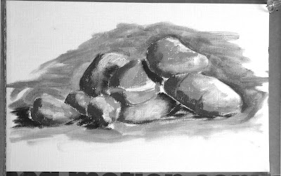
Pile of rocks value study, by Jennifer Johnson

Last week, I had you find and identify the simple shapes within a drawing. The prior week, we learned how to do abstracted value studies of our own homes.  This week I want you to do a monochrome (black and white) painting based on a value drawing.

Jennifer Johnson is usually two steps ahead of me. At the end of Tuesday’s class she told me she’d done this assignment before I assigned it. She graciously offered her paintings to illustrate this post.
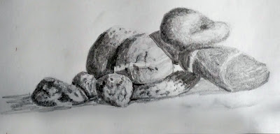
Jennifer started by doing this meticulous, detailed drawing of her pile of stones.
Before you can work successfully in color, you need to be able to work successfully in black and white. This is possibly the most valuable training an artist can give him or herself. I often do watercolor value studies before I paint in oils, but any painted medium will do for a monochrome study—gouache, watercolor, acrylic or oils.  It is not necessary to use a pricey substrate for this exercise: gessoed paper is sufficient for acrylics and oils; use any paper you have for gouache or watercolor.
Jennifer was trying to teach herself about rock structure, so she set up a pile of stones. First, she drew a meticulous, careful drawing of her subject. This step is akin to research; you are learning the details of your subject.
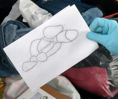
She traced the basic shapes for each iteration. It saved her tons of time and made it easier to do multiple iterations of the same idea.
Next, she simplified and redrew her picture in graphite, focusing on the values, not the fine details. She then painted the rocks in monochrome acrylic. She added a final step, using five different colors to represent five different value levels. If you want to add this step, the exact colors you use are immaterial, but they should go from warm to cool or cool to warm as they get darker.
Jennifer used tracing paper to redraw her outlines. That’s perfectly fine, since she didn’t get hung up on the drawing. You may find yourself doing a half-dozen drawings before you get the levels and composition just right. Your goal isn’t to simply copy reality, but to design a construction that pleases your eye. It may be almost exactly what you see, or it may be very different.
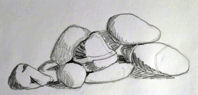
Next came a simple value sketch of the rocks.
Value is the first and most important visual element available to the painter. Get it right, and you can be wrong about a lot of other things and still produce a stellar painting. It’s a lot easier to experiment with value when you’re not fussing about color management at the same time.
Why use paint instead of a pencil for your value study? In practice, many students have trouble applying different pencil tones to paper. They leave most of the paper white. Moreover, it’s hard to differentiate four or five value steps with a #2 pencil.
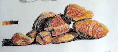
In addition to her monochrome painting, Jennifer did a version where she assigned different colors to different values. If you do this, make sure the colors move warm-to-cool or cool-to-warm as they get darker or lighter.
Work from light to dark. When you’re done, check where the area of highest contrast is. If that’s not where you wanted the focal point to be, you may have a design problem. If so, just do it again until your work can be read like a story: first focal point, next focal point, next focal point, etc.
Don’t be timid about laying in darks and don’t worry about neatness. This is rough work, and it should be done fast.
Why not do your value studies on the canvas you intend to work on? Once you cover it up, you no longer have it for reference. That becomes very important as the light shifts. Having a value study on hand can make the difference between being able to finish a painting or not.

Why am I hoarding art supplies and not getting any work done?

That bad habit will die, dear reader, when you finally own everything.
I paint random, meaningless still lives when I can’t get started. This is a stuffed birdie and the Douglas tartan.

“Why is it so easy to buy and hoard materials, then so hard to begin the artwork? Or is it just me?” wrote a correspondent.


The “Just Do It” campaign brought Nike’s share of the North American sneaker market from 18% to 43% over a decade. That tells us that dithering is a real, important part of the project-starting experience.
The dark shapes at the bottom left are credit cards, dear reader. Your problem is universal.
I can be a real ditherer. I spend way too much energy debating the order in which I should do simple tasks. None of this is productive, so my solution is to do all rote tasks in a specific order. I always make my bed, for example, when I get up. It saves me the hassle of debating whether I should make my bed. That battle can easily use more time and energy than just doing the chore.
Still lives are especially amusing when the technology they record is now obsolete. That’s not even a flip-phone.
The same holds true with my work. I always write my blog as soon as I get up. That’s usually 6 AM. Then I do other paperwork, and then I go into my studio.
The human brain reorganizes itself during learning. Scientists have studied activityin the ventral striatum of the basal ganglia, which is the brain region that controls habit formation. It shifts from fast and chaotic to slow synchronization pace as rats learn the ‘habit’ of running a maze.
“This is beneficial to the brain because once that habit is formed, what you want to do is free up that bit of brain so you can do something else — form a new habit or think a great thought,” MIT Institute Professor Ann Graybiel said.
Speaking of hoarding, the computer I bought this for died before the hard drive was ever installed. But I did enjoy painting the bubble-wrap.
One side-inference of this research is that even rats calm down when they have mastered habits.
So, the short answer to working efficiently is to develop the habit of regular work. This is the gist of the book Art & Fear, which I frequently recommend. The importance of habit is true across all disciplines, but creativity also requires a seemingly contrary characteristic: creative flexibility. Is that possible in a highly-ritualized person?
Those smarty-pants at MIT also discovered that brain synchrony, starting in the striatum, supports rapid learning. The human mind can rapidly absorb and analyze new information as it flits from thought to thought. These functional circuits are rhythm-based, and they’re controlled by the striatum, the same area that controls habit-formation and addiction.
Two very important elements of the backwoods painter’s experience.
The question of buying unnecessary art supplies is a different one. It happens because art is a system of dreaming and prototyping, and sometimes our ideas ‘die aborning.’ That’s not unique to artists; it happens to all visionaries.
I’m the opposite of a hoarder—I throw everything out. And still there is stuff in my studio for which I have no use, or that I bought for projects I never did. That habit will die out, dear reader, when you finally own everything.

Where do the dogs go?

Failed paintings are less common than you think. You just have to look at them the right way.
This is an example of an unfinished painting that pointed the way forward. It took years for me to understand where I was going with it.
Last week, as I dithered about which paintings to submit to Santa Fe Plein Air Fiesta, a reader wrote, “Can you write a post sometime about what you do with the second-tier paintings you make? Do you just scrape them? Give away to unsuspecting strangers? Donate, unsigned, to charity thrift shops? Let them accumulate and breed in a dark basement?”
First of all, let me be clear that I don’t think any of last week’s five (or the one I didn’t finish on Friday) are ‘second tier’ paintings. I’m happy with them all, and I think they’re sellable. They’re not sellable in either of the galleries that represent me on the Maine coast, however. I have two options: I will market them through my own studio, or sell them online through Chrissy Pahucki’s pleinair.store.
Spring, by Carol L. Douglas. I hated this when I painted it. Now I’ve almost caught up with it.
I’ve done plein airevents where I’ve sold exactly nothing, and other events where I’ve sold everything. It’s unpredictable. At the end of the summer, I usually have more work left over than I’ve sold. Usually these works end up selling in future years. Occasionally, they end up donated to fundraisers, but only for organizations I care about, who can get a fair-market price for their work.
But let’s talk about paintings that aren’t good enough to sell. It happens, although the artist in his or her post-creative exhaustion is the usually the last person to be a good judge of whether a painting has merit or not. Some artists are quick to scrape out everything they don’t like. After all, professional-grade painting panels are expensive.
Hollyhocks, by Carol L. Douglas. Sometimes you have to paint something a number of times to realize you aren’t interested in the subject. I thought I should be, since I’d planted this garden.
I don’t think scraping out is a good idea. It means new and difficult ideas are stillborn. How do you find a path forward without contemplating each tangled byway to see if this is the way forward?
These paintings—the edgy, difficult ones that don’t seem to have much value—go on racks to dry, and then into into bins in my studio, where they’re available at a reduced price. I can’t tell you how many times I’ve looked through those bins and suddenly seen something wonderful that I’ve never noticed before. My brain likes the status quo. Often it takes a few years for it to catch up with the intelligence of my hands. Those bins are part of the process of dragging it forward.
59th Street Bridge Approach, by Carol L. Douglas. There are subjects I used to love, but love no more.
I have a few customers who love the bins, and they root through them every time they visit. They can definitely get a good bargain there, because the binned paintings are available for a fraction of the cost of framed paintings.
Sometimes, these binned paintings live on as reference for larger works—I’d much rather scale up a field sketch in the studio than a photograph. Sometimes, I revise and finish in the studio. For example, the seasonal lag between New Mexico and Rockport, ME, means that I can comfortably find an apple tree here to use to finish Friday’s painting.
But, yes, sometimes I paint total dogs that aren’t useful for reference, for overpainting, or for any purpose known to mankind. These I destroy. Although that doesn’t happen very often, I reserve the right to edit my own legacy.

The hardest working women in show business

To the ramparts, woman! The future of women artists rests in part with you!

My first event this spring is Santa Fe Plein Air Fiesta, so I’m getting into a New Mexico kind of mood. This pasture sketch is from my last trip there.
Last night I had a brief chat with my pal Mary Byrom. I want to go down to draw in Strawbery Banke in Portsmouth, NH. Strawbery Banke is unlike other living history museums in that it is a real neighborhood of real houses, restored where they originally stood. It dates back to 1630, when Captain Walter Neale chose the area to build a settlement. It was saved from the wrecking ball of 1950s urban renewal by historic preservationists and opened as a museum in 1965. It has unadorned simplicity and solid shapes that make you itch to draw.
Mary lives and works in southern Maine, so Portsmouth is her stomping ground. She recently did some delightful pen-and-wash sketches of Strawbery Banke. When she put them on Facebook, I asked her if she’d be game to join me. “I have to wait for this foot to heal,” I said.
Last night she texted to see how I was doing. I’m off to Damariscotta this morning to have the stitches removed and the foot released from its bandages. As of now I can’t do any significant walking. I don’t know what the doctor is going to tell me, or whether I’m going to have the other foot operated on immediately. It’s frustrating to watch my friend doing such lovely work from the vantage point of my couch. I’m heartily sick of my couch.
The Rio Grande in New Mexico, by Carol L. Douglas
Mary told me she’s teaching three classes right now. I whistled in admiration. The last time I did that was in 2008. I was ten years younger then.
That doesn’t sound so hard, but it is really a lot of work for the solo practitioner, who must advertise, prep, teach and clean up on her own. Every hour spent teaching means at least an hour of preparation.
Meanwhile, Mary’s been out doing small pen-and-wash sketches all winter. They grow steadily more wonderful. All of which points out an essential principle of painting: if you want to improve, you have to keep doing it. That’s true for beginners and it’s equally true for old pros like Mary.
Study at Ghost Ranch, by Carol L. Douglas
Bobbi Heath and Poppy Balser are two other women artists I’m tight with. I know something about their day-to-day life. Neither of them is resting on their laurels, either. Both juggle the day-to-day business of an art career with the day-to-day business of living, while simultaneously driving themselves to improve and broaden their skills.
I’ve written hereherehereherehere (and probably elsewhere as well) about the fabulous misogyny of the art world. If that ship is righted—and it will be—it will be because women artists like Mary, Poppy, and Bobbi have worked so long and so hard to produce work. Their tireless efforts will open the door for younger women artists to be taken seriously right out of the gate.
Around the Bend, by Carol L. Douglas. New Mexico is surprisingly green in April.
Meanwhile, I’m trapped on the couch with a damn dicky foot. I realize it’s only been two weeks, but it feels like an eternity since I last had a brush in my hand. To the ramparts, Carol! The future rests with you!
It’s about time for you to consider your summer workshop plans. Join me on the American Eagle, at Acadia National Park, at Rye Art Center, or at Genesee Valley this summer.

Paying attention to clouds

What combinations of clouds are present? How frequently do they repeat? Where are they forming? Are they growing tighter or looser? Where is the light coming from?

They wrested their living from the sea (Advocate Harbour), by Carol L. Douglas

Yesterday, I gave a lesson on perspective in clouds. It’s also important to understand the variety of clouds in the sky.

When you’re on the edge of something big, like a mountain range or an ocean, the clouds often scramble themselves into strange and magnificent patterns trying to adjust to the updraft of odd air. Erie PA and the Tug Hill Plateau have bewitching skies because they’re drafting on a Great Lake. (That’s also why they get so much snow.)
Clouds are classified by their shape, the altitude they form at, and their opacity. All are important to the painter.
Various cloud types, 2005, by Christopher M. Klaus at w:en:Argonne National Laboratory
Cumulus clouds are the big, generous puffy clouds we love to paint. The ones that form pillows tend to be low in the atmosphere; the smaller ones are higher up. Cumulus clouds have flat bottoms and puffy tops. As a rule, the bigger the clouds, the more there is cooking, convection-wise.
Cumulus clouds can join up to create massive cloud sheets. These stratocumulusclouds are different from stratus clouds in that they’re warped, buckled, and rolled. Where they drift over land, the extremes of weather are reduced. That makes them both good and bad news in the Great Lakes regions: they keep the weather temperate, but they also create lots of dull weather.
Cobequid Bay farm, by Carol L. Douglas
Cumulinimbus clouds are the prima donnas of the cloud world, the towering giants we like to call “thunderheads.” They’re so big, they cross levels of the atmosphere. They’re a good news, bad news sight. They’re dramatic and fascinating to paint, but they also mean you may get dumped on, or worse, soon.
Stratus clouds are flat sheets of grey that can form at any altitude. At ground level, they’re fog. As they get higher in the atmosphere, they assume different names, along with better lighting and color: cirrostratus (high-level), altostratus (mid-level), and nimbostratus (multi-level), but they’re all really the same thing. Here in the east we often get high-level sheets of stratus cloud above cumulus clouds. When I see them, I always try to include them in my paintings, for the differences in color and form are appealing.
Cape Blomidon makes its own cloud, by Carol L. Douglas
Cirrus clouds are the most interesting and difficult to paint convincingly. These are the clouds sometimes called “mare’s tails.” They are generally translucent, and look like long, detached, strings or filaments in the sky. They can develop around thunderheads as dependencies. They are often seen above other cloud formations, doing their own thing in the sky.
Watch the sky over time. What combinations of clouds are present? How frequently do clouds repeat? Where are they forming? Are they growing tighter or looser? Where is the light coming from? Paying attention will add to the depth and character of your skies.

It’s about time for you to consider your summer workshop plans. Join me on the American Eagle, at Acadia National Park, at Rye Art Center, or at Genesee Valley this summer.

How Winslow Homer transformed himself

Before he became Maine’s greatest painter, he needed to shed his sentimentality. He did that in part by taking up watercolor.

Five boys at the Shore, Gloucester, 1880, Winslow Homer

After working as an illustrator during the Civil War, Winslow Homer concentrated on two distinct oeuvres: postwar healing and homely, nostalgic paintings of American innocence. These were well-received by the public but not universally respected.

“We frankly confess that we detest his subjects… he has chosen the least pictorial range of scenery and civilization; he has resolutely treated them as if they were pictorial… and, to reward his audacity, he has incontestably succeeded,” said writer Henry James. Winslow Homer’s work in the late 1860s and ‘70s was done in paint, but it was still illustration. When he depicted children as symbols of the nation’s lost innocence, he was playing on a common, well-worn theme of the time.
To be fair, Homer was a young man, and he hadn’t had the advantage of an extensive art education. He was just 29 when the Civil War ended. Snap-the-Whip was finished when he was 36 years old. It was about this time that he was able to give up illustration to focus on painting. It was also around this time that he took up watercolor seriously.
Three Fisher Girls, Tynemouth, 1881, Winslow Homer, courtesy National Gallery of Art, Washington DC
By the middle of the 19th century, the influence of critic John Ruskin led to an interest in watercolor as a serious medium. The American Society of Painters in Watercolor, later to be the American Watercolor Society, was founded in 1866. In 1873, this group mounted an exhibition of nearly 600 paintings at the National Academy of Design.
Homer was living in New York at the time and almost certainly saw this show. It’s also probable that he was already familiar with watercolor painting. It was a genteel medium, widely used by ladies and children, but not respectable enough for galleries.
In 1873, Homer left for Gloucester, where he made his first professional watercolors. That summer he sketched and painted children playing on the waterfront. They clam, row, pick berries, play on cliffs and stare longingly out to sea. These paintings were a continuation of his interest in the lost innocence of America.
The Boatman, 1891, Winslow Homer, courtesy Brooklyn Museum
What was different was how he applied the paint. He drew in graphite, and then painted over his drawing. He didn’t wet his paper, which was common practice at the time. This made for a less-detailed, more sparkling finish. Critics were mixed about the results. Some admired the rawness; others hated it. “A child with an ink bottle could not have done worse,” wrote one.
By the end of that decade, Homer had come to two points in his personal life which would mark his mature work—a tendency to reclusiveness and a fascination with the sea. But before he could become Maine’s quintessential painter, he needed to shed his obsession with the American myth.
Casting, Number Two, 1894, Winslow Homer, courtesy National Gallery of Art, Washington DC
He spent 1881 and 1882 in the English coastal village of Cullercoats, where he focused on the men and women who made their living from the sea. His palette muted; his painting became more universal. And he made much of this transition in watercolor.
He had, by changing up both his medium and his locale, made himself a painter of an elemental truth—the relationship of man and the sea.
Between 1873 and 1905 Homer made nearly seven hundred watercolors, transforming the medium and his artistic achievement as a whole. “You will see,” he said, “in the future I will live by my watercolors.”

Instagram, the internet, and the painter

Instagram is changing how buyers respond. Should it also change how artists paint?

Hashtag #pleinair. By the time you read this, the top nine will be something different.

I haven’t painted in square format in a long time. The stark symmetry of the square can be lovely, but it can also be static. Recently, however, one of my daughters suggested that I start up again. “You should try painting for Instagram,” she said.

Instagram images started at 612px by 612px but have grown to 1080px by 1080px. (On your laptop or tablet, the images are scaled back down to 612px.) You can nab a few more pixels by posting portrait-format images. This made it easier for marketers to cross-post to Facebook. As someone who uses Facebook/Instagram marketing, I appreciate that.
While 1080px is incredible resolution from a wee little phone app, it’s not going to reproduce the subtleties of a masterpiece like Frederic Church’s Heart of the Andes. It skews art to the graphic-design side. What’s important isn’t how the work reads on a wall; what’s important is what it looks like on a phone. There’s nothing inherently wrong with that, but it does tend to leave subtler painting back at the Met.
Hashtag #landscape is overwhelmingly photographic and mystical.
The Instagram artist’s goal is to end up where newspapermen used to call “above the fold,” meaning on the upper half of the front page. That translates to being among the top images in a wildly popular category like #art. You’re not going to get there without great images. But you also need to discipline yourself to act like a trained monkey at times, to do things like randomly “like” posts by your followers, over and over and over.
The artist/gallerist has to wrap his mind around the fact that Instagram isn’t a way to flog paintings, it’s a medium in itself. It favors the bold and simple. Composition and color are key. Instagram users like video. And they aren’t librarians: even in a category like #pleinair, the top posts don’t necessarily have anything to do with painting.
Hashtag #artist. Is that a Vampire Facial in the middle?
Instagram flows both ways, of course. There are artists whose work is about the interaction of people and technology, like Jeanette Hayes. There are many more of us who’ve integrated Instagram and Google into our reference material. That makes the search engine roughly analogous to the camera in the 20th century. Instead of creating our own reference images, modern artists appropriate them from others. Yeah, I know that’s illegal and unethical, but appropriation is one of the major movements in modern art.
Then there’s the issue of what’s acceptable. “There is also a notorious censorship issue on the app that prevents real artistic freedom,” said Instagram darling Brad Phillips. “Sure, the official stance is that you can post pretty much whatever you want but sexual images (ones that do not violate Instagram’s terms around nudity) are often flagged and deleted.” That predates Instagram, of course.
Hashtag #art. If they print it, it must be true.
All this is puts great pressure on the artist, particularly one trained in the 20th century, when there were very different ideals about craftsmanship and the meaning of art. I’m ambivalent about Instagram, but I ought to get past that. Should I change how I paint? I’m not sure I want to. Should I change how I photograph and present my work? Absolutely.