A good reference picture is not necessarily a good photo. A great photo is almost never a good reference picture.
 |
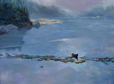
| Headwaters of the Hudson, by Carol L. Douglas, private collection. This is one of several paintings I’ve done based on the following photograph. |
Sometimes I’ll post a photo to Facebook, only to have someone suggest, “You should paint that!” Of course, I won’t. A photo good enough to elicit that response is a complete artistic statement in itself. Painting it won’t improve on it.
A good reference picture is not necessarily a good photo. A great photo is almost never a good reference picture. The purpose of a reference photo is not to make your composition, lighting, and color decisions for you, but to provide you the information you need to make those decisions in paint.
| The photo was taken on the causeway to Moose Island, ME, many years ago. |
When I do paint from photos, I always start (surprise, surprise) with a drawing. Why sketch first? I don’t want my photos to drive my paintings. It’s best for me to seek out the composition on my own, and then find the details and plug them in. The last thing I want is to be a slave to a photo.
I have tens of thousands of snapshots on my server, archived by where and when they were taken. But imagine, for a second, that I want to paint rolling surf. I‘ve taken many such photos, but was the right one on the Great Coast Road in Victoria, Australia, at Sandy Hook in New Jersey, or at Port Clyde in Maine? Nothing for it but to search every folder for the image I want. (My phone is, in this case, ahead of my laptop. It can search by image, and it does it very well.)
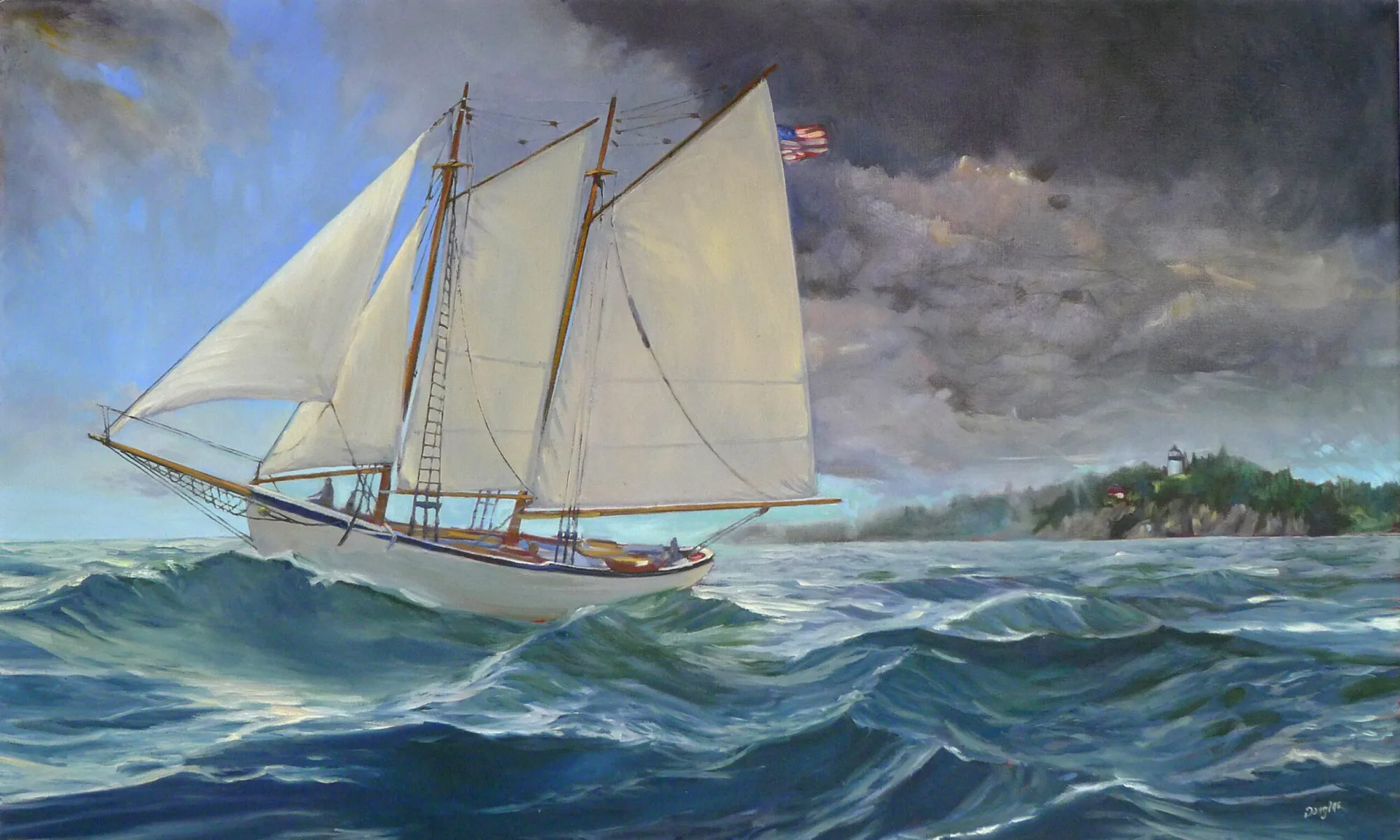
| Deadwood, 36X48, available from the artist. |
What will make one photo better than the next for my purposes? Not the setting, but the lighting, the color and the angle.
When I take reference pictures, I make a point of shooting far more peripheral material than I would for an artistic shot. This is because I’ve outsmarted myself too many times by cropping out essential information in the viewfinder. Detail is generally unimportant in a reference photo, and most modern cameras (including the one in your cell phone) have far greater resolution than the artist ever needs. Go ahead and crop when you’re ready to paint, but more overall information, not more detail, is generally what you’re looking for.
 |
| This was the reference photo for the painting above. It was taken by my friend Joe Wagner and I snagged it from Facebook. Yes, a certain amount of artistic license was taken in the final rendering. |
Flat, indirect light can be really boring in a landscape painting, but it’s sometimes helpful in a reference photo. It allows you to create your own atmospherics. You’re never stuck fighting a lighting source that doesn’t work.
Yes, I sometimes Google images. There are things I have seen in life but have never photographed—the Northern Lights, a star-spangled sky over Nebraska, or a Friendship sloop, to name just three. I use these pictures as background information. The last thing I want to do is copy someone else’s artistic ideas.
