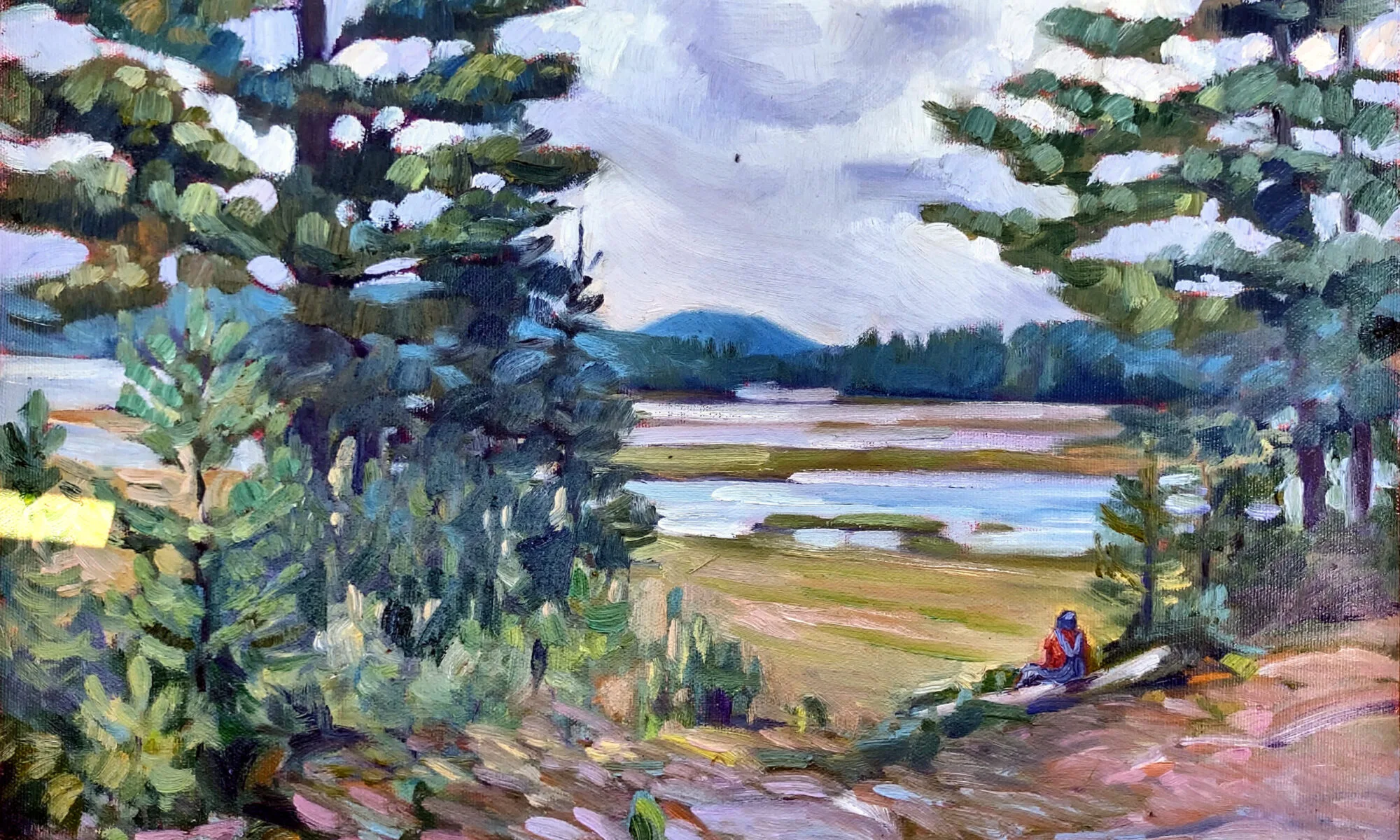
There’s no place for subtle in online art sales.
 |
| Headwaters of the Hudson, by Carol L. Douglas |
If you look at pastel kits online, you’ll see a bias toward high-chroma colors, even though lower-saturation chalks are the workhorses of pastel painting. In part, that’s because all mixing results in lower chroma; pigments are impure and their overtones tend to cancel each other out. But more than that, pastel kits are sold to beginners. People who already have kits just buy individual chalks to fill in holes.
Bright colors are attractive; a kit with luscious reds, brilliant yellows, and tropical turquoises will turn our heads while the hardworking neutrals sit in the corner, ignored. Since pastel manufacturers are in business to sell their products, they give the people what they want.
 |
| Fish Beach, by Carol L. Douglas |
The same thing happens with online painting sites. Although my Android phone has a 1440p display, the standard square image on Instagram scrolls by at 600×600 pixels. (Instagram stores at up to 1080 pixels, but doesn’t display at that size.) Compressed so severely, the best-looking images are the ones that have arresting composition, high contrast and lots of color.
Inside people’s homes, a very different trend continues. In 2015, when I painted my last house to sell, I used Benjamin Moore’s best-selling color,
Revere Pewter. This is a warm, soft grey, and I ran it ruthlessly through that elegant 1928 interior. I wish I’d done it when I still lived there; it looked beautiful and the house sold fast.
 |
| Finger Lakes vineyard, by Carol L. Douglas. There are a lot of places in America with muted light. |
Greys show no sign of abating. Benjamin Moore’s Color of the Year for 2019 is
Metropolitan, a neutral that somehow manages to look like it contains every pigment mixed together. BM is marketing this palette as a neutral refuge from the noise of the modern world, with tag lines like, “The calibrated silence of layered grays helps a modern home find its soft side.” They are not alone. Other paint manufacturers are also exploring the world of greys words like “repose,” “sea salt,” “mindfulness,” or “passive.”
I’m not averse to this trend of neutral walls with eye-popping color within picture frames; it looks great and matches my own worldview. But it behooves us to remember that high-chroma is just a style thing, driven by our electronic toys. It’s not an eternal verity, and it might not be the best way to make our point. Is there room for the quiet, contemplative painting in such a media-driven world?
 |
| All flesh is as grass, by Carol L. Douglas |
Yes. For one thing, the online market remains a small part of the overall art market—about $5 billion of a total market of around $63 billion. That means plenty of paintings are still sold in galleries.
But an interesting thing happened in the last cooling period for art sales, which was from 2015 to 2017. While traditional galleries and auction houses experienced retraction, online sellers did not.
I assume this is another sign of the bifurcation of the art market, between high-net-worth individuals trading pieces worth millions in the global market, and the small (under $10,000) galleries that represent the bulk of working artists. But sales aren’t tracked that way, so I’m only guessing.
The numbers for 2018 aren’t out yet, but in 2017, online sales represented 12% of the total art market. That’s too big a percentage to be ignored, and it’s steadily growing. We can’t ignore the screen-popping world of contemporary painting much longer.


