fbpx

Monday Morning Art School: the architecture of trees

To paint trees, you have to know trees. That doesn’t mean you need to memorize species, but you do need to be able to see the differences.

Along the Ottawa River, by Carol L. Douglas. You don’t need to be able to identify species at 200 paces, but you do need to be able to recognize how trees differ.
Trees, clouds and rocks are all frequently abused in the same way: the oblivious painter never thinks about their individual characteristics but paints them interchangeably. That’s a mistake.
There is a major division in the forest world between conifers (the trees with needles) and broadleaf trees. Most, but not all, conifers are evergreens; the biggest exception being the larches (tamaracks), which turn a delicious yellow-gold in autumn. Which are dominant in your landscape? Even in the Pine Tree State, the distribution of conifers to deciduous trees is about 50/50.
Old Bones, by Carol L. Douglas

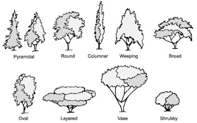
For broadleaf trees, the most important distinguishing characteristic is the branching pattern of the tree, which defines the shape of its canopy. Silver maples are large trees with open, vase-like canopies. Oaks have large spreading crowns; beeches have similar crowns that appear to have melted. Most broadleaf trees branch alternately but maple, ash, dogwood and horse chestnut branch in opposite pairs.

Pines have fewer branches than spruces or firs, and their branches grow in circular whorls on the trunk. As they age, they develop an open, jagged canopy. Spruce branches grow in an upturned direction; as youngsters, they look the most like ‘Christmas trees’. In their dotage, they turn a fine, weathered figure to the wind. Firs have wide lower branches and a downcast mien. Notably, their cones point upward.
Most scenes will include a variety of canopy shapes.
(Something that puzzles me: why do people find ancient trees more beautiful than their offspring, but prefer looking at young people over the elderly?)
Conifers are most easily identified by their needles. Pine needles grow in clusters of two, (red pines), three (yellow pines), or five (white pines), held onto the stem with a tiny papery wrapper. Spruce needles are short, stiff and grow individually from twigs. Fir needles are soft and flat. Cedars have flat, scale-like leaves and stringy bark. Junipers (including, confusingly, the Eastern Red Cedar) have berrylike, bluish cones on the tips of their shoots.
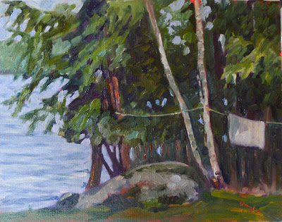
Along Kiwassa Lake, by Carol L. Douglas
Many people can identify the common broadleaf trees by their leaves, and I’ve included a chart to help you. The important part for the painter, however, is to see the differences in color. Silver maples have a lovely grey-silver color. Sycamores are garbed in military-fatigue green. Black spruces are dark while Eastern White Pines are fair and soft in their coloring.
This is why I discourage my students from using tube greens and encourage them, instead, to mix a matrix of green colors.
Basic broadleaf leaves.
Too often, we painters ignore young trees, something I tried to rectify (with varying success) last season. Young trees often look radically different from their aged ancestors, but they have a beauty of their own.
To be a convincing painter, you don’t need to memorize the species of trees, but you do need to learn to distinguish between them. Any plausible landscape will contain a variety of them, with different bark, branch structures, and leaf colors.
Baby black spruce and pines, by Carol L. Douglas
It’s almost the end of Early Bird discounts for my summer workshops. Join me on the American Eagle or at Acadia National Park this summer.

This column was originally published on May 18, 2018. 

Monday Morning Art School: Carol comes a cropper

She asked me to draw a simple tree. How hard could that be?
Velvet-flocked deer with double rainbow, by Carol L. Douglas. Behind the birch tree are marcescent leaves of a young red oak.
Marcescence is the retention of dead leaves in trees over the winter. It’s natural in oaks, beeches and hornbeams, especially in young trees. Leaves drop as Spring approaches. Susurrationis a very quiet whispering sound, such as made by those same oak leaves on a winter’s day. It’s a beautiful wintertime experience.
The oak outside my student’s office window.
One of my summer workshop participants spends her lunch hour drawing (hooray). Last week she asked me to help her figure out how to draw the oak tree outside her window. “Send me a photo,” I answered.
Leaves are generally drawn in masses, but the problem with midwinter oaks is that, like me, they are slowly losing their hair. There aren’t thick masses of dark leaves, but individual leaves etched against the winter sky. At least there are when you’re up close, but she isn’t. Short of getting her employer to move the tree, she was stuck drawing it from a middle distance, where it was a neat, plump form. Plus, Rochester has been very snowy, so there was no enlivening light.
Still, I tell my students they can make a drawing out of anything. I set to with a technical demonstration:
  • Figure out the branch structure.
  • Sketch the leaves as loose masses
Leaves and branches as loose masses.
  • Using your eraser, define and highlight various sections to make the drawing more interesting.
Sometimes I think I erase more than I draw.
The white space redefined with an eraser.
  • Add outlines that suggest the leaf shape.
A little top-drawing to define the leaf shape, and I removed that ungainly lower branch, which was really the most interesting thing about the tree.
That’s how I normally draw, but this time I hated the result. It was flat and uninteresting.
My former house with the neighbor’s oak tree. Photo courtesy of Mary Brzustowicz. 
I used to have an oak at the end of my driveway, so I asked my dear friend Mary to take a photo for me. I know it’s an elegant tree, because I’ve painted those branches many times. Alas, it was another overcast day, and that oak was equally drab.
So, I set to with my imagination. I know what oak leaves look like, more or less. I know what snow looks like. I drew an oak branch and put snow on it. And then I built a branch-cluttered backdrop. It was stillboring. I finally added a small Santa, because I could.
Oak leaves with Santa. 
“Boy, is that cluttered,” said Sandy Quang, who’d stopped by the house to get her mail.
Of course, there were two different objectives here. My student just wanted to know how to do it. The answer is outlined above, even if the demonstration is poor. Sorry, Diane. I wanted to make a drawing that amused and interested me. The lesson, I guess, is that even experienced draftsmen occasionally come a cropper. Don’t let it get inside your head when it happens, and you’ll be fine.

Monday Morning Art School: what I learned from losing 50 pounds

I rapidly gained a hundred pounds after my first cancer in 1999. It’s taken me this long to get serious about getting rid of it. As I reach my halfway goal, I realize that much of the discipline of losing weight is the same as the discipline of learning to paint and draw.
Peppers, by Carol L. Douglas
Being self-taught has its limits
After each of my pregnancies, I used Weight Watchers and exercise and bounced back. That didn’t work with my post-cancer weight. I tried many diets without success. The only solution the medical establishment offered was bariatric surgery. I’d seen too many mixed results to consider it.
I switched PCPs, and my new nurse-practitioner had a different idea. “Try this,” he said, and handed me a book. I’d have dismissed the plan as unsound had it not come from a medical professional.
When I first took classes at the Art Students League, Cornelia Foss looked at my work and said, “If it were 1950, I’d say ‘brava,’ but it’s not.” I’d still be painting derivatively today if it weren’t for her. Sometimes, a trained guide is necessary.
Dish of butter, by Carol L. Douglas
It takes longer than you ever believed possible
My weight loss seemed fast in the beginning. Now, it’s much slower, but it is still there. The same thing happens when you start to paint. Many people quit dieting when it gets tough, and they quit painting then, too. The secret of success is to maintain your discipline through these parched times, because that’s when you’re making real improvement. If it’s going to be meaningful, change is incremental.
Weight Watchers works for millions of people because it registers these incremental changes and encourages you through them. Painting teachers do the same thing. However, if you quit, you’ll make no progress at all. I started this diet in February; I thought I’d be down a hundred pounds now. I’m not, but I wouldn’t have lost a single pound had I not done it. While I didn’t meet my self-imposed goal, the last nine months have not been wasted in self-recrimination, either. 
Home made wine, by Carol L. Douglas
Chaos is not helpful
I realized that my travel schedule had stalled my weight loss, despite my faithfulness to the plan. Then I started to look at my painting in the same light. All these road miles were not helping my painting, either. There’s tremendous value in travel, both as a painter and a person, but months on the road are corrosive. Most improvement is going to happen in your own studio.
Acrylic paints, by Carol L. Douglas
The method isn’t the issue
The method I’ve used to lose this weight is Haylie Pomroy’s Fast Metabolism Diet. It isn’t for everyone. But I’ve come to believe that the method is far less important than your own self-discipline.
The same is true in painting. There is no inherent superiority to alla prima oil painting, although it’s what I practice. One can paint beautifully indirectly in oils, or in acrylic, gouache, or pastel. Mastery comes from within, not from the pigment.
There’s a spiritual element
I believe that God loves me and wants me to be happy, so I can work through the lean times without losing my courage. I can afford to take risks and be intrepid. That’s true in dieting, in painting, and in my business model. If you lack courage, you need to take a long, hard look at why that is.
Toy monkey, by Carol L. Douglas
Ultimately, it’s all about you
I have a friend who’s unsure how she can embrace a radical diet when so much of her family life revolves around food. Likewise, I have friends whose family commitments mean they have to cut back on their painting time. I have lived both those realities, and I am not downplaying them.
But in the end, it’s all about you. Families are remarkably resilient when they realize how much it means to you to succeed. If you’re conflicted about whether your art or your diet are ‘worth it,’ that conflict will spill over to your home and play itself out in your relationships.
My own children survived my tofu lasagna, and holiday dinners with nudes on the walls. They grew up with a working mother in a working studio, and they’re accomplished, good citizens. There’s no reason to sacrifice yourself on an altar of ‘how things should be’ or listen to your own self-destructive thoughts. Yes, you can do this.

Monday Morning Art School: drawing a globe

Start with the mechanical measurement and work your way down to the details.
All illustrations are by Carol L. Douglas (left) and Sandy P. Quang (right)
By now, the long slog to decorate for the Christmas holidays is in full swing. If you haven’t got your tree up, you’ve at least located the boxes and asked your family to help you carry them down from the attic. (Good luck with that, by the way.) Find a simple, round, reflective ornament. That’s your subject for today.
Those of you who don’t believe in Santa Claus or haven’t found the ornaments yet can find a spherical object to substitute. A ball or a snow-globe will work just fine.
The ornaments in question.
Some of you might know Sandy Quang; she was my painting student in Rochester. She went on to get a BFA from Pratt and an MFA from Hunter and now works at Maine Media Workshops and Camden Falls Gallery. And, she just enrolled in an MBA program at University of Maine. The girl never sleeps.
I asked her if she wanted to draw with me. As my students do, she had her sketchbook tucked in her backpack. “Which one do you want?” I asked her. She chose the spider ornament.
Noting the axes.
Recently, I wrote about drawing a glass dish, which is a series of ellipses on a central axis. A circle is easier to draw than an ellipse; it’s an ellipse that is symmetrical on all sides. A sphere appears to be a circle when it’s viewed in two dimensions. This is an unbreakable rule.
We both added details. Mine were the ellipses on the collar of the ornament; Sandy’s were the beaded legs of the spider and her first markings for reflections.
Both of us started with the axis of our drawing. For me, that was the vertical axis; for Sandy it was the axis holding her circles together. I mention this because when people say “I can’t draw!” they seldom realize how much of drawing is mechanical, simple measurement. It’s best to learn this from life, since the measurement has already been done for you when you work from a photo. You can easily work back from life drawing to working with pictures, but it’s harder to go the other way.
Next, we both put the appendages on our spheres. For me, that meant measuring the ellipses in the collar, as I demonstrated in detail in an earlier post. For Sandy, it was the beaded spider legs. Sandy was starting to note the overall areas of reflection in her spheres.
Marking out the outlines of our reflected shapes.

Sandy and I chose different approaches in the next step, dictated by the paper we were working on. Because I had a smooth Bristol, I was able to blend my pencil line into smooth darks with my finger. Sandy could only work light-to-dark on the rougher paper she was carrying. That gives you the chance to see two different approaches to shading.

We both worked on shading next. I finished my shading with an eraser, Sandy couldn’t do that because her paper was too rough.
Sandy has a shadow under her final drawing because the ornament was sitting directly on my coffee table. I put the reflection of myself drawing in my ornament.
All drawing rests on accurate observation and measurement. Get that right and the shading and mark-making is simple.
This post originally ran in December, 2017. It’s been edited.

Monday Morning Art School: holiday gift ideas

Gifts at every price point for the artist in your life (even if that’s you).

Mabef field painting easel M27: Non-artists often buy painters French easels, but please don’t do that. They’re heavy and tough to set up. Instead, choose a smaller, lighter, more efficient easel—the Mabef field painting easel M27. The pivot head makes it useful for both oils and watercolor. It comes with extension arms on which you can set a palette. I’ve had an earlier version of this for two decades. It’s my number one choice for watercolor, and I’m constantly loaning it to new painters. But a word of caution—the cheaper knock-offs of this easel don’t work well. Mabef has been making easels since 1948, and the quality is good.
Want a larger easel? Jerry’s sells a version of a Gloucester easel called the Beauport. Ken DeWaard uses one, as do I. It’s the best easel for large canvases in a stiff wind.
Testrite #500 studio easel: This is the teaching easel I use in my studio. Aluminum is light, easy to move, and easy to stow. Want a larger version? Try its big brother, the Testrite #700. I’ve had one for twenty years without trouble.
Princeton brushes:Over the years, Princeton has provided great value for money, but many professional painters eventually gravitate to something else. Sadly, I can no longer recommend Robert Simmons, because my last two orders have contained defective brushes. I’ve been given so many Princeton SNAP! in goodie bags this year that inevitably one made it into my painting kit. I was pleasantly surprised. Series 9700 is a natural bristle brush made for oil-painting. Series 9800 is a synthetic for oils. Series 9650 is made for watercolor and acrylic.
Despite having a quiver full of upscale watercolor brushes, I’m just as likely to grab my Princeton Neptunes when working in watercolor.
If you really want to surprise someone with your inside knowledge and impeccable taste, choose Rosemary & Co. brushes for watercolor or oil, or New York Central for oil painting brushes.
QoR watercolor kit:QoR (pronounced “core”) is a product of Golden Artist Colors of New Berlin, NY, so you can be assured that they’re a quality product. Golden has created a new binder for a higher-pigment paint that can rival oils and acrylics for vibrance. I use QoR myself, and for my workshops aboard schooner American Eagle, but you can easily buy ready-made sets of 6-12 pigments from any large paint dealer online. For acrylics, I’d recommend a Golden starter set hands down. For oils, buy Robert Gamblin or Winsor & Newton. It’s harder to make a one-size-fits-all recommendation for pastels, but anything sold by Dakota Art Pastelsis a good product.
If your artist has all the paints he thinks he needs, why not surprise him with some gouache? I have some Turner Design Gouache that I trot out whenever I’m thinking through ideas, but there are many fine brands.
In every case, less is more. The artist typically needs no more than a dozen colors, and it’s better to get a better brand with fewer pigments than a large assortment of bad paint.
Sketchbooks: I buy Strathmore 300 series Visual Journals and consume them like candy. They’re Bristol, so you can draw or paint on them. For fast outdoor sketching, I like the Strathmore 400 watercolor series. They’re so affordable, I have no worries about wasting paper.
Palamino Blackwing Pencil: I use mechanical pencils myself, but this was recommended to me by writer Tim Wendel. I’m dying to know what makes a pencil worth slightly more than $2, so I’m asking for it for Christmas.
A workshop: I can’t finish this without a plug for my own workshops. They allow the artist the chance to work with a group of like-minded people, without distractions, in settings of unparalleled beauty.
In 2020, we offer two all-inclusive trips aboard Schooner American Eagle, where I’ll teach the fundamentals of watercolor on the fly (and you get to sail, too). And there’s my annual intensive workshop, Sea & Sky at Schoodic Institute in Acadia National Park. Register by January 1 and get an early-bird discount on any or all of them!

Monday Morning Art School: four color exercises

By the time you’re done with these exercises, you’ll have lots more experience in mixing color.

Our basic classroom still-life for these exercises. 

Above is the still life I created for these exercises. Make your own, or work from a photograph. You can use the same subject for all four exercises. Keep it simple; it doesn’t pay to get lost in the details when you’re supposed to be thinking about color.

Mimicking the masters

The Starry Night, Vincent van Gogh, 1889, courtesy MoMA
What’s your favorite painting? Look carefully and mix the basic colors in it. One student referenced The Starry Night, above, for her painting, below. 
Jennifer’s painting based on The Starry Night.
The goal is to use those colors in various positions in your own painting. That means substituting Van Gogh’s blue for the blue in your painting, etc. You don’t need to use the same proportion of colors as Van Gogh used; just use them in your painting. If a color in your painting doesn’t appear in the picture you are mimicking, work around that. Don’t mix to approximate what you see.
Olive Trees with the Alpilles in the Background, Vincent van Gogh, 1889, courtesy MoMA
Van Gogh painted a series of olive trees in 1889. One of these, Olive Trees in a Mountainous Landscape, (above) was a complement to The Starry Night. You can see how he manipulated the palette (and linework and composition) to relate the olive trees to the night sky.
Color triads
For this exercise, I refer you back to this blog post on color harmonies. Re-read the section on triads, because you’re going to use either an equilateral triad or a harmonic triad to build a painting.
Mary’s color triad painting.
The easiest triad to use is a primary triad. The still life at top was set up to include primary triads and secondary triads, depending on which objects students emphasized. They started by choosing a dominant color and then from that, subservient ones. For example, one might base the painting on the cobalt of the blue vase, with the yellow bowl and red apples subservient to the blue.
Harmonic triads are not balanced, but are counted 3-4-5 in either direction on the color wheel (as in the section on triads). Again, mix a dominant tone, and then its subservient tones. Your goal is not to match the real colors in your subject; your goal is to substitute the color palette for what you see.
This, plus white, is a limited palette.
Limited palette
In theory, you can get to any color using just red, blue, yellow and white paint. But the chroma and clarity of those mixes depends on the pigments you start with. For example, cadmium red mixes brilliantly on the orange side, but muddily on the blue side.
Limited-palette paintings tend to be more unified than broader-palette paintings, precisely because you can’t hit all the points in the color wheel.
My limited-palette demo using the paints above.
The classic color pigments are cadmium yellow, cadmium red and ultramarine blue. You’ll need white as well. Don’t buy extra paints for this exercise; use what you have that’s closest to these colors.
Hardwood, by Carol L. Douglas. This is a color substitution painting.
Color substitution
The painting above is a kind of substitution painting, but we’re going to use a narrower interpretation of the idea. We’re going to substitute each main color for its complement on the color wheel.
Olive Orchard with a Man and a Woman Picking Fruit, Vincent van Gogh, 1889, courtesy KrĂśller-MĂźller Museum
In Van Gogh’s olive tree painting, above, he’s substituted a warm gold for a blue sky. We’re going to do the same thing, except we’ll do it everywhere on the canvas. Keep the value and chroma the same as the original color, but substitute the complementary position on the color wheel. It sounds simple, but it’s devilishly difficult. Have fun!

Monday Morning Art School: how to choose a workshop

The ads are flying fast and furious (including mine). How can you tell what workshop is right for you?

Storm clouds over Schoodic.

There are many fine teachers out there. We each stress something different, but when we’re in a back room chatting, it turns out that most of us really use the same methodology and work through the same fundamentals. But there’s more to a workshop. Here are questions you should ask yourself when choosing.

How many students? This is the first question I’d ask about any workshop. Mine are limited to 12 students, with a monitor or crew supporting me. Any more than that and the teacher will spend most of his or her time demoing, because there’s no way anyone can give personal attention to twenty or thirty students.
Tuscany or Teaneck? There are fine teachers all over America, or you can follow your dreams to Europe or beyond. The great advantage of local classes and workshops is that they’re affordable, and that’s where most of us learn our craft.

Waves, by Carol L. Douglas, oil on canvas

However, the travel workshop is immersive, and that brings out something different in your work. You’ll work, live, talk, eat and think in the culture of that place. Painting in new places is fun, and you meet new friends.

Are you up to this? Plein air workshops are not physically grueling (for the student) but they do require some physical capacity. I accommodate mobility issues in my land-based workshops, but it would be difficult on American Eagle. Talk clearly with the instructor beforehand about special needs.

On shore leave from American Eagle. Photo courtesy of  Ellen Trayer.

Do you like the teacher’s work? Most good teachers can see through your individual style to the technical questions you face. However, the things a painter stresses in his or her own work will be the things that are stressed in instruction. If, for example, you strive to be a Luminist, you’re unlikely to be happy in a class that stresses modern color theory.

Is the instructor a good teacher? This will set the tone for the entire workshop. He or she should be supportive and kind while still giving you practical suggestions to push you forward. There is no reason to put up with bad temper or class management. There are many fine painter/teachers out there who are also very nice, organized people. Ask the instructor what percentage of returning students he or she has. And why not ask for references?

Aboard schooner American Eagle for my annual Age of Sail workshops.

Is the workshop properly permitted and insured? Teaching in national and state parks requires permits and insurance, and teaching on private property requires consent. You should ask whether the workshop organizer has those permissions in place.

What are you getting for your money? The per-person rate for my workshops includes room and board (or berth). Some—including my watercolor workshops—even include materials. That’s a great advantage where accommodations are scarce and/or expensive, and it has the advantage of saving lots of time. Know what your fee is covering—is it just instruction, or does it include other things?

Schoodic Peninsula, site of my annual Sea & Sky Workshop.

My workshops for 2020 include two watercolor workshops aboard the schooner American Eagle. I’ll also be reprising my popular Sea & Sky workshop at Schoodic Institutein August. Both revolve around the incredible landscape and water of the Maine coast, but are very different experiences.

On American Eagle, we concentrate on capturing the quickly-changing marine view in watercolor sketchbooks. At Schoodic, we’re at the largest National Park Service Research Learning Centers in the United States, with superlative landscapes right at our fingertips.
I’ll be marketing these through Facebook and Instagram throughout the Christmas season, but the important thing to remember is that if you register before January 1, you get an early-bird discount. That’s an encouragement to give a workshop to yourself or to a loved one for Christmas.

Monday Morning Art School—drawing from the inside out

There are times when you have to dance backwards in 2-inch heels. Or at least do the equivalent in pencil. Here’s how.


My soap dish and towel. These are very small drawings, by the way—about three inches across.

If you’ve been reading this blog for a while, you know I stress working from big shapes to little shapes.  We start with generalizations and move to detail. This is such a fundamental rule of drawing that it seems almost inviolable.

Yet there are times where the reverse can work brilliantly. There are artists—Albert Handell, for example—who work from their focal point outward. It’s a good trick to have in your kit. Practicing it occasionally helps you see composition differently.
Don’t hate me for the state of that soap dish. At least I wash my hands!
Your assignment this week is to draw a small still life, starting from whatever detail first catches your eye. I used my grimy soap dish. For me, the most attractive thing was the elliptical shadow thrown by the bar of soap, so I started there.
The soap and its shadow. That would soon change.
When is a still life not a still life? When it’s a-travelin’, man. The soap and brush were still wet. As the towel settled down into its pose of casual insouciance, it deflated somewhat. All the pieces moved, imperceptibly at first, and then faster. The soap and brush slithered across the table and on to the floor. This happened three times before I got them to sit and stay.
Finding the arcs of the soap dish around the soap.
One of the advantages of drawing the what interests you first is that it helps you avoid losing your subject. This is particularly important if you draw people on the subway, or lobster boats in harbor. Both will leave on their schedule, not yours.
Fit the dish shapes around the soap like puzzle pieces. Note that the brush has mysteriously flipped over.
If you were drawing this big-to-small, you would start with the ellipse of the dish and its placement on the bigger shape of the towel. You would then break the dish down into its parts. Reversing that, I started with the bar of soap and its shadow. I then built the dish around those objects. To do that, I figured out how they fit around my brush and soap, like pieces of a puzzle, paying careful attention to the so-called negative shapes that resulted.
Brush and soap in their bowl.
(Remember that what you see in the photo isn’t what I saw in real life. Photos distort reality.)
After that, it’s just a question of continuing the process outward. At the end you’ll want to spend a few moments integrating everything and setting a few final, strong lines to hold the composition together.
Growing a shadow.
Where might I use this technique? If there’s one object that’s the focus of my piece, like a beautiful tree, I might start by positioning it elegantly on my canvas and working around it. I sometimes draw hanging coats from small-to-big, since it can be difficult to get the parts to flow together. I always work small-to-big when the object of my attentions is in danger of moving along soon. 
I developed the drapery from the inside out, as well, like little puzzle pieces.
This is a technique applicable to drawing, for the most part. The only time I do it when painting is when my subject is a boat and I’m concerned it will soon be off to sea. Oil paintings can’t be cropped as easily as watercolor or pastel. Making an error of placement at the beginning is a difficult mistake to work around. In oils, it makes the most sense to do a careful drawing and tuck it away against the possibility of losing your subject.
This technique works well for drapery. This is someone’s jacket, draped over a chair.

(This post originally appeared on January 15, 2018.)

Monday Morning Art School: losing your drawing

You do a lovely underpainting and you lose it in the top layers. Why does that happen?
Home Farm, by Carol L. Douglas. Painted at Winterthur in Delaware.

The human mind loves complex, irrational space divisions. The same mind perversely regularizes what it paints and draws. A split-rail fence, where the gaps between posts diminish haphazardly into infinity, attracts us when we see it. However, unless we’re mindful, when we paint it, we regularize the spacing. The same thing happens with trees, flowers and clouds. In nature, they’re artfully erratic. We too often space them in neat lines. Bobbi Heath calls this anti-entropy. It’s a good description of the brain’s powerful impulse to push ideas, images and tones into patterns.

We’re best at drawing when we’re fresh. The challenge is to keep that freshness throughout the finished layers of a painting.
Visan Vineyard underpainting, by Bobbi Heath
Bobbi graciously allowed me to share an example for this post. She painted the underpainting above last year in France and finished the work this month in her own studio. That in itself is a challenge. No matter how good your visual memory is, it diminishes over time. You’ll always be most accurate if you finish work quickly.
Visan Vineyard, by Bobbi Heath
Bobbi made significant changes between the drawing and the final work. The far hill doesn’t rear up as energetically. The ends of the rows are lower on the canvas, and thus less important. More critically, she reduced the contrast, softened the perspective lines, and the ends are less incisive. She also changed the value of the midfield. In my opinion, the painting was weakened by these changes (although it’s still beautiful).
I stress drawing on paper before painting, instead of going straight to the canvas. It’s important to work out the compositional questions before you pick up a brush. It’s just as important to have reference to consult when the light changes or your painting gets distorted. A photo on your phone will just tell you what was there, not how you drew it.
Avoid too much solvent in the bottom layers. In alla prima painting, the bottom layer should have enough OMS in it to move fluidly, but not enough to run. You cannot keep a tight drawing if you’re painting over mush, nor can you keep the colors separated and bright.
Detail from Home Farm, at top.
It’s a fallacy to think that you draw first and paint second. Painting is continuous drawing, and the initial drawing must be restated constantly. I leave important lines showing until I’m certain I have finished the passage, and sometimes (as in the detail above, from the painting at the top) I don’t obliterate them at all. You can’t cover your drawing and expect to reiterate the freshness of the original line. That early drawing will always be your most delightful.
I prefer to work large in general. It’s easier to be accurate and poetic with a large sweeping line. The smaller the canvas, the more jarring small errors of measurement become. For most brushwork, I recommend holding the brush at a point more than halfway back from the ferrule. That gives your brushwork bounce and grace. But for accurate fine drawing, hold it like a pencil.
Kudos to Bobbi for offering to let me critique her painting publicly. “I wish I’d showed it to you earlier so you could have told me to restate the drawing,” she said. That’s a pal.

Monday Morning Art School: color harmonies

Understanding basic color harmonies will help you integrate color in your painting.

Split the color wheel in half like this and you have your cool tones on one side, warm ones on the left.
Color is comprised of three elements: hue, value and saturation. We see value first, but our emotional response is largely dictated by hue. There are some common color schemes, or chords, found in nature and by extension, in art.
The idea isn’t to be slavishly attached to these schemes, but to use them to perceive and point up color relationships in nature.
With all color schemes, one hue should dominate. 
Complementary
Complementary color scheme
These are colors that lie opposite each other on the color wheel. The most famous example is Christmas’ red and green.
This is a vibrant, high-contrast scheme. It’s the basic schematic for the color of light, where shadows are always the complement of the light color. If the light is a warm gold, for example, its shadows will be cool blues.
Analogous
Analogous colors
Analogous color schemes use colors that lie next to each other on the color wheel. Using analogous colors can make what might be a garish scene (a sunset, for example) more serene.
Equilateral Triad
Equilateral colors
This uses colors that are evenly spaced on the color wheel. The most well-known example is the primary combination of red-blue-yellow.
Triadic color harmonies can be quite vibrant, even without high-saturation colors.  
Harmonic triads
A harmonic triad counting clockwise from the green
This variation counts 3-4-5 in either direction on the color wheel. Start with a key color, and count from there. This is a sophisticated variation on the equilateral triad.
Split-Complementary

Split complementary omitting the complement of blue

This is the color scheme I go to intuitively. It’s a variation of complementary colors. It substitutes for the complement or includes the complement’s adjacent hues. It’s as visually compelling as a complementary color scheme, but allows for much more variation in the accent colors.

Split complementary including the complement of green

Double complements
A symmetrical (square) double-complement color scheme
An asymmetrical (rectangle) double-complement color scheme.

The rectangle or tetradic color scheme uses four colors arranged into two complementary pairs. The colors can be in a rectangle or in a square.
Your assignment
Your assignment, should you choose to accept it, is to find these color schemes in your closet, in graphic designs, and in painting. Then paint a small still life using one of the color combinations you’ve located.